The diagram that draws, as I turned it, it turned out
When presenting digital data, one who knows how to build diagrams has a decisive advantage over the fact that he does not know how to do this.
Here, for example, is a fairly typical case: you need to demonstrate the dynamics of the number of subscribers. Suppose that if management believes that the dynamics are good, then they will give us a bonus (or at least not get fired).
If we simply take the number of subscribers and build the columns monthly, then we get a picture of cardinal stagnation (well, or stability).
So itchy hands "chopped up" the ordinate axis and start from scratch to show that the quantity is still increasing!
It seems now, exactly with the same data, the dynamics are visible. But something is wrong: since the last column is almost two times the first, the eyes stubbornly tell the viewer that the number of subscribers has doubled! This is already too much - too frank a scam that will most likely be revealed, and then no prizes can be seen.
But you can also show the increase from zero monthly, cumulative result! Naturally, you must first translate everything into a percentage.
Everything is absolutely honest, no chopping off of the scale. At least 5%, but it’s really clear that things are going uphill cheerfully. What you need!
And if you approach the issue seriously and really try to show a picture, on the basis of which you can analyze the situation that has developed over the course of the year, you get this option:
With him, of course, neither the stability of the situation, nor, moreover, the irrepressible explosive growth will not work.
But with such a picture of what is happening you can discuss really necessary questions:
"Why was there such a killer calm from February to summer?
»What factors influenced the fact that in June the increase is greater than in the" high season "in December?
Why, after this surge in the number of new subscribers, was there such a crushing fall?
But, as you know, for such questions you can make trouble and ill-wishers)))
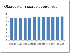
Here, for example, is a fairly typical case: you need to demonstrate the dynamics of the number of subscribers. Suppose that if management believes that the dynamics are good, then they will give us a bonus (or at least not get fired).
If we simply take the number of subscribers and build the columns monthly, then we get a picture of cardinal stagnation (well, or stability).
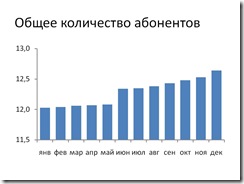
So itchy hands "chopped up" the ordinate axis and start from scratch to show that the quantity is still increasing!
It seems now, exactly with the same data, the dynamics are visible. But something is wrong: since the last column is almost two times the first, the eyes stubbornly tell the viewer that the number of subscribers has doubled! This is already too much - too frank a scam that will most likely be revealed, and then no prizes can be seen.
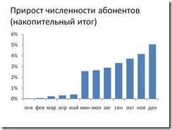
But you can also show the increase from zero monthly, cumulative result! Naturally, you must first translate everything into a percentage.
Everything is absolutely honest, no chopping off of the scale. At least 5%, but it’s really clear that things are going uphill cheerfully. What you need!
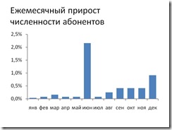
And if you approach the issue seriously and really try to show a picture, on the basis of which you can analyze the situation that has developed over the course of the year, you get this option:
With him, of course, neither the stability of the situation, nor, moreover, the irrepressible explosive growth will not work.
But with such a picture of what is happening you can discuss really necessary questions:
"Why was there such a killer calm from February to summer?
»What factors influenced the fact that in June the increase is greater than in the" high season "in December?
Why, after this surge in the number of new subscribers, was there such a crushing fall?
But, as you know, for such questions you can make trouble and ill-wishers)))