Texts in the user interface: microcontent. Part 1.
Recently I happened to face a very interesting task for me.
For the project we were developing, the Qotvety.com question and answer service, it was necessary to think over and prescribe microcontent - tests of links, headers, field descriptions, come up with a glossary (tooltips), comments on some important fields, letters of the robot - all in a certain style. The target audience is youth.
When designers develop a design, such creative topics as “send everything” (Yandex) are sometimes born, but I got more boring “Create an account” and “Delete my account”.
At first it seemed that everything was easy. But then many questions arose. In the course of my searches, I began to search the Internet: everywhere the translation of the article by Jacob Nielsen hangshis quote, “Microcontent must be the pinnacle of clarity and brevity,” besides it there is practically no information. But the topic is interesting not only for copywriters, but also for designers and those who design user interfaces.
Perhaps the last useful source was perhaps the website of Artemy Lebedev's studio. In addition to the famous " Lights and belt! ", Lebedev found the statement that" on the button of the submission, especially the graphic one, there should be a verb in the imperative mood, otherwise it can be confused with the usual link ".
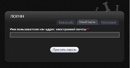
I decided to apply this advice to one of the pieces of my task:
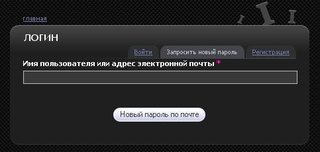
Here, instead of "New password by mail" on the button, it is better to write "Send password to mail" or "Send password" (a shorter version). Also, accordingly, it is better to make the names of the tabs nouns: Login, New password, Registration.
Chebykina, 2004, found a thick book “Development and design of textual content of sites” in the office. It described an example - how to choose the best word for the inscription.
Example: What should be the best search button text?
The inscription on the button should inform what this button does, and the more accurately, the better.
The most terrible option - “Submitting a request” - seems to have disappeared from the Internet. Another option - “OK” - is also completely unacceptable, it does not carry information about the purpose of the button.
A slightly better option is “Search” (as on realt.by). Associated not with the submit button of the form, but with a link to the page containing the search form.
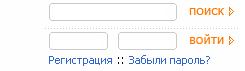
The user expects that after clicking on the button the system will search for what it has requested, which means that the button should have “Search” (Sports.ru for example).
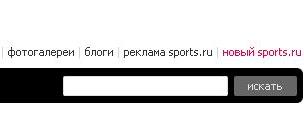
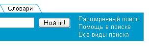
But the “Find” option will be even better (it is possible that Yandex was one of the first to use it) - after all, the user wants the system not only to search, but, in the end, to produce results.

The inscription can be enhanced with an exclamation mark: "Find!" (Rambler.ru). This will create the feeling that the user is giving the command to the search engine.
Another example is the Submit button, which is sometimes found on profile editing pages. In this case, it is better to replace it with "Save", and even better - with "Save changes."
On the user agreement page, options in the imperative mood are undesirable (they are always undesirable on buttons and wherever they can be avoided): so “I agree” is better than “Accept” or “Agree”.
Also, the words “Register” or “Register me” instead of “Register”, “Save” or “Send” will be more logical.
An interesting thing is noticed by the author of the article “ Website Navigation: Linguistic and Cultural Features ”, a page that is most often called “Help” on Russian-language resources, and “How To Use” on Western resources.
In the semantics of the word “help”, according to the author, there is a certain passive installation: a user who has lost orientation, by clicking on the link, expects real help. An English-language resource on a similar page usually offers only instructions for using the site, sometimes far from easy to grasp.
Based on these examples and many others, which I will write about later, the best, as I understand it, is to profess the principles:
1. To think about what exactly is meant, to strive for maximum clarity and concreteness. The inscription should be at the same time logically complete - so that the user does not have to guess its meaning, but at the same time - as short as possible, as short as possible.
2. Each inscription should be pleasant to the user, he should not have a feeling that he is following the instructions of the site, on the contrary - let the user manage it.
3. Short labels create a mood. True, it is important not to overdo it. That is, you should not call the forum " ontomolvish " if you are not sure that everyone who visits the site will understand this.
4. Of course, all inscriptions should be error-free and written in normal human language. It is necessary to control and shoot the temporary variants of the rogue “Your account is not activated” - otherwise they will become permanent.
5. Take into account the user's habits. For example, most of us use the search field at the level of reflexes and in the subcortex of most users it has already been postponed how the search field should look and what it is for.
6. Avoid stereotyping. It’s clear that it’s easier to take an idea from a neighbor than to come up with your own, but it’s just small chips and separate phrases that create the very atmosphere. To do this, you need to look for words, images, archetypes close to the target audience, and in general, introduce a creative component.
To be continued. In the next article, I plan to write about automatically sent letters, which many do not pay attention to - and in vain.
For the project we were developing, the Qotvety.com question and answer service, it was necessary to think over and prescribe microcontent - tests of links, headers, field descriptions, come up with a glossary (tooltips), comments on some important fields, letters of the robot - all in a certain style. The target audience is youth.
When designers develop a design, such creative topics as “send everything” (Yandex) are sometimes born, but I got more boring “Create an account” and “Delete my account”.
At first it seemed that everything was easy. But then many questions arose. In the course of my searches, I began to search the Internet: everywhere the translation of the article by Jacob Nielsen hangshis quote, “Microcontent must be the pinnacle of clarity and brevity,” besides it there is practically no information. But the topic is interesting not only for copywriters, but also for designers and those who design user interfaces.
Perhaps the last useful source was perhaps the website of Artemy Lebedev's studio. In addition to the famous " Lights and belt! ", Lebedev found the statement that" on the button of the submission, especially the graphic one, there should be a verb in the imperative mood, otherwise it can be confused with the usual link ".
I decided to apply this advice to one of the pieces of my task:
Here, instead of "New password by mail" on the button, it is better to write "Send password to mail" or "Send password" (a shorter version). Also, accordingly, it is better to make the names of the tabs nouns: Login, New password, Registration.
Chebykina, 2004, found a thick book “Development and design of textual content of sites” in the office. It described an example - how to choose the best word for the inscription.
Example: What should be the best search button text?
The inscription on the button should inform what this button does, and the more accurately, the better.
The most terrible option - “Submitting a request” - seems to have disappeared from the Internet. Another option - “OK” - is also completely unacceptable, it does not carry information about the purpose of the button.
A slightly better option is “Search” (as on realt.by). Associated not with the submit button of the form, but with a link to the page containing the search form.
The user expects that after clicking on the button the system will search for what it has requested, which means that the button should have “Search” (Sports.ru for example).
But the “Find” option will be even better (it is possible that Yandex was one of the first to use it) - after all, the user wants the system not only to search, but, in the end, to produce results.
The inscription can be enhanced with an exclamation mark: "Find!" (Rambler.ru). This will create the feeling that the user is giving the command to the search engine.
Another example is the Submit button, which is sometimes found on profile editing pages. In this case, it is better to replace it with "Save", and even better - with "Save changes."
On the user agreement page, options in the imperative mood are undesirable (they are always undesirable on buttons and wherever they can be avoided): so “I agree” is better than “Accept” or “Agree”.
Also, the words “Register” or “Register me” instead of “Register”, “Save” or “Send” will be more logical.
An interesting thing is noticed by the author of the article “ Website Navigation: Linguistic and Cultural Features ”, a page that is most often called “Help” on Russian-language resources, and “How To Use” on Western resources.
In the semantics of the word “help”, according to the author, there is a certain passive installation: a user who has lost orientation, by clicking on the link, expects real help. An English-language resource on a similar page usually offers only instructions for using the site, sometimes far from easy to grasp.
Based on these examples and many others, which I will write about later, the best, as I understand it, is to profess the principles:
1. To think about what exactly is meant, to strive for maximum clarity and concreteness. The inscription should be at the same time logically complete - so that the user does not have to guess its meaning, but at the same time - as short as possible, as short as possible.
2. Each inscription should be pleasant to the user, he should not have a feeling that he is following the instructions of the site, on the contrary - let the user manage it.
3. Short labels create a mood. True, it is important not to overdo it. That is, you should not call the forum " ontomolvish " if you are not sure that everyone who visits the site will understand this.
4. Of course, all inscriptions should be error-free and written in normal human language. It is necessary to control and shoot the temporary variants of the rogue “Your account is not activated” - otherwise they will become permanent.
5. Take into account the user's habits. For example, most of us use the search field at the level of reflexes and in the subcortex of most users it has already been postponed how the search field should look and what it is for.
6. Avoid stereotyping. It’s clear that it’s easier to take an idea from a neighbor than to come up with your own, but it’s just small chips and separate phrases that create the very atmosphere. To do this, you need to look for words, images, archetypes close to the target audience, and in general, introduce a creative component.
To be continued. In the next article, I plan to write about automatically sent letters, which many do not pay attention to - and in vain.