Me and the cover or “Go there, we don’t know where”
So, everything would be good if it weren’t so bad :( Therefore, tired of the search, I decided to contact the public. I need your help and advice as disinterested persons.
So, for some time now I’ve been compiling a catalog of auto chemical goods (t .e. there are all kinds of sprays, jars, cans for car care.)
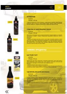
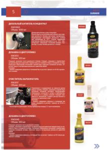
Here is the catalog page:
Next question!
Everything is almost ready, but the problem with the cover has become acute, since there is practically no chef, who is the main customer in Kiev, we communicate through a third party, etc. As a result, we have dogo his excellent idea of it, I have the list of demands, and the boss in the end still do not like what you like to me, and "third" (the rest of it for some reason, do not even show).
So I ask you to comment on what I should draw on the cover:
It’s necessary: beautifully, in the spirit of the catalog.
It’s necessary: “we don’t sell cars, but a jar, so we need them on the cover”. I

need: “less white (free space)” ( between the lines reads: “we do not pay for white sheets”) ... then there are even more jars, less free space - the cover should show what we are selling.
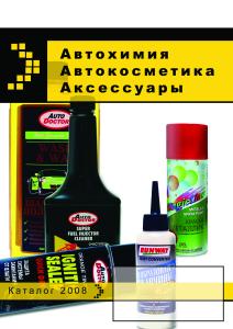
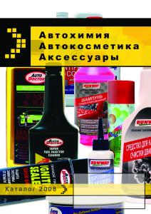
At this stage, I was already tired of the catalog itself, I realized that we will continue to work long and tedious, sent a series of sketches (without the exact preservation of colors, fonts, sizes - just as ideas. I also apologize for the color rendering curve - it was all messy):


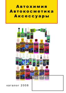
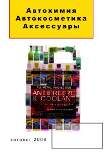
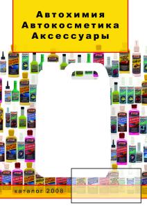

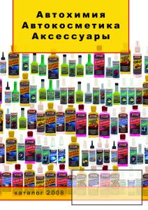
After communicating with the “third”, the various parts were connected (yes, I didn’t really like the names there either), they cut down my favorite concept of canister No. 1. Eventually:
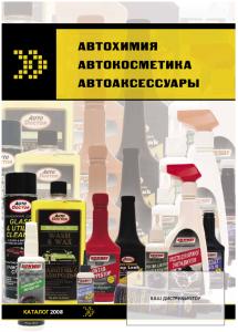
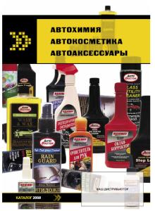
Returning, the chef hacked both of these options. the previous ones did not show him how inappropriate the concept of “little empty space”.
Now you need: a little white, a lot of jars (small), logos of manufacturers and present on the cover all 4 sections of the catalog with photos, although in 2 of them the quality of the photo is such that I would not dare to print, not like putting it on the cover.
I have several ideas, now I’ll sit down to collect; something based on the last “many, many cans”, but arranged on a grid, with logos, backgrounds and without. But I would like to know your opinion - which of the above is worthy, and what else could be done :(
So, for some time now I’ve been compiling a catalog of auto chemical goods (t .e. there are all kinds of sprays, jars, cans for car care.)
Here is the catalog page:


Next question!
Everything is almost ready, but the problem with the cover has become acute, since there is practically no chef, who is the main customer in Kiev, we communicate through a third party, etc. As a result, we have dogo his excellent idea of it, I have the list of demands, and the boss in the end still do not like what you like to me, and "third" (the rest of it for some reason, do not even show).
So I ask you to comment on what I should draw on the cover:
It’s necessary: beautifully, in the spirit of the catalog.

It’s necessary: “we don’t sell cars, but a jar, so we need them on the cover”. I

need: “less white (free space)” ( between the lines reads: “we do not pay for white sheets”) ... then there are even more jars, less free space - the cover should show what we are selling.
At this stage, I was already tired of the catalog itself, I realized that we will continue to work long and tedious, sent a series of sketches (without the exact preservation of colors, fonts, sizes - just as ideas. I also apologize for the color rendering curve - it was all messy):


After communicating with the “third”, the various parts were connected (yes, I didn’t really like the names there either), they cut down my favorite concept of canister No. 1. Eventually:


Returning, the chef hacked both of these options. the previous ones did not show him how inappropriate the concept of “little empty space”.
Now you need: a little white, a lot of jars (small), logos of manufacturers and present on the cover all 4 sections of the catalog with photos, although in 2 of them the quality of the photo is such that I would not dare to print, not like putting it on the cover.
I have several ideas, now I’ll sit down to collect; something based on the last “many, many cans”, but arranged on a grid, with logos, backgrounds and without. But I would like to know your opinion - which of the above is worthy, and what else could be done :(
