Optimal keyboard
The QWERTY layout has taken root pretty well not only on computer keyboards, but also in human minds. A full-fledged keyboard in most cases refers to a keyboard with QWERTY. Let me quote a piece of this article:
That is, it becomes clear that in order to prevent clues, the letters were carried at the maximum distance from each other. It turned out that this is extremely convenient, since one hand types one letter, the other the other, the delays are minimal. Ideal?
Most likely yes, but let's recall another type of device. PDAs, smartphones and other devices on which there is a screen or button quarter keyboard. In this case, I will talk about the screen version.
How does recruitment work? In very rare cases, with two fingers, and even then using third-party paid programs. Most use a stylus, which is just one. So we get that the QWERTY layout is the worstfor these devices, since the distance that you will go with the stylus will be the maximum.
To create an ideal keyboard for typing with a stylus, you need to solve the inverse problem - arrange the buttons so that the distance between the most frequently used letters is minimal. It should be borne in mind that now there are no strict restrictions on the shape, size and position of the letters.
But this is only a criterion of the first approximation, it is clear that there are a lot of ideal layouts. Therefore, we introduce one more criterion: the angle between the three-letter combinations of letters. Since it is more convenient to use a stylus in a straight line, the three-letter combinations are “straighter”, the easier it is to enter them. Thus, having solved the problem of the second approximation, we will teach the keyboard quite well close to ideal.
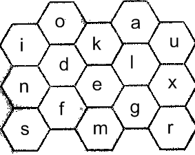
I don’t imagine how I can’t solve such a task or just write, but there is an attempt to build on the following idea - make the buttons 6 faceted (since the keyboard is on-screen, it is necessary that the buttons occupy all the intended space for them - the screen is too valuable to spend it empty . As you know, a plane can be covered with regular triangles, squares and 6-triangles, so if we don’t want to think about the shape of each button, then it’s better to choose one of these figures), put the center The most commonly used vowel (for English - 'e'), after which a series of consonants, then the vowels mixed with consonants, after all the remaining ones. All this is inscribed in the rectangle of the standard keyboard so that it does not take up more space than it was.

This is certainly not ideal, but the first thing that comes to mind.
But we were carried away by typing from the stylus. In addition, there is such an exotic option, as a set with your thumb, when operating the device with one hand. Since the device is in the hand, then

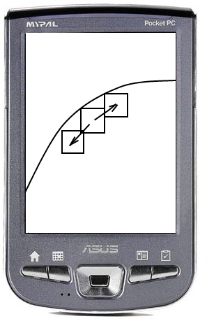
When you click on the button, two more appear next to it, centered on the same circle that describes the finger passing through the central button. If immediately after pressing a finger is torn off, a central button is entered. If you draw "forward" or "back" around the circumference, and then remove your finger, one of the buttons that appear will be pressed.
Thus, we practically do not lose typing speed, using immediately 3 instead of one button. Further, if we place the most frequently used keys as central buttons, we get a pretty good layout with good speed characteristics.
Total: we got two keyboard layouts that will give a higher typing speed than using a standard QWERTY keyboard. Unfortunately, I can’t clearly calculate everything and give specific figures of the optimality of these layouts, and I doubt that anyone can, but such options have the right to life.
The only thing that really needs to be fought is with established images in people's heads.
On the first typewriters (in the 19th century), the keys were arranged alphabetically. However, with increasing typing speed among typists, problems began to arise - letters with the most frequently used letters began to sink, clinging to each other and significantly complicating the typing process.
To solve this problem, Christopher Scholes (apparently, together with his brother, a mathematician) in 1868, compiled a new layout for a typewriter. The goal is to prevent the most frequently used letters from clinging to each other - Scholes achieved by spreading them on different sides of the keyboard and scattering them in different rows. Thus, the problem of stuck letters was resolved.
That is, it becomes clear that in order to prevent clues, the letters were carried at the maximum distance from each other. It turned out that this is extremely convenient, since one hand types one letter, the other the other, the delays are minimal. Ideal?
Most likely yes, but let's recall another type of device. PDAs, smartphones and other devices on which there is a screen or button quarter keyboard. In this case, I will talk about the screen version.
How does recruitment work? In very rare cases, with two fingers, and even then using third-party paid programs. Most use a stylus, which is just one. So we get that the QWERTY layout is the worstfor these devices, since the distance that you will go with the stylus will be the maximum.
To create an ideal keyboard for typing with a stylus, you need to solve the inverse problem - arrange the buttons so that the distance between the most frequently used letters is minimal. It should be borne in mind that now there are no strict restrictions on the shape, size and position of the letters.
But this is only a criterion of the first approximation, it is clear that there are a lot of ideal layouts. Therefore, we introduce one more criterion: the angle between the three-letter combinations of letters. Since it is more convenient to use a stylus in a straight line, the three-letter combinations are “straighter”, the easier it is to enter them. Thus, having solved the problem of the second approximation, we will teach the keyboard quite well close to ideal.
I don’t imagine how I can’t solve such a task or just write, but there is an attempt to build on the following idea - make the buttons 6 faceted (since the keyboard is on-screen, it is necessary that the buttons occupy all the intended space for them - the screen is too valuable to spend it empty . As you know, a plane can be covered with regular triangles, squares and 6-triangles, so if we don’t want to think about the shape of each button, then it’s better to choose one of these figures), put the center The most commonly used vowel (for English - 'e'), after which a series of consonants, then the vowels mixed with consonants, after all the remaining ones. All this is inscribed in the rectangle of the standard keyboard so that it does not take up more space than it was.

This is certainly not ideal, but the first thing that comes to mind.
But we were carried away by typing from the stylus. In addition, there is such an exotic option, as a set with your thumb, when operating the device with one hand. Since the device is in the hand, then
- access to some points on the screen is difficult, to some, on the contrary, easy
- thumb is easiest to move along an arc of a circle
- the buttons should be large so that it is comfortable to hit them with your finger

When you click on the button, two more appear next to it, centered on the same circle that describes the finger passing through the central button. If immediately after pressing a finger is torn off, a central button is entered. If you draw "forward" or "back" around the circumference, and then remove your finger, one of the buttons that appear will be pressed.
Thus, we practically do not lose typing speed, using immediately 3 instead of one button. Further, if we place the most frequently used keys as central buttons, we get a pretty good layout with good speed characteristics.
Total: we got two keyboard layouts that will give a higher typing speed than using a standard QWERTY keyboard. Unfortunately, I can’t clearly calculate everything and give specific figures of the optimality of these layouts, and I doubt that anyone can, but such options have the right to life.
The only thing that really needs to be fought is with established images in people's heads.
