Phones are not for people
Hello everyone.
Before you begin, consider a few pictures.
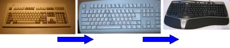
1. Keyboards.
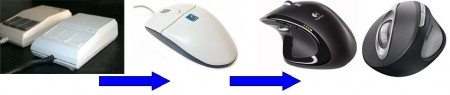
2. Manipulators of the "mouse" type.
3. Mobile phones.
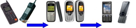
As it is not difficult to notice in all the pictures, at first there are models that were relevant at the beginning of the 90s, then the beginning of the century, and several modern keyboards, mice and phones. I intentionally did not publish many images of various products of different companies, but limited myself to only a few, only to show development trends in these three areas. So, keyboards and mice have become significantly more ergonomic than in the last century. Modern mice almost completely repeat the anatomy of the hand. Got grooves under the fingers, became more convex, the brush practically does not get tired during operation. Keyboards have also changed for the better, the center buttons have become larger, the overall geometry and direction of the buttons repeat the natural position of the hands during typing. On the example of keyboards and mice, evolution is clearly visible from strict geometric lines towards rounded shapes, bends repeating human anatomy. What about phones? Since the appearance of the first phone, their concept has not changed much. All the same regular rectangular shape and buttons located on the grill. Of course, in addition to the classic design, there were also “sliders” and “clamshells,” but they also did not take a step towards man. The same clear rectangular shapes, exactly the same location of the digital buttons. But the shape in the form of a brick is not convenient for a human brush. When we type in SMS with the thumb, we already instinctively squeeze the phone a little harder to hold it in our hand. And still, how many times did the phone slip out of hand? This happens too often. And the reason is in an uncomfortable, archaic form, not adapted to the human hand. As for the location of the buttons with a grid, it would be more suitable for some robot, but not for a person. Pressing the rightmost button in the bottom row with your thumb is not convenient in most cases. There are buttons on the phone, which account for significantly more clicks and still they are almost always all the same shape. Until now, on some phones, the Russian alphabet is divided into 4 letters on 9 buttons strictly in alphabetical order. This leads to the fact that you need to make three clicks to enter the letter "o", although this is the most common letter in the Russian text and at the same time the letters "f", "w", "b" begin the bottom row. Absurd. Pressing the rightmost button in the bottom row with your thumb is not convenient in most cases. There are buttons on the phone, which account for significantly more clicks and still they are almost always all the same shape. Until now, on some phones, the Russian alphabet is divided into 4 letters on 9 buttons strictly in alphabetical order. This leads to the fact that you need to make three clicks to enter the letter "o", although this is the most common letter in the Russian text and at the same time the letters "f", "w", "b" begin the bottom row. Absurd. Pressing the rightmost button in the bottom row with your thumb is not convenient in most cases. There are buttons on the phone, which account for significantly more clicks and still they are almost always all the same shape. Until now, on some phones, the Russian alphabet is divided into 4 letters on 9 buttons strictly in alphabetical order. This leads to the fact that you need to make three clicks to enter the letter "o", although this is the most common letter in the Russian text and at the same time the letters "f", "w", "b" begin the bottom row. Absurd. that you need to make three clicks to enter the letter "o", although this is the most common letter in the Russian text and at the same time the letters "f", "w", "b" begin the bottom row. Absurd. that you need to make three clicks to enter the letter "o", although this is the most common letter in the Russian text and at the same time the letters "f", "w", "b" begin the bottom row. Absurd.
Now an incomprehensible fashion has gone for thin, small phones, but thin does not mean convenient. Rather, on the contrary, the phone just drowns in the hand, it must be held tightly with your fingers so that it does not slip. On some small phones, it’s already difficult to hit the buttons without hitting the neighboring ones. It remains a mystery to me why for so much time no one has done, and is not even trying to (looking at the wretched concepts of the future) a really convenient phone. Instead, they chase after thickness, pixels and megahertz, forgetting what phones do for people, not robots.
Before you begin, consider a few pictures.
1. Keyboards.
2. Manipulators of the "mouse" type.
3. Mobile phones.
As it is not difficult to notice in all the pictures, at first there are models that were relevant at the beginning of the 90s, then the beginning of the century, and several modern keyboards, mice and phones. I intentionally did not publish many images of various products of different companies, but limited myself to only a few, only to show development trends in these three areas. So, keyboards and mice have become significantly more ergonomic than in the last century. Modern mice almost completely repeat the anatomy of the hand. Got grooves under the fingers, became more convex, the brush practically does not get tired during operation. Keyboards have also changed for the better, the center buttons have become larger, the overall geometry and direction of the buttons repeat the natural position of the hands during typing. On the example of keyboards and mice, evolution is clearly visible from strict geometric lines towards rounded shapes, bends repeating human anatomy. What about phones? Since the appearance of the first phone, their concept has not changed much. All the same regular rectangular shape and buttons located on the grill. Of course, in addition to the classic design, there were also “sliders” and “clamshells,” but they also did not take a step towards man. The same clear rectangular shapes, exactly the same location of the digital buttons. But the shape in the form of a brick is not convenient for a human brush. When we type in SMS with the thumb, we already instinctively squeeze the phone a little harder to hold it in our hand. And still, how many times did the phone slip out of hand? This happens too often. And the reason is in an uncomfortable, archaic form, not adapted to the human hand. As for the location of the buttons with a grid, it would be more suitable for some robot, but not for a person. Pressing the rightmost button in the bottom row with your thumb is not convenient in most cases. There are buttons on the phone, which account for significantly more clicks and still they are almost always all the same shape. Until now, on some phones, the Russian alphabet is divided into 4 letters on 9 buttons strictly in alphabetical order. This leads to the fact that you need to make three clicks to enter the letter "o", although this is the most common letter in the Russian text and at the same time the letters "f", "w", "b" begin the bottom row. Absurd. Pressing the rightmost button in the bottom row with your thumb is not convenient in most cases. There are buttons on the phone, which account for significantly more clicks and still they are almost always all the same shape. Until now, on some phones, the Russian alphabet is divided into 4 letters on 9 buttons strictly in alphabetical order. This leads to the fact that you need to make three clicks to enter the letter "o", although this is the most common letter in the Russian text and at the same time the letters "f", "w", "b" begin the bottom row. Absurd. Pressing the rightmost button in the bottom row with your thumb is not convenient in most cases. There are buttons on the phone, which account for significantly more clicks and still they are almost always all the same shape. Until now, on some phones, the Russian alphabet is divided into 4 letters on 9 buttons strictly in alphabetical order. This leads to the fact that you need to make three clicks to enter the letter "o", although this is the most common letter in the Russian text and at the same time the letters "f", "w", "b" begin the bottom row. Absurd. that you need to make three clicks to enter the letter "o", although this is the most common letter in the Russian text and at the same time the letters "f", "w", "b" begin the bottom row. Absurd. that you need to make three clicks to enter the letter "o", although this is the most common letter in the Russian text and at the same time the letters "f", "w", "b" begin the bottom row. Absurd.
Now an incomprehensible fashion has gone for thin, small phones, but thin does not mean convenient. Rather, on the contrary, the phone just drowns in the hand, it must be held tightly with your fingers so that it does not slip. On some small phones, it’s already difficult to hit the buttons without hitting the neighboring ones. It remains a mystery to me why for so much time no one has done, and is not even trying to (looking at the wretched concepts of the future) a really convenient phone. Instead, they chase after thickness, pixels and megahertz, forgetting what phones do for people, not robots.