Improving the effectiveness of online stores
Most of the stores in the network suffer from the same problems that made their way to us from real stores. It is unfortunate that few of the creators of such stores care about customers and do not take advantage of the Internet. In this article, I want to consider some simple ways to improve the store.
Content:
1. Structuring
2. Struggling with the “battery”
3. Sorting
4. Filtering
5. Search
1. Structuring
Each store has its own sections (departments), sections and categories. It is good when there are few of them and there will be no more. And when there are a lot of them and there are options, what will be more? In such cases, I see at least three options for submitting the directory:
The first option is good when there is a high probability that there will be new sections. The last column is just for them. In the second option, all sections are structured so that each of the columns has almost the same height. And in the third, a laconic version is presented, when the name of the section serves as a link, and a brief description is given below.
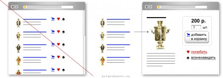
2. In each section, as often happens, dozens of products. Very often, designers make a gross mistake with the "battery" when next to each product are the same pictograms or inscriptions (such as buy). But in good stores such as Amazon this is not there:

Good advice on this matter was given by A. Gorbunov . There was a discussion of this problem.
3. The same product lists can be very well improved by sorting. Of course, it’s not necessary to sculpt eight different sortings, but several, such as: by price, alphabet, user rating, date, number of sales, I think it will be just right.
Here it is important to name the sorting. For example, sorting by “popularity” will not immediately make it clear to users what kind of results will take: from best to worse or vice versa. I think "from the most popular to not very" will be better than the name "by popularity", although this issue can be discussed for a long time and everyone will remain at his own.
4. But even a competent catalog structure and the ability to sort will not help with a huge amount of goods. Here search and filters come to the rescue.
Each of these methods is suitable for different situations, so one of the two is not the best option. The search helps people who know what they came for and want to finish it faster. Filtering is exactly the opposite. It helps the user reduce the number of products that are best suited to him. With a competent approach, filters are good at influencing the user.
Filters are used in different ways. Some sites have a bunch of filters separately: filter by price, year of release, etc. On the other filters are complex, where specifying the necessary parameters of the goods you get the goods as close to the needs as possible (for example, in mobile stores). Sometimes specific filters are even used. I noticed similar ones in souvenir shops, where the user is invited to filter out products by purchase, purchase task and the person to whom the souvenir is presented. This option is very good when the user himself does not know what he wants - and there is no time and desire to wander through the maze of offers. This option brings the store closer to its real prototype.
Another interesting point. Once I was fornication on Ozon.ruin search of a book that you can read at your leisure, but there was no desire to climb into all categories and read the description. Then I thought, and it would be cool when I go to the site - and both on, the book that I need - without any gestures. That is, the site itself hands you the most likely book for you. This can be done on the basis of statistics filled in by the user during registration, as well as on the basis of his purchases and site wanderings.
5. The last point of improvement is the search. The main task of any search is to provide data on demand, which means that people who are looking for already know in most cases what they want. Sometimes a search is crossed with filtering (some advanced search).
An excellent idea of maximizing the effectiveness of a situation where the user knows what he wants is offered inLJ Bogdan Miryuk :

I hope you have not wasted your time and I am glad that you have read to the end)
Content:
1. Structuring
2. Struggling with the “battery”
3. Sorting
4. Filtering
5. Search
1. Structuring
Each store has its own sections (departments), sections and categories. It is good when there are few of them and there will be no more. And when there are a lot of them and there are options, what will be more? In such cases, I see at least three options for submitting the directory:

The first option is good when there is a high probability that there will be new sections. The last column is just for them. In the second option, all sections are structured so that each of the columns has almost the same height. And in the third, a laconic version is presented, when the name of the section serves as a link, and a brief description is given below.
2. In each section, as often happens, dozens of products. Very often, designers make a gross mistake with the "battery" when next to each product are the same pictograms or inscriptions (such as buy). But in good stores such as Amazon this is not there:

Good advice on this matter was given by A. Gorbunov . There was a discussion of this problem.
3. The same product lists can be very well improved by sorting. Of course, it’s not necessary to sculpt eight different sortings, but several, such as: by price, alphabet, user rating, date, number of sales, I think it will be just right.
Here it is important to name the sorting. For example, sorting by “popularity” will not immediately make it clear to users what kind of results will take: from best to worse or vice versa. I think "from the most popular to not very" will be better than the name "by popularity", although this issue can be discussed for a long time and everyone will remain at his own.
4. But even a competent catalog structure and the ability to sort will not help with a huge amount of goods. Here search and filters come to the rescue.
Each of these methods is suitable for different situations, so one of the two is not the best option. The search helps people who know what they came for and want to finish it faster. Filtering is exactly the opposite. It helps the user reduce the number of products that are best suited to him. With a competent approach, filters are good at influencing the user.
Filters are used in different ways. Some sites have a bunch of filters separately: filter by price, year of release, etc. On the other filters are complex, where specifying the necessary parameters of the goods you get the goods as close to the needs as possible (for example, in mobile stores). Sometimes specific filters are even used. I noticed similar ones in souvenir shops, where the user is invited to filter out products by purchase, purchase task and the person to whom the souvenir is presented. This option is very good when the user himself does not know what he wants - and there is no time and desire to wander through the maze of offers. This option brings the store closer to its real prototype.
Another interesting point. Once I was fornication on Ozon.ruin search of a book that you can read at your leisure, but there was no desire to climb into all categories and read the description. Then I thought, and it would be cool when I go to the site - and both on, the book that I need - without any gestures. That is, the site itself hands you the most likely book for you. This can be done on the basis of statistics filled in by the user during registration, as well as on the basis of his purchases and site wanderings.
5. The last point of improvement is the search. The main task of any search is to provide data on demand, which means that people who are looking for already know in most cases what they want. Sometimes a search is crossed with filtering (some advanced search).
An excellent idea of maximizing the effectiveness of a situation where the user knows what he wants is offered inLJ Bogdan Miryuk :

I hope you have not wasted your time and I am glad that you have read to the end)
