Address Bar Improvement
The address bar that displays the path to the current directory has been known since the time when operating systems did not have a graphical interface and, interestingly, it now looks like 10 years ago. It's time to improve it, providing useful functionality.
The main task of the address bar, it is located in a browser or file manager, is to display the path to an open directory or web page and it copes with this task. What to do when you need to get into the folder located n levels higher (to understand exactly how many levels are higher, you still need to count)? Windows operating systems (up to XP) offer three options:
The main task of the address bar, it is located in a browser or file manager, is to display the path to an open directory or web page and it copes with this task. What to do when you need to get into the folder located n levels higher (to understand exactly how many levels are higher, you still need to count)? Windows operating systems (up to XP) offer three options:
- Select the excess part of the path in the address, delete it and press the jump button or Enter key;
- Press the “up” icon, which takes us one level higher until we are at the right level;
- Open the directory tree with the button, view it and click on the desired directory.
In order to perform each of the options requires a certain sequence of actions. In the first case, the user is required to have complex motility (when you hover exactly between two characters), plus moving the hand from the keyboard to the mouse and vice versa. In the second case, after each click of the “Up” icon, you need to read the name of the open folder and remember whether we need it. In the latter case, you need to read the open directory tree from the bottom up until we reach the desired directory, and then click on it.
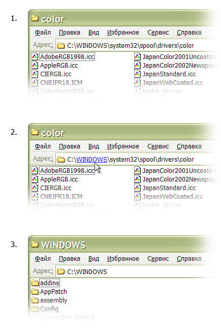
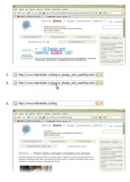
We will equip the address bar with new functionality - even if, when you hover over one of the parts of the path, after a short period of time, the name of the folder (or section) is displayed as a link that allows you to go to the folder with one click.
Here are some examples. In the file manager:
In the browser:
So, when the task is to go to the folder (or section) N, just hover over its name and click.Advantages of improvement:
- the added functionality does not require a new place, which means it makes more rational use of the existing one;
- It does not require changes in the interface, but only expands the basic capabilities of the address bar and can be implemented, for example, by a third-party utility.
- does not require any additional mental operations and complex motor actions from the user;
- in viewing mode, the address bar has not changed in any way and is read in the same way as before.
Anticipating the comments “in Windows Vista everything has been done long ago and much better”, I want to note that my proposal is theoretical, and refers to the address bar as an interface element, i.e. can be implemented at least on Linux, at least on MacOS. In addition, the address bar is used not only in file managers, but also in browsers.
UP. What is the beauty of social networks is in collective knowledge. What I did not find in the preparation of this short article was advised in the comments. So now I can supplement the article with examples of similar implementations:
- Plugin for FireFox - Locationbar 2 (thanks to Gram )
- zet : In Total Commander, when you click on the folder in the address bar (in the active panel) while holding the cipher, you go to this folder. Those. almost the same as suggested, but instead of waiting, a very clear action is to hold Shift-a. But you can edit the path manually only after a simple click on this line.


