Screen resolution. Thinking out loud
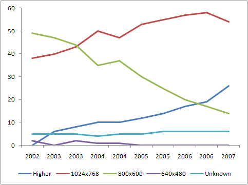
 I recently looked at the global statistics of screen resolutions and was surprised. Back in January 2007, the number of users with a screen resolution of 800x600 ranged from 15-17 percent , and at the moment only 6 - 9 percent.
 "- But it does mean something, " I thought, and began to estimate the calculations in my mind. If in less than six months the number of people with a small ... uh ... screen has decreased by 10 percent, then by the end of the year they just do almost disappear! (Screens, not people :))
And the figure of 6-7 percent in itself is already insignificant. About as many users do not use Javascript .

Then I decided to take a look at which of the well-known sites supports 800x600. The following picture is observed (the choice is absolutely arbitrary):
- yahoo.com - no
- yandex.ru - no
- mail.ru - yes (!)
- microsoft.com - no
- apple.com - no
- youtube.com - no
- rambler.ru - yes (!)
- digg.com - no
You can certainly continue, but the general trend is clear in my opinion.
Only Rambler and Mail.ru were surprised, they expected the least from them, but here you go.
Of course you can say that it’s supposedly giants, and they can afford it, but it seems to me that this is not so. They just made a sound count.
Already, an audience with a screen resolution higher than 1024x768 is at least four times larger than an audience with a resolution of 800x600 and the gap will only increase. So who is more profitable and promising to support?
Of course there are many “buts.” We can say that those with a higher screen resolution will still see a site optimized for 800x600, but who wants to see a small box in the center of a large monitor?
We can say that we should switch to the “rubber” layout. I agree, but unfortunately not every design can be implemented in this way.
You can determine the resolution of the screen and palm off CSS depending on it. But this is a problem. Not every designer will make 2 or 3 layouts, and it will not always be appropriate. Work doubles, and returns tend to zero. And with good acceleration.
And by this I had the obvious idea that it was time to stop focusing on 800x600 pixels and rise to a higher level. But with a reservation.
We will proceed from the fact that we need a maximum of visitors. When developing a site, you need to make a layout for a resolution of 1024x768, but put important information / blocks in a "cube" with dimensions 800x600 (760x430), starting from the upper left corner of the window.

As a result, it turns out that the sheep are safe and the wolves are full. All important information is visible with any extension, without using a horizontal scroll.
This is of course only a partial solution, but it seems to me that every month it will be more and more relevant.
The only caveat of all my mini-analysis is that the statistics on the Runet are limited by the Spaylog and Liveinternet from memory.
It is interesting to listen to your opinion on this matter, Habralyudi.
