How the digital designer works: basic principles
Offhand, the exhibition "Mercur and other designers" in the ZIL cultural center does not make an impression - here is a metal constructor, here is a plastic one, here is an engineering one, etc.
But one stand attracts attention - it demonstrates with a dozen digital designers, including:
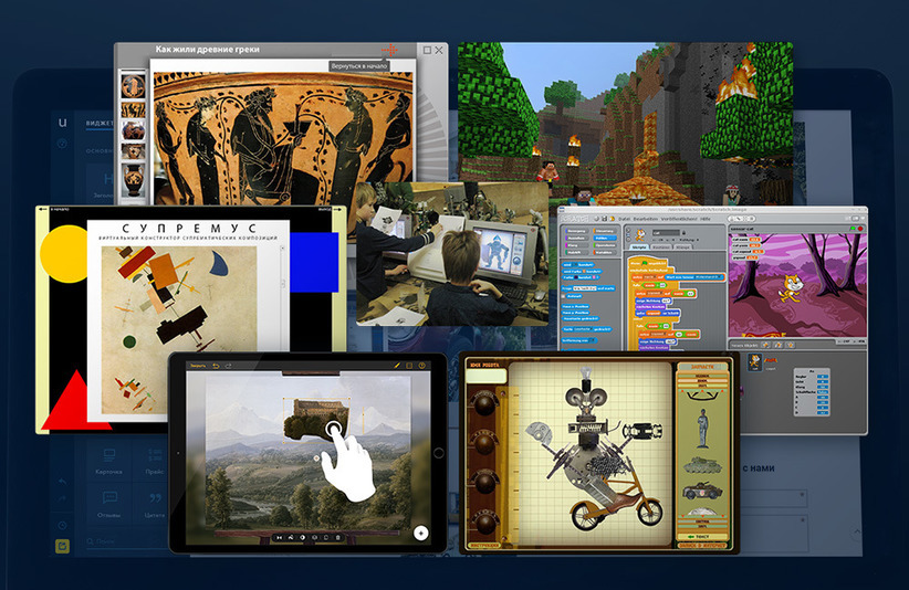
- a designer of fantastic creatures for schoolchildren who explains the whole culture of Ancient Greece in 5 minutes;
- an online robot designer from improvised materials explaining where to put the old pioneer badge with To Lenin
- and the designer of classical landscapes for visitors to the Tretyakov Gallery - he explains why all the landscapes of the 18th century are more or less the same.
Since designers are increasinglycome across to us in digital form - it is useful to know the general concept of their device. We’ll talk about this with an expert.
It turns out that the author of digital designers from the stand sits in the same building where the exhibition takes place.
We talked with Nikolai for two hours and found out - for whatever purpose a digital designer was created: for school, for games or for business - he would work according to the same laws.
Nikolai: “When I see parents who buy only Lego for children, I tell them:“ And who do you want to see him when a person graduates from a university - an executor in a large company or a creator and, possibly, the owner of this company? ”
The fact is that from the point of view of storytelling, Lego is beautiful - for example, we collect a bathyscaphe with my grandson, and in parallel I introduce him to the topic of underwater research. But from the point of view of the development of creative thinking, this constructor is rather weak, because it is often taught to collect a certain thing in a strictly defined way.
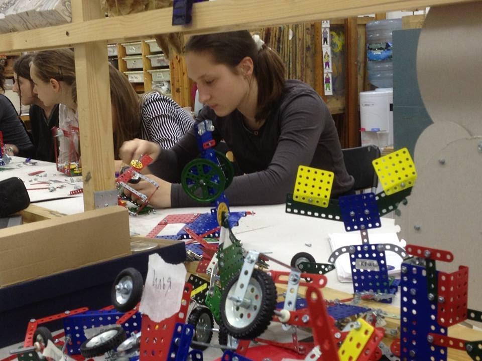
Lesson at the " Art Design Workshop ", which is led by Nikolai
The task of the designer: to give experience in the creation of certain things - that is, to understand the basic principle, and not to learn to do "specifically so." In this regard, even simple cubes are a great example of a proper constructor. You can do a lot with him - at least explain the model of the universe.
Another good example that I met was brochures and books for "homemade" ones, which were massively published in the 1930s. For example, it says something like this: “Here is the principle of the propeller; understanding him, you can make him even a plane, even a quadrocopter. ” That is, it shows the basis with which you can achieve a lot and different. And not a step-by-step instruction for each case, which will sit in your head. ”
uKit:When we just started writing about designers on Giktayms, in the comments there was a retelling of the story about “a designer is only to do like this” - it turned out, the problem of understanding why a designer is needed , sometimes it really exists:

Although the designer is that ordinary, that digital , - solves the problem of knowing and probing a new direction. Passing the first steps through personal experience, based on the experience of others.
For example, Scratch is both a visual environment for teaching schoolchildren programming, and the first steps in animation that the experts from MIT thought out for you.
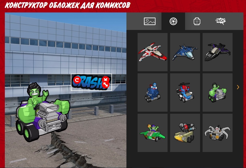
The same simple online designers of banners and covers from Lego are the first steps in graphic design for little ones, taking into account both the marketing task and the demonstration of how to make a poster / banner / collage.
And so - right up to the adult digital designer.
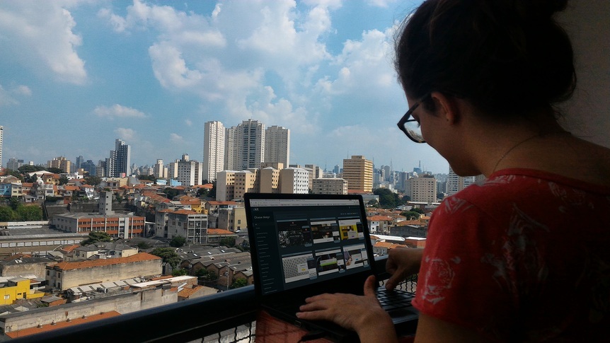
The sister of our Brazilian colleague is building a site on a designer somewhere in Sao Paulo.
Any site can be built in different ways, and your task as a designer is to indicate a common path and give room for reasonable creativity, highlighting the main points. And do not drive into the head the concept that "any site should contain such a button of green or red color, surely I say, my brother got up like that . "
And therefore, elements and logic are selected for each constructor according to the situation.
Nikolai: “Each designer has his own time and place. Each of my designers is an attempt to solve the problem. For example, take a group of schoolchildren and take them to the hall of ancient art. On the spot we will tell them for a long time how the famous Greek vases were made. But! The principle by which they were created will remain "closed" to them, believe me - new generations often do not perceive the cultural experience of the past.
But this principle is there. Any engineer would say - this is the principle of the unit: when a combination of different elements forms a system to solve any one problem.
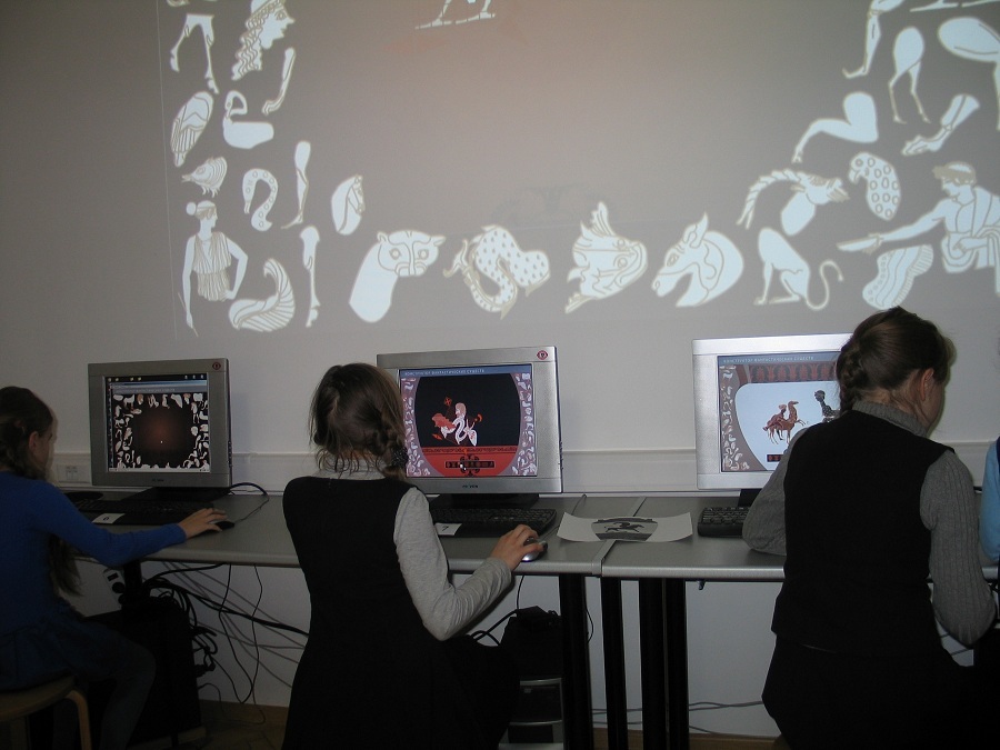
Children learn constructor of fantastic creatures in advanced art classes
So I came up with a designer of fantastic characters - it gives you a visual feel of the method by which images were created for different types of antique ceramics. When children of grades 2-8, having tried such a designer, come to the museum, they understand how, why and from which the object was created.
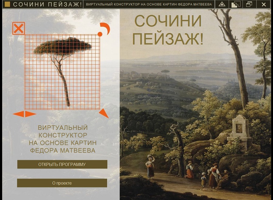
And this designer can be downloaded for free on the App Store and Google Play (the version for the tablet was not designed by Nikolai anymore)
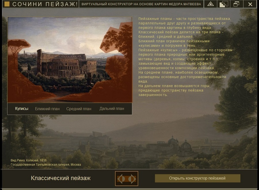
Let's take another example - the “Compose landscape” constructor for the Tretyakov Gallery. which we did for the exhibition of the painter Fedor Matveev, who lived at the end of the 18th century. This product is designed for a different task.
We wanted to give an idea of how the artists of that time worked. And the designer is based on a methodological scheme for writing a classic landscape - this is a specific color scheme, a specific concept of perspective and the principles of the location of objects on the plans.
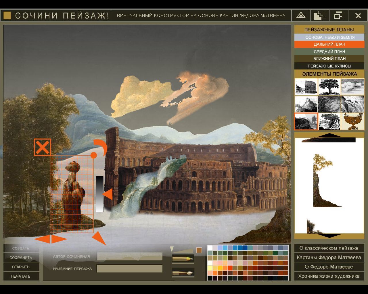
The designer himself was originally released on CD in 2008 by
uKit: Digital designers have always been based on the task at hand. Take, for example, uCoz - the first project of our company. In 2005, he solved the problem of the founders and their “hangouts” - to make a fan site, forum, blog or portal, without delving into FreeBSD. It was a product for geeks.

When at the end of the 2000s, social networks began to replace fan sites and portals, and small businesses began to go online, the idea of our uKit - a “simpler constructor” came up.
It also implements a system of soft “checks and restrictions”, pushing a person to understand what data is important on the site. For example, at the first step, we ask the creator of the site to fill in the address fields and give the phone number of his company - because for the client of a car dealership or workshop for the repair of equipment, this is important information.

Digital designer in 2016. The typical block of the start screen of the main page, for example, encourages thought - the visitor at first glance should understand what kind of site it is.
Such soft hints do not limit the creative impulse - any block can be removed or remade. But in every digital designer, there are borders that are impossible to transgress.
Nikolai: “An important task for the author of the constructor is to find the line between the originality of its development and its simplicity. Because coming up with a constructor and using it is different. Creating my designers, I came to this scheme: there is a grid, a clear palette and a clear set of elements from which you can choose - plus several options for connecting them. A kind of system of restrictions.
For example, take the same constructor of fantastic animals that educational institutions buy with textbooks. I give it a very limited palette.
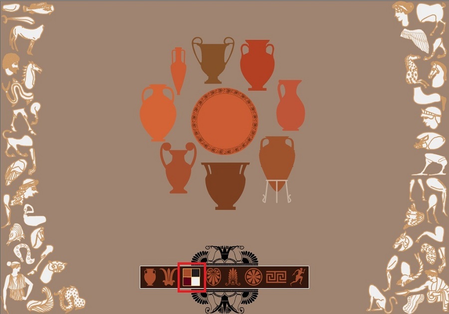
But in the same constructor of classical landscapes, you saw the palette is richer. The watershed of opportunities is different - we have introduced restrictions on the movement between the main plans of the picture. This framework has developed historically, they were determined by the artists of that time - starting from where and what can be located (for example, in the classical landscape architecture is always in the middle plane, and in the foreground - an event), and ending with what the focus should be on attention.
Such a restriction disciplines . ”
uKit:It is clear that any digital designer has the framework of "what is possible and what is not" also trivial because only the developer can make changes to the system. And the developer’s plan is scheduled for six months to a year in advance: and sometimes it’s more important to release a version for the visually impaired, rather than sawing "a thing that ...".
Of course, in the end, some of the custom Wishlist is implemented. But there are restrictions that are intentionally “nailed”. For example, we also introduced a restriction on the color palette - the user is given three sets, depending on the theme of the template (business).
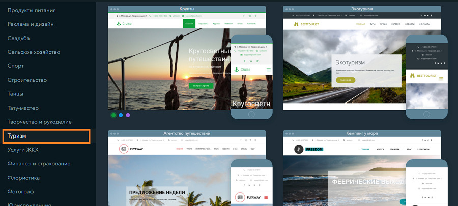
The point, of course, is not that "a car can be of any color if it is black." This is also taking into account the psychology of colors (a simple example: turquoise and blue are suitable for a travel agency's site, since they are associated with the sea and sky). And attention to detail: so that the palette and font set match on any page.
Finally, if you are creating a site for a bakery, hardly a light pink text on an acid yellow background would be the perfect solution. But there are those who are trying to do so ...
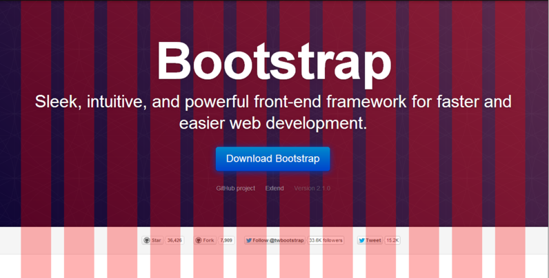
There are other useful limitations - for example, you cannot embed a comment widget anywhere except for a blog. Firstly, why do small businesses need comment widgets on their site when there is an online chat, call back and feedback form? Secondly, like Nikolai and many others, we came to a grid that supports the constructor: it performs an application function - it helps the site adapt to different screens on the fly.
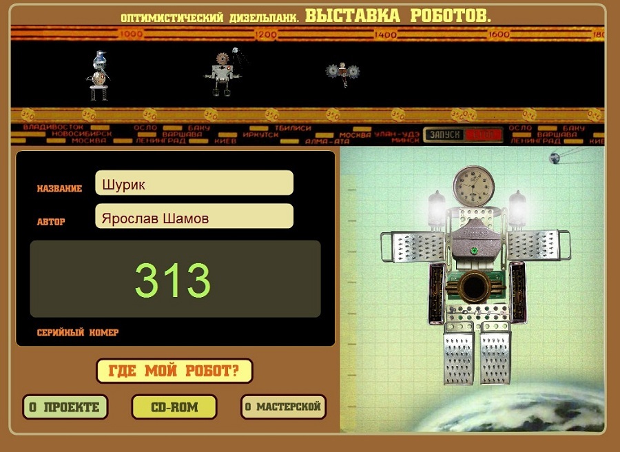
Nikolai: “No matter what design we do with the children, I always push the guys to give names to their creations. And in a digital environment, a name is one of those most useful limitations. For example, once we made a constructor of robots from domestic rubbish: you take, for example, a pioneer badge with Lenin, a tin can, bulbs, nuts - you assemble a two-dimensional robot from them, and then write instructions to it.
One of the conditions in our constructor is to come up with a name for the robot and give a serial number. That everything was as an adult. "
uKit: It’s natural for a person to give a name to his “brainchild”. Well, for any information system, an identifier is needed, by which, ideally, not only a robot, but also a person can find a specific creation.
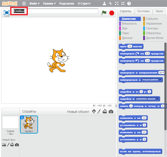
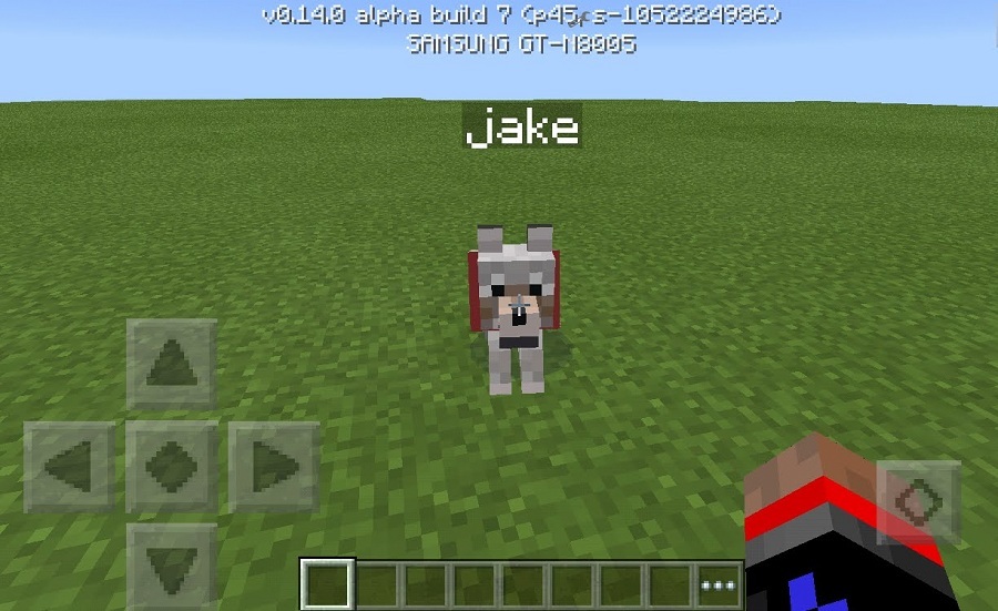
When you make an animation in Scratch, you need to give it a name. When you tamed a horse or another "mob" in Minecraft - you want to give a name, and for this privilege you also have to pay - buy a "tag" in the game.
When a person made a site - ideally, he needed not a third-level technical domain, which is automatically issued by any designer, but a full name for the site. This is not only a mild attempt to earn an extra 600-900 rubles a year, but a soft eyeliner to make the creation complete.
Nikolay: “Most of the work is monetized by order: for example, the designer for the Tretyakov Gallery sponsored Severstal (we also did another corporate designer for the company).

The designer of fantastic animals sells the publishing house as an addition to the textbook.
I created almost all my designers in the 2000s - and the CD became their carrier. I even put up disks with designers available for retail at one time. Of course, now we are thinking about how to rebuild - almost all designers have web versions, which we raise to order, but they are created on Flash. And everyone has already switched to HTML5. "
uKit: Online designers have one advantage - SaaS modellong ago replaced for most not only disks, but also flash drives. And it’s not going to die.
Otherwise, if you don’t have MIT resources behind you (like with Scratch), a PR task (as it was with Lego Digital Designer - but the project was closed ) or you don’t have an open source project supported by a large community, sooner or later your designer will have to monetize.
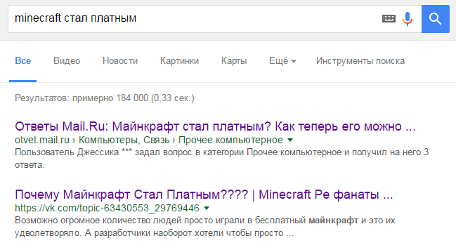
It is corny because, returning to paragraph 3 of our review, there is a team that supports the project and wants to eat. Be it Minecraft - this is a good habrastatya about their monetization , which began almost immediately, even before the "universal monetization" three years ago. Whether it’s a site builder, there are no free solutions on the market today if it’s not student crafts.
Nikolai: “I have not met people who would play with any designer all the time, without switching to new ones. A designer, especially a digital one, is a demonstration of the technique. You studied it, comprehended it, and went on. ”
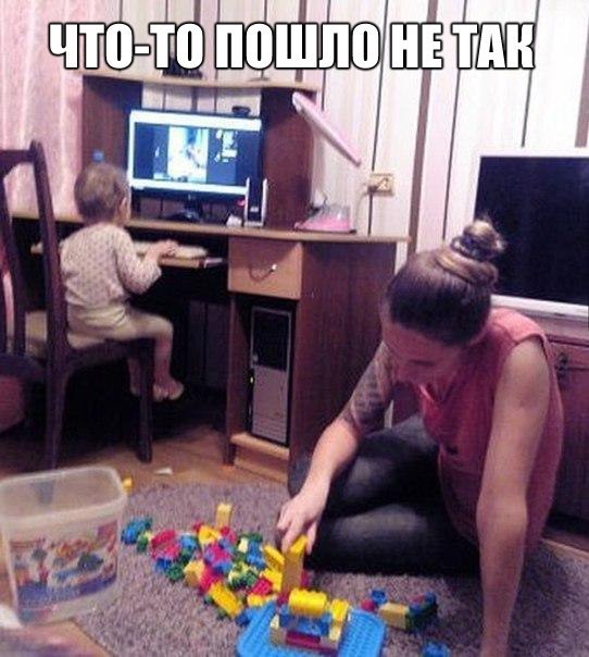
uKit: In the world of IT projects, there is a concept of a client’s life on this subject. For example, the average lifespan of a small business site assembled on a designer is 2 years. Either he felt the Internet for himself, understood what he wanted - and he would consciously try out more complex platforms, or - sadly, for such a period, the enterprise often simply shuts down.
Nikolai: “The trick of digital designers, whether it’s children's educational programs, games or specialized solutions, is the opportunity to combine them with the latest technologies. And the most promising here is the use of VR in digital designers.

It seems to me that such integration will open up a host of new applications for digital designers - in education, business (for example, tourism), preservation of cultural heritage and other areas. ”
uKit: Yes, the same Minecraft was shown in combination with virtual reality glasses:
In the world of site builders, VR is hardly applicable. But AI - to the very point. Today, several website designers are trying to integrate neural networks into their products in order to facilitate the most tedious stage - site prototyping for the business task.
But one stand attracts attention - it demonstrates with a dozen digital designers, including:

- a designer of fantastic creatures for schoolchildren who explains the whole culture of Ancient Greece in 5 minutes;
- an online robot designer from improvised materials explaining where to put the old pioneer badge with To Lenin
- and the designer of classical landscapes for visitors to the Tretyakov Gallery - he explains why all the landscapes of the 18th century are more or less the same.
Since designers are increasinglycome across to us in digital form - it is useful to know the general concept of their device. We’ll talk about this with an expert.
It turns out that the author of digital designers from the stand sits in the same building where the exhibition takes place.
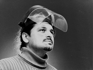 | Nikolay Selivanov is an artist, teacher, author of electronic educational systems. Manages the project "Workshop of artistic design" (creativity for children) and organizes exhibitions in the Palace of Culture ZIL. Leading specialist of the project Education, Art and ICT: integration for development of one's personality at the UNESCO Institute for Information Technologies in Education, member of the Presidium of NP ADIT (Automation of museums and information technologies). |
We talked with Nikolai for two hours and found out - for whatever purpose a digital designer was created: for school, for games or for business - he would work according to the same laws.
1. Showing the principle, not teaching the pattern
Nikolai: “When I see parents who buy only Lego for children, I tell them:“ And who do you want to see him when a person graduates from a university - an executor in a large company or a creator and, possibly, the owner of this company? ”
The fact is that from the point of view of storytelling, Lego is beautiful - for example, we collect a bathyscaphe with my grandson, and in parallel I introduce him to the topic of underwater research. But from the point of view of the development of creative thinking, this constructor is rather weak, because it is often taught to collect a certain thing in a strictly defined way.

Lesson at the " Art Design Workshop ", which is led by Nikolai
The task of the designer: to give experience in the creation of certain things - that is, to understand the basic principle, and not to learn to do "specifically so." In this regard, even simple cubes are a great example of a proper constructor. You can do a lot with him - at least explain the model of the universe.
Another good example that I met was brochures and books for "homemade" ones, which were massively published in the 1930s. For example, it says something like this: “Here is the principle of the propeller; understanding him, you can make him even a plane, even a quadrocopter. ” That is, it shows the basis with which you can achieve a lot and different. And not a step-by-step instruction for each case, which will sit in your head. ”
uKit:When we just started writing about designers on Giktayms, in the comments there was a retelling of the story about “a designer is only to do like this” - it turned out, the problem of understanding why a designer is needed , sometimes it really exists:

Although the designer is that ordinary, that digital , - solves the problem of knowing and probing a new direction. Passing the first steps through personal experience, based on the experience of others.
For example, Scratch is both a visual environment for teaching schoolchildren programming, and the first steps in animation that the experts from MIT thought out for you.

The same simple online designers of banners and covers from Lego are the first steps in graphic design for little ones, taking into account both the marketing task and the demonstration of how to make a poster / banner / collage.
And so - right up to the adult digital designer.

The sister of our Brazilian colleague is building a site on a designer somewhere in Sao Paulo.
Any site can be built in different ways, and your task as a designer is to indicate a common path and give room for reasonable creativity, highlighting the main points. And do not drive into the head the concept that "any site should contain such a button of green or red color, surely I say, my brother got up like that . "
And therefore, elements and logic are selected for each constructor according to the situation.
2. The situation and the solution of specific problems
Nikolai: “Each designer has his own time and place. Each of my designers is an attempt to solve the problem. For example, take a group of schoolchildren and take them to the hall of ancient art. On the spot we will tell them for a long time how the famous Greek vases were made. But! The principle by which they were created will remain "closed" to them, believe me - new generations often do not perceive the cultural experience of the past.
But this principle is there. Any engineer would say - this is the principle of the unit: when a combination of different elements forms a system to solve any one problem.

Children learn constructor of fantastic creatures in advanced art classes
So I came up with a designer of fantastic characters - it gives you a visual feel of the method by which images were created for different types of antique ceramics. When children of grades 2-8, having tried such a designer, come to the museum, they understand how, why and from which the object was created.

And this designer can be downloaded for free on the App Store and Google Play (the version for the tablet was not designed by Nikolai anymore)
Let's take another example - the “Compose landscape” constructor for the Tretyakov Gallery. which we did for the exhibition of the painter Fedor Matveev, who lived at the end of the 18th century. This product is designed for a different task.
We wanted to give an idea of how the artists of that time worked. And the designer is based on a methodological scheme for writing a classic landscape - this is a specific color scheme, a specific concept of perspective and the principles of the location of objects on the plans.

The designer himself was originally released on CD in 2008 by
uKit: Digital designers have always been based on the task at hand. Take, for example, uCoz - the first project of our company. In 2005, he solved the problem of the founders and their “hangouts” - to make a fan site, forum, blog or portal, without delving into FreeBSD. It was a product for geeks.

When at the end of the 2000s, social networks began to replace fan sites and portals, and small businesses began to go online, the idea of our uKit - a “simpler constructor” came up.
It also implements a system of soft “checks and restrictions”, pushing a person to understand what data is important on the site. For example, at the first step, we ask the creator of the site to fill in the address fields and give the phone number of his company - because for the client of a car dealership or workshop for the repair of equipment, this is important information.

Digital designer in 2016. The typical block of the start screen of the main page, for example, encourages thought - the visitor at first glance should understand what kind of site it is.
Such soft hints do not limit the creative impulse - any block can be removed or remade. But in every digital designer, there are borders that are impossible to transgress.
3. Built-in restrictions
Nikolai: “An important task for the author of the constructor is to find the line between the originality of its development and its simplicity. Because coming up with a constructor and using it is different. Creating my designers, I came to this scheme: there is a grid, a clear palette and a clear set of elements from which you can choose - plus several options for connecting them. A kind of system of restrictions.
For example, take the same constructor of fantastic animals that educational institutions buy with textbooks. I give it a very limited palette.

But in the same constructor of classical landscapes, you saw the palette is richer. The watershed of opportunities is different - we have introduced restrictions on the movement between the main plans of the picture. This framework has developed historically, they were determined by the artists of that time - starting from where and what can be located (for example, in the classical landscape architecture is always in the middle plane, and in the foreground - an event), and ending with what the focus should be on attention.
Such a restriction disciplines . ”

uKit:It is clear that any digital designer has the framework of "what is possible and what is not" also trivial because only the developer can make changes to the system. And the developer’s plan is scheduled for six months to a year in advance: and sometimes it’s more important to release a version for the visually impaired, rather than sawing "a thing that ...".
Of course, in the end, some of the custom Wishlist is implemented. But there are restrictions that are intentionally “nailed”. For example, we also introduced a restriction on the color palette - the user is given three sets, depending on the theme of the template (business).

The point, of course, is not that "a car can be of any color if it is black." This is also taking into account the psychology of colors (a simple example: turquoise and blue are suitable for a travel agency's site, since they are associated with the sea and sky). And attention to detail: so that the palette and font set match on any page.
Finally, if you are creating a site for a bakery, hardly a light pink text on an acid yellow background would be the perfect solution. But there are those who are trying to do so ...

There are other useful limitations - for example, you cannot embed a comment widget anywhere except for a blog. Firstly, why do small businesses need comment widgets on their site when there is an online chat, call back and feedback form? Secondly, like Nikolai and many others, we came to a grid that supports the constructor: it performs an application function - it helps the site adapt to different screens on the fly.
4. Objects created in the constructor must have names
Nikolai: “No matter what design we do with the children, I always push the guys to give names to their creations. And in a digital environment, a name is one of those most useful limitations. For example, once we made a constructor of robots from domestic rubbish: you take, for example, a pioneer badge with Lenin, a tin can, bulbs, nuts - you assemble a two-dimensional robot from them, and then write instructions to it.
One of the conditions in our constructor is to come up with a name for the robot and give a serial number. That everything was as an adult. "

uKit: It’s natural for a person to give a name to his “brainchild”. Well, for any information system, an identifier is needed, by which, ideally, not only a robot, but also a person can find a specific creation.

When you make an animation in Scratch, you need to give it a name. When you tamed a horse or another "mob" in Minecraft - you want to give a name, and for this privilege you also have to pay - buy a "tag" in the game.

When a person made a site - ideally, he needed not a third-level technical domain, which is automatically issued by any designer, but a full name for the site. This is not only a mild attempt to earn an extra 600-900 rubles a year, but a soft eyeliner to make the creation complete.
5. Usually it costs money
Nikolay: “Most of the work is monetized by order: for example, the designer for the Tretyakov Gallery sponsored Severstal (we also did another corporate designer for the company).

The designer of fantastic animals sells the publishing house as an addition to the textbook.
I created almost all my designers in the 2000s - and the CD became their carrier. I even put up disks with designers available for retail at one time. Of course, now we are thinking about how to rebuild - almost all designers have web versions, which we raise to order, but they are created on Flash. And everyone has already switched to HTML5. "
uKit: Online designers have one advantage - SaaS modellong ago replaced for most not only disks, but also flash drives. And it’s not going to die.
Otherwise, if you don’t have MIT resources behind you (like with Scratch), a PR task (as it was with Lego Digital Designer - but the project was closed ) or you don’t have an open source project supported by a large community, sooner or later your designer will have to monetize.

It is corny because, returning to paragraph 3 of our review, there is a team that supports the project and wants to eat. Be it Minecraft - this is a good habrastatya about their monetization , which began almost immediately, even before the "universal monetization" three years ago. Whether it’s a site builder, there are no free solutions on the market today if it’s not student crafts.
6. Do not play any constructor forever
Nikolai: “I have not met people who would play with any designer all the time, without switching to new ones. A designer, especially a digital one, is a demonstration of the technique. You studied it, comprehended it, and went on. ”

uKit: In the world of IT projects, there is a concept of a client’s life on this subject. For example, the average lifespan of a small business site assembled on a designer is 2 years. Either he felt the Internet for himself, understood what he wanted - and he would consciously try out more complex platforms, or - sadly, for such a period, the enterprise often simply shuts down.
7. It can mix technology
Nikolai: “The trick of digital designers, whether it’s children's educational programs, games or specialized solutions, is the opportunity to combine them with the latest technologies. And the most promising here is the use of VR in digital designers.

It seems to me that such integration will open up a host of new applications for digital designers - in education, business (for example, tourism), preservation of cultural heritage and other areas. ”
uKit: Yes, the same Minecraft was shown in combination with virtual reality glasses:
In the world of site builders, VR is hardly applicable. But AI - to the very point. Today, several website designers are trying to integrate neural networks into their products in order to facilitate the most tedious stage - site prototyping for the business task.
