How I tried to fix a map search for drivers. Part 3 (final)
So, this is the third part of my attempt to rethink the usual map search. The first part is here , and the second here - they are more technical, but you can run through your eyes for a better understanding. In a nutshell, it sounds like this: I'm tired of poking around in maps while driving, trying to find the nearest gas station among small icons and ads. Instead, I would just like to go looking at the application screen. In order for it to sort the nearest places by driving time, it would show them with a list, explain which of them are on the way and what traffic is to them. Such an idea.
Actually, by version 3.0 of the application it was finally possible to implement all the basic functions that I wanted. After the last article in this series, a number of people downloaded it, and even wrote reviews - thanks, I listened to everyone. I worked intensively on the new version of the month for two months, I can’t list all the minor changes - in fact this is an 80% new application. With a radically improved interface, 2 times faster and much more stable. Again, I invite sympathizers to evaluate and scold. And under the cut again technical points.
Here are the links to iPhone and Android
One of the key complaints about the previous version of the application was the incorrect calculation of time - I implemented it on my own through the Open Source Routing Machine, and he considered the net time of the road. During periods of minimal traffic (for example, at night), my numbers coincided with the fact that they issued the same Google cards, but in most cases the estimate was at least extremely optimistic. This leveled the very meaning of the application itself, and it was necessary to come up with something.
There are two ways to solve this: turn to a third-party api or try to pump out traffic weights from somewhere and import to yourself. I really didn’t want to depend on anyone, so I spent some time searching for a second solution. The results were disappointing: I have never found a database of traffic weights with a global coverage that would be compatible with OpenStreetMap. There are some open bases for pieces of Europe and America, which in theory can be sewn with OSM through jumping with a tambourine - but in the end, upon reflection, I decided not to get involved. Of course, the opportunity to host navigation with traffic attracted, but they scared off incomplete coverage, difficulties with integration, errors and the fact that the traffic was cached, and not in real time. In short, again spend a lot of time and get a minuscule in the end.
Realizing that in our time without api a large uncle is nowhere, I began to look for an adequate and cheap uncle. Having stumbled, I opted for the HERE services - these are former Nokia cards, then Microsoft took them to me, leaving them as a separate unit. As I understand it, they now mainly work with corporate clients (for example, on logistics) and have a fairly sane and clean api. And most importantly, they have global real-time traffic and fairly generous quotas. An unobvious choice, but I decided to try it.
Integration ended up being pretty simple. A significant role here was played by the general flexibility of architecture, which I have inspired. If you wish, now it’s easy to integrate at least Google, at least Yandex traffic jams into it. I made HERE traffic disconnected from the fallback to my old navigation. Finally, comparing the values without traffic (mine) and with traffic, you can derive a general estimate - an empty road, light traffic, average and so on.
Maps were the second major claim to the application. I spent some incredible amount of time drawing my own previews of the route and the general map, and it even worked - but generating raster tiles with a fashionable design drastically squandered the server. If in test mode the pictures appeared within half a second, then with a real audience (even a small one), people could wait up to five or even ten (!!!!) seconds. Especially if the piece of the map was large - then my code chewed and rendered a bunch of vector data. Moreover, this process is not particularly parallelized: there were bottlenecks, and all the lines were quickly clogged anyway. In general, sadness.
What to do, it was obvious - throw out the thumbnails of the cards to hell. I struggled with myself for a long time (all I did for so long), but in the end I made a strong-willed decision and, in general, did the right thing. When the huge and often not loaded pictures left, it became calmer and a lot of space on the screen was freed up. Even filling it with new data and increasing the labels, I was able to squeeze into the screen twice as many results as before.
But with the common card, I acted differently. No one (including myself) could understand why, in fact, it is needed. It was self-made, clumsy, loaded forever and in general was originally created for debug. However, the visual image of the isochron for some reason continued to warm my soul and as a result, it remained to occupy a place in the interface. Then I decided: let's try to make a full-fledged alternative viewing mode out of this meaningless picture. If someone doesn’t like the list and reads the map more easily - why not? Moreover, I still had a couple of ideas that couldn’t be found anywhere else.
Reluctantly, I threw out my picture (the server groaning from the load was grateful for this). Instead, I built a full-fledged map through the flutter_map plugin - I took background tiles from Mapbox- and began to show on it his position and points of results around. The need to cluster these points came up almost immediately, and I quickly sketched out the distance-based clustering code. It is quite primitive, but covers 90% of cases. Under all this, I again planted my beloved green blot of isochrone. Finally, the map legend also became interactive: tap by the number of results focuses the map on points, and tap on time - on isochron. Pretty comfortable.
One of the ideas in which I felt the value, but could not formulate it in any way, was to display the current route and the vehicle's motion vector. I tried to put it into the route cards in different ways, but nowhere did it look organic and in its place. And finally, almost desperate, I realized: the new map mode is ideal for this chip. Because in list mode, I write directly with text, along the way some place or not - but on the map this is always incomprehensible. Even at Google or Apple, you observe a constantly rotating sector of the compass and for a long time you do not understand in which direction you are going.
Inspired, I sat down to work. I had to refactor a bunch of code along the way, but after a couple of days the logic was ready. I decided to update the position not every 200 meters, as the results, but much more often through 10 meters. Each update I recalculate the motion vector, and so it turns out to be very accurate, because it depends not on the accelerometer, but on the previous position. The route (that is, an array of the history of our coordinates) I draw on the map with a line, and the direction of movement - with an arrow. All this is updated almost in real time, and you can’t even imagine how much the map has transformed and become more convenient.
A separate nuance was the fact that in the first seconds of receiving a location, gps is still calibrated. Have you noticed how the dot creeps on the map for a while at the beginning? With my logic, these phantom movements would immediately give false conclusions about the direction of movement. And taking into account the fact that the next update of the results already after 200 meters, this would coolly misinform the driver. I solved this problem very simply: pretend that we are standing before the first update. That is, do not show on the map either an arrow (although the point still creeps), or a route. And to unlock this data after that, when we moved some significant distance, 5 seconds passed and the chances of getting false information are practically zero.
I also added a card that crashes when I select a result on the map. In fact, this is the same data as in the list, but a route preview is added to them (yes, it still returned) and a button that starts navigation.
In general, the interface has been thoroughly redrawn. I will not describe how I rewrote the menus, rebuilt the color palette and all that. I will focus on the most interesting points. All the inscriptions were proportionally enlarged (my falling vision came in handy here - increased until I myself saw it from the driver's seat). Changed the font to SF Pro Rounded - this is a rounded variation of Apple San Francisco. Download here , sensible font. I strongly recommend in cases where you do not have solid text, but large dies that should be readable from afar.
After some thought, I made an unobvious decision to remove the “Along the Way” filter. Like the filter by time, at first it seemed almost the main function of the app. However, at some point I realized that I was not using it. In the list mode, you can clearly see which places are on the way, and in map mode, it is completely confusing. For some time I dragged this switch pointlessly across the interfaces, after which I simply hid it and did not lose anything. Plus, purely technically, he produced nuances that were dreary and completely optional.
Actually, the main problem at the moment of the application is data. I still take them from OSM with all the attendant problems: uneven coverage, a lot of outdated data, lack of hours, phones, and so on. My backend is built in such a way that it’s very easy to integrate any third-party api into it - only here where to get it? The first (and best) candidate is Google Places, but after a recent rise in price of 1400% (Lord) I still can not afford them. All the rest - TripAdvisor, Foursquare and the like - are either expensive or with clumsy api. Some services (the same Mapbox or HERE), under the guise of their data, provide chewed places from OSM that I myself have.
From all this fraternity, I decided to try to screw Yelp- It seems to be inexpensive and api looked decent. I understood that this is an American portal, respectively, there will be a minimum of data on other parts of the world, but at least some progress. And at first everything looked pretty good: I integrated everything in a couple of hours, and even read that they claim coverage of almost half of the world. However, I did not have time to rejoice when a circus began. A huge number of places in their data had incorrect coordinates. Obviously, they entered places not through dots, but through addresses - and their geocoder arranged the coordinates arbitrarily. As a result, I have some gas station in the right place, but except for the address it has almost no data; and they have reviews, ratings, and opening hours - only the coordinates are generally left-handed. The only properties by which our data can be reduced are the name and address. Moreover, often and that is written arbitrarily, with errors, incorrectly formatted, etc. I tried to compare them through my geocoder + fuzzy matching, and, in principle, it worked - although we still lose a certain percentage of places this way.
But this was only the first problem. The rest fell on them: they have a very unstable radius search, a bunch of bugs (if you read the comments of people in their git, then nothing works at all there) and so on. In the end, I checked the requirements for branding - it turns out you must use their red (!!!) stars to rank places. After seeing how it looks in my interface, I spat and turned off this whole booth.
As a result, there is not much progress with the data. Actually, the only thing that can be (and very easy) to do is to screw Google Places. Everything is fine there, both with coverage and with coordinates. Only now it costs a lot of money now. Therefore, I ask for your opinion: how would you feel about a paid subscription? In the free version it would be like it is now, but for some symbolic amount per month Google data or Yandex data would be available (you need to read how much they cost). So I’m probably not going to go broke.
In general, I recently figured out: for almost a year and a half this application took me. Of course, not all my free time I spent on it, but most of it is for sure. I threw it a couple of times for a month, sometimes it seemed that I would never finish it - but still I did it. And, in principle, now it looks exactly as I wanted from the very beginning. Along the way, I mastered more than one new technology and gained a lot of experience. In general, it was interesting. Now I would be glad if the result was useful to someone.
On the rights of self-promotion: in the interval I made another application for myself , very small - a parking assistant. I did not translate it into Russian, but there is a one-button interface. Maybe someone will be interested.
Actually, by version 3.0 of the application it was finally possible to implement all the basic functions that I wanted. After the last article in this series, a number of people downloaded it, and even wrote reviews - thanks, I listened to everyone. I worked intensively on the new version of the month for two months, I can’t list all the minor changes - in fact this is an 80% new application. With a radically improved interface, 2 times faster and much more stable. Again, I invite sympathizers to evaluate and scold. And under the cut again technical points.
Here are the links to iPhone and Android
Traffic jams
One of the key complaints about the previous version of the application was the incorrect calculation of time - I implemented it on my own through the Open Source Routing Machine, and he considered the net time of the road. During periods of minimal traffic (for example, at night), my numbers coincided with the fact that they issued the same Google cards, but in most cases the estimate was at least extremely optimistic. This leveled the very meaning of the application itself, and it was necessary to come up with something.
There are two ways to solve this: turn to a third-party api or try to pump out traffic weights from somewhere and import to yourself. I really didn’t want to depend on anyone, so I spent some time searching for a second solution. The results were disappointing: I have never found a database of traffic weights with a global coverage that would be compatible with OpenStreetMap. There are some open bases for pieces of Europe and America, which in theory can be sewn with OSM through jumping with a tambourine - but in the end, upon reflection, I decided not to get involved. Of course, the opportunity to host navigation with traffic attracted, but they scared off incomplete coverage, difficulties with integration, errors and the fact that the traffic was cached, and not in real time. In short, again spend a lot of time and get a minuscule in the end.
Realizing that in our time without api a large uncle is nowhere, I began to look for an adequate and cheap uncle. Having stumbled, I opted for the HERE services - these are former Nokia cards, then Microsoft took them to me, leaving them as a separate unit. As I understand it, they now mainly work with corporate clients (for example, on logistics) and have a fairly sane and clean api. And most importantly, they have global real-time traffic and fairly generous quotas. An unobvious choice, but I decided to try it.
Integration ended up being pretty simple. A significant role here was played by the general flexibility of architecture, which I have inspired. If you wish, now it’s easy to integrate at least Google, at least Yandex traffic jams into it. I made HERE traffic disconnected from the fallback to my old navigation. Finally, comparing the values without traffic (mine) and with traffic, you can derive a general estimate - an empty road, light traffic, average and so on.
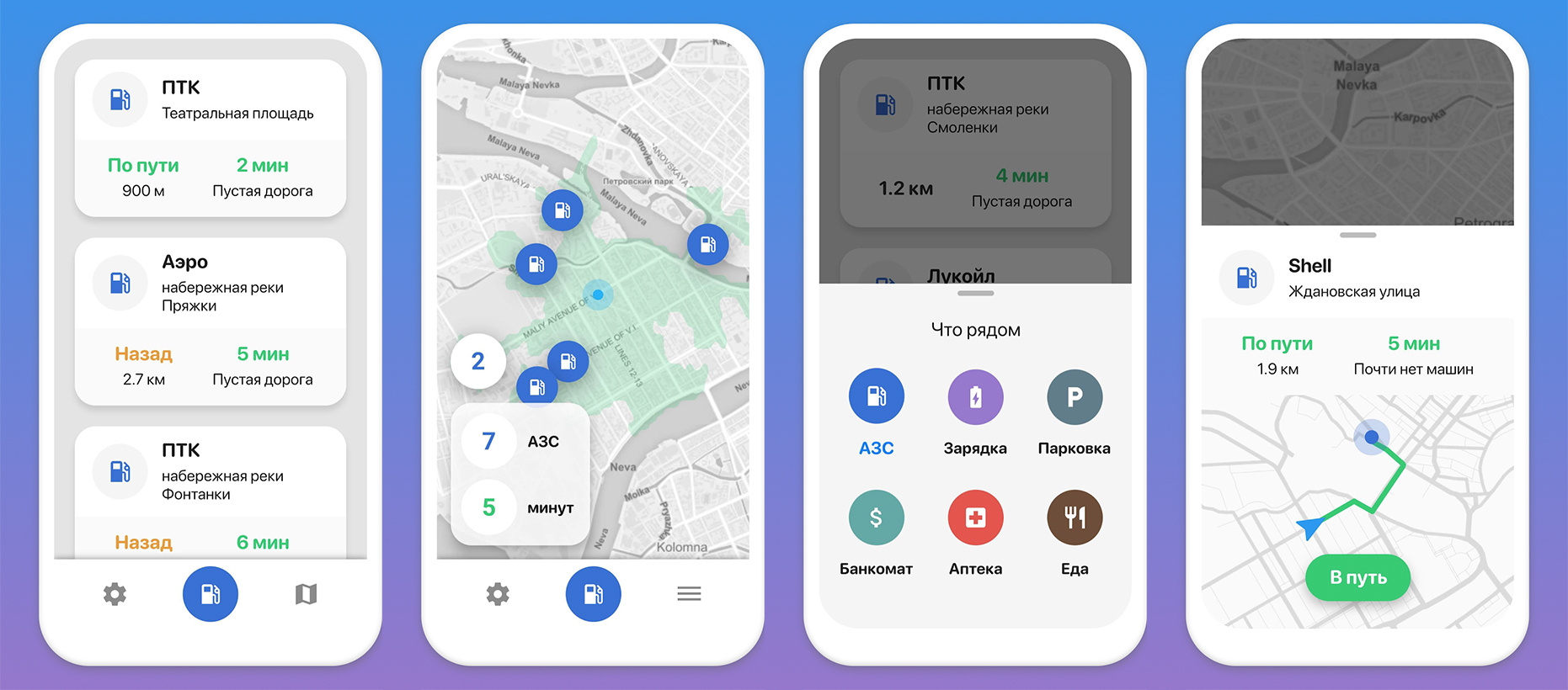
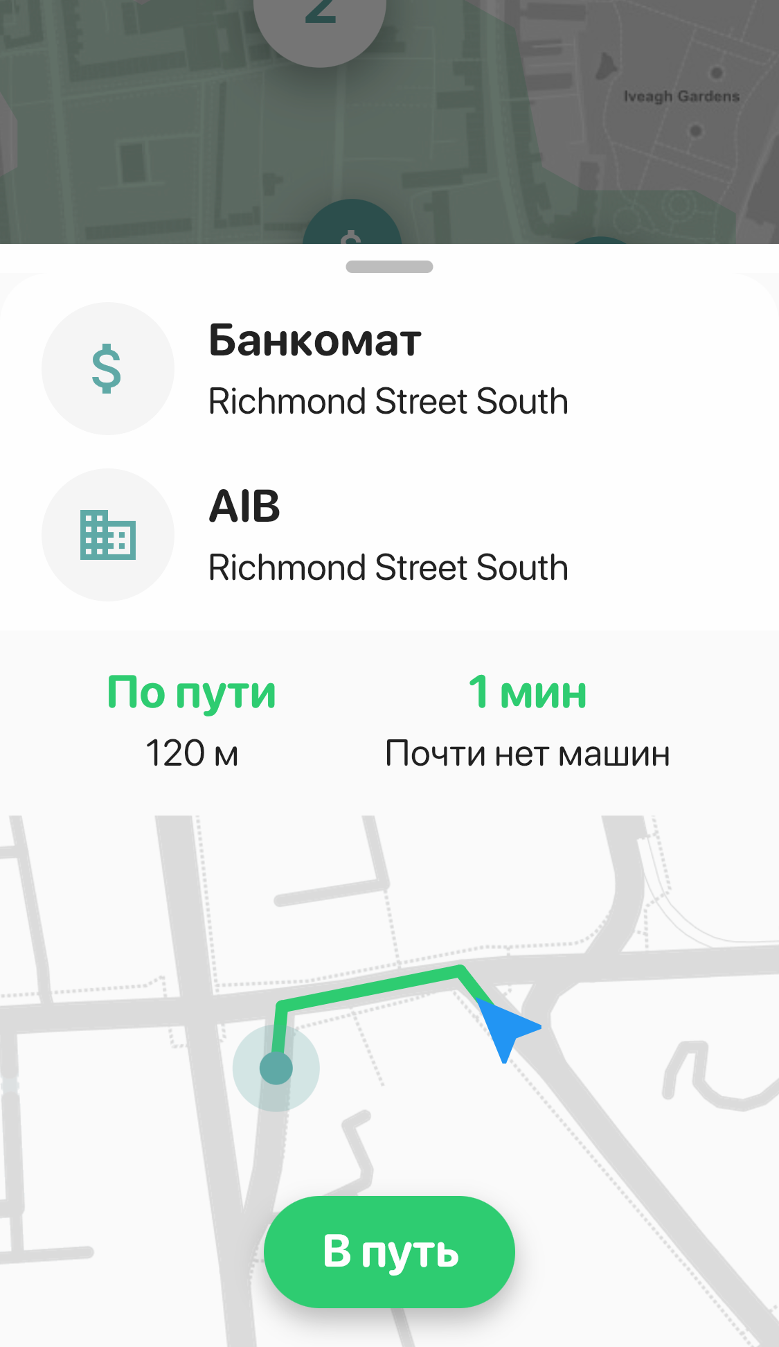
Maps - List
Maps were the second major claim to the application. I spent some incredible amount of time drawing my own previews of the route and the general map, and it even worked - but generating raster tiles with a fashionable design drastically squandered the server. If in test mode the pictures appeared within half a second, then with a real audience (even a small one), people could wait up to five or even ten (!!!!) seconds. Especially if the piece of the map was large - then my code chewed and rendered a bunch of vector data. Moreover, this process is not particularly parallelized: there were bottlenecks, and all the lines were quickly clogged anyway. In general, sadness.
What to do, it was obvious - throw out the thumbnails of the cards to hell. I struggled with myself for a long time (all I did for so long), but in the end I made a strong-willed decision and, in general, did the right thing. When the huge and often not loaded pictures left, it became calmer and a lot of space on the screen was freed up. Even filling it with new data and increasing the labels, I was able to squeeze into the screen twice as many results as before.
Maps - New Mode
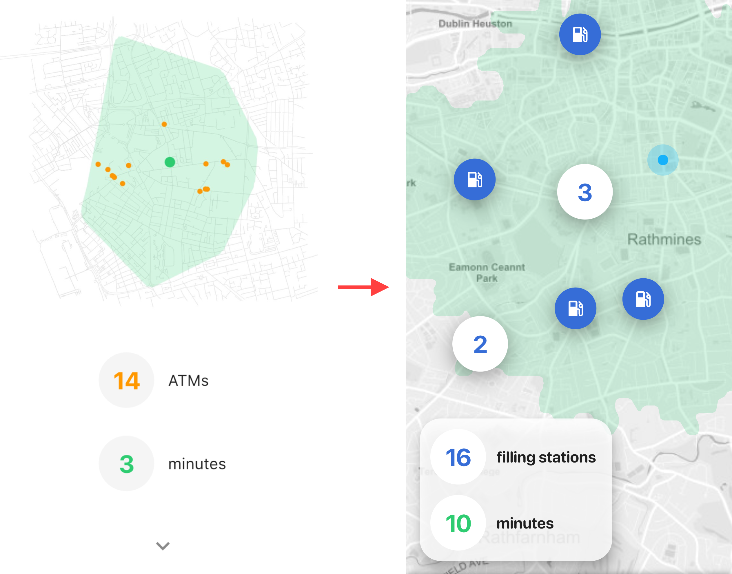
But with the common card, I acted differently. No one (including myself) could understand why, in fact, it is needed. It was self-made, clumsy, loaded forever and in general was originally created for debug. However, the visual image of the isochron for some reason continued to warm my soul and as a result, it remained to occupy a place in the interface. Then I decided: let's try to make a full-fledged alternative viewing mode out of this meaningless picture. If someone doesn’t like the list and reads the map more easily - why not? Moreover, I still had a couple of ideas that couldn’t be found anywhere else.
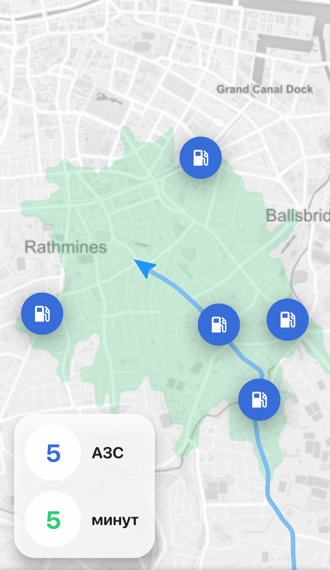
Reluctantly, I threw out my picture (the server groaning from the load was grateful for this). Instead, I built a full-fledged map through the flutter_map plugin - I took background tiles from Mapbox- and began to show on it his position and points of results around. The need to cluster these points came up almost immediately, and I quickly sketched out the distance-based clustering code. It is quite primitive, but covers 90% of cases. Under all this, I again planted my beloved green blot of isochrone. Finally, the map legend also became interactive: tap by the number of results focuses the map on points, and tap on time - on isochron. Pretty comfortable.
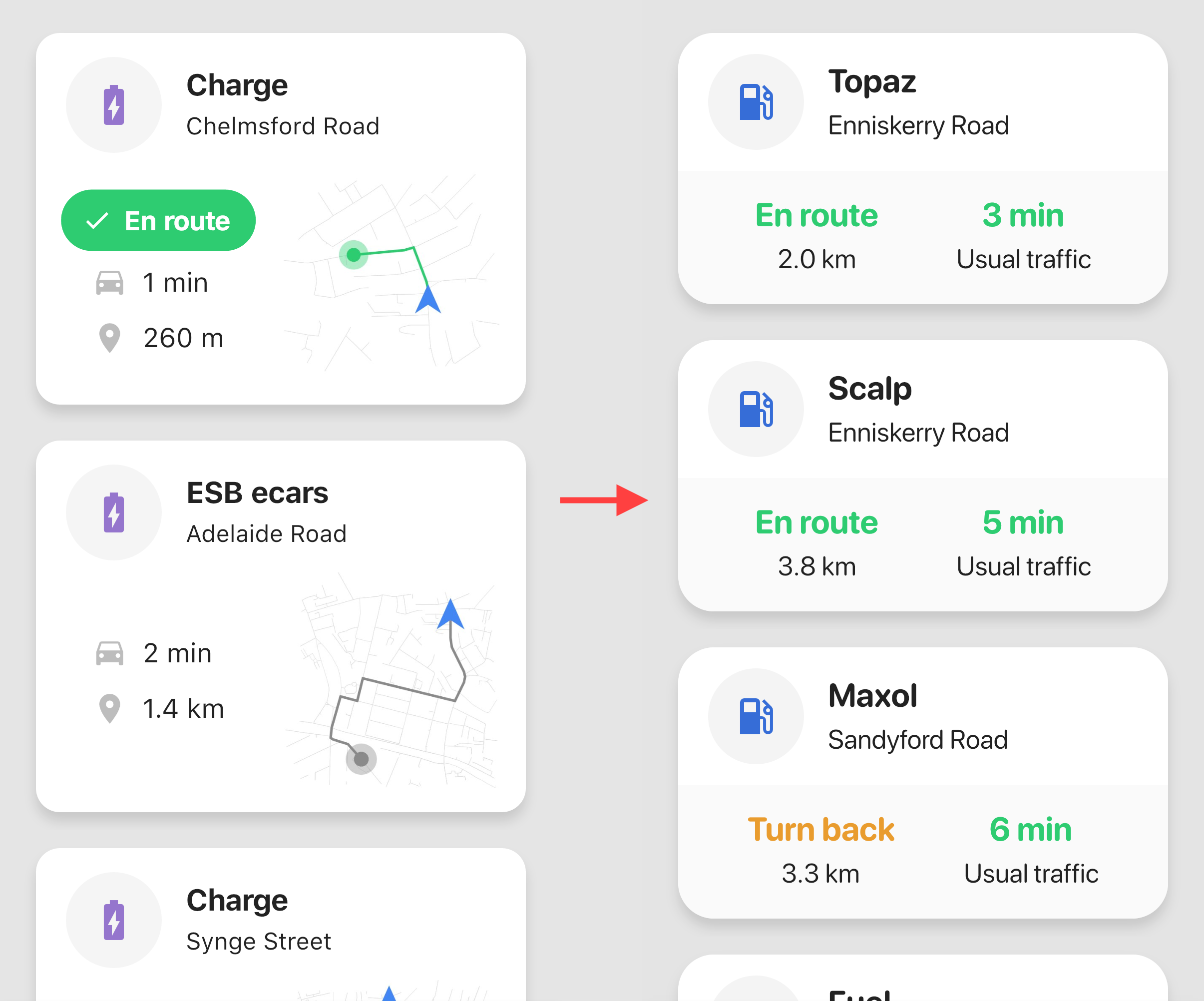
One of the ideas in which I felt the value, but could not formulate it in any way, was to display the current route and the vehicle's motion vector. I tried to put it into the route cards in different ways, but nowhere did it look organic and in its place. And finally, almost desperate, I realized: the new map mode is ideal for this chip. Because in list mode, I write directly with text, along the way some place or not - but on the map this is always incomprehensible. Even at Google or Apple, you observe a constantly rotating sector of the compass and for a long time you do not understand in which direction you are going.
Inspired, I sat down to work. I had to refactor a bunch of code along the way, but after a couple of days the logic was ready. I decided to update the position not every 200 meters, as the results, but much more often through 10 meters. Each update I recalculate the motion vector, and so it turns out to be very accurate, because it depends not on the accelerometer, but on the previous position. The route (that is, an array of the history of our coordinates) I draw on the map with a line, and the direction of movement - with an arrow. All this is updated almost in real time, and you can’t even imagine how much the map has transformed and become more convenient.
A separate nuance was the fact that in the first seconds of receiving a location, gps is still calibrated. Have you noticed how the dot creeps on the map for a while at the beginning? With my logic, these phantom movements would immediately give false conclusions about the direction of movement. And taking into account the fact that the next update of the results already after 200 meters, this would coolly misinform the driver. I solved this problem very simply: pretend that we are standing before the first update. That is, do not show on the map either an arrow (although the point still creeps), or a route. And to unlock this data after that, when we moved some significant distance, 5 seconds passed and the chances of getting false information are practically zero.
I also added a card that crashes when I select a result on the map. In fact, this is the same data as in the list, but a route preview is added to them (yes, it still returned) and a button that starts navigation.
Interface
In general, the interface has been thoroughly redrawn. I will not describe how I rewrote the menus, rebuilt the color palette and all that. I will focus on the most interesting points. All the inscriptions were proportionally enlarged (my falling vision came in handy here - increased until I myself saw it from the driver's seat). Changed the font to SF Pro Rounded - this is a rounded variation of Apple San Francisco. Download here , sensible font. I strongly recommend in cases where you do not have solid text, but large dies that should be readable from afar.
After some thought, I made an unobvious decision to remove the “Along the Way” filter. Like the filter by time, at first it seemed almost the main function of the app. However, at some point I realized that I was not using it. In the list mode, you can clearly see which places are on the way, and in map mode, it is completely confusing. For some time I dragged this switch pointlessly across the interfaces, after which I simply hid it and did not lose anything. Plus, purely technically, he produced nuances that were dreary and completely optional.
Data
Actually, the main problem at the moment of the application is data. I still take them from OSM with all the attendant problems: uneven coverage, a lot of outdated data, lack of hours, phones, and so on. My backend is built in such a way that it’s very easy to integrate any third-party api into it - only here where to get it? The first (and best) candidate is Google Places, but after a recent rise in price of 1400% (Lord) I still can not afford them. All the rest - TripAdvisor, Foursquare and the like - are either expensive or with clumsy api. Some services (the same Mapbox or HERE), under the guise of their data, provide chewed places from OSM that I myself have.
From all this fraternity, I decided to try to screw Yelp- It seems to be inexpensive and api looked decent. I understood that this is an American portal, respectively, there will be a minimum of data on other parts of the world, but at least some progress. And at first everything looked pretty good: I integrated everything in a couple of hours, and even read that they claim coverage of almost half of the world. However, I did not have time to rejoice when a circus began. A huge number of places in their data had incorrect coordinates. Obviously, they entered places not through dots, but through addresses - and their geocoder arranged the coordinates arbitrarily. As a result, I have some gas station in the right place, but except for the address it has almost no data; and they have reviews, ratings, and opening hours - only the coordinates are generally left-handed. The only properties by which our data can be reduced are the name and address. Moreover, often and that is written arbitrarily, with errors, incorrectly formatted, etc. I tried to compare them through my geocoder + fuzzy matching, and, in principle, it worked - although we still lose a certain percentage of places this way.
But this was only the first problem. The rest fell on them: they have a very unstable radius search, a bunch of bugs (if you read the comments of people in their git, then nothing works at all there) and so on. In the end, I checked the requirements for branding - it turns out you must use their red (!!!) stars to rank places. After seeing how it looks in my interface, I spat and turned off this whole booth.
As a result, there is not much progress with the data. Actually, the only thing that can be (and very easy) to do is to screw Google Places. Everything is fine there, both with coverage and with coordinates. Only now it costs a lot of money now. Therefore, I ask for your opinion: how would you feel about a paid subscription? In the free version it would be like it is now, but for some symbolic amount per month Google data or Yandex data would be available (you need to read how much they cost). So I’m probably not going to go broke.
Total
In general, I recently figured out: for almost a year and a half this application took me. Of course, not all my free time I spent on it, but most of it is for sure. I threw it a couple of times for a month, sometimes it seemed that I would never finish it - but still I did it. And, in principle, now it looks exactly as I wanted from the very beginning. Along the way, I mastered more than one new technology and gained a lot of experience. In general, it was interesting. Now I would be glad if the result was useful to someone.
PS
On the rights of self-promotion: in the interval I made another application for myself , very small - a parking assistant. I did not translate it into Russian, but there is a one-button interface. Maybe someone will be interested.