A very mathematical story of a perfect color combination
- Transfer

Zachary Beer creates drawings using the color palette from the color scheme for Mac Solarized and his own program for generating Geometriq images.
A couple of years ago, I fell in love with a color palette: a color slightly darker than white, highlighted by yellow-orange and neutral blue against a dark gray background, “the color of a TV switched to a dead channel,” as William Gibson wrote in Neuromancer. These colors belonged to the Solarized Dark theme of the popular MacOS code editor called TextMate. Honestly, at first I didn’t really like her. But I soon discovered that I could not work in any other color scheme. If you stare at the screen all day, then you will inevitably begin to find fault with fonts and colors.
It turned out that I'm not the only one. I am not a coder by profession, but I like to use code editors to write texts and organize notes. Switching from Mac to Windows, I began to look for the appropriate tools, and began to see Solarized Dark and her close relative Solarized Light, using the same palette of 16 colors, almost everywhere. It is difficult to say how many programmers use it. The scheme is free and open source, so it has no statistics on sales. It is in any large code editor and many other tools. Microsoft even included it in the suite of the popular VS Code editor. Solarized has a lot of fans.
“If I open a terminal window where the Solarized theme is not installed, I feel at ease,” says Zachary Beer from Richmond (Virginia), a programmer and artist who started using Solarized shortly after its introduction in 2011. Beer loves Solarized so much that he uses it as a color scheme for his computer-generated drawings . “I decided that I couldn’t give out such a balanced palette that looks good in dark and light colors,” he says.
The Solarized scheme appeared by chance. It reflects an obsession with the details of its creator, Ethan Shunover. “I didn’t release it until I was 1000% sure that I like all the colors and that they all fit together mathematically,” says Shunover. - I had a lot of monitors, some calibrated, others specially upset. Sometimes I showed it to my wife, who thought I was sorting out a bit with that. ”
Too much contrast
Shunover worked as a designer and programmer in Seattle when he started working on Solarized in 2010. Shortly before that, he changed the OS and was disappointed with the color schemes that came bundled with the tools he used. Many applications offered only a simple “black on white” scheme, derived from old textual computer terminals. However, it seemed to Shunover that these color schemes look much sharper than the old monitors that they are trying to emulate. The fact is that the background of the old monitors of the 1980s is really black, he says. “They had less contrast.” Today's LCDs have the ability to produce darker and brighter colors.
The optimal contrast for the text on the screen is a moot point. Many people like very contrasting patterns. However, Shunover was not only worried about the contrast. He did not like the schemes with low contrast. Even the best themes used at least one color that looked much brighter than the rest. This is because the apparent brightness of the color depends on the background. In other words, a certain shade of blue will seem more or less bright, depending on the colors surrounding it.
This phenomenon, known as the Helmholtz-Kohlrausch effect, It is especially annoying to programmers, because the tools for writing code use color to distinguish different parts of the code from each other. For example, in a web page code in a typical text editor using the Solarized Dark scheme, links are shown in green; formatting syntax, for example, oblique, blue, and comments that developers write to themselves are gray. Ideally, colors should help distinguish between these elements among themselves, but not one element should stand out more than others.
Shunover decided to choose colors that would not only look good together, but would have the same apparent brightness. The task was complicated by the fact that he wanted to use the same palettes for light and dark themes. Therefore, he needed several monitors and lengthy checks.
Solarized Dark

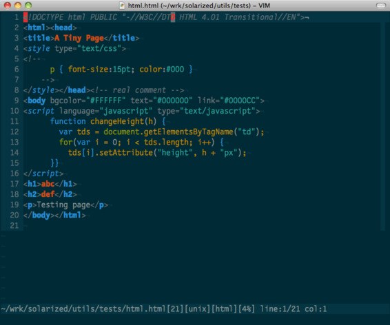
Solarized Light in the Vim editor
Shunover talks a lot about the mathematical nature of this choice of colors, but he chose the initial colors, blue and yellow, for personal reasons. Blue reminds him of his long-standing thalassophobia - fear of deep water. And although he says that he has no other manifestations of synesthesia - such as the sound of flowers or the taste of words - the yellow color evokes in him associations associated with the tastes and smells of his childhood. “My parents are artists and I’m not used to choosing things for unknown reasons,” he says.
Based on this, Shunover began to pick up other flowers that gave enough - but not too much - contrast between the elements, and maintaining the same level of contrast in the light and dark version. The result is a palette of 16 colors that maintain the same relationship, even when inverted. “I think it's a bit like composing music using a limited number of notes,” says Shunover. “There is something so absent-minded and beautiful in her.”
Open source software is gaining popularity
Shunover released Solarized for free in April 2011 through GitHub, a code storage and collaboration platform. He says that he was never going to make money on it. “That would kill something special in her, cast a shadow on her,” he says. “I believe in open source software, in releasing something special to the world so that everyone can use it.”
Although he tested the color scheme in various applications, Shunover first published topics only for a limited range of tools, which he used, for example, for the Vim editor and the Mutt text email client. He announced the release of the Solarized topic on the Vim mailing list; soon the project hit the front page of Hacker News. He immediately liked the programmers, who were soon engaged in adapting the theme for other programming tools. In 2013, Solarized Dark appeared on developers' monitors in Facebook ads - pay attention to dark screens and colored lines crossing them.
Solarized is gradually starting to penetrate applications designed not only for geeks. Solarized is offered in the Ulysses MacOS word processor as an option. The color scheme was used for graphics in the N ++ video game in 2014. MicroPad's note-taking program advertises Solarized as one of its features on the site. "Solarized Dark for MicroPad is especially useful for night work, which I do more often than I would like to admit," said program creator Nick Webster, a computer science student at Victoria University of Wellington, New Zealand.
But so far she has not reached such mainstream things as, say, the color scheme for a large web application or software package. “When Apple introduced the dark mode for MacOS, I decided it was cool,” Beer said. “But I would like it to be Solarized.”
But with the increasing number of dark-theme apps like Google Chrome, Facebook Messenger and Slack, Solarized can still get its moment of glory.