Habra megarating: the best articles and statistics of Habr for 12 years. Part 1/2
Hi Habr.
After the publication of the ranking of articles for 2017 and 2018 , the next idea was obvious - to collect a generalized rating for all years. But just collecting links would be trite (although also useful), so it was decided to expand data processing and collect some more useful information.

Ratings, statistics and a bit of source code in Python under the cat.
Those who are immediately interested in the results may skip this chapter. In the meantime, we will find out how it works.
As the source data, there is a csv file of approximately the following type:
The index of all articles in this form takes 42 MB, and to collect it took about 10 days to run the script on the Raspberry Pi (the download went in one stream with pauses so as not to overload the server). Now let's see what data can be extracted from all this.
Let's start with a relatively simple one - we’ll evaluate the site’s audience for all the years. For a rough estimate, you can use the number of comments on articles. Download the data and display a graph of the number of comments.
The data look something like this:

The result is interesting - it turns out that since 2009 the active audience of the site (those who leave comments on articles) has practically not grown. Although maybe all IT employees are just here?
Since we are talking about the audience, it’s interesting to recall Habr's latest innovation - the addition of an English version of the site. List articles with "/ en /" inside the link.
The result is also interesting (the vertical scale is specially left the same):

The surge in the number of publications began on January 15, 2019, when the announcement of Hello world was published ! Or Habr in English , however, several months before this 3 articles had already been published: 1 , 2, and 3 . It was probably beta testing?
The next interesting point, which we did not touch on in the previous parts, is the comparison of article identifiers and publication dates. Each article has a link of the type habr.com/en/post/N , the numbering of articles is end-to-end, the first article has the identifier 1, and the one you are reading is 441740. It seems that everything is simple. But not really. Check the correspondence of dates and identifiers.
Upload the file to the Pandas Dataframe, select the dates and id, and plot them:
The result is surprising - identifiers are not always taken in a row, as originally assumed, there are noticeable “outliers”.
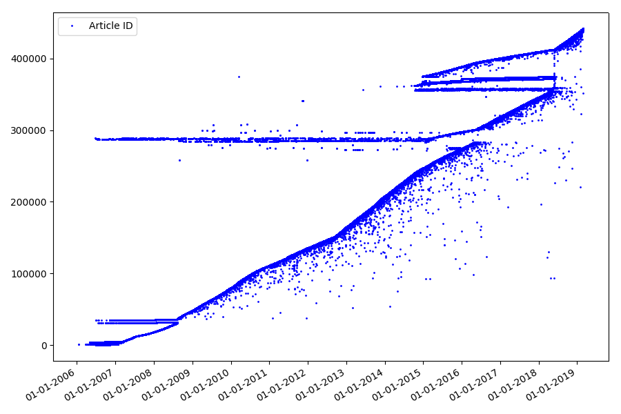
Partly because of them, the audience had questions about the ratings for 2017 and 2018 - such articles with the “wrong” ID were not taken into account by the parser. Why so hard to say, and not so important.
What could be interesting about identifiers? There is a hypothesis that I cannot prove formally, but which seems obvious. An identifier is assigned at the time of writing the draft article, and the publication date obviously comes later. Someone posts the article on the same day, someone publishes the material later. Why all this? Let’s place the identifiers on the X axis, and the dates vertically, and see a fragment of the graph in more detail:
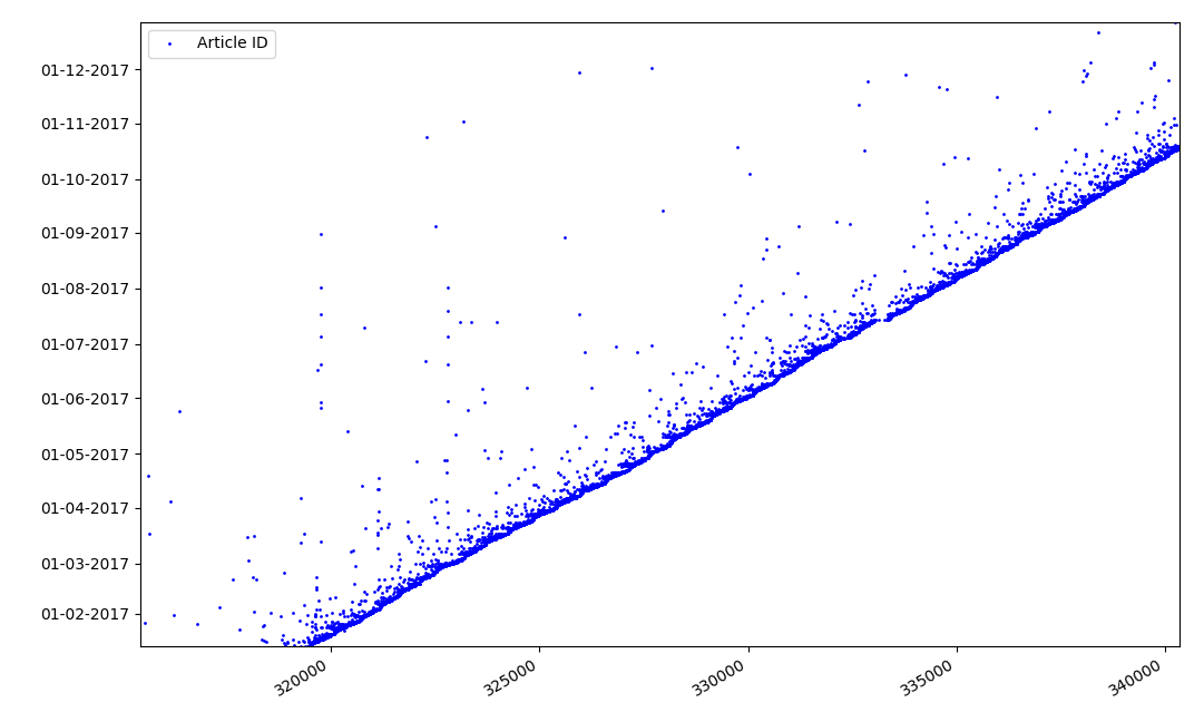
Result - we see a cloud of dots above the solid line, which shows us the distribution of time for the duration of the creation of articles . As you can see, the maximum falls on the interval up to 1-2 weeks. Almost the entire mass of articles is created in no more than a month, although some articles are published a few months after the creation of the draft (of course, this does not guarantee us that the author worked on the article for several months daily, but the result is still quite interesting).
An interesting, albeit intuitive, point is the time of publication of articles.
Output statistics on working days:
Dependence of the number of articles on the time of publication on weekdays: The
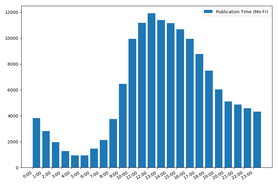
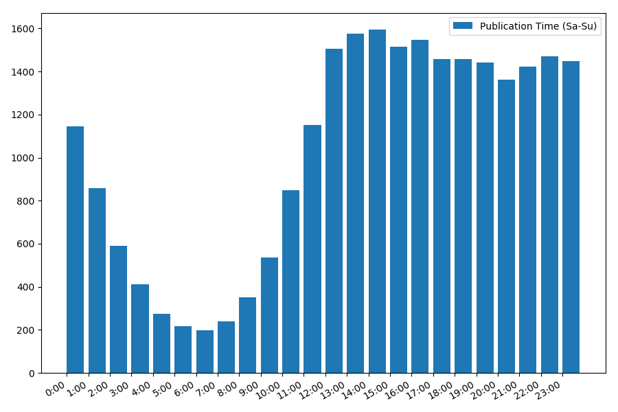
picture is interesting, most publications fall on working hours. Still interesting, for most authors writing articles is the main job, or are they just doing it during working hours? ;) But the distribution schedule on the weekend gives a different picture:
Since we are talking about the date and time, let's see the average value of views and the number of articles by day of the week.
The result is interesting:
As you can see, noticeably fewer articles are published on weekends. But then, each article gains more views, so publishing articles on the weekend seems quite advisable (as it was found in the first part , the active life of the article is no more than 3-4 days, so the first couple of days are quite critical).
The article is perhaps getting too long. The ending in the second part .
After the publication of the ranking of articles for 2017 and 2018 , the next idea was obvious - to collect a generalized rating for all years. But just collecting links would be trite (although also useful), so it was decided to expand data processing and collect some more useful information.
Ratings, statistics and a bit of source code in Python under the cat.
Data processing
Those who are immediately interested in the results may skip this chapter. In the meantime, we will find out how it works.
As the source data, there is a csv file of approximately the following type:
datetime,link,title,votes,up,down,bookmarks,views,comments
2006-07-13T14:23Z,https://habr.com/ru/post/1/,"Wiki-FAQ для Хабрахабра",votes:1,votesplus:1,votesmin:0,bookmarks:8,views:28300,comments:56
2006-07-13T20:45Z,https://habr.com/ru/post/2/,"Мы знаем много недоделок на сайте… но!",votes:1,votesplus:1,votesmin:0,bookmarks:1,views:14600,comments:37
...
2019-01-25T03:47Z,https://habr.com/ru/post/435118/,"Save File Me — бесплатный сервис бэкапов с шифрованием на стороне клиента",votes:5,votesplus:5,votesmin:0,bookmarks:26,views:1800,comments:6
2019-01-08T03:09Z,https://habr.com/ru/post/435120/,"Lambda-функции в SQL… дайте подумать",votes:9,votesplus:13,votesmin:4,bookmarks:63,views:5700,comments:30
The index of all articles in this form takes 42 MB, and to collect it took about 10 days to run the script on the Raspberry Pi (the download went in one stream with pauses so as not to overload the server). Now let's see what data can be extracted from all this.
Site Audience
Let's start with a relatively simple one - we’ll evaluate the site’s audience for all the years. For a rough estimate, you can use the number of comments on articles. Download the data and display a graph of the number of comments.
import pandas as pd
import matplotlib.pyplot as plt
df = pd.read_csv(log_path, sep=',', encoding='utf-8', error_bad_lines=True, quotechar='"', comment='#')
def to_int(s):
    # "bookmarks:22" => 22
    num = ''.join(i for i in s if i.isdigit())
    return int(num)
dates = pd.to_datetime(df['datetime'], format='%Y-%m-%dT%H:%MZ')
dates += datetime.timedelta(hours=3)
comments = df["comments"].map(to_int, na_action=None)
plt.rcParams["figure.figsize"] = (9, 6)
fig, ax = plt.subplots()
plt.plot(dates, comments, 'go', markersize=1, label='Comments')
ax.xaxis.set_major_locator(mdates.YearLocator())
plt.ylim(bottom=0, top=1000)
plt.legend(loc='best')
fig.autofmt_xdate()
plt.tight_layout()
plt.show()
The data look something like this:
The result is interesting - it turns out that since 2009 the active audience of the site (those who leave comments on articles) has practically not grown. Although maybe all IT employees are just here?
Since we are talking about the audience, it’s interesting to recall Habr's latest innovation - the addition of an English version of the site. List articles with "/ en /" inside the link.
df = df[df['link'].str.contains("/en/")]The result is also interesting (the vertical scale is specially left the same):
The surge in the number of publications began on January 15, 2019, when the announcement of Hello world was published ! Or Habr in English , however, several months before this 3 articles had already been published: 1 , 2, and 3 . It was probably beta testing?
Identifiers
The next interesting point, which we did not touch on in the previous parts, is the comparison of article identifiers and publication dates. Each article has a link of the type habr.com/en/post/N , the numbering of articles is end-to-end, the first article has the identifier 1, and the one you are reading is 441740. It seems that everything is simple. But not really. Check the correspondence of dates and identifiers.
Upload the file to the Pandas Dataframe, select the dates and id, and plot them:
df = pd.read_csv(log_path, header=None, names=['datetime', 'votes', 'bookmarks', 'views', 'comments'])
dates = pd.to_datetime(df['datetime'], format='%Y-%m-%dT%H:%M:%S.%f')
dates += datetime.timedelta(hours=3)
df['datetime'] = dates
def link2id(link):
    # https://habr.com/ru/post/345936/ => 345936
    if link[-1] == '/': link = link[0:-1]
    return int(link.split('/')[-1])
df['id'] = df["link"].map(link2id, na_action=None)
plt.rcParams["figure.figsize"] = (9, 6)
fig, ax = plt.subplots()
plt.plot(df_ids['id'], df_ids['datetime'], 'bo', markersize=1, label='Article ID')
ax.yaxis.set_major_formatter(mdates.DateFormatter("%d-%m-%Y"))
ax.yaxis.set_major_locator(mdates.MonthLocator())
plt.legend(loc='best')
fig.autofmt_xdate()
plt.tight_layout()
plt.show()
The result is surprising - identifiers are not always taken in a row, as originally assumed, there are noticeable “outliers”.
Partly because of them, the audience had questions about the ratings for 2017 and 2018 - such articles with the “wrong” ID were not taken into account by the parser. Why so hard to say, and not so important.
What could be interesting about identifiers? There is a hypothesis that I cannot prove formally, but which seems obvious. An identifier is assigned at the time of writing the draft article, and the publication date obviously comes later. Someone posts the article on the same day, someone publishes the material later. Why all this? Let’s place the identifiers on the X axis, and the dates vertically, and see a fragment of the graph in more detail:
Result - we see a cloud of dots above the solid line, which shows us the distribution of time for the duration of the creation of articles . As you can see, the maximum falls on the interval up to 1-2 weeks. Almost the entire mass of articles is created in no more than a month, although some articles are published a few months after the creation of the draft (of course, this does not guarantee us that the author worked on the article for several months daily, but the result is still quite interesting).
Date and time of publication
An interesting, albeit intuitive, point is the time of publication of articles.
Output statistics on working days:
print("Group by hour (average, working days):")
df_workdays = df[(df['day'] < 5)]
g = df_workdays.groupby(['hour'])
hour_count = g.size().reset_index(name='counts')
grouped =  g.median().reset_index()
grouped['counts'] = hour_count['counts']
print(grouped[['hour', 'counts', 'views', 'comments', 'votes', 'votesperview']])
print()
view_hours = grouped['hour'].values
view_hours_avg = grouped['counts'].values
fig, ax = plt.subplots()
plt.bar(view_hours, view_hours_avg, align='edge', label='Publication Time (Mo-Fr)')
ax.set_xticks(range(24))
ax.xaxis.set_major_formatter(FormatStrFormatter('%d:00'))
plt.legend(loc='best')
fig.autofmt_xdate()
plt.tight_layout()
plt.show()
Dependence of the number of articles on the time of publication on weekdays: The
picture is interesting, most publications fall on working hours. Still interesting, for most authors writing articles is the main job, or are they just doing it during working hours? ;) But the distribution schedule on the weekend gives a different picture:
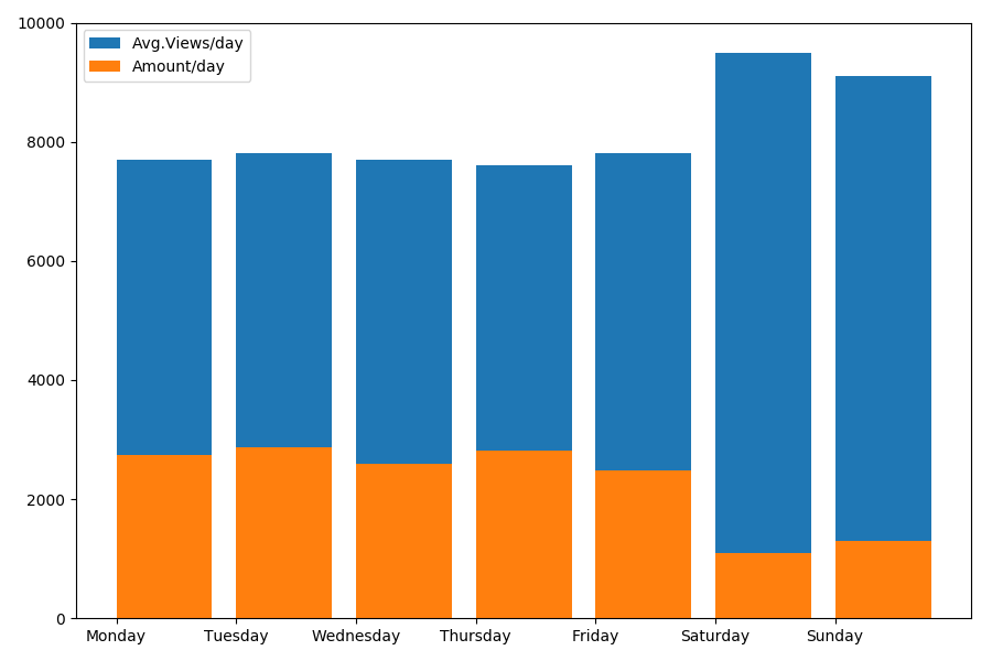
Since we are talking about the date and time, let's see the average value of views and the number of articles by day of the week.
g = df.groupby(['day', 'dayofweek'])
dayofweek_count = g.size().reset_index(name='counts')
grouped =  g.median().reset_index()
grouped['counts'] = dayofweek_count['counts']
grouped.sort_values('day', ascending=False)
print(grouped[['day', 'dayofweek', 'counts', 'views', 'comments', 'votes', 'votesperview']])
print()
view_days = grouped['day'].values
view_per_day = grouped['views'].values
counts_per_day = grouped['counts'].values
days_of_week = grouped['dayofweek'].values
plt.bar(view_days, view_per_day, align='edge', label='Avg.Views/day')
plt.bar(view_days, counts_per_day, align='edge', label='Amount/day')
plt.xticks(view_days, days_of_week)
plt.ylim(bottom=0, top=10000)
plt.show()
The result is interesting:
As you can see, noticeably fewer articles are published on weekends. But then, each article gains more views, so publishing articles on the weekend seems quite advisable (as it was found in the first part , the active life of the article is no more than 3-4 days, so the first couple of days are quite critical).
The article is perhaps getting too long. The ending in the second part .