 February 23, 2019 at 11:11
7 points of conversion growth or how to increase the clickability of buttons
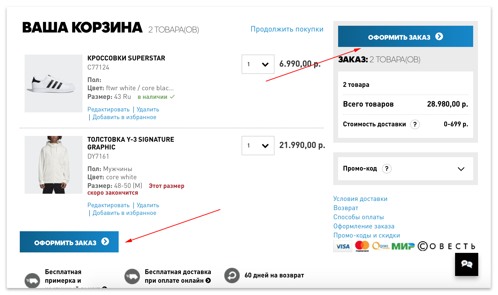
Buttons play an important role in the online shopping process: improperly designed buttons have low clickability and, as a result, low conversion. The article will discuss how to fix this.
Foreword:
This article is posted in the hubs "Internet Marketing", "Design" and is addressed primarily to marketers and designers. To share opinions, experiences and become better. From the first paragraph it becomes clear what this article is about. If you are a developer who believes that all stores are cheating, and all marketers are scammers, then this is your opinion and it has the right to exist. Do not waste your time reading this article and the subsequent minus for the time spent. It is better to read about how artificial intelligence makes a blowjob - the most popular topic in recent days on Habré. Good luck! Now, let's move on to the article.
1. Button availability
In order for the button to be clicked, the button on the page should be. This may sound strange, but there are sites without buttons. In the example below, the product page of the VeloDrive online store . The site is advertised in Yandex.Market, but there is no Buy button on the page, and calling and dictating the article number is not the most convenient option.

There is no button on the product page of velodrive.ru
2. The button should look like a button
In order for a button to be clicked, users need to understand that the button is in front of them. To do this, they must be made clear and recognizable, the buttons should be similar to the buttons. How to achieve this, recommendations below.

The link (left) is less visible than the button (right)
2.1. Button shape
The shape can be any (round, square, rectangular), but the rectangular one is most widely used, since it is possible to fit the inscription with its purpose on it.

Buttons on the Tmall website (AliExpress)
2.2. Rounded corners of buttons
Most buttons in the physical world have rounded corners, and such buttons on the site are easier to recognize. In addition, rounded corners are more familiar and therefore easier to perceive by the brain . Perhaps the most obvious example is the keys on the keyboard.

Apple Magic Keyboard, all keys have rounded corners
2.3. Volume buttons
It is better to make the button voluminous, for this shadow, gradient and frame are used. The trend of recent years is flat design. Such a design is beautiful, but one of its obvious shortcomings is that, due to the lack of shadows and volume of the button, it is more difficult to distinguish from non-clickable design elements. Nielsen Norman group conducted a test during which it was found that users find volume buttons 22% faster than flat buttons.

Flat button (left) and volumetric button with shadow and gradient (right)
2.4. Interactive buttons
It is desirable to make the button responsive, that is, when you hover over it, change its color and volume. Thus, even when you hover over (before a click), it becomes clear that the element is clickable.

Default button (left) and hover button (right)
3. King button
I have come up with one good rule that has never failed me: one page - one main button (CTA - call to action). Do not overload the page with many buttons, this scatters your attention, creates unnecessary questions and, as a result, reduces clickability.

Nix.ru, a multitude of buttons scatters attention and reduces click-through.
Do not make users think, give them only one main button on the page. This does not mean that there can be no other buttons on the page. They may be there, but their tasks are secondary, so they should be made less noticeable by size and color, as well as their location at a distance from the main button, creating free space. This is to ensure that the secondary buttons do not compete with the primary for the attention of users.
4. Button color
4.1. Ghost button
The main button on the page should be in a contrasting color to stand out from the background and surrounding elements. For less priority buttons, it is better not to use color, making them transparent and placing them in a frame - these are the so-called ghost buttons.

The color of the button separates the main button (top) and the secondary (bottom)
But do not make the ghost button the main one, otherwise it merges with the background and becomes less noticeable.

The ghost button as the main button is an unsuccessful solution.

So much better. Mi-storekazan.ru
4.2. What color buttons to choose
It is widely believed that the color of a button may suggest an action, for example:
- Positive action (CTA: add, send, save, load): blue, green;
- Negative action (CTA: delete, block, reset): red;
- Neutral action (CTA: learn more, compare, add to favorites): black;
- Inaccessible action: gray.

Button color
This opinion is based on the fact that a person from childhood gets used to the meaning of these colors, and this experience is fixed at the subconscious level. Because this is how traffic lights work in the streets (red - stand, green - go). This is how smartphones work (green - start a call, red - reset) and so on.

The usual meaning of red and green colors.
But in reality, the situation with the perception of colors is somewhat different. The red color of the traffic light was not chosen because of the psycho-emotional perception of color and not because of its symbolic interpretation. After all, the sight of a red apple or red cherry does not cause negative, disturbing or negative emotions in anyone. In China, red is the color of joy, of life. In India, the birthplace of color symbolism, is similar.
The case of Rayleigh scatteringin which the red color corresponds to the largest wavelength of the visible spectrum. And this means that it is least susceptible to scattering. All other things being equal, the driver will be able to distinguish the red traffic light at a more distant distance from the intersection or pedestrian crossing and he will have a little more time to stop.
But back to the conversion, as a result of testing the buttons of different colors, the best conversion was for the red button - 52.25%, and the worst indicator was for the green button 41.46%. In other words, the situation is absolutely opposite to the colors of the traffic light. Which speaks in favor of the Rayleigh law and the red color is more noticeable.

Conversion rate of buttons of different colors
In another testThe conversion rate of different text colors on the buttons was measured. As a result, white was leading with great advantage, with a conversion of almost 77%. White color turned out to be the most readable due to the high contrast with the background of buttons of different colors.

Conversion rate for text of different colors on buttons
5. Button size
Button size is important for two main reasons:
- With the help of a large size, you can attract attention, therefore it is better to make the main button larger.
- In mobile devices, the mouse cursor is absent, and the human finger is larger than the cursor, so the buttons need to be made larger so that it is convenient to hit them with the fingertips. A study was conducted at MIT (Massachusetts Institute of Technology) , which revealed that the average size of the fingertips is from 10 to 14 mm, and the tips of the fingers are from 8 to 10 mm. Therefore, the recommended minimum button size is 10x10 mm.

UX Magazine (left) and a fragment of Apple's manual (right)
Another important point that can be attributed to the size is the distance between the buttons. If the buttons are close together, mobile users may accidentally press the wrong button with their finger. The recommended distance between the buttons is 3 mm.
6. Button layout
Buttons should be visible, for this they are best placed where they are expected to see, for example, next to the product on the product page or next to the total price in the basket. The main button on the page must be placed in the initial screen. Do not force users to search for important buttons on the site, this will reduce conversion.

The main button “Buy” is located in a prominent place, in the first screen of the product page on the Sportmaster website. The

main button “Checkout” is located in the first screen of the basket on the Adidas website. Also, the button is duplicated in case of a large number of products in the basket.

The main button "Place an order" is missing in the first screen of the basket of the marketplace "Take".
7. Button text
7.1. Clear call to action
The man is so arranged that he is apprehensive about something unknown. Therefore, the inscription on the button should prompt what awaits the person after the click, and prompt them to act. Otherwise, the clickability of the button will be lower.

The text on the button should clearly indicate the action
7.2. Dynamic button labels
Another option is changing the labels on the buttons on hover. According to them, the user immediately understands what action he will perform by clicking on the button. This reduces uncertainty and improves clickability.

Dynamic buttons on Twitter, the button changes the inscription and color when you hover, prompting action
7.3. Button Icons
In addition to the inscriptions, the icon can be placed on the button, so it becomes much clearer. Below is an example of a button on an Amazon site, please note that thanks to the trash can icon, the value of the button is understandable in any language.

Buttons on the Amazon website in Russian (left) and Japanese (right) languages
But using the icons is worth it. Choose simple and clear icons, do not abuse jewelry. The icons should be within the meaning of the section to which they direct.

Icons (top) and their meanings (bottom)
1 - personal account (registration or login).
2 or 3 - you should be careful with these icons, because they can indicate many functions: favorites, saved, wish list, bookmarks, like, rating. Easy to get confused.
4 - comparison of goods (according to characteristics).
5 - previously viewed products.
6 - help (info).
7.4. Text next to buttons
It is advisable to indicate the captions for the buttons and icons. Without a signature, clickability decreases, and with it conversion. Example: when Microsoft released the Outlook 97 email client, the buttons for the main commands were used in the new button interface.
But tests showed that people almost never used a toolbar with icons. Then it was decided to make corrections: rearranging the icons in places, drawing new icons. But with each change, nothing changed, people did not use buttons with icons.
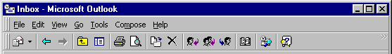
Microsoft Outlook 97
Finally, the project team decided to place a text description next to each icon. And it worked, people began to actively use the toolbar.

Microsoft Outlook 2003
The explanatory text next to the buttons also helps to alleviate user worries, for example: “Will I now click on the button and my money will be debited ?” The

explanatory text next to the button on Booking.com
7.5. Do not overload buttons with text
To do this, you can use the recommendations above.

Nix.ru
***
Author: Eduard Fayzullin, founder of Conversant.me