How I tried to fix a map search for drivers. Part 2
The first thing I want to say was that it was difficult. Much harder than I thought. I had before this very tough experience in bringing products to release at work, but I never reached for personal projects. They all ended with prototypes of varying degrees of disgust, but this one seemed to survive. At the moment, it has been launched for 80+ countries (all of Europe, Asia and North America), on both mobile platforms, and at the end of the article there will be download links - therefore, I invite everyone interested to try, break and scold.
Here is a brief thought with which it all began:In my opinion, a search on existing mobile maps is done for pedestrians and does not work for drivers at all. You need to stop, delve into the maps littered with excess information and advertising, poke at small icons. It’s inconvenient, it won’t help you out in an unknown place, in the end it's just dangerous. An intuitive and clean solution is needed that is not distracting and does not make you slow down.
In the first part, I described my path from this simple thought to a working solution, and then I will describe how I dragged this solution to the release.
To save your time, I’ll start with a brief retelling of the previous part: there I write that instead of searching I decided to use scanning in motion, and the application interface was simplified as much as possible. Instead of an absurd entry line for the driver, he added several large buttons for things that can come in handy on the road: gas station, charging, ATM, parking, pharmacy. Instead of a map, I made a list, and when I select a result, navigation through Apple / Google Maps opens. For the application, I decided to use Flutter (at the same time I got to know what kind of animal it is), I took the data from OpenStreetMap. I finished my story on the fact that a more or less sane prototype was ready.
Then it all took about 4-5 months, then the changes in life began and the project went by the wayside - and I started to get tired of it. A month later, I dusted it off, refreshed it in my head by writing an article on a hub and decided: let's finish it. Anyone who knows the difference between a prototype and a product will smile sadly at this place.
What happened next took another four months. I got myself a task tracker, in general terms formed a list of problems, collected devices for testing. In the evenings and on weekends, I sat down at work and moved the project forward. At what moments it seemed that the list was only growing, and I was drowning in endless nuances and finishing touches. He took himself in hand, threw something away, somewhere on the contrary drove to perfectionism. Next, I will try to talk about the most interesting points in the development of such a seemingly simple project.
Somewhere in the middle of the work, a feeling began to appear that the architecture was spreading out of control. Too many components and connections have been wound up; several bottlenecks have been groped. Fortunately, the project is small, and I felt it in time, so putting things in order was not difficult. At the level of individual components, this boiled down to refactoring and throwing out unnecessary libraries; at the global level, I spread the functionality to 3 small servers that I started in DigitalOcean .
In addition, I decided to feed extracts from OpenStreetMap for geo-calculations separately by country. It works like this: we make the first request with coordinates to our geocoder, it determines the country, and then we take the downloaded files only of this country for the manipulations we need. This is necessary, because even my rather powerful server is not able to convert the extract larger than two gigabytes in size - the process quickly eats up all the memory and chokes. Fortunately, almost all countries fit into this limit, except for the United States: this monster had to be divided into states. Finally, to maintain one and a half hundred extracts, I decided to write a bunch of scripts that check their health, repair and update.

In general, all this sounds more complicated than it works in practice. In principle, I am satisfied with the resulting solution - it has a good reserve for scaling by the number of supported territories and the level of load.
For a long time, one of the key problems for me was the heterogeneous density of results. The reason is quite understandable - this is the heterogeneous density of the road network itself and the buildings on it. In a medium-sized city within a radius of 5 minutes there can be 2-3 ATMs, and now we will move to the center of the metropolis - and for the same 5 minutes there can be 20 or 30 results. Finally, we jump into the countryside and observe an almost guaranteed 0 results until we get closer to the city and the search radius captures something.
This problem gives a non-linear and unpredictable load on the server, and most importantly - a rather lousy experience for the user. Adding a filter to the options (5 minutes, 10 minutes, 30 minutes) basically does not solve anything. In the village, even even a 30-minute radius may not return anything, but in a megalopolis even 5 minutes will overwhelm you with results. Plus, we added extra functionality, into the buttons of which the driver should get on the go. In general, nonsense, you need a fundamentally different solution.
When a solution was found, it turned out to be very simple. Instead of going from the opposite and prompting the user to select a search radius, we can make this radius automatic. The logic is actually elementary:
In fact, this is a little more complicated and there are a couple of nuances, for example, an ultra-dense city grid, when we have already reduced the time to the minimum, and there are still too many results. Here it is already necessary to sort, and therefore to lay routes, which is a little expensive. However, these are extreme cases and they are not very striking.
In reality, a person is unlikely to scroll the list below 5-6 positions, so in 95% of the scenarios the dynamic isochron solved the problem. We removed the bottleneck - an unpredictable amount of results - and made the load on the geographic server for any request almost flat. Checking this is very easy: The
old way: we take a 10-minute radius and 30 results
Result: 1 request for isochrone + 30 requests for routes = 31
A new way: we check, 30 results are many, divide the radius in half, now we get 10 results
Result: 2 requests for isochrone + 10 requests for routes = 12

In the last part, I described the mechanism for generating cards with laid routes. It then turned out to be quite complicated and expensive in terms of computing, but I liked them so much that I decided to leave them. At the same time, I understood that in their current form they had little practical benefit - it was not clear from them which way you were going, and they were all turned north up. It was necessary to refine.
The first thing I decided to do was to deploy the maps in real time using a compass. In flutter, this was described by microscopic logic and worked very quickly, however, with 10+ results that constantly spin, performance started to drain. In addition, it looked absolutely sickening: in fact, static pictures were spinning, and this was more confusing during the ride than it somehow helped.
The next idea was to indicate on the maps the direction of movement of the arrow. It was very simple - I already had a vector computed, and all I had to do was generate a geometric shape of the arrow. At the same time, in a static position, the cards continued to show the position of the driver with a round marker. There was one caveat - it was necessary to normalize the sizes of markers and arrows for different zoom levels. This seems to be a simple task, but I was stuck on it for a long time. The thing was this: I generated all the symbols on the map in meters, and took as a basis the fraction of the height of the entire map in meters. It turned out that during the creation of maps — determining square bounding boxes, gluing and trimming tiles on them, etc. — errors accumulated, and these small errors ultimately led to very different sizes of markers. Especially hellish was the situation with small-scale cards. I will not go into the details of the solution, however, because of these errors, the logic of card generation had to be completely redrawn. Helped a lot in thisturf is a great toolkit for manipulating geodata.
With the arrow cards were already more useful, but still something was missing. After live testing, it became clear that all the cards were turned north up. In statics, this was not striking, but it immediately became apparent when you get behind the wheel. The driver subconsciously expects the arrow to always be pointing up when driving. Having discovered this, I again sat down to work. This was again one of those tasks that seem very simple, but you will spend a couple of days after it. It would seem - calculate the azimuth, and turn the final GeoJSON before rasterization. But there was again one nuance - this final GeoJSON was generated by a direct bounding box, and, being rotated and cropped on it, it detects empty spaces.

In the diagram above, I roughly gave my solution. As a result, it turned out to be not very expensive in terms of resources and covering 99% of the scenarios (I think that bugs will climb somewhere near the poles). In general, the geo-computation server is still the most resource-intensive part of the project, but now its route cards, in addition to aesthetics, are also very practical. I even tried to get to the place using these cards exclusively, not including navigation. And even arrived.

I took all my data in different ways from OpenStreetMap. As you know, this resource is 100% non-profit and is supported by a collective mind. This is a plus (it is free and with a clear structure), it is also a minus - the data is very heterogeneous.
At a high level, this means uneven coverage of the globe as a whole: in countries and cities with a large number of enthusiasts, each lawn and path are described, and in other places there are almost empty zones with basic sketchy objects. Data is updated with exactly the same unevenness. While testing my application, I came across a couple of times new gas stations, cafes, and sometimes whole roads that I hadn’t managed to put on maps yet. Complaining about this is stupid: the same Google spends astronomical budgets and contains a whole staff of cars responsible for the relevance of its data. So here the best we can do is sync more often with OpenStreetMap extracts. Well, wish good luck to their community.
But at a lower level, due to the chaotic editing of maps, there are a number of other problems that can be completely solved. This mainly concerns junk data and duplicates. The variety of this mess is striking: the same place can be described 3 times in different ways, institutions do not have names, types and tags are put down incorrectly, and so on. All this does not have any unified solution; rather, a complex of measures is needed to systematize the content. For example, I have the following conditions:
There are several synonyms and variants of the same tag -> we describe alias dictionaries (e.g. parking, parking_space, parking_entrance, etc.).
There are several places with the same type and the same coordinates:
There are several places with the same type and almost the same coordinates:
The cluster in our case is a card in the header of which several places are described. Most often these are clusters of shops or gas stations nearby. Or for example, one ATM is located inside the bank building, and the other outside. They do not represent any difficulty for us: we calculate the average coordinates and plot the route to them. In the interface, we show this cleanly and simply:

So it happened to me that before the start of development, I usually already imagine the final picture. At the same time, I do not like to draw diagrams and concepts, preferring to form a design in parallel with functions (if this is my project, of course). This iterative approach is very cool on the one hand, because it allows you to switch between visuals and code, on the other hand - sometimes you have to redo everything too often. The same thing happened here: I seem to have shoveled the simplest interface a hundred times. Starting from trifles such as icons and indents, ending with the composition of cards, menus, etc. I will not describe everything, I will go quickly through key issues. If you are not interested in design, feel free to skip it.
For a long time I could not understand what to do with the palette. I really wanted to designate the categories of places in different colors, with the exception of green - I decided to save it as an accent. I chose easily distinguishable and rich colors, everything seems to be fine. After some time, I discovered that the blue for the gas station echoes the blue, which on the map indicates the position of the driver. He did nothing with this, left it as it is - but the internal perfectionist is dissatisfied.

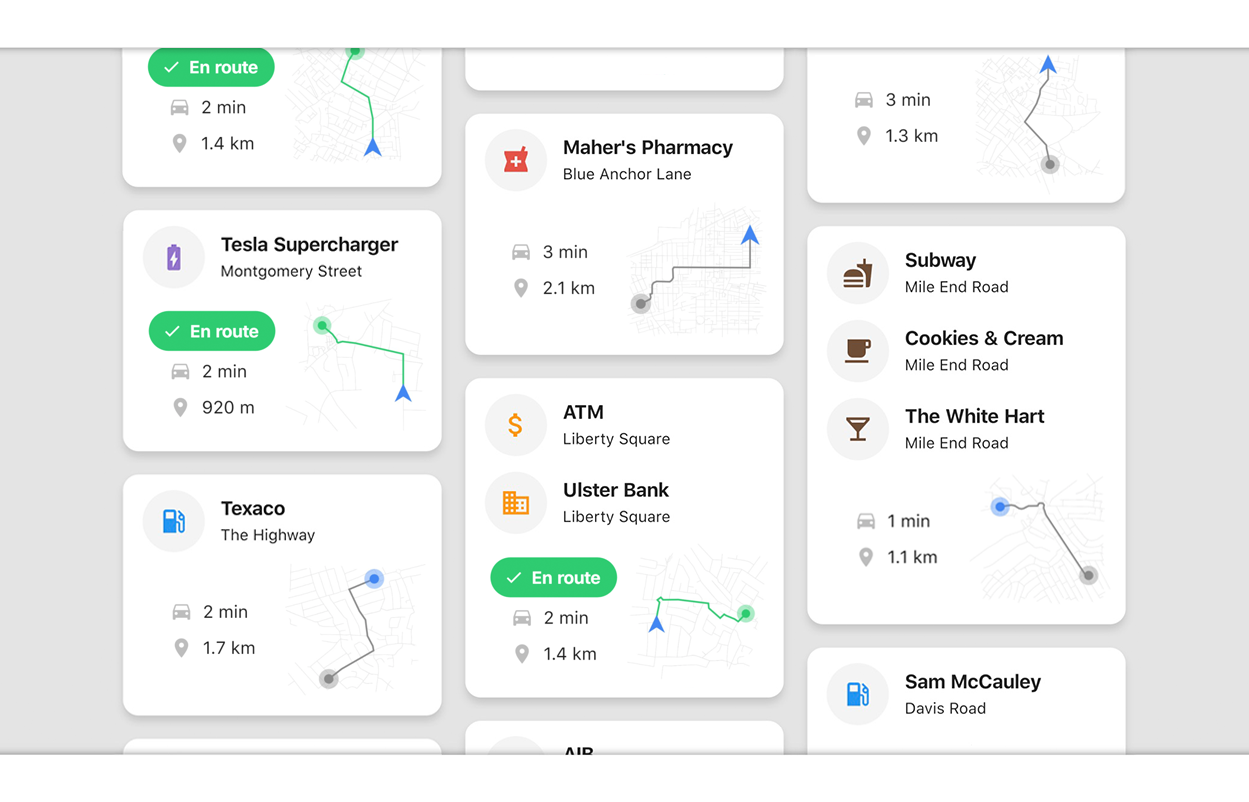
After the logic appeared that determines the direction of movement of the driver, it became possible to divide the routes into “along the way” and the rest. As I already said, this is determined by the first segment of the route laid to the place: does it coincide with the last segment of the driver’s route. If so, then we are already going to this place. Then the question arose of how to show this in the interface. In addition to the changes in the map that I described above, the idea came up of the “On the way” plate (or “En route” in English - it seems that they mean the same thing). I reuse the same die for another scenario: when the distance to the found place is less than 25 meters. Then it makes no sense to get directions, I hide the map and write that you are already close (“You are near” / “Look around”).

At the very beginning of development for debug I used a static map from Google to see the isochron and the results. Then he ran around with her for a long time, not knowing where to stick: it seems that the map is an interesting thing, but it seems that it should not take up a place. In addition, painfully did not even want to depend on Google in such a trifle. So in the end, I removed the map then, but after some time I began to generate route cards and realized that I had technologically “grown” to the big map myself. It turned out that it was not so difficult to do this, although so far the common map remains the most resource-intensive piece of the entire project. And so that it does not take up space in the interface, I put the card on a separate page (they will pull it less often).

For a normal output in production, localization is necessary. It is always on the one hand very direct and simple work, on the other - when you start to do it, crowds of cockroaches crawl out from everywhere. In my case, the main content from OSM was already localized, so that only place types and interface elements remained. With the exception of a few plugs (for a long time I could not formulate a die “On the way”) everything was easy. It is worth noting that place names can occupy both 2 and 3 lines, and may not fit into screens of small width - therefore the auto_size_text widget helped here , I recommend it within reasonable limits.

But on the technical side it was not so smooth. To date, almost the only solution for localization under flutter is the Intl_translation libraryand she is ... weird. It is clear that they have to sit on two chairs and generate completely different line formats for android and iPhone. However, this approach with transferring translations to a separate class, then running scripts from the console (!) To create some intermediate files, then fussing with them ... This is all completely unobvious for a beginner, and most importantly difficult to maintain, since each edit is accompanied by manual dances with a tambourine.
However, there is a possibility that I did not understand it to the end - or maybe some development environments already do this all automatically. In any case, my experience was quite stressful, and I hope that the localization mechanisms for flutter will be reworked.
Actually, there is nothing interesting to tell about the release itself. There were vague suspicions that the apple store would refuse to flutter the app, but they did not materialize - everything went well. I redrawn the icon and sketched an intro page that meets the user for the first time. I had to tinker a bit with drawing pictures, but it seems nothing happened. No pitfalls with permishens and their localization also arose.
At the last moment, the build of the release build for android broke down due to the transition from support to androidx: some libraries that I used did not immediately support it. As a result, I just waited a couple of days, but we must pay tribute to the authors of these libraries - they fixed them very quickly. Nevertheless, this incident once again convinced me: I will not drag out a major commercial project yet. Despite the fact that I liked him, the whole story is still very, very raw.
Well, as promised, download links:


And a few words in the end about plans. If this thing comes in handy for anyone other than me and there are downloads, I have many ideas for further development. Here is a sample list of what I would like to include in release No. 2:
I would like to support Android Auto and Apple CarPlay even further. I have never made applications for them, so I am curious to try it myself.
That's all, thank you all for your attention.
Here is a brief thought with which it all began:In my opinion, a search on existing mobile maps is done for pedestrians and does not work for drivers at all. You need to stop, delve into the maps littered with excess information and advertising, poke at small icons. It’s inconvenient, it won’t help you out in an unknown place, in the end it's just dangerous. An intuitive and clean solution is needed that is not distracting and does not make you slow down.
In the first part, I described my path from this simple thought to a working solution, and then I will describe how I dragged this solution to the release.
To save your time, I’ll start with a brief retelling of the previous part: there I write that instead of searching I decided to use scanning in motion, and the application interface was simplified as much as possible. Instead of an absurd entry line for the driver, he added several large buttons for things that can come in handy on the road: gas station, charging, ATM, parking, pharmacy. Instead of a map, I made a list, and when I select a result, navigation through Apple / Google Maps opens. For the application, I decided to use Flutter (at the same time I got to know what kind of animal it is), I took the data from OpenStreetMap. I finished my story on the fact that a more or less sane prototype was ready.
Then it all took about 4-5 months, then the changes in life began and the project went by the wayside - and I started to get tired of it. A month later, I dusted it off, refreshed it in my head by writing an article on a hub and decided: let's finish it. Anyone who knows the difference between a prototype and a product will smile sadly at this place.
What happened next took another four months. I got myself a task tracker, in general terms formed a list of problems, collected devices for testing. In the evenings and on weekends, I sat down at work and moved the project forward. At what moments it seemed that the list was only growing, and I was drowning in endless nuances and finishing touches. He took himself in hand, threw something away, somewhere on the contrary drove to perfectionism. Next, I will try to talk about the most interesting points in the development of such a seemingly simple project.
Technology
General architecture
Somewhere in the middle of the work, a feeling began to appear that the architecture was spreading out of control. Too many components and connections have been wound up; several bottlenecks have been groped. Fortunately, the project is small, and I felt it in time, so putting things in order was not difficult. At the level of individual components, this boiled down to refactoring and throwing out unnecessary libraries; at the global level, I spread the functionality to 3 small servers that I started in DigitalOcean .
- API server (Python) - the main server-laying, we turn to it. There is not a lot of logic, mainly the formation of results for output. The most economical in terms of resources.
- Elastic server (Java) - Elasticsearch and Photon (open source geocoder) are spinning on it. They use the same index into which the whole planet is imported from OpenStreetMap. Server functions: search for places by landfill and geocoder. By its nature, elastic is very fast and light, so the server is also not very greasy.
- A geo server (Node) is the hardest of all. Based on the Open Source Routing Machine, I wrote a small api, and its tasks include all geographical calculations: laying routes, calculating isochrones, and generating tiles. Each individual operation is not very resourceful, but dozens of them are needed for any search, and this becomes a bottleneck. At the moment, on this server 16 GB of RAM, and in general, everything works in a split second - except for generating tiles. When there are a lot of them in the queue, you can wait for pictures with cards in a few seconds. Fortunately, they appear on the client asynchronously, and this does not greatly spoil the overall picture (I hope).
In addition, I decided to feed extracts from OpenStreetMap for geo-calculations separately by country. It works like this: we make the first request with coordinates to our geocoder, it determines the country, and then we take the downloaded files only of this country for the manipulations we need. This is necessary, because even my rather powerful server is not able to convert the extract larger than two gigabytes in size - the process quickly eats up all the memory and chokes. Fortunately, almost all countries fit into this limit, except for the United States: this monster had to be divided into states. Finally, to maintain one and a half hundred extracts, I decided to write a bunch of scripts that check their health, repair and update.
In general, all this sounds more complicated than it works in practice. In principle, I am satisfied with the resulting solution - it has a good reserve for scaling by the number of supported territories and the level of load.
Dynamic isochron
For a long time, one of the key problems for me was the heterogeneous density of results. The reason is quite understandable - this is the heterogeneous density of the road network itself and the buildings on it. In a medium-sized city within a radius of 5 minutes there can be 2-3 ATMs, and now we will move to the center of the metropolis - and for the same 5 minutes there can be 20 or 30 results. Finally, we jump into the countryside and observe an almost guaranteed 0 results until we get closer to the city and the search radius captures something.
This problem gives a non-linear and unpredictable load on the server, and most importantly - a rather lousy experience for the user. Adding a filter to the options (5 minutes, 10 minutes, 30 minutes) basically does not solve anything. In the village, even even a 30-minute radius may not return anything, but in a megalopolis even 5 minutes will overwhelm you with results. Plus, we added extra functionality, into the buttons of which the driver should get on the go. In general, nonsense, you need a fundamentally different solution.
When a solution was found, it turned out to be very simple. Instead of going from the opposite and prompting the user to select a search radius, we can make this radius automatic. The logic is actually elementary:
- You set limits on the results - for example, at least 1 and no more than 20 - and start with 10 minutes
- Do a search by place. So far, we don’t need to get directions to them, so we just need to calculate the isochrone and filter by polygon in the elastic - both operations are very cheap
- If the number of results creeps out in one direction from the limits (in our case 0 or 20+), divide or multiply the time by 2 and do the search again. If it is included in the limit, then already we build routes, sort by time, etc.
In fact, this is a little more complicated and there are a couple of nuances, for example, an ultra-dense city grid, when we have already reduced the time to the minimum, and there are still too many results. Here it is already necessary to sort, and therefore to lay routes, which is a little expensive. However, these are extreme cases and they are not very striking.
In reality, a person is unlikely to scroll the list below 5-6 positions, so in 95% of the scenarios the dynamic isochron solved the problem. We removed the bottleneck - an unpredictable amount of results - and made the load on the geographic server for any request almost flat. Checking this is very easy: The
old way: we take a 10-minute radius and 30 results
Result: 1 request for isochrone + 30 requests for routes = 31
A new way: we check, 30 results are many, divide the radius in half, now we get 10 results
Result: 2 requests for isochrone + 10 requests for routes = 12
New map logic
In the last part, I described the mechanism for generating cards with laid routes. It then turned out to be quite complicated and expensive in terms of computing, but I liked them so much that I decided to leave them. At the same time, I understood that in their current form they had little practical benefit - it was not clear from them which way you were going, and they were all turned north up. It was necessary to refine.
The first thing I decided to do was to deploy the maps in real time using a compass. In flutter, this was described by microscopic logic and worked very quickly, however, with 10+ results that constantly spin, performance started to drain. In addition, it looked absolutely sickening: in fact, static pictures were spinning, and this was more confusing during the ride than it somehow helped.
The next idea was to indicate on the maps the direction of movement of the arrow. It was very simple - I already had a vector computed, and all I had to do was generate a geometric shape of the arrow. At the same time, in a static position, the cards continued to show the position of the driver with a round marker. There was one caveat - it was necessary to normalize the sizes of markers and arrows for different zoom levels. This seems to be a simple task, but I was stuck on it for a long time. The thing was this: I generated all the symbols on the map in meters, and took as a basis the fraction of the height of the entire map in meters. It turned out that during the creation of maps — determining square bounding boxes, gluing and trimming tiles on them, etc. — errors accumulated, and these small errors ultimately led to very different sizes of markers. Especially hellish was the situation with small-scale cards. I will not go into the details of the solution, however, because of these errors, the logic of card generation had to be completely redrawn. Helped a lot in thisturf is a great toolkit for manipulating geodata.
With the arrow cards were already more useful, but still something was missing. After live testing, it became clear that all the cards were turned north up. In statics, this was not striking, but it immediately became apparent when you get behind the wheel. The driver subconsciously expects the arrow to always be pointing up when driving. Having discovered this, I again sat down to work. This was again one of those tasks that seem very simple, but you will spend a couple of days after it. It would seem - calculate the azimuth, and turn the final GeoJSON before rasterization. But there was again one nuance - this final GeoJSON was generated by a direct bounding box, and, being rotated and cropped on it, it detects empty spaces.
In the diagram above, I roughly gave my solution. As a result, it turned out to be not very expensive in terms of resources and covering 99% of the scenarios (I think that bugs will climb somewhere near the poles). In general, the geo-computation server is still the most resource-intensive part of the project, but now its route cards, in addition to aesthetics, are also very practical. I even tried to get to the place using these cards exclusively, not including navigation. And even arrived.
Data quality
I took all my data in different ways from OpenStreetMap. As you know, this resource is 100% non-profit and is supported by a collective mind. This is a plus (it is free and with a clear structure), it is also a minus - the data is very heterogeneous.
At a high level, this means uneven coverage of the globe as a whole: in countries and cities with a large number of enthusiasts, each lawn and path are described, and in other places there are almost empty zones with basic sketchy objects. Data is updated with exactly the same unevenness. While testing my application, I came across a couple of times new gas stations, cafes, and sometimes whole roads that I hadn’t managed to put on maps yet. Complaining about this is stupid: the same Google spends astronomical budgets and contains a whole staff of cars responsible for the relevance of its data. So here the best we can do is sync more often with OpenStreetMap extracts. Well, wish good luck to their community.
But at a lower level, due to the chaotic editing of maps, there are a number of other problems that can be completely solved. This mainly concerns junk data and duplicates. The variety of this mess is striking: the same place can be described 3 times in different ways, institutions do not have names, types and tags are put down incorrectly, and so on. All this does not have any unified solution; rather, a complex of measures is needed to systematize the content. For example, I have the following conditions:
There are several synonyms and variants of the same tag -> we describe alias dictionaries (e.g. parking, parking_space, parking_entrance, etc.).
There are several places with the same type and the same coordinates:
- if everyone has no name -> the type of place becomes the name
- only one has a name -> take it
- everyone has a name and they are different -> take the last name chronologically
There are several places with the same type and almost the same coordinates:
- if everyone has no name -> most likely duplicates, we will not complicate. Merge into one point with averaged coordinates, in which the type of place becomes the name. A man will come and understand
- only one has a name -> the same thing, only now we already have a name
- everyone has a name and they are different -> but this is a cluster
The cluster in our case is a card in the header of which several places are described. Most often these are clusters of shops or gas stations nearby. Or for example, one ATM is located inside the bank building, and the other outside. They do not represent any difficulty for us: we calculate the average coordinates and plot the route to them. In the interface, we show this cleanly and simply:
Interface and Design
So it happened to me that before the start of development, I usually already imagine the final picture. At the same time, I do not like to draw diagrams and concepts, preferring to form a design in parallel with functions (if this is my project, of course). This iterative approach is very cool on the one hand, because it allows you to switch between visuals and code, on the other hand - sometimes you have to redo everything too often. The same thing happened here: I seem to have shoveled the simplest interface a hundred times. Starting from trifles such as icons and indents, ending with the composition of cards, menus, etc. I will not describe everything, I will go quickly through key issues. If you are not interested in design, feel free to skip it.
Color palette
For a long time I could not understand what to do with the palette. I really wanted to designate the categories of places in different colors, with the exception of green - I decided to save it as an accent. I chose easily distinguishable and rich colors, everything seems to be fine. After some time, I discovered that the blue for the gas station echoes the blue, which on the map indicates the position of the driver. He did nothing with this, left it as it is - but the internal perfectionist is dissatisfied.
“On the way” and “You are near”
After the logic appeared that determines the direction of movement of the driver, it became possible to divide the routes into “along the way” and the rest. As I already said, this is determined by the first segment of the route laid to the place: does it coincide with the last segment of the driver’s route. If so, then we are already going to this place. Then the question arose of how to show this in the interface. In addition to the changes in the map that I described above, the idea came up of the “On the way” plate (or “En route” in English - it seems that they mean the same thing). I reuse the same die for another scenario: when the distance to the found place is less than 25 meters. Then it makes no sense to get directions, I hide the map and write that you are already close (“You are near” / “Look around”).
General Map
At the very beginning of development for debug I used a static map from Google to see the isochron and the results. Then he ran around with her for a long time, not knowing where to stick: it seems that the map is an interesting thing, but it seems that it should not take up a place. In addition, painfully did not even want to depend on Google in such a trifle. So in the end, I removed the map then, but after some time I began to generate route cards and realized that I had technologically “grown” to the big map myself. It turned out that it was not so difficult to do this, although so far the common map remains the most resource-intensive piece of the entire project. And so that it does not take up space in the interface, I put the card on a separate page (they will pull it less often).
Localization
For a normal output in production, localization is necessary. It is always on the one hand very direct and simple work, on the other - when you start to do it, crowds of cockroaches crawl out from everywhere. In my case, the main content from OSM was already localized, so that only place types and interface elements remained. With the exception of a few plugs (for a long time I could not formulate a die “On the way”) everything was easy. It is worth noting that place names can occupy both 2 and 3 lines, and may not fit into screens of small width - therefore the auto_size_text widget helped here , I recommend it within reasonable limits.
But on the technical side it was not so smooth. To date, almost the only solution for localization under flutter is the Intl_translation libraryand she is ... weird. It is clear that they have to sit on two chairs and generate completely different line formats for android and iPhone. However, this approach with transferring translations to a separate class, then running scripts from the console (!) To create some intermediate files, then fussing with them ... This is all completely unobvious for a beginner, and most importantly difficult to maintain, since each edit is accompanied by manual dances with a tambourine.
However, there is a possibility that I did not understand it to the end - or maybe some development environments already do this all automatically. In any case, my experience was quite stressful, and I hope that the localization mechanisms for flutter will be reworked.
Release date
Actually, there is nothing interesting to tell about the release itself. There were vague suspicions that the apple store would refuse to flutter the app, but they did not materialize - everything went well. I redrawn the icon and sketched an intro page that meets the user for the first time. I had to tinker a bit with drawing pictures, but it seems nothing happened. No pitfalls with permishens and their localization also arose.
At the last moment, the build of the release build for android broke down due to the transition from support to androidx: some libraries that I used did not immediately support it. As a result, I just waited a couple of days, but we must pay tribute to the authors of these libraries - they fixed them very quickly. Nevertheless, this incident once again convinced me: I will not drag out a major commercial project yet. Despite the fact that I liked him, the whole story is still very, very raw.
Well, as promised, download links:
Plans
And a few words in the end about plans. If this thing comes in handy for anyone other than me and there are downloads, I have many ideas for further development. Here is a sample list of what I would like to include in release No. 2:
- more data on places (for example, gas prices or types of charges for electric cars)
- dark theme for night drivers
- compact mode to see more results without scrolling (for example, turn off the minimap if desired)
- acceleration of cartography (you really need to consider this bottleneck - either optimize somehow tricky, or transfer to container virtualization)
I would like to support Android Auto and Apple CarPlay even further. I have never made applications for them, so I am curious to try it myself.
That's all, thank you all for your attention.