Do not get smart with login forms
- Transfer
Recently, authorization on sites is starting to annoy me a lot. As password managers become more popular, such as 1Password (which I use) and Chrome password manager (which I also use), it is important for websites to take this fact into account.
Let's look at some login patterns that are not perfect in my opinion. And then consider best practices. TL; DR; These are authorization pages that are simple, predictable, on regular pages and are friendly with password managers.
Here are some examples that I would avoid.
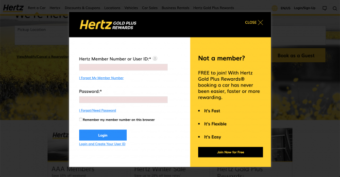
Hertz and a bunch of other sites put a login form in a modal window. This approach has two problems:
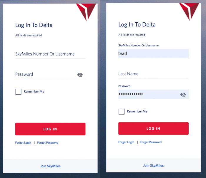
The Delta site hides the Last Name field. As I understand it, to make the interface cleaner by introducing elements of progressive design. The problem is that the field is required, and password managers cannot fill it out automatically . Users must first fill out and exit another field for this to appear. Just one additional, unnecessary obstacle so that a person can enter the system.
The MacOS login screen hides the password field in the same way to “clear” the UI (and I also assume to push users to log in via TouchID), but this cleanliness, in my opinion, can confuse people.
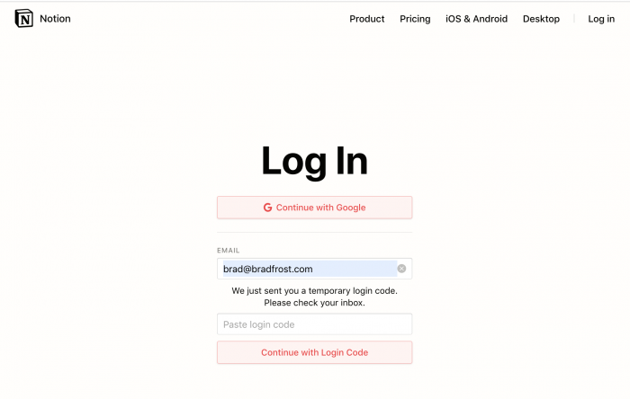
It may have started with Slack, but now other programs, such as Notion (which I love, by the way), send a temporary password to the system by email. I can appreciate the trick of this template, since it eliminates the suffering of unfortunate users who find it difficult to remember another password, and do not need to create all the necessary infrastructure to recover a forgotten password. But.


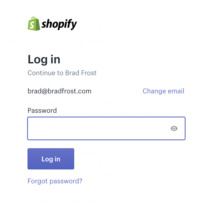
Shopify (another of my favorite services) annoyingly breaks the login into three separate screens. Again, I can understand the motives: they do not want to immediately overload the user with a lot of information. I agree with this template in certain cases (for example, in the online store, payment information, delivery method and address, credit card information, etc. are usually entered in several stages). But why do this for a form with three fields?
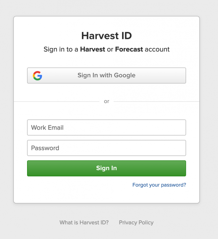
What do web designers do? I think the boring old login form is just fine. Here is Harvest :
And here is WordPress:
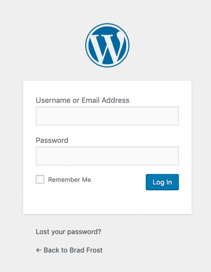
Simple, concise, predictable design. Compatible with password managers. Everything is in place. Here are some considerations:
The list is not exhaustive. I haven’t touched things like social media login or two-factor authentication. Express your observations about other irregular patterns if something is encountered.
Let's look at some login patterns that are not perfect in my opinion. And then consider best practices. TL; DR; These are authorization pages that are simple, predictable, on regular pages and are friendly with password managers.
What not to do
Here are some examples that I would avoid.
Do not put authorization in modal forms

Hertz and a bunch of other sites put a login form in a modal window. This approach has two problems:
- Additional steps for the user : “1. press the menu button, 2. select a login, 3. fill out the form ”instead of going to the authorization page (via search, customer support chat, bookmark, password manager, directly, through the main navigation) and filling out the form.
- There is no direct link to the page , which can be a pain for the support service (since they have to give a bunch of instructions described above, and not just send a person via the link). It also interferes with the work of password managers, since the modal window is initially hidden. 1Password has an amazing Open and Fill feature that allows you to open a site and fill out the login form with your credentials. This function does not work with modal windows.
Do not hide the fields

The Delta site hides the Last Name field. As I understand it, to make the interface cleaner by introducing elements of progressive design. The problem is that the field is required, and password managers cannot fill it out automatically . Users must first fill out and exit another field for this to appear. Just one additional, unnecessary obstacle so that a person can enter the system.
The MacOS login screen hides the password field in the same way to “clear” the UI (and I also assume to push users to log in via TouchID), but this cleanliness, in my opinion, can confuse people.
Do not mess with magic links

It may have started with Slack, but now other programs, such as Notion (which I love, by the way), send a temporary password to the system by email. I can appreciate the trick of this template, since it eliminates the suffering of unfortunate users who find it difficult to remember another password, and do not need to create all the necessary infrastructure to recover a forgotten password. But.
- This circuit is incredibly tiring . 1. Enter email in the login form. 2. Open a new tab or switch the program. 3. Open the mailbox. 4. Find a message from the service (if you are not distracted by other letters). 5. Open the message. 6. Copy the abracadabra password. 7. Return to the site. 8. Insert there abracadabra. 9. Submit the form. Pancake.
- This does not work with password managers at all , which is incredibly annoying. In design, we talk a lot about consistency. But we are talking not only about coherence in our own ecosystem, but also with the rest of the Internet, stick-trees.
- This forces users to learn new behaviors : users have learned certain patterns (login, verification, navigation, etc.), reusing them in many applications over many years. I am not saying that innovation should never be made. But it is important to recognize that users come to your product with a load of earned knowledge on how to use the Internet. When we try to become too smart, we force users to learn new patterns, which slows people down (at least from the very beginning).
Do not split the login form into multiple pages


Shopify (another of my favorite services) annoyingly breaks the login into three separate screens. Again, I can understand the motives: they do not want to immediately overload the user with a lot of information. I agree with this template in certain cases (for example, in the online store, payment information, delivery method and address, credit card information, etc. are usually entered in several stages). But why do this for a form with three fields?
- Unnecessary steps are added to enter the system : this is still a form with three fields, but now users have to wade through three screens. Sure, it slows people down.
- Does not work with password managers : password managers can fill in only one field on a page.
How to do
What do web designers do? I think the boring old login form is just fine. Here is Harvest :

And here is WordPress:

Simple, concise, predictable design. Compatible with password managers. Everything is in place. Here are some considerations:
- Make a separate page for logging in : people from support will be able to send customers to the URL (domain.com/login), and not set out a bunch of instructions on where to find the login form. Password managers will save this URL, at the click of a button they open and automatically fill in the fields.
- Show all the necessary fields : if you need to enter a surname to enter, immediately show this field!
- Put all the fields on one page : the input should be fast, and not an unnecessary channel stretched over several pages.
- Do not fantasize : it may be that these magic links and other ingenious login templates are, but you should take into account the habits of users on the Internet. Rely on this boring, predictable, established practice.
The list is not exhaustive. I haven’t touched things like social media login or two-factor authentication. Express your observations about other irregular patterns if something is encountered.
