Using the principles of gestalt psychology in web design
- Transfer
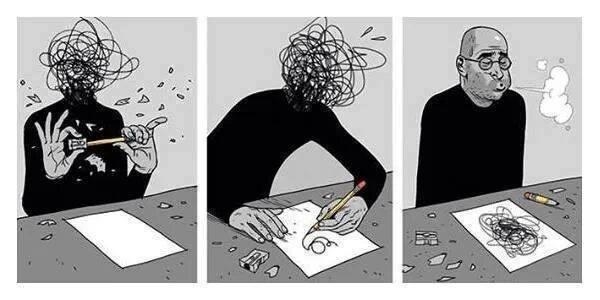
The author of the material, the translation of which we publish today, Mariel Moskeriola, says that she always believed that the “user experience” consists of psychology and design. The work of the designer, when he deals with the needs of people whose satisfaction is his task, includes the need to feel in the user's place. In this article, Mariel will talk about the application of the principles of gestalt psychology in the design of user interfaces.
Gestalt psychology is a school of thought that considers the mind and human behavior as a whole. Gestalt psychology makes the assumption that a person, in an attempt to understand the world around him, does not just focus on its individual small constituent parts. Instead of concentrating on every small detail, our brain tends to perceive individual objects as part of something larger, some single whole, as elements of more complex systems. This school of psychology plays a crucial role in modern research on how people perceive and perceive the world.
A journey through gestalt psychology has led me to a complete understanding of how I can use the appropriate psychological principles in my work. And in this article I want to share how I apply the Gestalt principles when working on various websites and applications.
I would like to note right away that the design solutions presented here are examples prepared using the principles of gestalt psychology. Some examples that you will see will not hinder the redesign, but I decided to stick to the original design and show how to improve it using psychological principles. As a result, you can well perceive the same tasks differently, see other ways to solve them. If so, share your ideas on this subject in the comments. In addition, I am not the owner of the images used here. The rights to them belong to their owners.
This principle is that when objects are located close to each other, they are perceived as a group, and not as separate objects.
Here is an example of how we can use this principle in design. So, consider the problem that we want to solve.

Image, title and link are located far from each other.
As you can see, here the titles of the sections (Online Booking and Cruises) are aligned to the left, and the links to go to sections (Learn more) are aligned to the right. Images are centered. They are too far from each other, which makes them perceive as freely located elements that are not connected with each other. If we create a simplified layout based on this example, then we get the following.

Page fragment layout
Separate components related to one section (image, title, link) are not visually connected. In solving this problem, the application of the principle of proximity can help. We need to move from the three elements in each group that exist on the page independently of each other, to such an arrangement that will allow them to look like a whole.

The title and the link are aligned in the same way as the image.
In solving the problem using the proximity principle, I reduced the distance between the title and the link by aligning them in the center. As a result, we can link all three elements together (image, title and link), which helps solve the problem of losing context.
Similarity is when objects are similar to each other. People often perceive such objects as a group or a certain connected sequence of elements.
Below we consider two problems. In the first of them, presented in the following figure (Design Problem A), pay attention to the blue color of the link text. When interacting with the site, the user can perceive it as a link leading to an external resource, and not as a link that opens a tab of the same site. The reason for this is the dissimilarity of the "Heavy Data User" and "Flexible Maximizer" elements, although they are actually connected and represent the tabs of the user interface.
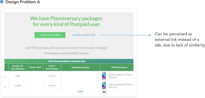
Problem A - the type of tabs is different, which confuses the user
What gives the feeling that these elements are not connected with each other? In fact - a lot. But, to put it extremely simply, the fact is that nothing visually connects them, as a result they look like two different elements. The main color of the interface, as you can see, is green, but the problematic link is painted in the blue that came from nowhere. In solving this problem, the principle of similarity will help us.

Solving the problem using the principle of similarity
As you can see, the link color is changed to green here, in addition, the left and right fields are added to the active element. All this enhances the similarity of the elements and improves the design.
It should be noted that the example considered here can still be improved and improved by conducting a complete redesign of the page (this page still needs redesign), which will simplify the user’s interaction with it. However, here we confine ourselves to the only improvement presented, based on the principle of similarity.
Here's another problem (Design Problem B) that you can use to solve the principle that is being considered now.
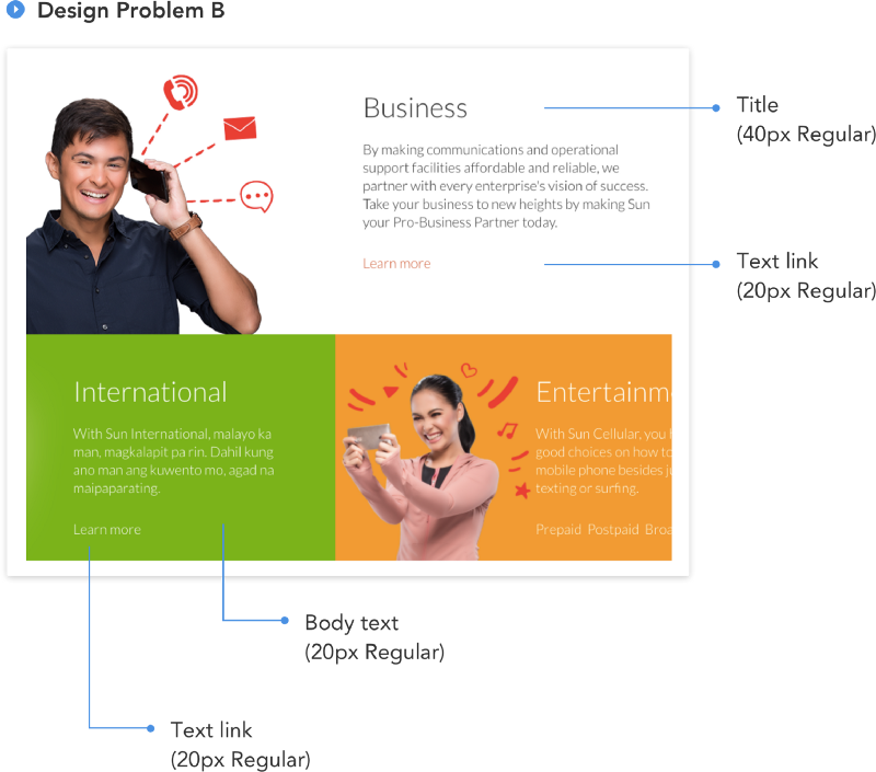
Problem B is in fonts.
This problem, as you can see, is in fonts. Namely, now the following font settings are used here:
At first glance, it may seem that we have before us a completely ordinary font system, the features of which can be ignored. However, if you look closely, it turns out that our problem is the same characteristics of the fonts used for the main text of the page and the text of the links. This can confuse the user, worsen his impression of working with the site. When working with the site, the user may have doubts, try to do something and make mistakes, taking plain text as a link, and a link as plain text.
How to solve this problem? Again we use the principle of similarity, only this time it will be useful to us in order to visually separate the different elements.

Changing the font characteristics allows you to select links.
Here we have reduced the characteristics of the font set used on the page to the following form:
We made the text of the links more contrast, displaying them in bold, and also added special icons to them, giving them visual weight. Thanks to these changes, users will be able to quickly distinguish links from plain text.
Here, since we are talking about fonts, I want to give one little advice. When developing a font system for a page, use fonts of different weights (thin, light, regular, bold, and so on) to highlight various elements. Our goal is to, for better separation of texts for various purposes, use not a lot of fonts of various sizes with several options for saturation, but several font sizes, with many options for saturation. Details about this can be found here .
Focus points are areas of interest that stand out from or differ from the overall composition that capture and hold the viewer's attention.
Considering this principle, we will also analyze two problems. Here is the first one.

The figure illustrating Problem A is taken from the telecommunications company website.
In this example, you will notice that the buttons for performing the main and secondary actions are very similar. They are located quite acceptable (although their location relative to each other is a separate conversation), but looking at them, it is impossible, at first glance, to build their hierarchy, since they use the same styles.
It is clear that the purpose of the page considered here is to encourage the user to download the application, and that the button for viewing the FAQ plays a supporting role, giving the user access to materials that allow him to find out details about the application. And by the way, I doubt that the owners of the resource more want users to read the FAQ, rather than downloading their application.
We solve this problem using the principle of the focus point.
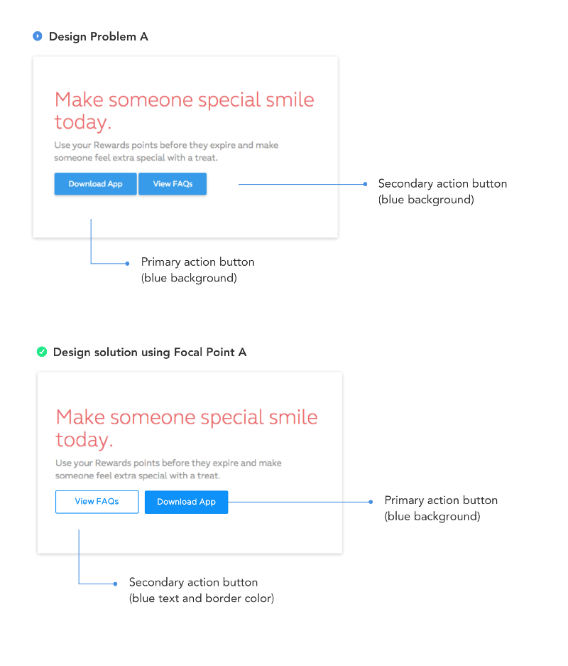
Solving the problem using the principle of the focus point
Using the principle of the focus point, I changed the style of the “View FAQs” button. Now, due to the use of a white background and a thin border, instead of a solid fill, it is clear that it plays a secondary role. In addition, I swapped the buttons by moving the button for the main action to the right and the button for the secondary action to the left. The reason for this change is the application of the Gutenberg rule based on the chart of the same name. This rule, as applied to our case, if expressed very simplistically, is that the user considers more important the elements located on the right side of the page. Therefore, in this case, there is no doubt about where to place the button that calls the user to action. Details of the Gutenberg diagram can be read here and here .
In addition, here we can recall a typical problem regarding the design of buttons, which consists in the fact that the buttons of the same type are used to perform different functions with different priorities.
If you continue the theme of the same buttons, you may wonder what is probably good, in the sense that the content of the page with these buttons looks uniform. It is widely known that uniformity plays a huge role in UX design, but here we are talking about uniformity in terms of functionality. If we create the same buttons designed to serve different functionalities, this can confuse the user, and can also affect the business goals of the customer of the site.
As regards buttons, it is worth adhering to the consideration, according to which the functional similarity of the buttons should be based on uniformity of button design.
Now consider the second problem that we are going to solve using the same principle.

Problem B is touching the buttons again. Both have the same background.
Here we see the same flaw. The OK and Cancel buttons are the same. In order to decide which one to click, which one allows you to send data, and which one to cancel the operation, the user needs to carefully read the labels on them.
The principle of the focus point allows you to come to the next solution to this problem, which will accelerate the user’s work with the site, reducing the time required to understand the purpose of the buttons.
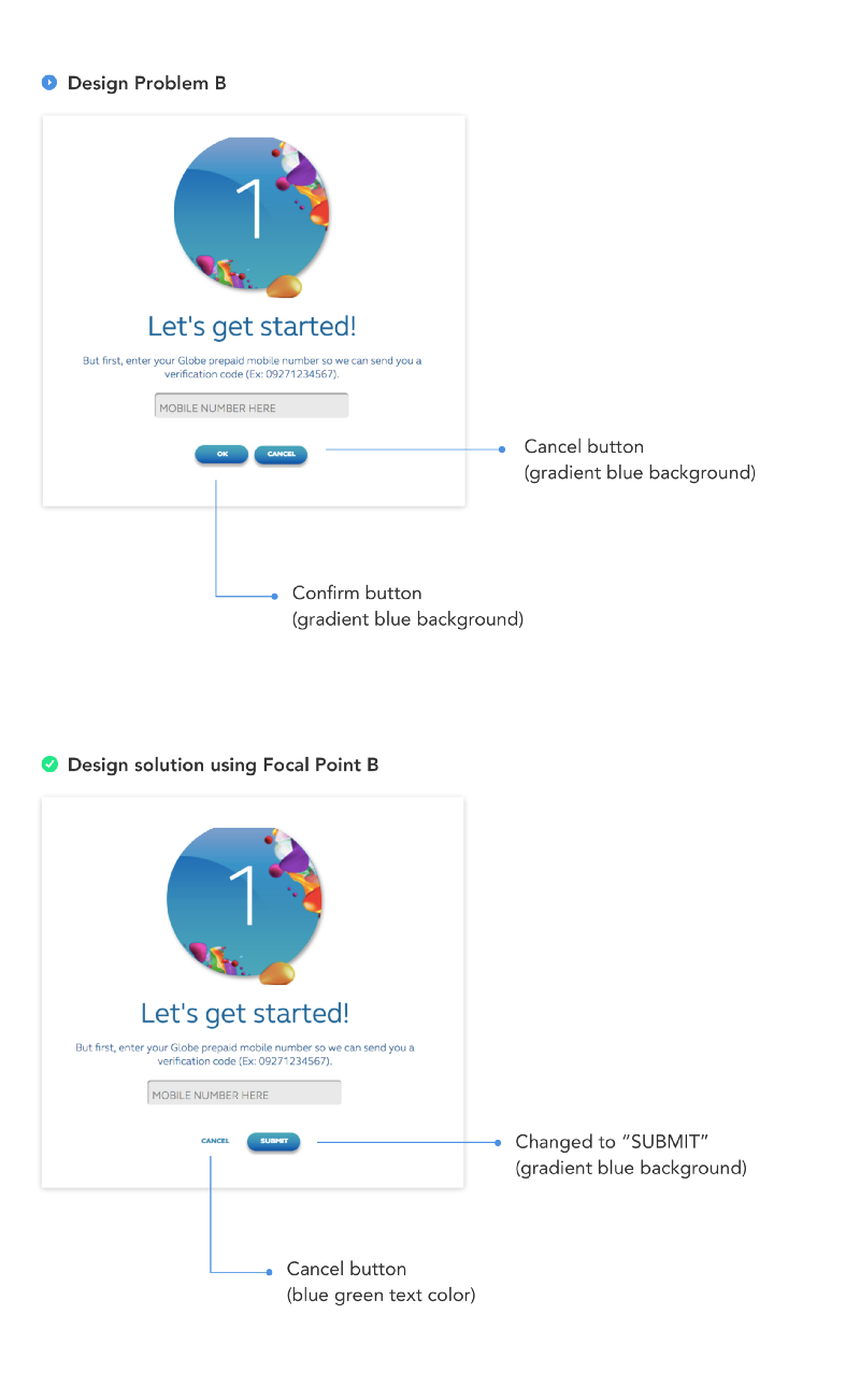
Solution B
Here, we first swapped the buttons, then changed the inscription on the operation confirmation button from OK to Submit so that the user could more clearly understand what action the button would take in the context of other elements. As in the previous example, we changed the style of the secondary button.
The principle of the general domain is strongly related to the principle of proximity. In accordance with this principle, if objects are located in a closed area, we perceive them as part of a group.
This is the problem that we are going to solve by applying the principle of a common area.
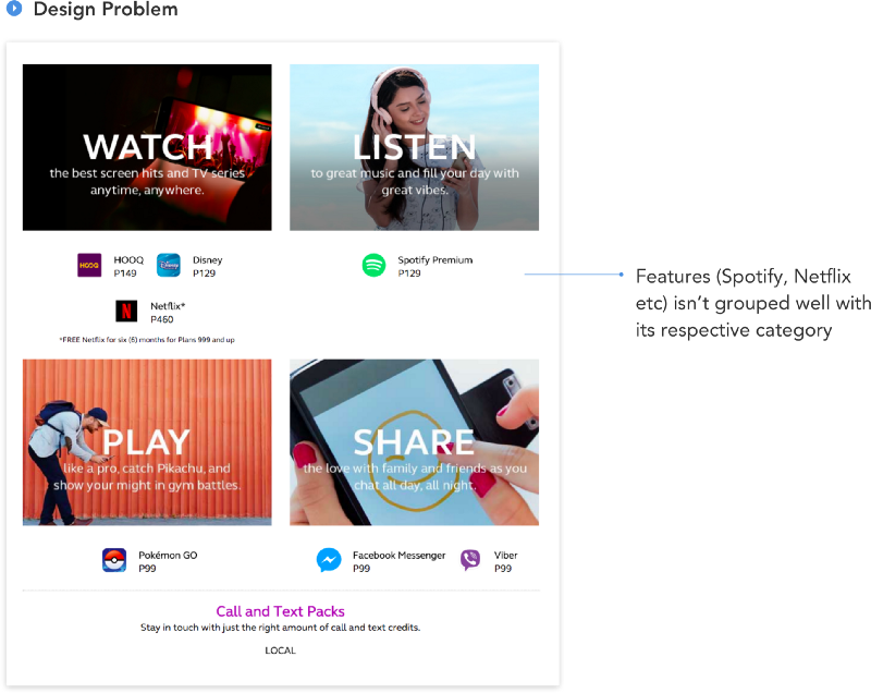
A problem that demonstrates a violation of the principle of a common area
Here you can see that the elements (Spotify, Disney, Netflix), representing additional features relating to each category, do not look like a single group attached to a certain category. They look like freely arranged elements, it is not clear what they are related to. Here we, before finding a solution to the problem, simplify it by presenting the page in the form of the following layout.
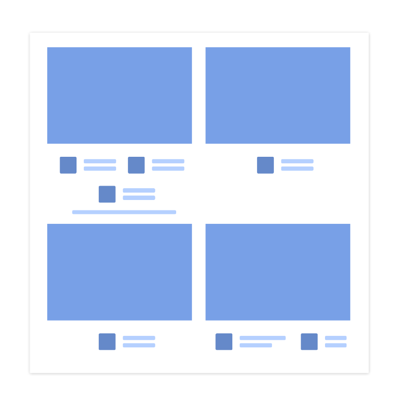
Layout of the problem page
Studying this layout makes it obvious that the content of the page looks more like a collection of many separate elements than four large components. The solution to the problem will be the application of the principle of a common area. First, again, to demonstrate it brighter, we express this decision in the form of a layout.

The layout illustrating the solution of the problem using the principle of a common area.
The most important thing that we have done here is to surround all the elements belonging to one category with a common border. Now they are perceived as parts of something larger, and not as separate objects. Below is a finished page, modified in accordance with the above idea.
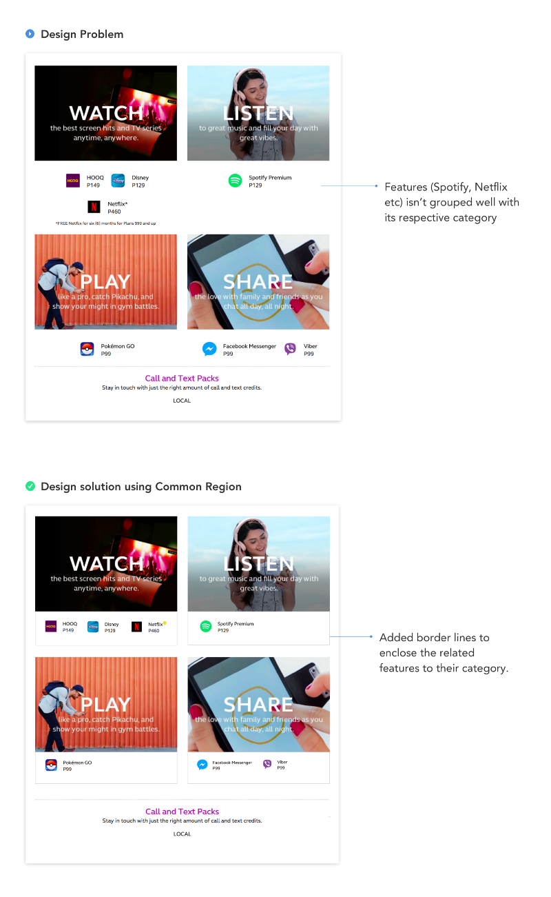
Solving the problem using the principle of a common area
Here, in addition to the border surrounding the elements and connecting them to the main image of the category, the long inscription "* Free Netflix for six (6) months for Plans 999 and up" is replaced by a yellow information icon located in the upper right the corner of the item to which it refers. When you click on this icon, a tooltip appears with additional information. This, among other things, frees up space for other elements.
Here we examined four principles of gestalt psychology that can help a designer in his daily work. In fact, there are much more of these principles, but if you have not encountered them before, we hope that even the four that you learned about today will allow you to experience the spirit of Gestalt psychology and come in handy in practice. And if you like it all, relying on what you have mastered today, you can expand your knowledge in this area.
Dear readers! Do you use the principles of gestalt psychology in design?

What are gestalt principles?
Gestalt psychology is a school of thought that considers the mind and human behavior as a whole. Gestalt psychology makes the assumption that a person, in an attempt to understand the world around him, does not just focus on its individual small constituent parts. Instead of concentrating on every small detail, our brain tends to perceive individual objects as part of something larger, some single whole, as elements of more complex systems. This school of psychology plays a crucial role in modern research on how people perceive and perceive the world.
A journey through gestalt psychology has led me to a complete understanding of how I can use the appropriate psychological principles in my work. And in this article I want to share how I apply the Gestalt principles when working on various websites and applications.
I would like to note right away that the design solutions presented here are examples prepared using the principles of gestalt psychology. Some examples that you will see will not hinder the redesign, but I decided to stick to the original design and show how to improve it using psychological principles. As a result, you can well perceive the same tasks differently, see other ways to solve them. If so, share your ideas on this subject in the comments. In addition, I am not the owner of the images used here. The rights to them belong to their owners.
Proximity principle
This principle is that when objects are located close to each other, they are perceived as a group, and not as separate objects.
Here is an example of how we can use this principle in design. So, consider the problem that we want to solve.
Image, title and link are located far from each other.
As you can see, here the titles of the sections (Online Booking and Cruises) are aligned to the left, and the links to go to sections (Learn more) are aligned to the right. Images are centered. They are too far from each other, which makes them perceive as freely located elements that are not connected with each other. If we create a simplified layout based on this example, then we get the following.
Page fragment layout
Separate components related to one section (image, title, link) are not visually connected. In solving this problem, the application of the principle of proximity can help. We need to move from the three elements in each group that exist on the page independently of each other, to such an arrangement that will allow them to look like a whole.
The title and the link are aligned in the same way as the image.
In solving the problem using the proximity principle, I reduced the distance between the title and the link by aligning them in the center. As a result, we can link all three elements together (image, title and link), which helps solve the problem of losing context.
Similarity principle
Similarity is when objects are similar to each other. People often perceive such objects as a group or a certain connected sequence of elements.
Below we consider two problems. In the first of them, presented in the following figure (Design Problem A), pay attention to the blue color of the link text. When interacting with the site, the user can perceive it as a link leading to an external resource, and not as a link that opens a tab of the same site. The reason for this is the dissimilarity of the "Heavy Data User" and "Flexible Maximizer" elements, although they are actually connected and represent the tabs of the user interface.
Problem A - the type of tabs is different, which confuses the user
What gives the feeling that these elements are not connected with each other? In fact - a lot. But, to put it extremely simply, the fact is that nothing visually connects them, as a result they look like two different elements. The main color of the interface, as you can see, is green, but the problematic link is painted in the blue that came from nowhere. In solving this problem, the principle of similarity will help us.
Solving the problem using the principle of similarity
As you can see, the link color is changed to green here, in addition, the left and right fields are added to the active element. All this enhances the similarity of the elements and improves the design.
It should be noted that the example considered here can still be improved and improved by conducting a complete redesign of the page (this page still needs redesign), which will simplify the user’s interaction with it. However, here we confine ourselves to the only improvement presented, based on the principle of similarity.
Here's another problem (Design Problem B) that you can use to solve the principle that is being considered now.
Problem B is in fonts.
This problem, as you can see, is in fonts. Namely, now the following font settings are used here:
- Title: 40px Regular
- Body text: 20px Regular
- Text link: 20px Regular
At first glance, it may seem that we have before us a completely ordinary font system, the features of which can be ignored. However, if you look closely, it turns out that our problem is the same characteristics of the fonts used for the main text of the page and the text of the links. This can confuse the user, worsen his impression of working with the site. When working with the site, the user may have doubts, try to do something and make mistakes, taking plain text as a link, and a link as plain text.
How to solve this problem? Again we use the principle of similarity, only this time it will be useful to us in order to visually separate the different elements.
Changing the font characteristics allows you to select links.
Here we have reduced the characteristics of the font set used on the page to the following form:
- Title: 40px Regular
- Body text: 20px Regular
- Link text (Text link): 20px Bold
We made the text of the links more contrast, displaying them in bold, and also added special icons to them, giving them visual weight. Thanks to these changes, users will be able to quickly distinguish links from plain text.
Here, since we are talking about fonts, I want to give one little advice. When developing a font system for a page, use fonts of different weights (thin, light, regular, bold, and so on) to highlight various elements. Our goal is to, for better separation of texts for various purposes, use not a lot of fonts of various sizes with several options for saturation, but several font sizes, with many options for saturation. Details about this can be found here .
Focus Point Principle
Focus points are areas of interest that stand out from or differ from the overall composition that capture and hold the viewer's attention.
Considering this principle, we will also analyze two problems. Here is the first one.
The figure illustrating Problem A is taken from the telecommunications company website.
In this example, you will notice that the buttons for performing the main and secondary actions are very similar. They are located quite acceptable (although their location relative to each other is a separate conversation), but looking at them, it is impossible, at first glance, to build their hierarchy, since they use the same styles.
It is clear that the purpose of the page considered here is to encourage the user to download the application, and that the button for viewing the FAQ plays a supporting role, giving the user access to materials that allow him to find out details about the application. And by the way, I doubt that the owners of the resource more want users to read the FAQ, rather than downloading their application.
We solve this problem using the principle of the focus point.
Solving the problem using the principle of the focus point
Using the principle of the focus point, I changed the style of the “View FAQs” button. Now, due to the use of a white background and a thin border, instead of a solid fill, it is clear that it plays a secondary role. In addition, I swapped the buttons by moving the button for the main action to the right and the button for the secondary action to the left. The reason for this change is the application of the Gutenberg rule based on the chart of the same name. This rule, as applied to our case, if expressed very simplistically, is that the user considers more important the elements located on the right side of the page. Therefore, in this case, there is no doubt about where to place the button that calls the user to action. Details of the Gutenberg diagram can be read here and here .
In addition, here we can recall a typical problem regarding the design of buttons, which consists in the fact that the buttons of the same type are used to perform different functions with different priorities.
If you continue the theme of the same buttons, you may wonder what is probably good, in the sense that the content of the page with these buttons looks uniform. It is widely known that uniformity plays a huge role in UX design, but here we are talking about uniformity in terms of functionality. If we create the same buttons designed to serve different functionalities, this can confuse the user, and can also affect the business goals of the customer of the site.
As regards buttons, it is worth adhering to the consideration, according to which the functional similarity of the buttons should be based on uniformity of button design.
Now consider the second problem that we are going to solve using the same principle.
Problem B is touching the buttons again. Both have the same background.
Here we see the same flaw. The OK and Cancel buttons are the same. In order to decide which one to click, which one allows you to send data, and which one to cancel the operation, the user needs to carefully read the labels on them.
The principle of the focus point allows you to come to the next solution to this problem, which will accelerate the user’s work with the site, reducing the time required to understand the purpose of the buttons.
Solution B
Here, we first swapped the buttons, then changed the inscription on the operation confirmation button from OK to Submit so that the user could more clearly understand what action the button would take in the context of other elements. As in the previous example, we changed the style of the secondary button.
General area principle
The principle of the general domain is strongly related to the principle of proximity. In accordance with this principle, if objects are located in a closed area, we perceive them as part of a group.
This is the problem that we are going to solve by applying the principle of a common area.
A problem that demonstrates a violation of the principle of a common area
Here you can see that the elements (Spotify, Disney, Netflix), representing additional features relating to each category, do not look like a single group attached to a certain category. They look like freely arranged elements, it is not clear what they are related to. Here we, before finding a solution to the problem, simplify it by presenting the page in the form of the following layout.
Layout of the problem page
Studying this layout makes it obvious that the content of the page looks more like a collection of many separate elements than four large components. The solution to the problem will be the application of the principle of a common area. First, again, to demonstrate it brighter, we express this decision in the form of a layout.
The layout illustrating the solution of the problem using the principle of a common area.
The most important thing that we have done here is to surround all the elements belonging to one category with a common border. Now they are perceived as parts of something larger, and not as separate objects. Below is a finished page, modified in accordance with the above idea.
Solving the problem using the principle of a common area
Here, in addition to the border surrounding the elements and connecting them to the main image of the category, the long inscription "* Free Netflix for six (6) months for Plans 999 and up" is replaced by a yellow information icon located in the upper right the corner of the item to which it refers. When you click on this icon, a tooltip appears with additional information. This, among other things, frees up space for other elements.
Summary
Here we examined four principles of gestalt psychology that can help a designer in his daily work. In fact, there are much more of these principles, but if you have not encountered them before, we hope that even the four that you learned about today will allow you to experience the spirit of Gestalt psychology and come in handy in practice. And if you like it all, relying on what you have mastered today, you can expand your knowledge in this area.
Dear readers! Do you use the principles of gestalt psychology in design?