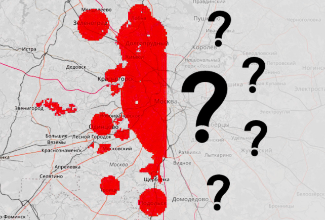
How can I predict the number of emergency calls in different parts of the city using geodata analysis?
Try to solve the problem from the Geohack . 112 online hackathon . Given: the territory of Moscow and the Moscow region was divided into squares of sizes from 500 to 500 meters. The average number of emergency calls per day (numbers 112, 101, 102, 103, 104, 010, 020, 030, 040) is presented as the initial data. The region in question was divided into western and eastern parts. Participants are invited to study in the western part to predict the number of emergency calls for all eastern squares.
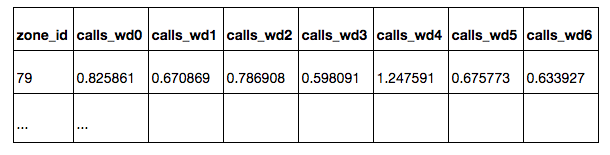
In the zones.csv tablelists all the squares with their coordinates. All squares are located in Moscow, or at a short distance from Moscow. The squares located in the western part of the sample are intended for training the model - for these squares the average number of emergency calls per square per day is
known : calls_daily : on all days
calls_workday : on weekdays
calls_weekend : on weekends
calls_wd {D} : on weekday D (0 - Monday, 6 - Sunday)
On the squares from the eastern part of the sample, it is necessary to forecast the number of calls for all days of the week. Assessment of the quality of the prediction will be carried out on a subset of squares, which do not include squares, from where calls come extremely rarely. A subset of the target squares has is_target = 1 in the table. For test squares, the values of calls_ * and is_target are hidden.
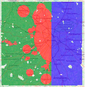
Three types of squares are marked on the map:
Green - from the training part, non-target
Red - from the training part, target
Blue - test, you need to build a forecast on them.
As a solution, you must provide a CSV table with predictions for all test squares, for each square - by all days of the week.
Quality is judged only by a subset of the target squares. Participants do not know which of the target squares, however, the principle of choosing the target squares in the training and test parts is identical. During the competition, quality is estimated at 30% of the test target squares (randomly selected), at the end of the competition the results are summed up for the remaining 70% of the squares.
Prediction Quality Metric - Kendall's Tau-b rank correlation coefficient, is considered as the proportion of pairs of objects with incorrectly ordered predictions adjusted for pairs with the same value of the target variable. The metric evaluates the order in which predictions relate to each other, rather than their exact values. Different days of the week are considered independent sampling elements, i.e. the correlation coefficient is predicted for all test pairs (zone_id, day of the week).
The prediction of the number of calls can be made using machine learning methods. To do this, each square needs to build a vector with a characteristic description. Having trained the model in the marked-up western part of Moscow, it can be used to predict the target variable in the eastern part.
According to the conditions of the competition, data for solving the problem can be taken from any open sources. When it comes to describing a small area on a map, the first thing that comes to mind is OpenStreetMap, an open, non-profit electronic map created by the community.
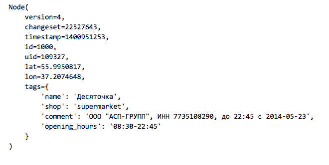
The OSM map is a set of elements of three types:
Node: points on the
Way map : roads, areas, are defined by a set of points
Relation: connections between elements, for example, combining a road from several parts.
Elements can have a set of tags - key-value pairs. Here is an example of a store that is indicated on the map as an element of type Node:
Actual data uploading of OpenStreetMap can be taken from the GIS-Lab.info website . Since we are interested in Moscow and its immediate surroundings, we upload the RU-MOS.osm.pbf file - part of OpenStreetMap from the corresponding region in the osm.pbf binary format . There is a simple osmread library for reading such files from Python.
Before we start working, we consider from OSM all the elements of type Node from the region we need that have tags (the rest are eliminated and will not be used in the future).
The organizers of the competition prepared a base line, which is available here . All the code below is contained in this baseline.
When working in Python, geodata can be quickly visualized on an interactive map using the folium library , which under the hood Leaflet.js is a standard solution for displaying OpenStreetMap.
We aggregate the obtained set of points by squares and construct simple signs:
1. The distance from the center of the square to the Kremlin
2. The number of points in the radius R from the center of the square (for different values of R)
a. all points tagged with
b. train stations
c. shops
d. public transport stops
3. Maximum and average distance from the center of the square to the nearest points of the types listed above
For a quick search for points in proximity to the center of the square, we will use the kd tree data structure implemented in the SciKit-Learn package in the NearestNeighbors class.
As a result, for each square from the training and test samples, we have a characteristic description that can be used for prediction. A slight modification of the proposed code can take into account objects of other types in the signs. Participants can add their own characteristics, thereby giving the model more information about urban development.
Predicting the number of challenges
Experienced participants in data analysis competitions know that to get a high place it is important not only to look at the public leaderboard, but also to do your own validation on the training sample. Let's make a simple partition of the training part of the sample into subsamples for training and validation in the ratio of 70/30.
Take only the target squares and train the random forest model (RandomForestRegressor) to predict the average number of calls per day.
We will evaluate the quality on the validation subsample, for all days of the week we will build the same forecast. The quality metric is the non-parametric correlation coefficient of Kendall tau-b, it is implemented in the SciPy package as a function scipy.stats.kendalltau.
It turns out Validation score: 0.656881482683
This is not bad, because the value of the metric 0 means no correlation, and 1 means a complete monotonous correspondence of real values and predicted.
Before entering the ranks of participants who will receive an invitation to the Data Fest, one small step remains: to build a table with predictions on all test squares and send them to the system.
Why analyze your location data?
The main sources of data, not only spatial (geographical), but also temporal, for any telecom company are the complexes of equipment for signal reception and transmission located on the entire territory of the service countries — Base Stations (BS). Spatial analysis of data is technically more difficult, but can bring significant benefits and features that add a significant contribution to the effectiveness of machine learning models.
At MTS, the use of geographic data helps expand the knowledge base. They can be used to improve the quality of the service provided when analyzing subscribers' complaints about the quality of communication, improving the coverage area of the signal, planning network development and solving other problems where spatio-temporal communication is an important factor.
Increasing, especially in large cities, population density, rapid development of infrastructure and road network, satellite images and vector maps, the number of buildings and POIs (points of interest) from open maps of the area associated with the provision of services - all these spatial data can be obtained from external sources. Such data can be used as an additional source of information, and also allow you to get an objective picture, regardless of network coverage.
Do you like the challenge? Then we invite you to take part in the Geohack . 112 geographic data analysis online hackathon . Register and upload your solutions to the siteuntil April 24th. The authors of the top three results will receive cash prizes. Separate nominations are provided for participants who have presented the best public solution to the problem and the best visualization of data journalism. The total prize fund of MTS GeoHack is 500,000 rubles . We hope to see interesting new approaches to generating spatial features, visualizing geodata and using new open sources of information.
The award ceremony will be held April 28 at the DataFest conference .
In the zones.csv tablelists all the squares with their coordinates. All squares are located in Moscow, or at a short distance from Moscow. The squares located in the western part of the sample are intended for training the model - for these squares the average number of emergency calls per square per day is
known : calls_daily : on all days
calls_workday : on weekdays
calls_weekend : on weekends
calls_wd {D} : on weekday D (0 - Monday, 6 - Sunday)
On the squares from the eastern part of the sample, it is necessary to forecast the number of calls for all days of the week. Assessment of the quality of the prediction will be carried out on a subset of squares, which do not include squares, from where calls come extremely rarely. A subset of the target squares has is_target = 1 in the table. For test squares, the values of calls_ * and is_target are hidden.
Three types of squares are marked on the map:
Green - from the training part, non-target
Red - from the training part, target
Blue - test, you need to build a forecast on them.
As a solution, you must provide a CSV table with predictions for all test squares, for each square - by all days of the week.
Quality is judged only by a subset of the target squares. Participants do not know which of the target squares, however, the principle of choosing the target squares in the training and test parts is identical. During the competition, quality is estimated at 30% of the test target squares (randomly selected), at the end of the competition the results are summed up for the remaining 70% of the squares.
Prediction Quality Metric - Kendall's Tau-b rank correlation coefficient, is considered as the proportion of pairs of objects with incorrectly ordered predictions adjusted for pairs with the same value of the target variable. The metric evaluates the order in which predictions relate to each other, rather than their exact values. Different days of the week are considered independent sampling elements, i.e. the correlation coefficient is predicted for all test pairs (zone_id, day of the week).
We read the table of squares using Pandas
import pandas
df_zones = pandas.read_csv('data/zones.csv', index_col='zone_id')
df_zones.head()
Retrieving Features from OpenStreetMap
The prediction of the number of calls can be made using machine learning methods. To do this, each square needs to build a vector with a characteristic description. Having trained the model in the marked-up western part of Moscow, it can be used to predict the target variable in the eastern part.
According to the conditions of the competition, data for solving the problem can be taken from any open sources. When it comes to describing a small area on a map, the first thing that comes to mind is OpenStreetMap, an open, non-profit electronic map created by the community.
The OSM map is a set of elements of three types:
Node: points on the
Way map : roads, areas, are defined by a set of points
Relation: connections between elements, for example, combining a road from several parts.
Elements can have a set of tags - key-value pairs. Here is an example of a store that is indicated on the map as an element of type Node:
Actual data uploading of OpenStreetMap can be taken from the GIS-Lab.info website . Since we are interested in Moscow and its immediate surroundings, we upload the RU-MOS.osm.pbf file - part of OpenStreetMap from the corresponding region in the osm.pbf binary format . There is a simple osmread library for reading such files from Python.
Before we start working, we consider from OSM all the elements of type Node from the region we need that have tags (the rest are eliminated and will not be used in the future).
The organizers of the competition prepared a base line, which is available here . All the code below is contained in this baseline.
Loading objects from OpenStreetMap
import pickle
import osmread
from tqdm import tqdm_notebook
LAT_MIN, LAT_MAX = 55.309397, 56.13526
LON_MIN, LON_MAX = 36.770379, 38.19270
osm_file = osmread.parse_file('osm/RU-MOS.osm.pbf')
tagged_nodes = [
    entry
    for entry in tqdm_notebook(osm_file, total=18976998)
    if isinstance(entry, osmread.Node)
    if len(entry.tags) > 0
    if (LAT_MIN < entry.lat < LAT_MAX) and (LON_MIN < entry.lon < LON_MAX)
]
# Сохраним список с выбранными объектами в отдельный файл
with open('osm/tagged_nodes.pickle', 'wb') as fout:
    pickle.dump(tagged_nodes, fout, protocol=pickle.HIGHEST_PROTOCOL)
# Файл с сохраненными объектами можно будет быстро загрузить
with open('osm/tagged_nodes.pickle', 'rb') as fin:
    tagged_nodes = pickle.load(fin)
When working in Python, geodata can be quickly visualized on an interactive map using the folium library , which under the hood Leaflet.js is a standard solution for displaying OpenStreetMap.
Visualization example using folium
import folium
fmap = folium.Map([55.753722, 37.620657])
# нанесем ж/д станции
for node in tagged_nodes:
    if node.tags.get('railway') == 'station':
        folium.CircleMarker([node.lat, node.lon], radius=3).add_to(fmap)
# выделим квадраты с наибольшим числом вызовов
calls_thresh = df_zones.calls_daily.quantile(.99)
for _, row in df_zones.query('calls_daily > @calls_thresh').iterrows():
    folium.features.RectangleMarker(
        bounds=((row.lat_bl, row.lon_bl), (row.lat_tr, row.lon_tr)),
        fill_color='red',
    ).add_to(fmap)
# карту можно сохранить и посмотреть в браузере
fmap.save('map_demo.html')
We aggregate the obtained set of points by squares and construct simple signs:
1. The distance from the center of the square to the Kremlin
2. The number of points in the radius R from the center of the square (for different values of R)
a. all points tagged with
b. train stations
c. shops
d. public transport stops
3. Maximum and average distance from the center of the square to the nearest points of the types listed above
For a quick search for points in proximity to the center of the square, we will use the kd tree data structure implemented in the SciKit-Learn package in the NearestNeighbors class.
Building a table with a characteristic description of the squares
import collections
import math
import numpy as np
from sklearn.neighbors import NearestNeighbors
kremlin_lat, kremlin_lon = 55.753722, 37.620657
def dist_calc(lat1, lon1, lat2, lon2):
    R = 6373.0
    lat1 = math.radians(lat1)
    lon1 = math.radians(lon1)
    lat2 = math.radians(lat2)
    lon2 = math.radians(lon2)
    dlon = lon2 - lon1
    dlat = lat2 - lat1
    a = math.sin(dlat / 2)**2 + math.cos(lat1) * math.cos(lat2) * \
          math.sin(dlon / 2)**2
    c = 2 * math.atan2(math.sqrt(a), math.sqrt(1 - a))
    return R * c
df_features = collections.OrderedDict([])
df_features['distance_to_kremlin'] = df_zones.apply(
    lambda row: dist_calc(row.lat_c, row.lon_c, kremlin_lat, kremlin_lon), axis=1)
# набор фильтров точек, по которым будет считаться статистика
POINT_FEATURE_FILTERS = [
    ('tagged', lambda
     node: len(node.tags) > 0),
    ('railway', lambda node: node.tags.get('railway') == 'station'),
    ('shop', lambda node: 'shop' in node.tags),
    ('public_transport', lambda node: 'public_transport' in node.tags),
]
# центры квадратов в виде матрицы
X_zone_centers = df_zones[['lat_c', 'lon_c']].as_matrix()
for prefix, point_filter in POINT_FEATURE_FILTERS:
    # берем подмножество точек в соответствии с фильтром
    coords = np.array([
        [node.lat, node.lon]
        for node in tagged_nodes
        if point_filter(node)
    ])
    # строим структуру данных для быстрого поиска точек
    neighbors = NearestNeighbors().fit(coords)
    # признак вида "количество точек в радиусе R от центра квадрата"
    for radius in [0.001, 0.003, 0.005, 0.007, 0.01]:
        dists, inds = neighbors.radius_neighbors(X=X_zone_centers, radius=radius)
        df_features['{}_points_in_{}'.format(prefix, radius)] = \
            np.array([len(x) for x in inds])
    # признак вида "расстояние до ближайших K точек"
    for n_neighbors in [3, 5, 10]:
        dists, inds = neighbors.kneighbors(X=X_zone_centers, n_neighbors=n_neighbors)
        df_features['{}_mean_dist_k_{}'.format(prefix, n_neighbors)] = \
            dists.mean(axis=1)
        df_features['{}_max_dist_k_{}'.format(prefix, n_neighbors)] = \
            dists.max(axis=1)
        df_features['{}_std_dist_k_{}'.format(prefix, n_neighbors)] = \
            dists.std(axis=1)
    # признак вида "расстояние до ближайшей точки"
    df_features['{}_min'.format(prefix)] = dists.min(axis=1)
# Создаем таблицу и сохраняем ее в features.csv
df_features = pandas.DataFrame(df_features, index=df_zones.index)
df_features.to_csv('data/features.csv')
df_features.head()
As a result, for each square from the training and test samples, we have a characteristic description that can be used for prediction. A slight modification of the proposed code can take into account objects of other types in the signs. Participants can add their own characteristics, thereby giving the model more information about urban development.
Predicting the number of challenges
Experienced participants in data analysis competitions know that to get a high place it is important not only to look at the public leaderboard, but also to do your own validation on the training sample. Let's make a simple partition of the training part of the sample into subsamples for training and validation in the ratio of 70/30.
Take only the target squares and train the random forest model (RandomForestRegressor) to predict the average number of calls per day.
Highlighting a validation subsample and training RandomForest
from sklearn.model_selection import train_test_split
from sklearn.ensemble import RandomForestRegressor
df_zones_train = df_zones.query('is_test == 0 & is_target == 1')
idx_train, idx_valid = train_test_split(df_zones_train.index, test_size=0.3)
X_train = df_features.loc[idx_train, :]
y_train = df_zones.loc[idx_train, 'calls_daily']
model = RandomForestRegressor(n_estimators=100, n_jobs=4)
model.fit(X_train, y_train)
We will evaluate the quality on the validation subsample, for all days of the week we will build the same forecast. The quality metric is the non-parametric correlation coefficient of Kendall tau-b, it is implemented in the SciPy package as a function scipy.stats.kendalltau.
It turns out Validation score: 0.656881482683
This is not bad, because the value of the metric 0 means no correlation, and 1 means a complete monotonous correspondence of real values and predicted.
Validation forecast and quality assessment
from scipy.stats import kendalltau
X_valid = df_features.loc[idx_valid, :]
y_valid = df_zones.loc[idx_valid, 'calls_daily']
y_pred = model.predict(X_valid)
target_columns = ['calls_wd{}'.format(d) for d in range(7)]
df_valid_target = df_zones.loc[idx_valid, target_columns]
df_valid_predictions = pandas.DataFrame(collections.OrderedDict([
    (column_name, y_pred)
    for column_name in target_columns
]), index=idx_valid)
df_comparison = pandas.DataFrame({
    'target': df_valid_target.unstack(),
    'prediction': df_valid_predictions.unstack(),
})
valid_score = kendalltau(df_comparison['target'], df_comparison['prediction']).correlation
print('Validation score:', valid_score)
Before entering the ranks of participants who will receive an invitation to the Data Fest, one small step remains: to build a table with predictions on all test squares and send them to the system.
Building predictions on a test
idx_test = df_zones.query('is_test == 1').index
X_test = df_features.loc[idx_test, :]
y_pred = model.predict(X_test)
df_test_predictions = pandas.DataFrame(collections.OrderedDict([
    (column_name, y_pred)
    for column_name in target_columns
]), index=idx_test)
df_test_predictions.to_csv('data/sample_submission.csv')
df_test_predictions.head()
Why analyze your location data?
The main sources of data, not only spatial (geographical), but also temporal, for any telecom company are the complexes of equipment for signal reception and transmission located on the entire territory of the service countries — Base Stations (BS). Spatial analysis of data is technically more difficult, but can bring significant benefits and features that add a significant contribution to the effectiveness of machine learning models.
At MTS, the use of geographic data helps expand the knowledge base. They can be used to improve the quality of the service provided when analyzing subscribers' complaints about the quality of communication, improving the coverage area of the signal, planning network development and solving other problems where spatio-temporal communication is an important factor.
Increasing, especially in large cities, population density, rapid development of infrastructure and road network, satellite images and vector maps, the number of buildings and POIs (points of interest) from open maps of the area associated with the provision of services - all these spatial data can be obtained from external sources. Such data can be used as an additional source of information, and also allow you to get an objective picture, regardless of network coverage.
Do you like the challenge? Then we invite you to take part in the Geohack . 112 geographic data analysis online hackathon . Register and upload your solutions to the siteuntil April 24th. The authors of the top three results will receive cash prizes. Separate nominations are provided for participants who have presented the best public solution to the problem and the best visualization of data journalism. The total prize fund of MTS GeoHack is 500,000 rubles . We hope to see interesting new approaches to generating spatial features, visualizing geodata and using new open sources of information.
The award ceremony will be held April 28 at the DataFest conference .