Cretaceous lettering for "dummies" on the example of working on an art object
This is the story of the personal experience of one UX designer who fell in love with lettering, still not knowing exactly what it is.
I will talk about what lettering in modern design is based on the example of my work on an art object; about the difficulties that I encountered and how I solved them; about slate paint and chalk markers. And why is it “good for business”. And there will be a little motivation for designers who would like to get out of the chair, but do not know how.
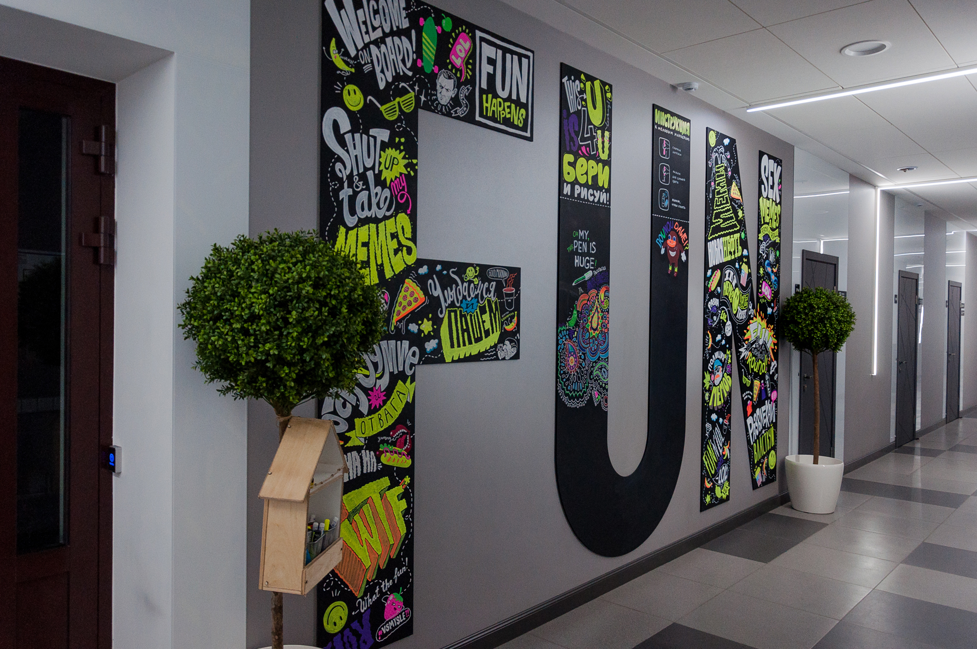
It all started with the fact that our department had the task of making huge letters FU N. So that from the floor to the ceiling, so that the maximum fun would be guaranteed to our guests from the very threshold of the office, and the employees would get a boost of vigor, passing by every day.
What does the designer do in such cases? Nothing.
Do it yourself - nothing.
We, graphic, product and interface designers, sit down in our chair (and often sit in it), open Adobe Illustrator and type FUN in corporate or any type that pleases the eye and send the file to the advertising production company ...
And we wait.
The guys will come soon and will implement our design in real life. They paste what should be pasted, paint what should be painted ... or what they do there, these advertisers. The designer usually only needs to evaluate the result and either rejoice or sob.
So I, the interface designer, opened Adobe Illustrator and typed this:

Very corporate, given that the brand's base color is black. On this, my work, in fact, ended, but in order to calm my conscience (and the management team), I made a mocap. Here it is:
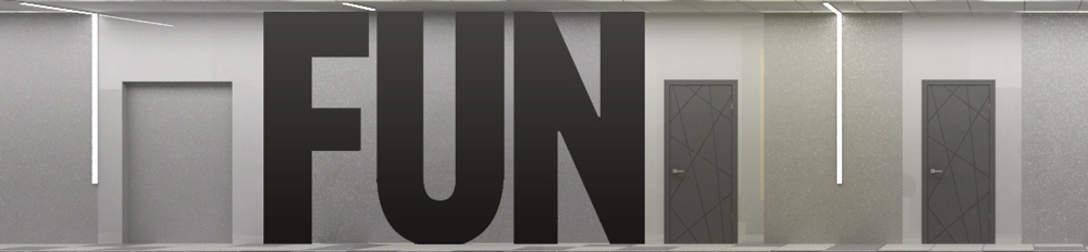
And this:

And it became obvious that the huge black letters are not fun at all.
Looking at them, I do not want to run frantically to work and develop as a specialist. They do not motivate, but even slightly oppress with their mourning appearance.
And this means that the task as a designer has not been solved. Having realized this, our department gathered for a brainstorm, the result of which was the decision to maximize the mission of FUN letters, filling them with vivid content. Bright, interesting, daring and, of course, corporate. This meant the development of a unique 3 by 5 meter illustration. Illustration implies the need for an illustrator, and God knows why I decided that this challenge is for me.
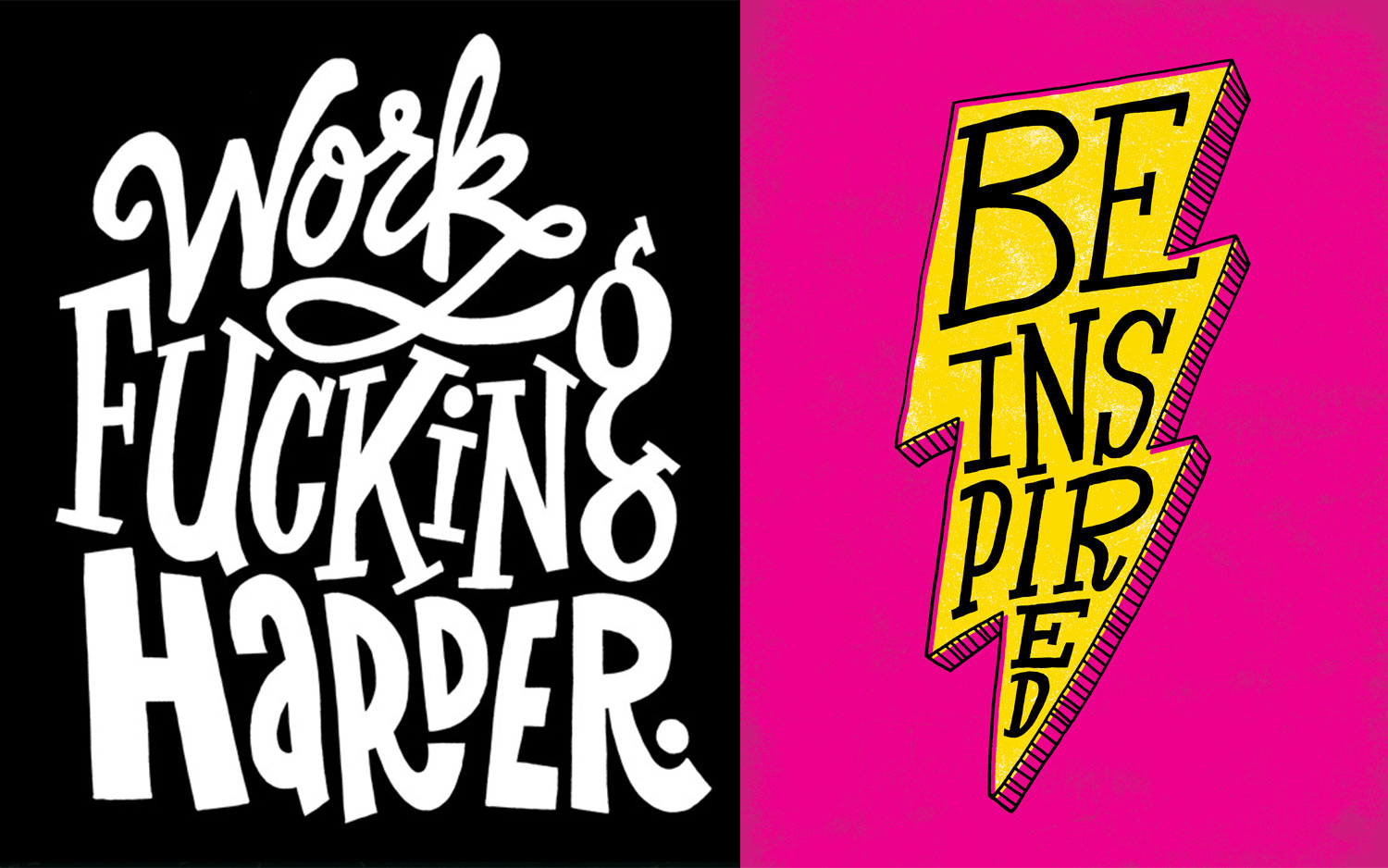
Lettering (English lettering - drawing letters) gives the artist the freedom to turn the text into a drawing, supporting and enhancing its semantic content.
Jay Roeder This is
probably why lettering is so popular all over the world, because it has absorbed the strengths of two expressive means: drawing and text. Handwritten inscriptions and fonts were one of the significant trends in illustrative art last year, and you can be sure that lettering will continue to gain popularity in this. Indeed, while digital technologies are capturing an ever-increasing part of our lives, creative people are looking for ways to once again make design personal, to return the human element to it.
Timothy goodman
You know, there was one interesting study (alas, I don’t remember which company was conducted), where product labels were shown to consumers so that they would choose the most pleasant options. Then the marketers were very surprised to see that typewriting with a great margin prevailed over hand-drawn labels. People unconsciously appreciated the design drawn by hand.
Chris Piascik
And if we see few examples of lettering in everyday life and on the streets of our hometown, the reason for this is still the small popularization of this trend among the leaders of large and medium-sized businesses in Russia (at the moment). But this is an amazing thing, just take a look:
Jason Naylor

Chris Piascik
Business giants such as Google, Coca-Cola, Nickelodeon, Reebok, Converse, Nike, McDonalds, Facebook, Xbox, Forbes, Vogue, etc. boldly use lettering at a wide variety of events and in their products. And the work of Russian and foreign lettering masters can be found on Instagram and on Behance at the request of #lettering . We got acquainted, were impressed and realized that we had found a fresh stream and an ideal means for conveying our ideas.
In the world of Instagram, Behance and Dribble, you can now find many illustrators with their own unique styles, but if you (like me) are not one of them yet - do not worry. Own style is born from daily practice, and at the beginning we all look at the “greats”, analyze their work, recharge their energy and ideas.
One of the latest trends in illustration in 2017–2018 is doodling (from the English doodle, which can be translated as “scribbles”, and doodling is unconscious drawing).
Doodle - this is what our hand draws while the brain is busy with another matter (for example, talking on the phone or listening to lectures). If you connect the mind to the doodling, you get a very original, incredibly free illustrative style that captivated many.
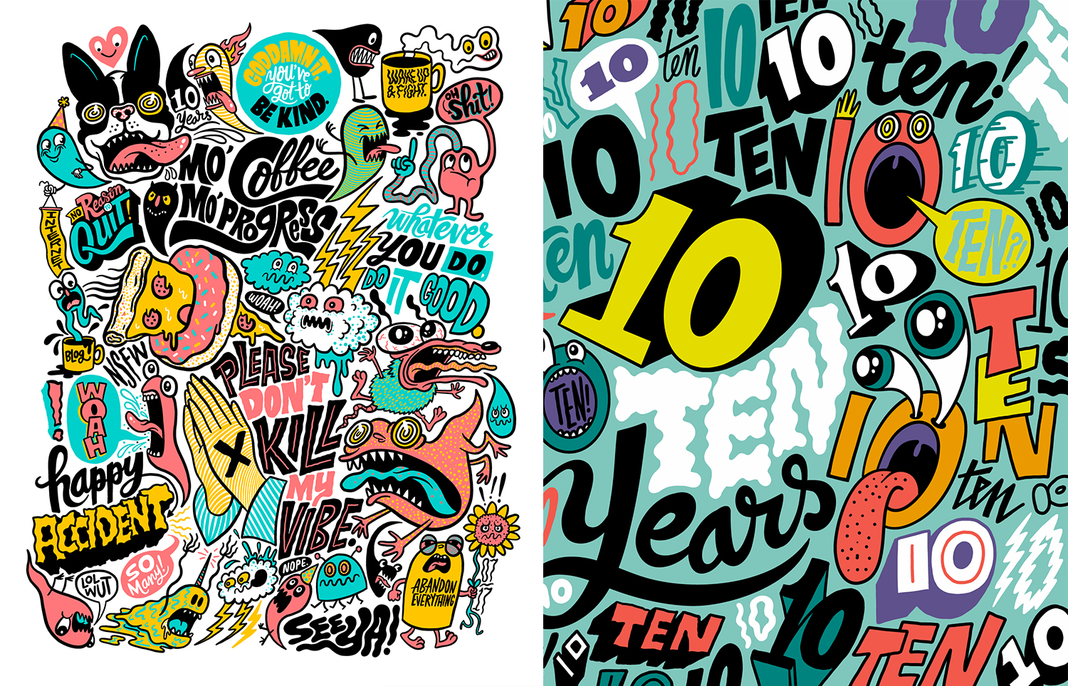
Choosing which direction to move, we involuntarily came up with the use of doodling. Its advantage is that in one canvas you can organically place many messages, images, phrases, slogans (and Easter eggs), combining them with a single style space. It’s interesting to look at it, reading it like a book, only in random order: from top to bottom, from right to left ...
Chris Piascik The
illustrators @timothygoodman, @andyjpizza, @ chrispiascik.
So, we decided on the style, it remains to generate the content, i.e. content of our illustration.
This was the second big reason why I, as a product designer, took on the task. Nobody knows and loves your company like you do. A guest illustrator can bring his own style, but he is not familiar with your brand, and the brand is a living creature. He has a certain collective personality with a set of individual qualities that managers so much like to list in the terms of reference for logo design in the “Describe your brand” column: young, innovative, reliable, stable, friendly ... Absorb all these 50 shades of the brand, rethink and broadcast in the form of a distinct design solution is quite difficult if you yourself do not cook in this saucepan. Therefore, working with a third-party specialist often requires a long synchronization between the customer and the performer, including divination by a magic ball,
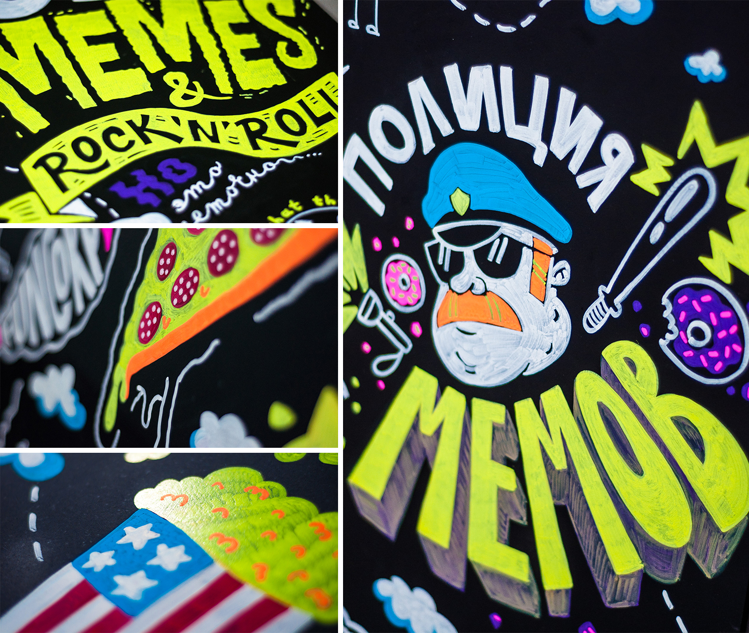
We decided that nobody knows better than us how much we value good fun, courage and thinking outside the scope of the task, hooliganism on the verge of trash, informality for the sake of productivity ... all that creates FunCorp.
And so the design and administration teams met for a brainstorming session and decided on the content theme. It looked something like this:
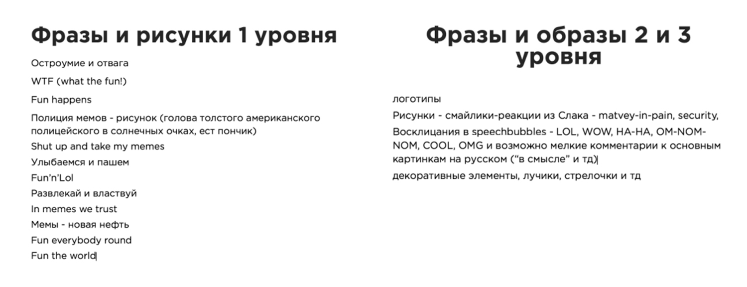
A hodgepodge came out of corporate slogans, mottos, ideas, just funny and congenial phrases, slightly peppered with Slack's internal jokes.
Then weeks of individual work followed in a bunch of iPad Pro + Apple Pencil + Adobe Draw, which I recommend for development to all interested people because of its high technological capabilities, incredible performance and convenience. As a result, the layout of the illustration was ready for transferring to the letters FUN, which by that time had been produced and mounted (I will talk about them a little more in the chapter on chalk markers).
Of course, it’s much faster and easier to print illustrations on self-adhesive film. Faster and cheaper. Cheaper and more boring. And Facebook would never do that, and Facebook knows a lot about the creative revitalization of the space of its offices!
In Europe and America there is a profession that is not in Russia, it is called signpainter. Translated, this is probably the artist "signage". These are people who in our digital era with brush and paint create signboards, window dressing and walls of buildings. Foreign artists were also greatly pressured by the invention of plotter cutting, but nevertheless, this profession exists and is now experiencing, perhaps, its Renaissance (the documentary SignPainters (2014) will introduce you to it).
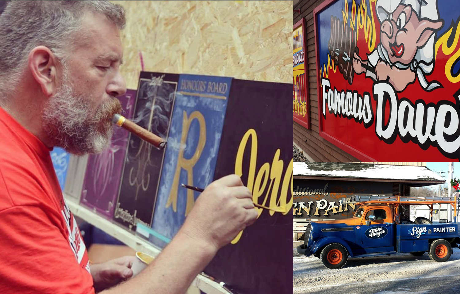
Mike Meyer
@copenhagensigns
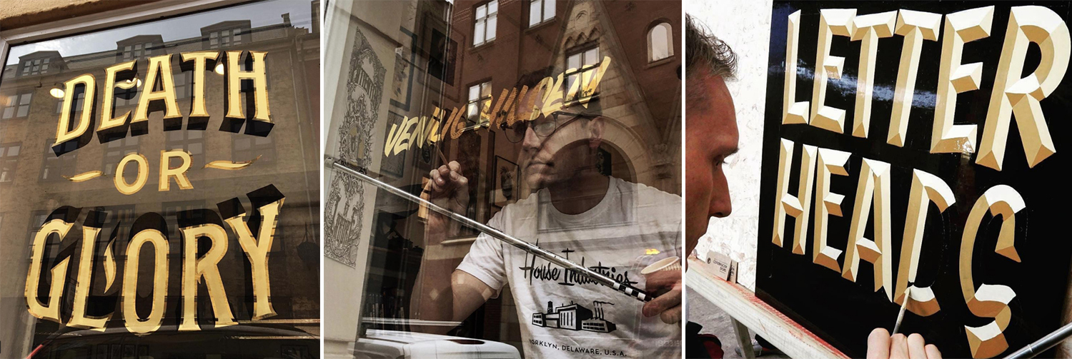
So why will hand-drawn or hand-painted always be valued higher than stamped, even if the plotter cuts out more evenly? Because this is how our brain works. We feel that a real person is behind this, his living work and talent, his vision of things, and we appreciate the opportunity to touch what enriches our visual culture.
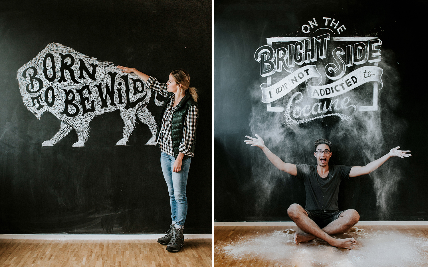
Stefan Kunz
We really wanted our FUN letters to be alive, to talk with the viewer, attract the eye and captivate his imagination, so we decided that the illustrations should be drawn on the surface of the letters in the most classic way - the hands of an illustrator. Inexperienced, but loving.
Even the designers of ancient Rome knew: ubi nihil vales, ibi nihil velis (lat.) - "where you can’t do anything, you shouldn’t want anything there." A reasonable question: why climb into an area where you are unprofessional?
That is, perhaps in childhood you drew horses well, and now you draw interfaces well, and your grandmother calls you an artist, but when it comes to a task in the framework of brand design, is it wise to take responsibility for a business that you don’t even know how to approach At the risk of delivering unknown bullshit as a result, for which you will at best be deprived of a quarterly bonus?
I have no answer to this question. But I think that's about how we get out of our comfort zone. And the comfort zone in the creative profession is professional death.
I believe that, contrary to the prevailing stereotype, any designer is an artist. Even if he draws not with his hands, but with his head, working exclusively on the trackpad of his laptop. And when the product challenge (and the blessing of leadership) gives us, designers, a chance to step into a beautiful new world - it needs to be missed.
Acquaintance with the work of modern illustrators broke the stereotype in me that everyone should do their work, and the lot of the designer is the Adobe package. All these unusually talented artists unanimously reiterate: do not be afraid to start, do not be shy to look unprofessional, just take it and do it! And enjoy it!
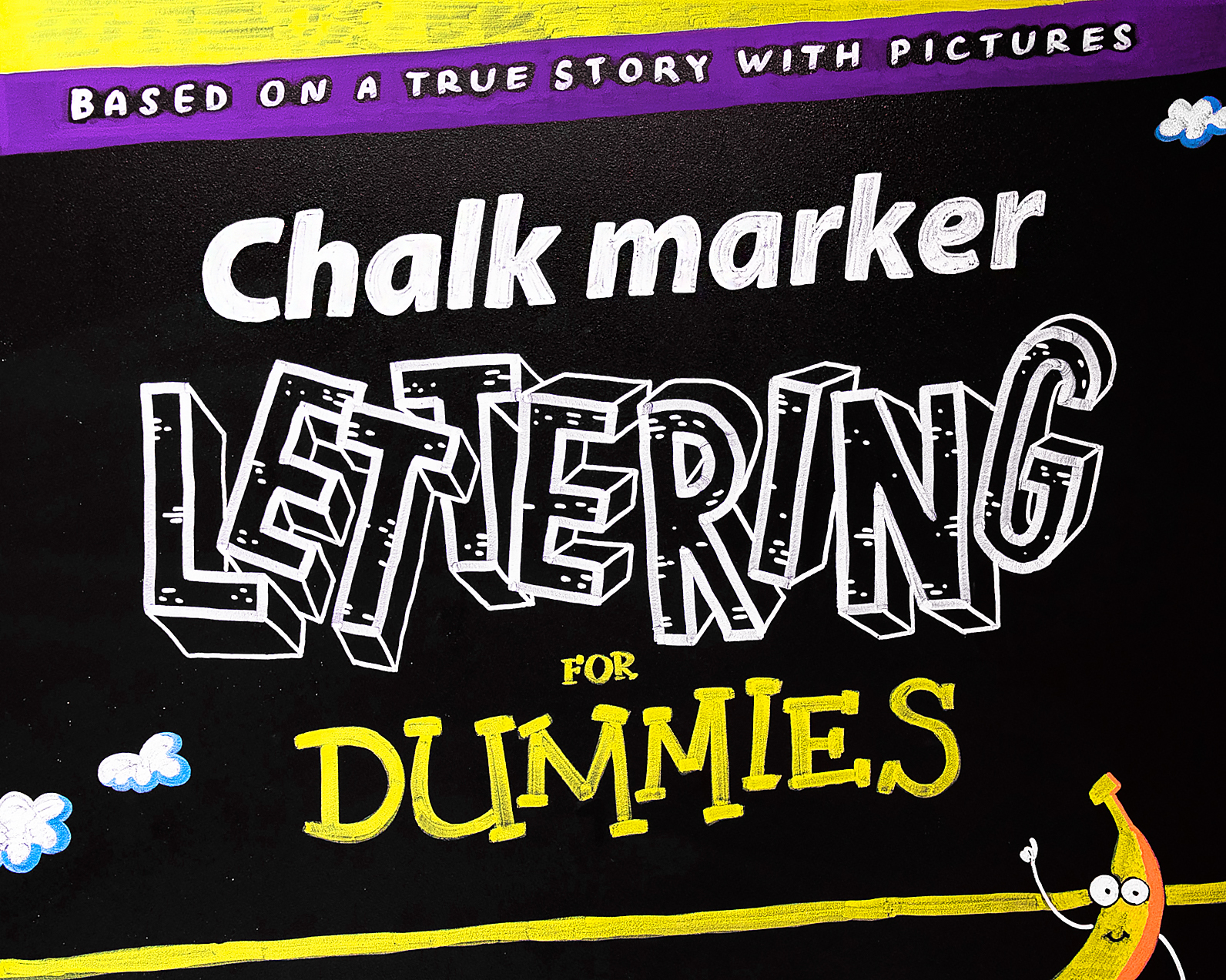
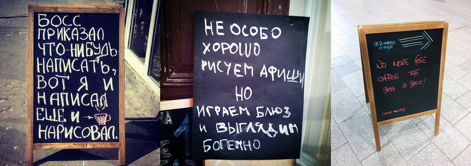
Chalk markers - this is what the barista of the whole world write on their boards "Cappuccino - 250 rubles."
It was the chalk markers we chose to transfer the image to our rather big black letters. “But they are erased!” - you say. "Exactly!" - we will answer. This means freedom to change the content of the illustration in the future. “Well, if the barista can, then I can do it!” - With this slogan, I started to study the lettering with chalk markers.
Immediately make a reservation, Cretaceous lettering and chalking with lettering are not exactly the same thing. The main difference between the Cretaceous markers from the Cretaceous is that the chalk leaves a more friable, heterogeneous trace; markers give a clean, dense line, do not crumble and are stable after drying. These are two similar, but different tools, and it would be illiterate to say that one is better than the other, as each solves its own problems. Cretaceous markers ideally solved our task.
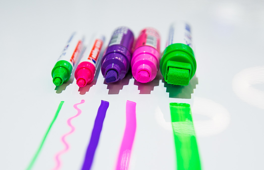
The chalk marker is also called paint marker, chalk ink, chalk pen, bistro marker, glass pen, liquid chalk, but more often chalk marker.
It's funny that this name does not correspond to reality, because, contrary to the stereotype, inside the chalk markers there is not liquid chalk, but special water-based pigment inks. This pigment has several winning points: it is resistant to ultraviolet radiation and does not fade in the sun, and it also has a very good “hiding power”, that is, it well overlaps the color of the surface on which it is applied. Due to this, a very saturated color of the picture is achieved. Chalk markers can be used on glass, plastic, metal, LED-board, slate paint and other solid, non-porous surfaces. The drawing is easily washed off with a sponge with water (and even better with a sponge with a special tool for washing off chalk markers).
You yourself, most likely, are already familiar with chalk markers as a tool for children's or office creativity. You may have seen chalk on the boards in restaurants, shops, weddings or banquets. Meanwhile, they certainly deserve more attention.
We tested the markers of these brands personally and were satisfied: Edding, Uni Chalk .
And these are other leading brands in the market: Zig, Molotow, VersaChalk .
The market is now flooded with chalk markers from a variety of companies (including Chinese ones), but it is better to trust well-known manufacturers. The average price of one marker varies from about 200 to 400 rubles., Depending on the size of the tip and the amount of ink in the tank.
How to choose quality chalk markers? The following criteria will help you:
It could be said that the quality of the chalk marker is primarily indicated by the density and brightness of the line, but these properties are difficult to evaluate by buying a marker in an online store, and most likely it will be more convenient for you to buy them there, like any highly specialized art product.
We chose eco-friendly and lightweight plywood for letters, high-quality primed and coated with special Blackboard paint. Slate paints are not uncommon now, and observing the painting technology, you will surely get a good result, whichever one you choose. I will give only a few tips:

We made about 7 small test letters, experimenting with various combinations of materials, until we finally came to a combination of plywood and matte slate paint. This combo with brilliance passed the test (we draw - we evaluate the brightness and consistency of the stroke - we erase it with a wet rag - we dry it - we evaluate the cleanliness of the canvas - we pick it with a fingernail, we scratch it - we evaluate the strength).
But you can use chalk markers not only on surfaces with slate paint. There are many other options where you can use them for your business:


Our letters began to fulfill a fun mission already in the process of drawing, since all the employees passing along the corridor had fun contemplating the UX designer, either hanging on a stepladder under the ceiling, or lying on a rug on the floor and painstakingly painting certain areas of letters. :-)
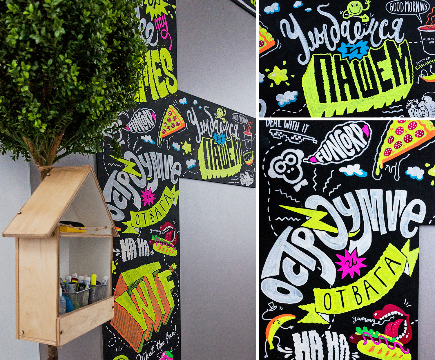
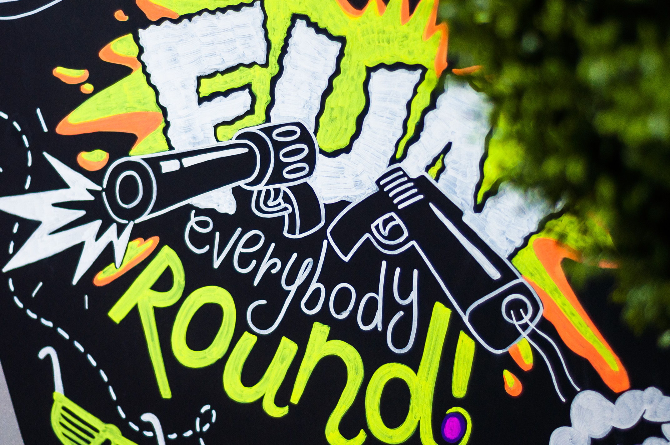
We also decided to leave room for colleagues to work daily, so the middle letter U was given for use to everyone to relieve stress and draw freely.
I want to share my experience with those who are inspired by the idea of chalk-marker drawing. The following tips will hopefully save you from newbie mistakes.
PS It’s hard to say why I wrote this article: either to inspire designers to get out of the chair more often and not be afraid to do something with their own hands, or to convince brand managers of the creative potential of live lettering, doodle illustrations, non-standard materials ... But if at least someone, having read it, decides to pick up a marker and write something - this will undoubtedly be an excellent result!
I will talk about what lettering in modern design is based on the example of my work on an art object; about the difficulties that I encountered and how I solved them; about slate paint and chalk markers. And why is it “good for business”. And there will be a little motivation for designers who would like to get out of the chair, but do not know how.
It all started with the fact that our department had the task of making huge letters FU N. So that from the floor to the ceiling, so that the maximum fun would be guaranteed to our guests from the very threshold of the office, and the employees would get a boost of vigor, passing by every day.
What does the designer do in such cases? Nothing.
How does a designer do nothing?
Do it yourself - nothing.
We, graphic, product and interface designers, sit down in our chair (and often sit in it), open Adobe Illustrator and type FUN in corporate or any type that pleases the eye and send the file to the advertising production company ...
And we wait.
The guys will come soon and will implement our design in real life. They paste what should be pasted, paint what should be painted ... or what they do there, these advertisers. The designer usually only needs to evaluate the result and either rejoice or sob.
So I, the interface designer, opened Adobe Illustrator and typed this:
Very corporate, given that the brand's base color is black. On this, my work, in fact, ended, but in order to calm my conscience (and the management team), I made a mocap. Here it is:
And this:
And it became obvious that the huge black letters are not fun at all.
Looking at them, I do not want to run frantically to work and develop as a specialist. They do not motivate, but even slightly oppress with their mourning appearance.
And this means that the task as a designer has not been solved. Having realized this, our department gathered for a brainstorm, the result of which was the decision to maximize the mission of FUN letters, filling them with vivid content. Bright, interesting, daring and, of course, corporate. This meant the development of a unique 3 by 5 meter illustration. Illustration implies the need for an illustrator, and God knows why I decided that this challenge is for me.
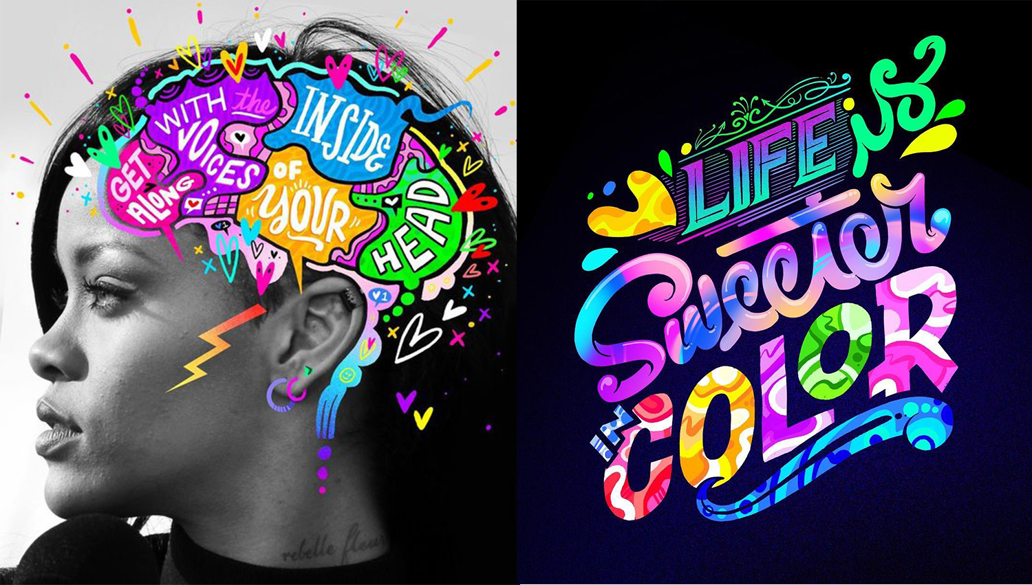
The whole world chooses lettering, and we also chose
Lettering (English lettering - drawing letters) gives the artist the freedom to turn the text into a drawing, supporting and enhancing its semantic content.
Jay Roeder This is
probably why lettering is so popular all over the world, because it has absorbed the strengths of two expressive means: drawing and text. Handwritten inscriptions and fonts were one of the significant trends in illustrative art last year, and you can be sure that lettering will continue to gain popularity in this. Indeed, while digital technologies are capturing an ever-increasing part of our lives, creative people are looking for ways to once again make design personal, to return the human element to it.
Timothy goodman
You know, there was one interesting study (alas, I don’t remember which company was conducted), where product labels were shown to consumers so that they would choose the most pleasant options. Then the marketers were very surprised to see that typewriting with a great margin prevailed over hand-drawn labels. People unconsciously appreciated the design drawn by hand.
Chris Piascik
And if we see few examples of lettering in everyday life and on the streets of our hometown, the reason for this is still the small popularization of this trend among the leaders of large and medium-sized businesses in Russia (at the moment). But this is an amazing thing, just take a look:
Jason Naylor
Chris Piascik
Business giants such as Google, Coca-Cola, Nickelodeon, Reebok, Converse, Nike, McDonalds, Facebook, Xbox, Forbes, Vogue, etc. boldly use lettering at a wide variety of events and in their products. And the work of Russian and foreign lettering masters can be found on Instagram and on Behance at the request of #lettering . We got acquainted, were impressed and realized that we had found a fresh stream and an ideal means for conveying our ideas.
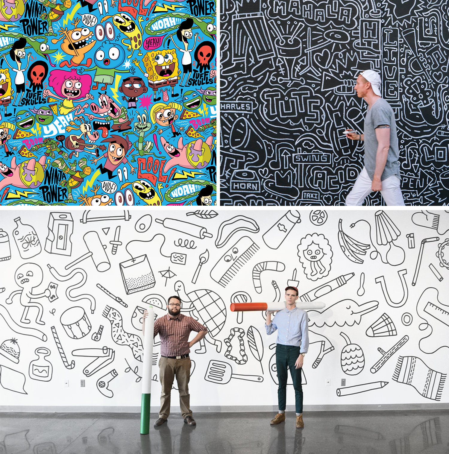
Doodling is another new word and cool illustrative style.
In the world of Instagram, Behance and Dribble, you can now find many illustrators with their own unique styles, but if you (like me) are not one of them yet - do not worry. Own style is born from daily practice, and at the beginning we all look at the “greats”, analyze their work, recharge their energy and ideas.
One of the latest trends in illustration in 2017–2018 is doodling (from the English doodle, which can be translated as “scribbles”, and doodling is unconscious drawing).
Doodle - this is what our hand draws while the brain is busy with another matter (for example, talking on the phone or listening to lectures). If you connect the mind to the doodling, you get a very original, incredibly free illustrative style that captivated many.
Choosing which direction to move, we involuntarily came up with the use of doodling. Its advantage is that in one canvas you can organically place many messages, images, phrases, slogans (and Easter eggs), combining them with a single style space. It’s interesting to look at it, reading it like a book, only in random order: from top to bottom, from right to left ...
Chris Piascik The
illustrators @timothygoodman, @andyjpizza, @ chrispiascik.
Well, what are we going to draw?
So, we decided on the style, it remains to generate the content, i.e. content of our illustration.
This was the second big reason why I, as a product designer, took on the task. Nobody knows and loves your company like you do. A guest illustrator can bring his own style, but he is not familiar with your brand, and the brand is a living creature. He has a certain collective personality with a set of individual qualities that managers so much like to list in the terms of reference for logo design in the “Describe your brand” column: young, innovative, reliable, stable, friendly ... Absorb all these 50 shades of the brand, rethink and broadcast in the form of a distinct design solution is quite difficult if you yourself do not cook in this saucepan. Therefore, working with a third-party specialist often requires a long synchronization between the customer and the performer, including divination by a magic ball,
We decided that nobody knows better than us how much we value good fun, courage and thinking outside the scope of the task, hooliganism on the verge of trash, informality for the sake of productivity ... all that creates FunCorp.
And so the design and administration teams met for a brainstorming session and decided on the content theme. It looked something like this:
A hodgepodge came out of corporate slogans, mottos, ideas, just funny and congenial phrases, slightly peppered with Slack's internal jokes.
Then weeks of individual work followed in a bunch of iPad Pro + Apple Pencil + Adobe Draw, which I recommend for development to all interested people because of its high technological capabilities, incredible performance and convenience. As a result, the layout of the illustration was ready for transferring to the letters FUN, which by that time had been produced and mounted (I will talk about them a little more in the chapter on chalk markers).
Drawn live better than printed
Of course, it’s much faster and easier to print illustrations on self-adhesive film. Faster and cheaper. Cheaper and more boring. And Facebook would never do that, and Facebook knows a lot about the creative revitalization of the space of its offices!
In Europe and America there is a profession that is not in Russia, it is called signpainter. Translated, this is probably the artist "signage". These are people who in our digital era with brush and paint create signboards, window dressing and walls of buildings. Foreign artists were also greatly pressured by the invention of plotter cutting, but nevertheless, this profession exists and is now experiencing, perhaps, its Renaissance (the documentary SignPainters (2014) will introduce you to it).
Mike Meyer
@copenhagensigns
So why will hand-drawn or hand-painted always be valued higher than stamped, even if the plotter cuts out more evenly? Because this is how our brain works. We feel that a real person is behind this, his living work and talent, his vision of things, and we appreciate the opportunity to touch what enriches our visual culture.
Stefan Kunz
We really wanted our FUN letters to be alive, to talk with the viewer, attract the eye and captivate his imagination, so we decided that the illustrations should be drawn on the surface of the letters in the most classic way - the hands of an illustrator. Inexperienced, but loving.
Is it wise to draw if you are not an artist?
Even the designers of ancient Rome knew: ubi nihil vales, ibi nihil velis (lat.) - "where you can’t do anything, you shouldn’t want anything there." A reasonable question: why climb into an area where you are unprofessional?
That is, perhaps in childhood you drew horses well, and now you draw interfaces well, and your grandmother calls you an artist, but when it comes to a task in the framework of brand design, is it wise to take responsibility for a business that you don’t even know how to approach At the risk of delivering unknown bullshit as a result, for which you will at best be deprived of a quarterly bonus?
I have no answer to this question. But I think that's about how we get out of our comfort zone. And the comfort zone in the creative profession is professional death.
I believe that, contrary to the prevailing stereotype, any designer is an artist. Even if he draws not with his hands, but with his head, working exclusively on the trackpad of his laptop. And when the product challenge (and the blessing of leadership) gives us, designers, a chance to step into a beautiful new world - it needs to be missed.
Acquaintance with the work of modern illustrators broke the stereotype in me that everyone should do their work, and the lot of the designer is the Adobe package. All these unusually talented artists unanimously reiterate: do not be afraid to start, do not be shy to look unprofessional, just take it and do it! And enjoy it!
Chalk markers and what they eat with
Chalk markers - this is what the barista of the whole world write on their boards "Cappuccino - 250 rubles."
It was the chalk markers we chose to transfer the image to our rather big black letters. “But they are erased!” - you say. "Exactly!" - we will answer. This means freedom to change the content of the illustration in the future. “Well, if the barista can, then I can do it!” - With this slogan, I started to study the lettering with chalk markers.
Immediately make a reservation, Cretaceous lettering and chalking with lettering are not exactly the same thing. The main difference between the Cretaceous markers from the Cretaceous is that the chalk leaves a more friable, heterogeneous trace; markers give a clean, dense line, do not crumble and are stable after drying. These are two similar, but different tools, and it would be illiterate to say that one is better than the other, as each solves its own problems. Cretaceous markers ideally solved our task.
The chalk marker is also called paint marker, chalk ink, chalk pen, bistro marker, glass pen, liquid chalk, but more often chalk marker.
It's funny that this name does not correspond to reality, because, contrary to the stereotype, inside the chalk markers there is not liquid chalk, but special water-based pigment inks. This pigment has several winning points: it is resistant to ultraviolet radiation and does not fade in the sun, and it also has a very good “hiding power”, that is, it well overlaps the color of the surface on which it is applied. Due to this, a very saturated color of the picture is achieved. Chalk markers can be used on glass, plastic, metal, LED-board, slate paint and other solid, non-porous surfaces. The drawing is easily washed off with a sponge with water (and even better with a sponge with a special tool for washing off chalk markers).
You yourself, most likely, are already familiar with chalk markers as a tool for children's or office creativity. You may have seen chalk on the boards in restaurants, shops, weddings or banquets. Meanwhile, they certainly deserve more attention.
How to choose good chalk markers?
We tested the markers of these brands personally and were satisfied: Edding, Uni Chalk .
And these are other leading brands in the market: Zig, Molotow, VersaChalk .
The market is now flooded with chalk markers from a variety of companies (including Chinese ones), but it is better to trust well-known manufacturers. The average price of one marker varies from about 200 to 400 rubles., Depending on the size of the tip and the amount of ink in the tank.
How to choose quality chalk markers? The following criteria will help you:
- double-sided tip at the marker (when one side fails, it can be turned over and reused, also one side is oval and the other is beveled);
- a large palette of colors in the line, the presence of fluorescent colors, the presence of a line of tips of different diameters and shapes;
- refillable ink tank (this is very rare: I found refill only for Molotow CHALK markers).
It could be said that the quality of the chalk marker is primarily indicated by the density and brightness of the line, but these properties are difficult to evaluate by buying a marker in an online store, and most likely it will be more convenient for you to buy them there, like any highly specialized art product.
What can you draw with chalk markers?
We chose eco-friendly and lightweight plywood for letters, high-quality primed and coated with special Blackboard paint. Slate paints are not uncommon now, and observing the painting technology, you will surely get a good result, whichever one you choose. I will give only a few tips:
- choose a surface that is well primed, and do not neglect the quality primer;
- Before buying paint, contact the manufacturer and specify the properties. Slate colors are matte and glossy (it is better to choose in advance which effect you want to get);
- make a sample of the product, and if necessary, not one.
We made about 7 small test letters, experimenting with various combinations of materials, until we finally came to a combination of plywood and matte slate paint. This combo with brilliance passed the test (we draw - we evaluate the brightness and consistency of the stroke - we erase it with a wet rag - we dry it - we evaluate the cleanliness of the canvas - we pick it with a fingernail, we scratch it - we evaluate the strength).
But you can use chalk markers not only on surfaces with slate paint. There are many other options where you can use them for your business:
- on glass (the design of glass windows and windows. Pictures can be changed at least every week, however, you have to get hold of an artist in the state);
- on a mirror (for decorating the interior or other non-trivial ideas);
- on metal and plastic (for temporary branding of products or to write a joke on a colleague's favorite mug or instructions for a coffee maker);
- on marker and magnetic boards of all types (to make your presentation or report more vivid and vibrant).
FUN letters are ready
Our letters began to fulfill a fun mission already in the process of drawing, since all the employees passing along the corridor had fun contemplating the UX designer, either hanging on a stepladder under the ceiling, or lying on a rug on the floor and painstakingly painting certain areas of letters. :-)
We also decided to leave room for colleagues to work daily, so the middle letter U was given for use to everyone to relieve stress and draw freely.
Life hacks for a beginner chalk marker artist
I want to share my experience with those who are inspired by the idea of chalk-marker drawing. The following tips will hopefully save you from newbie mistakes.
- Have a supply of markers, as they tend to end fairly quickly with intensive drawing. Buy immediately more than you need, so that later you do not have to reorder and interrupt the work process (as it turned out with us).
- Prepare a stepladder, various sponges and cotton buds for error correction, microfiber cloths, washing liquid - all this you need.
- Before applying the drawing to the surface, make and approve the layout (unless, of course, your design does not involve free meditative doodle drawing, as, say, Shantell Martin does. Then just “follow the line”).
- Очень большим подспорьем для переноса макета на реальную поверхность будет проектор. Это «читкод» для художника-любителя и гарантия того, что результат будет стопроцентно соответствовать вашему макету. Проектор помогает соблюсти точные пропорции и, бесспорно, значительно ускоряет работу.
- Протестируйте ваши маркеры, прежде чем приступать к работе. Привыкните к форме и толщине наконечников, узнайте на своем опыте, как пропитывать наконечник чернилами при рисовании, как сохранить его целостность, избегая сильных нажатий и «затирания». Некоторые чернила ярче и «укрывистее» прочих, некоторые можно наложить только в 1 слой, а затем они начинают соскребать нижние слои. Всё это можно узнать, только совершив несколько пробных рисунков.
- Для супер-насыщенного цвета ждите высыхания первого слоя и накладывайте второй и третий там, где это возможно.
- Цвета смешиваются! Вы можете пройти по фиолетовому слою желтым — и получите цвет хаки, по белому малиновым — и получите розовый. Также можно создавать градиенты, и это очень красиво. Смешивание цветов меловых маркеров не очень практично, потому что вы пачкаете наконечник маркера другим цветом. Хорошая новость в том, что его можно вынуть и промыть водой.
- Цвета смешиваются-2! Помните об этом, когда решите рисовать одним цветом поверх другого. Вы можете получить неожиданный результат, так как влажный верхний штрих растворит неподсохший нижний.
- Ну и напоследок приятный нюанс: маркеры, которые имеют в описании слово neon (неоновый), а также белый маркер неплохо флуоресцируют при УФ-освещении.
PS It’s hard to say why I wrote this article: either to inspire designers to get out of the chair more often and not be afraid to do something with their own hands, or to convince brand managers of the creative potential of live lettering, doodle illustrations, non-standard materials ... But if at least someone, having read it, decides to pick up a marker and write something - this will undoubtedly be an excellent result!