Compressing and improving handwritten notes
- Transfer
I wrote a program to clean scanned abstracts while reducing file size.
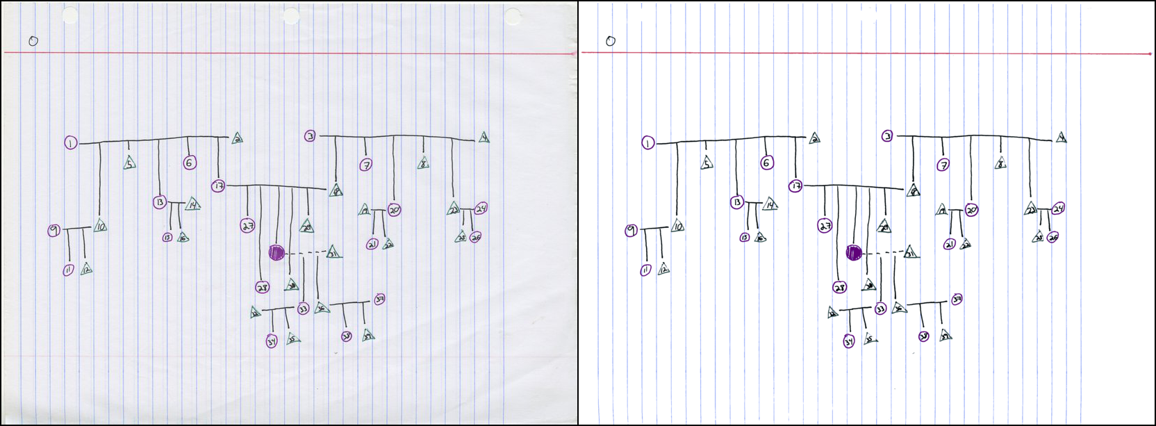
Original image and result:
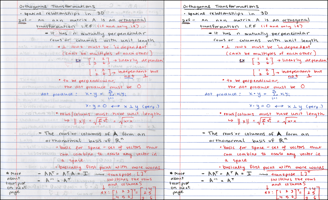
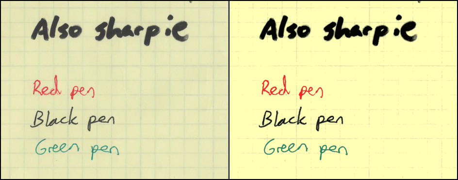
Left: initial scan at 300 DPI, 7.2 MB PNG / 790 KB JPG. Right: result with the same resolution, 121 KB PNG [1]
Note: the process described here is more or less the same as Office Lens . There are other similar programs. I am not saying that I came up with something radical new - it's just my implementation of a useful tool.
If you are in a hurry, just check out the GitHub repository or go to the results section , where you can play around with interactive 3D color cluster diagrams.
There are no textbooks on some of my subjects. For such students, I like to arrange weekly “correspondence” when they share their notes with the rest and check how much they have learned. Abstracts are posted on the course website in PDF format.
The faculty has a “smart” copier that immediately scans to PDF, but the result of such a scan ... is less than pleasant. Here are some examples of scanning a student’s homework:

It is as if a copier randomly chooses one of two things : either binarization of the character (x characters), or conversion to terrible JPEG blocks (square root characters). Obviously, such a result can be improved.
Let's start by scanning such a beautiful student abstract page:
The original 300 DPI PNG weighs about 7.2 MB. An image in JPG with a compression level of 85 takes about 790 KB 2. Since PDF is usually just a container for PNG or JPG, when converting to PDF you won’t compress the file even stronger. 800 kilobytes per page is quite a lot, and for the sake of speeding up the download, I would like to get something closer to 100 KB 3.
Although this student takes notes very carefully, the scan result looks a bit messy (not his fault). The reverse side of the sheet is noticeably visible, which distracts the reader and interferes with the effective compression of JPG or PNG compared to a flat background.
Here is what the program produces
This is a tiny PNG file that is only 121 KB in size. Do you know what I like the most? In addition to reducing the size, the synopsis has become more legible!
Here are the steps to create a compact and clean image:
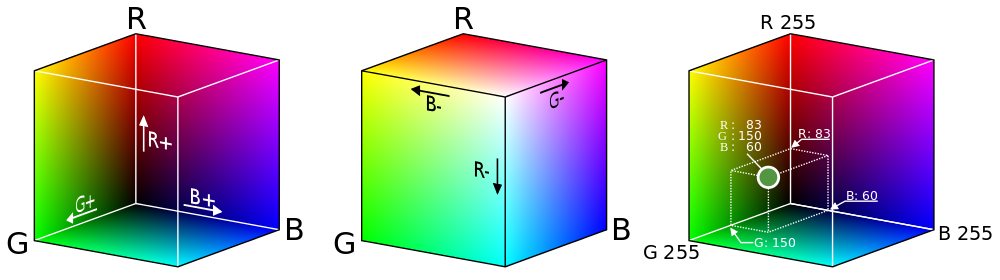
Before delving into the topic, it is useful to recall how color images are stored digitally. Since there are three types of color-sensitive cells in the human eye, we can restore any color by changing the intensity of red, green and blue light 4. The result is a system that assigns colors to the dots in the three-dimensional color space RGB 5. Although true vector space allows an infinite number of continuously changing intensity values, for digital storage, we sample colors, usually highlighting 8 bits for each channel: red, green, and blue. However, if we consider colors as points in a continuous three-dimensional space, then powerful tools for analysis become available, as shown further in the description of the process.
Since the main part of the page is blank, it can be expected that the color of the paper will be the most common color on the scanned image. And if the scanner always represented each point of blank paper as the same RGB triplet, we would not have problems. Unfortunately, this is not the case. Random changes in color occur due to dust and spots on the glass, color variations of the paper itself, noise on the sensor, etc. Thus, the actual “page color” can be distributed across thousands of different RGB values.
The original scanned image has a size of 2081 × 2531, the total area of 5,267,011 pixels. Although you can consider all the pixels, it’s much faster to take a representative sample of the original image. Program
It looks a little like a real scan - there is no text here, but the distribution of colors is almost identical. Both images are mostly grayish white, with a handful of red, blue, and dark gray pixels. Here are the same 10,000 pixels sorted by brightness (i.e., by the sum of the intensities of the R, G, and B channels):

If you look from afar, the lower 80-90% of the image seems to be the same color, but upon closer inspection, there are quite a lot of variations. In fact, the image most often contains a color with an RGB value (240, 240, 242), and it is represented by only 226 out of 10,000 pixels - not more than 3% of the total.
Since the mode represents such a small percentage of the sample, the question arises of how closely it corresponds to the distribution of colors. It is easier to determine the background color of the page if you first reduce the color depth . Here's what the sample looks like if you lower the depth from 8 to 4 bits per channel by zeroing out the four least significant bits :

Now the most common value is RGB (224, 224, 224), which is 3623 (36%) of the selected points. In fact, reducing the color depth, we grouped similar pixels into larger “baskets”, which made it easier to find the explicit peak 6.
There is a tradeoff between reliability and accuracy: small baskets provide better color accuracy, but large baskets are much more reliable. In the end, to select the background color, I settled on 6 bits per channel, which seemed like the best option between the two extremes.
After we have determined the background color, we need to select a threshold value for the remaining pixels according to the degree of proximity to the background. A natural way to determine the similarity of the two colors is to compute the Euclidean distance between their coordinates in the RGB space. But this simple method incorrectly segments some colors:

Here is a table with colors and Euclidean distance from the background:
As you can see, the dark gray color from the translucent ink that needs to be classified as a background is actually farther from the white color of the page than the pink color of the line that we want to classify as the foreground. Any threshold in the Euclidean distance, which makes pink the foreground, will certainly include translucent ink.
You can work around this problem by moving from the RGB space to the Hue-Saturation-Value (HSV) space , which converts the RGB cube into a cylinder, shown here in section 7.

In the HSV cylinder, a rainbow of colors is distributed around the circumference of the outer upper edge; value of hue (color tone) corresponds to an angle on the circumference. The central axis of the cylinder goes from black at the bottom to white at the top with gray shades in the middle - all this axis has zero saturation or color intensity, and for bright shades on the outer circle, the saturation is 1.0. Finally, the color value value characterizes the overall brightness of the color, from black at the bottom to bright shades at the top.
So, now let's look at our colors in the HSV model:
As expected, white, black and gray vary significantly in color value, but have similar low levels of saturation - much less than red or pink. Using the additional information in the HSV model, you can successfully mark a pixel as belonging to the foreground if it meets one of the criteria:
The first criterion takes black ink from the pen, and the second - red ink and a pink line. Both criteria successfully remove gray pixels from the translucent ink from the foreground. For different images, different saturation thresholds / color values can be used; see the results section for more information .
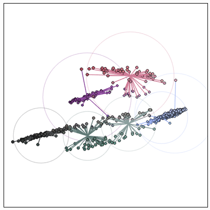
As soon as we isolated the foreground, we got a new set of colors corresponding to the marks on the page. Let's visualize it - but this time we will consider colors not as a set of pixels, but as 3D dots in the RGB color space. The resulting chart looks slightly “crowded”, with several stripes of related colors.

Link Interactive Chart
Now our goal is to convert the original 24-bit image to indexed colorby selecting a small number of colors (eight in this case) to represent the entire image. Firstly, it reduces the file size because the color is now determined by only three bits (since 8 = 2³). Secondly, the resulting image becomes more visually cohesive, because similar color ink dots are likely to be assigned the same color in the final image.
To do this, we use a method based on data from the crowded diagram mentioned above. If we choose the colors corresponding to the centers of the clusters, we get a set of colors that accurately represent the source data. From a technical point of view, we solve the problem of color quantization (which in itself is a special case of vector quantization ) using cluster analysis.
For this work, I chose a specific methodological tool - the k- means method . Its purpose is to find a set of averages or centers that minimize the average distance from each point to the nearest center. Here's what happens if you select seven different clusters in our dataset 8.

Here, dots with black outlines correspond to foreground colors, and colored lines connect them to the nearest center in the RGB space. When an image is converted to an indexed color, each foreground color is replaced by the color of the nearest center. Finally, large circles indicate the distance from each center to the farthest connected color.
In addition to setting thresholds for color and saturation, the program

The adjusted palette is brighter:

There is an option to force the background to white after isolating the foreground colors. To further reduce file sizes, it
At the output, the program produces such PDF-files with several images using the conversion program from ImageMagick. As an added bonus, it
Here are some more examples of program output. The first ( PDF ) looks great with default thresholds:
Visualization of color clusters:
For the following ( PDF ), it was necessary to lower the saturation threshold to 0.045, because the gray-blue lines are too dull:
Color clusters:

Finally, an example of a graph paper scan ( PDF ). For her, I set the threshold value to 0.05, because the contrast between the background and the lines is too small:
Color clusters:

Together, four PDF files occupy about 788 KB, an average of about 130 KB per page.
I am glad that I managed to create a useful tool that can be used in the preparation of PDF files with abstracts for my courses. In addition, I really liked preparing this article, especially because it prompted me to try to improve the important 2D visualizations that are shown in the Wikipedia article on color quantization , and also finally study three.js (a very funny tool, I will use it again )
If I ever return to this project, I would like to play with alternative quantization schemes. This week I came up with the idea of using spectral clustering on a graph of nearest neighborsin a set of colors - it seemed to me, I came up with an interesting new idea, but then I found an article in 2012 , which proposed just such an approach. Okay.
You can also try the EM-algorithm for the formation of a Gaussian model of the mixture , which describes the distribution of colors. Not sure if this was often done in the past. Other interesting ideas: an attempt to cluster in a “perceptually uniform” color space like L * a * b * , as well as an attempt to automatically determine the optimal number of clusters for a given image.
On the other hand, you need to deal with other topics for the blog, so for now I will leave this project and suggest you look at the repository
1. Samples of abstracts are presented with the generous permission of my students Ursula Monaghan and John Larkin. ↑
2. The image shown here is actually reduced to 150 DPI to make the page load faster. ↑
3. The only thing our copier does well is that it reduces the size of the PDF to 50-75 KB per page for documents of this type. ↑
4. Red, green, and blue are the primary colors in the additive model . A drawing teacher in elementary school could tell you that the primary colors are red, yellow and blue. This is a lie [a method of simplifying complex concepts in the education system - note. trans.]. However, there are three subtractive primary colors: yellow, purple, and cyan. Additive primary colors refer to combinations of light (which monitors emit), while subtractive colors refer to combinations of pigment in ink and inks. ↑
5. Image of Maklaan in Wikimedia Commons. License: CC BY-SA 3.0 ↑
6. Look at the tip distribution diagram on Wikipedia as another example of why increasing the size of the “basket” is useful. ↑
7. Image of user SharkD in Wikimedia Commons. License: CC BY-SA 3.0 ↑
8. Why is k = 7 and not 8? Because we need eight colors in the final image, and we have already set the background color ... ↑
9. Yes, I am looking at you, Image Capture from Mac OS ... ↑
Original image and result:
Left: initial scan at 300 DPI, 7.2 MB PNG / 790 KB JPG. Right: result with the same resolution, 121 KB PNG [1]
Note: the process described here is more or less the same as Office Lens . There are other similar programs. I am not saying that I came up with something radical new - it's just my implementation of a useful tool.
If you are in a hurry, just check out the GitHub repository or go to the results section , where you can play around with interactive 3D color cluster diagrams.
Motivation
There are no textbooks on some of my subjects. For such students, I like to arrange weekly “correspondence” when they share their notes with the rest and check how much they have learned. Abstracts are posted on the course website in PDF format.
The faculty has a “smart” copier that immediately scans to PDF, but the result of such a scan ... is less than pleasant. Here are some examples of scanning a student’s homework:
It is as if a copier randomly chooses one of two things : either binarization of the character (x characters), or conversion to terrible JPEG blocks (square root characters). Obviously, such a result can be improved.
General view
Let's start by scanning such a beautiful student abstract page:
The original 300 DPI PNG weighs about 7.2 MB. An image in JPG with a compression level of 85 takes about 790 KB 2. Since PDF is usually just a container for PNG or JPG, when converting to PDF you won’t compress the file even stronger. 800 kilobytes per page is quite a lot, and for the sake of speeding up the download, I would like to get something closer to 100 KB 3.
Although this student takes notes very carefully, the scan result looks a bit messy (not his fault). The reverse side of the sheet is noticeably visible, which distracts the reader and interferes with the effective compression of JPG or PNG compared to a flat background.
Here is what the program produces
noteshrink.py:
This is a tiny PNG file that is only 121 KB in size. Do you know what I like the most? In addition to reducing the size, the synopsis has become more legible!
Basics of color and processing
Here are the steps to create a compact and clean image:
- Determine the background color of the original scanned image.
- Isolate the foreground by setting the threshold to other colors.
- Convert to indexed PNG by selecting a small number of “representative colors” in the foreground.
Before delving into the topic, it is useful to recall how color images are stored digitally. Since there are three types of color-sensitive cells in the human eye, we can restore any color by changing the intensity of red, green and blue light 4. The result is a system that assigns colors to the dots in the three-dimensional color space RGB 5. Although true vector space allows an infinite number of continuously changing intensity values, for digital storage, we sample colors, usually highlighting 8 bits for each channel: red, green, and blue. However, if we consider colors as points in a continuous three-dimensional space, then powerful tools for analysis become available, as shown further in the description of the process.

Background color detection
Since the main part of the page is blank, it can be expected that the color of the paper will be the most common color on the scanned image. And if the scanner always represented each point of blank paper as the same RGB triplet, we would not have problems. Unfortunately, this is not the case. Random changes in color occur due to dust and spots on the glass, color variations of the paper itself, noise on the sensor, etc. Thus, the actual “page color” can be distributed across thousands of different RGB values.
The original scanned image has a size of 2081 × 2531, the total area of 5,267,011 pixels. Although you can consider all the pixels, it’s much faster to take a representative sample of the original image. Program
noteshrink.pyby default it takes 5% of the original image (more than enough for a 300 DPI scan). But let's look at an even smaller subset of 10,000 pixels randomly selected from the original image:It looks a little like a real scan - there is no text here, but the distribution of colors is almost identical. Both images are mostly grayish white, with a handful of red, blue, and dark gray pixels. Here are the same 10,000 pixels sorted by brightness (i.e., by the sum of the intensities of the R, G, and B channels):
If you look from afar, the lower 80-90% of the image seems to be the same color, but upon closer inspection, there are quite a lot of variations. In fact, the image most often contains a color with an RGB value (240, 240, 242), and it is represented by only 226 out of 10,000 pixels - not more than 3% of the total.
Since the mode represents such a small percentage of the sample, the question arises of how closely it corresponds to the distribution of colors. It is easier to determine the background color of the page if you first reduce the color depth . Here's what the sample looks like if you lower the depth from 8 to 4 bits per channel by zeroing out the four least significant bits :
Now the most common value is RGB (224, 224, 224), which is 3623 (36%) of the selected points. In fact, reducing the color depth, we grouped similar pixels into larger “baskets”, which made it easier to find the explicit peak 6.
There is a tradeoff between reliability and accuracy: small baskets provide better color accuracy, but large baskets are much more reliable. In the end, to select the background color, I settled on 6 bits per channel, which seemed like the best option between the two extremes.
Foreground highlight
After we have determined the background color, we need to select a threshold value for the remaining pixels according to the degree of proximity to the background. A natural way to determine the similarity of the two colors is to compute the Euclidean distance between their coordinates in the RGB space. But this simple method incorrectly segments some colors:
Here is a table with colors and Euclidean distance from the background:
| Color | Where found | R | G | B | Distance from background |
|---|---|---|---|---|---|
| white | background | 238 | 238 | 242 | - |
| Gray | seen from the back page | 160 | 168 | 166 | 129.4 |
| the black | front page ink | 71 | 73 | 71 | 290.4 |
| red | front page ink | 219 | 83 | 86 | 220.7 |
| pink | vertical line to the left | 243 | 179 | 182 | 84.3 |
As you can see, the dark gray color from the translucent ink that needs to be classified as a background is actually farther from the white color of the page than the pink color of the line that we want to classify as the foreground. Any threshold in the Euclidean distance, which makes pink the foreground, will certainly include translucent ink.
You can work around this problem by moving from the RGB space to the Hue-Saturation-Value (HSV) space , which converts the RGB cube into a cylinder, shown here in section 7.

In the HSV cylinder, a rainbow of colors is distributed around the circumference of the outer upper edge; value of hue (color tone) corresponds to an angle on the circumference. The central axis of the cylinder goes from black at the bottom to white at the top with gray shades in the middle - all this axis has zero saturation or color intensity, and for bright shades on the outer circle, the saturation is 1.0. Finally, the color value value characterizes the overall brightness of the color, from black at the bottom to bright shades at the top.
So, now let's look at our colors in the HSV model:
| Color | Color value | Saturation | Difference with background by value | Saturation difference with background |
|---|---|---|---|---|
| white | 0.949 | 0.017 | - | - |
| Gray | 0.659 | 0,048 | 0.290 | 0,031 |
| the black | 0.286 | 0,027 | 0.663 | 0.011 |
| red | 0.859 | 0.621 | 0,090 | 0.604 |
| pink | 0.953 | 0.263 | 0.004 | 0.247 |
As expected, white, black and gray vary significantly in color value, but have similar low levels of saturation - much less than red or pink. Using the additional information in the HSV model, you can successfully mark a pixel as belonging to the foreground if it meets one of the criteria:
- the color value differs by more than 0.3 from the background or
- saturation differs by more than 0.2 from the background
The first criterion takes black ink from the pen, and the second - red ink and a pink line. Both criteria successfully remove gray pixels from the translucent ink from the foreground. For different images, different saturation thresholds / color values can be used; see the results section for more information .
Select a set of representative colors
As soon as we isolated the foreground, we got a new set of colors corresponding to the marks on the page. Let's visualize it - but this time we will consider colors not as a set of pixels, but as 3D dots in the RGB color space. The resulting chart looks slightly “crowded”, with several stripes of related colors.
Link Interactive Chart
Now our goal is to convert the original 24-bit image to indexed colorby selecting a small number of colors (eight in this case) to represent the entire image. Firstly, it reduces the file size because the color is now determined by only three bits (since 8 = 2³). Secondly, the resulting image becomes more visually cohesive, because similar color ink dots are likely to be assigned the same color in the final image.
To do this, we use a method based on data from the crowded diagram mentioned above. If we choose the colors corresponding to the centers of the clusters, we get a set of colors that accurately represent the source data. From a technical point of view, we solve the problem of color quantization (which in itself is a special case of vector quantization ) using cluster analysis.
For this work, I chose a specific methodological tool - the k- means method . Its purpose is to find a set of averages or centers that minimize the average distance from each point to the nearest center. Here's what happens if you select seven different clusters in our dataset 8.
Here, dots with black outlines correspond to foreground colors, and colored lines connect them to the nearest center in the RGB space. When an image is converted to an indexed color, each foreground color is replaced by the color of the nearest center. Finally, large circles indicate the distance from each center to the farthest connected color.
Gadgets and bells and whistles
In addition to setting thresholds for color and saturation, the program
noteshrink.pyhas several other notable features. By default, it increases the brightness and contrast of the palette, changing the minimum and maximum intensity values to 0 and 255, respectively. Without this, the eight-color palette of our scanned sample would look like this:The adjusted palette is brighter:
There is an option to force the background to white after isolating the foreground colors. To further reduce file sizes, it
noteshrink.pycan automatically launch PNG optimization tools such as optipng , pngcrush and pngquant . At the output, the program produces such PDF-files with several images using the conversion program from ImageMagick. As an added bonus, it
noteshrink.pyautomatically sorts the file names numerically in ascending order (rather than alphabetically, like glob in the console). This is useful when your dumb scan program 9gives the output file names like scan 9.pngand scan 10.png, and you want the pages in the PDF to be in order.results
Here are some more examples of program output. The first ( PDF ) looks great with default thresholds:
Visualization of color clusters:
For the following ( PDF ), it was necessary to lower the saturation threshold to 0.045, because the gray-blue lines are too dull:
Color clusters:
Finally, an example of a graph paper scan ( PDF ). For her, I set the threshold value to 0.05, because the contrast between the background and the lines is too small:
Color clusters:
Together, four PDF files occupy about 788 KB, an average of about 130 KB per page.
Conclusions and Future Work
I am glad that I managed to create a useful tool that can be used in the preparation of PDF files with abstracts for my courses. In addition, I really liked preparing this article, especially because it prompted me to try to improve the important 2D visualizations that are shown in the Wikipedia article on color quantization , and also finally study three.js (a very funny tool, I will use it again )
If I ever return to this project, I would like to play with alternative quantization schemes. This week I came up with the idea of using spectral clustering on a graph of nearest neighborsin a set of colors - it seemed to me, I came up with an interesting new idea, but then I found an article in 2012 , which proposed just such an approach. Okay.
You can also try the EM-algorithm for the formation of a Gaussian model of the mixture , which describes the distribution of colors. Not sure if this was often done in the past. Other interesting ideas: an attempt to cluster in a “perceptually uniform” color space like L * a * b * , as well as an attempt to automatically determine the optimal number of clusters for a given image.
On the other hand, you need to deal with other topics for the blog, so for now I will leave this project and suggest you look at the repository
noteshrink.py on GitHub.Notes
1. Samples of abstracts are presented with the generous permission of my students Ursula Monaghan and John Larkin. ↑
2. The image shown here is actually reduced to 150 DPI to make the page load faster. ↑
3. The only thing our copier does well is that it reduces the size of the PDF to 50-75 KB per page for documents of this type. ↑
4. Red, green, and blue are the primary colors in the additive model . A drawing teacher in elementary school could tell you that the primary colors are red, yellow and blue. This is a lie [a method of simplifying complex concepts in the education system - note. trans.]. However, there are three subtractive primary colors: yellow, purple, and cyan. Additive primary colors refer to combinations of light (which monitors emit), while subtractive colors refer to combinations of pigment in ink and inks. ↑
5. Image of Maklaan in Wikimedia Commons. License: CC BY-SA 3.0 ↑
6. Look at the tip distribution diagram on Wikipedia as another example of why increasing the size of the “basket” is useful. ↑
7. Image of user SharkD in Wikimedia Commons. License: CC BY-SA 3.0 ↑
8. Why is k = 7 and not 8? Because we need eight colors in the final image, and we have already set the background color ... ↑
9. Yes, I am looking at you, Image Capture from Mac OS ... ↑