Windows 95 user interface design
- Transfer
 Three years ago I came across an interesting scientific article by Microsoft employee Kent Sullivan on the process and results of designing a new user interface for Windows 95. Since then, the web page has disappeared - one of the reasons why I am such a digital Plyushkin.
 The article describes some common problems of the Program Manager shell in Windows 3.1 and considers options for developing a separate shell for "newbies". I am inclined to believe that it was supposedly created in the spirit of Apple's At Ease program, which was quite popular in the days of System 7. I remember well how we started At Ease in elementary school, so the kids didn't have to bother with the hard drive in Finder.
So, this is what Kent wrote verbatim in his article entitled “The Windows 95 User Interface: A Case Study in Usability Engineering”. We publish it so that the document is never lost.
Summary
Many people are involved in developing the user interface for a large commercial software product like Microsoft Windows 95. This project has extensive tasks and an aggressive schedule. A summary of the project here describes the experience of successfully applying the principles of usability design, iterative development, and problem tracking to improve the manageability of the UI development process. Specific design problems and their solutions are also discussed.
Introduction
Windows 95 is an extensive update to Windows 3.1 and Windows for Workgroups 3.11. In almost all parts of Windows, many changes have occurred. The user interface was no exception. This article discusses the design team, its tasks and the work process. It then explains how the project applied usability design principles, such as iterative development and problem tracking. Specific design problems and their solutions are given as examples.
Design department
The Windows 95 UI Development Team was formed in October 1992 at an early stage of the project. I joined the group in December 1992 as an assistant to provide usability services. The team was truly multidisciplinary, with specialists in the fields of design, graphic design, usability testing and computer science. The number of employees fluctuated during the project, but on average there were twelve of us. There are as many programmers to implement the user interface.
Design goals
The design team worked on two very broad tasks:
- Making it easier to learn Windows for people who just started using computers and Windows.
- To make it easier to use Windows for people who have already worked with computers - both for ordinary users of Windows 3.1, and for advanced, experienced users of Windows 3.1.
With over 50 million installations of Windows 3.1 and 3.11 plus an almost untouched home PC market, it became clear from the very beginning that the task of releasing a better product would be a non-trivial exercise. Without careful design and testing, we are likely to make a product that improves usability only for a certain category of users, but worsens it for millions of others (existing or potential). We well understood the problems of average and advanced users, but knew little about the problems experienced by beginners.
Design process
Given the very broad tasks and the aggressive work schedule, before the product was released (it took about 18 months to design and program the user interface), we knew from the very beginning that the development using the traditional cascade model (“Waterfall”) would not provide us with sufficient flexibility to achieve the best solution . In fact, we were worried that the traditional approach would lead to the creation of an unusable system.
In a cascade model, system design is divided into parts (usually limited to the writing phase of specifications), and usability testing, as a rule, occurs closer to the end of the process during quality control activities. We realized that this is not enough to create a design, test it on users (perhaps in comparison with other designs), make changes and collect feedback. Fortunately, our desire to abandon the cascade model in favor of iterative development coincided with similar attempts in other departments of the company, so we had concrete examples of its advantages and applicability.
Iterative development in practice
In fig. 1 outlines our development process. It is typical of most products that are developed iteratively: design ideas have been tested as prototypes on paper or in digital form to collect laboratory usability data. After programming the design, it was refined in the laboratory. Upon reaching a sufficient level of coding and refinement, the project was studied more widely, over time, in a combat situation. Minor usability issues are immediately fixed before the finished product is released. More importantly, field-collected data is used to guide work on the next version.
Our iterative development process went through three main stages: study, rapid prototyping, and fine-tuning.
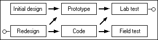
Fig. 1: Windows 95 Iterative Development Process
Study stage
At this first stage, we experimented with different areas of design and collected the first user reviews. We started with the solid foundation of visual UI design using the work done by the Cairo team. We inherited from them a significant part of the fundamental UI and interaction interfaces: desktop, tray (notification area), context menus, three-dimensional view, etc.). We also received data from the support service about the 20 main problems of Windows 3.1 users.
In fig. Figure 2 shows a prototype of the Windows 95 desktop design, the usability of which we tested in January 1993. The design is based on Cairo and includes the first pass to fix some of the known problems of Windows 3.1 (in particular, window management).
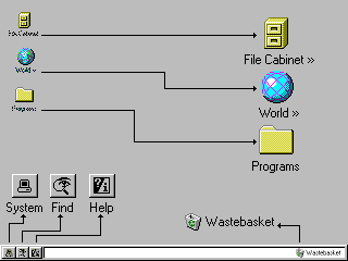
Fig. 2: An early version of the Windows 95 desktop (with callouts for clarity) The
upper File Cabinet icon opened up in the style of the Windows 3.1 file manager (hierarchy on the left, content on the right). The second World icon showed items on the network. The third Programs icon is a folder with other folders full of links to programs installed on the system. Along the bottom of the screen is a system tray with three buttons (System, Find and Help) and a file storage area. Another Wastebasket icon is a container of deleted files.
The usability studies of this prototype desktop were conducted at the Microsoft usability lab, as well as subsequent tests. We conducted typical iterative usability studies. From three to four users, each of which represented a separate group of interest (usually beginners and intermediate users of Windows 3.1), performed tasks on the prototype. During testing, we wanted to get answers to very broad questions (for example, do users like the interface) and very specific ones (for example, will a user detect within 10 minutes the ability to copy a file by dragging and dropping with the mouse). We collected typical data for iterative research: verbal protocols, task completion time, number of errors, types of errors and estimates.
First results
The usability testing of this prototype yielded many results, including some unexpected ones:
- Beginners and many average users were confused by the two-pane file manager interface (Fig. 3). They were not sure about the connection between the panels and how to move to other folders. Beginners were often struck by the visual complexity of the file manager - and they experienced more basic problems, such as a lack of understanding of the possibility of the existence of some folders inside other folders. Many users were confused by the Parent Folder icon. It appeared in each folder and looked like a file, although in fact it is a navigation element to go to the previous level of the hierarchy.
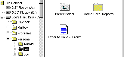
Fig. 3: File Cabinet, an earlier version of the file system manager - Users of all skill levels were confused by the Programs folder. We thought that having such a folder on the desktop with other folders and links to programs inside would be natural for Windows 3.1 users who are used to the program manager, and at the same time it would be relatively easy for newcomers to master it. We were wrong! Beginners quickly got lost in all folders (unlike File Cabinet, here each folder opened in a new window), and other users had many problems trying to figure out if they see the real file system and its files, or just links to real files.
- Users had significant difficulties in determining why each of the three buttons in the tray was needed, and later there were difficulties in remembering where to go to execute a specific command, because in certain contexts their functions intersected (for example, to search for something in the help section Help click Find or Help?)
Comparison with Windows 3.1
From the first laboratory experiments, it became clear that we needed a Windows 3.1 base to better understand what problems existed before Windows 95 and which problems are unique to the new design. First, we collected market research data on the 20 most common tasks that users of Windows 3.1 perform. Then we conducted several laboratory studies comparing Windows 3.1 and Windows 95 with these 20 tasks in mind. We also interviewed professional Windows 3.1 teachers (and Macintosh, for comparison) to understand what aspects of the operating system they consider simple and difficult to teach users.
Key results:
- In Windows 3.1, newcomers took an average of 9.5 minutes to find and open a program that is not immediately visible on the screen. In our prototype Windows 95, the results were not much better. Such results are clearly unacceptable given the fact that market research data (and common sense) indicated that launching programs for users is the number one task.
- New and some average users have had big problems using the mouse, especially double-clicking. As a result, they often could not find items in containers, access to which was opened only by double-clicking.
- Beginners and many average users relied almost exclusively on visual information to search for teams. They relied on menu bars and toolbars, but did not use pop-up (context) menus even after training.
- All but the most advanced users did not understand how to effectively manage multiple overlapping windows. Beginners most of all had problems - when minimizing the window, they thought that it “left” if it was closed by another window. We heard a lot of stories from teachers (and observed this in the laboratory), as users ran out of RAM on a computer, launching numerous copies of the program instead of switching to the first running copy. Average users showed more experience, but also had problems, especially with Multiple-Document-Interface (MDI) applications such as Program Manager and Microsoft Word. Market research data confirmed the problem: it turned out that 40% of average Windows users did not run more than one program at a time, because they had some difficulties with this.
- Beginner users were baffled by the hierarchical file system. Average users usually managed the hierarchy, but often did it with difficulty and saved all their documents in the default directory for the program they used. This problem (especially for beginners) was also observed among Macintosh users.
Change of direction
The results of these studies and interviews greatly changed the design of the Windows 95 user interface. In the early prototype of Windows 95, we specifically changed some elements of Windows 3.1 (for example, the Desktop element has now become a real container), while others have remained unchanged (for example, the file manager and program manager icons on the desktop), because they were afraid to change the design too much. We knew that a product with radical differences from Windows 3.1 could confuse and disappoint millions of existing users, which is clearly unacceptable.
However, the data collected in the prototype of Windows 95 and in Windows 3.1, showed the impossibility of maintaining the current design. The results of novice users in performing basic tasks were unacceptably poor, and many average users expressed the opinion that Windows 95 is just a different, but not the best system.
We decided to step back and think about the situation for several days. The design team held a field meeting outside the office and reviewed all the data collected at that time: basic usability studies, job interviews, market research, and support information. During the discussion of the data, we realized that we need to concentrate on the most frequently performed tasks. We also realized that we paid too much attention to connectivity with Windows 3.1.
In fact, we realized that a viable solution does not have to look like Windows 3.1, but it definitely should be attractive to users of any level, potentially for various reasons. We realized that a truly convenient system will scale in accordance with the needs of different users: it is easy to learn and learn, and at the same time it will provide efficiency (through shortcuts or alternative methods) for more experienced users.
Fast Iteration Stage
When we started working on a new design, we hoped to avoid the classic paradox of “easy to learn, but hard to use.” We constantly kept in mind that the basic functions of the UI should be scalable. We knew that in order to achieve this goal, it was necessary to quickly try out many different ideas, compare them and carry out a repetition of those that seem to be the most promising. This required very effective design and evaluation processes.
The evolution of the UI specification process
Although we chose the iterative development process from the very beginning, we still have one element of the cascade method: the monolithic design specifications (“specs”). In the first few months, specs grew rapidly and reflected hundreds of man-hours of work. But due to problems discovered during user testing, the design documented in the specs is suddenly out of date. An important decision was to be made: spend weeks changing specifications to reflect new ideas and lose valuable time needed for iterations, or stop updating specifications and let prototypes and code play the role of live specs.
After some debate, the group chose the second option. Although such a change made it difficult for outside groups to follow our work, it allowed iterations to be carried out at maximum speed. The changes also led to an unexpected effect: they rallied the team stronger, because most of the specifications existed verbally and were discussed in conversations and on a white board in the offices of employees. Many “corridor” conversations followed, which continued throughout the project.
So that all interested parties are always up to date with current design, we organized the following events:
- Regular meetings of the design department . At weekly (sometimes more often) meetings, everyone checked their work with the general project and everyone discussed how the work of each employee can affect others.
- Email usability charts and usability test results . Design team members received regular notifications of upcoming usability tests and the results of completed tests to keep abreast of how the design is progressing.
- Formal usability tracking . With a Windows 95-scale project, we realized that we needed a standard way to record identified usability problems, when and how they should be fixed - and then close tickets after fixing the problem and successfully validating users. This process is described in more detail in the chapter “Tracking open tickets”.
- Regular design presentations for outside groups . As the project progressed, more and more groups (inside and outside Microsoft) wanted to see what we were doing, so we made such presentations. They are more effective than sending out documents, because presentations are easier to keep up to date and they allow you to discuss design in a timely manner.
Separate UI for beginners
The first important design change we reviewed was a separate UI (“shell”) for novice users. The design was quickly sketched in Visual Basic and tested in the usability laboratory (Fig. 4). Testing showed a good result, since the design successfully limited the possible choice of user actions to a very small set of actions, but the more users participated in the testing, the more clearly the restrictions appeared:
- If the shell for beginners did not support only one desired function, then the user had to refuse to use the shell (at least temporarily).
- In theory, most users, after gaining experience, should leave the shell for beginners and go to the standard interface. But the experience they gained in the beginner shell does not necessarily transfer to the standard shell.
- The shell for beginners is generally not similar to all other programs that the user launches (text editors, spreadsheets, etc.). As a result, users had to learn two ways to interact with a computer, which was confusing.
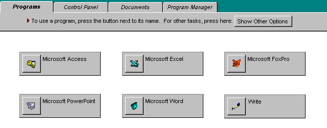
Fig. 4. Partial view of a separate shell for beginners.
For these and other reasons, we abandoned the idea. It is important to note that thanks to the prototyping tool and immediate testing at the usability laboratory, we still had a lot of time to test other ideas.
Fast Iteration Examples
Below is an overview of the five areas for which three or more large design iterations have been designed and tested. Iterations have been applied in many other areas, but there is not enough space to discuss them.
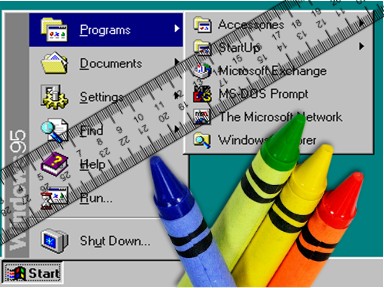
1. Launch programs: Start menu. Although we abandoned the idea of a separate shell for beginners, we retained its most useful functions: access by a single click, good distinguishability, interaction through the menu. We sketched many options in Visual Basic and tested them on users of all levels, not just beginners, because this design decision should have been well received by users of any level. Fig. 5 shows the final version of the "Start" menu and the "Programs" submenu. This menu serves not only to launch programs, but also combines other functions. All of them open with the click of a button.
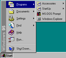
Fig. 5. The "Start" menu and the "Programs" submenu
2. Window management: taskbar. Our first idea of improving window management was not very ambitious, but we did not know how much work would be needed to solve the problem. The first idea was to change the appearance of minimized windows from icons to “tiles”. (fig. 6).

Fig. 6. Minimized windows in the form of "tiles"
We hoped that the problem could be resolved if the minimized windows were different in appearance and larger. We were wrong! Users experienced almost the same difficulties as in the case of Windows 3.1. The test results showed that the main problem is that the windows do not appear constantly, so that users do not see which windows are open, and can not quickly access them. Having realized this, we quickly came up with the idea of the taskbar shown in Fig. 7. Each task has its own place in the panel, which is displayed on top of all windows. User testing has shown that this is an acceptable solution to the problem.

Fig. 7. Taskbar with the "Start" button, programs and clocks
3. Working with files: "Open" and "Save as ..." dialogs. Information from the support service and the results of laboratory tests showed that beginners and average users experience many problems with system dialogs for opening and saving files (Fig. 8).
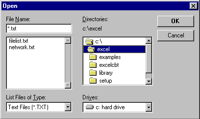
Fig. 8. The dialog box for opening a file in Windows 3.1.
Problems are caused by the fact that the fields of the dialog box are not in logical order and have a complex selection methodology. The Cairo team took the lead in solving this problem and developed a comprehensive prototype on Visual Basic, including a file system layout. We tested several options until we settled on the final version shown in Fig. 9.
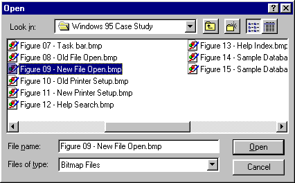
Fig. 9. File Open Dialog Box in Windows 95
4. Print: Setup Wizard. Information from the support service indicated that the installation and configuration of the printer was the main reason for calls from Windows 3.1 users. Many problems stem from the printer setup interface (Figure 10).
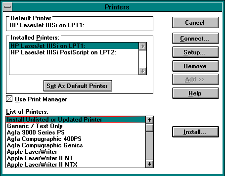
Fig. 10. The main printer installation dialog box in Windows 3.1
Finding the right printer is difficult because they are all on the same long list. To select a port, especially in a networked environment, it was necessary to go down to 4-5 levels with non-standard and complex choices. Around the time when we started to solve this problem, the design department employees began to consider the master (wizard) as a solution for multi-stage infrequently performed tasks. The installation of the printer fit perfectly into this definition, and the created wizard showed good results in testing on users. In fig. 11 shows a screen for selecting a printer from the final version of the wizard.

Fig. 11. The Add Printer Wizard screen in Windows 95
5. Help: search dialog and index tab. Laboratory testing of Windows 3.1 showed that users experience problems with the search dialog in the help section (Fig. 12).
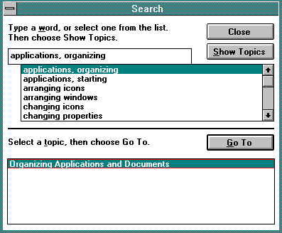
Fig. 12. Search dialog for help information in Windows 3.1.
People hardly understood that the dialog box essentially consists of two parts and that you must first select something from the first list, and then from the second, using different buttons. We tested several ideas before reaching the final version of the index tab (Fig. 13). There is only one list on this tab, and keywords with more than one topic trigger a pop-up dialog that is hard to miss.
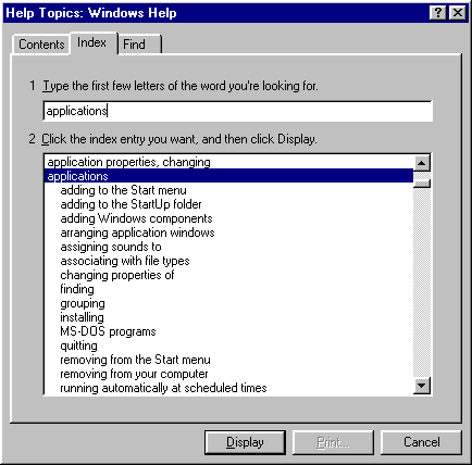
Fig. 13. Index tab in the Windows 95 help topic
Fine tuning phase
When we designed all the main areas of the product, we realized that we needed to take a step back and see how all the pieces fit together. For this, the final laboratory tests and a lengthy study with real users were carried out.
- Final laboratory tests . Using the 20 main tasks from market research, we conducted comprehensive testing of the entire UI. Users of different levels of training were offered isomorphic sets of tasks to measure the speed of learning and the level of use after development. We compared the performance with the basic level of Windows 3.1. After conducting his own pilot test to determine possible problems with the procedure, the final testing was carried out by an outside contractor, so these results can be used in official documents [3]. The results were very encouraging - users completed tasks about twice as fast as in Windows 3.1 and in 20 of the 21 categories showed more satisfaction with Windows 95.
- Long field study . Twenty people took part in a field study on the beta version of Windows 95. First, we studied how they work in Windows 3.1, and then watched the installation of Windows 95. Additional tests were carried out after a week and a month to check the level of training and the changes that occurred. We did not find any serious gaps in the usability of the product, but we corrected the wording in the UI and the topics in the reference section. Some of the collected data was subsequently used in planning the next version of Windows, as well as by the support staff, including a short list of topics that can be expected with the start of calls to the support team.
Tracking open tickets
During the development and testing of the Windows 95 user interface, we applied various principles and practices of usability development [2] [4]. With a Windows 95-scale project, we realized that we needed a standard way to record identified usability problems, when and how they should be fixed - and then close tickets after fixing the problem and successfully validating users.
For this, we developed a relational database (Fig. 14).
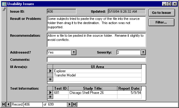
Fig. 14. Sample entry in the ticket database
After each stage of laboratory testing, I introduced new problems and positive results there and assigned an appropriate responsible person to each ticket - usually both a designer and a teacher who educates users. The status of current problems was updated - the ticket either remained open if additional work was required, or it was closed if the problem was resolved. Every few weeks I issued a series of reports listing all remaining problems for each responsible person and distributed them to employees (Fig. 15). We met to discuss the current progress and decided when the changed design would be ready for testing on users.
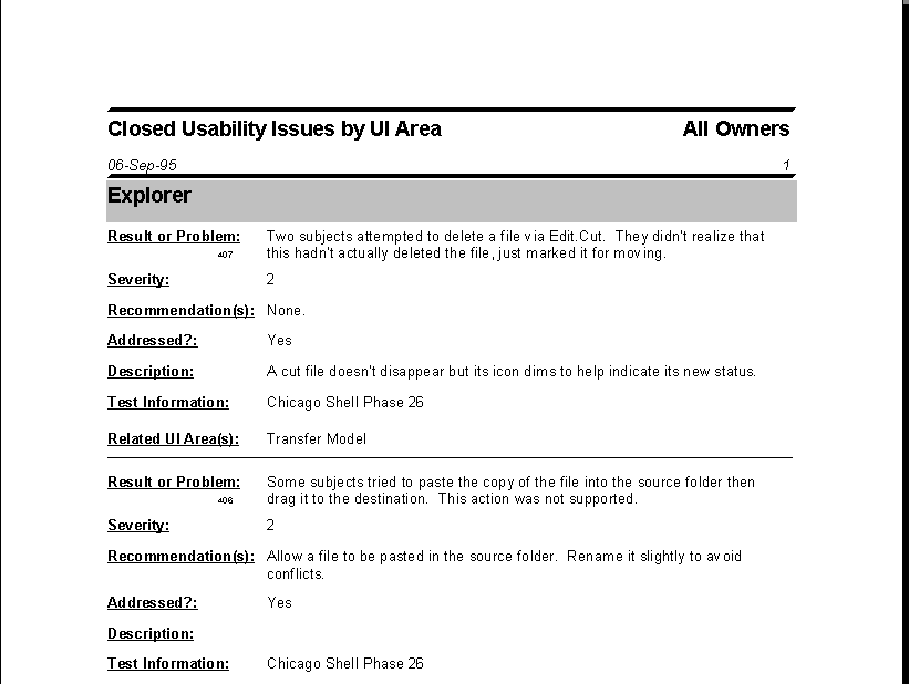
Fig. 15. Sample report in the ticket database
Report
As in any project, practice is a criterion of truth, so I will give some summary statistics.
Lab tests
We conducted 64 stages of laboratory testing with 560 users. 50% of them had average experience with Windows 3.1; the rest are beginners, advanced users and users of other operating systems. These numbers do not include testing components received from other teams (Exchange mail client, fax program, etc.). Testing of these components took place in approximately 25 stages with the participation of 175 people.
Problem identification
For key shell components during the project, 699 “usability reports” were entered into the database. Of these, 148 positive results and 551 problems. The problems were assigned one of three levels of severity:
- Level 1: Users cannot continue to complete a task or series of tasks.
- Level 2: Users experience significant difficulties in completing a task or series of tasks, but are still able to continue to complete it.
- Level 3: Users experience minor difficulties in completing a task or series of tasks.
Of the 551 identified problems, 15% received level 1, 43% - level 2 and 42% - level 3.
Problem Resolutions
The project used five resolutions on problems:
- It is resolved. The team fixed the problem and successfully tested the solution on users.
- Scheduled. The team has developed a fix for the problem and we look forward to its implementation.
- Questionable. The team is not sure whether to solve the problem, or does not know if its solution is possible.
- Partially. The team developed the solution and it was tested on users with satisfactory results, but still some questions remain.
- Not decided. The team is not going to solve the problem.
By the end of the project, all problems with resolutions “planned” or “in doubt” passed into one of the other categories. 81% of the problems ended with a successful solution, 8% remained with the resolution “partially”, and 11% remained unresolved. In most cases, the reason for the lack of a solution was technical limitations, and sometimes the limitations of the work schedule.
conclusions
For many department employees, the Windows 95 project was the first experience in iterative development, usability testing, and problem tracking.
Iterative development
Perhaps the best proof of our commitment to iterative development is that literally no detail of the original UI design for Windows 95 has been preserved unchanged in the final product. At the beginning of the design process, we did not expect the scale and scope of the changes that would have to be made. Iterative development using prototypes and a product as a specification, as well as continuous testing on users, allowed us to quickly explore many different ways to solve problems.
The group was so used to iterations of design that we felt a rush when, near the end of the project, we had to complete some of the latest design work. There was no time for iterations. We felt disappointed that there was no time to fine-tune and re-test the design.
Specification process
The “prototype or code are specifications” approach generally worked well, although over time we naturally refined the procedure. For example, all prototypes of a particular release began to be posted in the public domain (for all employees) with instructions for installing and launching them.
The design team edited the documents from the original specification and distributed them for early feedback. However, when prototyping and usability tests began, often specs sent readers to prototypes to obtain relevant information. In fact, we found that the prototype is a richer form of specification, requiring less time to create. At the same time, he has other useful applications (usability testing, demos, etc.). The prototype stimulates more meaningful reviews, because the reviewer does not need to connect the imagination so much to understand the system.
Usability testing
Although the design and iterative tests made it possible to create separate functions, it was the usability testing of the entire product that became the key to carefully fitting the individual parts to each other. As already mentioned, based on the data collected, we made changes to the wording of the UI and the topics in the reference section. If we had not conducted that testing, then the product would not have looked so efficient and enjoyable to work with.
Problem tracking
A high percentage of usability issues fixed would not have been possible without the intense dedication of all team members. The problem tracking framework has improved process control and ensures that problems do not slip out of sight. However, corrections would not have been made if the team did not believe in creating a product of the highest possible quality. The main thing in this faith was our understanding that we probably won’t get the right result the first time — and that the wrong result is just as useful and important for creating a product as the right one.
All tickets marked "partially" and "not decided" were transferred to a new database. They became the starting point for designing the next version of Windows. Planners and designers worked daily with this information, and also analyzed support reports.
List of references
1. Dumas, JS, Redish, JC (1993). A Practical Guide to Usability Testing (pp. 324-325). Norwood, NJ: Ablex Publishing Company.
2. Nielsen, J. (1993). Usability Engineering . San Diego, CA: Academic Press, Inc.
3. Usability Sciences Corporation. (1994). Windows 3.1 and Windows 95 Quantification of Learning Time & Productivity .
4. Whiteside, JL, Bennett, J, & Holtzblatt, K. (1988). Usability Engineering: Our Experience and Evolution. In M. Helander (Ed.), Handbook of Human-Computer Interaction (pp. 791-817). Amsterdam: Elsevier Science Publishers, BV
5. Wiklund, ME (1994). Usability in Practice: How Companies Develop User-Friendly Products. Cambridge, MA: Academic Press, Inc.