 October 24, 2017 at 20:24
Design for iPhone X. Guidelines for iOS 11
- Transfer
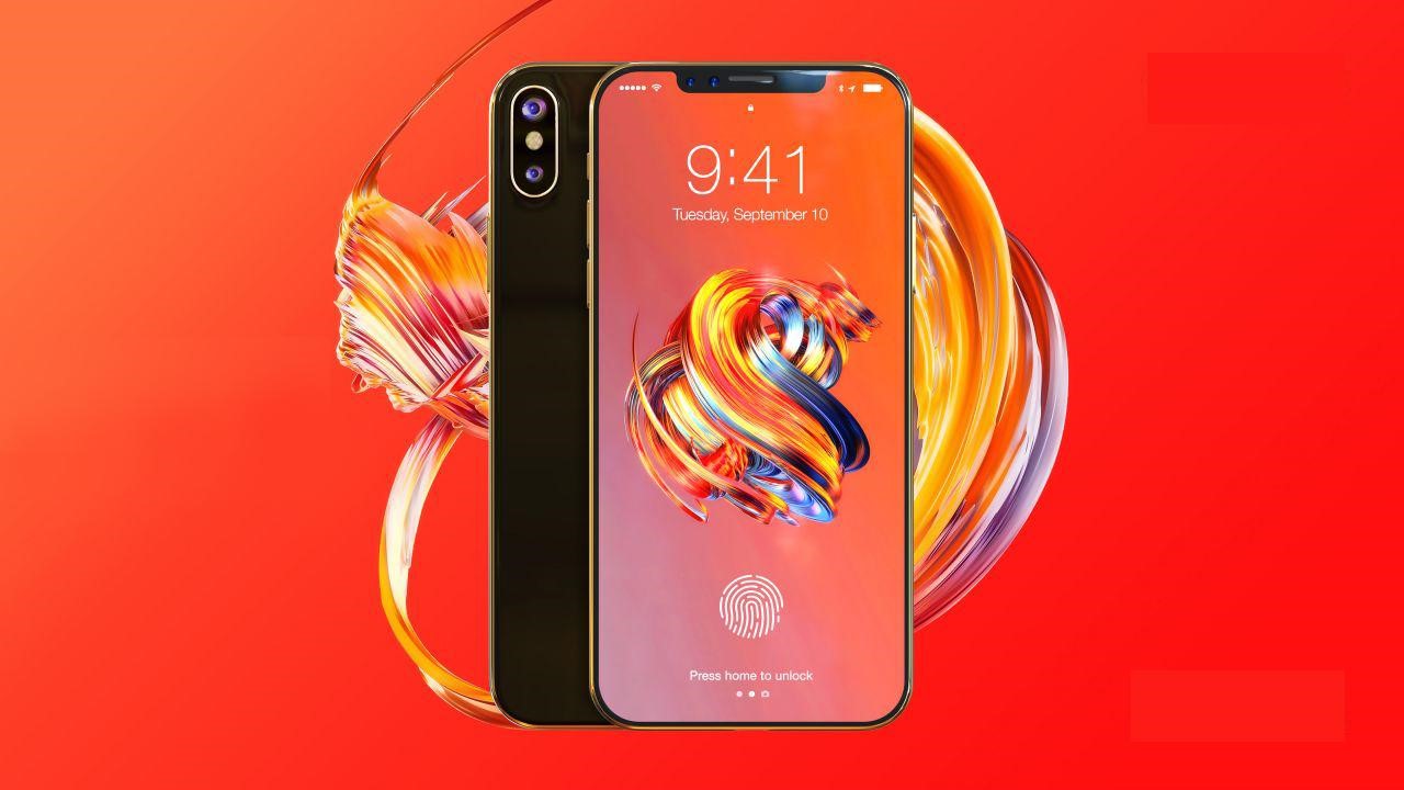
Along with iOS 11, the new iPhone X, an iPhone with the largest screen size, which actually has no boundaries, has appeared. The 5.8-inch OLED screen is even larger than the 5.5-inch screen of the iPhone 8 Plus, while the size of the case itself is about the same as that of the iPhone 8. For designers, this means more freedom in layouts.
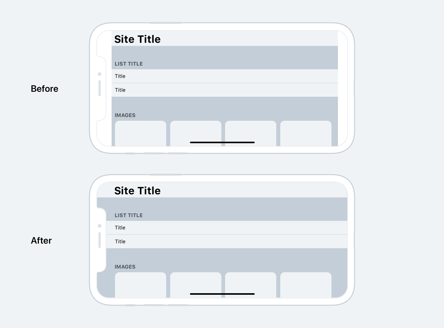
Large screen
An additional 145 pt provides space for yet another series of content. Or we can place on the screen a menu that previously did not fit there. These innovations apply to both the iPhone 8 and 8 Plus, as they have the same proportions, despite different resolutions.

More space for content
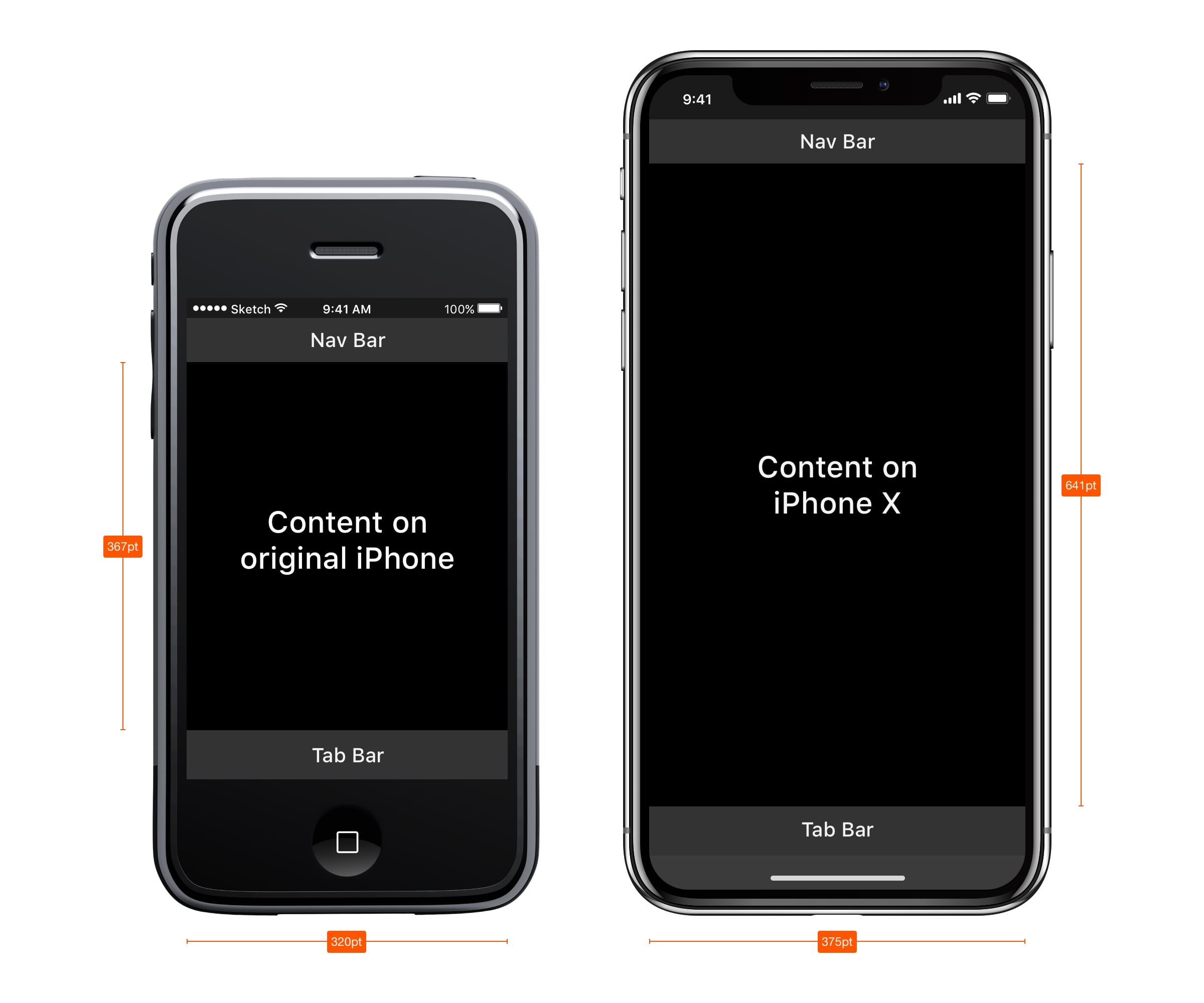
Compared to the very first iPhone, the screen height has increased by 332 pt, which is 7 navigation bars. More and more space for content, and less and less need for a hamburger menu.
If you compare the first iPhone and iPhone X, you can see that the space for content has almost doubled. In general, this means that modern applications should always include all the components: status bar, navigation, tab bar and Home button indicator. By ignoring these elements, you run the risk of harming the user experience and making the application incompatible with Apple standards.
Excavation
Perhaps the most controversial aspect of the new design is the top 10% of the screen. The touch sensor, better known as the notch, is an element that prevents the new screen from occupying the entire area. Technologically, it is now impossible to do without Face ID, cameras and speakers located in it.
In terms of design, this is the biggest compromise Apple has made in recent years. But looking at how other phone manufacturers solve the problem of the big screen, you can see that they were not without compromises.
Apple advises not to hide the notch behind the black status bar. They argue this with the fact that despite its importunity, the notch provides valuable space for the status of the bar and additional content.
It is a logical continuation of the content and visually makes the screen bigger. Background elements such as wallpapers, maps, and colors do not suffer when they are slightly covered by rounded corners of the screen and a notch. Hiding this space, the screen will appear smaller, and the application will not meet Apple standards. Explanation in this video .

Huge headers
In iOS 11, headers are usually 34 pt black in the Bold style. Interestingly, when you scroll down the screen, the headings go to the navigation bar and, thus, return us this valuable space.
With the landscape orientation of the screen, the title remains small in the bar. From this, designers can conclude that, firstly, you need to use this additional space wisely, and secondly, you need to make the design adaptive, since this space can be in portrait orientation and not in landscape.
Great status bar
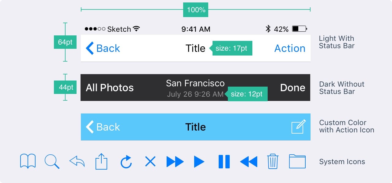
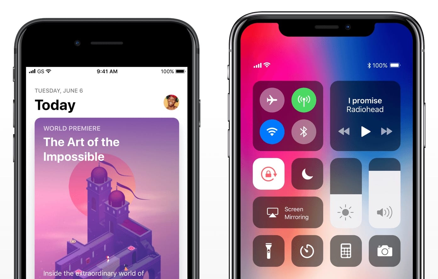
The status bar has increased in height more than 2 times from 20 pt to 44 pt. Notifications can now simply be pulled down from the upper left corner. To call up the control point, swipe the screen from the upper right corner of the screen. Sweeping the screen from the bottom you get to the home screen, but only if the movement is done quickly.
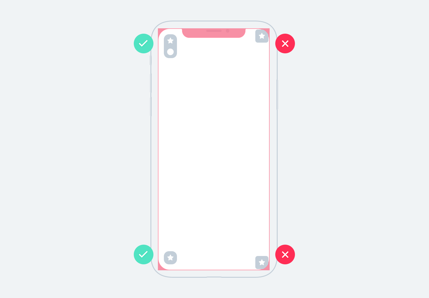
Secure Content Zone
When creating a design for the iPhone X, you need to consider that the rounded corners of the screen and the notch can crop the content. You must always remember this. Using the safe areas of the screen, you can arrange your elements so that the recess does not crop the content. In general, all background images can be positioned without relying on this guide, but elements such as text, images and buttons must be located taking into account these zones.

iPhone X in landscape mode
In landscape orientation of the screen, the status bar is hidden to maximize the space for content. The navigation bar is reduced to 32 pt, Tab bar to 30 pt, and the indicator of the home button to 23 pt. Although most users rarely switch to landscape mode on the iPhone X, there are still a large number of scenarios when this mode is needed.
For example, to view horizontal photos, full-screen videos, or to read articles with large texts. After the viewing is completed, the user intuitively returns to the portrait orientation of the screen, especially if the device is conveniently supported in landscape orientation.
If your application is already adapted for the iPad, why not adapt it for the landscape orientation of the iPhone? A huge benefit with minimal effort, as most applications are designed with adaptability in mind.

Websites in landscape mode
If you are a product designer, most likely you are working with the Web. When viewed in landscape mode on iPhone X, your site will have a lot of empty space on the left and right sides of the screen. This happens because safe zones appear automatically to avoid trimming the content, which makes things even worse. To avoid this, Apple has developed a guide to adapt your site to the iPhone X in landscape orientation. In general, you can expand your background so that it fills the entire screen, while the content itself is within the safe zone.
Rounded corners of the screen
Content may also be clipped due to the rounded corners of the iPhone X screen. If you do not hide the status bar or indicator of the Home button, you will not encounter such a problem. However, for full-screen applications such as Camera, it will be important to indent in the corner of the screen. The corner fillets are set with a radius of 16 pt, the same fillet radius is also recommended for use in buttons.
Browse your apps on the iOS simulator
iPhone X has not yet come out. Most likely, after the opening of sales, devices will quickly be sold out, and they will not be available to most of us. Not having the right device on hand to test your design on it, you just use the iOS simulator. You can view your application or website by installing Xcode .

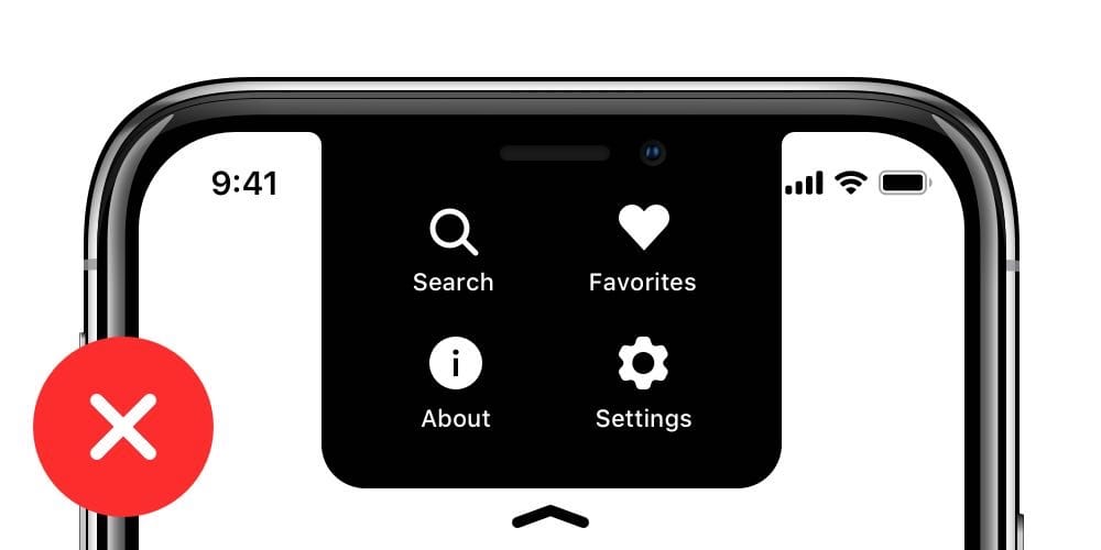
“Hamburger” menus are no longer needed
Over the past decade, designers have had to fight for every pixel on the tiny screen of the first iPhone. Many decided to completely omit the Tab bar, because it required too much vertical space. Using a bit of creativity, some of them came up with a button that will travel to the left. It was the birth of the famous Hamburger menu. At first it was fun and fresh, but in terms of usability it was a real nightmare. More clicks to reach screens hidden under the button. As a result, the use of secondary tabs has declined, as often people forget that there may be more content.
With the advent of large-screen smartphones, it has become more difficult for the user to use it with one hand.
Apple even implemented the function of lowering the Navigation Bar by double-tapping the Home button, while the entire user interface of the application also moved down. This was done so that the user can get to navigation using the thumb. Then this function was transformed into a double tapu menu call. The hamburger menu was usually located in the upper left corner of the screen and it was extremely difficult to get to it. And now, when the screens have become much larger, there is no longer any need to fight for a place for content. Tab bar is the most obvious way to replace the Hamburger menu, as there is enough space for it now. iPhone X confirms this trend. If your application has several sections, then there is no reason not to use the Tab bar. In iOS 11, the Tab bar takes even less space in landscape orientation.
Hamburger menus are very common on the web, and perhaps this is one of the reasons why the mobile web experience did not catch up with the native experience.
Even React Native uses native controls, which are a fantastic trend in Web technology. However, on iOS and especially on iPhone X, you need to use the Tab bar.
Responsive layouts and multitasking
Now that the number of resolutions for the screens you have to deal with is constantly increasing, it is very important to make your layouts adaptive. Using tools such as Constraints in Sketch and Auto Layout in Xcode, you have to design the screen so that the screen is flexible and can display an additional menu if necessary.
Stack views
In Xcode, you'll also find Stack Views , a great app to make your layouts more responsive to changes. Some elements and groups can be dynamically connected to each other and you only need to edit the indentation when the content falls into place. Then you can complete the work with Auto Layout. Apple recommends using Stack Views first, then Auto Layout.

Dots and Pixels
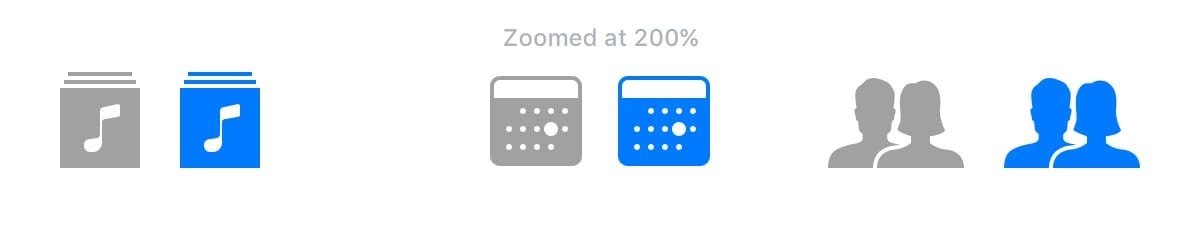
Developers work with dots, so it’s very important to understand the difference with pixels. When the very first iPhone was introduced, these 2 units were the same 1 point equaled 1 pixel. Then, when the retina screens appeared, 1 point began to equal 2 pixels. Thus, we can say that the points are the measurement values for the first iPhone, while the pixels are the measurement units for the new models, and the screen quality directly depends on their density (iPhone 4, 5, 6, 7, 8 = @ 2x, iPhone 8 Plus, iPhone X = @ 3x). To better understand the difference between points and pixels, I recommend watching a video .

IPhone Screen Resolution
In total, the iPhone 5 line has major resolutions: 320 x 480 pt (iPhone 4), 320 x 568 pt (iPhone 5), 375 x 667 pt (iPhone 8), 414 x 736 pt (iPhone 8 Plus) and 375 x 812 pt ( iPhone X). The layout does not scale, but expands depending on the resolution. For example, the navigation bar adapts to the width, but retains the same height. Elements inside remain unchanged. iPhone 8 Plus is the only phone that behaves more like an iPad in landscape mode. In other words, navigation may appear on the left, replacing the Tab bar.

Application Icons The application
icon is used to style your application. This is the first thing that users see when they start working with the application. It is displayed on the home screen, in the App Store, Spotlight and settings.
Icon Sizes
@ 1x resolution is no longer supported for iPhone, so you don’t need to create an icon for it.
Application icons now have only two resolutions: @ 2x and @ 3x. There are three types of icons: application icon, spotlight icon and icon for settings. For iPad, @ 1x and @ 2x are used.

Super Ellipse
Starting with iOS 7, the round corners of the icons are replaced by the shape of an ellipse. If you look closely, you can see that the corners are rounded off smoothly. Therefore, do not export masked icons, as you can get black areas around the edges. It is better to export a square shape.

The
Apple Icon Grid uses the golden ratio rule in some icons. This is a guarantee of good proportions, but not a strict rule. Even Apple doesn't always stick to it.

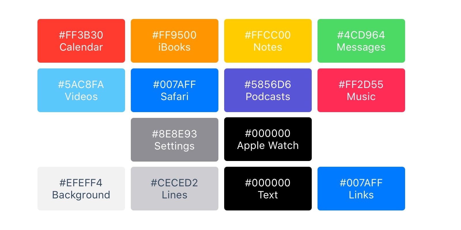
Colors
iOS uses vibrant colors to make icons stand out. Such colors work well on both white and black backgrounds. Keep in mind that bright colors should be used rarely, only as a call to action and on a minimally loaded background. Approximately, only 10-20% of the entire design can be in color, or they will compete too much with the content.
iOS often uses neutral colors to display the background or menu area. Good contrasting black text against a white background is the best tool for comfortable reading. Finally, pastel blue is used to highlight the buttons.
System font
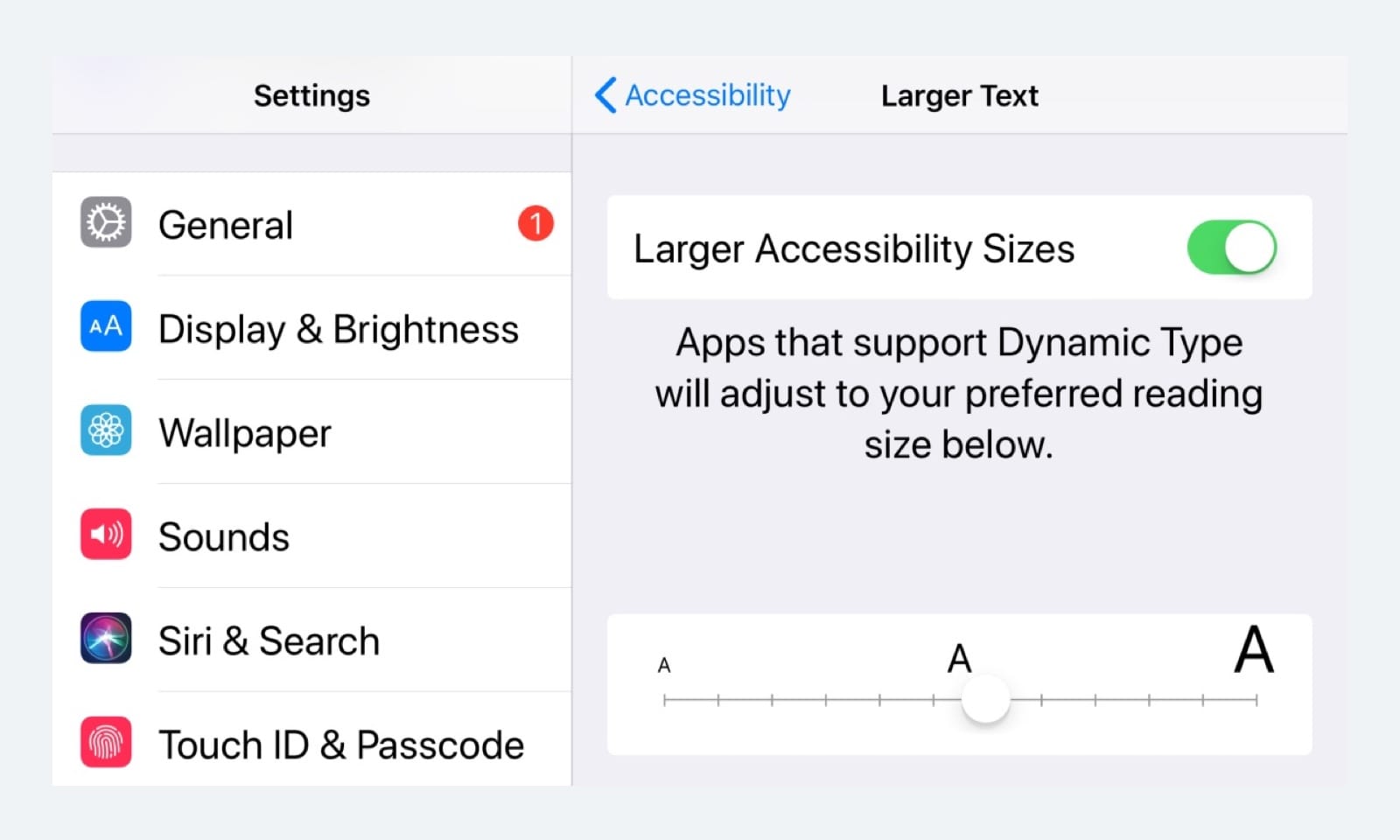
The system font is now called SF Pro Text for font sizes less than 20 pt, and SF Pro Display for font sizes 20 pt and larger. It is important to note that now when using the system font, you get access to the dynamic font (Dynamic Type), which allows the font to be customized according to user preference.
Buttons and font sizes
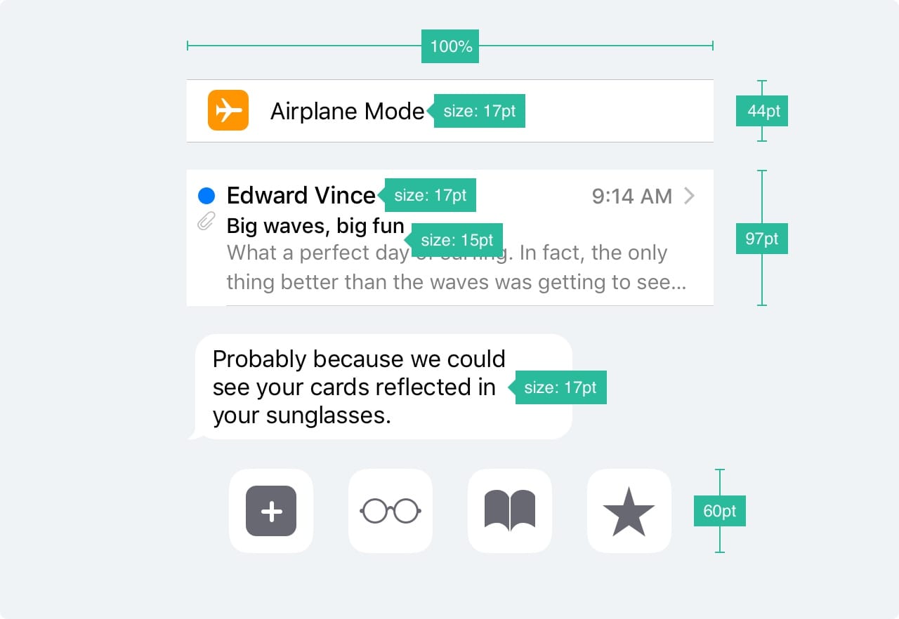
The main rule: 44pt for buttons, 12pt for small text, 17pt for content and 20pt + for headings.
The distance between the elements and the position
The main rule is to indent 8pt from the edge of the screen and between the elements. This creates enough air, which facilitates the perception of the content on the page, and makes the text more readable. Also, UI elements and text should be located on a common baseline.

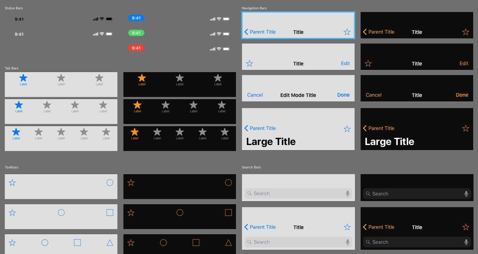
Status Bar
It is recommended to include a status bar on those screens where it is possible to do this. Users rely on it when viewing such important information as the charge level, network signal, time. Text and icons can be either white or black, but the background can be any color or even merge with the navigation bar.

Navigation Bar The
navigation bar provides quick access to screen information. The left part of the bar can be used to place the buttons "Back", "Profile", "Menu", while the right part can be used for buttons of the action: "Add", "Change", "Finish". It is important that if you use one of the system icons, then there is no need to create assets for them.
Just like in the status bar, the background can be set in any color, and usually has a subtle blur so that the text is always read. When the navigation bar is created together with the status bar, both backgrounds are combined.
Search
When you have a lot of content on the page, you must add the ability to search the content.

Toolbar The
toolbar is used as an additional place to place active buttons and display the status of the screen.

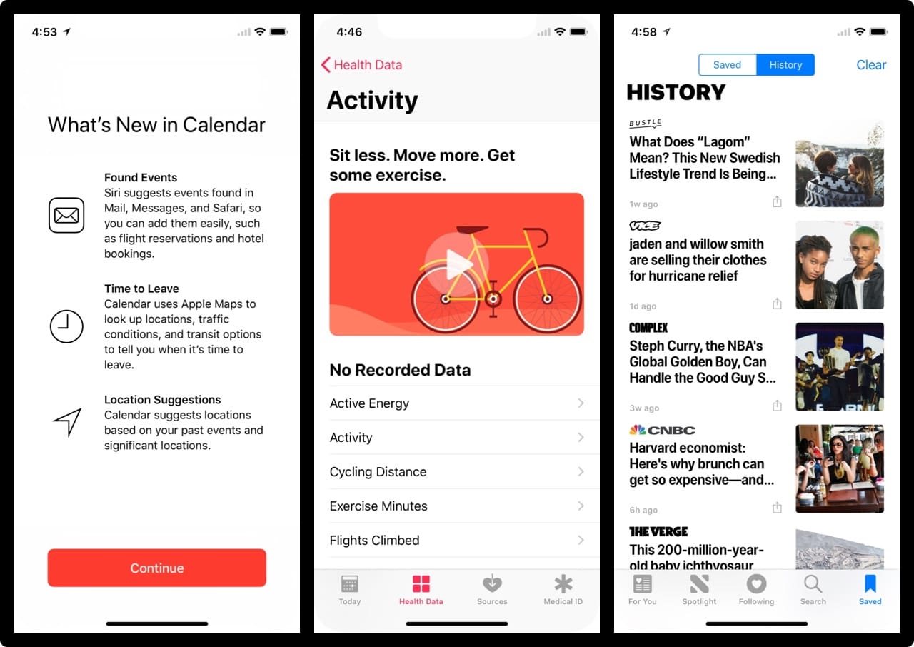
Tab bar
A tab bar is the main navigation between screens. Avoid burger menus if you have only a few items. The menu, which is visible immediately, increases the number of clicks on the items on this menu, since the obvious is always better. In addition, it is better to add text to the menu icons, as most users cannot recognize characters, especially when they are not standard.
Statuses
When menu items are not active, the icons should be grayed out. For example, as in the picture - they attract less attention.

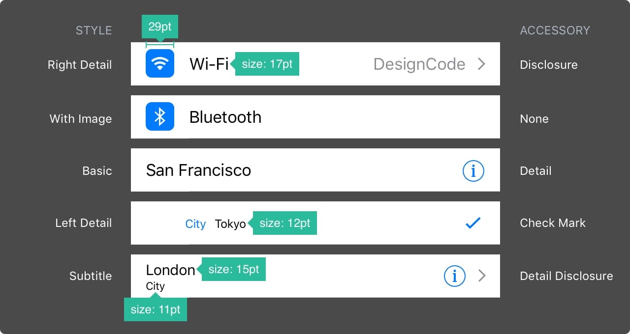
Table view
Table view most frequently used form to scroll through content. Many applications use a table display format. This view is standard and customizable right down to the smallest elements.
Basic styles
At a basic level, you can use some set of predefined styles and features.
Sections
Elements can be grouped with a heading above and a description below.
Collection View
When you want to place content in the form of a tablet by row and column, you can use Collection View. He will help you in creating a dream layout.
Collection View layout options
If there is more than one collection, you can create a Collection View combination. The possibilities are endless.

Modal windows
A warning dialog box is used to convey important information and requires the user to take immediate action. Dialogs of this type should contain concise and concise information, and actions should be obvious.

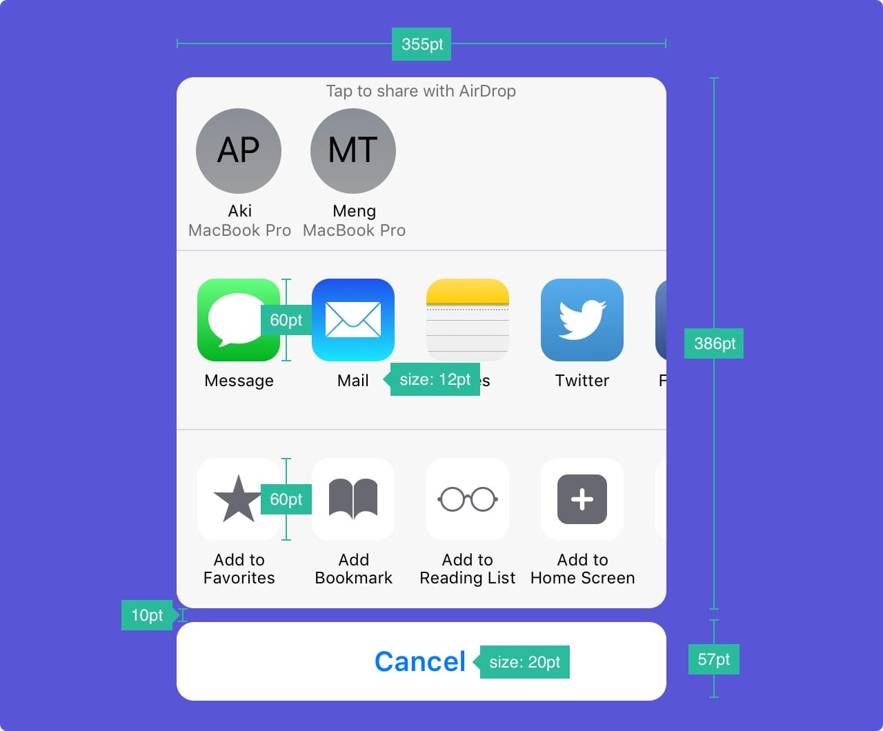
Modal activity windows The activity
dialog allows you to exchange content (text, images, links) through Airdrop, various applications (for example, Mail, Facebook, Twitter), as well as add to favorites, bookmarks, etc. You cannot configure the appearance of the window, but the functions can.
Full-screen modal windows
If there is a lot of information, you can use full-screen modal windows. Such windows usually open and close with the help of animation (they can move out, appear and disappear, turn over, scroll through). Like other modal windows, these should also be extremely short and capacious, they should be easy to hide.
Keyboards
The keyboard is used to enter information in the text fields. It is easily customizable for entering various types of information, for example, links, emails, phone numbers, emoji. It is possible to choose a light or dark theme and an inscription on the confirmation button (by default, “input” or “return” in English).

Picker
If there are many choices, you can use Picker. It is especially convenient for dates when you need to enter three fields at once (date, month, year).

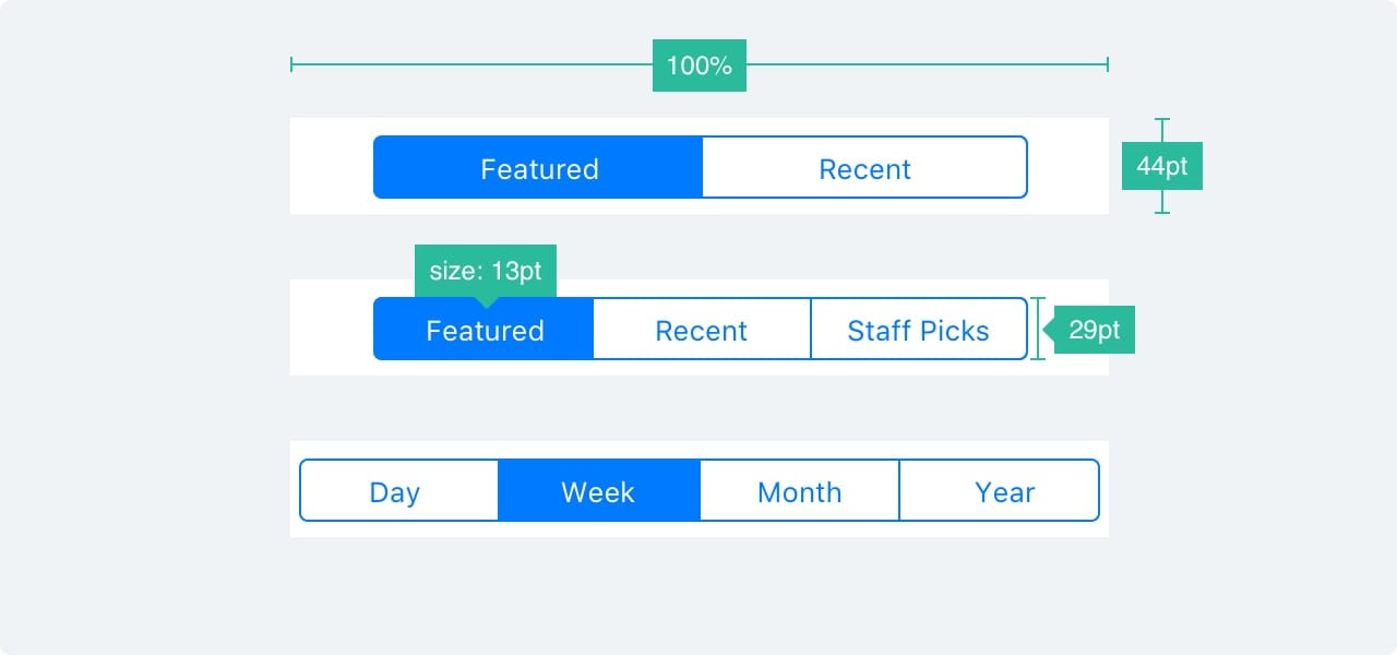
Segmented Control
If the Tab Bar is used to switch between the main sections, then this control is used to switch between sections.
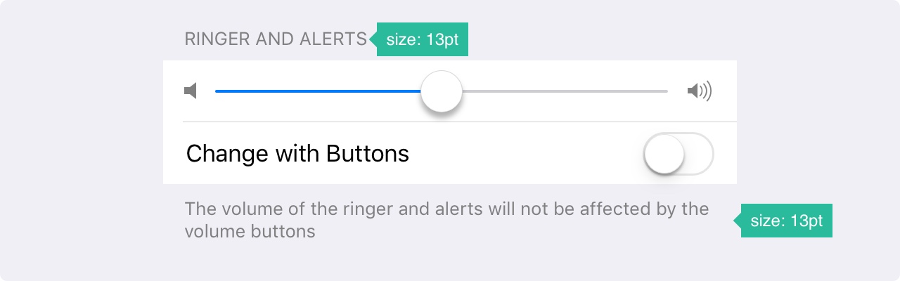
Sliders
Sliders are interactive controls that are not very accurate, but extremely convenient for quick settings such as sound or brightness.

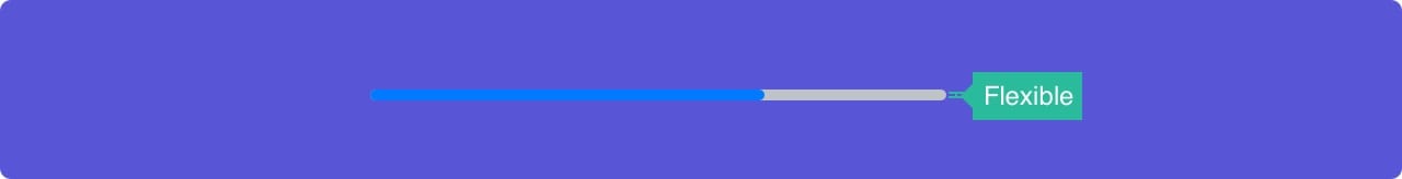
Progress bar
The Progress bar element shows the progress of the action. For example, when loading a web page. Element height can be adjusted.
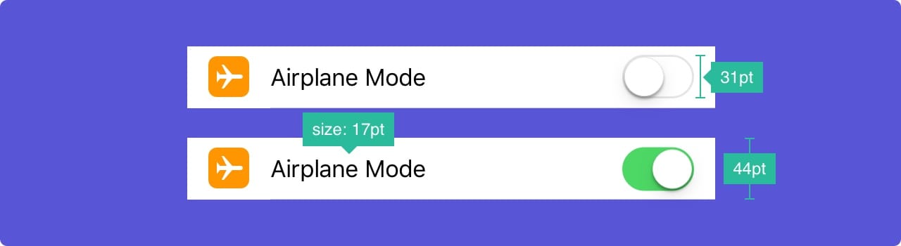
Switch
Used to quickly turn functions on and off. Not suitable for any context other than on / off.
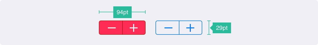
Stepper
Stepper is slower, but more accurately slider. Allows users to increase or decrease the value in increments of one. The border and fill are customizable.
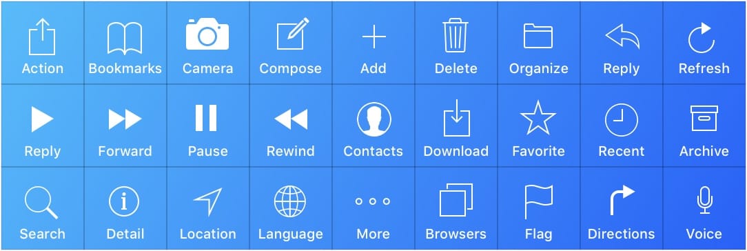
IOS Icons
Standard platform icons. They are commonly used in iOS and are well understood by users. Using these icons for other purposes can confuse users, so it’s very important to know how they are used in iOS.
When creating your icons, it’s important to use familiar characters. In addition, it is recommended that you supplement them with small text of 10pt or more.
Recommended Resources
These templates are not only useful for learning. You can use them and customize to your needs.
APPLE IOS 11 GUI Kit
If you are creating a design for iOS, you will want to use standard elements such as status, navigation and tab bars.
GREAT SIMPLE STUDIO IOS 11 GUI Kit
The most complete set with many elements.
Mocapas of devices in vector.
Personal collection of the author with more than 260 mocapas made in vector. Ideal for presenting your projects.

Design Resources from FACEBOOK A
treasure trove of iOS design resources , including SoundKit, hand-held devices and useful interfaces.
WHAT TO AVOID
A wonderful article about the design for the iPhone X. Includes some good examples of what NOT to do if you prepare design for iPhone X.
There are practices that you should avoid at all costs, especially if you are new in design for iOS . Follow these simple examples compiled by Apple. Just a glance might be helpful.
IVO Guidelines by IVO MYNTTINEN
If you want to learn more about iOS from a different perspective, check out this wonderful and informative guide .
The translation was made by UX / UI designers of the company Victoria Shishkina, Ksenia Valyakina and Anastasia Ovsyannikova