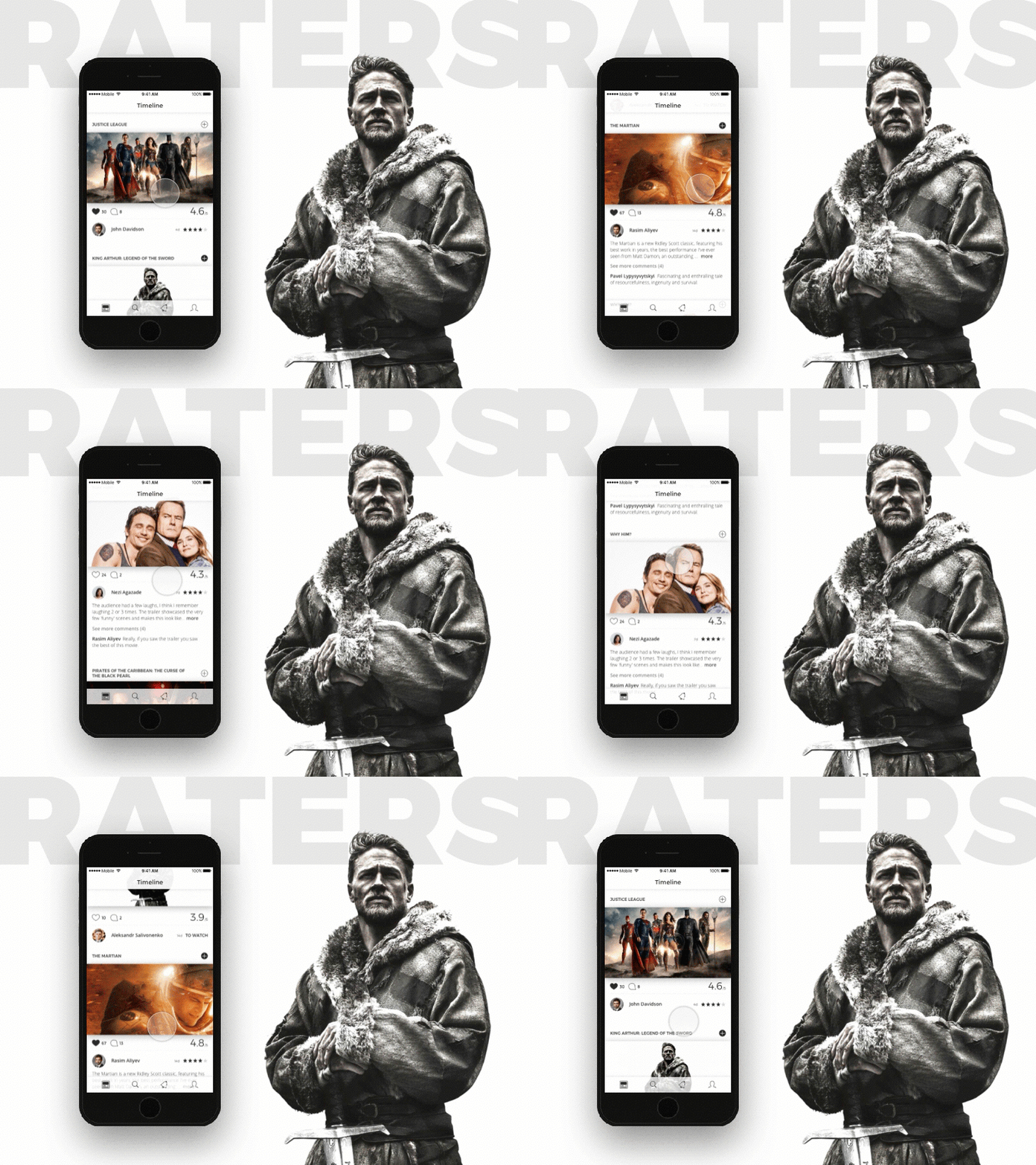
August 9, 2017 at 14:58
Social network for moviegoers or how not to dig in, developing yet another social network
Redesign or a little more?
In the fall of 2016, a customer approached me on a recommendation with a request to develop an iOS application for movie fans with a fairly extensive functionality. At that time, there was already a ready-made prototype with, to put it mildly, a primitive UI. The task was as follows: to redesign with the refinement of “some” functionality. Even then, the idea crept in that the redesign wouldn’t work, but I didn’t realize how voluminous this project was. But the more interesting ...
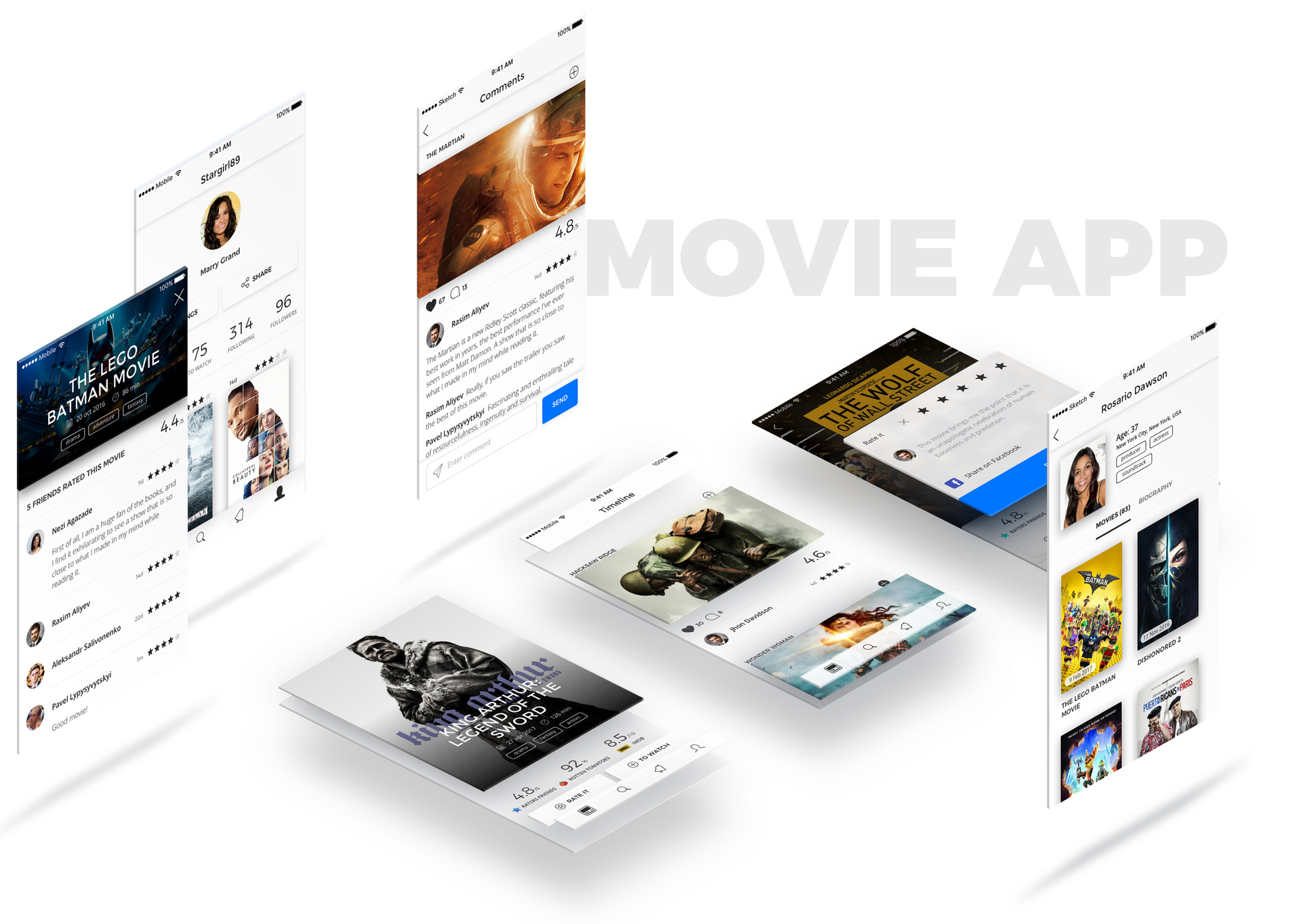
Getting started, I began to search for suitable solutions for the UI. Of course, an extensive overview of existing applications on the market was first conducted. Dozens of movie advisory services were reviewed, from the well-known IMDb and Rotten Tomatoes to the new services that have appeared in the market recently.

Social network or recommendation service?
The result of the review process was two options for UI, which significantly differed among themselves both externally and in meaning.
The first "yuayka" was a dark interface that draws an analogy with a movie theater. Bright control elements, reminiscent of glowing in the dark green signs "Exit" in the cinema halls, which clearly make it clear their purpose.
The second version of the UI was cardinal in color: white was chosen as the background color, and light shades of gray were intended to separate the functional blocks from each other. This combination was more like a social network, with quality content.

At this point, the question “what is the main purpose of the application: the recommendation service or a full-fledged social network for moviegoers?” Became. The decision was made in favor of a social network. At this moment, I clearly understood that I got involved in a serious story. But for some reason, this did not stop me, but rather provoked me. I have not yet solved this problem.
Flow
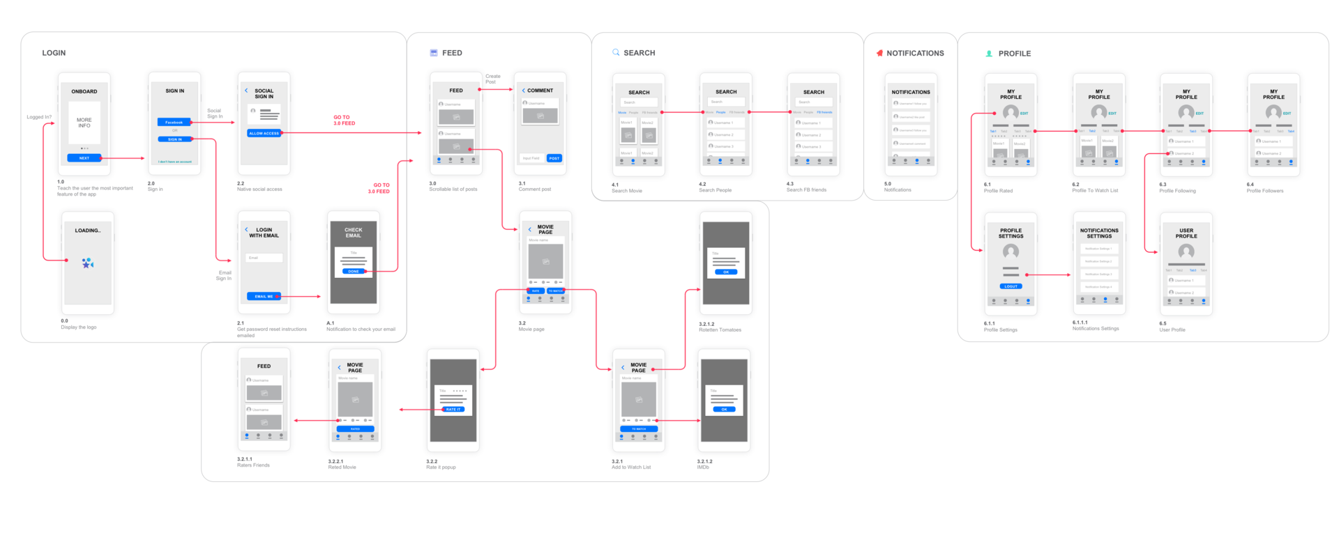
Based on the new input, it was not entirely correct to use the existing flow: some functions required a new solution, and some were not taken into account in the prototype at all. From experience, I can conclude that remaking something existing is more difficult than doing it from scratch. And so it happened: in the end, we used no more than 15% of the existing code when developing the application, the same applies to the interface.
Taking into account the benchmark for the social network, the second version of the UI was finalized. In favor of an even greater emphasis on application content, it was decided to abandon most colors. There was only an accent blue color, similar to the system color of the Windows operating system and several shades of gray for texts. As the main font, I chose Open Suns, the universal publicly available font, and for the headings I chose one of my favorite Montserrat fonts.

I started developing the interface from one of the main screens - the movie page.
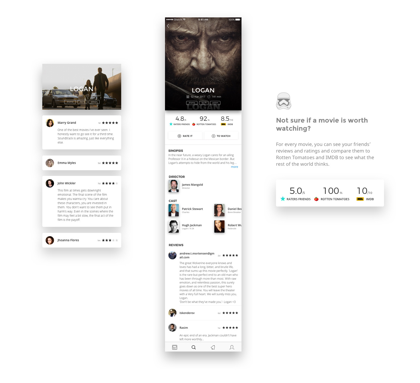
This screen contains complete information about the film.
And also on the movie page the ratings of authoritative resources about the movie are displayed:
In addition, the movie page should contain the main controls - Rate and To Watch List buttons. Using the first one, the movie is rated, the second button adds the movie to the To watch list. Both actions are mutually exclusive, which means that after clicking one of them, the second button should become inaccessible.
Feature List Movie Page:
- title,
- duration
- date of release,
- genres
- description,
- producer,
- the actors
And also on the movie page the ratings of authoritative resources about the movie are displayed:
- IMDB
- Rotten tomato
- Raters Friends - rating of friends, own rating of the application, which is formed by the formula of the arithmetic average rating exclusively of the user's friends. This rating is actually one of the main USP (unique selling proposition) applications.
In addition, the movie page should contain the main controls - Rate and To Watch List buttons. Using the first one, the movie is rated, the second button adds the movie to the To watch list. Both actions are mutually exclusive, which means that after clicking one of them, the second button should become inaccessible.
To place such an amount of information on one screen, and so as not to clutter it up, is not an easy task. Here's the solution that came about in the end:
Other screens followed, such as Timeline, Raters Friends, Comment page, all Login / Registration screens, screens related to Profile, and a few dozen more screens.

Not a trivial task was the development of the Profile page. In addition to basic information about the user, this screen contains lists of watched and desired films, as well as subscriptions and subscribers. Navigation between these lists is implemented using tabs.
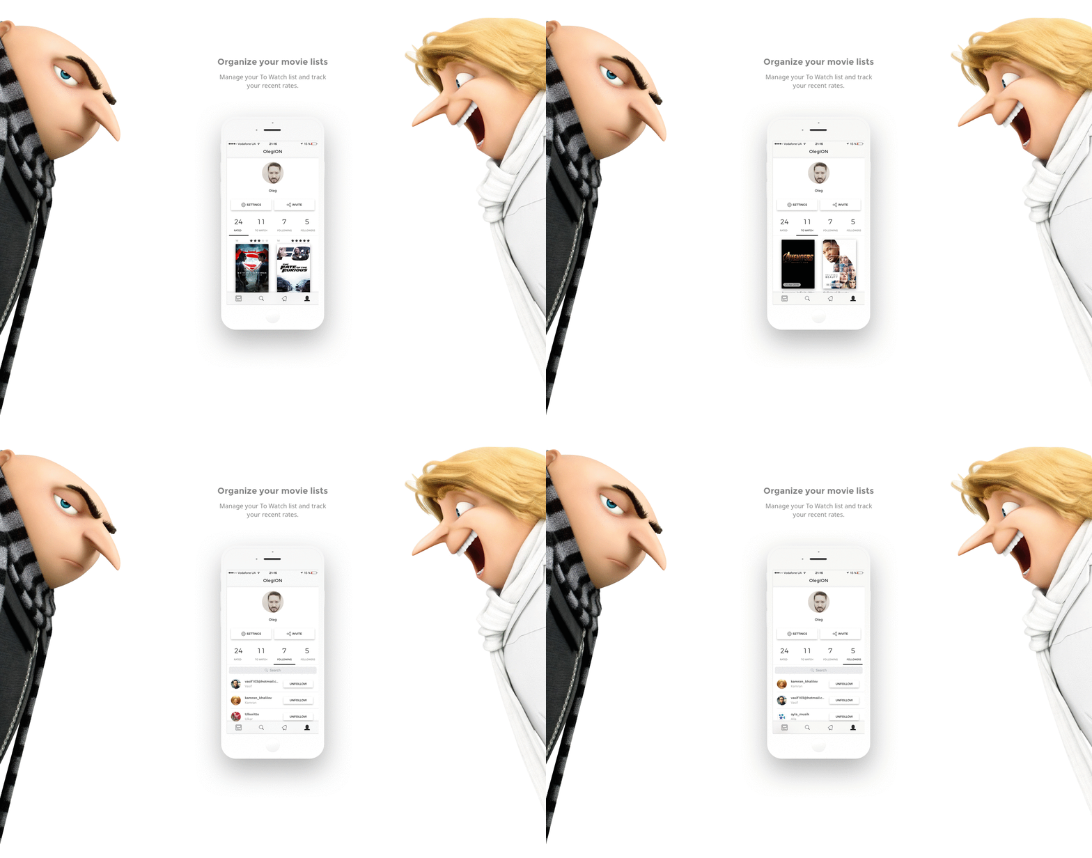
The structural grid of the application turned out to be quite complicated. Each screen has different elements, so the indents from the edge, the sizes of the header and menu, and some snacks between the elements, like movie posters, remained common.

Iconography
The main control menu has simple understandable icons, by clicking on which navigation between the main screens is carried out:
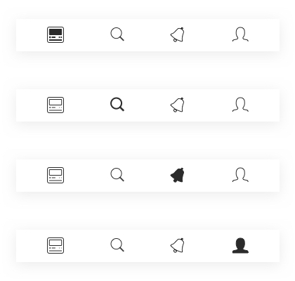
- Timeline
- Search
- Notification
- Profile
Larger illustrations were created primarily for the Landing Page, but are also used in Onboarding.
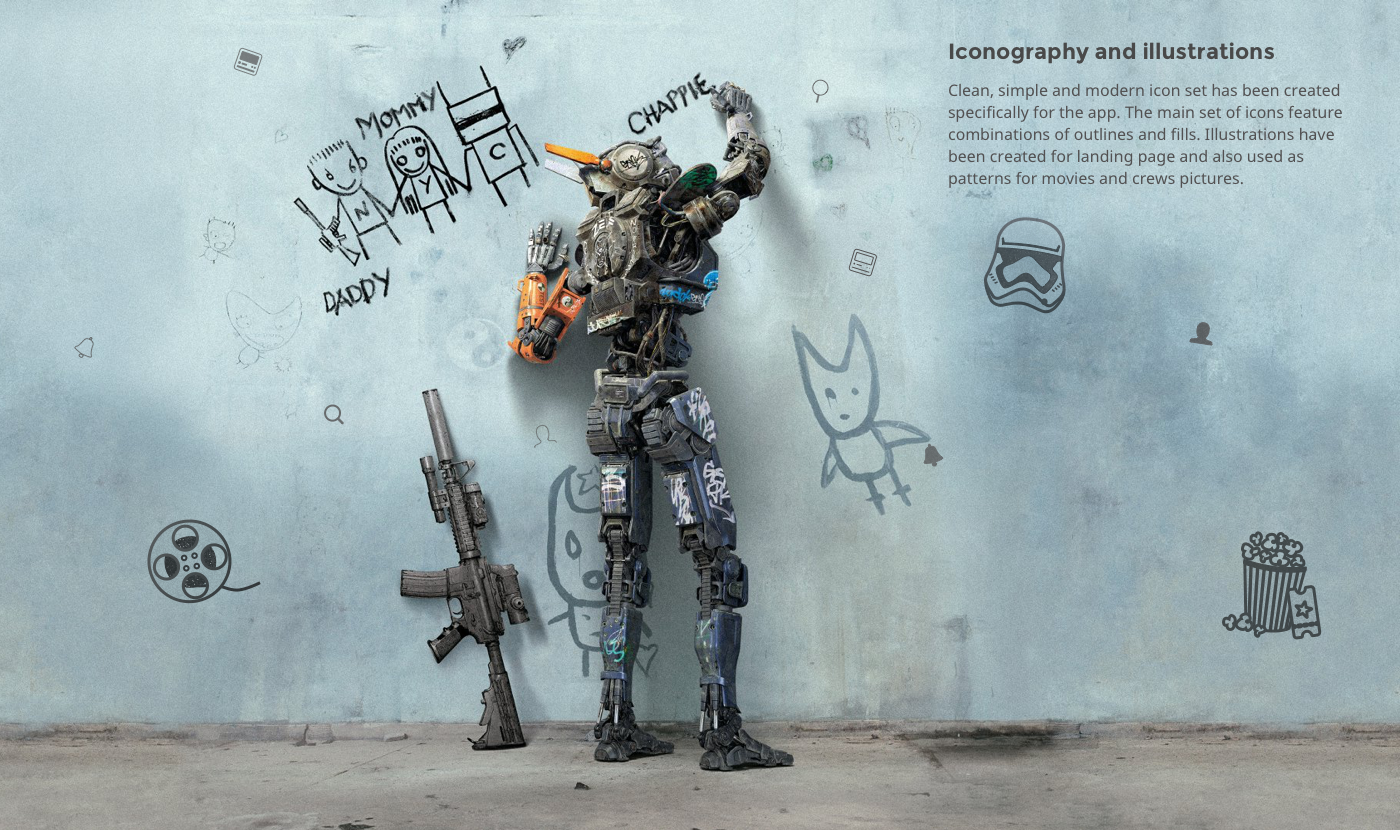
Icon
The initial symbol of the project was a star - a generally accepted symbol for rating, used in almost all ratings. To make it clear to users that this application is directly related to films, it was decided to use some of the elements associated with cinema. I tried both the film strip and the clapper board numbering. However, the final decision was a star stylized as a movie projector.

Why do you need another movie service if you have Movie Search, IMDB and Rotten Tomatoes?
I asked this question at the start of the project. And most likely they are also asked by those who first hear about Raters. But after a short time using the application, everything falls into place: KP, IMDB, Tomatoes and other platforms are focused on the ratings of critics or viewers that you are not personally acquainted with. And the Raters philosophy in the following is the opinion of people whose movie tastes coincide with yours, much more relevant than the average opinion of tens of thousands of users unknown to you. Raters not only allows you to rate and write reviews, but also monitor the movie activity of those users whose opinions are interesting to you. The task is to drag as many friends with similar movie tastes into the app as possible, and then get the relevant Raters Friends.

Why does the application need a website?
After a detailed study of all the interface elements and all the layouts, the time has come to develop a Landing Page. I believe that any self-respecting application must have a landing page. Raters App was no exception. During the development of the application, the main task of the landing was to collect emails to notify about the release of the application. After the release, the landing page should redirect traffic to marketplaces: AppStore and GooglePlay. But at the same time, the site should tell in detail about the main features of the application.
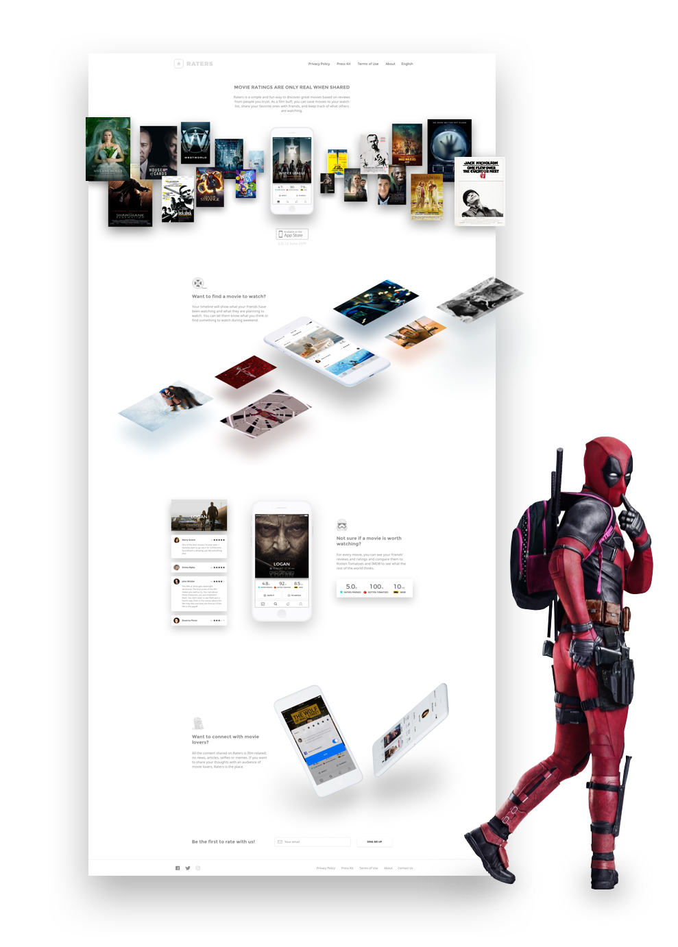
In approximately this way, the recommendation service grew into a social network. Of course, this project will never be fully completed; it, like any social program, should iteratively be updated and develop in step with the times. Already at the moment a schedule of several updates is scheduled. But for this to happen, Raters App needs basic users, and how to get them is a completely different story.