Nike Brand History
At the end of June, the Cannes Lions International Advertising Festival ended. The highest award of the “Golden Lion” in individual nominations was awarded to 18 commercials.
Incredible success enjoyed the video company Nike - five of them were recognized as winners according to critics.
Nike is a young corporation; history dates back to 1963. The world was recovering after World War II. Phil Knight graduated from the University, worked briefly as a finance specialist, and went to Japan to conclude his first business deal. Did he know that he was destined to establish a global brand?
Phil Knight's idea was simple - to fill the American continent with inexpensive sneakers of an Asian manufacturer, buying and selling. Few people know, but the company was originally known as Blue Ribbon Sports, and running shoes, which it realized, was named «Tiger», now known under the brand Asics.

Knight was not confident of success - Eastern model of doing things, different from the American one. The Japanese were courteous and silent, they listened. Knight finished the presentation, there was a pause.
“Which company do you represent?” - the question of partners broke the silence.
"Blue Ribbon Sports!" Knight blurted out the first thing that came to mind. That was in 1964.
Closer to the 70s, the company underwent changes, the management completed the resale of shoes. The era of our own production has come, and therefore there is a need to come up with a new brand. Knight’s team, which at that time had about 50 employees, sorted out dozens of ideas - brainstorming did not produce results. Time passed inexorably.
Phil Knight chose between Falcon (falcon) and Dimension 6 (sixth dimension) —the latter liked because he invented it himself. Phil's partners were honest - long names were not original and empty.
A good thought was born suddenly! The first Blue Ribbon Sports employee, Jeff Johnson, saw the word "Nike" in a dream. The name comes from the Greek goddess of Victory (pronounced "ny'-kee"). In Russia, speaking of a famous brand, they say: “Nike”, but “Nike” is correct. The word "Nike" is consonant with the name of the founder: Knight-Nike.
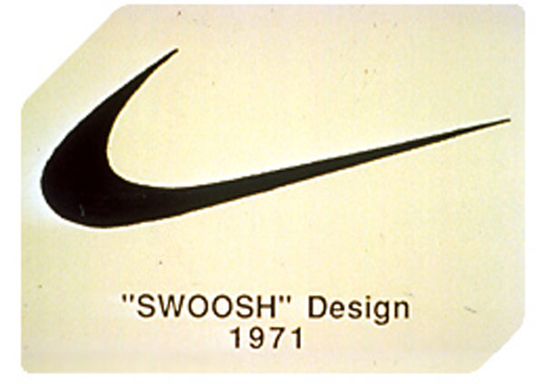
The appearance of the new name was preceded by one important event - the development of the logo. The creation of the logo was entrusted to Caroline Davidson, a student at the University of Portland, who was educated in advertising. I needed a badge that could easily be placed on a boot:
“What type?” - clarified Caroline.
“I don’t know ... Anything that evokes a sense of movement!” Phil answered her.
The first logos looked like lightning and swirls, the “checkmark” was born on the second attempt - it looked like a wing and a trace from a racing runner. At the end of the work, Caroline handed Knight “Swush” (original SWOOSH), and he handed her $ 35. (Even at 2014 prices, this is very small).
Source
Nike's rapid development has put it on a par with the largest manufacturers of sportswear and shoes. Phil Knight generously thanked Caroline - the founders had a gala evening in honor of the designer, where they handed the woman a gold ring with an engraved logo and a heavy envelope with stocks. This is a good lesson for both business creators and young designers, do not be afraid to work for little money!
What is "Swush"? The sound of dissecting air. Why exactly him? Nike sneakers were invented for running. Step, movement, jerk, speed! Shoes - freedom, lightness, flexibility, amortization, the famous “checkmark” combined these concepts, becoming the only logo that has a name.
The simplicity of Nike's corporate identity has allowed the brand to be remembered for several generations, and now it is clearly associated with sports, dynamism and constant movement.
Source
"Swush" has undergone only minor changes, more than 50 years of its existence.

A source
The logo has changed, after 7 years from the moment of its appearance, in 1978 it became more “regular” in shape. A rectangular inscription neatly placed above the picture. A few years later, the “swush” was slightly stretched, as well as the distance between the letters, made the text more readable and dynamic, and in 1995 the brand underwent the last change, became recognizable enough for designers to remove the name reminder. 22 years have passed since then.
Despite the popularity of the products, Nike still had to compete with the leaders of the sports market. Advertising that existed before the 80s, whose protagonists were famous athletes, was losing its relevance - the sport has become affordable for amateurs. The company management wanted a slogan that was able to motivate. A phrase that will make everyone believe in itself: a boy from a school stadium or a participant in the Olympic Games.
An important mission was carried out by Wieden & Kennedy advertising agency, the company's founder Dan Wieden took up the matter. After all, it was not only a monetary contract, but also a matter of reputation. Dan spent days in endless search, how to come up with a capacious phrase that will be remembered?
In 1977, Gary Gilmore was sentenced to death for killing several people. The news spread throughout the United States - such a sentence in the United States, the court passed for the first time in 10 years. Gary was not a prosperous citizen; he spent most of his life in prison. He deliberately chose the death penalty, refusing the petition for clemency.
“So let's do it!” - solemnly said Gilmore. (Original as: “Let's do it”). The phrase with a little change was borrowed for an advertising campaign. The slogan first appeared at the box office in 1988. The video was a huge success.
Unlike “Swush”, which is performed in different colors to match the style of sneakers, the inscription “Just do it” is used in two - black and white, is rarely placed on clothes and is more a slogan and logo of company policy than of products. Here, the designers did not deviate from the "corporate identity" of the company: ease in font, rectangular shape, letters of the same height, in a word - minimalism.
So, if you have long been in search of a simple design that will become known to millions, then:
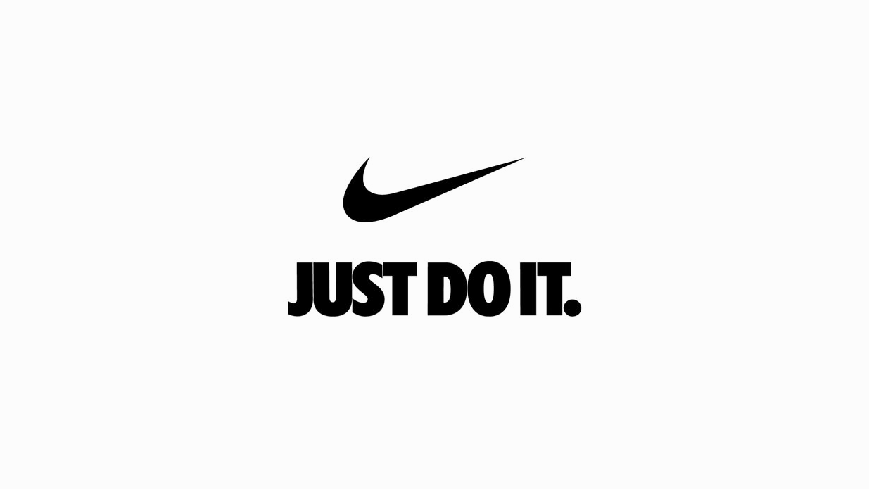
Image source
The text was prepared by Logomashina’s copywriter Alena Kovalenko
Incredible success enjoyed the video company Nike - five of them were recognized as winners according to critics.
Make it easy
Nike is a young corporation; history dates back to 1963. The world was recovering after World War II. Phil Knight graduated from the University, worked briefly as a finance specialist, and went to Japan to conclude his first business deal. Did he know that he was destined to establish a global brand?
Phil Knight's idea was simple - to fill the American continent with inexpensive sneakers of an Asian manufacturer, buying and selling. Few people know, but the company was originally known as Blue Ribbon Sports, and running shoes, which it realized, was named «Tiger», now known under the brand Asics.
Knight was not confident of success - Eastern model of doing things, different from the American one. The Japanese were courteous and silent, they listened. Knight finished the presentation, there was a pause.
“Which company do you represent?” - the question of partners broke the silence.
"Blue Ribbon Sports!" Knight blurted out the first thing that came to mind. That was in 1964.
Closer to the 70s, the company underwent changes, the management completed the resale of shoes. The era of our own production has come, and therefore there is a need to come up with a new brand. Knight’s team, which at that time had about 50 employees, sorted out dozens of ideas - brainstorming did not produce results. Time passed inexorably.
Phil Knight chose between Falcon (falcon) and Dimension 6 (sixth dimension) —the latter liked because he invented it himself. Phil's partners were honest - long names were not original and empty.
A good thought was born suddenly! The first Blue Ribbon Sports employee, Jeff Johnson, saw the word "Nike" in a dream. The name comes from the Greek goddess of Victory (pronounced "ny'-kee"). In Russia, speaking of a famous brand, they say: “Nike”, but “Nike” is correct. The word "Nike" is consonant with the name of the founder: Knight-Nike.
The appearance of the new name was preceded by one important event - the development of the logo. The creation of the logo was entrusted to Caroline Davidson, a student at the University of Portland, who was educated in advertising. I needed a badge that could easily be placed on a boot:
“What type?” - clarified Caroline.
“I don’t know ... Anything that evokes a sense of movement!” Phil answered her.
The first logos looked like lightning and swirls, the “checkmark” was born on the second attempt - it looked like a wing and a trace from a racing runner. At the end of the work, Caroline handed Knight “Swush” (original SWOOSH), and he handed her $ 35. (Even at 2014 prices, this is very small).
Source
Nike's rapid development has put it on a par with the largest manufacturers of sportswear and shoes. Phil Knight generously thanked Caroline - the founders had a gala evening in honor of the designer, where they handed the woman a gold ring with an engraved logo and a heavy envelope with stocks. This is a good lesson for both business creators and young designers, do not be afraid to work for little money!
What is "Swush"? The sound of dissecting air. Why exactly him? Nike sneakers were invented for running. Step, movement, jerk, speed! Shoes - freedom, lightness, flexibility, amortization, the famous “checkmark” combined these concepts, becoming the only logo that has a name.
The simplicity of Nike's corporate identity has allowed the brand to be remembered for several generations, and now it is clearly associated with sports, dynamism and constant movement.
Source
"Swush" has undergone only minor changes, more than 50 years of its existence.
A source
The logo has changed, after 7 years from the moment of its appearance, in 1978 it became more “regular” in shape. A rectangular inscription neatly placed above the picture. A few years later, the “swush” was slightly stretched, as well as the distance between the letters, made the text more readable and dynamic, and in 1995 the brand underwent the last change, became recognizable enough for designers to remove the name reminder. 22 years have passed since then.
Despite the popularity of the products, Nike still had to compete with the leaders of the sports market. Advertising that existed before the 80s, whose protagonists were famous athletes, was losing its relevance - the sport has become affordable for amateurs. The company management wanted a slogan that was able to motivate. A phrase that will make everyone believe in itself: a boy from a school stadium or a participant in the Olympic Games.
An important mission was carried out by Wieden & Kennedy advertising agency, the company's founder Dan Wieden took up the matter. After all, it was not only a monetary contract, but also a matter of reputation. Dan spent days in endless search, how to come up with a capacious phrase that will be remembered?
In 1977, Gary Gilmore was sentenced to death for killing several people. The news spread throughout the United States - such a sentence in the United States, the court passed for the first time in 10 years. Gary was not a prosperous citizen; he spent most of his life in prison. He deliberately chose the death penalty, refusing the petition for clemency.
“So let's do it!” - solemnly said Gilmore. (Original as: “Let's do it”). The phrase with a little change was borrowed for an advertising campaign. The slogan first appeared at the box office in 1988. The video was a huge success.
Unlike “Swush”, which is performed in different colors to match the style of sneakers, the inscription “Just do it” is used in two - black and white, is rarely placed on clothes and is more a slogan and logo of company policy than of products. Here, the designers did not deviate from the "corporate identity" of the company: ease in font, rectangular shape, letters of the same height, in a word - minimalism.
So, if you have long been in search of a simple design that will become known to millions, then:
Image source
The text was prepared by Logomashina’s copywriter Alena Kovalenko