Red, white, blue: eight rules for choosing a color palette that everyone should know
- Transfer
Human-computer interaction relies heavily on graphical interface elements, and color plays an important role in this process. As Pierre Bonnard once said : “Color not only makes the design pleasing to the eye, but also reinforces it.”
When designing a new product, designers often find it difficult to draw up a color scheme, since there are an unlimited number of possible combinations. In this article, we will cover eight basic rules that can help you with your choice.
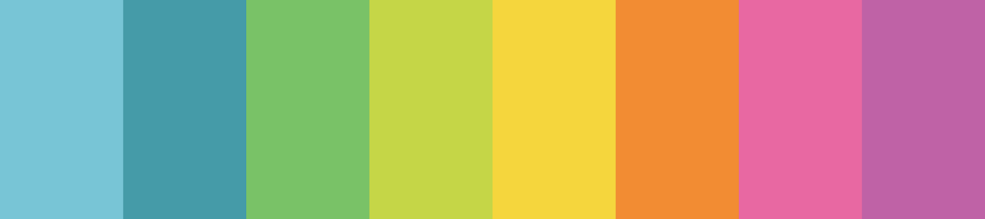
When adding colors to the design, it is extremely important to maintain a balance; and the more of them, the more difficult it becomes. The result will be better if you adhere to the rule "maximum three primary colors", forming a palette. In a study by specialists from the University of Toronto on how people use Adobe Color CC , most respondents said they prefer simple combinations based on two or three colors.
If you need additional colors, in addition to those already added to the palette, use different shades.
But how to choose these two or three colors? Here the color wheel will help you.
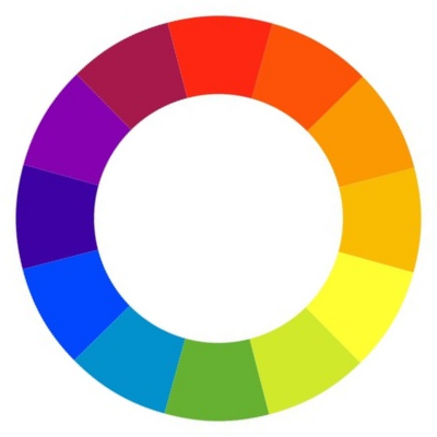
Such a circle of 12 colors is one of the main materials for compiling the palette.
There are a number of ready-made standard schemes that can facilitate the process of creating a palette, especially for beginners:
- One-color palettes

One-color schemes leave a very pleasant impression (especially if made in shades of blue or green). As you can see in the example of Facebook, the palette looks very neat and elegant.
With single-color palettes, it is easiest to work with: they contain only one color with various variations in shades and saturation. All shades of color combine well with each other and create a calming effect.
- Palettes of related colors
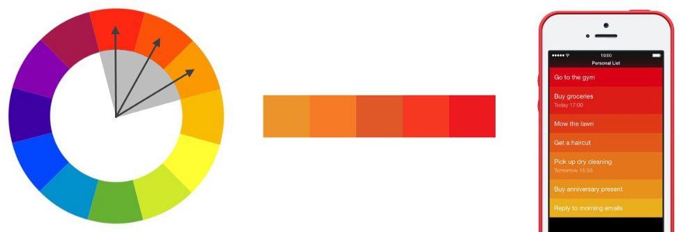

Related colors are those that are next to each other in a circle.
Such scales are based on related colors: one of them becomes a reference, and the rest are used to enrich the palette. Everything here is also quite simple, but the trick is to choose the brightness of the colors used correctly - it will set the tone for the entire gamut. For example, Clear , a gesture-based to-do list management utility, uses flashy colors to visually draw attention to the tasks that the user is currently performing. On the contrary, in the Calm meditation application, a preference is given to a pair of related colors “blue + green” to create a sense of peace and tranquility for users.
- Complementary color palettes

Using complementary (opposite) colors, you can easily visually highlight an element.
The simplest varieties of this type consist of two colors that contrast sharply with each other. This scheme allows you to attract the attention of the beholder. When using a complementary palette, it is necessary to determine the primary color, and use an additional one to emphasize key elements. Say, when the human eye sees an object painted in different shades of green, a smear of red will stand out very strongly against its background.
- Customized palettes

Color splashes on a gray background are a great way to catch your eye. The design, done in white and gray colors with blue accents, we can see on the Dropbox website.
Creating your own palette is not as difficult as many people think. There is a very simple way that you can use to get a great option: just add bright accents to a neutral gamut (that is, one that is commonly called black and white). The resulting palette will look very impressive.
The best color combinations are the ones we take from the natural world. Why? Because for our eyes they look the most natural. Just look around enough for ideas. If in everyday life you notice some particularly beautiful or catchy eye shade, try creating a color scheme based on it. Just take photos of beautiful landscapes and choose colors from them for the palette.

Nature creates the best color combinations. From this photo you can get a great color scheme.
When compiling a palette, the always up-to-date rule from interior designers will also come in handy: the 6/3/1 ratio allows you to create the perfect balance of colors in any space.
Making this concept a reality is very simple: your reference color should occupy 60%, an additional 30%, and 10% should be emphasized. The basic idea is that the complementary color should serve as support for the primary, but be easily distinguishable against its background. The color for visual highlighting of individual areas accounts for 10% of the screen - you can use it to call to action or any other element.

Playing with flowers is fun. It is not surprising that work on a project often begins with the choice of a palette. The temptation to put the search for the perfect color scheme as the first step is great, but I would advise you to overcome yourself and first design the interface in shades of gray. Make a black and white prototype of the application and use it as a basic version. In the absence of colors, you will have to focus on the distances and arrangement of the elements.
Enter color last and very purposefully.

A bright spot on a gray background is a simple and effective way to direct your eyes to the desired object.
In reality, black is almost never found. All the “black” objects that come across to us in the surrounding world reflect a certain amount of light, which means that they are no longer black, but dark gray. Fresh asphalt, for example, is not black at all. And the shadows too.
If you add black to your set of carefully selected colors, it will “crush” all the others. He is so striking precisely because he is not perceived as natural. Many of the applications that we use every day add supposedly black colors to the interface, which are actually dark gray. For example, the darkest color in the top panel of the Asos application is not # 000000, but # 242424. So do not forget to adjust the saturation.

Color is a tool that guides the eye along the desired path. The more you need to draw attention to an object, the more you should rely on contrast. Usually, high contrast is reserved for the most important information or key elements. If you want your users to notice something or click somewhere, you need it to catch the eye!

Due to the contrast, one area of the screen is noticeably different from the rest.
It's no secret that colors express certain ideas and can affect people's mood. These ideas will directly influence how people feel about your product.
When drawing up a palette for an interface, it is not enough to think only how everything will look - you need to take care of how it will be perceived. Selected colors can either reinforce the image of the brand that you are trying to create, or contradict it. To be where to start, I have compiled for you a small memo with basic associations for each color (in Western culture).
Red (passion, strength, danger, significance): Red is a very stimulating color. It leaves a feeling of speed and strength and is associated with energy. It has already been proven that it affects us even at the physiological level, accelerating metabolism and blood circulation . That is why people even read faster and louder when they see red. It is good to use it to quickly attract the attention of users or to highlight a separate element that requires their attention.
Orange (naughty, peppy, attractive, cheap): Orange is a warm and bright color. It creates an atmosphere of vivacity and inspires a feeling of warmth and coziness on users. Some researchers claim that orange expresses the idea of cheapness .
Yellow(funny, friendly, stimulating, attracts attention): Yellow is an extremely versatile color that combines shades with different meanings. So, light yellow is associated with the sun, that is, with something positive and friendly. More saturated tones leave an impression of ancient times and monumentality. They are often used when you need to show something unshakable and wise.

Green (natural, safe, fresh): Green expresses the idea of merging with the outside world and proximity to nature. It is also associated in our minds with growth, as a result of which it is widely used in the business sphere. Green can also be associated with ethical attitudes.
Blue (calm, responsible, trustworthy, reliable): Blue is usually associated with feelings of peace and tranquility, as well as strength and reliability, which in general gives a sense of professionalism and inspires confidence. Blue inspires us that we are safe. For this reason, banks and IT companies are actively using it. Many titans in the social networking market (Facebook, Twitter, LinkedIn) also feature blue in the interface.
Violet (luxurious, mysterious, romantic, spiritual): Violet has historically been considered a color associated with people of royal blood, and hints that the product belongs to the elite category.

Pink (femininity, innocence, youth): The most widely known association with pink is femininity.
Black (strong, refined, mysterious, defiant): Black attracts attention faster than any other color, even red. As a rule, it is used only for text and accents.
White (purity, health, innocence, virtue): White well emphasizes the colors that surround it, so it is often chosen as an additional color.
Gray (neutral, formal, sophisticated, sterile): Gray leaves a neutral feeling and can take on the characteristics of both black and white. Acting as the primary color, creates an official atmosphere.

It is important to note here that the meanings of colors can vary greatly depending on the circumstances and cultural context. To learn more about this topic, read the Symbolism Of Colors And Color Meanings Around The World article .
Accessibility is one of the key considerations for applying color in design. Nowadays, products should be accessible to everyone and everyone, regardless of physical abilities.
About 8% of men and 0.5% of women suffer from some form of color blindness - that is, every twelfth man and every two hundred women. There are different types of it, but the most common is blindness to red and green. A person prone to color blindness usually has difficulty distinguishing between any shades of these two colors.

From left to right: the color wheel with the eyes of an ordinary person - The color wheel with the eyes of a person with a deuteranopic type of color blindness - The color wheel with the eyes of a person with a protanopic type of color blindness.
Since color blindness takes different forms (some do not distinguish between red and green, others yellow and blue, and someone else sees everything in shades of gray), it is necessary to use several visual markers at once to indicate the most key conditions in the product. In addition to color, you can also include faces, symbols, patterns, textures, and text to describe actions or content.

Avoid transmitting information through red and green colors - this will be extremely inconvenient for people who do not distinguish between them.
Contrast is the area in color theory that is crucial to usability. When choosing a color for the text, keep in mind: overlapping two colors with low contrast will make it very difficult to read.

Low contrast can be a fatal blow to usability.
Track the contrast to make sure that the color of the text will be sufficiently distinguished relative to the background color and even a person with color blindness or very low vision will be able to distinguish between words. Contrast ratio is a mathematical expression of how one color differs from another (usually it is written like this: 1: 1, 21: 1). The greater the difference between the numbers, the stronger the colors differ in brightness. The following ratios between text and image brightness are recommended at W3C :
But the good news is: you don’t have to check everything manually. Using the Color Contrast Checker, you can calculate the ratio in a few clicks.

To make it easier for you, I also give a list of the most useful tools for choosing a color scheme.
Adobe Color CC
Adobe Color CC (formerly known as Kuler) is a great solution to find, edit, and create palettes. You can modify each color included in the gamut, or set it as a reference in just a couple of clicks. Ready-made palettes can be saved and added to the library; in addition, a wide range of colors created by other members of the community are in the public domain on the site.

Dribbble Search-by-color
If you want to see how other designers apply this or that color in their projects, go to dribbble.com/colors and select the desired shade.

Material Design The Material Design
Guideline offers a great range of colors that you can use to illustrate or select brand colors. All the colors that it covers are selected so that they will be in harmony with each other in any combination.

Colorzilla
Colorzilla is an extension for the Google Chrome and Mozilla Firefox browsers that includes a bunch of color tools, including a color picker, CSS gradient generator and palette viewer.

Coolors.co
Coolors.co is a powerful tool for building a palette of several colors. You can just pin the desired color and click on the space bar to get a new gamut. What is especially cool, here you are not limited to the only option - you can create different palettes by changing the parameters at the start.

I especially like taking palettes with photos. This tool allows you to upload photos and build a palette of colors that are present on it.

The color blind simulator in Adobe Photoshop
Photoshop allows you to check how your design is universally accessible. Just go to the View> Proof Setup tab and select the type of interest (Protanopia type or Deuteranopia type).

NoCoffee Vision Simulator for Chrome
To make sure that your design is accessible to everyone, it would be nice to experience color blindness in the design process. NoCoffee Vision Simulator provides the ability to create a simulation for any interface, showing how it looks for people with color blindness or low vision. For example, applying the “Deuteranopia” filter in the “Color Deficiency” tab, you will see the website in grayscale. This will help you adapt the interface to the needs of people with eye problems.

Color is one of the most powerful tools in the arsenal of a designer, but mastering it is not easy. I hope the rules that I have listed are useful to newcomers to lay the foundation. The next step is practice: after all, the only way to get your hand in creating palettes is to do this as much as possible.
When designing a new product, designers often find it difficult to draw up a color scheme, since there are an unlimited number of possible combinations. In this article, we will cover eight basic rules that can help you with your choice.
1. Limit the number of colors
When adding colors to the design, it is extremely important to maintain a balance; and the more of them, the more difficult it becomes. The result will be better if you adhere to the rule "maximum three primary colors", forming a palette. In a study by specialists from the University of Toronto on how people use Adobe Color CC , most respondents said they prefer simple combinations based on two or three colors.
If you need additional colors, in addition to those already added to the palette, use different shades.
How to build a palette
But how to choose these two or three colors? Here the color wheel will help you.
Such a circle of 12 colors is one of the main materials for compiling the palette.
There are a number of ready-made standard schemes that can facilitate the process of creating a palette, especially for beginners:
- One-color palettes
One-color schemes leave a very pleasant impression (especially if made in shades of blue or green). As you can see in the example of Facebook, the palette looks very neat and elegant.
With single-color palettes, it is easiest to work with: they contain only one color with various variations in shades and saturation. All shades of color combine well with each other and create a calming effect.
- Palettes of related colors
Related colors are those that are next to each other in a circle.
Such scales are based on related colors: one of them becomes a reference, and the rest are used to enrich the palette. Everything here is also quite simple, but the trick is to choose the brightness of the colors used correctly - it will set the tone for the entire gamut. For example, Clear , a gesture-based to-do list management utility, uses flashy colors to visually draw attention to the tasks that the user is currently performing. On the contrary, in the Calm meditation application, a preference is given to a pair of related colors “blue + green” to create a sense of peace and tranquility for users.
- Complementary color palettes
Using complementary (opposite) colors, you can easily visually highlight an element.
The simplest varieties of this type consist of two colors that contrast sharply with each other. This scheme allows you to attract the attention of the beholder. When using a complementary palette, it is necessary to determine the primary color, and use an additional one to emphasize key elements. Say, when the human eye sees an object painted in different shades of green, a smear of red will stand out very strongly against its background.
- Customized palettes
Color splashes on a gray background are a great way to catch your eye. The design, done in white and gray colors with blue accents, we can see on the Dropbox website.
Creating your own palette is not as difficult as many people think. There is a very simple way that you can use to get a great option: just add bright accents to a neutral gamut (that is, one that is commonly called black and white). The resulting palette will look very impressive.
2. Take inspiration from nature
The best color combinations are the ones we take from the natural world. Why? Because for our eyes they look the most natural. Just look around enough for ideas. If in everyday life you notice some particularly beautiful or catchy eye shade, try creating a color scheme based on it. Just take photos of beautiful landscapes and choose colors from them for the palette.
Nature creates the best color combinations. From this photo you can get a great color scheme.
3. Try to keep the proportion 6/3/1
When compiling a palette, the always up-to-date rule from interior designers will also come in handy: the 6/3/1 ratio allows you to create the perfect balance of colors in any space.
Making this concept a reality is very simple: your reference color should occupy 60%, an additional 30%, and 10% should be emphasized. The basic idea is that the complementary color should serve as support for the primary, but be easily distinguishable against its background. The color for visual highlighting of individual areas accounts for 10% of the screen - you can use it to call to action or any other element.
4. First design in black and white.
Playing with flowers is fun. It is not surprising that work on a project often begins with the choice of a palette. The temptation to put the search for the perfect color scheme as the first step is great, but I would advise you to overcome yourself and first design the interface in shades of gray. Make a black and white prototype of the application and use it as a basic version. In the absence of colors, you will have to focus on the distances and arrangement of the elements.
Enter color last and very purposefully.
A bright spot on a gray background is a simple and effective way to direct your eyes to the desired object.
5. Avoid black
In reality, black is almost never found. All the “black” objects that come across to us in the surrounding world reflect a certain amount of light, which means that they are no longer black, but dark gray. Fresh asphalt, for example, is not black at all. And the shadows too.
If you add black to your set of carefully selected colors, it will “crush” all the others. He is so striking precisely because he is not perceived as natural. Many of the applications that we use every day add supposedly black colors to the interface, which are actually dark gray. For example, the darkest color in the top panel of the Asos application is not # 000000, but # 242424. So do not forget to adjust the saturation.
6. Build a visual hierarchy with contrast
Color is a tool that guides the eye along the desired path. The more you need to draw attention to an object, the more you should rely on contrast. Usually, high contrast is reserved for the most important information or key elements. If you want your users to notice something or click somewhere, you need it to catch the eye!
Due to the contrast, one area of the screen is noticeably different from the rest.
7. Use color to influence the user's emotional state
It's no secret that colors express certain ideas and can affect people's mood. These ideas will directly influence how people feel about your product.
When drawing up a palette for an interface, it is not enough to think only how everything will look - you need to take care of how it will be perceived. Selected colors can either reinforce the image of the brand that you are trying to create, or contradict it. To be where to start, I have compiled for you a small memo with basic associations for each color (in Western culture).
Red, Orange, Yellow
Red (passion, strength, danger, significance): Red is a very stimulating color. It leaves a feeling of speed and strength and is associated with energy. It has already been proven that it affects us even at the physiological level, accelerating metabolism and blood circulation . That is why people even read faster and louder when they see red. It is good to use it to quickly attract the attention of users or to highlight a separate element that requires their attention.
Orange (naughty, peppy, attractive, cheap): Orange is a warm and bright color. It creates an atmosphere of vivacity and inspires a feeling of warmth and coziness on users. Some researchers claim that orange expresses the idea of cheapness .
Yellow(funny, friendly, stimulating, attracts attention): Yellow is an extremely versatile color that combines shades with different meanings. So, light yellow is associated with the sun, that is, with something positive and friendly. More saturated tones leave an impression of ancient times and monumentality. They are often used when you need to show something unshakable and wise.
Green, Blue, Purple
Green (natural, safe, fresh): Green expresses the idea of merging with the outside world and proximity to nature. It is also associated in our minds with growth, as a result of which it is widely used in the business sphere. Green can also be associated with ethical attitudes.
Blue (calm, responsible, trustworthy, reliable): Blue is usually associated with feelings of peace and tranquility, as well as strength and reliability, which in general gives a sense of professionalism and inspires confidence. Blue inspires us that we are safe. For this reason, banks and IT companies are actively using it. Many titans in the social networking market (Facebook, Twitter, LinkedIn) also feature blue in the interface.
Violet (luxurious, mysterious, romantic, spiritual): Violet has historically been considered a color associated with people of royal blood, and hints that the product belongs to the elite category.
Pink, Black, White, Gray
Pink (femininity, innocence, youth): The most widely known association with pink is femininity.
Black (strong, refined, mysterious, defiant): Black attracts attention faster than any other color, even red. As a rule, it is used only for text and accents.
White (purity, health, innocence, virtue): White well emphasizes the colors that surround it, so it is often chosen as an additional color.
Gray (neutral, formal, sophisticated, sterile): Gray leaves a neutral feeling and can take on the characteristics of both black and white. Acting as the primary color, creates an official atmosphere.
It is important to note here that the meanings of colors can vary greatly depending on the circumstances and cultural context. To learn more about this topic, read the Symbolism Of Colors And Color Meanings Around The World article .
8. Make design available
Accessibility is one of the key considerations for applying color in design. Nowadays, products should be accessible to everyone and everyone, regardless of physical abilities.
Do not use color as the only indicator
About 8% of men and 0.5% of women suffer from some form of color blindness - that is, every twelfth man and every two hundred women. There are different types of it, but the most common is blindness to red and green. A person prone to color blindness usually has difficulty distinguishing between any shades of these two colors.
From left to right: the color wheel with the eyes of an ordinary person - The color wheel with the eyes of a person with a deuteranopic type of color blindness - The color wheel with the eyes of a person with a protanopic type of color blindness.
Since color blindness takes different forms (some do not distinguish between red and green, others yellow and blue, and someone else sees everything in shades of gray), it is necessary to use several visual markers at once to indicate the most key conditions in the product. In addition to color, you can also include faces, symbols, patterns, textures, and text to describe actions or content.
Avoid transmitting information through red and green colors - this will be extremely inconvenient for people who do not distinguish between them.
Make text as contrasted as possible
Contrast is the area in color theory that is crucial to usability. When choosing a color for the text, keep in mind: overlapping two colors with low contrast will make it very difficult to read.
Low contrast can be a fatal blow to usability.
Track the contrast to make sure that the color of the text will be sufficiently distinguished relative to the background color and even a person with color blindness or very low vision will be able to distinguish between words. Contrast ratio is a mathematical expression of how one color differs from another (usually it is written like this: 1: 1, 21: 1). The greater the difference between the numbers, the stronger the colors differ in brightness. The following ratios between text and image brightness are recommended at W3C :
- If the text is small, the ratio should be at least 4.5: 1;
- For large text (that is, 14 pt and higher for bold, 18 pt and higher for normal), the ratio is 3: 1 or more.
But the good news is: you don’t have to check everything manually. Using the Color Contrast Checker, you can calculate the ratio in a few clicks.
Bonus: Tools Needed for a UX Designer
To make it easier for you, I also give a list of the most useful tools for choosing a color scheme.
Adobe Color CC
Adobe Color CC (formerly known as Kuler) is a great solution to find, edit, and create palettes. You can modify each color included in the gamut, or set it as a reference in just a couple of clicks. Ready-made palettes can be saved and added to the library; in addition, a wide range of colors created by other members of the community are in the public domain on the site.
Dribbble Search-by-color
If you want to see how other designers apply this or that color in their projects, go to dribbble.com/colors and select the desired shade.
Material Design The Material Design
Guideline offers a great range of colors that you can use to illustrate or select brand colors. All the colors that it covers are selected so that they will be in harmony with each other in any combination.
Colorzilla
Colorzilla is an extension for the Google Chrome and Mozilla Firefox browsers that includes a bunch of color tools, including a color picker, CSS gradient generator and palette viewer.
Coolors.co
Coolors.co is a powerful tool for building a palette of several colors. You can just pin the desired color and click on the space bar to get a new gamut. What is especially cool, here you are not limited to the only option - you can create different palettes by changing the parameters at the start.
I especially like taking palettes with photos. This tool allows you to upload photos and build a palette of colors that are present on it.
The color blind simulator in Adobe Photoshop
Photoshop allows you to check how your design is universally accessible. Just go to the View> Proof Setup tab and select the type of interest (Protanopia type or Deuteranopia type).
NoCoffee Vision Simulator for Chrome
To make sure that your design is accessible to everyone, it would be nice to experience color blindness in the design process. NoCoffee Vision Simulator provides the ability to create a simulation for any interface, showing how it looks for people with color blindness or low vision. For example, applying the “Deuteranopia” filter in the “Color Deficiency” tab, you will see the website in grayscale. This will help you adapt the interface to the needs of people with eye problems.
Color is one of the most powerful tools in the arsenal of a designer, but mastering it is not easy. I hope the rules that I have listed are useful to newcomers to lay the foundation. The next step is practice: after all, the only way to get your hand in creating palettes is to do this as much as possible.