Food Design Digest, May 2017
For seven years now I have been publishing regular reviews of recent articles on the topic of interfaces, new tools and collections of patterns, interesting cases and historical stories. From the tapes of several hundred thematic subscriptions, approximately 5% of the publications worth publishing are selected, which are interesting to share. Previous materials: April 2010-April 2017 .

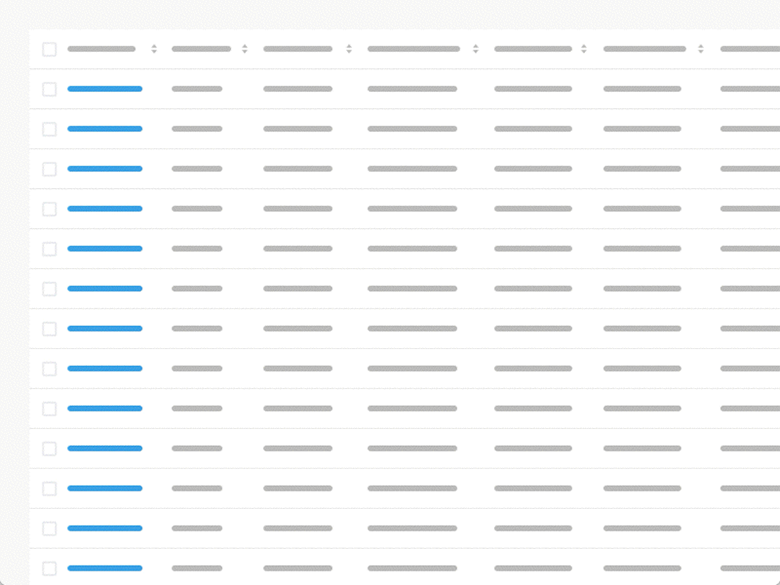
Design Better Data Tables
Andrew Coyle's memos for working with complex tables. He clearly lists a lot of useful patterns of navigation, sorting and filtering. Translation . Sliders, Knobs, and Matrices - Balancing Exploration and Precision Page Laubheimer explores the use of sliders, shift knobs, and two-dimensional matrices in interfaces. For what tasks they are appropriate, how to ensure comfortable work with them with different input devices. Interactive Email Design Elements, Interactive Email Marketing
An excellent catalog of patterns of modern interactive techniques in mailing lists. True, there is very little information about how much it is supported by postal services and customers, and this is the main problem in the implementation of all these beautiful ideas. Continuing the topic:
Casey Winters Reveals How Pinterest Perfected User Onboarding
Former Pinterest designer Casey Winters talks about how the process of meeting a new user in a product works. Continuing the topic:

Hollywood Goodbyes and Focused Content
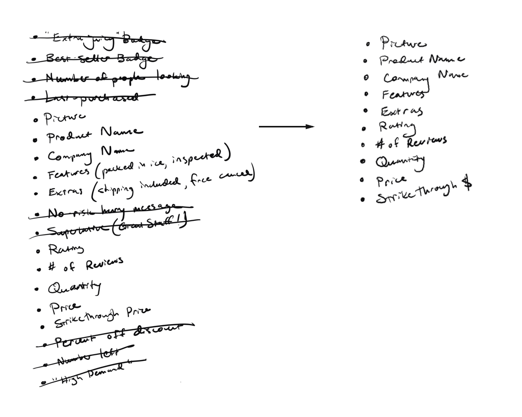
An interesting approach to simplify existing interface screens from Dave Riensche. He defines the key tasks of the page, and then writes out its current elements and crosses out those that are not related to the task. After that, it ranks them by value and reassembles the screen without too much and with the necessary accents. Jessica Enders - Designing UX: Forms Last year, SitePoint published the Jessica Enders book, Designing UX: Forms . UXmatters publishes an excerpt from it dedicated to designing a common script for filling out a form. Best Practices for Long Scrolling Nikolai Babich describes the principles of designing solid page interfaces with long scrolling. A couple of fresh articles from him:

Big Pictures on Small Screens
Tips by Amy Schade from the Nielsen / Norman Group on what to do with large pictures in the mobile version.
Baymard Institute Research
A Year of Google Maps & Apple Maps
Justin O'Beirne continued his comparison of Google and Apple maps. During the year, he collected screenshots of updates to several pieces of the sought-after territory.
Design principle: IKEA effect
Anton Nikolov describes the interface principle of IKEA - how to engage users through simple steps to configure or fill in personal data.
Design avatars that make sense - and be more inclusive in the process
Michelle Venetucci Harvey explores different ways to represent avatars by default when the gender of the user is unknown.
Anchors OK? Re-Assessing In-Page Links
An Amy Schade memo from Nielsen / Norman Group on using anchor links within a page. They have many potential problems and the article tells how to avoid them.
Microsoft Fluent Design System
At Build, Microsoft showed the next generation of Windows design. They called it the Fluent design system - it develops the current visual language in order to combine not only screen interfaces, but also augmented / virtual reality . If Material Design once showed a unification method for everything that has a display, then this is the next step in the development of visual languages.
So far this is just a one-page page with a story about ideology, plus several new pages in the UWP (Universal Windows Platform) guidelines . But this will be the development of UWP (there are already templates and toolkits for many design tools - Sketch, Photoshop, Illustrator, XD and Framer). I wonder how this will affect the Office Fabric design system .
At the beginning of the year, screenshots of its earlier version, codenamed Project Neon, leaked . They showed the return of the translucent effect from Windows Vista and the addition of typographic accents. Video demonstrationconfirms this direction. In addition, the already successful work with front-end animation, which Microsoft rethought in 2010 and had a great impact on the market, has become even more vigorous. As well as the principle of scale , which is important for augmented and virtual reality.
At one time, metro-design changed the interfaces with a more modern and organic approach to the digital environment and identified several key principles that Google and Apple picked up - focus on content instead of decor, a special role of animation. True, mobile Windows could not compete with the leaders, and the desktop one simplified the interface approaches in Windows 10. In the new generation, Microsoft added the material thoughts of Material Design to its initial ideas, so the new generation of the visual language should become even more interesting. Moreover, with a new update cycle every six months, this will not remain an empty spotlight, as often happened before.
The official group on LinkedIn .
Android O
At the Google I / O conference, Android updates were presented. Company design teamnoted the most interesting performances . The main changes are technical, the interface concerns everything that has already been announced before (finally there are update indicators on application icons , new emoji (no better than old ones), contextual tips for working with the clipboard , improvements to the notification area). Now a simplified version of Tensor Flow is built into the platform, which solves the problems of machine learning, the next acceleration of work and the reduction of the battery load, a new powerful engine for 3D graphics . The best part is that many standard animations have been added to the standard libraries. You can put a beta version of Android O. There are libraries of Material Design components
and online tutorials on how to use them: Android , iOS, and the web . The Google office put together a great working session with sensible local designers who offered a lot of application concepts . By the way, the platform is already used on 2 billion devices .
Interestingly, Google is experimenting in the background on a non-Linux version of Android. She is called Fuchsia and her interface screens have recently leaked . There are no plans and deadlines for it, so the pictures are more likely to be in the know.
Design system of Russia
The initiative group “Design of state systems” showed the first parts of the design system, which should unify the sites of state organizations.
Illustrating a more human brand, part 2
Continuation of the epic article by the Dropbox design team on the evolution of their illustration style. The second part describes the birth of the current approach. Continuing the topic:
Samsung Design
The site has been updated quite a lot.
The Path to Design System Maturity
Christian Beck describes his vision of the maturity levels of a design system: unification at the level of layouts, unification of all product communication, unification of code.
Style Guide Guide by Brad Frost
Brad Frost created a stub to describe a simple design system. It offers a generic structure for describing variables, elements, and components.
The Illusion of Measuring What Customers Want The
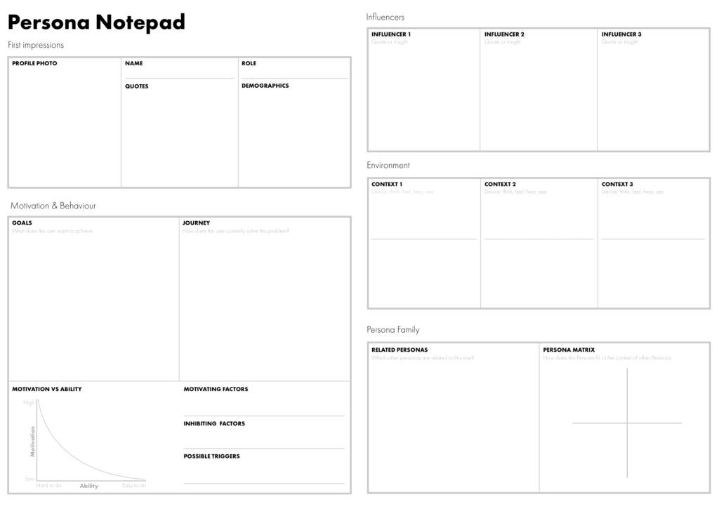
smartest analysis of the limitations of UX measurement from Alan Klement. Despite the fact that popular measurements based on the Likert scale are expressed in numbers, these are qualitative rather than quantitative data, and they should be used for calculations with caution. Creating Personas - A guide, not a template An interesting character description format from Ben Ralph, which takes into account a lot of details. True, few of these articles solve the problem of using characters after they are created. Continuing the topic:
 Nir Eyal - On the hook
Mann Publishing House, Ivanov, Ferber publishes a Russian translation of Nir Eyal's Hooked.
Contemporary morality - Moral judgments in digital contexts An
interesting user-psychological study - about 1000 people suggested solving moral and ethical problems using a telephone or computer. Phone users made the best moral choice. Brief conclusions from the study .
Design for Fingers, Touch, and People, part 2
Continuation of the new edition of Steven Hoober's article on how users work with mobile phones.
Jonathan Shariat & Cynthia Savard - The Tragic Design Book
A book was published by Jonathan Shariat and Cynthia Savard, dedicated to the tragic situations in life, where the designers did not think and made the situation worse.
The 5 Steps of Successful Customer Journey Mapping
Kate Kaplan’s explanatory step-by-step guide on creating a customer journey map. These are five stages for collecting an initiative group, conducting research and creating the map itself.
Framer Design
Framer rethought the tool and added their Sketch there. Now it is a full-fledged product for design and prototyping with switching between these two modes. Video demonstration . Other tool news:
Sketch 44
In the new version, it became possible to more accurately set the behavior of elements with adaptability - to which edges it sticks, how it stretches vertically and horizontally. This works for both objects and artboards (which now have the ability to quickly switch sizes). Perhaps this will make Auto Layout unnecessary, because it often knocks down sizes and indents between elements. There was also the opportunity to replace the missing fonts, comment on the layouts in Sketch Cloud, updated templates for iOS. Translation . Fresh plugins and instructions:

Ludus
Browser graphics editor. An interesting feature - you can import materials from third-party services - for example, Framer prototypes or scripts on CodePen.
Storyframes before wireframes - Starting designs in the text editor
Fabricio Teixeira describes a method for designing storyframing pages. Instead of creating the usual wireframes, a promotional site or a similar page is described by a short narrative text that includes the main messages that the company wants to convey to the user.
C4Studio
Invision
Adobe xd
Figma
Flinto
Group Notetaking for User Research
An excellent methodology for group taking notes during usability testing sessions, which the entire product team attends to - in this format, the effectiveness of the knowledge gained for changes in the product is much greater. Description of the process, document templates, pitfalls. How to work with analytics, if you are a designer Natalya Babaeva from the MIF publishing house, shows how a designer can effectively interact with an analyst to improve interfaces. It shows the approximate steps of "growing up" the dialogue from obtaining useless numbers to productive work through hypotheses. 5 Techniques to Identify Clusters In Your Data Jeff Sauro breaks down five key techniques for clustering user research data. Ambient research
Vox Media's Gregg Bernstein talks about how they make user research results constantly accessible and visible to the entire product team. Due to the fact that they are always in sight, their insights are used more often.
A Better Way to Code A
crazy example of visual programming from Mike Bostock, creator of the popular d3.js library for data visualization. He launched d3.express, a development and analytics environment at the same time, which allows you to step through and visualize data - in this format, the analysis work radically changes its format. New scripts
Flexbox and CSS Grid
Work with SVG
Web Typography
Business Software UX & NPS Benchmarks
Jeff Sauro conducted a study of NPS and SUS indicators for a dozen well-known productivity services. The report is paid and quite expensive , but the article has the main conclusions.
UX strategy. Part 6 - Introducing
Sixth, the final article in the series about the UX strategy in practice. It is dedicated to implementing changes in products and companies. This is an expanded and revised version of the presentation .
It is not enough to accomplish a feat in the form of a successful redesign of an outdated service - it is necessary to ensure repeatability of good results. Therefore, you need to think about rebuilding the socio-technical system, and not just updating several screens. The reason for bad products is the poor machine that produces them, so you need to repair it first. The sixth part is based on the idea of patterns of design management and actively refers to the previous ones.

After the release of the English version, I’ll do two things:
Product Design Exercises We Use At WeWork Interviews
Good test cases from the WeWork design team. They successfully described the problems and set limits.
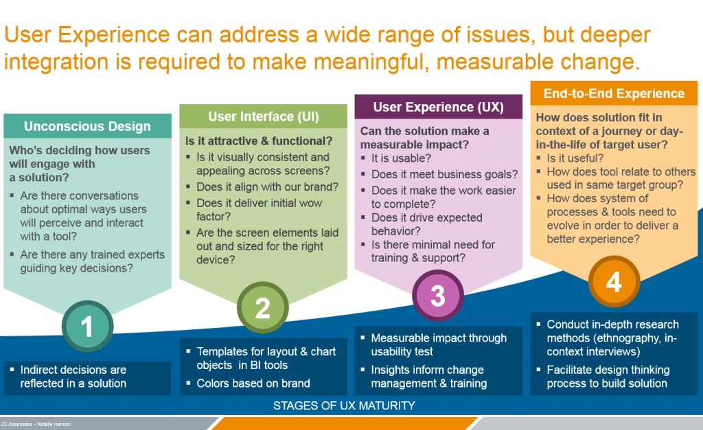
A New UX Maturity Model
Natalie Hanson offers its UX maturity model. In it, the design in the company develops from a not very meaningful one to focus first on visual consistency, then on the quality of user interaction and, finally, on a holistic map of interaction across all channels. Continuing the topic:
How to jump-start recruiting in hard-to-staff contexts
Tips for hiring and developing designers from Facebook Product Design Margaret Gould Stewart.
How IBM Trains Design Thinking Facilitators
Ann F. Novelli talks about how IBM trains facilitators to spread design thinking practices throughout the company. This has become one of the key ideas for scaling design. UX & Agile: Dream Team or Odd Couple? The topic of integrating UX practices into a flexible development process has already been beaten up, but Paul McInerney from IBM has structured the company's experience well. How Intercom brings play into their design process Intercom Stewart Scott-Curran's head of brand design tells how his team works. Continuing the topic:
Translating UX Goals into Analytics Measurement Plans
Aurora Harley of the Nielsen / Norman Group shows how to translate front-end questions into the analytic language and set up tracking of the required metrics.
Product discovery: Making progress towards the innovation land - Interview with Nikkel Blaase
Interview with Niking Blaase from XING about receiving product insights from users who help them find innovative solutions.
 Jake Knapp - Sprint: How to develop and test a new product in just five days
Alpina Publishing House has released a Russian translation of the book about Design Sprints from Google Ventures.
Prototyping IBM Design Thinking Method Cards
Eric Morrow talks about how IBM made design-thinking playing cards that help guide co-design sessions. They plan to put them in all the meeting rooms so that any team can improve working discussions. True, the continuation of the article is watery.
Experience designer
IKRA and Odnoklassniki launched a training manual, which collected a lot of methods for solving problems and gags in working on digital products. These are both good practices and just warm-up exercises.
Unsolicited Redesigns
Reissue of the IBM Graphic Standards Manual by Paul Rand
A group of enthusiasts is about to re-release the classic IBM guidelines from Paul Rand. For € 30 you can get a print of one of the best visual languages.
The 5 Principles of IoT UX Design The
principles of interface design for the Internet of things from Jared Porcenaluk. Accents have been sensibly laid out - these interfaces are utilitarian and should not require too much attention.
Designing Voice Experiences
Overview of the design process for voice interfaces from Lyndon Cerejo. Key and scenarios, error handling and deviations from the plan, best practices.
Algorithmic Design
Smart watches and bracelets
Ten Principles of Good Design (2017 Tech Industry Edition)
Tobias van Schneider updated the design principles of Dieter Rams in accordance with the realities of the modern Internet.
Can Digital Products Be "Timeless?"
Hodinkee's Adam Kopec discusses whether digital products can be designed in the spirit of timeless classics from the physical world (like the Porsche 911). Digital product changes are happening so quickly and often that product styles and models are constantly changing. There are a couple of such examples - the Google homepage and the Facebook news feed.
Re-finding Your Individual Contributor Self
Erin Malone reflects on how a design manager can’t forget to work with his hands and not break away from real food business. She is trying to restore her skills and shares her experience.
AMA: 2GIS
Interview with the 2GIS design team based on AMA. The Novosibirsk cartographic service is successful in terms of products and devotes a lot of time to developing the design of the main product, and also makes multiple experimental applications. A few years ago they showed an example of how you can use your own relatively simple means to get your own font. In addition, they organize the CodeFest conference in Novosibirsk and support Typography Silver, dedicated to typography. Women Who Design Twitter website for women designers. How and why it was done . The Slash Workers Survey of 300 freelancers about the features of their work and career vision from And Co. However, as usual, it is not a fact that is relevant for our market - 70% of respondents are from the USA.

Freelance.tv
Dann Petty is preparing a film about freelance designers. To do this, he traveled to America in a minibus and recorded a bunch of interviews with famous freelancers.
IA, Rosenfeld Media, and EUX - An Interview with Louis Rosenfeld
Interview with Louis Rosenfeld, in which he talks about the transition from working on projects to developing the profession as a whole - they expand the publishing activities of Rosenfeld Media and announce new conferences.
Interface Lovers
The site publishes interviews with product designers.
Agile UX Virtual Summit
UXPin and Rosenfeld Media host a free online conference on June 13-16. Again a fairly powerful lineup: John Zeratsky, Indi Young, Peter Merholz, Carol Smith, Josh Seiden and others.
Design Ops Summit A
conference on design management and UX strategy from Rosenfeld Media, which will be held in New York on November 6-8.
UXSTRAT USA 2016
Overview of three presentations from the American part of the UXSTRAT 2016 conference from Krispian Emert - it was held on September 14-16 in Providence, USA.
Subscribe to our newsletter ! A letter arrives once a month.
Patterns and best practices
Design Better Data Tables
Andrew Coyle's memos for working with complex tables. He clearly lists a lot of useful patterns of navigation, sorting and filtering. Translation . Sliders, Knobs, and Matrices - Balancing Exploration and Precision Page Laubheimer explores the use of sliders, shift knobs, and two-dimensional matrices in interfaces. For what tasks they are appropriate, how to ensure comfortable work with them with different input devices. Interactive Email Design Elements, Interactive Email Marketing
An excellent catalog of patterns of modern interactive techniques in mailing lists. True, there is very little information about how much it is supported by postal services and customers, and this is the main problem in the implementation of all these beautiful ideas. Continuing the topic:
- The creators of the Really Good Emails blog have tried to create their own design award for the best emails .
Casey Winters Reveals How Pinterest Perfected User Onboarding
Former Pinterest designer Casey Winters talks about how the process of meeting a new user in a product works. Continuing the topic:
- Samuel Hulick describes three principles for a good new user meeting process : integrated, self-reliant and reliable.
Hollywood Goodbyes and Focused Content
An interesting approach to simplify existing interface screens from Dave Riensche. He defines the key tasks of the page, and then writes out its current elements and crosses out those that are not related to the task. After that, it ranks them by value and reassembles the screen without too much and with the necessary accents. Jessica Enders - Designing UX: Forms Last year, SitePoint published the Jessica Enders book, Designing UX: Forms . UXmatters publishes an excerpt from it dedicated to designing a common script for filling out a form. Best Practices for Long Scrolling Nikolai Babich describes the principles of designing solid page interfaces with long scrolling. A couple of fresh articles from him:
- Pros and cons of the main way to organize navigation in mobile applications .
- A guide to best practices for designing mobile interfaces .
Big Pictures on Small Screens
Tips by Amy Schade from the Nielsen / Norman Group on what to do with large pictures in the mobile version.
Baymard Institute Research
- An updated report on the quality of product pages from Baymard , the previous version of which was released two years ago.
- The importance of product photos, clearly showing its dimensions . 56% of users in their research immediately began to study the photos on the product card, many expected to see the size.
A Year of Google Maps & Apple Maps
Justin O'Beirne continued his comparison of Google and Apple maps. During the year, he collected screenshots of updates to several pieces of the sought-after territory.
Design principle: IKEA effect
Anton Nikolov describes the interface principle of IKEA - how to engage users through simple steps to configure or fill in personal data.
Design avatars that make sense - and be more inclusive in the process
Michelle Venetucci Harvey explores different ways to represent avatars by default when the gender of the user is unknown.
Anchors OK? Re-Assessing In-Page Links
An Amy Schade memo from Nielsen / Norman Group on using anchor links within a page. They have many potential problems and the article tells how to avoid them.
Design systems and guidelines
Microsoft Fluent Design System
At Build, Microsoft showed the next generation of Windows design. They called it the Fluent design system - it develops the current visual language in order to combine not only screen interfaces, but also augmented / virtual reality . If Material Design once showed a unification method for everything that has a display, then this is the next step in the development of visual languages.
So far this is just a one-page page with a story about ideology, plus several new pages in the UWP (Universal Windows Platform) guidelines . But this will be the development of UWP (there are already templates and toolkits for many design tools - Sketch, Photoshop, Illustrator, XD and Framer). I wonder how this will affect the Office Fabric design system .
At the beginning of the year, screenshots of its earlier version, codenamed Project Neon, leaked . They showed the return of the translucent effect from Windows Vista and the addition of typographic accents. Video demonstrationconfirms this direction. In addition, the already successful work with front-end animation, which Microsoft rethought in 2010 and had a great impact on the market, has become even more vigorous. As well as the principle of scale , which is important for augmented and virtual reality.
At one time, metro-design changed the interfaces with a more modern and organic approach to the digital environment and identified several key principles that Google and Apple picked up - focus on content instead of decor, a special role of animation. True, mobile Windows could not compete with the leaders, and the desktop one simplified the interface approaches in Windows 10. In the new generation, Microsoft added the material thoughts of Material Design to its initial ideas, so the new generation of the visual language should become even more interesting. Moreover, with a new update cycle every six months, this will not remain an empty spotlight, as often happened before.
The official group on LinkedIn .
Android O
At the Google I / O conference, Android updates were presented. Company design teamnoted the most interesting performances . The main changes are technical, the interface concerns everything that has already been announced before (finally there are update indicators on application icons , new emoji (no better than old ones), contextual tips for working with the clipboard , improvements to the notification area). Now a simplified version of Tensor Flow is built into the platform, which solves the problems of machine learning, the next acceleration of work and the reduction of the battery load, a new powerful engine for 3D graphics . The best part is that many standard animations have been added to the standard libraries. You can put a beta version of Android O. There are libraries of Material Design components
and online tutorials on how to use them: Android , iOS, and the web . The Google office put together a great working session with sensible local designers who offered a lot of application concepts . By the way, the platform is already used on 2 billion devices .
Interestingly, Google is experimenting in the background on a non-Linux version of Android. She is called Fuchsia and her interface screens have recently leaked . There are no plans and deadlines for it, so the pictures are more likely to be in the know.
Design system of Russia
The initiative group “Design of state systems” showed the first parts of the design system, which should unify the sites of state organizations.
Illustrating a more human brand, part 2
Continuation of the epic article by the Dropbox design team on the evolution of their illustration style. The second part describes the birth of the current approach. Continuing the topic:
- An interesting story by Alice Lee about creating a new unified style of Wordpress , taking into account the diversity of users.
- Shopify's Meg Robichaud continues to describe his vision of the role and objectives of product illustration . In another article, she talks about the nuances of working with a team of illustrators in a product team .
Samsung Design
The site has been updated quite a lot.
The Path to Design System Maturity
Christian Beck describes his vision of the maturity levels of a design system: unification at the level of layouts, unification of all product communication, unification of code.
Style Guide Guide by Brad Frost
Brad Frost created a stub to describe a simple design system. It offers a generic structure for describing variables, elements, and components.
User understanding
The Illusion of Measuring What Customers Want The
smartest analysis of the limitations of UX measurement from Alan Klement. Despite the fact that popular measurements based on the Likert scale are expressed in numbers, these are qualitative rather than quantitative data, and they should be used for calculations with caution. Creating Personas - A guide, not a template An interesting character description format from Ben Ralph, which takes into account a lot of details. True, few of these articles solve the problem of using characters after they are created. Continuing the topic:
- Jeff Sauro describes in detail a competent user research process for character writing . True, it also does not concern the problem of their further use.
Nir Eyal - On the hookMann Publishing House, Ivanov, Ferber publishes a Russian translation of Nir Eyal's Hooked.
Contemporary morality - Moral judgments in digital contexts An
interesting user-psychological study - about 1000 people suggested solving moral and ethical problems using a telephone or computer. Phone users made the best moral choice. Brief conclusions from the study .
Design for Fingers, Touch, and People, part 2
Continuation of the new edition of Steven Hoober's article on how users work with mobile phones.
Jonathan Shariat & Cynthia Savard - The Tragic Design Book
A book was published by Jonathan Shariat and Cynthia Savard, dedicated to the tragic situations in life, where the designers did not think and made the situation worse.
Information architecture, conceptual design, content strategy
The 5 Steps of Successful Customer Journey Mapping
Kate Kaplan’s explanatory step-by-step guide on creating a customer journey map. These are five stages for collecting an initiative group, conducting research and creating the map itself.
Design and design of interface screens
Framer Design
Framer rethought the tool and added their Sketch there. Now it is a full-fledged product for design and prototyping with switching between these two modes. Video demonstration . Other tool news:
- Microsoft's Joe Day talks about how to use Framer on Windows . This, unfortunately, is not about how to install the editor itself.
Sketch 44
In the new version, it became possible to more accurately set the behavior of elements with adaptability - to which edges it sticks, how it stretches vertically and horizontally. This works for both objects and artboards (which now have the ability to quickly switch sizes). Perhaps this will make Auto Layout unnecessary, because it often knocks down sizes and indents between elements. There was also the opportunity to replace the missing fonts, comment on the layouts in Sketch Cloud, updated templates for iOS. Translation . Fresh plugins and instructions:
- Michael Spiegel shows how you can colorize a set of icons by redefining a copy of a character .
- Mirr is another plugin that allows you to build a simple interactive prototype directly in Sketch.
Ludus
Browser graphics editor. An interesting feature - you can import materials from third-party services - for example, Framer prototypes or scripts on CodePen.
Storyframes before wireframes - Starting designs in the text editor
Fabricio Teixeira describes a method for designing storyframing pages. Instead of creating the usual wireframes, a promotional site or a similar page is described by a short narrative text that includes the main messages that the company wants to convey to the user.
C4Studio
- After a long break, the developers announced an updated version .
Invision
- Craft: The ability to create interactive prototypes is finally out of beta. Connections between screens are created in Sketch, then everything is exported to InVision.
- InVision buys TrackDuck , a service for discussing layouts by the team.
Adobe xd
- At Behance, you can see examples of work created using the tool .
Figma
- Published application Figma Mirror for All Android .
- A fairly detailed analysis of the strengths of Figma from Tom Johnson .
Flinto
- Version 2.2 released . You can edit text and objects directly in Flinto, so experimenting becomes easier.
- Translation of step-by-step instructions for working with Behavior Designer .
User research and testing, analytics
Group Notetaking for User Research
An excellent methodology for group taking notes during usability testing sessions, which the entire product team attends to - in this format, the effectiveness of the knowledge gained for changes in the product is much greater. Description of the process, document templates, pitfalls. How to work with analytics, if you are a designer Natalya Babaeva from the MIF publishing house, shows how a designer can effectively interact with an analyst to improve interfaces. It shows the approximate steps of "growing up" the dialogue from obtaining useless numbers to productive work through hypotheses. 5 Techniques to Identify Clusters In Your Data Jeff Sauro breaks down five key techniques for clustering user research data. Ambient research
Vox Media's Gregg Bernstein talks about how they make user research results constantly accessible and visible to the entire product team. Due to the fact that they are always in sight, their insights are used more often.
Visual programming and design in the browser
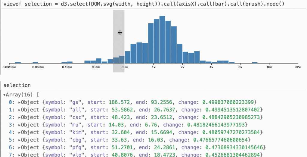
A Better Way to Code A
crazy example of visual programming from Mike Bostock, creator of the popular d3.js library for data visualization. He launched d3.express, a development and analytics environment at the same time, which allows you to step through and visualize data - in this format, the analysis work radically changes its format. New scripts
- A collection of spectacular animations revealing the contents of a folder for file storage.
- A collection of scripts to animate passages through tunnels .
- Gorgeous animation of the transformation of abstract shapes when scrolling the page .
Flexbox and CSS Grid
Work with SVG
- Another online service for optimizing SVG code .
Web Typography
- An interesting formula for calculating font size for pure adaptability from Jake Wilson . The size of the browser window, of course, is rarely changed by users, but such a flexible approach allows you to lay on any device and screen.
Metrics and ROI
Business Software UX & NPS Benchmarks
Jeff Sauro conducted a study of NPS and SUS indicators for a dozen well-known productivity services. The report is paid and quite expensive , but the article has the main conclusions.
UX Strategy and Management
UX strategy. Part 6 - Introducing
Sixth, the final article in the series about the UX strategy in practice. It is dedicated to implementing changes in products and companies. This is an expanded and revised version of the presentation .
It is not enough to accomplish a feat in the form of a successful redesign of an outdated service - it is necessary to ensure repeatability of good results. Therefore, you need to think about rebuilding the socio-technical system, and not just updating several screens. The reason for bad products is the poor machine that produces them, so you need to repair it first. The sixth part is based on the idea of patterns of design management and actively refers to the previous ones.
After the release of the English version, I’ll do two things:
- Книга по дизайн-менеджменту на основе серии. В ней будет переработана структура, добавлено много примеров и раскрыты чуть менее масштабные темы, которые не попали в основные 6 частей.
- Инструмент для оценки зрелости вашей компании и рекомендации по дальнейшим шагам. В серии статей вырисовалось что-то вроде собственного метода, попробую формализовать его.
Product Design Exercises We Use At WeWork Interviews
Good test cases from the WeWork design team. They successfully described the problems and set limits.
A New UX Maturity Model
Natalie Hanson offers its UX maturity model. In it, the design in the company develops from a not very meaningful one to focus first on visual consistency, then on the quality of user interaction and, finally, on a holistic map of interaction across all channels. Continuing the topic:
- Jeff Sauro is preparing its UX maturity model . To do this, he analyzed existing models, compiled a questionnaire based on them, and launched them on hundreds of companies. Results will be published later.
How to jump-start recruiting in hard-to-staff contexts
Tips for hiring and developing designers from Facebook Product Design Margaret Gould Stewart.
How IBM Trains Design Thinking Facilitators
Ann F. Novelli talks about how IBM trains facilitators to spread design thinking practices throughout the company. This has become one of the key ideas for scaling design. UX & Agile: Dream Team or Odd Couple? The topic of integrating UX practices into a flexible development process has already been beaten up, but Paul McInerney from IBM has structured the company's experience well. How Intercom brings play into their design process Intercom Stewart Scott-Curran's head of brand design tells how his team works. Continuing the topic:
Product Management and Analytics
Translating UX Goals into Analytics Measurement Plans
Aurora Harley of the Nielsen / Norman Group shows how to translate front-end questions into the analytic language and set up tracking of the required metrics.
Product discovery: Making progress towards the innovation land - Interview with Nikkel Blaase
Interview with Niking Blaase from XING about receiving product insights from users who help them find innovative solutions.
Methodologies, Procedures, Standards
Jake Knapp - Sprint: How to develop and test a new product in just five daysAlpina Publishing House has released a Russian translation of the book about Design Sprints from Google Ventures.
Prototyping IBM Design Thinking Method Cards
Eric Morrow talks about how IBM made design-thinking playing cards that help guide co-design sessions. They plan to put them in all the meeting rooms so that any team can improve working discussions. True, the continuation of the article is watery.
Experience designer
IKRA and Odnoklassniki launched a training manual, which collected a lot of methods for solving problems and gags in working on digital products. These are both good practices and just warm-up exercises.
Cases
Unsolicited Redesigns
- Surprisingly sensible, the unsolicited redesign of Apple Music from Jason Yuan , who tried to get into the company, but failed to qualify.
- InVision brought together the concepts of the mythical product Pied Piper from the Silicon Valley series , which were laid out on Dribbble.
History
Reissue of the IBM Graphic Standards Manual by Paul Rand
A group of enthusiasts is about to re-release the classic IBM guidelines from Paul Rand. For € 30 you can get a print of one of the best visual languages.
Trends
The 5 Principles of IoT UX Design The
principles of interface design for the Internet of things from Jared Porcenaluk. Accents have been sensibly laid out - these interfaces are utilitarian and should not require too much attention.
Designing Voice Experiences
Overview of the design process for voice interfaces from Lyndon Cerejo. Key and scenarios, error handling and deviations from the plan, best practices.
Algorithmic Design
Smart watches and bracelets
- Amazon, eBay и Google Maps удалили свои приложения для Apple Watch. Последние, правда, обещают вернуть когда-нибудь. Отгремела первая волна приложений, во многом сделанных ради фичеринга, так что хайп постепенно откатывается к реальности.
Для общего и профессионального развития
Ten Principles of Good Design (2017 Tech Industry Edition)
Tobias van Schneider updated the design principles of Dieter Rams in accordance with the realities of the modern Internet.
Can Digital Products Be "Timeless?"
Hodinkee's Adam Kopec discusses whether digital products can be designed in the spirit of timeless classics from the physical world (like the Porsche 911). Digital product changes are happening so quickly and often that product styles and models are constantly changing. There are a couple of such examples - the Google homepage and the Facebook news feed.
Re-finding Your Individual Contributor Self
Erin Malone reflects on how a design manager can’t forget to work with his hands and not break away from real food business. She is trying to restore her skills and shares her experience.
Люди и компании в отрасли
AMA: 2GIS
Interview with the 2GIS design team based on AMA. The Novosibirsk cartographic service is successful in terms of products and devotes a lot of time to developing the design of the main product, and also makes multiple experimental applications. A few years ago they showed an example of how you can use your own relatively simple means to get your own font. In addition, they organize the CodeFest conference in Novosibirsk and support Typography Silver, dedicated to typography. Women Who Design Twitter website for women designers. How and why it was done . The Slash Workers Survey of 300 freelancers about the features of their work and career vision from And Co. However, as usual, it is not a fact that is relevant for our market - 70% of respondents are from the USA.
Freelance.tv
Dann Petty is preparing a film about freelance designers. To do this, he traveled to America in a minibus and recorded a bunch of interviews with famous freelancers.
IA, Rosenfeld Media, and EUX - An Interview with Louis Rosenfeld
Interview with Louis Rosenfeld, in which he talks about the transition from working on projects to developing the profession as a whole - they expand the publishing activities of Rosenfeld Media and announce new conferences.
Interface Lovers
The site publishes interviews with product designers.
Conference proceedings
Agile UX Virtual Summit
UXPin and Rosenfeld Media host a free online conference on June 13-16. Again a fairly powerful lineup: John Zeratsky, Indi Young, Peter Merholz, Carol Smith, Josh Seiden and others.
Design Ops Summit A
conference on design management and UX strategy from Rosenfeld Media, which will be held in New York on November 6-8.
UXSTRAT USA 2016
Overview of three presentations from the American part of the UXSTRAT 2016 conference from Krispian Emert - it was held on September 14-16 in Providence, USA.
Subscribe to our newsletter ! A letter arrives once a month.