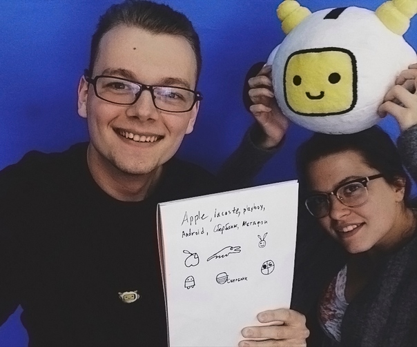
Experiment: passersby draw famous logos from memory
We decided to conduct a comic experiment: go outside and find out how well people remember the logos of famous brands. We asked passers-by to draw from memory the logos of Apple, Lacoste, Playboy, Android, Sberbank, Megaphone.
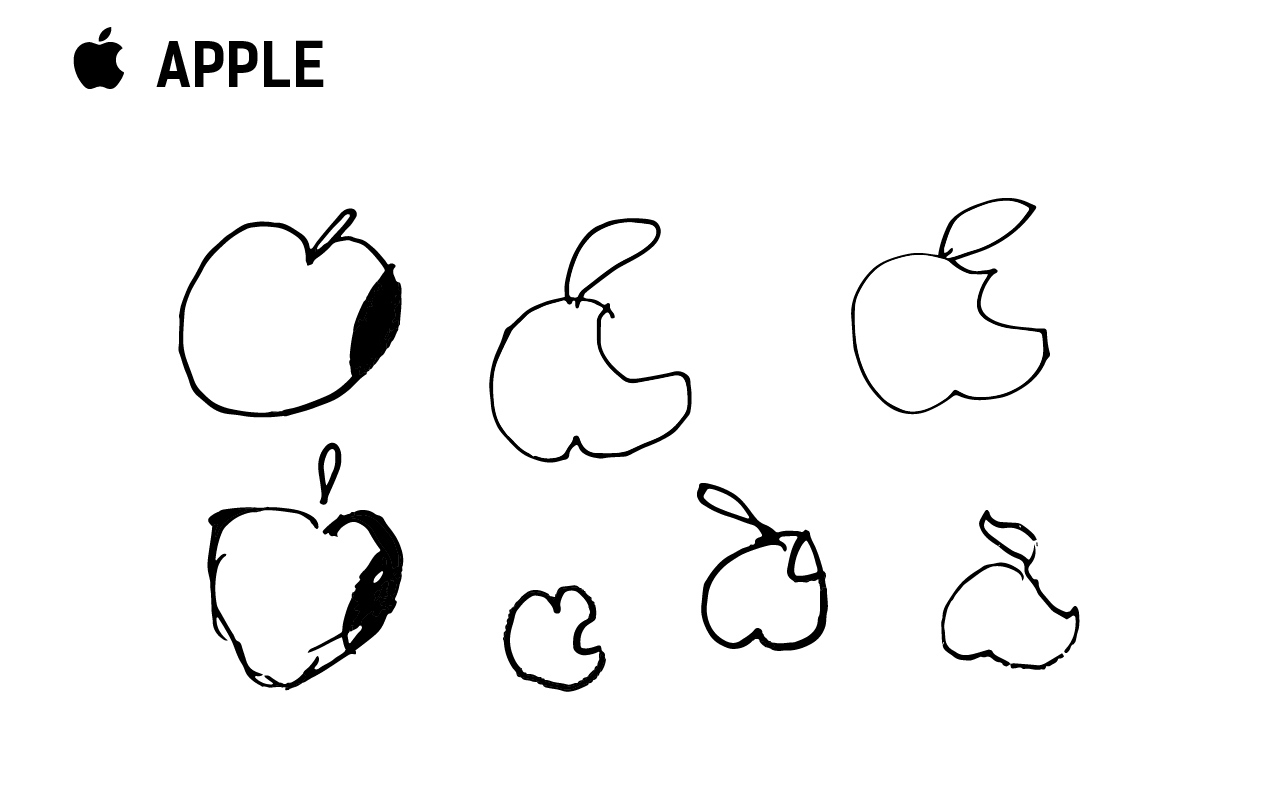
There were no big problems with this logo:
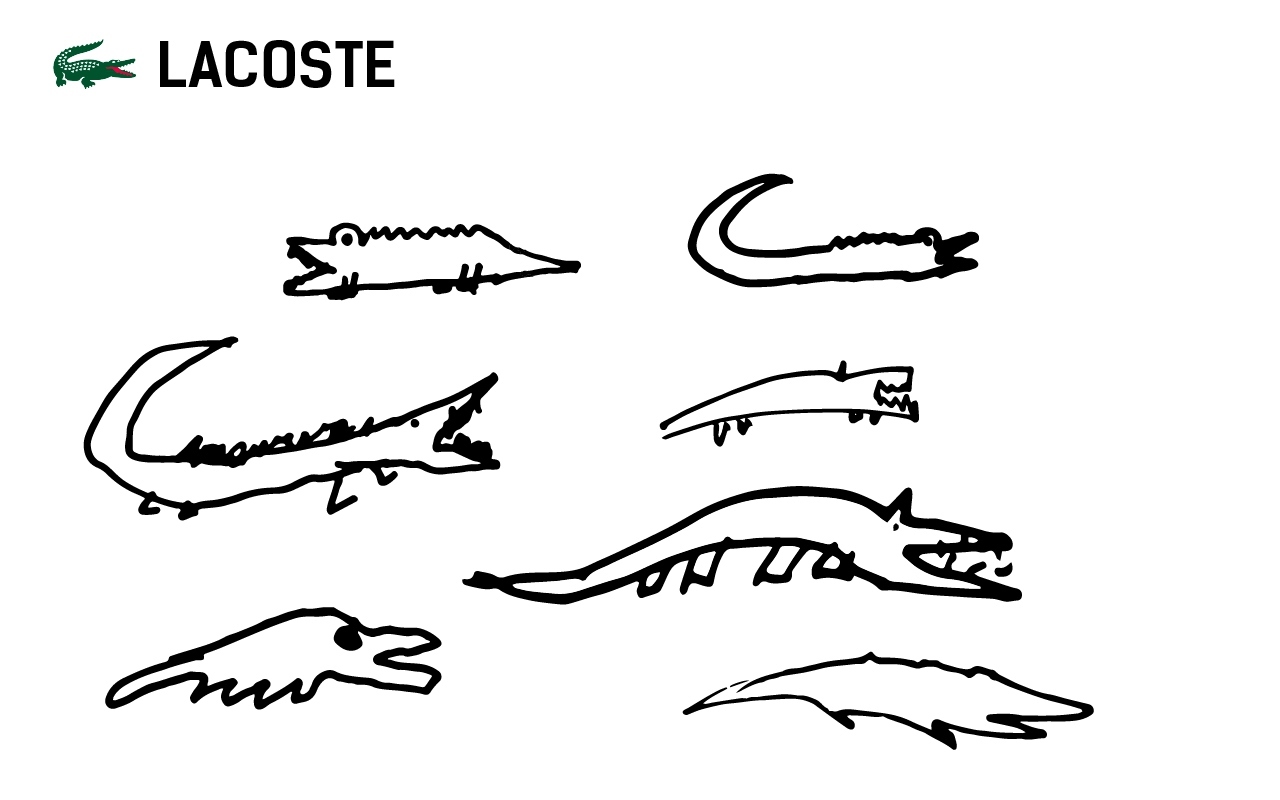
Something like that the image of the logo was deposited in the memory of people. Of course, not everyone can draw a crocodile, but the general motives are visible:
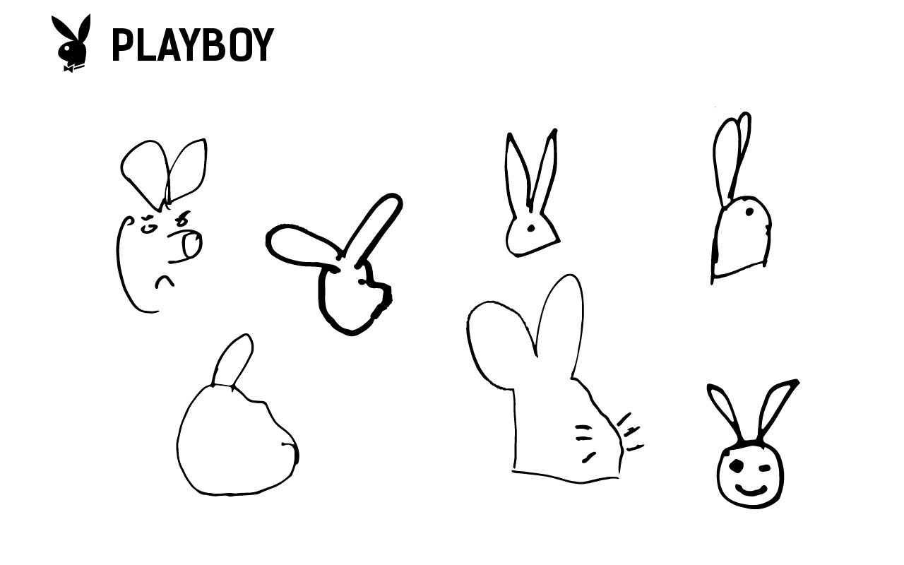
For some reason, all the passers-by painted the rabbit in the wrong direction, although they did not see each other's options:
Everyone remembers the general form, but no one drew characteristic hands:
Most of the memory, apparently, reflected the old Sberbank logo, without the slight asymmetry that appeared later:
Here the scatter is the largest - from an exact copy to ???!?:

Of course, this is not a serious experiment, but even from it you can understand which logo features people remember better and which worse. We took some options and imagined what the world would look like with such a logo:


Hmm ... Android is prettier.
If you liked our comic experiment, subscribe to Logomashina in VK , there is more interesting. See you later!
PS The second part of the experiment with the logos of frets, starbucks and others
Apple
There were no big problems with this logo:
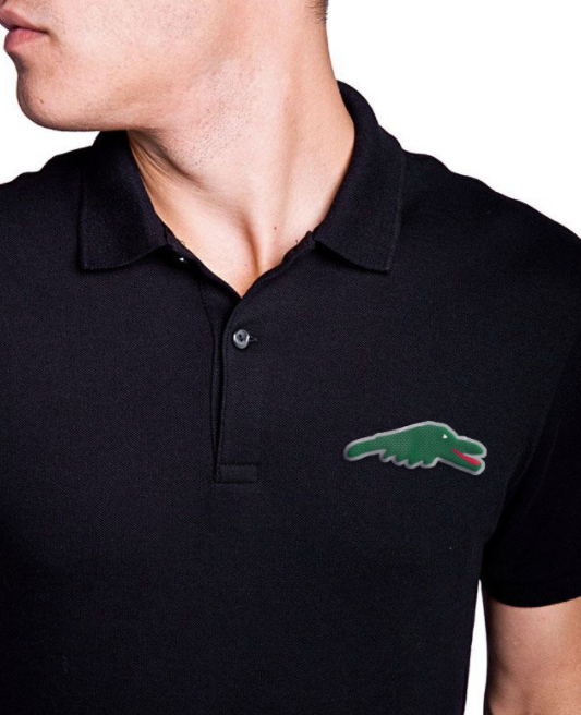
Lacoste
Something like that the image of the logo was deposited in the memory of people. Of course, not everyone can draw a crocodile, but the general motives are visible:
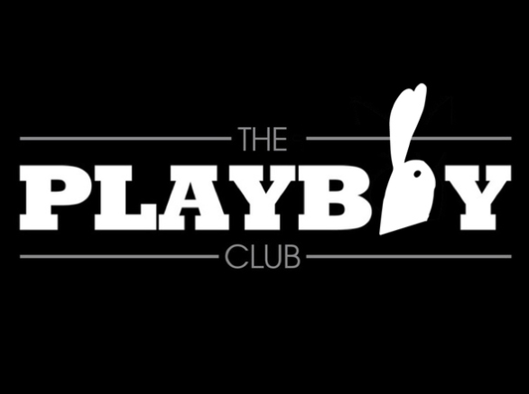
Playboy
For some reason, all the passers-by painted the rabbit in the wrong direction, although they did not see each other's options:
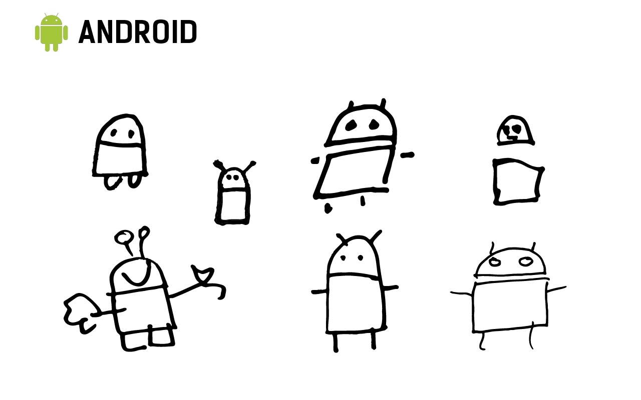
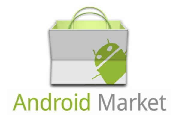
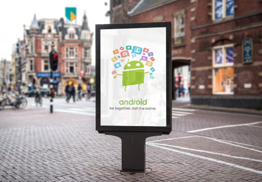
Android
Everyone remembers the general form, but no one drew characteristic hands:
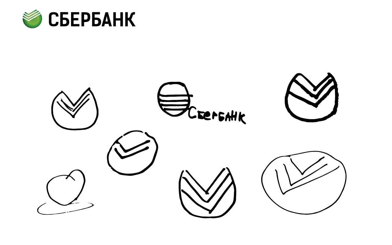
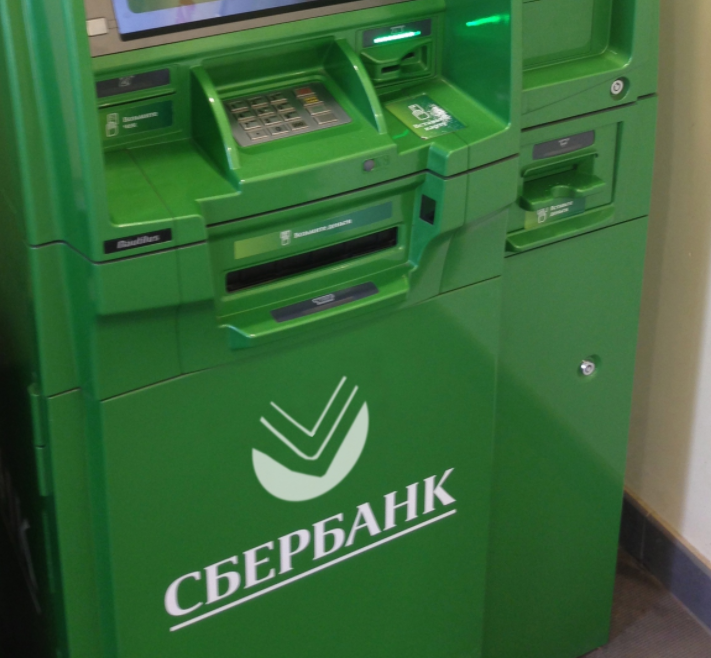
Sberbank
Most of the memory, apparently, reflected the old Sberbank logo, without the slight asymmetry that appeared later:
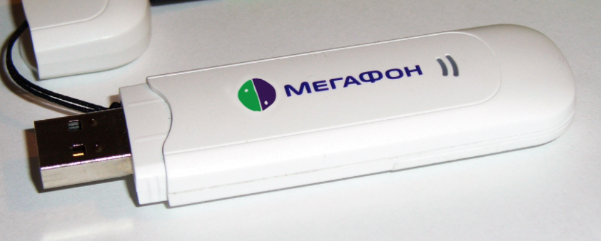
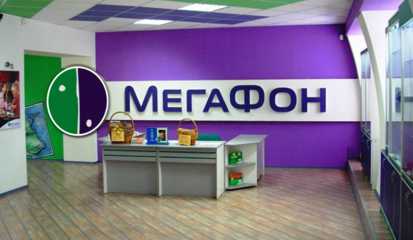
Megaphone
Here the scatter is the largest - from an exact copy to ???!?:
Of course, this is not a serious experiment, but even from it you can understand which logo features people remember better and which worse. We took some options and imagined what the world would look like with such a logo:
Hmm ... Android is prettier.
If you liked our comic experiment, subscribe to Logomashina in VK , there is more interesting. See you later!
PS The second part of the experiment with the logos of frets, starbucks and others