Choosing a chart for one-dimensional data: a geometric model
Data visualization is always some kind of graphical construction that helps to examine the available data. We build a geometric model and modify it to represent different aspects of the data. We are also faced with the restriction imposed by visual perception, namely that the dimension of the visualization cannot be more than two. All available graphic tools are two-dimensional: a sheet of paper or a monitor screen.
Using diagrams for one-dimensional data as an example, let us see how a geometric model is constructed, how it is modified, and how the dimensionality of data and visualization is manifested.
The simplest geometric model of numerical values
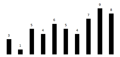
Consider a number of values of one variable (speed, temperature, price, etc.), for example:
3, 1, 5, 4, 6, 5, 4, 7, 9, 8
By the one-dimensionality of data, we mean that there is only one variable. To study the properties of a number series, we will construct a geometric model, that is, a model where data elements (numerical values) are represented using geometric objects: points, lines and circles.
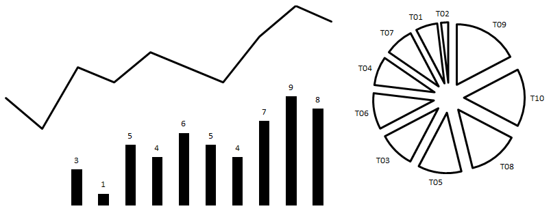
For a number series, the simplest is to map each number to a line whose length is proportional to the numerical values. For example, the line corresponding to the number 3 is three times longer than the line corresponding to the number 1. The result is a regular bar chart:
Transforming visualization to explore different aspects of data
Now we will change the simplest model of the number series in order to explore its various aspects.
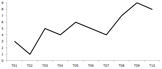
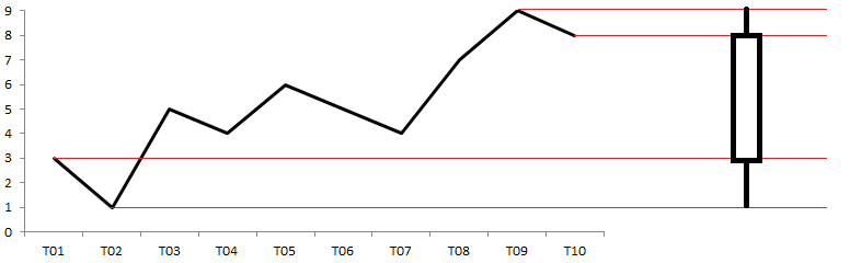
A significant parameter for a bar chart is the distance from the base of the chart (horizontal axis) to the top point. This distance is proportional to the value of the variable at some point in time. If you leave only the top points and connect them together, you get a graph (line chart). On the graph, the points are ordered by time from left to right:
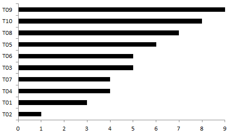
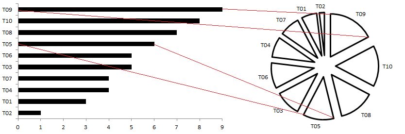
If you sort the lines not in time, but in ascending or descending order, you get a bar chart. This chart is well suited for presenting a rating and allows you to visualize the values of a variable sorted in descending or ascending order from top to bottom (by rank). Then it will look like an ordered list:
Now the conversion is more complicated. We divide the sorted set of lines into groups. In each group there are only lines of a certain length, no more and no less than given boundary values. For each group, we consider the number of lines (values) falling in a given interval. The resulting value is assigned a new line. As if the original lines were dies, and we stack them one on top of the other. Next, we arrange the new lines in ascending order of the maximum (minimum) boundary of the interval and a histogram is obtained.
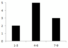
The histogram along the horizontal axis shows the values of the original variable, in contrast to the bar chart. Therefore, a bar chart is best done horizontally - so as not to be confused with the histogram, especially if they are used simultaneously.
Visual Dimension Reduction
You can notice that the diagrams discussed above are two-dimensional, despite the fact that with their help one-dimensional data is visualized:
- graph: time and variable value
- bar chart: variable value and rank (for horizontal line orientation)
- histogram: interval and number of values
That is, the dimension of the visualization does not necessarily coincide with the dimension of the data.
Effectively increasing the dimension of visualization is difficult, but reducing the dimension can be quite easy. Such a modification will make it possible to obtain several more diagrams for visualizing and modeling the values of one variable.
A one-dimensional analogue of a chart is an interval chart or a candlestick chart, often used to display stock charts. For its construction, we leave only four values of the variable: initial, final, minimum and maximum. Instead of studying the time interval in detail, we look only at the boundary (in time and magnitude) values. In the interval chart, the rectangle is not filled if the final value is greater than the initial (growth), and filled if it is the other way round (drop).
Now take all the lines that make up the bar chart and connect them in series. We take the longest line corresponding to the maximum value, we attach the next largest line to it, etc. And then close the start and end point so that we get a circle. Thus, each line corresponding to a variable becomes an arc of a circle, and the circle itself corresponds to an integer - the sum of all values. With this share of each value, there corresponds a sector of the circle and a certain angle proportional to the share.
We got a pie chart.
And finally, reduce the dimension of the histogram. By analogy with the interval chart, we leave only a few basic values characterizing the distribution: the minimum and maximum, two quartiles and a median. We get a scale chart or a box with a mustache (box plot), on which the quartiles set the boundaries of the rectangle, and the vertical line in the middle is the median.
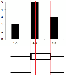
The lower version, proposed by the "minimalist" Tufty, clearly demonstrates the one-dimensionality of this visualization.
The interval chart (Japanese candlestick) and the span chart (box with a mustache) are very similar. Therefore, especially if they are used together, it is better to orient the candle vertically, and the box horizontally.
On the whole, a representation with lower dimensions, as if compressed, will allow us to build visualizations on which several series of values are compared.
Chart selection for visualization of one-dimensional data
Now we’ll draw up a table that will help you choose diagrams for visualizing one-dimensional data. The six diagrams examined are classified by the following aspects of visualization:
- Time sequence (detail or short)
- Ratio: between values and values to the whole
- The distribution of values in intervals (in detail and briefly)
| Dimension | Time | Attitude | Distribution |
|---|---|---|---|
| 2D | Schedule | Bar chart | bar chart |
| 1D | Interval chart ("Japanese candle") | Pie chart | Span chart (“mustache box”) |
conclusions
- Diagrams for one-dimensional data are presented as a geometric model and the relationships between different diagrams are considered.
- Modifications of the geometric model (visualization) allow us to show different aspects of the data being studied.
- Changing the dimension of the diagrams allows you to present information in a more concise form, for example, for comparison
References
- Charts and graphs: conceptualizing tufty
- How to escape from the plane: review of the book "Presentation of Information" by Edward Tufte
- The Data Visualization Catalog
- Interval chart ("Japanese candles")
- Interval Simplification Example
- Span chart ("mustache box")
- Bar graph and box with mustache on fingers
- Speak Chart Language