 February 6, 2017 at 13:21
Work with Flexbox in GIFs
- Transfer
Flexbox just asks to create visual cribs on it . Today we offer you a translation of Scott Domes' article “How Flexbox Works - in Large, Vivid Animated GIFs”, a kind of visual aid.
Flexbox promises to spare us the flaws of standard CSS (such as vertical alignment).
Admittedly, Flexbox really does the job. However, the development of this new model may cause some difficulties.
Let's try to demonstrate how Flexbox works, allowing you to create more advanced page layouts.
Flexbox's core tenet is flexible and intuitive page layouts. This is achieved due to the fact that the containers themselves evenly distribute their children - including their size and the space between them.
The idea, in principle, is not bad. But let's see how this is implemented in practice. In this article, we will take a look at 5 basic Flexbox features. We will describe why they are needed, how you can use them, and what results they ultimately lead to.
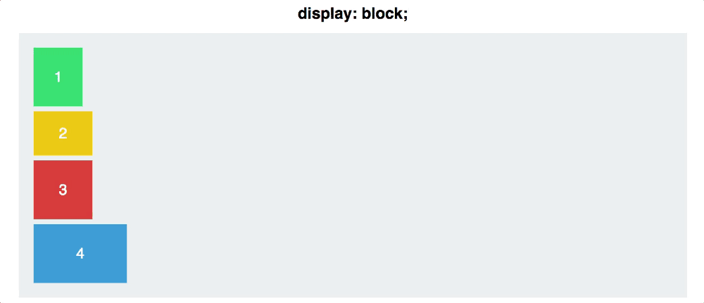
Here is our example web page:

You have four multi-colored blocks of various sizes in a gray container. Currently, display: block is defined by default for each block. Each square thus occupies the entire width of its line.
To get started with Flexbox, you need to turn your container into a flex container. This is done as follows:
At first glance, the changes are insignificant - your blocks are now displayed in-line, that's all. In between, you have taken a big step. You have created a so-called flex context for your blocks.
Now you can place them in this context - it is much easier than with traditional CSS.
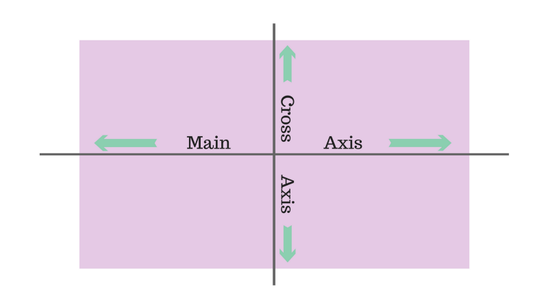
A flexbox container has two axes: the main axis and the perpendicular axis, which by default look like this:
By default, flex elements line up along the main axis, from left to right. Therefore, your squares will be placed in a horizontal row by default as soon as you apply display: flex. Flex-direction, however, allows you to rotate the main axis.

It should be emphasized: flex-direction: column does not place squares on the perpendicular axis instead of the main axis. This property changes the direction of the most important axis from horizontal to vertical.
Flex-direction has other meanings: row-reverse and column-reverse.

Justify Content sets the alignment of elements along the main axis.
Here the difference between the main and perpendicular axes should be considered in more detail. First, back to flex-direction: row.
Justify Content has five meanings:

Space-around and space-between are the least intuitive. Space-between aligns the elements so that they are located at the same distance relative to each other, but not relative to the container.
Space-around sets the same indent around the element from all sides. This means that the space between the outermost squares and the container is half as much as the space between the two squares (all the indents are the same size and do not overlap, respectively, the gap between the squares is double).
And finally: remember that justify-content aligns elements along the main axis, and flex-direction changes the position of the main axis itself. It will be important when you move on to ...
If you mastered justify-content, align-items will not be difficult for you.
While justify-content is used for the main axis, align-items sets the alignment of elements on the perpendicular axis.
Set flex-direction to the original row value so that the axes look like this.
Then let's move on to the align-items commands.
The first three act in the same way as for justify-content, so everything is simple with them.
The following two are slightly different.
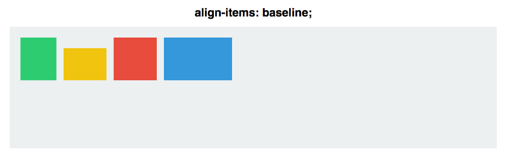
With a given stretch value, the elements occupy all the free space along the perpendicular axis. If baseline is specified, paragraph tag bases are aligned.

(The following is important for align-items: if stretch is set, the height of the squares must be set automatically, otherwise it will redefine the width.)
As for baseline, keep in mind that if you remove paragraph tags, the bases of the squares will be aligned, as in the example:
To better demonstrate the functioning of the main and perpendicular axes, combine justify-content and align-items and see how the center value affects each of the flex-direction commands:

With row, the squares are aligned along the horizontal major axis. At column, they are located along the vertical major axis.
Even if the squares are centered both vertically and horizontally in both cases, these two teams are not interchangeable!
Align Self allows you to manually control the alignment of one specific element.
This property overrides the align-items values for the selected square. All properties are the same, but auto is set by default, at which the values are similar to the container's align-items.
Let's see how it will look. You apply align-self to two squares, and for the rest you apply align-items: center and flex-direction: row.
Although we have only superficially touched on working with Flexbox, the above commands will allow you to perform most basic alignments and vertical alignment of elements.
Thanks for attention!
Flexbox promises to spare us the flaws of standard CSS (such as vertical alignment).
Admittedly, Flexbox really does the job. However, the development of this new model may cause some difficulties.
Let's try to demonstrate how Flexbox works, allowing you to create more advanced page layouts.
Flexbox's core tenet is flexible and intuitive page layouts. This is achieved due to the fact that the containers themselves evenly distribute their children - including their size and the space between them.
The idea, in principle, is not bad. But let's see how this is implemented in practice. In this article, we will take a look at 5 basic Flexbox features. We will describe why they are needed, how you can use them, and what results they ultimately lead to.
Property # 1: Display: Flex
Here is our example web page:
You have four multi-colored blocks of various sizes in a gray container. Currently, display: block is defined by default for each block. Each square thus occupies the entire width of its line.
To get started with Flexbox, you need to turn your container into a flex container. This is done as follows:
#container {
  display: flex;
}
At first glance, the changes are insignificant - your blocks are now displayed in-line, that's all. In between, you have taken a big step. You have created a so-called flex context for your blocks.
Now you can place them in this context - it is much easier than with traditional CSS.
Property # 2: Flex Direction
A flexbox container has two axes: the main axis and the perpendicular axis, which by default look like this:
By default, flex elements line up along the main axis, from left to right. Therefore, your squares will be placed in a horizontal row by default as soon as you apply display: flex. Flex-direction, however, allows you to rotate the main axis.
#container {
  display: flex;
  flex-direction: column;
}
It should be emphasized: flex-direction: column does not place squares on the perpendicular axis instead of the main axis. This property changes the direction of the most important axis from horizontal to vertical.
Flex-direction has other meanings: row-reverse and column-reverse.
Property # 3: Justify Content
Justify Content sets the alignment of elements along the main axis.
Here the difference between the main and perpendicular axes should be considered in more detail. First, back to flex-direction: row.
#container {
  display: flex;
  flex-direction: row;
  justify-content: flex-start;
}
Justify Content has five meanings:
- Flex start
- Flex end
- Center
- Space between
- Space-around
Space-around and space-between are the least intuitive. Space-between aligns the elements so that they are located at the same distance relative to each other, but not relative to the container.
Space-around sets the same indent around the element from all sides. This means that the space between the outermost squares and the container is half as much as the space between the two squares (all the indents are the same size and do not overlap, respectively, the gap between the squares is double).
And finally: remember that justify-content aligns elements along the main axis, and flex-direction changes the position of the main axis itself. It will be important when you move on to ...
Property # 4: Align Items
If you mastered justify-content, align-items will not be difficult for you.
While justify-content is used for the main axis, align-items sets the alignment of elements on the perpendicular axis.
Set flex-direction to the original row value so that the axes look like this.
Then let's move on to the align-items commands.
- flex-start
- flex end
- center
- stretch
- baseline
The first three act in the same way as for justify-content, so everything is simple with them.
The following two are slightly different.
With a given stretch value, the elements occupy all the free space along the perpendicular axis. If baseline is specified, paragraph tag bases are aligned.
(The following is important for align-items: if stretch is set, the height of the squares must be set automatically, otherwise it will redefine the width.)
As for baseline, keep in mind that if you remove paragraph tags, the bases of the squares will be aligned, as in the example:
To better demonstrate the functioning of the main and perpendicular axes, combine justify-content and align-items and see how the center value affects each of the flex-direction commands:
With row, the squares are aligned along the horizontal major axis. At column, they are located along the vertical major axis.
Even if the squares are centered both vertically and horizontally in both cases, these two teams are not interchangeable!
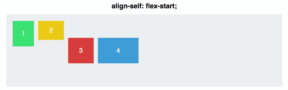
Property # 5: Align Self
Align Self allows you to manually control the alignment of one specific element.
This property overrides the align-items values for the selected square. All properties are the same, but auto is set by default, at which the values are similar to the container's align-items.
#container {
  align-items: flex-start;
}
.square#one {
  align-self: center;
}
// Only this square will be centered.
Let's see how it will look. You apply align-self to two squares, and for the rest you apply align-items: center and flex-direction: row.
Conclusion
Although we have only superficially touched on working with Flexbox, the above commands will allow you to perform most basic alignments and vertical alignment of elements.
Thanks for attention!