How to create a website or application, taking into account users with special needs
Creating digital content, we are accustomed to focus on the average user. Thus, almost a third of the population of Russia is ignored - these are people with disabilities, the elderly, as well as those who temporarily experience special needs. In the past, we talked about our approach to the adaptation of digital services in Sberbank .
On International Day for Persons with Disabilities, we decided to share with the professional community a guide on digital accessibility . In this article you will find that it is important to know the manager, designer and developer, designing an accessible interface.

To visualize the user experience of people with disabilities, try programs that simulate different types of color blindness , low vision, and other disorders . To better know how blind people use the voice interface, use screen access programs ( VoiceOver on MacOS , VoiceOver on iOS , TalkBack on Android , NVDA or JAWS for Windows).
Include availability in the development process from the start:
The list of tips for designers is much more. Some tips are general in nature and useful for the interface in principle.
Proper scaling of the page will also make it easy to read from any electronic media and facilitate the perception of content by the visually impaired. The best solution in this case is adaptive layout. When the layout is ready, make a check: increase the screen to 200% using the “Cmd +” or “Ctrl +” key combinations.
(A bad example of scaling)
(A good example of scaling)
Keyboard control is a real salvation for people with disabilities of the musculoskeletal system and motility, as well as for blind users who use a screen reader to navigate the Internet. For correct keyboard access you need to control the following points:
For some users, the parameter of the field of pressing elements is extremely important . There are people with disorders of the musculoskeletal system and motility. They find it difficult to get on small or close to each other links, work with the site / application with one hand. To ensure that such users accessibility of the interface, you need:
All texts on the site should be readable. Here is what you can do for this:
In addition to the readability of the text itself, it is important that its design helps its perception. For this:

Graphics should be used only where you can not exactly cope with one text. If so, then:
Signatures to the elements, links and instructions should be made logically justified, for example, for a blind user to understand why they are needed in a particular situation and what will happen when you click on them.
Contextual prompts perform an important auxiliary function, reducing the likelihood of error when filling out a form on the site. Make sure you have them. And do not forget:

Blind people interact with the interface using screen-reader / screen reader software that reproduces what is depicted on the screen with a voice. The availability of the interface for the user of the screen reader depends primarily on the developer. If the cursor of the screen reader is on the button, then the name of the button from the developer and the type of this element from the operating system will be included in the voice message output unit. So a blind user understands what this element is and how to work with it.
Since the developer is also involved in navigation , here are some recommendations related to it:
As for the questions of logic and structure , then:
To make all users comfortable, you need:
Automated testing helps to find accessibility errors, while user testing helps to adapt the interface to the needs of people with special needs, so these two types should be combined.
A quick automated check can be done in several ways:
But the user testing algorithm with blind users:
Other recommendations for web and mobile developers can be found on the digital accessibility guide .
We want the digital environment to be maximally adapted for people with special needs, including people with impaired hearing, vision, motor skills and difficulties in perceiving information.
We hope that with our recommendations the audience of your site / application will be replenished with grateful users with special needs. We are happy to answer questions in the comments.
On International Day for Persons with Disabilities, we decided to share with the professional community a guide on digital accessibility . In this article you will find that it is important to know the manager, designer and developer, designing an accessible interface.
General recommendations for managers
To visualize the user experience of people with disabilities, try programs that simulate different types of color blindness , low vision, and other disorders . To better know how blind people use the voice interface, use screen access programs ( VoiceOver on MacOS , VoiceOver on iOS , TalkBack on Android , NVDA or JAWS for Windows).
Include availability in the development process from the start:
- Tell the team that it is important to create and evaluate user experience based on accessibility requirements.
- Check every update and new feature for the needs of people with disabilities.
- Each sprint conduct automated testing with developers to quickly catch common errors, and combine it with user testing to achieve accessibility requirements.
- Regularly conduct manual testing of the product: then at the final stage of corrections there will be few;
- Before selling a product, at least three weeks in advance, conduct a final test with an accessibility expert.
What to do the designer
The list of tips for designers is much more. Some tips are general in nature and useful for the interface in principle.
Requirements for structural elements and page management
- The design should be such that the user quickly and easily find key information.
- All content and design should fit into the logical structure of the headlines: it is very helpful for blind users and older people.
- Users should be able to navigate the site in several ways: through the table of contents, site map, links between pages and search.
- The screen reader does not work well with pop-up objects, so modal windows should not be used.
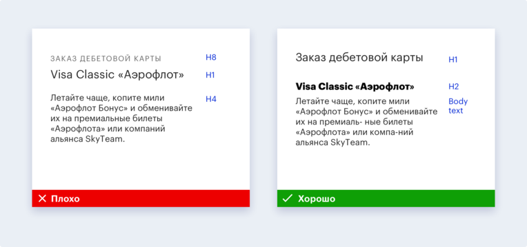
- Styles should be used correctly. Layer 1 headers in the layout should be H1 headers in the code. Conversely, that which is not a first level heading should not be marked up as an H1 heading.
Proper scaling of the page will also make it easy to read from any electronic media and facilitate the perception of content by the visually impaired. The best solution in this case is adaptive layout. When the layout is ready, make a check: increase the screen to 200% using the “Cmd +” or “Ctrl +” key combinations.
(A bad example of scaling)
(A good example of scaling)
Keyboard control is a real salvation for people with disabilities of the musculoskeletal system and motility, as well as for blind users who use a screen reader to navigate the Internet. For correct keyboard access you need to control the following points:
- The user should be able to select and activate any interactive element on the page using the Tab keys, the spacebar and the arrows.
- For sighted users, it is important that interactive elements have visible and familiar states: focus, hover, active, and visited.
- For blind users, a function is important that allows you to go to the main content - skip ads with navigation elements and go directly to the main information, reducing the amount of unnecessary content to listen.
- The user also expects that the focus between the elements will switch in a logical order: usually it is from left to right and from top to bottom.
- When the layout of the site is ready, check with the Tab key, is it everywhere visible when operating from the keyboard, where is the focus?
For some users, the parameter of the field of pressing elements is extremely important . There are people with disorders of the musculoskeletal system and motility. They find it difficult to get on small or close to each other links, work with the site / application with one hand. To ensure that such users accessibility of the interface, you need:
- Make sure that you can reach the main controls of the thumbs and the left and right hands, even on large phones.
- Set a click area of at least 44 CSS pixels. So for them it will be easy to get to the average adult with the size of the finger pads about 10 mm. Icons are often smaller, so the area around them should be increased.
- Separate clickable elements with 8-pixel space.
Filling the site / application
All texts on the site should be readable. Here is what you can do for this:
- Avoid clericals, specific terms, and abstruse sentences that abound in all types of turnovers;
- Try to reduce paragraphs - so it will be easier to view them on mobile devices;
- If possible, use short sentences.
- If you need to use terms, explain them. If there are too many of them, make a glossary.
- When using an abbreviation or abbreviation for the first time, decipher them.
- Try not to use idioms, because people who speak sign language, as well as users with mental disabilities, can take them literally;
- Watch the keyboard layout and typos, as their presence greatly complicates the work of screen readers.
In addition to the readability of the text itself, it is important that its design helps its perception. For this:
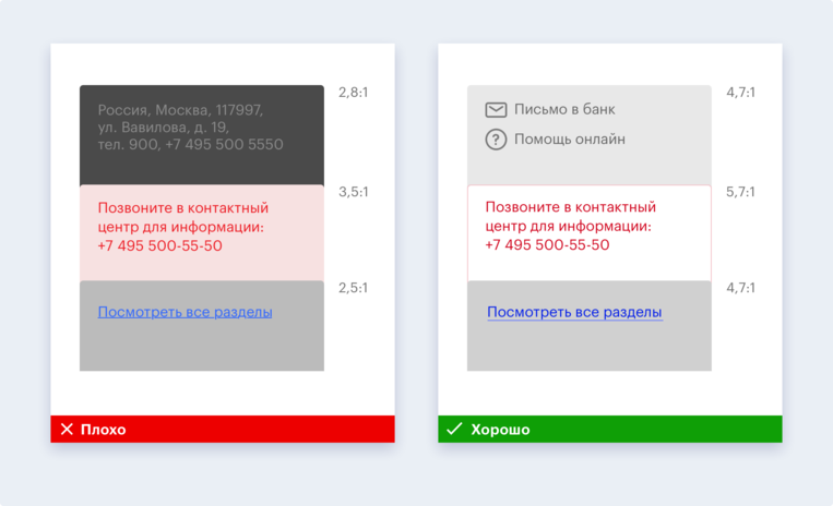
- Make sure the minimum contrast ratio is 4.5: 1; for enlarged text, the contrast can be reduced to 3: 1. The exceptions are logos, elements that perform a decorative role and inactive controls;
- Use a font size sufficient for comfortable reading: the minimum for the main text is 16 pixels.
- Choose a legible font, well readable regardless of scale, rather large in the selected size, supporting all necessary signs and styles, with constant parameters for letter forms and unique letters that are not confused with each other.
- Do not rely on color as the only visual means of transmitting information, because there are people with color blindness among your users. Use boldface, asterisks, icons, typography, text, tick required fields, etc.
Graphics should be used only where you can not exactly cope with one text. If so, then:
- Make sure that the entire schedule is accompanied by a brief and clear description.
- Choose familiar icons - for example, a trash can to remove information.
- When overlaying text on a picture, remember the contrast: use a solid background or darken the image;
- Accompany the data visualization with a brief description to put the user in context.
- Provide sufficient contrast between the data presented so that people with color blindness can distinguish colors.
- Create an alternate form for content that cannot be represented as text. For example, the search for an ATM can be implemented either through a map or through a table or list;
- Captcha is one of the biggest problems for blind people. If you can’t refuse it, make an alternative way of perceiving it, for example, sound.
- Make sure that your design does not contain elements flashing more than three times per second, as the animated elements of the site can lead people with certain types of violations to an epileptic seizure.
Signatures to the elements, links and instructions should be made logically justified, for example, for a blind user to understand why they are needed in a particular situation and what will happen when you click on them.
- By the name of the “Create Account” button, unlike “Done”, the user clearly understands what will happen in the next step.
- If the click leads to the download of the document, write about it directly. Instead of "Click here" write "Download report."
- Links should be entered into the text so that they are part of the proposal. This approach will be more convenient for both the blind and the sighted user.
- Make sure that the instructions can be followed by a person without hearing and sight: do not make references to the shape, size, visual location or sound.
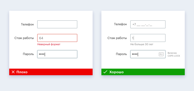
Contextual prompts perform an important auxiliary function, reducing the likelihood of error when filling out a form on the site. Make sure you have them. And do not forget:
- Check that all input elements have clear label names that remain visible even after filling the field.
- Warn the user in advance about the format of the data: date, phone, TIN, etc. With CAPS LOCK turned on, a good tone is to remind about it.
- Inform the user about the appearance of new information in the process of filling out the form.
- Check for instructions that help the user correct the error.
Tips for web developer
Blind people interact with the interface using screen-reader / screen reader software that reproduces what is depicted on the screen with a voice. The availability of the interface for the user of the screen reader depends primarily on the developer. If the cursor of the screen reader is on the button, then the name of the button from the developer and the type of this element from the operating system will be included in the voice message output unit. So a blind user understands what this element is and how to work with it.
Since the developer is also involved in navigation , here are some recommendations related to it:
- Provide a logical transition between pages. When a page loads for a long time, a sighted visitor understands this without difficulty, but a blind user should be warned that the download is in progress;
- When updating or moving to a new page, make sure that the focus immediately hits the first element — the back button or the page title. This will allow the blind user to learn that the page has refreshed and understand where he has got;
- When the page does not reload, but only the contents of the containers change, you need to inform the user that the content has changed.
- Provide a logical transition of focus between elements: usually switching from left to right or from top to bottom.
- Make each element on the page as a separate one, because otherwise a blind person will not understand which field a particular signature belongs to.
- Use items with links to quickly navigate users around the page;
- Add a link "Go to main content" to the page header. This will help move the page faster. The option may be initially hidden, but should become visible when the focus hits it.
- Work out the basic landmark elements, which are defined either by semantic markers in HTML5, or by using ARIA roles.
As for the questions of logic and structure , then:
- Use attributes for content - section, article, aside - to divide the page content into logical blocks.
- Make sure the headings match the page structure.
- Use H1 – H6: H1 heading levels for the topmost level, H6 for the bottommost one. Do not miss the headline levels.
- Provide different ways to search for content: sitemap, site search.
To make all users comfortable, you need:
- Try to use native controls, such as button .
- Check that custom interface components are accessible to screen reader users.
- Specify in the code the type of the element, its state (value), the name and the hint for any interface element that is waiting for any action from the screen reader user.
- Check whether element types are correctly defined. As a rule, the type of native elements is correctly defined by default, and for custom or more complex elements the type may be incorrectly determined and then it must be determined independently.
- Use tables for tabular data - then they will be available to the screen reader.
- Sign any interface element that is visible to the sighted and valuable to the user of the screen reader. If the element does not represent value for the screen reader user, then its “visibility” for the user should be disabled. The caption to the picture allows the blind user to understand what is depicted on it. Signatures for images in the code are important for users with slow Internet.
- Describe input fields using label, title attributes or aria-label;
- Use the for attribute binding and a special class for assistive technology if you want to set one element as a label source for another element.
Automated testing helps to find accessibility errors, while user testing helps to adapt the interface to the needs of people with special needs, so these two types should be combined.
A quick automated check can be done in several ways:
- Directly in your browser using HTML CodeSniffer , aXe , Lighthouse Accessibility Audit or WAVE ;
- By integrating ax-core , Lighthouse Audits or AccessLint.js tools into your project to programmatically add accessibility tests and catch errors when assembling an interface;
- Using tools like AccessLint to find accessibility problems during a pull on GitHub.
But the user testing algorithm with blind users:
- Check that the screen reader goes to the elements and voices everything you need, including labels, hints and errors.
- Make sure that the content is played in the correct order: label to the field, headers to the content, etc.
- Check that the code indicates the correct language and the screen reader utters words without an accent.
- Make sure that the buttons and links have a description that allows you to understand where the click on them will lead.
Other recommendations for web and mobile developers can be found on the digital accessibility guide .
We want the digital environment to be maximally adapted for people with special needs, including people with impaired hearing, vision, motor skills and difficulties in perceiving information.
We hope that with our recommendations the audience of your site / application will be replenished with grateful users with special needs. We are happy to answer questions in the comments.