About layout, logic, cranks and portals of MTS
Remark - this text is only my personal value judgment and does not claim to be absolute truth.
Background. Autumn night, lack of work, internet. Ended up. As usual, the traffic on the pay tariff ended.
OK, I thought, I’ll try to pay by mobile.
In the yard 2016, it should be simple and convenient. MTS did not think so.
An attempt to enter a random site safely redirected to pay.mts.ru. Well, thanks, the routing worked.
2016, one of the three main operators of the country, the site looks ... well, something like this:
Not reactive, not convenient for the blind or the sighted, it looks equally awful on mobile phones and on wide screens.
And the feedback form, by the way, sent a request to another site in the back and fell from the 500th. Maybe the unshielded layout in the post-parameter did not like.
Background. Autumn night, lack of work, internet. Ended up. As usual, the traffic on the pay tariff ended.
OK, I thought, I’ll try to pay by mobile.
In the yard 2016, it should be simple and convenient. MTS did not think so.
An attempt to enter a random site safely redirected to pay.mts.ru. Well, thanks, the routing worked.
- The first bell, as usual, sounded during authorization. View authorization password
dShJS4
Comrades, even Sber sends digital passwords to confirm the payment.
No, well, seriously, have you tried to type a alphanumeric password with letters of different letters on the keyboard of your smartphone? Unrealistically comfortable - Replenishment Form (made iframe-th) at pay.mts.ru/webportal/payments/3565/Tula with iframe at mts.platbox.com/mts?product_id=0000002&mobile=0 at ending traffic is not working. Most likely, at the end of traffic, the surge protector allows * .mts.ru domains and does not allow * platbox.com. Perfect.Notarized (no, of course not) screenshot
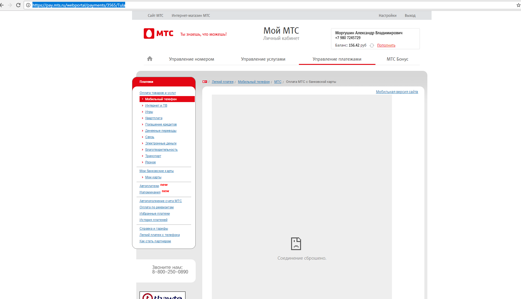
- After swearing, I turn on the hot spot and go in from my laptop. Hmm, the inscription "My Account" ... maybe this is the very door through which Alice gets into Wonderland?
Alice got on the second authorization. Perhaps I missed something in history, or in my development, but if you are already doing cross-domain authorization, then do it everywhere and the same way.
The domain pay.mts.ru is tied up with cookies and mts.ru, it even has a certain auth-back-url and sessionid-services ... but something does not work .Cookie
For those who are interested in the second underlined inscription. This site is very fond of iframe. He loves the iframe so much that the user’s widget with the balance is pulled by him. And yes, there are 8 divas, a bunch of scripts and cookies from login.mts.ru in order to display the name, balance and two links.
We rummage in sms to find the password. - Op. SMS about tools and services comes from the correct MTS symbolic name, and passwords from a certain number 3339. This greatly simplifies the search.By the wayThe answer to the balance request came from the symbolic name Balance. Why would it ... and yes, I have a dual-SIM phone, and guessing which SIM card came in is very interesting. Thanks. You need to go into the channel and see the icons.
- We are all people, we are all
crutcheswrong. Well, the link "replenish by 1000 rubles" catches your eye right away.Link
I reflexively click on it with a wheel(it should redirect me to the form of payment, right?). Not this way. Not understood. We look at her under the inspector ... yeah. button. Ok, maybe everything will open here? We get the redirect, the page reloads. Interestingly, what prevented just wrapping this button in a link, since it reloads the page?Common sense - After all the torment, the payment was successful. As a law-abiding person and citizen, I still decided to send feedback on the use of this creation of a crazy artist. A feedback form was found immediately. Textarea is 256 pixels wide with the ability to stretch it vertically, but not horizontally. Something like sprinkling a plaintive book with skunk gland products so they don't write a lot.OS form
Are you asking me for your name and email? Oh God, I’m logged in to your site, do you know my phone number, did you have my details when registering a SIM card, and you ask me for personal data on the OS form? Even the sky, even Allah did not know such a shame! Inside the send button is hidden span with text. Just span with text. Removed span, left the text. Nothing changed. - Checkboxes. Checkboxes are a separate song.
Do you think the checkbox is input? Not. The checkbox is here only as an “accessibility element” for the visually impaired with voice browsers. In fact, a checkbox is a block with the jq-checkbox class as a frame, and a hotel block with jq-checkbox__div as a beautiful red daw. And on input, if you look closely, there is a beautiful bunch of z-index: -1; opacity: 0. The
layout designer who did this, I recommend participating in the actions (any, but better on the Red Square) of a St. Petersburg artist. At least a tick through: after would be done if you want such a trick with a hidden checkbox. But in general, this is better done through code of the form:
Ordo not vomit,leave a little stylized standard checkboxes.
2016, one of the three main operators of the country, the site looks ... well, something like this:
One form of payment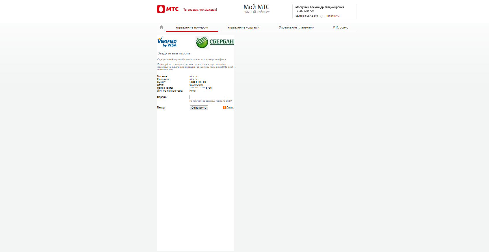
Not reactive, not convenient for the blind or the sighted, it looks equally awful on mobile phones and on wide screens.
And the feedback form, by the way, sent a request to another site in the back and fell from the 500th. Maybe the unshielded layout in the post-parameter did not like.