Our smaller browsers, or We need to talk seriously
Vadim Makeev (Opera Software)
My name is Vadim Makeev ( pepelsbey ). I work for Opera Software. We produce browsers, in particular, desktop, mobile, etc.
Today we will talk about the browser that we release, it is called “Opera mini”, but I didn’t come to sell it to you, I came to talk about browsers and things that few people think about.
The conversation will be not only technological, but also serious. I’ll try to tell you about serious things, so that you do not think “herak-herak - and in production” about your profession, but in the sense of “what and why” you are doing. This is my main point.
I, as a user of the Internet (regularly, for many years since 2001, have been doing just that), have problems when I use the web. The main problems are that people who develop the web (that is, you and I personally), in some situations, close information from the user, prevent people from using it normally, block access ... Every day, one way or another, they do it . Whether they decide not to support “ie 6,” whether they decide to do client-side rendering or something else — is good for some but bad for others, and decide to launch a native application instead of the site ... This all leads to some problems.
For example, a problem like this happens:

This slide depicts the problem very accurately. These are not fonts loaded, this is not a 4 meter website, these are other problems. This site needs javascript. At least in order to draw something.
Another problem looks like this:

Sometimes sites look like this because the body’s background is dark, but the site didn’t load, because it needs javascript, or the javascript library didn’t load, or the browser that renders on the javascript server simply cannot process all your synchronous events because it works in a certain way.
Those. no access to information in these cases. I go in and do not get information about the phone of any cafe where I want to get, information about the TV program, etc.
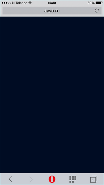
This is ayyo.ru, a movie catalog where you can rent movies to watch.
I was an active user when I lived in Russia (I came from sunny Norway). When I left, I continued to use this site, in the sense of a directory. There is a really good catalog of films and you can search by genre, etc.
When I visit the site in “Opera Mini” (I try to save traffic when roaming - as if roaming is everywhere roaming), the site shows me a blue thing and says: “No”.
And if I go to the site and spend all the traffic that he wants from me - a lot, the site is thick, it shows me such a thing:

Not optimized for the mobile version, in general, even once, but it can be used. Turned the phone, thought, etc. And why? Because it is SPA - single page application. What for? I do not know. People just decided to do it. Good people I know, I like the company, etc. I am still a user of this directory. But they decided to do everything fashionably, progressively, and eventually cut off some of the people who can’t use their site. This is one of the options.
In principle, this problem can be described like this:
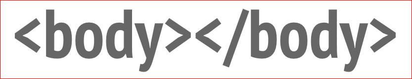
This is when the site has a body and nothing in the body, or javascript is connected. You do not give the content, you start to initialize it later. For some, this is an absolutely normal approach, because javascript should be on sites. You say: “For my site to work, the browser must support javascript. If it does not support, I'm sorry, so I'm developing. " It’s your right to say so, but I show you what this leads to, and at the end of the report I will try to convince you that this is the wrong approach.
In general, what’s the point of doing a single page application if it’s just a directory and everything you do with your background reboots? You just save the transition between two html pages. All the same, you can do client-side rendering so that the browser can display information. And below I will show examples of successful execution of such things.
Such sites still exist:
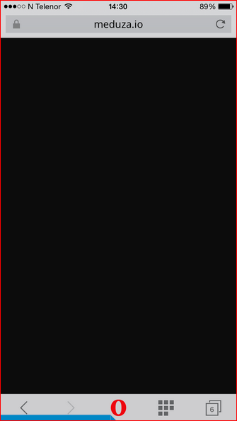
Yes, they are completely black, there it is different. In January-December 2015, the site meduza.io looked like this in my browser when I was saving traffic or trying to keep pages offline or just to open many, many articles on poor communication. This is how the site looked.
I complained to the developers, they replied: “And everything works for us,” and when I open, I have everything like this.
And because they use the built-in browser, they do not consider Opera Mini users or other proxy browsers as their target audience. Some time passed, and the guys redid the site, and now they have an application on React, it is rendered on the server, and a ready-made static version is given in the browser, and only then, with the help of all kinds of dynamic scripts, it is updated.

1– this is January, 2– this is also January, and 3 - this is already in the spring they restarted. This last, 3rd picture is Opera Mini. You can make websites like web applications that work fine in proxy browsers, work fine there, which you don't even know about. There are a lot of browsers, a lot of devices and robots, readers, crazy everything you don’t know about, which you will never test on. And there are principles that allow everyone to do it.
There is still such a problem: when you start to make up how you like, how you feel comfortable, how the next framework dictates to you, some library or just an approach that you picked up or heard somewhere. The problem of various inaccessibility begins.
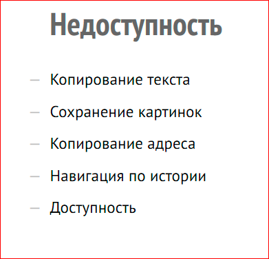
- For example, copying text. You think that the user, scrolling the page, will cling to the text, such as random selection or something else, and you take and make your site scroll perfectly. Your site does not zoom because they have disabled the increase in text, and your site looks like an application. But if I want to copy some piece of text and tweet about your site, I can’t do it. This is the basic ability to access information on the web so that it is textual. And to imitate the application is to prevent people from using your information, disseminating it.
- Saving pictures. Pictures are hiding behind transparent divs, put in the background, or simply somehow hiding so that, God forbid, users do not save them. If you put your picture in the site, it will still appear in google images, Yandex-pictures, etc. Those. it’s impossible to hide your graphics anyway, so don’t hide your graphics from users, they will find it anyway. This is the same, you hide your information, you make an application from the site.
- Copy address. About addresses that are not updated on the site, although you go through the pages, I won’t even talk. This will be further meme.
- History navigation is the same, it is connected with the address. If you don’t give a link to a specific page of your site, if you don’t go back and forth on the site by navigation, this is not a site, it’s just a piece of information that is hidden from the user. Those. he seems to be on the screen, but he cannot be reached.
- Basic accessibility for people who use not their eyes, but their ears in order to perceive your site - screen readers, etc.
I was at a conference in Warsaw recently, and there Leon, a British lady who deals with accessibility, blind from birth, read a report on accessibility. When you hear about how she talks about how she uses the web, and she is active IT'shnik, she uses them, she makes her presentations. The only thing she could not do was to go down the stage on her own, because there was a difficult staircase, she did everything else amazingly herself. When you hear from a person who really suffers from the sites we make, from the code we write, you start to think. I hope this will also be some kind of argument for you. It is strange that this requires a person who is actually blind to convince you, but maybe you have other arguments, and you just hear what I say.
People are trying to imitate the neutral. And this is a big difficulty, because they get it in the end. And along with this “neutral” feeling from the site, they lose all the flexibility, all the versatility of the web. Here, for example, is a Facebook application:
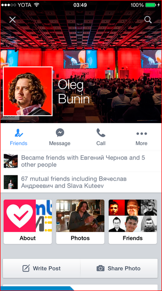
Here, Oleg Bunin is the organizer of the festival. Someone asked me: “Listen, you have Oleg Bunin in your friends, and who is that?” I am talking now". I open the Facebook application, I open his profile. “So,” I think, “now I need to send a link.”
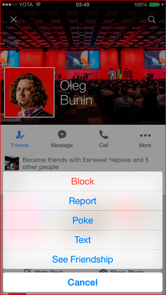
So ... you can block it, write something bad, you can poke it, write a text for it and clarify your friendship, you can also “cancel” it. But:

The developers of the Facebook application decided for me that I can’t send the link, the link to the user profile. They have a website on the Internet where you can copy a link to the user profile from the address bar, you can’t do this from the application!
Applications from sites differ in that the application developer decides for you that you can, that you cannot. If the application developer has the task of leaving you inside the application so that you don’t go anywhere else, he will do it. It will forbid you to copy links, it will forbid you to open a browser, it will do all this inside the application. And you will always remain a user of not the Internet, but Facebook.
But you can do better. You can make a Facebook application, the correct one, you can make it possible to copy a link, you can fix one thing, you can fix another thing, but maybe ...
If you wind up the application to the extent that it will be just as flexible, you will end up invent a browser. And he has already been invented! Therefore, guys, the neutral is good, but the neutral closes us and makes the dissemination of information less flexible, builds new walls around the information, so we, as a medium who brings data through the interface to users, should feel responsible. This word - “responsibility” - will still sound today.
I come to another topic.
I talked about the pain that happens when I use the Internet. Now I’ll talk about the type of browsers that you all don’t like, that work unpredictably and few people test, but many people use them.
There are three of the most popular browsers that can be grouped under the name "proxy browsers" - UC browser, Puffin, and Opera Mini.

All these three browsers are united by the fact that they are trying to save money and user time. Those. they do not just take the page and render it right on the device and show it right there, they take it, compress it well on the server and send it to the user.

Actually it works like this.
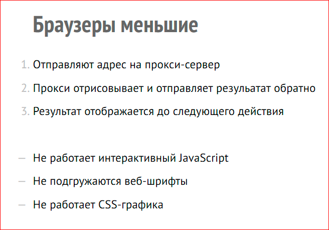
The user enters some address, the address is sent to the proxy server, which is located in our case in Norway, in California or elsewhere. The proxy renders and sends the result and sends it very compressed. Those. up to 90% of the page weighs less. What happens is a little further.
The result is displayed until the next action. As soon as the user needs to open some kind of drop-down menu, the application registers a click by sending a request to the server, the server renders this click on itself, draws the menu and returns it to the client. Those. you seem to wait longer between the opening of the menu and the appearance of it on your screen, but in the end it turns out faster, because you load not 4 MB, but 400 KB, for example. Those. the difference is 10 times.
But what can these browsers not do? They do not know how to work with interactive javascript, i.e. every set of timeouts there have hardcoded values, no matter how many intervals you set. They do not load web fonts, these browsers are for the most part. Those. if you specify a custom font, it will not load, or some system font will be used, or some default font on the system, and CSS graphics will not work.
CSS graphics is a broad concept - border-radius, box-shadow, gradient, etc.
Accordingly, what the browser will have to draw in a raster and send to the stream, etc., in order to save space, traffic, money and user time, these things are cut off. Not to ruin your life, not to ruin your relationship with your designer, not just to make you angry, but to get the user information, first of all, the basic design. This is not an attempt to make a bad browser. This is an attempt to make a browser that performs a narrow and useful task.
Awful browser! Who "joyfully" made up for Opera Mini? Who was angry if he tested his site in Opera Mini? I'm angry, I'm angry. I’m developing some sites and I think: “What a horror!”, But I rejoice when I go on vacation to Italy, for three we have one SIM card for 1 GB of traffic, and we take turns using the Internet through Opera Mini, and we have enough for everyone until the end of the vacation. To read information and something like that. Well, unless, of course, the site is not made somehow crookedly.
The browser is terrible. There are different statistics, you could hear them, but, it seems to me, these statistics will sound for the first time today. I took and made a cut specifically for Russia.

This is all only in April 2015. For 1 month. It all happens in Russia. A lot of people use the Opera Mini browser. I use it myself. This is so that you understand that this is not just some browser that will die out soon, because time has passed, it is a browser that people use, because it is convenient to use, because not everyone has unlimited tariffs, because not everyone fast internet.
Almost the Iranian president calls 3G the main global evil ... There are countries in the world where fast Internet means regime change and revolution. There will simply not be a fast Internet there after some time. And there, our browser is quite popular. Russia is approximately in fifth place among popular countries. In the first places are Asian countries, where the Internet has stepped over the stage of home desktop computers and immediately became mobile. We had this stage, so we still have not switched to fully mobile Internet.
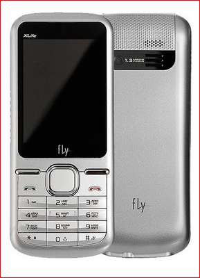
This is the most popular phone in Russia used by users of Opera Mini. “Fly” is called. They use a browser on their small screen, on this insanely inconvenient keyboard.
What do you think is the second most popular phone? There he is:
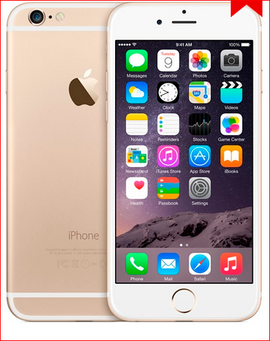
Not sure if it is gold. In fact, I am ironic, but he is really the second most popular, i.e. the first is the Fly model, the second is the Iphone, and then 10 million others go. Those. the gap between different devices is very small. There is no such thing as a mass leader who occupies half of all devices in Russia. There are an infinite number of devices, but, interestingly, users of expensive smart phones also use Opera Mini. They can use it in different modes, but they can just turn it on and see how many Kbytes of traffic they save every day. Just so that you know that this is not only some kind of miserable cell phones. It can be such blades 6+.
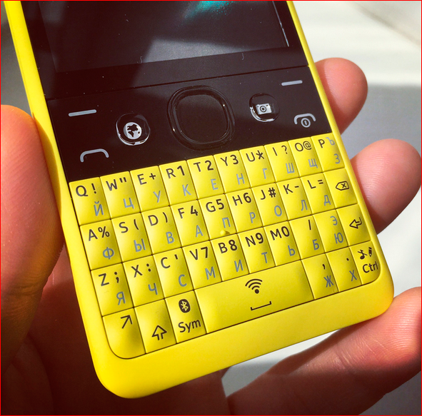
Such a phone is now in my pocket, I bought it in some strange store, for 1,400 rubles. This is the cheapest Nokia phone that has wi-fi. I bought it in order to feel how people use the Internet, who do not have smartphones in their hands. It's very cheap. For a phone that has two SIM cards, the battery lives for a week, some kind of madness. There is some kind of java platform crazy, there is a browser. The thing is that if you need to test a live device somewhere, it’s best for this.
Another interesting thing about frail phones. The most frail phones, now by capabilities very much like browsers in hours. Those. if you want to make up a site for apple watch, where there is no browser yet, or to make up for some Samsung bracelet with a browser, you can make up the same site for Opera Mini, and the browser will have the same power, they can be about the same. This will also be a weak device with a tiny screen. Those. small screens are not old phones, they are also new devices that appear in unexpected places, on your hands or where they will appear next time, I don’t even know.
This is how the jellyfish site looks on this phone:
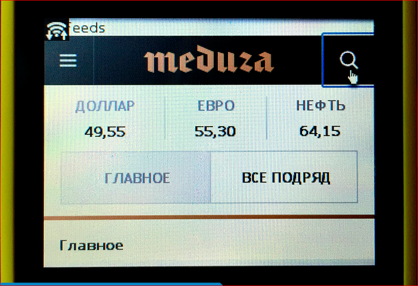
It can be used. I click on this menu, it sends a request to the server, and the menu is displayed. I can read the news in a normal design on this small screen, this infinitely weak device. Nothing is falling apart, but just the gradients are not loaded or something else.
On the same Meduz site (I will often mention it because this is such an example of a web application, not just a site). They did not make font icons, but fonts, as I told you, do not work in proxy browsers. They made svg icons, so do svg icons, guys, because, firstly, it’s just right, because it makes sense, it’s graphics, not a font, and secondly, it works in browsers, it’s more compatible way.
But they have a slightly different problem. When I open the site, scroll through what I showed today in the browser, I see such black holes.
The Opera Mini browser normally displays pictures on websites, but does not show background pictures, because background pictures are a design. Those. when we set some thing in the background, we say it’s a gradient, something else when we talk about content, we say img, this content is from the point of view of html, and this content and other browsers show, but the background doesn’t . But the guys at Meduz, I asked them, they say: "It’s more convenient for us." Well, and the background image, where the background-size have set the background, she immediately adjusted herself. You can do the same with img, position, etc.
There are a lot of pictures on the Meduz site. They even have a special heading “History”, where everything is beautifully beautifully colored, but when I look at the black squares, I feel sad. And when I first began to understand what was going on there, I saw the following. Naturally, this is a bad-bad browser, because it does not show our pictures. But if you look, this is what happens:
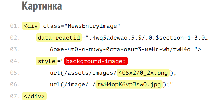
The picture on the site is done ... div class = "NewsEntryImage", well, ok, class. Next is data-reactid ... well, this is a web application, it needs to encapsulate la la la there, track the components in some way. Not the point. Then everything is so strange. Then the style attribute begins, then the background-image is given, i.e. that’s how they insert an img image onto the page, i.e. the content, what the user should see along with the header, what should load and read, what should normally be seen. But hiding, because the browser thinks this design.
Those. the browser expects one thing, and the developer gives it another. What is interesting: they use multiple background images, and in one picture they load a dotted background, dots in a ripple above the photo, and then upload the image, i.e. they take, mix design and content in one description. Those. guys just figure out the interface.
And what does the link to this news look like? And the link looks like this:
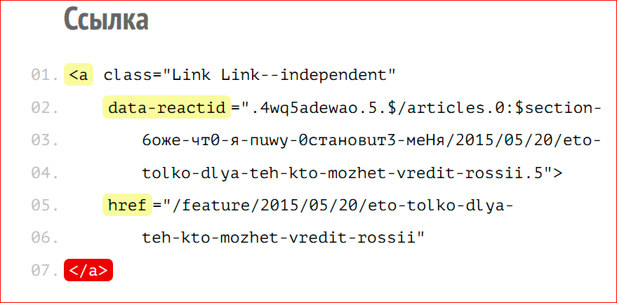
... Link — independent, also normal - reactid ... href, there is href in the link - cool, this, however, does not always happen. The link continues, the link closes. The link has no content, this is an empty link. The block with the news is lying, and under the block with the news there is simply a link, and it is positioned on top of the block with the news. And when the person who listens to your web page approaches this link and asks: “What is the link to?”, The voice browser will say: “No matter what”. And I do not know what he will say for sure, but the link will lead to nowhere, it will be just a visual positioned link to nowhere with url.
In a good way, the contents had to be wrapped in this link, because the link goes somewhere from this block, i.e. it is logical. But if you just sculpt the interface from pieces and don’t think about it, it turns out such a mess, and you get inaccessible pages.
What can be the solutions to the problems that I described. I once thought that if I go on stage and talk about semantics, people will understand, and they will believe me, they say, semantics are the meaning, this is the semantic use of html elements in the meaning of how they were intended. And I went out like that and said: “Html 5, new elements, read new tag roles there, use them for their intended purpose, naf, footer, header, and the difference between production and article is such, they discussed it, but in the end it doesn’t work” . And even the logo showed:

Semantics have their own logo, everything was very cool.
Testing. After all, you can test the site in all devices and then you can’t make a mistake, and all developers, of course, test on all devices:
None. Everyone is testing in browsers that are in your pocket and on the laptop on which you are developing. Nobody has such a laboratory, if you don’t work in Yandex or in some large office that is very focused on this, Mail.ru is also very worried about testing. No one has such a device lab. Accordingly, all this simply does not work. Those. neither arguments about semantics, nor explaining to people that you need to test pages not only in a pocket browser, it just doesn’t work.
What works, I want to offer you at the end of the report. That, I hope, will work, but it must be perceived.
Try to take your site code as an API. You connect an Yandex.Maps card to your website, and you go, read the documentation, and it says that this key gives such a parameter, this method returns such and such a value ... You read the documentation and write your code strictly according to the documentation. And once - you get a cool embedded map, Google map, Yandex map. You took the API that Yandex, Google provided to you, used it, and you got a predictable result. That html code that you write is also an API.
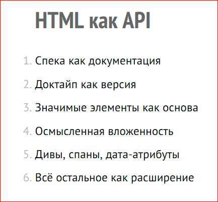
You tell the whole open world: spec for you documentation on this API. And you give not just the browser in which you want to test, you give the whole history of our Internet. Our entire Internet, all our devices, browsers, programs, any devices work according to the specification, they work according to the documentation for this API, and they expect that if you use a picture, it will be inserted as img if it will be content, if it will be a design , it will be inserted in the background, if you use the link, then it will lead somewhere, it will have the contents of href, etc. Those. all that is described in the specification is an API.
You can version the API using doctype. Since you are all writing a short doctype right now, use the API that the html 5, 5.1 specification provides you with. The significant elements that you use in your code, let them work strictly according to the documentation, according to the API, i.e. according to the html specification, so that browsers that are trying to optimize the traffic of your users can successfully do this.
What do Opera Mini, UC Browser, Puffin, etc. browsers do? They read the specification and think: “The developer will indicate the design like this, the content like that, and knowing how he will do it, we can do something with it, interpret it correctly, optimize it correctly, etc.” Since developers “steal and kill” in their code, failures occur accordingly. Accordingly, you do not like what you see in proxy browsers, difficulties arise - users do not see the content, etc. etc. And if you don’t give away any API at all, an empty body, accordingly, you don’t use this API at all ... Inject using javascript, and it just doesn't work.
Meaningful nesting, as I said. So that the elements are not just visually glued to each other, but are logically nested, so that this whole structure makes sense, since this is what the API of this html suggests. And divas, spans, data attributes as extensions, if you need to build your crazy framework, templating on the client - anything, do it. This html API is good in that it is highly extensible and well described. Right in the html documentation itself it is written how to expand it. There are web components as the next step in expanding this web API. And if all this is done correctly, we will have no problems either with the proxy browser, or with any other browsers, in watches, in irons, anywhere.
There is a very important word. Responsibility. We are a medium between information and the user. We decide whether the user sees the information that we, our customers, our customers or the company in which we work, try to convey to them, or not. Let's not flirt with frameworks, effective development, etc. Let's think about the information that the user comes to the site not in order to see the animation, not in order to appreciate what a cool framework you have under the hood. They come in order to see the information. And if you choose which users to show and which not to show, you break the web, you break access to information. This is infinitely insanely bad, and the web is turning into such a crazy toy that is available to one, inaccessible to others.

Take a week without the Internet. You will feel like a person who has a weak phone, who cannot access the sites, because all of a sudden became a single page application, poorly made.
You can read and listen about this further:
- This Web App Best Viewed By Someone Else - Eric Meyer
- Responsive
Web Design in Practice - Anton Eprev - Articles about Opera Mini on Dev.Opera
- Better by Proxy - Tim Kadek
- Everyone has JavaScript, right?
If you just spit on these links but want to see at least one, check out Eric Meyer's first report, “This Web App Best Viewed By Someone Else.” A very important report, which he read, in my opinion, in March or February. And other articles can be clicked.
And this is a link to the presentation:

Contacts
» Pepelsbey
» Opera's blog
This report is a transcript of one of the best speeches at the conference of developers of highly loaded FrontendConf systems .