How marketers of Maxidom lose millions flirting in groz marketing: independent usability auditing
The personal look of the UX-designer on the tricks of the grow-hackers by Maxid’s online store against the background of trash and interface problems that cause users to suffer.

Recently caught the eye of the case of the next "groz hackers" grose hacking "site Maxid. The guys, having implemented solutions that are standard for the ecommerce segment, such as a list of popular products, sincerely admired the growth in conversion, but overlooked the “beam in the eye”, which could have been dragged out and produced much more impressive results without unnecessary costs or misleading mechanic users.
Maxidom's website is stuffed with all sorts of tricks of marketers who are eager to get permission to send you spam pushes in the browser or get your email to send this spam to your email as well. When you try to leave the site, they will carefully ask what it is you suddenly decided to leave without buying anything. And it would be possible to close our eyes to all these aggressive tricks if there were not a lot of problems that prevent users from comfortable finding the right products and making purchases.
In this usability audit, I only looked at significant errors in the user's path.
Content:
The main thing in any ecommerce project is products. For convenient access to them, there are many interface solutions, but the main one still remains the directory.
Finding a product catalog when interacting with the main page is another task. On the one hand, the developers added a big bright button directly to the header of the site, on the other hand, they did everything possible so that it merged with the other elements and got lost.

Excessive use of corporate red in the header of the site reduces the rapid identification of the “Catalog” button.
How to fix
Reduce the contrasting load from static elements (for example, the top menu), ensuring sufficient identification of the “Product Catalog” button.
Non-optimal presentation of the menu that appears after clicking on the "Catalog" button.

The list of 24 items contains groups of goods different in meaning and volume (for example: "hardware" and "toys"). Presented as a vertical list of links without any sorting, the menu is very difficult to understand and interact with visitors.
You can click on each link to go to the category page, but when you hover, another pop-up menu appears with a list of subcategories.
The feasibility of moving subcategories to the pop-up menu, in the presence of a huge "hole" on the right, raises questions. Interaction with such a menu requires high accuracy in mouse movement - the slightest up-down shift opens up another list of subcategories. In addition, due to the lack of sufficient identification of the selected category (the link is simply underlined when you hover over it), users may not understand that they moved the mouse pointer and try to search for the desired subcategory already in another list.
The interaction is also complicated by technical implementation errors, as a result of which the menu of subcategories pops up not only when you directly hover over the category link, but also by simply moving the pointer to the right of the menu list.
How to fix
Revise the overall approach to the presentation of the main menu of the product catalog, provide a quick and easy identification of the first level sections and the same interaction with the second level sections.
In some browsers (for example, Safari) interaction with the product catalog is hampered by switching the slider on the main page.
How to fix
Test the technical implementation of all interactive elements of the site in different browsers for possible errors that create difficulties in the interaction.
For each level of the catalog there is a separate page. For example, for the catalog of the first level, it looks like this:
Each category is accompanied by a thematic picture. Clicking on the picture and the category name leads to an identical action - go to the page of the second level catalog.
This is the second level directory page:
At first glance, the interface solution for the first and second level directory is identical. But in fact, clicking on the image on the catalog of the second level leads to the transition immediately to the item card. To see the entire list of products in the subcategories, you need to click on its name under the product image.
The situation is also complicated by the fact that some users may not perceive the second-level category page as a list of possible subcategories, and consider this as a specific range of products and limit themselves to interacting only with it.
How to fix
Be consistent, stick to identical interface solutions in the same interaction context. Eliminate any misinterpretation of the interface.
Some users prefer to use search on the site to access goods. Apparently, knowing this, the developers placed a large search bar right in the header of the site and ensure its availability with further interaction.
When interacting with the search string, search prompts that actually became the standard for e-commerce projects are not used.
Such hints greatly simplify and accelerate the interaction with the search, allowing you to go directly to the desired category or specific product without visiting the Search Results page. Their absence may be a signal to some users that something is not working on the site, because the usual prompts do not appear, or there is simply no product in the range.
How to fix
Embed tips when interacting with the search string.
At the level of categories of the second level there is the opportunity to interact with the list of products.
The product filter includes several entities with different behavior: a list of third-level subcategories and a set of characteristics depending on the selected subcategory.
Two different entities, combined visually, create a false view of the operation of the filter. This solution can also cause irritation in the case when the user has applied several filter parameters, and then decided to refine the subcategory. This will reload the page and reset all filter settings. In addition, a new list of possible filtering options will appear, depending on the subcategory, which will further confuse.
How to fix:
Separate entities with different behavior, eliminating false interpretations of possible interactions among users.
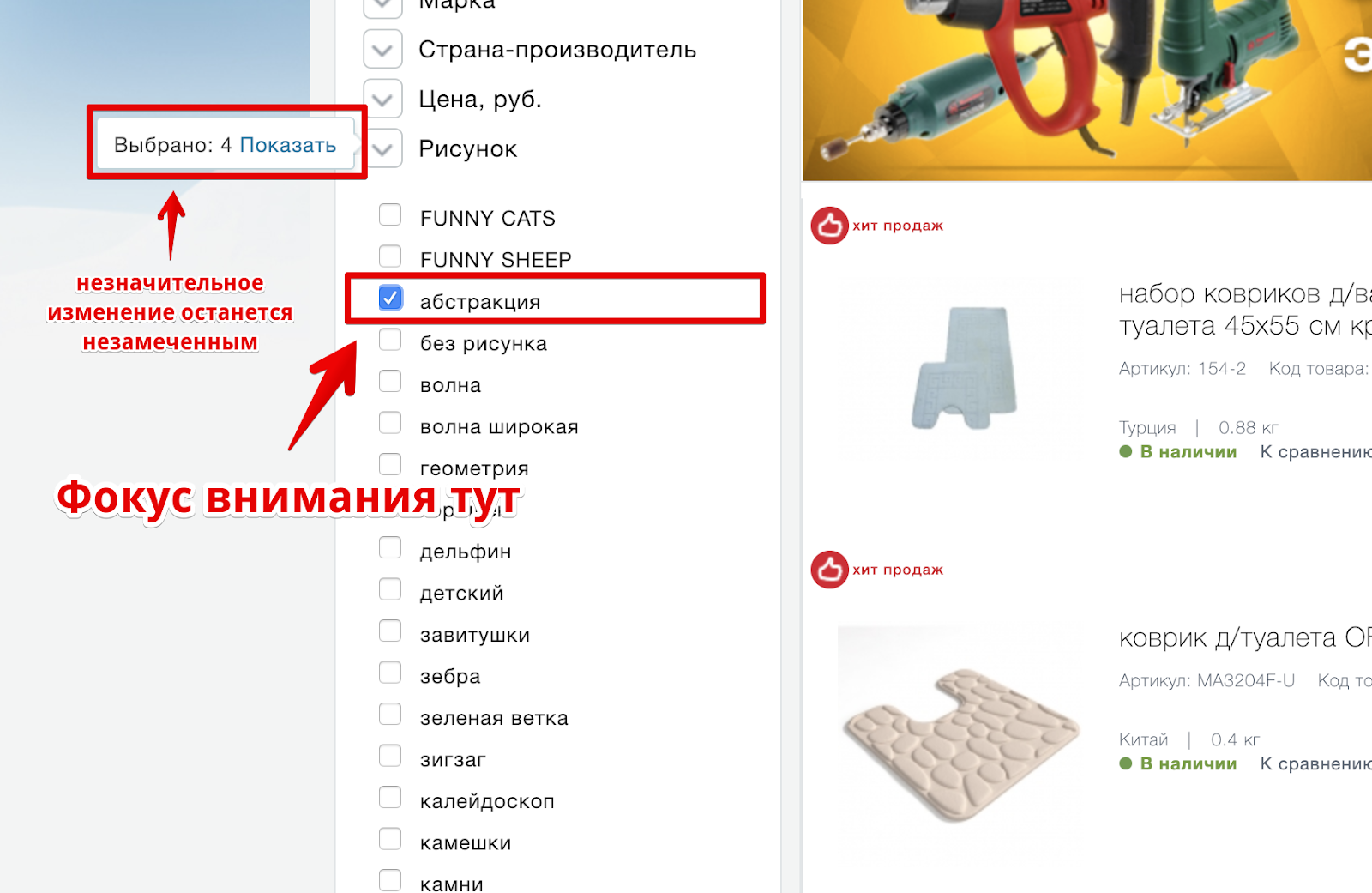
Incorrect use of link highlighting when hovering in the "All subcategories" block.
A link with a dotted underscore means performing an action without reloading the page (for example, opening a popup). In this case, when you click on a link, it switches to another page. Considering that other links on the site when pointing are underlined by a solid line, the decision forms a false wait for users.
How to fix
Use the site’s standard way to highlight links or, in general, review the approach to interacting with the block.
Incorrect use of checkbox to highlight filter parameters.

Using the selected checkbox can be perceived by users as an already selected filter parameter. Displaying the checkbox in light gray may indicate that the setting is not editable.
When you hover over the filter, only the mouse pointer changes, but there is no additional signal that each item contains its own individual set of parameters.
The buttons "Show" and "Reset" have an equivalent visual weight. To understand which button to interact with, additional focusing is required, which leads to excessive cognitive stress.
How to fix
Refuse to use elements that can be treated differently by users. More clearly show that each filter item is a group with its own set of parameters. Apply different styles for the "Show" and "Reset" buttons. "Reset" can not be shown at all before applying any filter parameters.
When interacting with the filter parameters, a label is displayed indicating the number of products corresponding to the applied filter.
This, which has become a standard pattern, is really convenient for users interacting with the filter. But, displaying such a shortcut at the level of a group of parameters, the developers have deprived most of the users of the possibility of interaction with it, especially in groups with a large number of parameters - you just can’t just see it.
Although with a small number of parameters or interaction in the upper part of the group, the probability of noticing this label is rather low - the user's attention is concentrated in the place where the parameter is directly selected and any (especially such minor changes) in the periphery of the view can be missed.
How to fix
Display a label with the number of products corresponding to the selected filters in close proximity to the applied filter parameter.
The list of products in the default display option contains redundant information about the product, which does not help to understand whether the product meets expectations, and at the same time complicates the interaction.
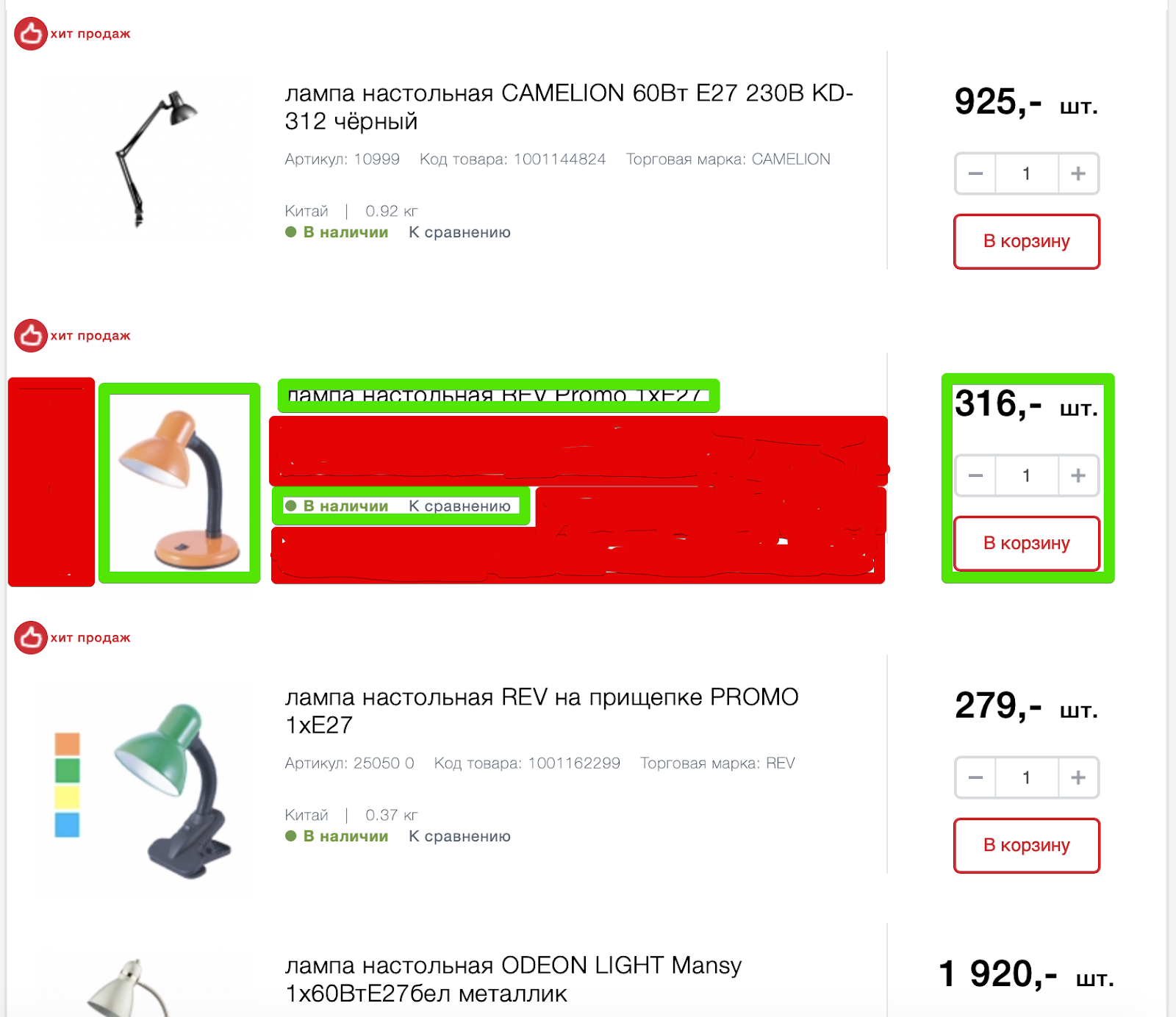
Green highlighted elements that are sufficient for interaction and selection of products from the range. Red highlighted areas that do not contain any valuable (context-sensitive) information.
Article, product code, brand, weight, country of production may be important on the product card, but are redundant in the interaction with the list. At the same time, the elements take up much more space compared to the really valuable information.
Information on availability, price, “Buy” button and comparison are elements of the same order and should be visually combined.
How to fix
Conduct research on how users interact with the shelves in Maxidom's offline stores, understand how they are looking for products, what they pay attention to, and transfer this experience to the site. At a minimum, you can significantly increase the photos of the product, facilitating their identification.
Combine into one group the elements of the same order, such as: information on the availability of goods, cost, "Buy" button and comparison.
The site interface also offers an alternative view of the list of products - tiles.

But in this version of the presentation of photos of goods is even less and at the same time some of the product information disappears. So she really wasn't so important? Not! Simply, the developers have found a brilliant solution - to show it in a larger product card when hovering over it, simultaneously blocking a part of neighboring goods and, at the same time, making it difficult to interact with them.
The most interesting thing is that part of the data in this view still disappears, for example, “Country of origin”, but new ones appear - “rating”. The “compare” link is unexpectedly transformed into an icon, once again creating additional cognitive load.
The expansion of the product card to the right is justified only by the need to add the button "To the basket". But is this interface solution worth the additional inconvenience of interaction with neighboring products?
How to fix
Provide the necessary interaction without going beyond the boundaries of the product or implement it in such a way as to eliminate the creation of additional difficulties in the interaction with other products.
Discard redundant information given the context of the interaction. Enlarge product photos.
The place where the final decision on the purchase of goods. A good product card should answer questions about the product itself, and questions related to delivery, payment, and return terms.
Not enough informative display of information about the availability of goods.
If the information on the availability of information in the list of goods is indicated explicitly, then on the product card such information is by default missing. To make sure you have it, you need to go to a separate “Availability” tab.
Go and understand that this is information about availability in specific stores:
Is there a product on the site? And what are these addresses? Yes, when you first visit, the site is trying to find out your region, but it doesn’t do it very convincingly:

If you skip this message, then the product card will display information about the availability in stores in St. Petersburg. And the ability to somehow influence this, if you do not see a subtle message in the upper left, no.
How to fix
Explicitly indicate information about the status of the goods and the ability to buy it online. Rename the “Availability” tab to “Availability in stores” and provide an interface for selecting a city right above the address list.
The “Buy” button is detached from the price and has a non-priority design. Try to relax your eyesight and immediately find the “Buy” button in the screenshot below:
Having spent a certain amount of energy, the “Buy” button can be found on the right side of the page, while in the most expected place is a plate with information about bonuses, which has the highest priority on page due to massive selection.
How to fix
Visually combine logically related elements: information on availability, price and the "Buy" button. Design the "Buy" button so as to eliminate any false interpretations. Reduce the visual load in the design of information about bonuses.
There is no intelligible information about the conditions and methods of delivery. Interacting with the goods card, it is unclear how, when and under what conditions the goods can be delivered. The information on the “Delivery” tab contains a lot of text, but does not answer any of the questions:

This text may seem quite self-sufficient, but in fact it provokes even more questions than it gives answers.
How to fix
Indicate possible options, terms and cost of delivery directly on the item card.
Missing information about the warranty, return and payment methods. In the item card, the user makes a purchase decision. No need to force him to search for answers to basic questions throughout the site. The user is easy to distract and even easier to lose. And the difficulty of finding answers to basic questions will be transferred to the impression of the entire store: "Oh, everything is so difficult, I will buy it in another place."
How to fix
Report the conditions of warranty, return and payment methods directly on the item card.
The lack of information that the goods are already in the basket. Adding goods to the cart is confirmed with the proposal to proceed to checkout.
But, having closed the pop-up window with this offer, it becomes impossible to understand whether this item is already in the basket or not? How to proceed to checkout?
How to fix
For the goods in the basket, replace the "Add to cart" button with an explicit message that the goods are already in the basket and suggest moving to checkout.
Errors in the shopping cart interface and the checkout process occupy top places in the ranking of reasons for the refusal of purchases. Site Maksidom collected them all that pulls on a separate large material, so I will pay attention only to one of them.
Weak identification of goods in the basket. This is how a basket looks like when there are no goods in it:
And this is what a basket looks like when there are goods in it:

Visually, only the number changes. For the rest, the basket remains the same mild and barely noticeable. Especially if you are a new user. The position is somewhat saved by the observance of the traditional pattern of the location of the basket in the upper right corner. But at the same time, to find it, you need to make an effort.
How to fix
Visually separate the basket from other interface elements, make it more separate. Change the view of the cart when goods appear in it. Users should easily find a cart and understand further actions after adding goods to it.
According to that found in the network description of the advertising opportunities for suppliers, he said Maksidom more than 60% of the buyers secured mature people aged 35-55 years. At this age, vision loss is common. How did the website developers take this into account?

The site offers very small photos of products, and important information is displayed in extremely small print with weak contrast. In general, everything is for people.
Naturally, no one is interested in messing with this incomprehensible usability. Much more interesting is something “grow-hack”. Therefore, visitors to the site are met by an army of gimmicks, the main purpose of which is to receive your email or make them subscribe to notifications in the browser.
The interface asks a question that can not be abandoned. The only chance to remove this message is to accept and forgive.
You will be shown a request for notifications and you must accept it. Clear?

It is necessary to go to another page, as a new, barely visible form at the bottom of the page begins to beg for your email.

And the site already looks like this. Got a little more red, right? Analyzing the errors on the product card, I wrote about the lack of information about payment methods, warranty and return. So here they are, below in the form of a red plate. Did not notice? I did not immediately. Is it possible to do something with this element, for example, to know the specifics of delivery? Not! Look at the plate, and when you get tired, just hide it.

In an attempt to show that not only you are suffering on this site, information about other people appears. Later, this message is changed by stating that someone just made a purchase.

The appeared bell will remind about it, but why it is necessary, it will not remind you already. Just open the popup, where the arrow indicates where to click, so surely.


If all the previous tricks have not hooked you, there is a special popup. The name is no longer important. Just leave an email and go in peace.
We honestly do not understand what we did wrong, so before you leave, fill out the form and help us in striving to become better.
All these tricks, in general, can really help a business get more. But only at their expense will not go far, and the dissatisfaction of users of the site will necessarily result in an increase in sales from nearby competitors.
You can continue to play in the "Groz marketing" and "hack" the conversion, or you can just look at the project through the eyes of users and achieve greater growth due to small, pinpoint, but more significant interface improvements.
How interesting are articles of this format to you? Sometimes I get bombed and I do usability auditing of random projects. Recently, I already wrote about the usability audit of the site for three million . To direct my energy in a useful way, you can offer an audit of your website or mobile application. Just write me in PM. I will choose interesting projects and make an audit for free.
What do you think of the site Maxidom? Did you buy something on it? Write in the comments.
Recently caught the eye of the case of the next "groz hackers" grose hacking "site Maxid. The guys, having implemented solutions that are standard for the ecommerce segment, such as a list of popular products, sincerely admired the growth in conversion, but overlooked the “beam in the eye”, which could have been dragged out and produced much more impressive results without unnecessary costs or misleading mechanic users.
Maxidom's website is stuffed with all sorts of tricks of marketers who are eager to get permission to send you spam pushes in the browser or get your email to send this spam to your email as well. When you try to leave the site, they will carefully ask what it is you suddenly decided to leave without buying anything. And it would be possible to close our eyes to all these aggressive tricks if there were not a lot of problems that prevent users from comfortable finding the right products and making purchases.
In this usability audit, I only looked at significant errors in the user's path.
Content:
- Navigation: interaction with the catalog of goods
- Navigation: site search
- Second level category pages
- Card Product
- Basket and checkout
- Little about accessibility
- List of groo-marketing tricks
Navigation: interaction with the catalog of goods
The main thing in any ecommerce project is products. For convenient access to them, there are many interface solutions, but the main one still remains the directory.
Problem
Finding a product catalog when interacting with the main page is another task. On the one hand, the developers added a big bright button directly to the header of the site, on the other hand, they did everything possible so that it merged with the other elements and got lost.
Excessive use of corporate red in the header of the site reduces the rapid identification of the “Catalog” button.
How to fix
Reduce the contrasting load from static elements (for example, the top menu), ensuring sufficient identification of the “Product Catalog” button.
Problem
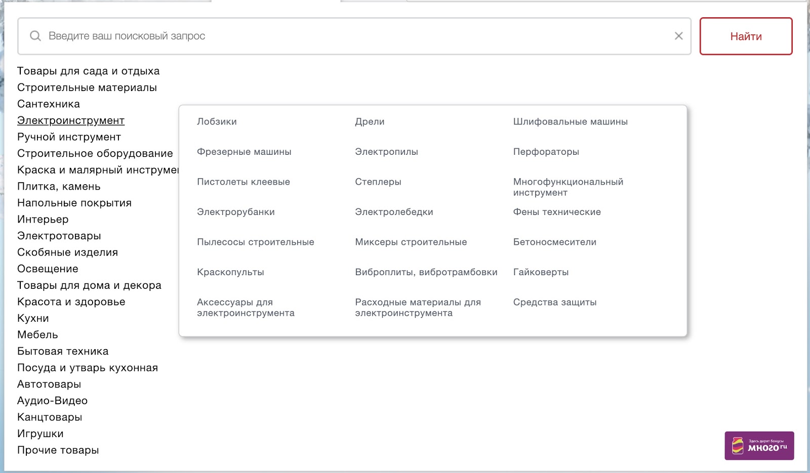
Non-optimal presentation of the menu that appears after clicking on the "Catalog" button.
The list of 24 items contains groups of goods different in meaning and volume (for example: "hardware" and "toys"). Presented as a vertical list of links without any sorting, the menu is very difficult to understand and interact with visitors.
You can click on each link to go to the category page, but when you hover, another pop-up menu appears with a list of subcategories.
The feasibility of moving subcategories to the pop-up menu, in the presence of a huge "hole" on the right, raises questions. Interaction with such a menu requires high accuracy in mouse movement - the slightest up-down shift opens up another list of subcategories. In addition, due to the lack of sufficient identification of the selected category (the link is simply underlined when you hover over it), users may not understand that they moved the mouse pointer and try to search for the desired subcategory already in another list.
The interaction is also complicated by technical implementation errors, as a result of which the menu of subcategories pops up not only when you directly hover over the category link, but also by simply moving the pointer to the right of the menu list.
How to fix
Revise the overall approach to the presentation of the main menu of the product catalog, provide a quick and easy identification of the first level sections and the same interaction with the second level sections.
I only cover the technical part of the solution, while the catalog also needs to be revised in structure and logic. To perform such a task would require a much more extensive study.
Problem
In some browsers (for example, Safari) interaction with the product catalog is hampered by switching the slider on the main page.
How to fix
Test the technical implementation of all interactive elements of the site in different browsers for possible errors that create difficulties in the interaction.
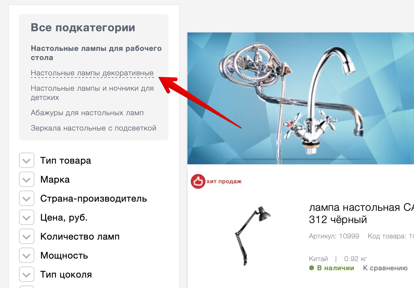
Problem
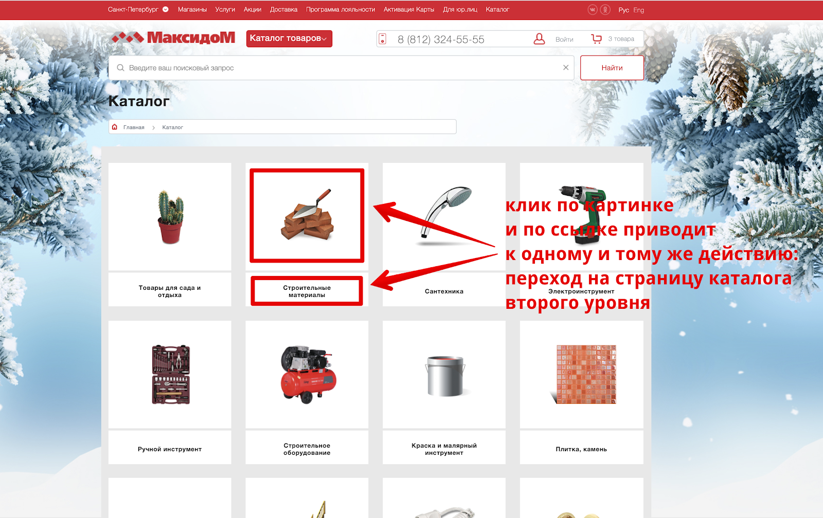
For each level of the catalog there is a separate page. For example, for the catalog of the first level, it looks like this:
Each category is accompanied by a thematic picture. Clicking on the picture and the category name leads to an identical action - go to the page of the second level catalog.
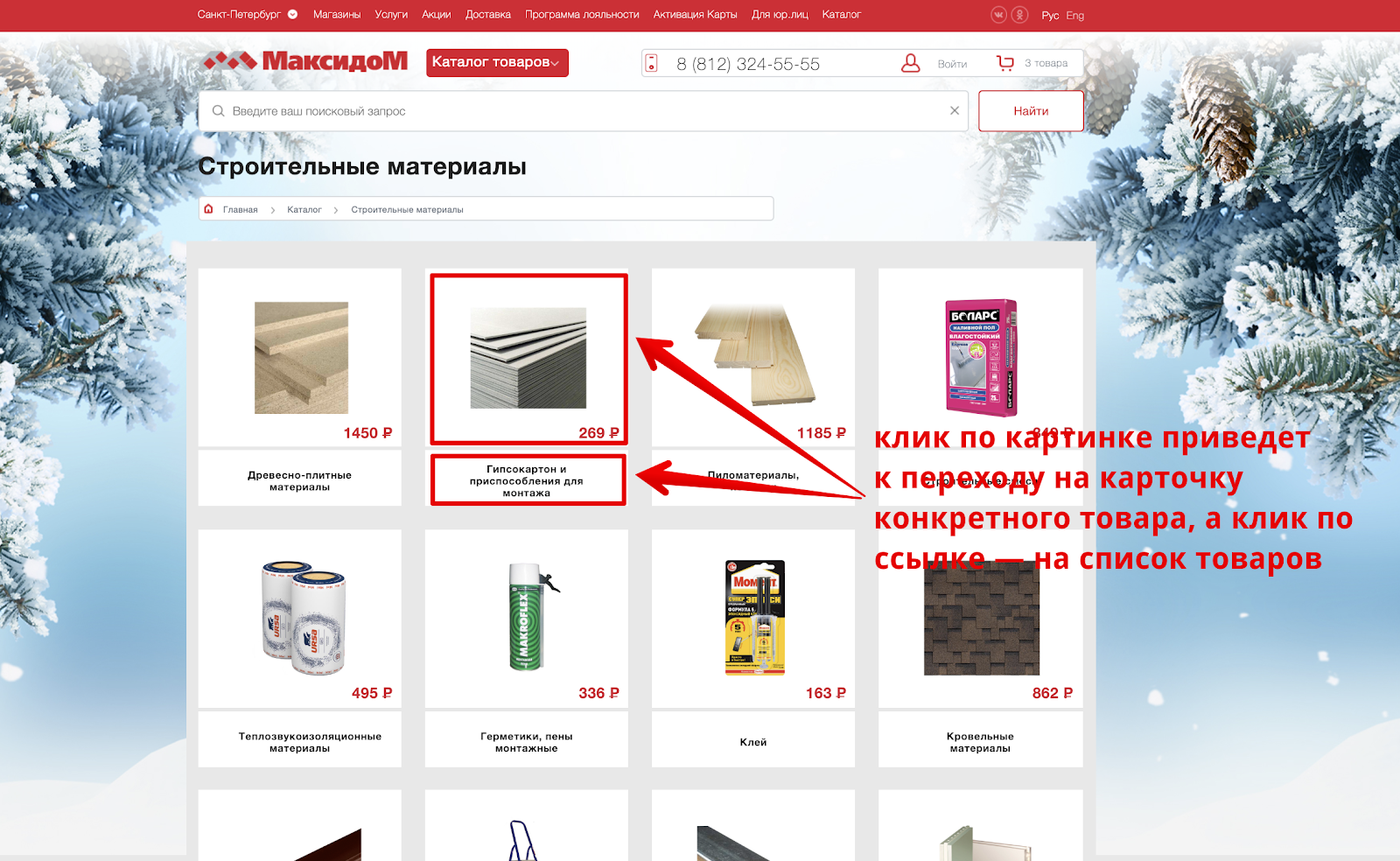
This is the second level directory page:
At first glance, the interface solution for the first and second level directory is identical. But in fact, clicking on the image on the catalog of the second level leads to the transition immediately to the item card. To see the entire list of products in the subcategories, you need to click on its name under the product image.
The situation is also complicated by the fact that some users may not perceive the second-level category page as a list of possible subcategories, and consider this as a specific range of products and limit themselves to interacting only with it.
How to fix
Be consistent, stick to identical interface solutions in the same interaction context. Eliminate any misinterpretation of the interface.
Navigation: site search
Some users prefer to use search on the site to access goods. Apparently, knowing this, the developers placed a large search bar right in the header of the site and ensure its availability with further interaction.
Problem
When interacting with the search string, search prompts that actually became the standard for e-commerce projects are not used.
Such hints greatly simplify and accelerate the interaction with the search, allowing you to go directly to the desired category or specific product without visiting the Search Results page. Their absence may be a signal to some users that something is not working on the site, because the usual prompts do not appear, or there is simply no product in the range.
How to fix
Embed tips when interacting with the search string.
Second level category pages
At the level of categories of the second level there is the opportunity to interact with the list of products.
Problem
The product filter includes several entities with different behavior: a list of third-level subcategories and a set of characteristics depending on the selected subcategory.
Two different entities, combined visually, create a false view of the operation of the filter. This solution can also cause irritation in the case when the user has applied several filter parameters, and then decided to refine the subcategory. This will reload the page and reset all filter settings. In addition, a new list of possible filtering options will appear, depending on the subcategory, which will further confuse.
How to fix:
Separate entities with different behavior, eliminating false interpretations of possible interactions among users.
Problem
Incorrect use of link highlighting when hovering in the "All subcategories" block.
A link with a dotted underscore means performing an action without reloading the page (for example, opening a popup). In this case, when you click on a link, it switches to another page. Considering that other links on the site when pointing are underlined by a solid line, the decision forms a false wait for users.
How to fix
Use the site’s standard way to highlight links or, in general, review the approach to interacting with the block.
Problem
Incorrect use of checkbox to highlight filter parameters.
Using the selected checkbox can be perceived by users as an already selected filter parameter. Displaying the checkbox in light gray may indicate that the setting is not editable.
When you hover over the filter, only the mouse pointer changes, but there is no additional signal that each item contains its own individual set of parameters.
The buttons "Show" and "Reset" have an equivalent visual weight. To understand which button to interact with, additional focusing is required, which leads to excessive cognitive stress.
How to fix
Refuse to use elements that can be treated differently by users. More clearly show that each filter item is a group with its own set of parameters. Apply different styles for the "Show" and "Reset" buttons. "Reset" can not be shown at all before applying any filter parameters.
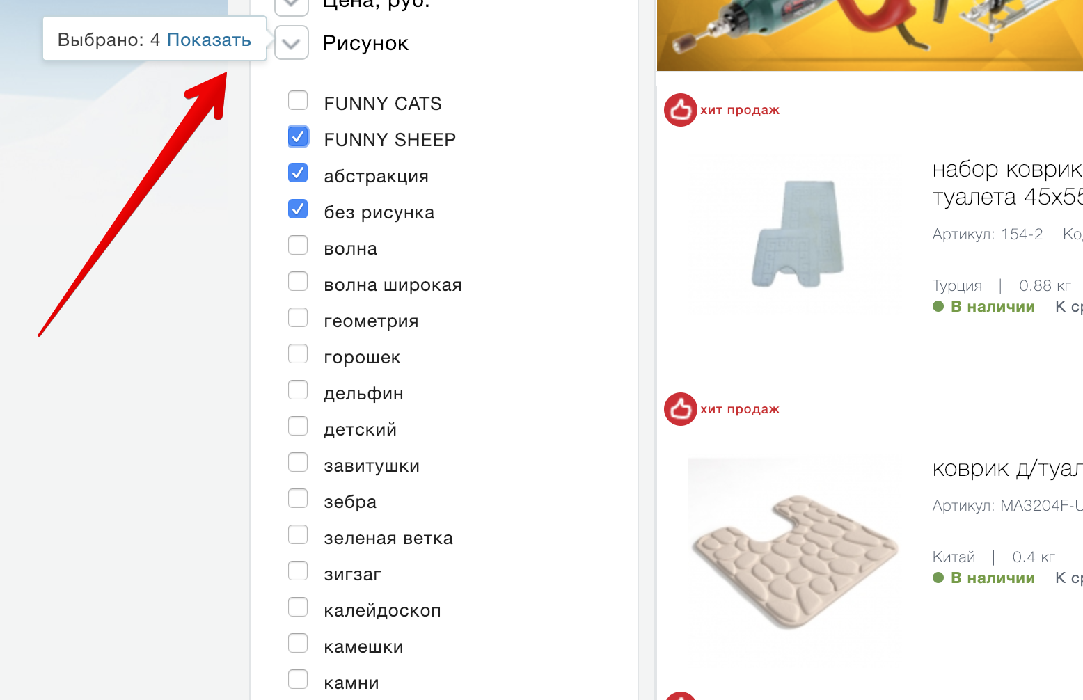
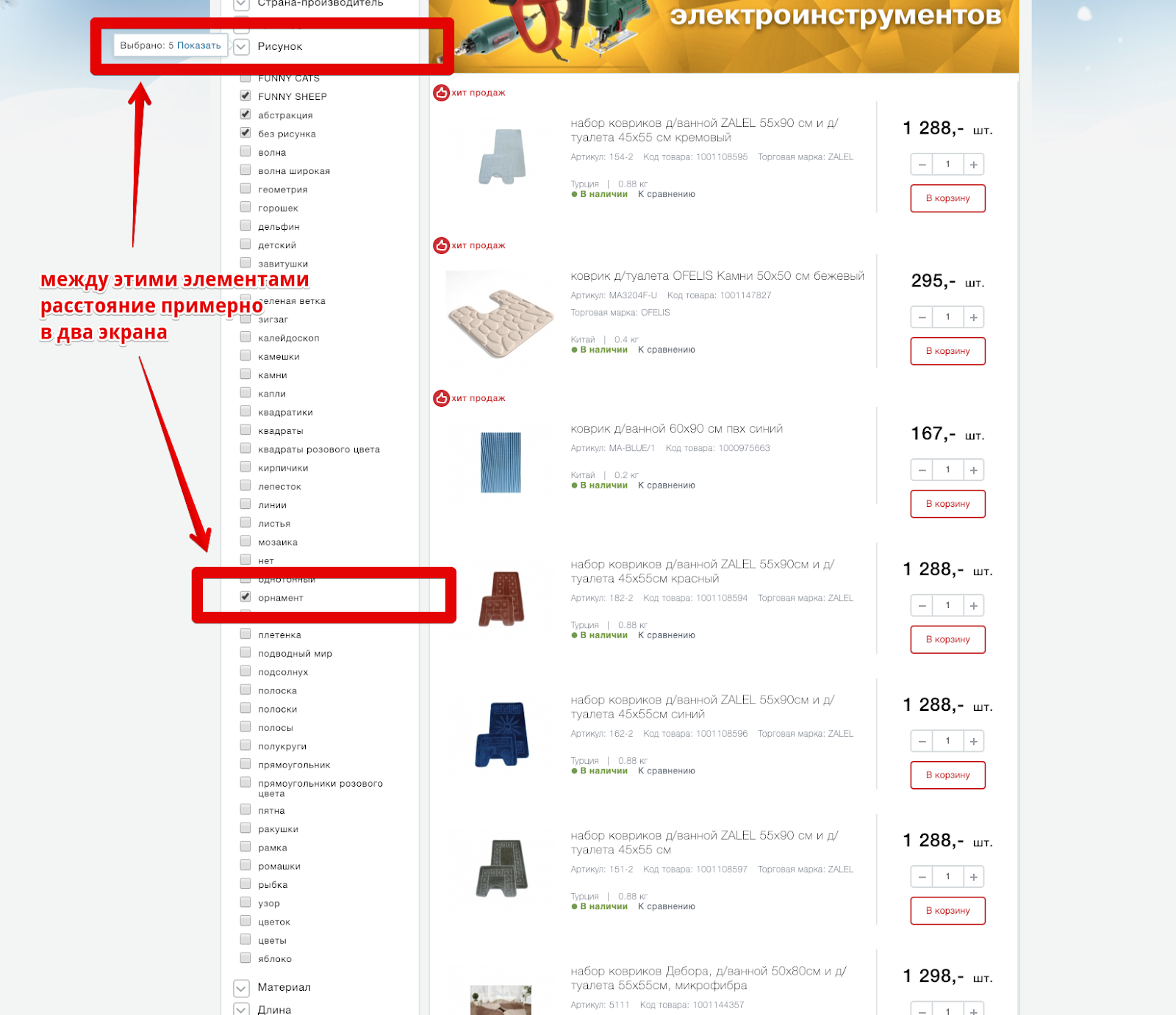
Problem
When interacting with the filter parameters, a label is displayed indicating the number of products corresponding to the applied filter.
This, which has become a standard pattern, is really convenient for users interacting with the filter. But, displaying such a shortcut at the level of a group of parameters, the developers have deprived most of the users of the possibility of interaction with it, especially in groups with a large number of parameters - you just can’t just see it.
Although with a small number of parameters or interaction in the upper part of the group, the probability of noticing this label is rather low - the user's attention is concentrated in the place where the parameter is directly selected and any (especially such minor changes) in the periphery of the view can be missed.
How to fix
Display a label with the number of products corresponding to the selected filters in close proximity to the applied filter parameter.
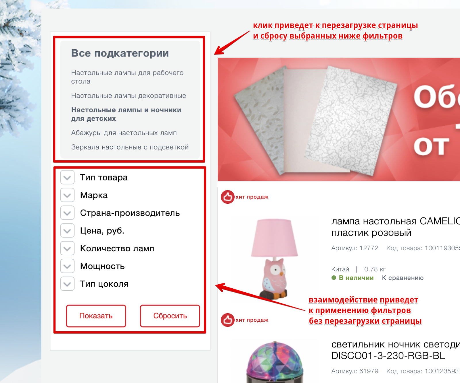
Problem
The list of products in the default display option contains redundant information about the product, which does not help to understand whether the product meets expectations, and at the same time complicates the interaction.
Green highlighted elements that are sufficient for interaction and selection of products from the range. Red highlighted areas that do not contain any valuable (context-sensitive) information.
Article, product code, brand, weight, country of production may be important on the product card, but are redundant in the interaction with the list. At the same time, the elements take up much more space compared to the really valuable information.
Information on availability, price, “Buy” button and comparison are elements of the same order and should be visually combined.
How to fix
Conduct research on how users interact with the shelves in Maxidom's offline stores, understand how they are looking for products, what they pay attention to, and transfer this experience to the site. At a minimum, you can significantly increase the photos of the product, facilitating their identification.
Combine into one group the elements of the same order, such as: information on the availability of goods, cost, "Buy" button and comparison.
Problem
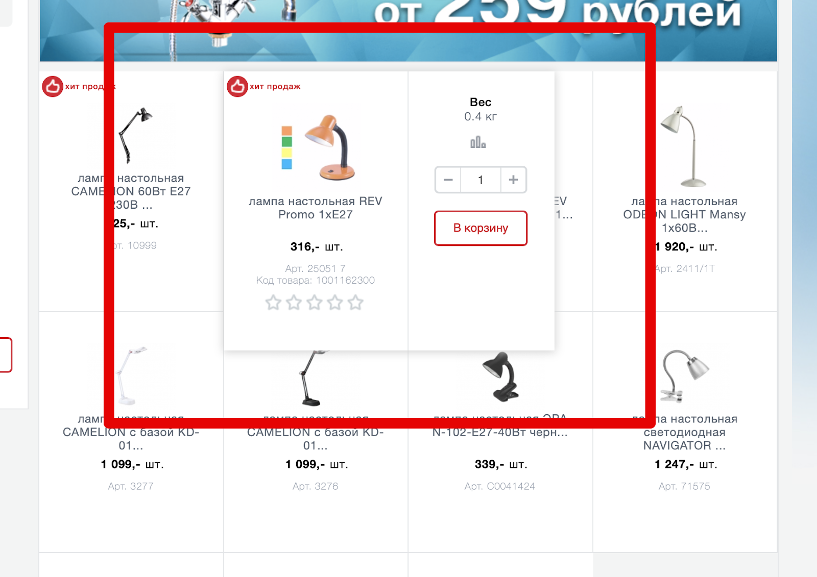
The site interface also offers an alternative view of the list of products - tiles.
But in this version of the presentation of photos of goods is even less and at the same time some of the product information disappears. So she really wasn't so important? Not! Simply, the developers have found a brilliant solution - to show it in a larger product card when hovering over it, simultaneously blocking a part of neighboring goods and, at the same time, making it difficult to interact with them.
The most interesting thing is that part of the data in this view still disappears, for example, “Country of origin”, but new ones appear - “rating”. The “compare” link is unexpectedly transformed into an icon, once again creating additional cognitive load.
The expansion of the product card to the right is justified only by the need to add the button "To the basket". But is this interface solution worth the additional inconvenience of interaction with neighboring products?
How to fix
Provide the necessary interaction without going beyond the boundaries of the product or implement it in such a way as to eliminate the creation of additional difficulties in the interaction with other products.
Discard redundant information given the context of the interaction. Enlarge product photos.
Card Product
The place where the final decision on the purchase of goods. A good product card should answer questions about the product itself, and questions related to delivery, payment, and return terms.
Problem
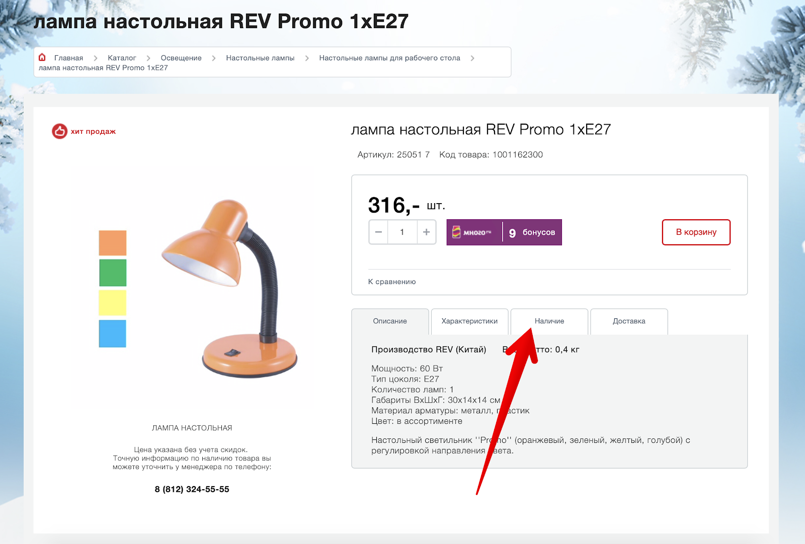
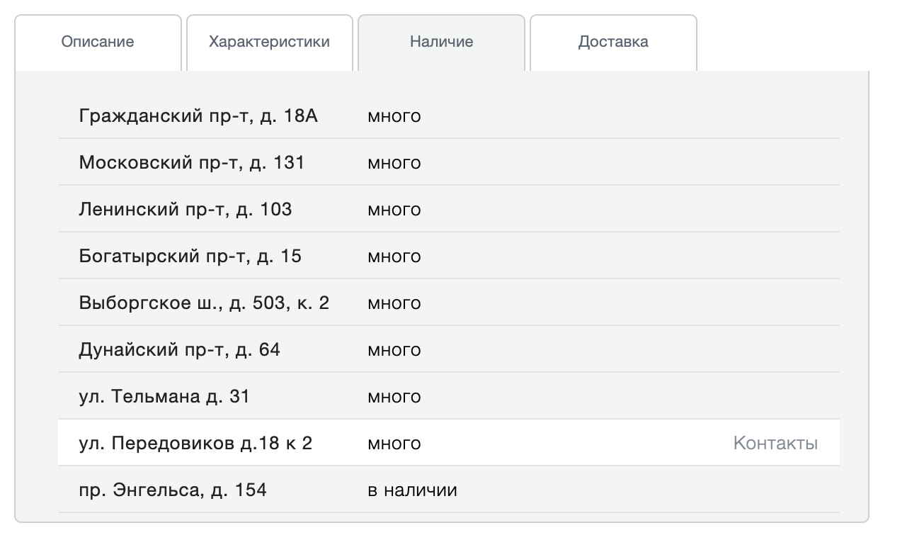
Not enough informative display of information about the availability of goods.
If the information on the availability of information in the list of goods is indicated explicitly, then on the product card such information is by default missing. To make sure you have it, you need to go to a separate “Availability” tab.
Go and understand that this is information about availability in specific stores:
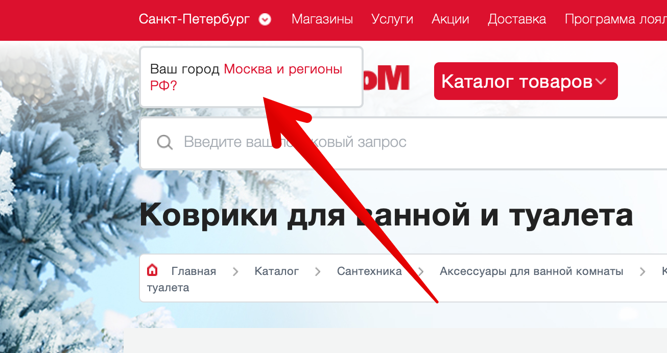
Is there a product on the site? And what are these addresses? Yes, when you first visit, the site is trying to find out your region, but it doesn’t do it very convincingly:
If you skip this message, then the product card will display information about the availability in stores in St. Petersburg. And the ability to somehow influence this, if you do not see a subtle message in the upper left, no.
How to fix
Explicitly indicate information about the status of the goods and the ability to buy it online. Rename the “Availability” tab to “Availability in stores” and provide an interface for selecting a city right above the address list.
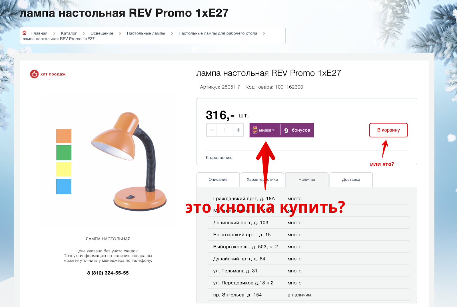
Problem
The “Buy” button is detached from the price and has a non-priority design. Try to relax your eyesight and immediately find the “Buy” button in the screenshot below:
Having spent a certain amount of energy, the “Buy” button can be found on the right side of the page, while in the most expected place is a plate with information about bonuses, which has the highest priority on page due to massive selection.
How to fix
Visually combine logically related elements: information on availability, price and the "Buy" button. Design the "Buy" button so as to eliminate any false interpretations. Reduce the visual load in the design of information about bonuses.
Problem
There is no intelligible information about the conditions and methods of delivery. Interacting with the goods card, it is unclear how, when and under what conditions the goods can be delivered. The information on the “Delivery” tab contains a lot of text, but does not answer any of the questions:
This text may seem quite self-sufficient, but in fact it provokes even more questions than it gives answers.
How to fix
Indicate possible options, terms and cost of delivery directly on the item card.
Problem
Missing information about the warranty, return and payment methods. In the item card, the user makes a purchase decision. No need to force him to search for answers to basic questions throughout the site. The user is easy to distract and even easier to lose. And the difficulty of finding answers to basic questions will be transferred to the impression of the entire store: "Oh, everything is so difficult, I will buy it in another place."
How to fix
Report the conditions of warranty, return and payment methods directly on the item card.
Problem
The lack of information that the goods are already in the basket. Adding goods to the cart is confirmed with the proposal to proceed to checkout.
But, having closed the pop-up window with this offer, it becomes impossible to understand whether this item is already in the basket or not? How to proceed to checkout?
How to fix
For the goods in the basket, replace the "Add to cart" button with an explicit message that the goods are already in the basket and suggest moving to checkout.
Basket and checkout
Errors in the shopping cart interface and the checkout process occupy top places in the ranking of reasons for the refusal of purchases. Site Maksidom collected them all that pulls on a separate large material, so I will pay attention only to one of them.
Problem
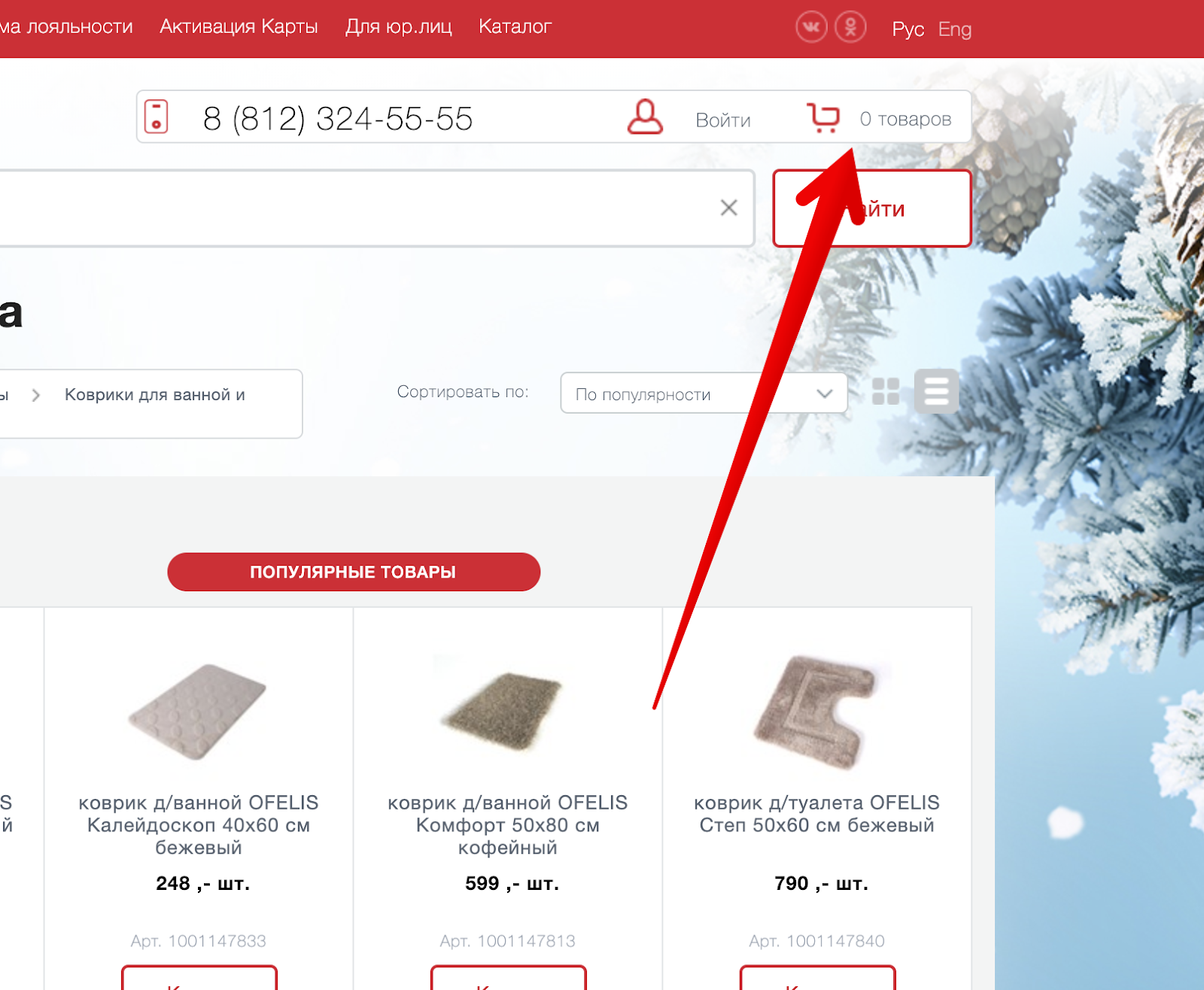
Weak identification of goods in the basket. This is how a basket looks like when there are no goods in it:
And this is what a basket looks like when there are goods in it:
Visually, only the number changes. For the rest, the basket remains the same mild and barely noticeable. Especially if you are a new user. The position is somewhat saved by the observance of the traditional pattern of the location of the basket in the upper right corner. But at the same time, to find it, you need to make an effort.
How to fix
Visually separate the basket from other interface elements, make it more separate. Change the view of the cart when goods appear in it. Users should easily find a cart and understand further actions after adding goods to it.
Who are your customers?
According to that found in the network description of the advertising opportunities for suppliers, he said Maksidom more than 60% of the buyers secured mature people aged 35-55 years. At this age, vision loss is common. How did the website developers take this into account?
The site offers very small photos of products, and important information is displayed in extremely small print with weak contrast. In general, everything is for people.
Tricks instead of making
Naturally, no one is interested in messing with this incomprehensible usability. Much more interesting is something “grow-hack”. Therefore, visitors to the site are met by an army of gimmicks, the main purpose of which is to receive your email or make them subscribe to notifications in the browser.
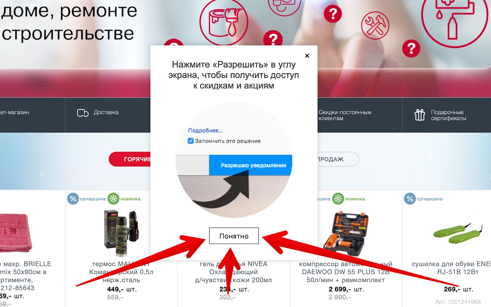
It is impossible to refuse
The interface asks a question that can not be abandoned. The only chance to remove this message is to accept and forgive.
"Che" is not clear here?
You will be shown a request for notifications and you must accept it. Clear?
No, well, really, want?
It is necessary to go to another page, as a new, barely visible form at the bottom of the page begins to beg for your email.
Viewed a few more pages?
And the site already looks like this. Got a little more red, right? Analyzing the errors on the product card, I wrote about the lack of information about payment methods, warranty and return. So here they are, below in the form of a red plate. Did not notice? I did not immediately. Is it possible to do something with this element, for example, to know the specifics of delivery? Not! Look at the plate, and when you get tired, just hide it.
You need to increase confidence, think of something!
In an attempt to show that not only you are suffering on this site, information about other people appears. Later, this message is changed by stating that someone just made a purchase.
How, you have not subscribed to notifications in the browser?
The appeared bell will remind about it, but why it is necessary, it will not remind you already. Just open the popup, where the arrow indicates where to click, so surely.
And even the email is not left? We will remind immediately after pushing
Control shot for not at all compliant
If all the previous tricks have not hooked you, there is a special popup. The name is no longer important. Just leave an email and go in peace.
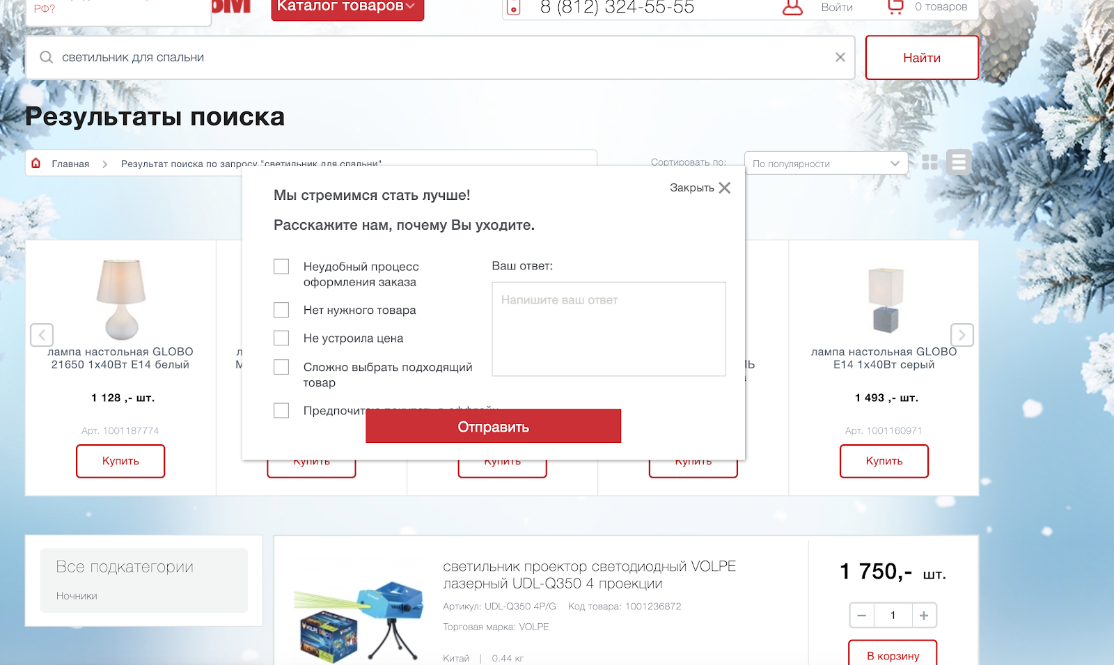
Why did you decide to leave the site?
We honestly do not understand what we did wrong, so before you leave, fill out the form and help us in striving to become better.
What to do?
All these tricks, in general, can really help a business get more. But only at their expense will not go far, and the dissatisfaction of users of the site will necessarily result in an increase in sales from nearby competitors.
You can continue to play in the "Groz marketing" and "hack" the conversion, or you can just look at the project through the eyes of users and achieve greater growth due to small, pinpoint, but more significant interface improvements.
***
How interesting are articles of this format to you? Sometimes I get bombed and I do usability auditing of random projects. Recently, I already wrote about the usability audit of the site for three million . To direct my energy in a useful way, you can offer an audit of your website or mobile application. Just write me in PM. I will choose interesting projects and make an audit for free.
What do you think of the site Maxidom? Did you buy something on it? Write in the comments.