How I created maps of the continents for my game.
- Transfer
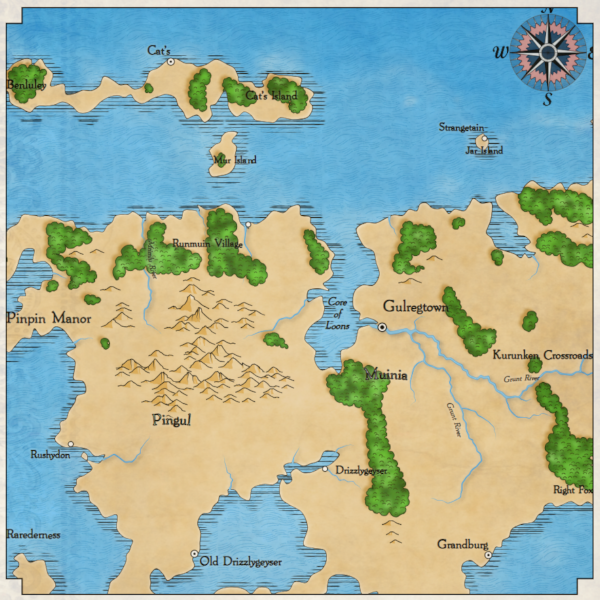
Part 1. SVG and coordinate systems
Until recently, the size of the maps in my game Dragons Abound was fixed and somewhat non-deterministic. I considered them "regional" - not maps of the whole world, but its large parts, such as, for example, the west coast of the United States or part of Europe. I was quite happy with this scale, but I wanted to experiment a bit with the game to see if I could generate maps of the whole world (or at least a larger one). But before I get to this, let's talk a little bit about fantasy worlds maps.
The world is a big space. Most of the fantasy "worlds" cards don't even come close to their true size. Take, for example, Middle-earth, in which the Lord of the Rings takes place:
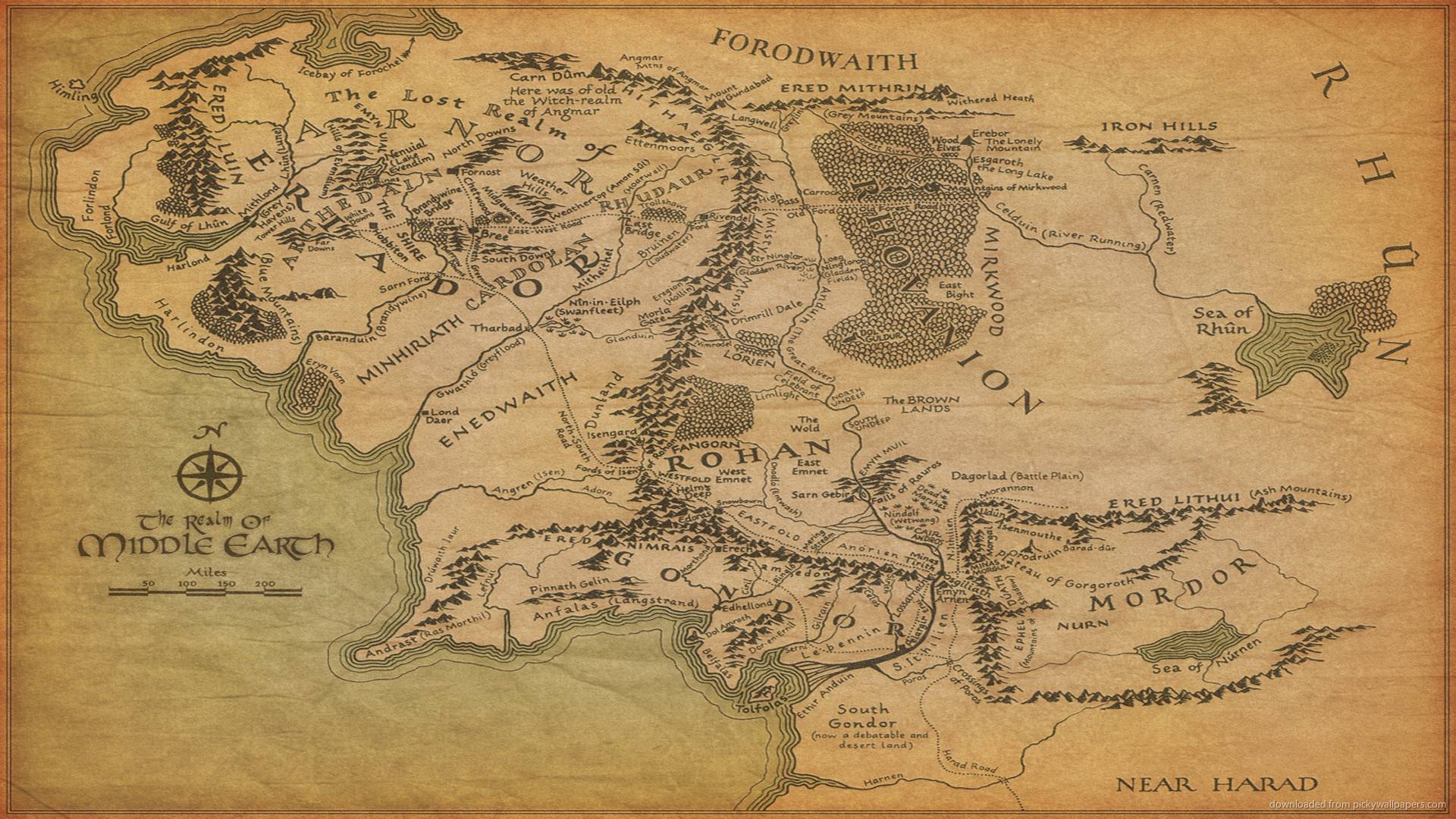
Although it seems that a huge world is captured on it, in fact, Middle-earth was created on the basis of Europe.
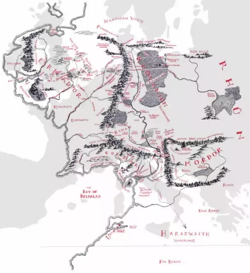
That is, the real map of the “world” for Tolkien’s world will be about 50 times larger than the map of Middle-earth (!). In fact, most of the maps of fantasy worlds that I have seen display a territory about the size of a continent:

It seems that this is the largest area that is well visualized in the style of fantasy cards.
That is, the task of generating real “world maps” is probably too ambitious. It is better to aim at creating a map of the continent (or part of the continent). (However, it is still more convenient to consider a card having the size of a “world.”) So how big should the map be? If the current Dragons Abound cards have a “subcontinental” size, then we can assume that you need to generate cards 8-10 times larger.
Before I proceed to the task of generating large maps, I need to better understand the various coordinate systems that are used in my game. I borrowed a lot of coordinate systems from Martin O'Leary’s source code, and their interactions can be confusing, even when you work with them for two years. Usually I managed to do without experimenting with them, but it is obvious that in order to generate large maps this will have to be done.
To begin with, the “world” of the regional map is currently generated within a single square. Each regional map has coordinates from (-0.5, -0.5) to (0.5, 0.5), and the origin (0,0) is in the middle of the region.

One of the oddities here is that the Y-axis is reversed compared to what we studied in school geometry. -0.5 is at the top of the map, and 0.5 - at the bottom. In computer graphics, the y-axis is often inverted. I heard that this is explained by the way the first monitors (TVs) performed the scan from top to bottom, that is, the first scan line was at the top, the next immediately below it, and so on, that is, the Y index of the scan lines changed from zero at the top to some positive number down below. Anyway, the SVG (Scalable Vector Graphics) format uses the same coordinate system, so Dragons Abound too.
This coordinate system is independent of how the map will be displayed. This is just a dimensionless system for the creation of the world - the city is located at (0.12875, -0.223), the border runs from (0.337, 0.010) to (0.333, 0.017), and so on. And although my current regional maps are limited to the range from 0.5 to -0.5, this is not the limit of the coordinate system. I can create a world beyond these borders.
The next coordinate system is what the SVG is called the viewbox. It sets the true coordinates that will be used to draw the graphics. For example, Dragons Abound at the beginning sets the viewbox to the coordinates (-500, -500) and it has a width of 1000 and a height of 1000:

(There is a typo in the picture, at the top of the Y axis should be -500, I'm sorry.)
You can see that in this case the transformation between the first and second coordinate systems is only multiplying by only 1000. That is. in order to draw something, the game finds the coordinates of this object, multiplies them by 1000, and draws in these coordinates SVG.
That is, I can use the viewbox coordinates to allow us to draw a line from (0, 0) to (250, 250). But actually I don’t want to draw a line from (0, 0) to (250, 250) on the computer screen. This would mean that if I want to display a map at a different point on the screen, then I will have to change the coordinates of all map objects and redraw them. It would be a lot of work.
To control the coordinates of displaying graphics on the screen, there is a third coordinate system in SVG, called viewport. Viewport is the part of the page in which the graphics should be drawn (on a web page this is the <svg> element). It has a width, height and location. The location is the coordinates of the upper left corner of the viewport. That is, if I displayed the map in the viewport with coordinates (30, 100), which is 800 meters high and wide, then the coordinate system of the viewport would look like this:

In SVG, the coordinate systems viewbox and viewport are connected to each other, and the transition between them is handled by the SVG itself. We simply draw in the viewbox coordinate system, and everything drawn is displayed in the corresponding viewport location. (There are some problems when creating the viewbox and viewport with different aspect ratios. Then the objects are either clipped or stretched, depending on the attribute value
preserveAspectRatio. I recommend not to do this at all.) To summarize: a city located in world coordinates (0.10, 0.33) is drawn in coordinates (100, 330) and is shown on the screen in (110, 764).
Now you can understand why this can be confusing!
What happens if I change each of these coordinate systems? Suppose that in the first coordinate system I will generate a world that ranges from -0.25 to 0.25 along each axis. Then the resulting world will be four times smaller than the ordinary world and will fill only the middle part of the viewport:

(You can also notice artifacts around the edges, which are usually hidden.) Similarly, if I double the size of the first coordinate system (CS), then we will not see most of the map, because it will be outside the edges of the viewport.
What happens if I double the viewbox size? Well, if I also double the ratio between the first SC and the viewbox (from 1000 to 2000), then nothing will change much. If the ratio remains equal to 1000, the map will again be halved.
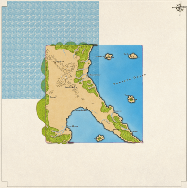
However, this time the map has an initial area of 1x1. We can again notice artifacts around edges that are usually hidden (for example, bulging parts of forests). You can also see that the ocean pattern is incorrect - I must have rigidly set some assumptions about the size of the viewbox. In addition, it seems that the compass is not located on the corner of the map, but on the corner of the viewbox.
And vice versa, if I reduce the size of the viewbox by half, this will create the effect of a zoom map:
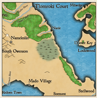
Here we see only the middle quarter of the map. This is not a very convenient way to perform the zoom, because when displaying only half of the map, some problems are created - for example, the marker of the city “South Owenson” has gone off the screen. In addition, it doubles the size of fonts and other things that I do not need.
A more useful aspect of the viewbox is changing the origin point. While the viewbox has been centered on the map, this is not necessary. For example, I can shift the map to the right by centering the viewbox on a point on the left side of the map:
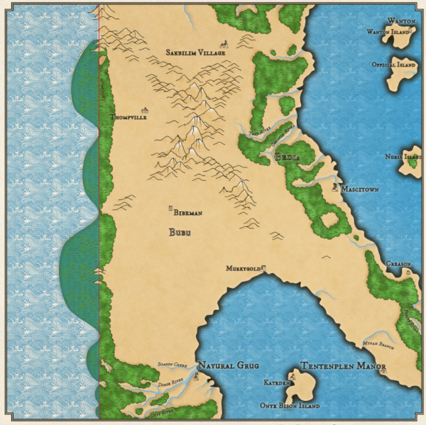
We can again notice the effects on the borders and some other problems, but in fact the map has shifted to the right. The usefulness of this may not be obvious, but imagine that I will generate a map that is twice the width of a regular map. By default, it looks like this:
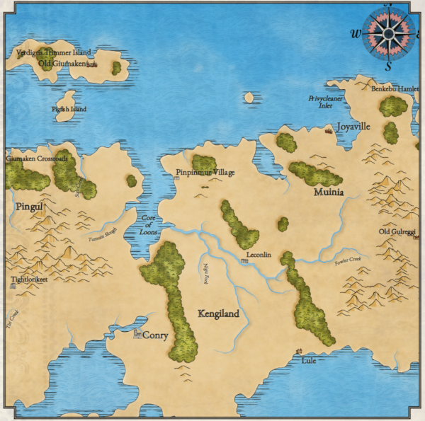
It looks like any other map, but in fact it is only the central part of a larger map. That is, now I can change the viewbox to transfer other parts of the map to the overview window:

Here I have shifted the viewpoint to the left, so we see a part of the world east of the original view. Some names on the map have changed, because Dragons Abound performs some functions (for example, gives names to objects) based on whether they are visible. I will need to change this so that when I move the viewbox, the map remains constant. However, later I can move the viewbox on a large map and generate regional maps of any desired area. That is, I can generate and display large maps the size of a continent, but I can also generate regional maps of areas within a large map.
To summarize: the game uses three coordinate systems. The first is an abstract SC for objects of the world. The second is the viewbox, it defines the visible region of the world. The third is the viewport, it controls where the map will be drawn on the screen. To draw a larger world, I need to expand the first UK. To display more on the screen, you need to expand the viewbox. I can also move the viewbox to display different parts of the big world.
Part 2. Making cards permanent
In the previous part, I explored the coordinate systems and learned how to move the SVG viewport to display only parts of the larger world. However, this approach has some problems, because earlier I assumed that everything invisible to us is unimportant. In this part, I will eliminate these assumptions so that you can generate and view different parts of the unchanged large maps.
The problem with the placement of names, which I described in the previous part, is clearly visible on these two types of a single card:

Here is the same world, only the view is shifted to the left:

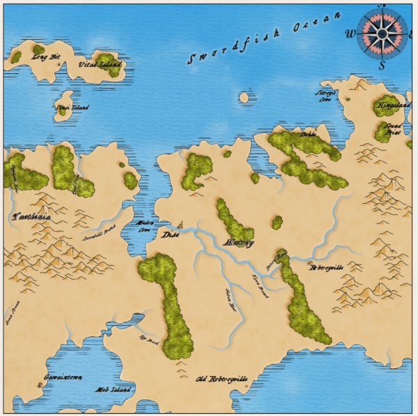
You may notice that the geography is the same, but many names have changed. Since in two forms different objects are visible, and the process of creating names is controlled by random numbers, different names are obtained.
Looking at the code, I found that almost all objects are given names depending on their visibility. But there is only one exception that makes it difficult to give names to all subsequent objects. In our case, the exception is that Dragons Aboundgenerates only visible coastlines. The reasons for this are very confusing. In fact, there is a “coastline” along the entire edge of the world, but the creation of this line destroys part of the logic of the program, because it encloses the whole world. To avoid this, I simply generated only the visible coastline. Now that the map can expand far beyond the viewport, this solution does not look good. Instead, I need to stop generating shorelines when I approach the real edge of the map. (Which I still leave off-screen to hide problems on the edges.)
After this problem is fixed, the names on two maps remain constant:
and:
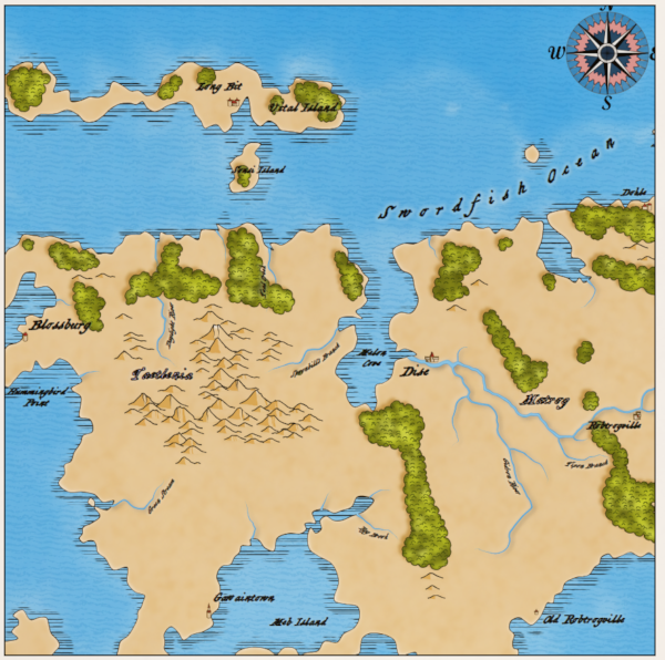
One more note for the future: if I use the possibility of interactivity to change the names of map objects, this change will not be recreated in its current form, and probably will not even be reproducible. It is worth thinking about.
If you look closely at the previous map, you can see that the area of the ocean near the lower central part of the map has a hanging label “Meb Island”. This happened because Dragons Abound actually believes that the area of the ocean is an island. I will not go into technical details, but it is surprisingly difficult to distinguish islands from lakes when they go beyond the limits of the map. The algorithm is confusing the change I made to the generation of invisible coastlines, and to avoid such problems, this needs to be fixed.
Now let's quadruple the size of the map and show only a quarter of it in the map window:
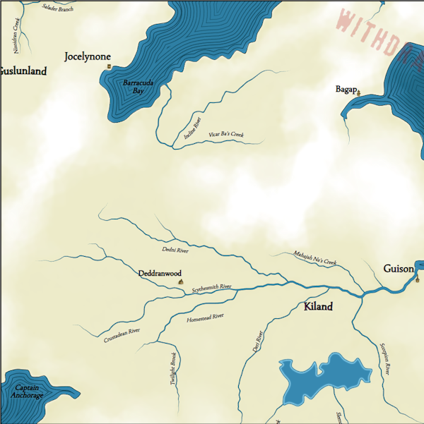
In general, everything looks good (there is an interesting system of rivers on the map, a big lake, but you can see that cities are very rare. It happened because Dragons Abound generates 10-20 cities. This interval is well suited for the world of normal size, but it’s bad, when the size is four times larger. Therefore, the interval should be changed in accordance with the relative size of the world. Probably, it should be done in several places.
Here is the same map after fixing the problem:
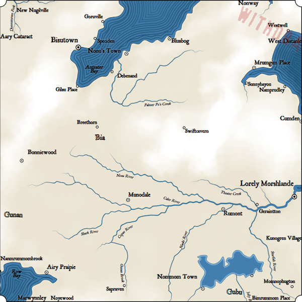
Now there is a more logical number of cities and towns on the map, but this shows us another problem. You can see a lot of extra names around the edges of the map, for example, Nanmrummombrook, Marwynnley and Noyewood in the lower left corner. This happens because the placement code of the method tries to put them where they are visible. Previously, this procedure never had to worry about marks off the screen, because in the maps of regional size the whole world is usually visible. But now there may be cities and other objects located off-screen. Therefore, I need to add logic to the label placement procedure that does not attempt to create labels for invisible map objects.
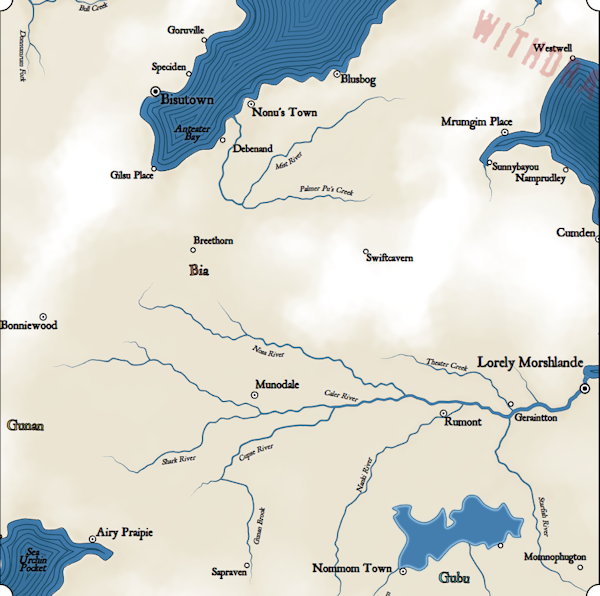
Now the picture is more logical. On the right, Cumden is barely displayed on the map, but the label is still located where it is visible.
There is one aspect that is not immediately noticeable on large maps: the number of locations in the world has not changed. Although the map (in a sense) has become 4 times larger, its total area is still limited by the same number of locations. The initial stage of the map generation was to cover the world with a Voronoi diagram with a constant number of locations. That is, when the map becomes larger, the Voronoi cells also become larger.
It would be logical to scale the number of locations according to the size of the map, but unfortunately, the dependence of the speed of execution is Dragons Aboundthe number of locations is much worse than linear, that is, the generation of a map with a large number of locations can take a long time. Here is an example of a map with quad resolution (number of locations):

The added locations change the generation process, so the terrain is different from the maps shown above, but you can see added details on the coasts on it.
Fortunately, when profiling the performance of generating large cards, I noticed that most of the CPU time was taken away by obvious problems. Having completed the debugging, I eliminated the most interfering of them, which allowed me to create even more cards. Here is the entire 4x map:
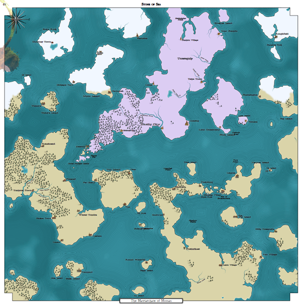
Completed zoom at 25% size. It looks like about the maximum map size Chrome can display. The world generation procedure can process maps of a larger size, but the browser crashes while trying to display them. It seems that in this sense, Firefox is more functional; It can display maps 9 times larger than its original size. Here is a part of such a map - I left it in full size, so you can open it in a separate window in order to better understand the size and detail.
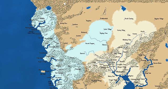
Firefox is able to generate maps of this size, but I can only take screenshots at the maximum size of the browser window. I have the function to save the map as a PNG file, but it can only save the displayed part of the map. I think you can scroll the map, capture individual screens and connect them together, but it will be time consuming.
The best solution is to save the SVG itself so that it can be opened in a program like Inkscape.
Previously, I could cut and paste SVG maps in Inkscape, but the SVG for world maps is so great that when I try to cut the browser crashes! Fortunately, I found FileSaver.js and can use it to save the SVG directly to a file and then open it in Inkscape, thus creating a very large image.
At least theoretically. When I try to open these maps in Inkscape, I run into a couple of problems.
The first problem is that Inkscape assumptions are different from Chrome and Firefox assumptions in how to open SVG. In particular, if the fill color is not specified in the contour, then browsers assume that there is no fill; Inkscape assumes that the outline is filled with black. So when I open a saved SVG in Inkscape, it is almost completely black, because the topmost layer of the map does not contain a fill color. This can be corrected by specifying “fill: none” in the necessary places so that the contours are displayed equally in both the browser and Inkscape.
The second problem - Inkscape has errors in the processing of masks. It seems that Inkscape creates masks with only one element, and badly handles masks with several elements.Dragons Abound creates many masks with several elements. One can get around this problem by grouping all the elements of each game mask into one (optional) “group” element.
The third problem is related to images and other downloadable resources. In the original SVG links to them are indicated in a relative form, for example, "images / background0.png". My sources are organized in such a way that I use a separate web server.can find these resources in specified places. When I take the same SVG and open it in Inkscape, these relative paths are treated as the URL "file:" and Inkscape searches for resources relative to the folder into which the SVG was saved. This problem can be easily circumvented by saving the SVG to a folder that already has resources in the right places; it can be the same root folder as that used by the web server, or another place where there are copies of resources along the same (relative) paths.
The fourth issue is fonts. In Dragons Aboundboth web fonts and locally stored fonts are used; those and others in the WOFF2 format. In the browser, they are applied to the text using the font-family CSS style, and before generating a map, all possible fonts are uploaded to a web page to be ready for use. When the same file is opened in the game, it searches for fonts in the system font directory, and it looks like you cannot specify another font directory in any way. A simple solution (at least on the machine where I develop) is to install the fonts used by the game into the system font directory. However, this is not as easy as it seems, because the font names must match, and in Windows there are no simple ways to change the font name. But, of course, such a scheme will not work on computers that do not have all the necessary fonts installed. A more portable solution is toembedding SVG fonts in maps . This will be on my todo list.
In the end, I came to this map generation interface:

The Extent input fields specify the total size of the world, where 1x1 is the size of the source maps. The size of the vbx (viewbox) determines the size of a fragment of the world displayed on the map; in the screenshot, it also has a value of 1x1, that is, the map will display the whole world. The vbx center fields specify the location of the map center in the world; 0, 0 is the center of the world. Finally, the SVG parameters set the number of screen pixels per 1 viewbox size unit; with a value of 775, a 1x1 map will be displayed on the screen in a size of 775x775 pixels. This is convenient when I create a very large map. By setting the parameter to a low value (for example, 150 pixels), I can fit a large map on the screen entirely.
By changing these six parameters, I can control the size of the world and the proportion of the world that is displayed on the map. The Generate button works exactly as you might guess; the Display button simply displays a part of the world, that is, I can generate the world and then display its individual parts by changing the parameters of the viewbox without the need to re-generate the world. (A better programmer would implement this as scaling and scrolling.) The Save PNG button saves the visible map as a PNG file; The Save SVG button saves the entire map SVG file. The Test It button is used to launch a test code that changes during the development of various functions.
Now that I can generate and reflect all parts of the big world, we can move on to adapting the shape of sushi to larger maps.
Part 3. Forms of sushi
Having made various changes in the previous part, now I can generate worlds that are much larger than the previous ones (up to 8 times more) and save them as large graphic images:

(Open the image in a separate window to see the map in full resolution 4800x2400 on Flickr.)
I generate these maps using the same procedural generation that created the regional maps. The map shown above has a fairly regular continental shape and several interesting outer islands. However, it mostly depends on luck. Here is another map:

This map is just chaos from the islands and Swiss sushi cheese.
Here is another example, something intermediate between the two previous maps. He is not completely realistic, but may be interesting for a fantasy entourage:
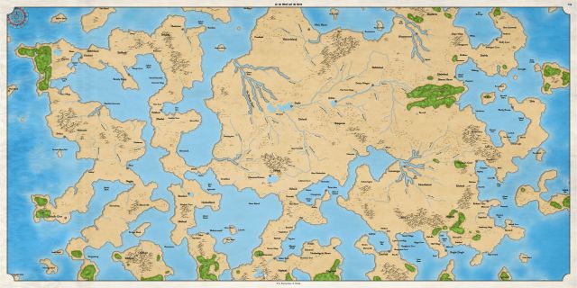
This is a huge continental mass of land, but there are quite a few strange forms of land, and the whole world does not look quite "real." (Although to someone such a world will seem quite suitable for fantasy.) So what forms should the “world” card have?
Most of the maps of fantasy worlds that I have seen display a large island continent (with small islands around), for example, such as this map of Andelen :

Or the peninsula of the continent, as on this map of Angoruna :
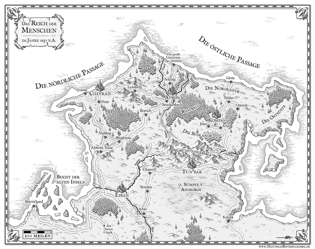
From time to time it turns out a map consisting entirely of land or several island continents, but they are rather exceptions to the rule.
First, let's deal with the generation of "island" continents. As it turns out in my game, there was already a function that generates a large central island on the map, taking into account the size of the map, so it should be suitable for generating the main form of the continent. The rest will be taken care of by noise and additional islands.

I did not expect a large central sea on this map, but it is a pleasant surprise. Here is another example:
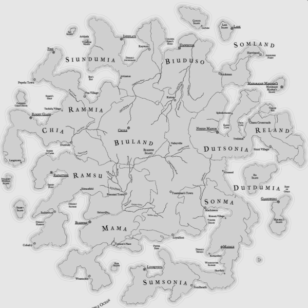
The problem of the function of the central island is that it starts with a circle, which is suitable for the square maps I show, but is not very good for rectangular ones. (Below are examples with a small amount of distortion so that the basic forms are more clearly visible.)
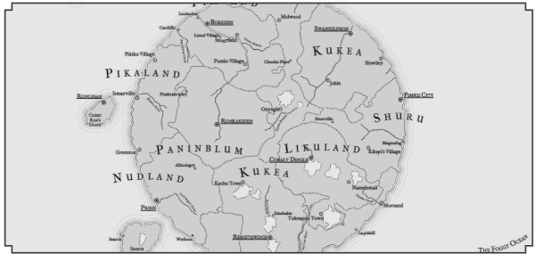
This is easily corrected by masking sushi instead of a circle with an ellipse (distorted) taken according to the size of the map:
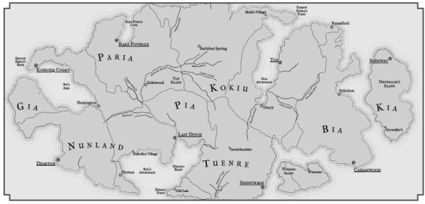
These central islands are scaled to fill the map, but in many cases for continental maps we need to leave a “border” around the continent. Two parameters control the amount of filling the map with the island along the X and Y axes.

Here is the same border management system with more logical distortions:

It can be seen that the eastern and western parts of the map remain the ocean. (You can open the map in a separate window to study it more carefully.) This means that the map displays the whole world (and its right and left edges can be joined) or a part of the world that can be attached to another map that also has an ocean from the corresponding edge.
An attentive reader who has studied the previous map may have noticed that the patterns of ocean and sushi stop in the middle of the map. Previously, I had maps of only 1x1 in size, so the size of the ocean and sushi patterns fit these maps. On larger maps, I need to manually mask the patterns on the map, so I added this feature. (In SVG there is a way to perform a tiling pattern, but in Chrome it contains a bug, so I cannot use it.) This is a good function, because now I can use smaller land and ocean patterns that will be hidden automatically. I do not know why I did not implement it before!
So, now the island continents are working normally, and we will proceed to the implementation of the “peninsular” continents - maps, in which the continent appears on the map from its edge.

In this case, the continent cannot fold at three edges. But the main feature of such maps is that there is a significant land connection on them between the continent displayed on the map and the land outside the map.
The easiest way to provide such a connection outside the map is to set the low sea level when generating. So we will increase the area of the land displayed on the map, which increases the likelihood of large masses of land and the emergence of land (and not the sea) along the edges of the map.
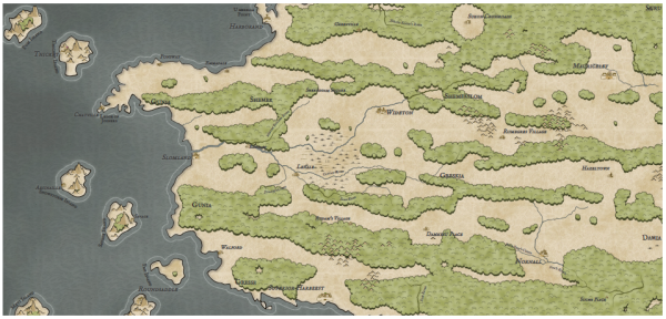
Of course, this does not guarantee that the land mass will be very interesting, and indeed it will be the same:
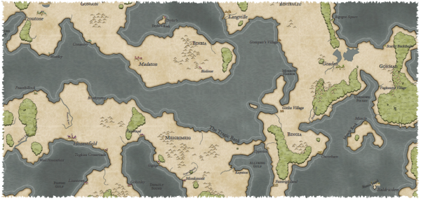
The similarity of a single continent can be created using the same generation of the island continent, but at the same time shifting the island to the edge of the map. It turns out something like this:
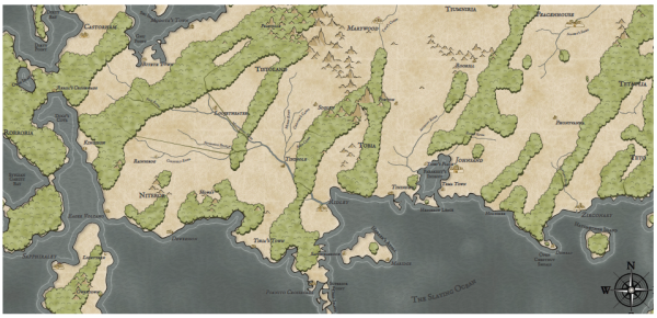
It can be seen that the continent (mostly) is the central island, shifted up and to the right. Since this is a continent and it is not obliged to maintain a strict island form, you can add more distortion to the form.
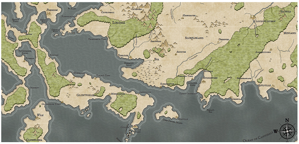
Obviously, there are many other approaches to the generation of relief, but these two, at least, give me the opportunity to generate the most common land forms on a continental scale.
An attentive reader may have noticed the strange forms of forest in the form of stripes on many maps of the continents. Next time I will start to deal with the problems of the wind and biome models that cause these oddities.
Part 4. Wind model
As he said, the size of the continents on the Dragons Abound maps began to show unrealistic patterns of weather and biomes. In this example, it is clear that the forest is aligned along the prevailing wind direction:

The reason is not in broken code; rather, the weather and biome models are too simple, and on a large scale this becomes obvious. To cope with these problems, I began by revising the wind model.
I would like my wind model to better reflect the dynamics of the Earth’s wind: Hadley cells , trade winds, and the like. Such dynamics can help get rid of the strange patterns of weather on continental maps. However, when they were added, the excruciating dissatisfaction with the model of the wind Dragons Abound , slow and too complicated, came to light again . (You can read about the initial implementation of the wind model here .) After thinking about this for several days, I decided that most of the problems boil down to the fact that the game map is presented as a diagramVoronoi . (Or rather, the Delaunay triangle of the Voronoi diagrams.) It has many advantages in generating relief — in combination with noise, it can create natural-looking land masses. That is why it is so often used to generate relief. But since the individual triangles have different sizes and orientations, any calculations, including wind models that use the acting neighboring cells, become quite complex. It will be much easier to model the wind through a grid of evenly spaced identical areas. In addition, the wind model most likely does not have to be as detailed as land.
But I do not want to completely abandon the Voronoi diagram, which underlies the Dragons Abound. (At a minimum, this will require rewriting almost the entire program!) Instead, I want to experiment with binding the map to a uniform grid, run the wind model in it, and then perform the reverse binding. If the losses in copying back and forth are not too great, then this can make the wind model faster and easier.
What kind of mesh should I use? Ideally, the grid should consist of equal areas equidistant from their neighbors. And this description is like a grid of hexagons.
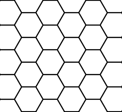
In fact, the grid of hexagons is the best way to divide a flat surface into equal areas.
The next step is to determine how to represent the grid of hexagons in my program. I searched the web for a bit of clues, and each link brought me back to the page about the grids of Amit Patel’s hexagons ( translated to Habré). Probably, with her and need to start; it is also a good idea to first explore the Red Blob Games website if you are looking for information on the implementation of game mechanics. Amit explains better than me, so if something is unclear, then read his page.
The first choice to be made is a way to store a grid of hexagons. The easiest way to store it as a two-dimensional array, I need the ability to bind the grid cells to an array. There are many options (read the Amita page ), but I will use what he calls odd-r:
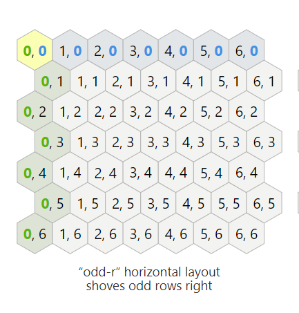
The numbers in each cell are indices of the location of a cell in a two-dimensional array. (The image is stolen from the page of Amit . On its page they are interactive, so I advise you to experiment with them.)
Having made a choice, now I have to learn how to tie the indices to the grid of hexagons. For example, if I search for a hexagonal cell (3, 3), what will be its neighbors? If each cell has a width of 5 pixels, what will be the coordinates of the center of the cell (3, 3)? And so on. Dealing with this can be difficult, so I'm glad that Amit did it for me.
Assuming that we can steal everything Amit needs, I first need to figure out how to place the hexagons on the map. At this stage, I still do not need an array, I can pretend that it is and see where the hexagons will be. If I know the location of the hexagons, I will simply divide the width of the map by the horizontal distance between them to get the number of columns, and do the same vertically to get the number of rows, after which I draw a hexagon in each place:

These hexagons are much larger than those that I will use to model the wind, but they show me that everything is placed correctly.
Here I opened the edges of the map and drew only the central hexagon and on the borders to check if I really close the entire map:

Top and bottom are outside the map, but it’s not a matter of having multiple cells abroad, unless I miss a part of the map.
The next step is to create an array for the grid of hexagons and bind all Delone triangles to the corresponding hexagons. Since Javascript does not support negative array indices , I need to shift the cell (0, 0) from the center of the map to the upper right corner. Having done this, I go around all Delone triangles and add them to the appropriate cells of the grid of hexagons. I can verify this by coloring the hexagons containing land:

To determine whether a cell is land, I average the height of all locations that fall in this cell. It can be seen that for some coastal hexagons, the average is below zero, even if there is land. You can also use the maximum height of all locations in the hexagon:
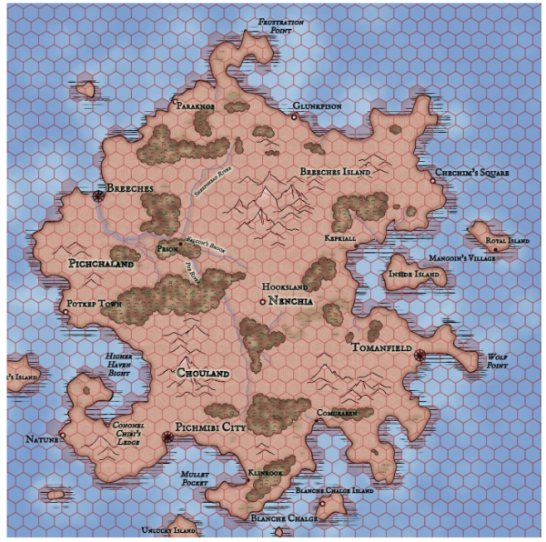
When this happens, the search in the other direction occurs - a hexagon is marked as land, if there is any land in it. What is better depends on what you need.
In any case, I can improve the accuracy by reducing the size of the hexagons:

Now the coast has become much better, but a new problem has arisen - a lot of internal hexagons, which are not considered land. This happens because when the hexagons become quite small, inside some of them there are no Delone triangles at all. Therefore, they have no "height". (This also demonstrates the non-uniformity of the Delaunay triangles.)
You can use this solution — take the height of the missing triangles as the average of their neighbors, or as the maximum of their neighbors.

In general, when the binding between hexagons and locations is not one to one, then corrections are needed to fill in the missing information.
Now that I have laid a grid of hexagons on the map, we can begin to implement the wind model. The main idea of the wind model is to simulate some winds (trade winds) and spread them all over the map until they reach a state of immobility. At the level of hexagons (or the level of locations, if I do it on Delone triangles), this includes two steps: (1) summarize all the winds in the current hexagon, and (2) determine how the summed wind leaves the hexagon.
The first stage is quite simple. Each hexagon has six neighbors, and each of these hexagons contributes. If we consider each of the winds entering the hexagon as a vector, then the total wind in the cell will be the sum of these vectors, i.e. two strictly opposite winds of the same strength nullify each other.
The second stage (determining how the total wind leaves the hexagon) requires thinking. The simplest case is the wind blowing through the hexagon directly:
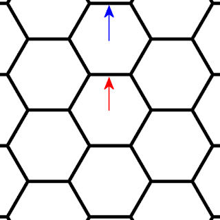
In this case, we expect the wind to move to the next cell without any changes. (Here, the vector of the original wind is shown in red, and the vector of the propagated wind is in blue.)
But what if the wind does not blow directly onto the neighboring cell?

In this case, it seems logical that the part of the wind bore the hexagon directly above it, the other part into the cell located counterclockwise from this one, and the proportions should depend on the direction in which the arrow points. In our case, the main part of the wind will move to the upper cell, and less - to the neighboring cell.
It is also necessary to decide on the direction of the spread wind. One option is to maintain the direction of the original wind:
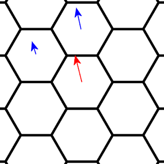
It seems that this is the most realistic option, but there is another one - to change the wind direction in accordance with the edge of the hexagon that it intersects:

This approach is less accurate, but it has an advantage: incoming winds will always be in one of the six directions, which can simplify calculations.
Another difficulty arises when considering relief. What should happen when a mountain gets in the way of the wind?

In this case, part of the wind passes over the mountain (possibly creating precipitation), but part of the wind turns to the sides.
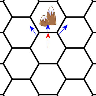
Therefore, how the wind leaves the hexagon depends on its direction, as well as the relief in the neighboring cells.
Now let's talk about how to represent vectors. There are two main options. First, the vector can be represented as X and Y values, like this:
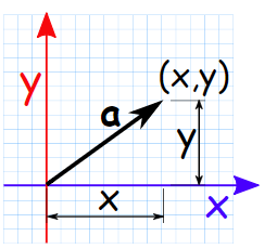
If we draw a vector starting at (0, 0), then (X, Y) are the coordinates of the end points. Such a record makes it very easy to summarize the vectors. We simply sum all the values (X, Y) and get a new vector:

Another option is to use the angle and length of the vector:
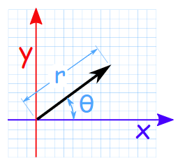
In this form, it is easy to perform operations such as rotating vectors or changing its length.
For most of the operations needed in a wind model, the first option is better, but in some cases the second is better, so it would be convenient to switch between them if necessary. In order not to reinvent the wheel, I searched the vector Javascript library and Victor.js was quite suitable , so I used it.
I will start by adding a wind vector to each hexagon and see if I can visualize it:

Looks good for now.
The next step is to check if I can properly divide the wind vector and spread it to the next cell. First, you need to calculate the angles leading to other cells. I found the answer again on Amita’s page :

That is, a vector at 0 degrees indicates a hexagon to the right, at 60 degrees - a hexagon to the bottom right, and so on. A vector pointing between these two directions is proportionally divided between two cells - that is, a vector at an angle of 30 degrees will be evenly divided between the cell to the right and the cell from the bottom to the right. Each vector lies somewhere between the angles of the faces of two neighboring cells, so it’s enough to look at the angle of the wind vector, find out that it falls between the central angles of the two hexagons, and then proportionally divide it between these two hexagons.
For example, if the wind vector has an angle of 22 degrees:

then 38/60 values are distributed to the cell to the right, and 22/60 values of the vector - to the cell below to the right. If the vectors are represented as a pair of X and Y values, then they can be expanded by multiplying each value of the original vector by a fraction (for example, by 22/60), and then adding it to the wind vector in the new hexagon.
To test this, I can position the winds in different directions and position them at the top and side of the map and see if they can spread properly across the map. When the winds collide, they must be combined and choose the middle direction with increased speed:
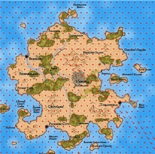
Here we see that the winds meet along the diagonal and combine to blow towards the lower corner.
The next stage is to take into account the influence of land on the wind. Of course, real wind models are very complex, but I’m mainly interested in how the surface winds are affected by the land geography. At the simplest level, this is the influence of heights and lowlands of land on the direction and speed of the wind. I experimented with many different approaches, but as a result I stopped at two simple rules :
- The wind turns away from obstacles.
- The wind slows when it rises, and accelerates, dropping down.
An obstacle occurs when the wind blows into a cell with a greater height, for example, a cell with a mountain. When this happens, I look at the two cells into which the wind blows, and I change the angle of the wind so that it points more to the lower of the two hexagons. The magnitude of the angle changes depends on the height difference between the two cells, so when the wind blows into two adjacent cells with mountains, its direction changes little, but if it blows into a cell with a mountain and a cell with a plain, then it will turn more towards the empty cell:
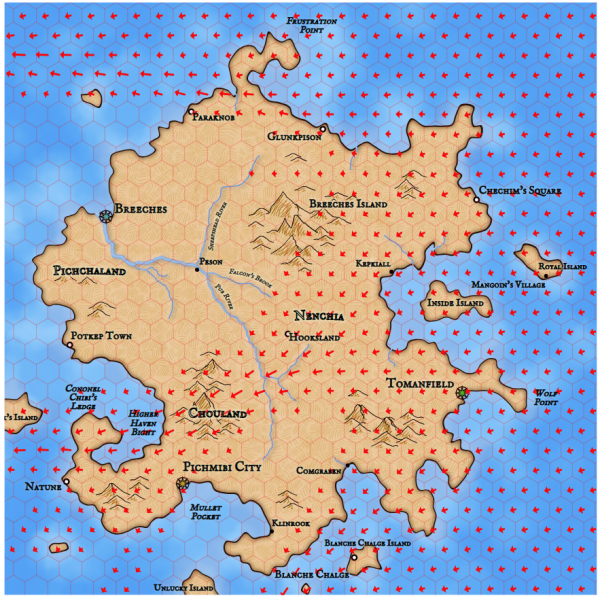
Wind power can be customized. On the map shown above, it is too strong, which will lead to the emergence of many unrealistic biomes. Here is a more logical meaning:
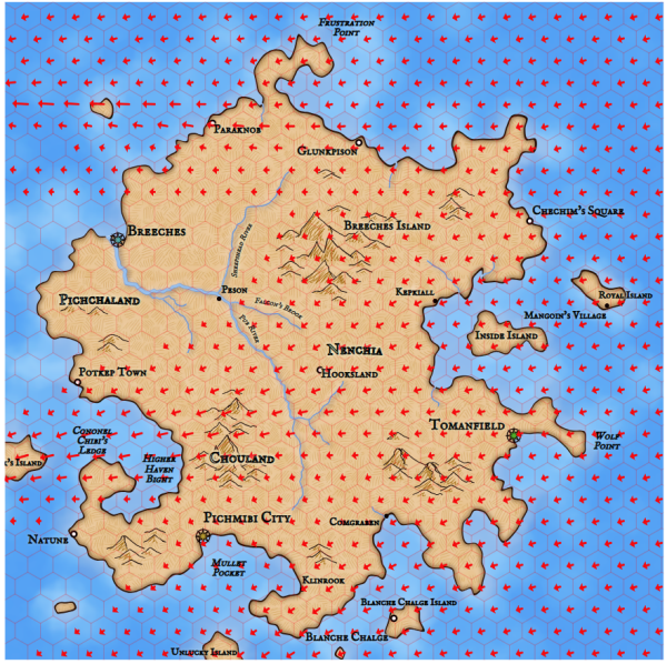
There is still a large proportion of wind movement caused by reliefs, but there are fewer large gaps and valleys of strong wind.
Another feature that enhances realism is wind scattering. For example, on the map shown above, it can be seen that the wind blows to the west just above the city of Breeches. Although it blows far enough away, it never disperses as we would expect. When the blowing wind meets another air, it usually pulls the wind behind it. To simulate this, I can take a small part of the wind blowing in each hexagon and redistribute it to all the neighboring cells. This is how the map shown above will look like with a small scatter value:
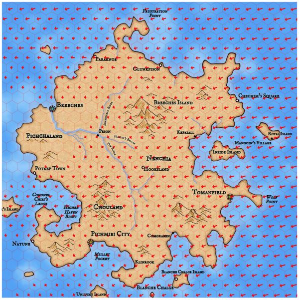
As you can see, now the wind over Breeches began to dissipate a little down.
This operation determines the bulk of the wind directions. The second part is the deceleration of the wind when rising up and acceleration while descending. I can do this by looking at the relative height of the cell from which the wind comes, and the height of the cell into which the wind blows, and speeding up / slowing it down if necessary.
Here is how it all looks:
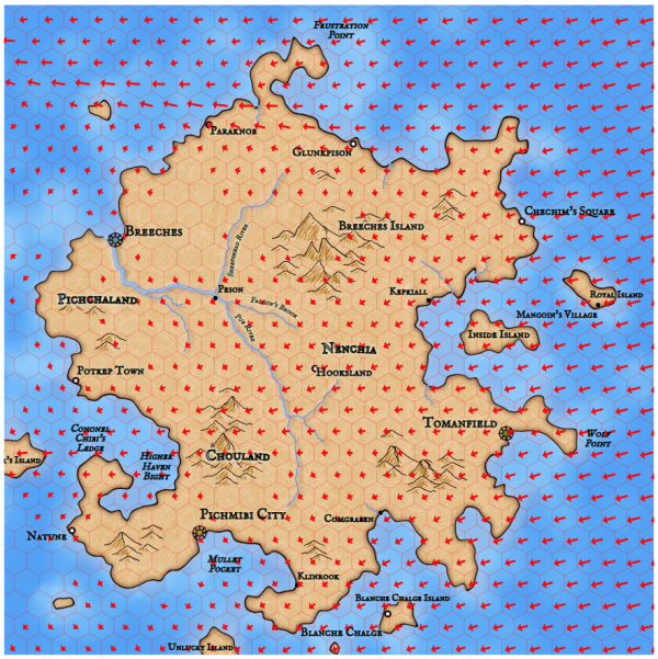
Now we see that part of the wind blowing through the high mountains in the central part of the island was cut off. And vice versa - several new winds appeared in the western part of the island, where the air moves from relatively high land to the sea. (This is a coastal breeze ! Although not really at all: the mechanism is different there.)
Now I can substitute the new wind into the already existing precipitation algorithm. Here is a comparison of them (old winds on the left, new ones on the right):
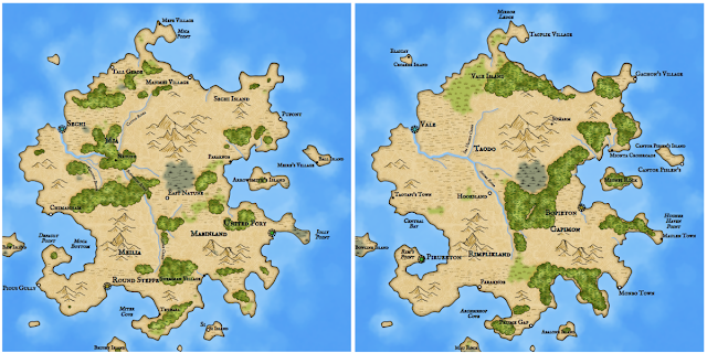
(Click on the picture to view a larger version.) Obviously, there are differences between the wind models. On both maps the wind blows from the east. The mountains near the center of the map turn the wind to the south, causing heavy precipitation to fall and create a swamp and forests south of the mountains. In the lower part of the wind blows without interference, and forests are formed along the eastern half of the island. In the original wind model, a sufficient amount of wind passed over the central mountains and marshes to create a forest in the western part of the island. In the new model, most of the wind is cut off and grassy biomes form on the far side of the mountains.
The old model has a variability of random parameters (within a given interval), and it is likely that some combination of these parameters would give a picture that looks more like a new map. But in reality, we do not need to reproduce the exact behavior of the old model, a model that creates convincing-looking results is enough.
The point of all this is to accelerate and simplify the generation of wind, so that you can add new wind behaviors to continental maps. Did I succeed? I have profiled the original wind model and the new hexagon-based model. It turned out that the new model is 15-20 times faster than the original (!). This is a very significant acceleration, little impact on the card. Experiments make it clear that the model is not particularly sensitive to the size of the hexagons, so if necessary, I can speed up the algorithm even more by increasing the size of the cells.
Next time we will work on using a new wind model to implement continental-scale wind patterns, and then connect them to the precipitation model and biomes.
