On the example of creating an online store, we learn what businessability is.
So much has been said about user-centered design, or the process of designing information systems that focuses on the needs of the end user, that it seems as if nothing could be added (and not necessary). At every overwhelming conference, symposium, rally, and professional gathering, 99% of all the words that are spoken will in one way or another relate to the importance of the user's inner world, his desires, needs, expectations, habits, etc.
To me, this approach seems too superficial, so “for beginners,” for two reasons:
1. The owner of the business is still making an order for engineering and design, which means that he, and not the end user, will evaluate the results of the work and pay for the work. In other words, if the designer does not receive% of each completed order from the online store, then the meaningfulness of the orientation towards the end user abruptly disappears. Indeed, if the particular boss does not like the same navigation, then the end customer may never see it, no matter how much he dreams of such a method of navigating through the pages.
2. Any (absolutely any? Yes) person is extremely suggestible, manageable and amenable to simple manipulations. It’s possible to introduce any idea into his mind with such ridiculous simplicity that it’s even ridiculous to look back at finding and revealing his natural desires. Today it is not at all necessary to immerse a potential buyer in the third level of sleep in order to intelligibly explain and argue - what he really wants, he just does not suspect about it. Proof:
In my opinion, the principle "The less a woman we love - the more she likes us" - we apply absolutely everywhere. Most people will be sincerely grateful if you save them from the pains of choice, self-digging and attempts to understand their own tastes and values. You need to directly tell them that it’s exactly this and that’s cool, and every person will be grateful to you for saving his time and mental energy in finding your own point of view. Therefore, I see no reason to declare a user-oriented approach fundamental for information systems of the 21st century.
So, at the same time, while many of you delve into the darkness of the souls of ordinary people, there is a more professional approach to the design and development of information systems, which immediately, without embellishment and unnecessary equivocations, declares a total focus on the interests and capabilities of the business, that is selling, not buying, which can be called as businessability. And now, with the example of one completely real case, we will analyze how it looks in practice.
Brief
The initial brief or task for development is present in this approach, but it contains completely different points and concepts than a regular brief with its points that cause hysterical laughter: “sites that you like”, “which sections should be on the site in your opinion”, “Your favorite headline size” and other extremely unprofessional passages.
When adult uncles decide to use the business rehab approach, the ideal brief for development is the existing and approved general business plan of the company, or a strategy document for the next 5 years, or even an examination in the form of a study of existing processes in the company (no, not carbonized diagrams) with percentages of users of social networks among schoolchildren, and a clear description of how it all works for the customer in fact) of at least 50 pages. In the end, a professional brief may even look like this:
What is the difference - you ask, because here and there the description of customers takes most of the time? The difference in courage in connection with the existing technical and business restrictions is to be able to create your own rules and impose your will on the client contrary to established rules and patterns. That is, if you can’t deliver the goods to a neighboring city at an adequate price, you need to be able to remove the “Delivery” section from your typical design layout with an unwavering hand, and not leave it blank “for later”, as is done today in most cases.
Or now, we are moving on to the current case of the elite online store of alcoholic beverages. His main idea when selling an exclusive drink was that no one can buy it for himself, that is, you can only get it as a gift (by sending an appropriate request to a friend via the social network) or first buy a gift for a friend yourself, and only then get it from him the opposite gesture of politeness is already for himself. This was originally decided by the expert on the part of the customer on the basis of the thorough work done by him, and as if from the point of view of the usual UX, it would not create additional restrictions and barriers - but it was necessary to work with such input data. That is, I’ll draw your attention once again - the interests and needs of the typical buyer “buy everything quickly and cheaply” were thrown into the basket in order to give the product a special status, creating a halo of inaccessibility and over-jaziness. The business strategy in this approach was initially more important than simplicity and convenience, since this is precisely how the passion of the hunter for the most unattainable prey aroused in a man.
The next important thesis that we had to work with was that the customer’s company paid great attention to the delivery of the goods - excellent packaging, an enclosed printed booklet, a character figure (more on this below), jade to cool an elite drink (since ordinary ice dilutes the exclusive product when melting) and even the possibility of helicopter delivery within a few hours. There was also a certificate in the box, notifying that the person received a unique drink as a gift from such a wonderful friend and business partner. And this was all, this, it was necessary to show it as clearly as possible, which is why the customer had already shot several dozen video packaging of each drink to give the impression of a manual online order picking.
Video in the basket - at what usability conference do you hear such as an example of the pinnacle of convenience and unsurpassed design thinking? But we had the courage to act in defiance of all established rules.

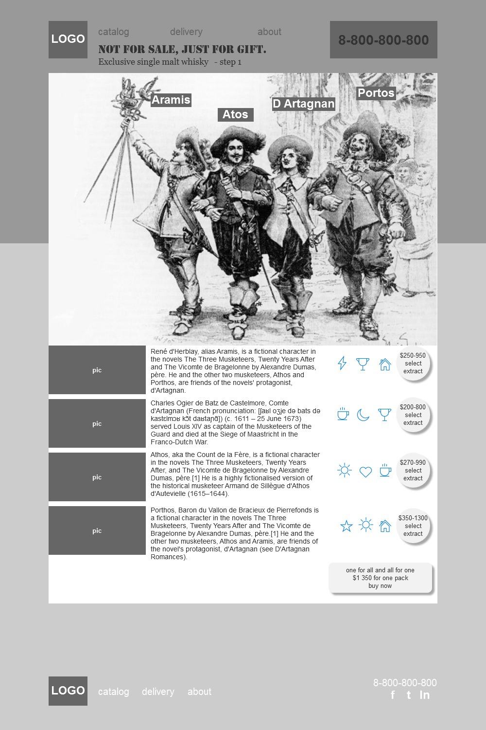
In total, we had 4 varieties of the drink, 4 aging options for each, 4 variants of bottle capacity - a total of 64 variants. How many design rules needed to place product items on the product catalog page in rows and columns? I’ll immediately make a reservation that for the answer: “Probably only 16 on the screen, with filters by volume or by years of exposure?” - the previous designer was kicked out by the customer with shame. A unique product cannot stand on 16 pieces on shelves, but only discounted consumer goods. Thus, it was decided that on the landing page the show will begin with a demonstration of four different recipes that define the style and image of the future order. For a more explicit association, a unique character was invented for each drink recipe, the figure of which was attached to each order for free.
Prototypes
The main task of the designer: how to display on the screen a domestic elite alcoholic drink that is carefully branded, positioned for import? The scenario is already clear: 4 varieties of the drink are presented, on the presented prototype the buyer first selects one of the four varieties of the elite drink, clicking on the character, who is the embodiment and protagonist of the taste qualities of this variety. By the way, for the article on Megamind the concept of the selected characters has been slightly changed, since here it is even more important to show the thinking process, rather than to advertise the product itself:
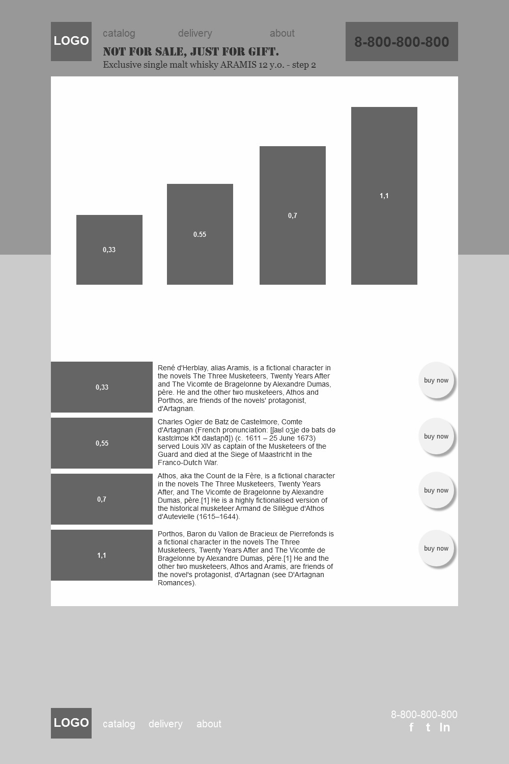
Then, moving to the next page, the buyer selects the shutter speed and determines the last (third) step with the container (volume) of the drink.

Thus, there is no typical basket on the site (an online store without a basket? Horror-horror), but there is a clearly tuned order wizard that purposefully directs the rather blurry needs of the user about an unusual unique gift - to a real embodiment.
Gift decoration
Simplicity, speed and convenience when making piece goods - the key to success? Absolute nonsense, as market experts on the customer’s side decided. Their argument looks iron: to buy a car - people are willing to spend several days on all documents; and 9 months are waiting for the desired child; the same unique thing as a passport is generally issued for years. What does this mean in practice?
People know how to wait. People are ready to fill out 150 forms and questionnaires. People even like a little misery, which they poetically call anticipation. And based on all these customer concepts, the design of the gift was not made too simple, because for the sake of a good product you can spend an extra 10-15 minutes taking them from your beloved VKontakte.
Where, at what time, the form of the box, what the courier should look like, what to say in words, from whom, why, why, if I want a similar present as confirmation of many years of cooperation - the result was a complex anti-human form, also deliberately playing out of reach. For relief and help - only a phone number and a live girl operator with a pencil at the ready, a kind of analog voice interface.

Probably, many will find this work process extremely boring. I know several designers who adore determining the marketing concept on their own in the process of moving gray squares around the screen, single-handedly planning the tactics of defeating all competitors and the general concept of sales. Such specialists are very closely within the narrow framework of an already developed concept, they want more creativity, art directorship, a flight of fantasy. Well, when such a prototype is paid at the rate of the commercial director or deputy marketing director of this company, it’s excellent, and really very exciting, to become really everything for the customer at once, and as a brave captain to save the whole team during a storm, with a confident hand guiding the site to new uncharted shores.
But, in my opinion, it’s better to be in command of all the concepts and business strategies of someone who has worked in the research area for at least 10-15 years and knows such subtleties and details of a market niche that cannot be comprehended in a few weeks \ months of participation in project, poking at a graphic editor.
The customer himself formulated this idea more briefly: “If you know the market better than me, why haven’t you done your own online store and earned millions from it? He would give up usability, would hire me as a supplier, and for a couple of years now he would have lived in London with such a suit. And so, until the age of 50 do you plan to paint pictures for others? ” It is such sanity that inspires respect for people of work and for people of business.
Answers to questions of skeptics
1) “But how will this work in practice and will it not be necessary to change everything six months after the launch?” - Pavel Globa will give you the most accurate answer, successfully predicting fluctuations in oil prices and the weather forecast for the Murom Region.
2) “Or maybe you are lying, and you will all die tomorrow and never fulfill the pathetic super-megaplan you set for sales for the next five years?” - maybe, or maybe we are all dead for a long time and this is our universal hell.
In my opinion, the main thing for today was achieved in the Dammo project: the current task set by the customer was carried out brilliantly (in his own words), an ideal mutual understanding was developed and a desire to work together further, making current adjustments to the online sales strategy and site structure, giving the project flexibly adjusts to new sanctions, current demand, seasonality and the Dow Jones Index. Excellent relations between living people in a team are a thousand times more important and a million times more difficult to achieve than replacing a button’s color, fixing fonts, or adding a couple of new features on an existing site.
To me, this approach seems too superficial, so “for beginners,” for two reasons:
1. The owner of the business is still making an order for engineering and design, which means that he, and not the end user, will evaluate the results of the work and pay for the work. In other words, if the designer does not receive% of each completed order from the online store, then the meaningfulness of the orientation towards the end user abruptly disappears. Indeed, if the particular boss does not like the same navigation, then the end customer may never see it, no matter how much he dreams of such a method of navigating through the pages.
2. Any (absolutely any? Yes) person is extremely suggestible, manageable and amenable to simple manipulations. It’s possible to introduce any idea into his mind with such ridiculous simplicity that it’s even ridiculous to look back at finding and revealing his natural desires. Today it is not at all necessary to immerse a potential buyer in the third level of sleep in order to intelligibly explain and argue - what he really wants, he just does not suspect about it. Proof:
In my opinion, the principle "The less a woman we love - the more she likes us" - we apply absolutely everywhere. Most people will be sincerely grateful if you save them from the pains of choice, self-digging and attempts to understand their own tastes and values. You need to directly tell them that it’s exactly this and that’s cool, and every person will be grateful to you for saving his time and mental energy in finding your own point of view. Therefore, I see no reason to declare a user-oriented approach fundamental for information systems of the 21st century.
So, at the same time, while many of you delve into the darkness of the souls of ordinary people, there is a more professional approach to the design and development of information systems, which immediately, without embellishment and unnecessary equivocations, declares a total focus on the interests and capabilities of the business, that is selling, not buying, which can be called as businessability. And now, with the example of one completely real case, we will analyze how it looks in practice.
Brief
The initial brief or task for development is present in this approach, but it contains completely different points and concepts than a regular brief with its points that cause hysterical laughter: “sites that you like”, “which sections should be on the site in your opinion”, “Your favorite headline size” and other extremely unprofessional passages.
When adult uncles decide to use the business rehab approach, the ideal brief for development is the existing and approved general business plan of the company, or a strategy document for the next 5 years, or even an examination in the form of a study of existing processes in the company (no, not carbonized diagrams) with percentages of users of social networks among schoolchildren, and a clear description of how it all works for the customer in fact) of at least 50 pages. In the end, a professional brief may even look like this:
What is the difference - you ask, because here and there the description of customers takes most of the time? The difference in courage in connection with the existing technical and business restrictions is to be able to create your own rules and impose your will on the client contrary to established rules and patterns. That is, if you can’t deliver the goods to a neighboring city at an adequate price, you need to be able to remove the “Delivery” section from your typical design layout with an unwavering hand, and not leave it blank “for later”, as is done today in most cases.
Or now, we are moving on to the current case of the elite online store of alcoholic beverages. His main idea when selling an exclusive drink was that no one can buy it for himself, that is, you can only get it as a gift (by sending an appropriate request to a friend via the social network) or first buy a gift for a friend yourself, and only then get it from him the opposite gesture of politeness is already for himself. This was originally decided by the expert on the part of the customer on the basis of the thorough work done by him, and as if from the point of view of the usual UX, it would not create additional restrictions and barriers - but it was necessary to work with such input data. That is, I’ll draw your attention once again - the interests and needs of the typical buyer “buy everything quickly and cheaply” were thrown into the basket in order to give the product a special status, creating a halo of inaccessibility and over-jaziness. The business strategy in this approach was initially more important than simplicity and convenience, since this is precisely how the passion of the hunter for the most unattainable prey aroused in a man.
The next important thesis that we had to work with was that the customer’s company paid great attention to the delivery of the goods - excellent packaging, an enclosed printed booklet, a character figure (more on this below), jade to cool an elite drink (since ordinary ice dilutes the exclusive product when melting) and even the possibility of helicopter delivery within a few hours. There was also a certificate in the box, notifying that the person received a unique drink as a gift from such a wonderful friend and business partner. And this was all, this, it was necessary to show it as clearly as possible, which is why the customer had already shot several dozen video packaging of each drink to give the impression of a manual online order picking.
Video in the basket - at what usability conference do you hear such as an example of the pinnacle of convenience and unsurpassed design thinking? But we had the courage to act in defiance of all established rules.
In total, we had 4 varieties of the drink, 4 aging options for each, 4 variants of bottle capacity - a total of 64 variants. How many design rules needed to place product items on the product catalog page in rows and columns? I’ll immediately make a reservation that for the answer: “Probably only 16 on the screen, with filters by volume or by years of exposure?” - the previous designer was kicked out by the customer with shame. A unique product cannot stand on 16 pieces on shelves, but only discounted consumer goods. Thus, it was decided that on the landing page the show will begin with a demonstration of four different recipes that define the style and image of the future order. For a more explicit association, a unique character was invented for each drink recipe, the figure of which was attached to each order for free.
Prototypes
The main task of the designer: how to display on the screen a domestic elite alcoholic drink that is carefully branded, positioned for import? The scenario is already clear: 4 varieties of the drink are presented, on the presented prototype the buyer first selects one of the four varieties of the elite drink, clicking on the character, who is the embodiment and protagonist of the taste qualities of this variety. By the way, for the article on Megamind the concept of the selected characters has been slightly changed, since here it is even more important to show the thinking process, rather than to advertise the product itself:
Then, moving to the next page, the buyer selects the shutter speed and determines the last (third) step with the container (volume) of the drink.
Thus, there is no typical basket on the site (an online store without a basket? Horror-horror), but there is a clearly tuned order wizard that purposefully directs the rather blurry needs of the user about an unusual unique gift - to a real embodiment.
Gift decoration
Simplicity, speed and convenience when making piece goods - the key to success? Absolute nonsense, as market experts on the customer’s side decided. Their argument looks iron: to buy a car - people are willing to spend several days on all documents; and 9 months are waiting for the desired child; the same unique thing as a passport is generally issued for years. What does this mean in practice?
People know how to wait. People are ready to fill out 150 forms and questionnaires. People even like a little misery, which they poetically call anticipation. And based on all these customer concepts, the design of the gift was not made too simple, because for the sake of a good product you can spend an extra 10-15 minutes taking them from your beloved VKontakte.
Where, at what time, the form of the box, what the courier should look like, what to say in words, from whom, why, why, if I want a similar present as confirmation of many years of cooperation - the result was a complex anti-human form, also deliberately playing out of reach. For relief and help - only a phone number and a live girl operator with a pencil at the ready, a kind of analog voice interface.
Probably, many will find this work process extremely boring. I know several designers who adore determining the marketing concept on their own in the process of moving gray squares around the screen, single-handedly planning the tactics of defeating all competitors and the general concept of sales. Such specialists are very closely within the narrow framework of an already developed concept, they want more creativity, art directorship, a flight of fantasy. Well, when such a prototype is paid at the rate of the commercial director or deputy marketing director of this company, it’s excellent, and really very exciting, to become really everything for the customer at once, and as a brave captain to save the whole team during a storm, with a confident hand guiding the site to new uncharted shores.
But, in my opinion, it’s better to be in command of all the concepts and business strategies of someone who has worked in the research area for at least 10-15 years and knows such subtleties and details of a market niche that cannot be comprehended in a few weeks \ months of participation in project, poking at a graphic editor.
The customer himself formulated this idea more briefly: “If you know the market better than me, why haven’t you done your own online store and earned millions from it? He would give up usability, would hire me as a supplier, and for a couple of years now he would have lived in London with such a suit. And so, until the age of 50 do you plan to paint pictures for others? ” It is such sanity that inspires respect for people of work and for people of business.
Answers to questions of skeptics
1) “But how will this work in practice and will it not be necessary to change everything six months after the launch?” - Pavel Globa will give you the most accurate answer, successfully predicting fluctuations in oil prices and the weather forecast for the Murom Region.
2) “Or maybe you are lying, and you will all die tomorrow and never fulfill the pathetic super-megaplan you set for sales for the next five years?” - maybe, or maybe we are all dead for a long time and this is our universal hell.
In my opinion, the main thing for today was achieved in the Dammo project: the current task set by the customer was carried out brilliantly (in his own words), an ideal mutual understanding was developed and a desire to work together further, making current adjustments to the online sales strategy and site structure, giving the project flexibly adjusts to new sanctions, current demand, seasonality and the Dow Jones Index. Excellent relations between living people in a team are a thousand times more important and a million times more difficult to achieve than replacing a button’s color, fixing fonts, or adding a couple of new features on an existing site.