 May 5, 2015 at 00:07
"7 Principles of Usability from Jesse Hausler" - a brief extract from the article
The other day, my attention was attracted by one article from Jesse Hausler, who is the chief usability specialist at Salesforce. In the article, he wrote about 7 principles of usability that every designer should know.
The fact is that the owner of any web service needs to better understand the importance of usability and design. Today, the vast majority of companies are disgustingly packaged, not to mention the usability and internal structure of the product.
Of course, it’s easier to buy a ready-made theme for $ 20 from the Bootstrap website and not take a steam bath.
Yes, I myself did it and do it today, when it is appropriate. For example, when you test your idea and launch a trial product to test demand. Let me remind you that the first version of our widget was built on a purchased topic and this is normal. Now, of course, we have created everything from scratch and I put my soul into the design of my personal account so that it would be easy and simple to use. By the way, I’ll just talk about the mistakes that I made during development.
This is not a literal translation, but a brief squeeze of the main points that seemed to me the most important.
So, let's begin:
1) The usability rules do not interfere with inventing new things and pushing the limits of what has been adopted.
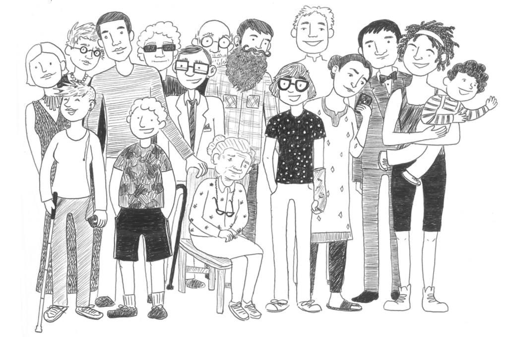
This is the first principle and I consider it “introductory”, since everything is obvious here. The author writes that it is necessary to create a universal design for all user groups. Remember that people with disabilities, color blind people, elderly people, etc., may get to your site.
In general, remember that design is not designed for the designer. Design for everyone.
2. Do not use color as the only tool to attract attention.
This is more important. Color impaired users will find it much easier to understand your site. These include people who are color blind (every 12th man and every 200th woman), have poor eyesight (every 30th), or are blind (every 188th person).
Use color to highlight what is already obvious.
In the example below, it is shown that in addition to the color, there must be another element indicating the same error.
Without a triangle in the input line, it seems that only the captcha is filled incorrectly.
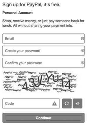
(b / w varinat)
(full color mode)
3. Ensure sufficient contrast between the text and the background.
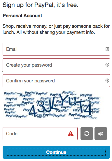
Ah, thanks captain for obviousness! In fact, this item has a place to be! Below I will explain how to prevent one serious mistake that we made in the design of the Perezvoni 2.0 personal account.
In the meantime, we read the author:
In accordance with the Guide to Ensuring the Usability of Web Content , the text and its background should have a contrast ratio of at least 4.5: 1. If you use a font between 19 and 24 pixels, this ratio can be reduced to a ratio of 3: 1.
This means that when the font size is between 19 and 24 pixels, or even larger, the lightest shade of gray that you can use on a white background is # 959595.
For smaller text, the lightest shade of gray you can use on a white background is # 767676. If you have a gray background, the color of the text should be darker.
Jesse Hausler also provides a couple of useful services for choosing the right font color. I have studied both and will say that it is simpler and easier to use WebAIM's Color Contrast Checker . The service shows the contrast of the selected background and font color.
Now, I will tell you about my experience.
Let me remind you that the first version of the widget is a purchased theme for $ 20, which looked like this:
(first version of the widget Perezvoni.com)
After we connected the first thousand sites, we decided to take the matter seriously. From scratch, they began to create a personal account design for the second version of the widget. I really love minimalism, so they did it in this style and used gray shades. All work was done at Photoshope on the iMac. It turned out like this:
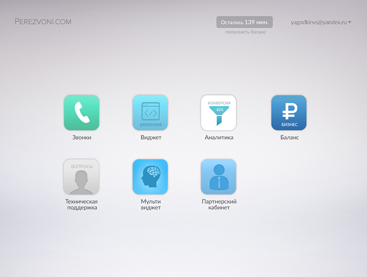
(the version of the Perezvoni 2.0 widget was released in January 2015. a screenshot from iMac)
But ... When I saw the layout, the finished layout on windows, the texts were unreadable. Fonts were ultra-thin and very pale. The thing is what color rendering on your screen and on the screen of most users. Our careful selection of font size and color turned out to be useless.
It’s also worth considering that fonts on mac os look fatter than on windows.
If you observe the contrast, which is indicated in the manual, it will be convenient for everyone.
4. Try to provide visual focus for input fields and other elements.
This item seemed not very important to write about it, but still ...
Briefly, the bottom line is that if the user on the site without a mouse, then all active elements should have focus when choosing.

default focus settings in Chrome and Firefox
One can’t help but notice that RSS is at the same time almost the main culprit of one of the most common usability errors on the Internet.
: focus {outline: 0;}
This single line of CSS (cascading style sheets) makes it almost impossible to work with the site using just the keyboard.
Therefore, for convenience, create focus styles, but do not forget to turn off the standard focus styles, otherwise it will turn out like this:
5. Be careful with the forms.
An insignificant principle, since in Russia the input field often has a standard form, with clear boundaries.
Knowing the location and size of the target button is important for people using a standard or adaptive input device. People with cognitive impairment may have difficulty finding and interacting with fields that do not have a clear visual designation.
The following is an example of a search bar from a popular note taking app. Where would you click to start typing?
When you click in any area, you will be directed to enter.

6. Avoid contradictions in the constituent components.
Perhaps today this issue is the main problem of the usability of web resources. To understand this issue in detail, we recommend that you study W3C's workshop (World Wide Web Consortium) on design templates. This guide is about how to build a usability version of the site taking into account the huge number of existing standard templates for designing elements, including: menus, modules, autocomplete, tab settings, and many others.
For example, when the user is in the “menu” field, he receives a hint about the possibility of using the navigation keys to move up and down the list.
Get acquainted with a simple example of autocomplete:

And this is it, but already using the icons opposite each of the alternative options. Icons are used to reduce uncertainty.
There were examples of using the menu and the drop-down list in the article, but either I didn’t understand it or they were talking about minor things. Go ahead.
7. Do not force users to move the cursor to get information.
Compliance with this principle is necessary in the interests of users with disorders of the musculoskeletal system. This also includes users who use the keyboard exclusively.
"Primary things should be visible, secondary things should be shown when you hover over"
Instead of hiding actions and information behind the mouse cursor, you can use a number of alternatives:
- Place the secondary stuff inside the menu (or drop-down lists), instead of hiding the trigger behind a "hover".
- Reduce the contrast of the secondary icons and darken them when you hover over the mouse.
- Use specific objects as pointers. The information icon is suitable for the role of a pointer.
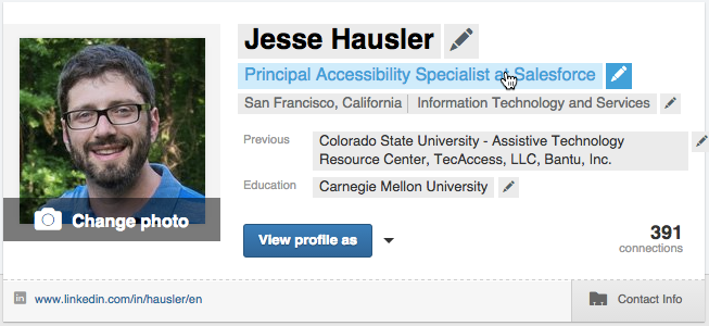
Here is an example from LinkedIn. Below is a screenshot of my profile.

But what happens to the same profile after hovering over it with the mouse.
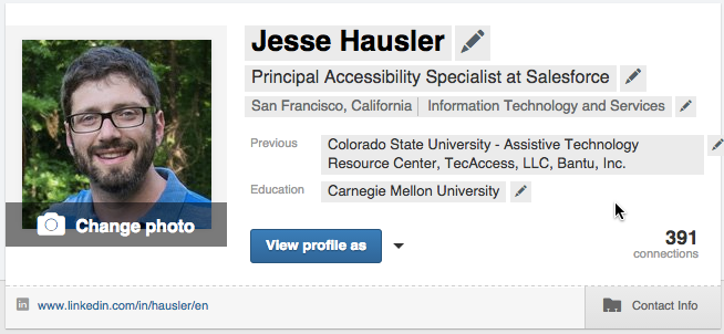
Suddenly there are visual pointers showing that I can edit each of these fields individually, including my name, my position, previous work experience, my education and even my photo. If you place the cursor over the name of my post, the text is highlighted in blue, indicating that I am going to click on the mouse button.
And in conclusion, Jesse leads to the thought: “Remember that design is not just for designers. We design for a wide range of users with different needs and different devices.
Jesse Hausler has 12 years of usability experience. He is currently the chief usability specialist at Salesforce, where he has been working for 4 years.
This article is a bit unusual, but I emphasized useful tips for myself. Like if article liked and dislike if you didn’t like it.
I wrote an article right now, sitting in a cafe, a photo from the scene :) You

can see the full translation in our blog . I promise to find a good translator for the following articles)
Original article: here
Subscribe to the blog and we will keep in touch, Thank you!