CSS tips that you can hardly find in the tutorials
- Transfer
There are certain CSS rules that can be found in any tutorial. But there are also CSS rules that you will not find in the manuals, but will come across them as soon as you start writing code. I’m sure you’ve already figured out how to align an element vertically or create a complex layout. We will not talk about it.
Finally, there are CSS rules that you could hardly see in the manuals, and which you may simply not be aware of. For some time I collected these tips and now decided to write an article in the hope that they would be useful. The following is what the CSS tutorials didn't teach me.

How often have you used relative units in CSS? I am a big fan of them, because they allow you to create a responsive website, without going too far into media queries. If you want to set the height of the element to half the height of the parent, then simply write
You can use relative units anywhere. If you want to add a distance between two vertical elements, you can write
In some situations it is better to use padding instead of margin . But when you install
The property does not work as we expect. It does not set parameters relative to the height of the parent. What's happening?
It sets the parameters relative to the parent width. Do you need a demonstration? Here is:
Just play with the change in parent width and see how this affects the indentation of the child. At first glance, this may seem strange, but in fact there is a good reason why this happens. You will find it by reading the CSS specification ...
No, I'm joking - there is no explanation why this is happening. At least I could not find an explanation anywhere. Just so happens, keep this in mind.
Although we do not understand why the developers did this, we can use this feature to our advantage. For our item, we set the following:
Then the height of the element will be the same as the height of the child, although we have specified
Here is a working example:
If you change
If you studied computer science, you will surely remember this terrible turtle and its moving pen. This educational concept is better known as the turtle chart , the purpose of which is to guide the turtle along the way using simple instructions - “20 steps forward”, “90 degrees turn” and the like.
What if using CSS, you could specify a command to move “20 pixels to the right” relative to the current position of the element, rather than its starting position? And if I say that you can do it using a property
Many developers do not know that a property
Are you confused? Perhaps this example will help you recover:
Note that we did not use any JavaScript variables to save the current position or the current rotation. This information is not stored anywhere! The solution is simple if you write:
And then add the following rule:
The second rule will not replace the first - they will be applied consistently. The fact that they are applied consistently is important. When you rotate an element, you change the reference system, and further rules will apply to the new reference system. So this entry:
will be different from this:
You can also combine different units of measure. For example, you can center an element with a size of 600 as follows:
But if you are not going to animate it, then perhaps the
If you are worried about the tortoise, then I created another fragment that recreates the dynamics:
Unfortunately, she does not draw yet. But, if you want, you can always implement the drawing function.
This is easy and many will think that I am writing banal things, but I have seen so many people struggling with the fours, that I stopped taking it for granted.
Many developers do not know that almost every CSS property has an abbreviated alternative. Other developers know this, but continue to use the full version, because they never remember the order.
Let me give you a hint:
Indents and borders follow clockwise.
It’s easier to explain. You can use with confidence:
But you can also use a shorter alternative:
The procedure is easy to remember - just look at this watch:

Start at 12:00 and continue to move clockwise. You will get the correct order.
If instead you use only two values:
The browser will expand it by repeating the parameters:
If you use three values:
The browser will use the average for both the left and right edges, as if you wrote:
This is one of the least known properties, although it is widely supported.
You know that you can specify the URL of the image inside the property
Why can this be useful? What do you think about Linus Torvalds against the background of the generated sunrise using CSS?
You can also make a square rectangular image by adding those shaded borders that are so popular on Instagram. To do this, I repeated the same image twice, increasing the background image 5 times:
Thanks to media queries, we can make websites flexible and adapt layouts to screens of various sizes. But this is not enough!
Smartphones, tablets and classic personal computers are different in nature. It's not about screen size.
On a touchscreen device, you use screen gestures, and tools like HammerJS help with this. With the mouse you just click, but with greater accuracy. If you have adapted your site to screens of different sizes, you may be thinking about its flexibility in other directions and support for various types of input!
You do not need complex JavaScript code to define a user-agent. Everything you need is in CSS:
Here is an example:
Tip : You do not need a smartphone to test, you can simulate a touch device using Google Chrome tools, just by clicking this icon:

It is very useful, and I do not know why it is not common, although it is decently supported. For example, I used it in a carousel to hide chevron icons on touchscreen devices for a more natural look.
In the end, you can provide a file
Note : Firefox is not currently supported, as you can see on caniuse.com .

“And watch the stairs. They love to change. ”(Percy Weasley to Harry Potter)
I like CSS — it's clean, precise, and elegant; it has everything the developers need.
You apply the rule and it works. But when I thought I knew everything about CSS, this happened:
What the hell is going on? You are probably waiting for the text to be inside the title field, but the title is below. I did not want this scenario. Later, I discovered that confusion occurs with indents.
What does it mean? Suppose we want to create such a layout:
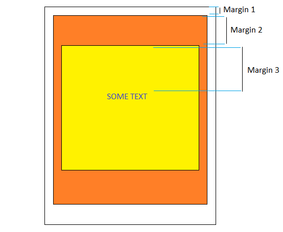
We created markup for the three elements and set a different height for the upper border for each of them. It seems that everything should work? Not.
If you do this, the browser will notice three adjacent fields and will want to combine them into one big block.
The result will look like this:

What happened? I dont know. This is a historical feature of CSS. I think that when CSS was standardized, the margins were not a problem at all, and the layouts were not as complicated as they are now. Therefore, the developers decided that this is a useful feature. But now it does not make sense.
If you’ve been working with CSS for many years and have never encountered this problem, it’s because indents are combined only when:
And the list goes on. If you encounter this problem, you can simply eliminate one of these conditions (except the first one), and the indents will return to normal. You can also avoid using
Please note that this can happen for elements of the same level. If you have two related elements one above the other and you are setting
That's all! I hope I did not waste time on the article and it turned out to be useful for you.
Finally, there are CSS rules that you could hardly see in the manuals, and which you may simply not be aware of. For some time I collected these tips and now decided to write an article in the hope that they would be useful. The following is what the CSS tutorials didn't teach me.
Padding-top property relative to the width of the parent element
How often have you used relative units in CSS? I am a big fan of them, because they allow you to create a responsive website, without going too far into media queries. If you want to set the height of the element to half the height of the parent, then simply write
height: 50%. You can use relative units anywhere. If you want to add a distance between two vertical elements, you can write
margin-top: 15%and an external indent appears. The distance will be 15% of the original height. I think you know all this, and I will not waste your time. But perhaps you do not know that everything is not so simple. In some situations it is better to use padding instead of margin . But when you install
padding-top: 15%... What the ...?The property does not work as we expect. It does not set parameters relative to the height of the parent. What's happening?
Explanation
It sets the parameters relative to the parent width. Do you need a demonstration? Here is:
Just play with the change in parent width and see how this affects the indentation of the child. At first glance, this may seem strange, but in fact there is a good reason why this happens. You will find it by reading the CSS specification ...
No, I'm joking - there is no explanation why this is happening. At least I could not find an explanation anywhere. Just so happens, keep this in mind.
Although we do not understand why the developers did this, we can use this feature to our advantage. For our item, we set the following:
.parent {
  height: auto;
  width: 100px;
}
.child {
  padding-top: 100%;
}
Then the height of the element will be the same as the height of the child, although we have specified
height: auto. On the other hand, the height of the child element will be the same as the width of the parent element, as we set padding-top: 100%. The result is a square, and the element will maintain this ratio for all sizes. Here is a working example:
If you change
padding-top: 100%to any other percentage, you get a rectangle. If you change the width, the ratio is still preserved.Transformation can accumulate rules
If you studied computer science, you will surely remember this terrible turtle and its moving pen. This educational concept is better known as the turtle chart , the purpose of which is to guide the turtle along the way using simple instructions - “20 steps forward”, “90 degrees turn” and the like.
What if using CSS, you could specify a command to move “20 pixels to the right” relative to the current position of the element, rather than its starting position? And if I say that you can do it using a property
transform? Many developers do not know that a property
transformcan accumulate rules and the rule n + 1 will refer to the position reached in the nth rule, and not to the original position.Are you confused? Perhaps this example will help you recover:
Note that we did not use any JavaScript variables to save the current position or the current rotation. This information is not stored anywhere! The solution is simple if you write:
transform: translateX(20px);And then add the following rule:
transform: translateX(20px) translateX(40px)The second rule will not replace the first - they will be applied consistently. The fact that they are applied consistently is important. When you rotate an element, you change the reference system, and further rules will apply to the new reference system. So this entry:
transform: rotateZ(20deg) translateX(30px)will be different from this:
transform: translateX(30px) rotateZ(20deg)You can also combine different units of measure. For example, you can center an element with a size of 600 as follows:
transform: translateX(50vw) translateX(-300px)But if you are not going to animate it, then perhaps the
calc ()best alternative. If you are worried about the tortoise, then I created another fragment that recreates the dynamics:
Unfortunately, she does not draw yet. But, if you want, you can always implement the drawing function.
External and internal indents are counted clockwise.
This is easy and many will think that I am writing banal things, but I have seen so many people struggling with the fours, that I stopped taking it for granted.
Many developers do not know that almost every CSS property has an abbreviated alternative. Other developers know this, but continue to use the full version, because they never remember the order.
Let me give you a hint:
Indents and borders follow clockwise.
It’s easier to explain. You can use with confidence:
padding-top: 3px;
padding-left: 6px;
padding-right: 6px;
padding-bottom: 3px;
But you can also use a shorter alternative:
padding: 3px 6px 3px 6px;The procedure is easy to remember - just look at this watch:
Start at 12:00 and continue to move clockwise. You will get the correct order.
If instead you use only two values:
padding: 2px 4px;The browser will expand it by repeating the parameters:
padding: 2px 4px 2px 4px;If you use three values:
padding: 2px 4px 6px;The browser will use the average for both the left and right edges, as if you wrote:
padding: 2px 4px 6px 4px;Background supports multiple images.
This is one of the least known properties, although it is widely supported.
You know that you can specify the URL of the image inside the property
background, but, if necessary, you can insert as many images as you want. All you need to do is separate them with a comma:background: url('first-image.jpeg') topleft,
url('second-image.jpeg') bottomright;Why can this be useful? What do you think about Linus Torvalds against the background of the generated sunrise using CSS?
You can also make a square rectangular image by adding those shaded borders that are so popular on Instagram. To do this, I repeated the same image twice, increasing the background image 5 times:
Sensor detection
Thanks to media queries, we can make websites flexible and adapt layouts to screens of various sizes. But this is not enough!
Smartphones, tablets and classic personal computers are different in nature. It's not about screen size.
On a touchscreen device, you use screen gestures, and tools like HammerJS help with this. With the mouse you just click, but with greater accuracy. If you have adapted your site to screens of different sizes, you may be thinking about its flexibility in other directions and support for various types of input!
You do not need complex JavaScript code to define a user-agent. Everything you need is in CSS:
@media (any-pointer: fine) {
  /*
    These rules will be applied to not-touchscreen devices
  */
}
@media (any-pointer: coarse) {
  /*
    These rules will be applied to touchscreen devices only
  */
}
Here is an example:
Tip : You do not need a smartphone to test, you can simulate a touch device using Google Chrome tools, just by clicking this icon:
It is very useful, and I do not know why it is not common, although it is decently supported. For example, I used it in a carousel to hide chevron icons on touchscreen devices for a more natural look.
In the end, you can provide a file
touchscreen.cssand, if necessary, import it:@import url('touchscreen.css') screen and (any-pointer: coarse);Note : Firefox is not currently supported, as you can see on caniuse.com .
Indents collapse
“And watch the stairs. They love to change. ”(Percy Weasley to Harry Potter)
I like CSS — it's clean, precise, and elegant; it has everything the developers need.
You apply the rule and it works. But when I thought I knew everything about CSS, this happened:
What the hell is going on? You are probably waiting for the text to be inside the title field, but the title is below. I did not want this scenario. Later, I discovered that confusion occurs with indents.
What does it mean? Suppose we want to create such a layout:
We created markup for the three elements and set a different height for the upper border for each of them. It seems that everything should work? Not.
If you do this, the browser will notice three adjacent fields and will want to combine them into one big block.
The result will look like this:
What happened? I dont know. This is a historical feature of CSS. I think that when CSS was standardized, the margins were not a problem at all, and the layouts were not as complicated as they are now. Therefore, the developers decided that this is a useful feature. But now it does not make sense.
If you’ve been working with CSS for many years and have never encountered this problem, it’s because indents are combined only when:
- the fields are vertical (with horizontal this does not occur);
- external elements do not contain text or other content;
- no internal padding or borders are set;
- the display property is defined as “block”;
- the overflow property is different from “initial”;
- indents are not negative.
And the list goes on. If you encounter this problem, you can simply eliminate one of these conditions (except the first one), and the indents will return to normal. You can also avoid using
margin-top, and instead use topand padding-top. Please note that this can happen for elements of the same level. If you have two related elements one above the other and you are setting
margin-bottom: 30pxfor the first and margin-top: 60pxfor the second, then there will be the least problems. Indents in the result will not be equal to 30 + 60 = 90 pixels, but will be equal to the highest value (30, 60) = 60 pixels.Final Thoughts
That's all! I hope I did not waste time on the article and it turned out to be useful for you.
Go to VPS.today - a site for searching virtual servers. 1500 tariffs from 130 hosters, convenient interface and a large number of criteria for finding the best virtual server.