From Victory to PornHub: how companies use dark patterns
Many companies use so-called dark patterns: interfaces made not for the convenience of the user, but for the benefit. The speaker of the course Binary District “UX / UI for Product Technologists and Designers” - Art Director of Nanosemantics Mikhail Fedosov - told what types of patterns are used in different companies, and whether designers have an alternative to this approach.

Dark pattern (dark pattern) - this is a deliberate misrepresentation of the user. The author of the term is British UX designer Harry Brinul. In 2013, he launched the Dark Patterns special project, where he described the main types of such techniques. Among them are disguised ads, an attempt to shame the user for refusing to agree to something, adding extra products to the shopping cart on the site and other tricks. Marketers, designers and product engineers use such techniques to increase conversion on the site and increase profits.
The company was repeatedly accused of using dark patterns. One of the first examples cited by Brinul in 2013 was the impossibility of easily deleting an account :
Later, bloggers also reported that the site does not allow to compare the price of similar goods.
The last case, described by a blogger in July 2018 - the inability to leave a bad review of the purchased product.
Companies were accused of using dark patterns in June 2018. The Norwegian Consumer Council issued a report titled "Design Cheated." The report was based on the results of user tests, which were conducted in April and in May, when all three companies made changes to their privacy policies in accordance with the Personal Data Protection Regulations (GDPR protocol).
The report listed several violations:
For example, Facebook warned that if you disable facial recognition, the company will not be able to interfere if someone steals a user's photo and impersonates himself.
The privacy settings offered by companies often gave the user only the illusion of control over their personal data. The same Facebook offered to users to limit the provision of their data to display ads, but in fact continued to receive them.
The Google privacy settings panel should have allowed the user to delete their data, but the navigation was more like a labyrinth than a tool for this task.
Finally, Microsoft got its share of criticism for giving the user equal opportunity to choose safe and unsafe privacy settings when installing Windows 10.
Companies denied all the allegations. According to representatives of Google and Facebook, they were preparing to adopt a GDPR for a year and a half and took into account all the requirements of the protocol.
To make their taxi drivers work longer and drive in those areas that are less profitable for them, the company used a psychological trick in the mobile application. As soon as the driver tried to complete the work and exit the application, it warned that in order to achieve the goal, a couple more orders had to be completed. This was told by the New York Times in 2017.
Josh Streeter, a Uber driver in Florida, worked on New Year's Eve. When at 7:13 in the morning he tried to log out, he received a message with the headline: “Reach the sum of 330 dollars”. The text explained: "You only have $ 10 to 330. Do you really want to go out?" The "Continue" button, in accordance with the classic dark patterns, was highlighted.
Messages that the driver can earn a little more on the next order, appeared during the current trip. In the end, drivers began to complain that they could not go offline because all orders arrived. The company was forced to allow them to cancel this function in the application (but so far this has to be done after each new order).
In 2017, Uber also launched a function that navigated drivers to the navigator where chances to find passengers were allegedly higher and fares higher. In fact, the program sent them to places beneficial to the company. "You come, and there is nothing there, and so constantly," - said the former Uber driver Scott Weber. As in the case of Streeter, the message was designed in such a way that the “Accept” button was larger than the “Reject” button, and, unlike it, was in the center of the screen.
After the charges of manipulation, the company representatives said that the experiment was intended for novice drivers who complained that they did not know where and how to look for passengers.
Other Russian and foreign companies are more likely to use less complex types of patterns. Mikhail Fedosov says that the most common of them are the following six.
When buying tickets on the website of Pobeda Airlines, a tick is automatically put to pay for insurance during the flight. In an amicable way, you should be given a choice - to buy it or not, and to focus on it. But here such consent is established in the system by default:

VTB-Insurance in its mailing list offers the user to buy goods and services from partner companies. Button "Go to the selection" seems the only one. Everything is designed for the fact that most users will not notice the gray line in small print below: "To unsubscribe from the newsletter, click here."
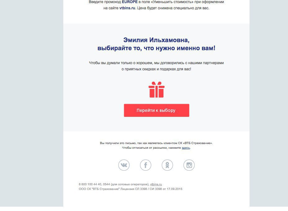
Some companies, however, do even worse: the unsubscribe buttons simply do not exist.
Medium.com is trying hard to get the user to register and subscribe to the newsletter. When you try to just start reading materials, part of the screen overlaps the top and bottom bars.

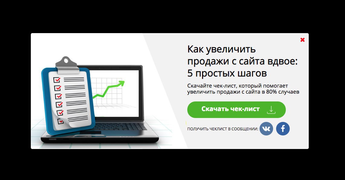
The company Sales Generator advertises its services in website promotion and content marketing. The site tracks the cursor, and as soon as you remove it, pop up pops up. Some, however, consider this not a pattern, but an ordinary marketing ploy.
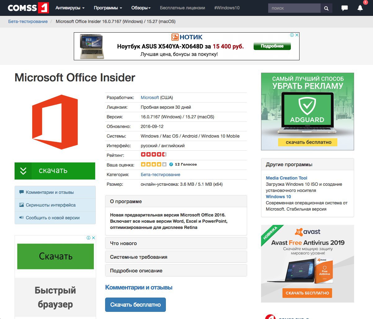
Favorite dark patterns on software download sites. On the Comss site, the user sees five “Download” buttons at once - in order to understand that he needs the smallest and most inconspicuous, it may take several seconds.
Most often such banners appear if the user had the word “Download” in the request. Targeting ads are specifically tuned to such keywords, because a person will search for a button with exactly this name.
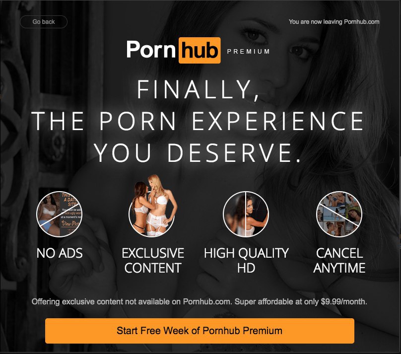
Porn sites are best illustrated by another kind of dark patterns - renewing a subscription without the consent of users. So, PornHub gives two weeks of free premium subscription, but before that it asks to enter a bank card number. After two weeks, the buyer automatically switches to a paid subscription.
If the company deliberately misleads users - it will affect their loyalty. For some time, the conversion on the site can grow, conditionally, from 1% of clicks to 5%, but most people will immediately close such a site. Another part will remain briefly - simply because it does not immediately understand what happened. But in the long run, the company is unprofitable: deceived users will leave.
Some designers themselves are the initiators of the use of dark patterns. Not for all employers this attracts: some, on the contrary, will avoid specialists with such experience.
It is necessary initially to build relationships with the customer so that he treats the designer as a specialist who is able to offer the most effective way to solve his problem.
Michael tells how they once made a “story” of a single product for Instagram: after the user clicked on several pictures, he had the opportunity to vote whether he liked it or not. People click on the right side of the screen very quickly, so if you put the "I liked" button on it, most will click on it automatically, and the percentage of those who allegedly liked the product will be higher.
But to adequately assess the attractiveness of the product for buyers will not work. You can make a poll convenient for the user in two ways: move the voting buttons to another window and slow down the voting picture so that the person doesn’t click on for or against it. Then at the end you can see the real picture.
Giving arguments against the use of dark patterns, one can, firstly, indicate that large companies are still paying attention to ethics. So, Google recently announced that it cares about user loyalty, not conversion. YouTube has already appeared function of limiting the time spent in the video blog: a tooltip reminds you that watching too many clips is harmful. User loyalty, which Google gets in return, is difficult to measure, but in the long run it is obviously more profitable for it.
Secondly, alternative solutions can be proposed. Instead of dark patterns, you can always use something else.
In a professional environment, those who uphold designer ethics are highly respected. If you are able to explain to others how the UX design should take care of the user and show how it works, you definitely get likes.
You can talk with Mikhail Fedosov and learn more about what skills a good UX designer should possess, at the Binary District “UX / UI for Productologists and Designers” on the intensive . The closest course will be November 10-11.

What are dark patterns
Dark pattern (dark pattern) - this is a deliberate misrepresentation of the user. The author of the term is British UX designer Harry Brinul. In 2013, he launched the Dark Patterns special project, where he described the main types of such techniques. Among them are disguised ads, an attempt to shame the user for refusing to agree to something, adding extra products to the shopping cart on the site and other tricks. Marketers, designers and product engineers use such techniques to increase conversion on the site and increase profits.
How international corporations use dark patterns
1. Amazon
The company was repeatedly accused of using dark patterns. One of the first examples cited by Brinul in 2013 was the impossibility of easily deleting an account :
Later, bloggers also reported that the site does not allow to compare the price of similar goods.
The last case, described by a blogger in July 2018 - the inability to leave a bad review of the purchased product.
2. Google, Microsoft and Facebook
Companies were accused of using dark patterns in June 2018. The Norwegian Consumer Council issued a report titled "Design Cheated." The report was based on the results of user tests, which were conducted in April and in May, when all three companies made changes to their privacy policies in accordance with the Personal Data Protection Regulations (GDPR protocol).
The report listed several violations:
- some privacy settings were hidden;
- pop-up windows forced users to choose certain options for settings: information about what their acceptance would mean, while going down or downplayed;
- opportunity to postpone the decision was not;
- if the settings were not selected, the user was threatened to delete his account or reduce its functionality.
For example, Facebook warned that if you disable facial recognition, the company will not be able to interfere if someone steals a user's photo and impersonates himself.
The privacy settings offered by companies often gave the user only the illusion of control over their personal data. The same Facebook offered to users to limit the provision of their data to display ads, but in fact continued to receive them.
The Google privacy settings panel should have allowed the user to delete their data, but the navigation was more like a labyrinth than a tool for this task.
Finally, Microsoft got its share of criticism for giving the user equal opportunity to choose safe and unsafe privacy settings when installing Windows 10.
Companies denied all the allegations. According to representatives of Google and Facebook, they were preparing to adopt a GDPR for a year and a half and took into account all the requirements of the protocol.
3. Uber
To make their taxi drivers work longer and drive in those areas that are less profitable for them, the company used a psychological trick in the mobile application. As soon as the driver tried to complete the work and exit the application, it warned that in order to achieve the goal, a couple more orders had to be completed. This was told by the New York Times in 2017.
Josh Streeter, a Uber driver in Florida, worked on New Year's Eve. When at 7:13 in the morning he tried to log out, he received a message with the headline: “Reach the sum of 330 dollars”. The text explained: "You only have $ 10 to 330. Do you really want to go out?" The "Continue" button, in accordance with the classic dark patterns, was highlighted.
Messages that the driver can earn a little more on the next order, appeared during the current trip. In the end, drivers began to complain that they could not go offline because all orders arrived. The company was forced to allow them to cancel this function in the application (but so far this has to be done after each new order).
In 2017, Uber also launched a function that navigated drivers to the navigator where chances to find passengers were allegedly higher and fares higher. In fact, the program sent them to places beneficial to the company. "You come, and there is nothing there, and so constantly," - said the former Uber driver Scott Weber. As in the case of Streeter, the message was designed in such a way that the “Accept” button was larger than the “Reject” button, and, unlike it, was in the center of the screen.
After the charges of manipulation, the company representatives said that the experiment was intended for novice drivers who complained that they did not know where and how to look for passengers.
Six types of dark patterns
Other Russian and foreign companies are more likely to use less complex types of patterns. Mikhail Fedosov says that the most common of them are the following six.
1. Hidden cost
When buying tickets on the website of Pobeda Airlines, a tick is automatically put to pay for insurance during the flight. In an amicable way, you should be given a choice - to buy it or not, and to focus on it. But here such consent is established in the system by default:

2. Distraction
VTB-Insurance in its mailing list offers the user to buy goods and services from partner companies. Button "Go to the selection" seems the only one. Everything is designed for the fact that most users will not notice the gray line in small print below: "To unsubscribe from the newsletter, click here."

Some companies, however, do even worse: the unsubscribe buttons simply do not exist.
3. Forced registration
Medium.com is trying hard to get the user to register and subscribe to the newsletter. When you try to just start reading materials, part of the screen overlaps the top and bottom bars.

4. Pop-up notifications
The company Sales Generator advertises its services in website promotion and content marketing. The site tracks the cursor, and as soon as you remove it, pop up pops up. Some, however, consider this not a pattern, but an ordinary marketing ploy.

5. Disguised ads
Favorite dark patterns on software download sites. On the Comss site, the user sees five “Download” buttons at once - in order to understand that he needs the smallest and most inconspicuous, it may take several seconds.
Most often such banners appear if the user had the word “Download” in the request. Targeting ads are specifically tuned to such keywords, because a person will search for a button with exactly this name.

6. Forced renewals
Porn sites are best illustrated by another kind of dark patterns - renewing a subscription without the consent of users. So, PornHub gives two weeks of free premium subscription, but before that it asks to enter a bank card number. After two weeks, the buyer automatically switches to a paid subscription.

Do dark patterns work?
If the company deliberately misleads users - it will affect their loyalty. For some time, the conversion on the site can grow, conditionally, from 1% of clicks to 5%, but most people will immediately close such a site. Another part will remain briefly - simply because it does not immediately understand what happened. But in the long run, the company is unprofitable: deceived users will leave.
Some designers themselves are the initiators of the use of dark patterns. Not for all employers this attracts: some, on the contrary, will avoid specialists with such experience.
What to do if the customer offers to play in the dark
It is necessary initially to build relationships with the customer so that he treats the designer as a specialist who is able to offer the most effective way to solve his problem.
Michael tells how they once made a “story” of a single product for Instagram: after the user clicked on several pictures, he had the opportunity to vote whether he liked it or not. People click on the right side of the screen very quickly, so if you put the "I liked" button on it, most will click on it automatically, and the percentage of those who allegedly liked the product will be higher.
But to adequately assess the attractiveness of the product for buyers will not work. You can make a poll convenient for the user in two ways: move the voting buttons to another window and slow down the voting picture so that the person doesn’t click on for or against it. Then at the end you can see the real picture.
Giving arguments against the use of dark patterns, one can, firstly, indicate that large companies are still paying attention to ethics. So, Google recently announced that it cares about user loyalty, not conversion. YouTube has already appeared function of limiting the time spent in the video blog: a tooltip reminds you that watching too many clips is harmful. User loyalty, which Google gets in return, is difficult to measure, but in the long run it is obviously more profitable for it.
Secondly, alternative solutions can be proposed. Instead of dark patterns, you can always use something else.
In a professional environment, those who uphold designer ethics are highly respected. If you are able to explain to others how the UX design should take care of the user and show how it works, you definitely get likes.
You can talk with Mikhail Fedosov and learn more about what skills a good UX designer should possess, at the Binary District “UX / UI for Productologists and Designers” on the intensive . The closest course will be November 10-11.
