Product Design Digest October 2018
The digest collects fresh articles on interface design, as well as tools, patterns, cases and historical stories since 2009. I carefully filter a large stream of subscriptions so that you can upgrade your professional skills and better solve work tasks. Previous issues: April 2010-September 2018 .

Bill Chung conducted a user study of sketchy loading screens, which Facebook once popularized. They help if they show loading in stages and reduce the ambiguity of expectations, and are not just serving as stubs. The author gives advice on the correct animation for them.
Aurora Harley says a significant improvement in recommender systems in recent years. She gives sensible advice on their implementation.
Smashing Magazine released Adam Silver's Form Design Patterns book on form design techniques. The author examines many typical examples. They publish an excerpt from it dedicated to registration forms.
Memo on the implementation of "lazy" upload images on the web from Rahul Nanwani. Many greatly impair the work with sites, realizing only a part of these practices. As a result, users with good Internet wait longer for the graphics to load.

Vivian Zhang describes a user-pushing action pattern using delayed animation of an interface element. It helps to pay attention to the functionality, not throwing all the possibilities at once to a person.

Mini-site with a memo for the competent implementation of dialogs in the interfaces. The best advice is to avoid them where possible.
Alexander Handley describes wireframes and script detail levels.
Basecamp's Michael Berger talks about quick product navigation for users with disabilities (although it’s useful for others). It looks like a spotlight in MacOS.
Mad * Marli Mesibov from Pow gives interface design tips that help in maintaining the mental health of users.
Alita Joyce from the Nielsen / Norman Group describes the principles of good micro-interactions in the interface.
Part 5 of the Nathan Curtis series of articles about the release cycle of design systems speaks about interdependencies between components and other layers of modularity.
A two-hour screencast demonstrating the collaboration of the designer and developer from Brad Frost and Dan Mall. The accompanying article .
A sensible article by Jerlyn Jareunpoon-Phillips from Clearleft on the implementation of design systems in practice. Useful nuances of the process of communicating with the product team or customer.

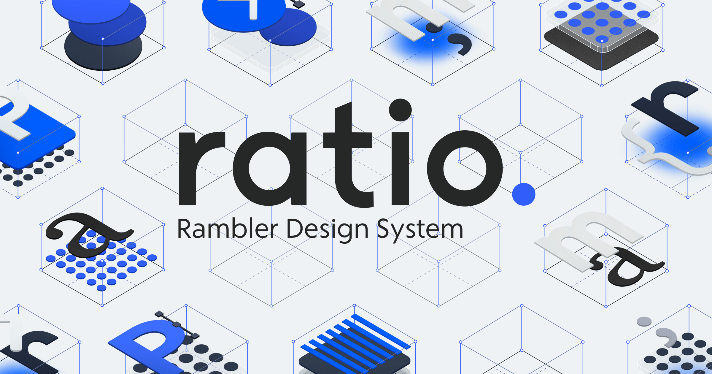
Rambler updated the site of its design system Ratio.
Josh Clark also writes that intermediate project artifacts are often useless and it is better to focus on the development of the design system, even in the early stages of grocery work.
Tyler Miller shows how you can make a dark interface theme and describe its variables.
Illustrations have become an indispensable part of the identity of digital products - they are in every first service. No wonder - in a good interface everything is occupied by useful things and there are no special places for expressing the brand, except that the logo, color palette, pictograms and characteristic patterns. So the illustrations are a simple and expressive way to make it more cheerful and more recognizable. Particularly advanced demonstrate the unity of communication in texts and animation, but this is more difficult to achieve. So it is no wonder that half of Dribbble is crammed with interfaceless pictures. Gathered a pack of stories of famous companies that have found themselves.

Jennifer Hom talks about working on a new Airbnb style of illustrations. Her Wired interview on the same topic.

Emma Zhang talks about working on the new unified style of Adobe illustrations.
Gallery of isometric objects for one of the most fashionable now style illustrations. With such tools in six months he will be generally everywhere.

Joseph Russell studied non-gaming iOS apps that have won the Apple Design Awards since 2014. He tried to reveal the common between them. Mostly stiff, but useful.
An excellent example of the description of Jobs to Be Done based on the typical life situations of a teacher.

Kate Moran and Kim Flaherty from the Nielsen / Norman Group show the causes of technological myths and how they affect the use of products.

Kate Moran and Kim Flaherty of the Nielsen / Norman Group describe a “whirlpool” situation in which user distracts events like notifications are being sucked.
MIT Press has published a book on inclusive design from the head of this initiative at Microsoft. Excerpt from it .

Publisher A Book Apart has released a mini-book about the texts in the interfaces. They publish an excerpt from it .
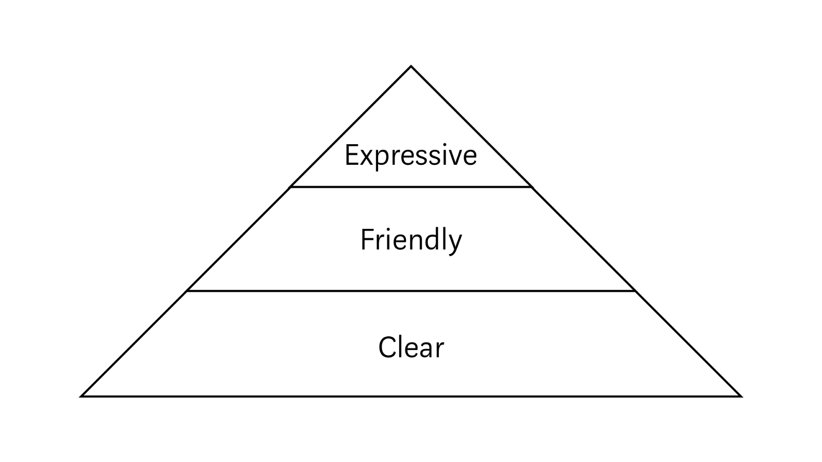
Ben Hersh's sensible approach from Medium to good texts in the interface. He shares three components - clarity, friendliness and emotionality.
Dylan Ortega gives tips on writing good texts in the interface. Typical, but well structured memo.
The annual monster presentation of new products and experiments Adobe MAX 2018 was held from October 15 to October 17 in Los Angeles . As always, dump truck upgrades.

The October update came out very dense, it is the largest tool jerk. The coolest - you can prototype voice interfaces ; The prototype listens to commands and responds with a voice ( bought the Sayspring service in the spring ). Figas! In addition - UI Kit for Amazon Alexa .
The first plug-ins appeared. In addition to the basic types of Zeplin and on-duty like Slack and Jira, there are junk designers - Overflow, ProtoPie, UI Faces, Rename It.
Another interesting thing is autoanimation, when the tool itself creates a transition between two artboards with a change of element states.
Linked characters can be updated in layouts that use them as the original changes. You can also open Adobe Illustrator files and export to After Effects.
The promised full version for the iPad has been confirmed . You can work with PSD-files in an adapted interface. Will be available next year.

The basic version is also updated . Many new features, improvements of the old and optimize the interface (for example, finally there are mathematical formulas when setting dimensions).
TypeKit is finally renamed. And they removed a lot of restrictions - you can synchronize at least all 14,000 fonts to a computer, there is no difference between using on a computer and on the web, and the limits on browsing and domains on the web have been removed.

Updates have already flown through Creative Cloud. All video speeches .
Although many people, with a surprised little finger, will adjust the monocle, looking from the heights of their Figm and Sketch, Adobe is an important company on the market, so you probably use some of their products. It is a sin to a professional not to be interested in what is happening with the design tools, because Adobe does an insane amount of breakthrough things.
A powerful function has appeared to work with a group of repeating objects , when they can be changed simultaneously.
See also Daniel Hollick 's TIDAL Beginner API Guide . Step-by-step connection to layouts and their analysis.
Lachezar Petkov dismantled the nuances of working with the tool .
An experimental online interface design tool that also promises a bundle with real-world components of a React, Angular and Vue design system.
Colm Tuite began collecting money for his framework for creating design systems , which he wrote about several times in a digest ( accompanying article ). Gave money.
A simple tool for Mac allows you to insert an interactive prototype into the frame of your phone and get a video for the promo site.
An experimental design tool from Florian Schulz. In his coolest cover article, he talks about his work principles . Ratio is based on tokens and uses them in a fairly advanced form (for example, it can connect them from a third-party tool).
There was an update, albeit a light one. You can import layouts from Figma, there is a dark theme.
Common variables appeared in the prototypes that can be used at different steps (for example, the user name entered into the form).
The tool promises to export Sketch, Adobe XD and Photoshop layouts to running Progressive Web Apps.
Added a tool to work with CSS Grid .
Dmitry Bunin's tips on using text styles in Sketch 52 .
Prototypr launched a chronology of updates to the design tools - now there is an archive for the last year.

Publisher A Book Apart has released a book from the main typographer Adobe.

Kie Watanabe from HubSpot gives advice on communicating user research results to the product team and decision makers. Explanatory system view.
Memo on conducting interviews with users from Kara Pernice from the Nielsen / Norman Group. Enough detail for review.
Selina Parmar from Deliveroo talks about user research methods for different tasks in a company.
Meghan Wenzel shares his experience in building a UX research process in a company from scratch.
The service allows you to poll site users. At the entrance - assessment through emoticons (on a scale of 5), it is possible to ask additional questions.
An excerpt from Chapter 6 of Matej Latin’s “Rhythm in Web Typography” , which deals with the rhythm of web typography.
Jeff Sauro describes the approach of the UX summary score sheets in a product. This is a great visual tool for tracking the “health” of the design and selecting the points of application of the design team's efforts.
Dave Malouf reflects on the topic of ROI DesignOps. There are no simple ways (and not the fact that it is needed at all), but you can evaluate maturity through a few simple indicators.
Hannah McKelvey and Jacqueline L. Frank tell how they used a customer journey map to meet new employees at the library. This task itself is interesting and important, so the article is doubly useful.
Karl Fast writes about the three roles of design in modern companies: integration, transformation and evolution. An explanatory look at the tasks of the design manager.
Memo on the formulation of design feedback by Jes Kirkwood.
Deliveroo's Aimee Quantrill talks about regular content collaboration days involving many company employees.
The design maturity model in the state-owned Margot Lagendijk and Charlotte van Lijnden teams. Built on the principle of the radar chart.
Column UXmatters on how to sell UX-strategy to top managers. In the article, a good separation of the two concepts of this term is the strategy of organizational change for the production of good products and a plan for working on a specific product.
Deliveroo's Rob Hunt describes the informal approach of the design team, which encourages colleagues to share their current work status so that everyone is up to date.
The system of versioning layouts and templates for designers from Sympli. She announced last year, now it is available to all.
Another service for storing layouts in a team. True, not very useful - just a gallery without specifications and even descriptions. Does the domestic company Scada .
Another versioning service layouts.
The service helps to store design documentation for design - from incoming requirements and usage scenarios in a wide variety of variations to mock-ups and other visual results of work.
Michael Hendrix from IDEO responded to criticism of design thinking, which has been very much in recent years. He rightly notes that this is one of the methodologies that can always be used incorrectly.
Maple Kuo's story about the redesign of part of Google’s Firebase analytics service.
Design studio Heavyweight talks about the redesign of the Dutch service for accountants KeesdeBoekhouder.
JR Raphael collected screenshots of the first versions of key Google products.
computer sales growth in the world
smartphone sales growth in Russia
Fred O'Brien describes the current state of website constructors using an algorithmic design. He spoke with the creators of many of them or quoted their opinions on the topic.
Raluca Budiu and Kathryn Whitenton continue a series of voice interface research from the Nielsen / Norman Group. They studied user expectations from the ideal smart assistant and compared them with existing products on several criteria. Extremely interesting food for the choice of directions of development.

Alexa skills can interact with each other .
Relatively sensible analysis of interface design features in the blockchain. Most of the articles on the subject suffer from a lack of specifics, here at least a good overview of the key nuances.
The concept of navigation between mobile applications due to their binding to the physical space - this allows you to make the transitions between them closer to the objects of the real world.
Last year, the premiere of a documentary film about the Ural School of Design in the USSR. Now he is online. Now in the continuation of the work of the Leningrad school .
The authors all autumn publish videos of the five-year plans. Almost all videos are available for those enrolled in the course.
Becc Erickson made a bolshoit bingo pattern for designer portfolios.
A fun way to describe the skills of a product designer from Anish Joshi.
Pocket design team blog. In the first article, Tony Murphy talks about the goals of product redesign and the design principles that were laid in it.

Patterns and best practices
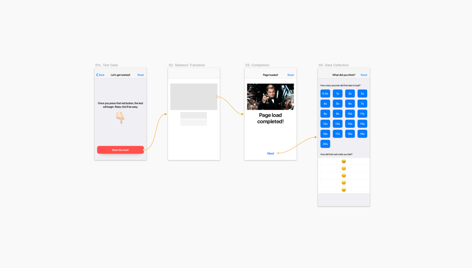
Everything you need to know about skeleton screens
Bill Chung conducted a user study of sketchy loading screens, which Facebook once popularized. They help if they show loading in stages and reduce the ambiguity of expectations, and are not just serving as stubs. The author gives advice on the correct animation for them.
Individualized Recommendations - Users' Expectations & Assumptions
Aurora Harley says a significant improvement in recommender systems in recent years. She gives sensible advice on their implementation.
Adam Silver - Form Design Patterns
Smashing Magazine released Adam Silver's Form Design Patterns book on form design techniques. The author examines many typical examples. They publish an excerpt from it dedicated to registration forms.
Lazy Loading Images
Memo on the implementation of "lazy" upload images on the web from Rahul Nanwani. Many greatly impair the work with sites, realizing only a part of these practices. As a result, users with good Internet wait longer for the graphics to load.
Micro nudge - A micro animation for behavioral change
Vivian Zhang describes a user-pushing action pattern using delayed animation of an interface element. It helps to pay attention to the functionality, not throwing all the possibilities at once to a person.
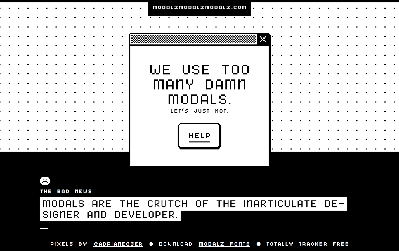
MODALZ MODALZ MODALZ
Mini-site with a memo for the competent implementation of dialogs in the interfaces. The best advice is to avoid them where possible.
User flow is the new wireframe
Alexander Handley describes wireframes and script detail levels.
The next big jump in Basecamp accessibility!
Basecamp's Michael Berger talks about quick product navigation for users with disabilities (although it’s useful for others). It looks like a spotlight in MacOS.
Designing Experiences To Improve Mental Health
Mad * Marli Mesibov from Pow gives interface design tips that help in maintaining the mental health of users.
Microinteractions in User Experience
Alita Joyce from the Nielsen / Norman Group describes the principles of good micro-interactions in the interface.
Baymard Institute Studies
- Problems of horizontal tabs on the product page . They help to divide the large-scale description into parts, but users lose them.
- Tips on the correct field for entering the card expiration date .
Design systems and guidelines
Dealing with Dependencies Inside Design Systems
Part 5 of the Nathan Curtis series of articles about the release cycle of design systems speaks about interdependencies between components and other layers of modularity.
Brad Frost & Dan Mall - Designer + Developer Workflow
A two-hour screencast demonstrating the collaboration of the designer and developer from Brad Frost and Dan Mall. The accompanying article .
Designing design systems
A sensible article by Jerlyn Jareunpoon-Phillips from Clearleft on the implementation of design systems in practice. Useful nuances of the process of communicating with the product team or customer.
Rambler Ratio
Rambler updated the site of its design system Ratio.
Only One Deliverable Matters
Josh Clark also writes that intermediate project artifacts are often useless and it is better to focus on the development of the design system, even in the early stages of grocery work.
Systemizing color for change
Tyler Miller shows how you can make a dark interface theme and describe its variables.
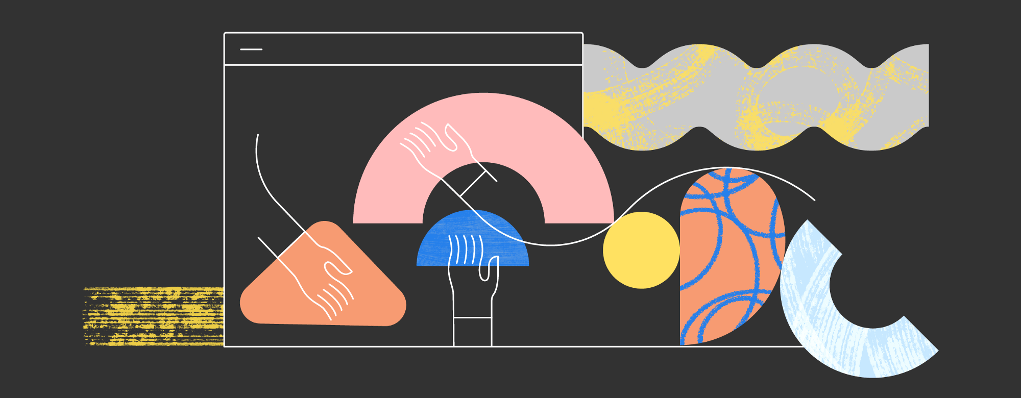
Unified illustrations in digital products
Illustrations have become an indispensable part of the identity of digital products - they are in every first service. No wonder - in a good interface everything is occupied by useful things and there are no special places for expressing the brand, except that the logo, color palette, pictograms and characteristic patterns. So the illustrations are a simple and expressive way to make it more cheerful and more recognizable. Particularly advanced demonstrate the unity of communication in texts and animation, but this is more difficult to achieve. So it is no wonder that half of Dribbble is crammed with interfaceless pictures. Gathered a pack of stories of famous companies that have found themselves.
Your Face Here
Jennifer Hom talks about working on a new Airbnb style of illustrations. Her Wired interview on the same topic.
Designing Adobe's Brand Illustration Style
Emma Zhang talks about working on the new unified style of Adobe illustrations.
Isometriclove - Cute Isometric Objects For Design
Gallery of isometric objects for one of the most fashionable now style illustrations. With such tools in six months he will be generally everywhere.
What does it take to win an Apple Design Award
Joseph Russell studied non-gaming iOS apps that have won the Apple Design Awards since 2014. He tried to reveal the common between them. Mostly stiff, but useful.
Understanding the user
Four Jobs Teachers Are Trying To Get Done
An excellent example of the description of Jobs to Be Done based on the typical life situations of a teacher.
Technology Myths and Urban Legends
Kate Moran and Kim Flaherty from the Nielsen / Norman Group show the causes of technological myths and how they affect the use of products.
The Vortex - Why Users Feel Trapped in Their Devices
Kate Moran and Kim Flaherty of the Nielsen / Norman Group describe a “whirlpool” situation in which user distracts events like notifications are being sucked.
Kat Holmes "Mismatch"
MIT Press has published a book on inclusive design from the head of this initiative at Microsoft. Excerpt from it .
Information architecture, conceptual design, content strategy
Scott Kubie "Writing for Designers"
Publisher A Book Apart has released a mini-book about the texts in the interfaces. They publish an excerpt from it .
The Riddle of UX Writing
Ben Hersh's sensible approach from Medium to good texts in the interface. He shares three components - clarity, friendliness and emotionality.
The 3 Elements of Great UX Writing
Dylan Ortega gives tips on writing good texts in the interface. Typical, but well structured memo.
Design and design of interface screens
Adobe MAX 2018
The annual monster presentation of new products and experiments Adobe MAX 2018 was held from October 15 to October 17 in Los Angeles . As always, dump truck upgrades.
Adobe XD
The October update came out very dense, it is the largest tool jerk. The coolest - you can prototype voice interfaces ; The prototype listens to commands and responds with a voice ( bought the Sayspring service in the spring ). Figas! In addition - UI Kit for Amazon Alexa .
The first plug-ins appeared. In addition to the basic types of Zeplin and on-duty like Slack and Jira, there are junk designers - Overflow, ProtoPie, UI Faces, Rename It.
Another interesting thing is autoanimation, when the tool itself creates a transition between two artboards with a change of element states.
Linked characters can be updated in layouts that use them as the original changes. You can also open Adobe Illustrator files and export to After Effects.
Photoshop
The promised full version for the iPad has been confirmed . You can work with PSD-files in an adapted interface. Will be available next year.
The basic version is also updated . Many new features, improvements of the old and optimize the interface (for example, finally there are mathematical formulas when setting dimensions).
Adobe fonts
TypeKit is finally renamed. And they removed a lot of restrictions - you can synchronize at least all 14,000 fonts to a computer, there is no difference between using on a computer and on the web, and the limits on browsing and domains on the web have been removed.
Other products
- After Effects with a pack of nice features.
- Illustrator with a bunch of improvements to the interface and work with objects.
- InDesign makes it easy to rebuild when resizing the page and automatically selects the correct cropping of images.
- Project Aero for drawing in augmented reality.
- Project Gemini , a drawing tool for iPad.
- Character Animator CC screwed up the groundwork from last year’s spectacular demos with the rapid imposition of illustrative styles on characters.
- Dimension 2.0 for the use of 3D-objects in two-dimensional images.
- Premiere CC focused on video bloggers.
Updates have already flown through Creative Cloud. All video speeches .
Although many people, with a surprised little finger, will adjust the monocle, looking from the heights of their Figm and Sketch, Adobe is an important company on the market, so you probably use some of their products. It is a sin to a professional not to be interested in what is happening with the design tools, because Adobe does an insane amount of breakthrough things.
Figma
A powerful function has appeared to work with a group of repeating objects , when they can be changed simultaneously.
See also Daniel Hollick 's TIDAL Beginner API Guide . Step-by-step connection to layouts and their analysis.
FramerX
Lachezar Petkov dismantled the nuances of working with the tool .
Interplay
An experimental online interface design tool that also promises a bundle with real-world components of a React, Angular and Vue design system.
Modulz
Colm Tuite began collecting money for his framework for creating design systems , which he wrote about several times in a digest ( accompanying article ). Gave money.
Overframe
A simple tool for Mac allows you to insert an interactive prototype into the frame of your phone and get a video for the promo site.
Ratio
An experimental design tool from Florian Schulz. In his coolest cover article, he talks about his work principles . Ratio is based on tokens and uses them in a fairly advanced form (for example, it can connect them from a third-party tool).
Principle 5
There was an update, albeit a light one. You can import layouts from Figma, there is a dark theme.
Uxpin
Common variables appeared in the prototypes that can be used at different steps (for example, the user name entered into the form).
Famous
The tool promises to export Sketch, Adobe XD and Photoshop layouts to running Progressive Web Apps.
Webflow
Added a tool to work with CSS Grid .
Sketch
Dmitry Bunin's tips on using text styles in Sketch 52 .
Design Tool Time Machine
Prototypr launched a chronology of updates to the design tools - now there is an archive for the last year.
Tim Brown "Flexible Typesetting"
Publisher A Book Apart has released a book from the main typographer Adobe.
User research and testing, analytics
3 Ways to Make Your Research Better Today
Kie Watanabe from HubSpot gives advice on communicating user research results to the product team and decision makers. Explanatory system view.
User Interviews - Conduct Them
Memo on conducting interviews with users from Kara Pernice from the Nielsen / Norman Group. Enough detail for review.
Refining research needs
Selina Parmar from Deliveroo talks about user research methods for different tasks in a company.
7 Tips for Building a UX Research Team
Meghan Wenzel shares his experience in building a UX research process in a company from scratch.
UX Feedback
The service allows you to poll site users. At the entrance - assessment through emoticons (on a scale of 5), it is possible to ask additional questions.
Visual programming and browser design
Rhythm in web typography
An excerpt from Chapter 6 of Matej Latin’s “Rhythm in Web Typography” , which deals with the rhythm of web typography.
New scripts
CSS features for design
Metrics and ROI
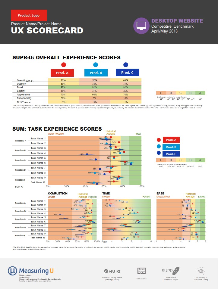
Building a UX Metrics Scorecard
Jeff Sauro describes the approach of the UX summary score sheets in a product. This is a great visual tool for tracking the “health” of the design and selecting the points of application of the design team's efforts.
Measuring DesignOps
Dave Malouf reflects on the topic of ROI DesignOps. There are no simple ways (and not the fact that it is needed at all), but you can evaluate maturity through a few simple indicators.
UX strategy and management
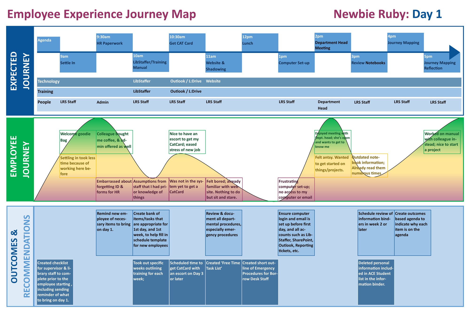
AXXXXXXXXXXXXXXXXXXXXXXXXXXXXXXXXXXXXXXXXXXXXXXXXXXXXX4D4
Hannah McKelvey and Jacqueline L. Frank tell how they used a customer journey map to meet new employees at the library. This task itself is interesting and important, so the article is doubly useful.
The fundamental job of design
Karl Fast writes about the three roles of design in modern companies: integration, transformation and evolution. An explanatory look at the tasks of the design manager.
How to give designers constructive feedback they can actually use
Memo on the formulation of design feedback by Jes Kirkwood.
Why do we run content design days?
Deliveroo's Aimee Quantrill talks about regular content collaboration days involving many company employees.
GC Maturity Score
The design maturity model in the state-owned Margot Lagendijk and Charlotte van Lijnden teams. Built on the principle of the radar chart.
The Role of Soft Skills in Conveying Strategy to Executives
Column UXmatters on how to sell UX-strategy to top managers. In the article, a good separation of the two concepts of this term is the strategy of organizational change for the production of good products and a plan for working on a specific product.
Team interaction
WAYWO - Because of work
Deliveroo's Rob Hunt describes the informal approach of the design team, which encourages colleagues to share their current work status so that everyone is up to date.
Sympli Versions
The system of versioning layouts and templates for designers from Sympli. She announced last year, now it is available to all.
Drafta
Another service for storing layouts in a team. True, not very useful - just a gallery without specifications and even descriptions. Does the domestic company Scada .
Sensitive
Another versioning service layouts.
Purple
The service helps to store design documentation for design - from incoming requirements and usage scenarios in a wide variety of variations to mock-ups and other visual results of work.
Methodologies, procedures, standards
Ideo breaks its silence on design thinking
Michael Hendrix from IDEO responded to criticism of design thinking, which has been very much in recent years. He rightly notes that this is one of the methodologies that can always be used incorrectly.
Cases
How to build a product for a product redesign
Maple Kuo's story about the redesign of part of Google’s Firebase analytics service.
How we're designing complex systems
Design studio Heavyweight talks about the redesign of the Dutch service for accountants KeesdeBoekhouder.
Story
The earliest versions of Google's top products
JR Raphael collected screenshots of the first versions of key Google products.
Trends
Market statistics (Quarter III 2018)
0.1%
computer sales growth in the world
1.6%
smartphone sales growth in Russia
Algorithmic design
Artificial Intelligence and the Future of Web Design
Fred O'Brien describes the current state of website constructors using an algorithmic design. He spoke with the creators of many of them or quoted their opinions on the topic.
Voice Interfaces
What could an intelligent assistant do for you? A Diary Study of User Needs
Raluca Budiu and Kathryn Whitenton continue a series of voice interface research from the Nielsen / Norman Group. They studied user expectations from the ideal smart assistant and compared them with existing products on several criteria. Extremely interesting food for the choice of directions of development.
news
Alexa skills can interact with each other .
Blockchain UX - Challenges, Principles and Heuristics
Relatively sensible analysis of interface design features in the blockchain. Most of the articles on the subject suffer from a lack of specifics, here at least a good overview of the key nuances.
Magic ux
The concept of navigation between mobile applications due to their binding to the physical space - this allows you to make the transitions between them closer to the objects of the real world.
For general and professional development
Technical aesthetics
Last year, the premiere of a documentary film about the Ural School of Design in the USSR. Now he is online. Now in the continuation of the work of the Leningrad school .
Video from the course "100 years of design"
The authors all autumn publish videos of the five-year plans. Almost all videos are available for those enrolled in the course.
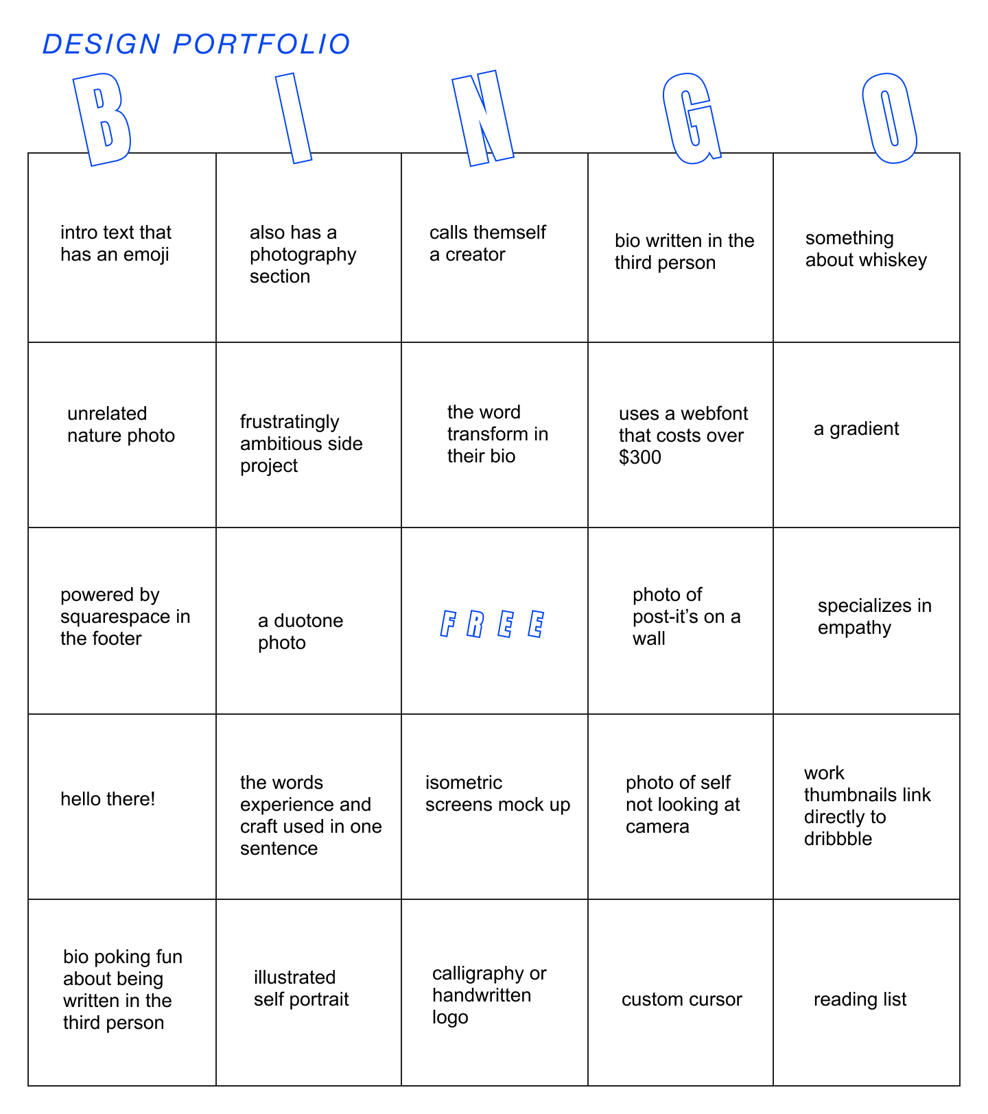
Design Portfolio Bingo
Becc Erickson made a bolshoit bingo pattern for designer portfolios.
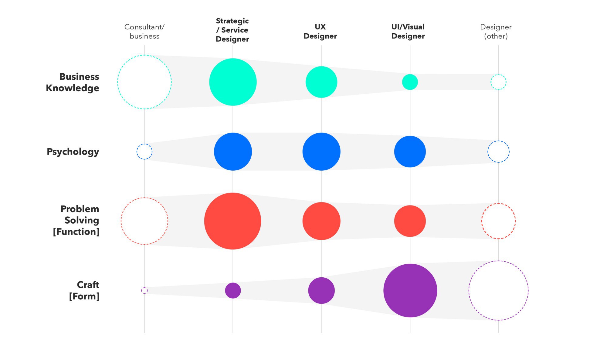
DNA of a Designer
A fun way to describe the skills of a product designer from Anish Joshi.
People and companies in the industry
Pocket design
Pocket design team blog. In the first article, Tony Murphy talks about the goals of product redesign and the design principles that were laid in it.
Subscribe to a digest on Facebook , VKontakte , Telegram or by mail - there fresh links appear every week. Thanks to everyone who shares the links in the group, especially Gennady Dragun, Pavel Skripkin, Dmitry Podluzhny, Anton Artyomov, Denis Efremov, Alexey Kopylov, Taras Brizitsky, Yevgeny Sokolov and Anton Oleynik.