How I created a mood-changing animation using CSS masks
- Transfer
Remember the cartoons that we watched in childhood? At the time, they were the personification of animation. Now animation is not only cartoons, we meet it almost every day, checking the phone or using any device that has a screen.
Today, animation is used not only to attract attention, but also to improve user interaction and ease of navigation. In any good design, the animation is added in such a way that it is combined with the general concept, thereby creating a convenient user interface. In this article, we will create a simple animation of the face with different expressions, and in the process we will learn a little about CSS.

We will use the CSS technique, rarely used by web developers, but to which designers quite often resort. It is called masking.
What comes to mind when you hear the words "mask"? Probably, you presented something that hides the essence. That's all we need to know.
Wait - but the article is about writing and using CSS animation ... No panic! All right!
Suppose we have a tag
Also there is a file

If we apply the CSS property
You might think that this is strange. The face.svg image was placed on top
Let's not go deep. Just keep in mind that you can use
The result will be:

Now add an animation to this empty face. To do this, use the

Now
One of the most important properties of CSS masks is
First position
Now let's animate these expressions when you hover over. The full code that we get after applying the hover pseudo-class will be:
After playing a little more with the properties of CSS, we can do this:
This is one of the methods that can be used to create the most exciting animations that we encounter almost daily.
Masking may not work in all browsers. To make it work in all browsers, simply add special browser labels, such as
You can see the full code on github and codepen . Thank! Hope it was helpful.
Today, animation is used not only to attract attention, but also to improve user interaction and ease of navigation. In any good design, the animation is added in such a way that it is combined with the general concept, thereby creating a convenient user interface. In this article, we will create a simple animation of the face with different expressions, and in the process we will learn a little about CSS.
Let's get started
We will use the CSS technique, rarely used by web developers, but to which designers quite often resort. It is called masking.
What comes to mind when you hear the words "mask"? Probably, you presented something that hides the essence. That's all we need to know.
Wait - but the article is about writing and using CSS animation ... No panic! All right!
Creating a base mask
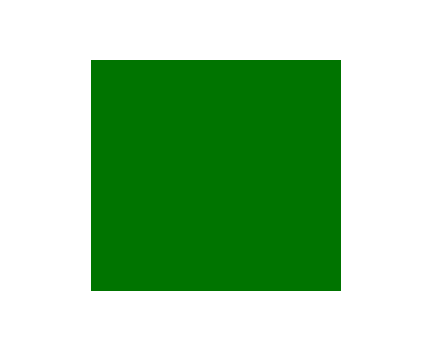
Suppose we have a tag
divwith background: green;and it looks like this: Also there is a file
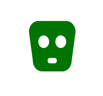
face.svg: If we apply the CSS property
mask-image: url (face.svg);to the tag div, then you will be amazed to see the result: You might think that this is strange. The face.svg image was placed on top
div, but assumed the background color. This is contrary to our expectations. This happens because of a property mask-typethat makes the opaque part of svg transparent. This makes the background color visible. Let's not go deep. Just keep in mind that you can use
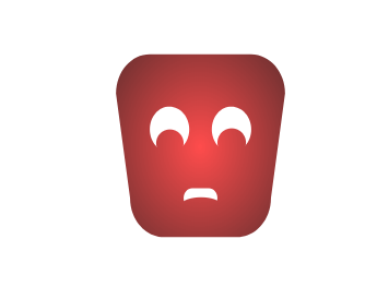
background-colorto change the color of the mask. If you are familiar with different ways of usingbackground-color, you can also apply gradients and write a simple gradient that fills the center with red and radially spreads black around the edges. The code will look like this:background-image: -webkit-radial-gradient( hsla(0, 100%, 50%, .7), hsla(0, 100%, 20%, .8), hsla(0, 100%, 10%, 1));The result will be:
Add animation
Now add an animation to this empty face. To do this, use the
expression.svgone you see in the image below. For simplicity, I created all the svg files of the same width and height, so I don’t have to align the faces and expressions manually. Now
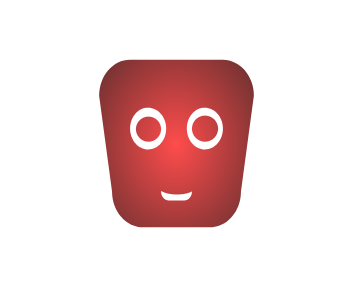
mask-imagehas a cool option that allows you to use multiple images as masks. So we can do this: mask-image: url (face.svg), url (expression.svg);. Here's what happened: One of the most important properties of CSS masks is
mask-positionby which the mask is located in the upper left corner relative to the parent element. And I can arrange several masks using the property mask-positionjust as mask-image. To make a person sad, we use something like this: mask-position: 0 0, 0 12px;. That's what happened. First position
0 0for face.svg, and the second 0 12px- for expression.svg. This led to a transfer of 12px and gave the face the necessary expression.Application of functionality
Now let's animate these expressions when you hover over. The full code that we get after applying the hover pseudo-class will be:
i {
  background-image: -webkit-radial-gradient(hsla(0, 100%, 50%, .7), hsla(0, 100%, 20%, .8) 60%, hsla(0, 100%, 10%, 1));
  mask-image: url('face.svg'), url('expression.svg');
  mask-position: 00, 012px; /* To make the sad expression */transition: mask-position .5s ease-out;
}
i:hover {
  background-image: -webkit-radial-gradient(hsla(120, 100%, 50%, .7), hsla(120, 100%, 20%, .8) 60%, hsla(120, 100%, 10%, 1));
  mask-position: 00, 00; /* To make the happy expression */transition: mask-position .1s linear;
}
After playing a little more with the properties of CSS, we can do this:
This is one of the methods that can be used to create the most exciting animations that we encounter almost daily.
One important note
Masking may not work in all browsers. To make it work in all browsers, simply add special browser labels, such as
-webkit-, -moz-and -0-. You can see the full code on github and codepen . Thank! Hope it was helpful.
Go to VPS.today - a site for searching virtual servers. 1500 tariffs from 130 hosters, convenient interface and a large number of criteria for finding the best virtual server.