 February 24, 2016 at 13:09
Framer Tutorial: Custom device, Input fields, flowing loading and rainbow at the end
In my last article, I talked about how to get started with Framer, create beautiful prototypes by importing layers from Sketch, and also showed how to create nice loading with percentages.
After the article was published on habrahabr - here , I decided to continue my experiments with Framer, simply because I can no longer see my designer everyday life without this fascinating thing.
The aim of the new prototype was again loading , but of a different format, created without importing layers from anything. The prototype serves to illustrate the capabilities of Framer and to describe my experiments with code.
So, here is what we will create in this tutorial:
Three screens of a simple prototype:
Login and password entry
screen Loading
screen Welcome screen You
can see the result here: http://share.framerjs.com/s6q2nzb8xf3f/

We will create all interface elements immediately in Framer (without importing layers from Sketch or Photoshop).
We will complicate the task by trying to create a prototype for a device that is not on the Viewer list in Framer. But first, let's see what devices there are:
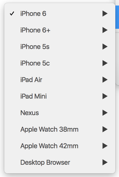
As you can see, there is no Samsung Galaxy Tablet. We will use it.
If accuracy is important for the prototype, then you need to find a picture of the Samsung Galaxy Tablet equal to the natural size of the tablet (2560 * 1600 px).
In this tutorial, the natural sizes are not important, as well as what is shown on the device’s screen.
I used this picture .
Its size (1500 * 1000 px).
We write the parameters:
Screen sizes of 1258 * 784 are suitable for us, since they completely cover what is shown on the screen of the device in the picture.
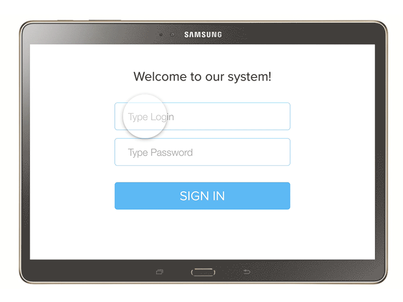
Create a background layer for the “Sign In” screen:
Now, you can draw fields for login, password and the “Sign in” button on this layer.
In order to enter the password and login in the fields, you need to download the InputField.coffee module. I used the module created by Jordan Robert Dobson. You can download it here .
After loading, go to the “modules,” folder, copy the InputField.coffee file and paste it into the “modules” folder of your project.

In Framer, write:
Now, we can create input fields. Let's start with the password field, as this field will be located in the center of the screen:
In the parameters, we, in addition to the main characteristics, also described what should be displayed in the field when we put the cursor there - in this case, just asterisks: placeHolderFocus: “********”
Next, write the login field parameters:
As you can see, we set this field to y = Password.y - 130, that is 130 px above the Password field and aligned it with the X coordinate in the center.
Now create a button that will be below the Password field by 160 px:
Let's write the title of this screen. For example, the phrase “Welcome to our system!” .
In order not to set a specific state for the header in the future, we can set a parent layer for it - superLayer. It will be, for example, the Password field. Now, the header will change state along with its parent layer - the Password field.
Since we can already enter our username and password into the fields, it is time to click on the “Sign in” button. Let's make a hover for her.
In the hover state, the button and the inscription on it will change color and slightly increase in size. To make the color change smoothly, first set the button to the transition and spring curve style:
Now, you can record the onMouseOver event:
In order for the button to return to its original state, when we move the mouse away from it, we need to create the inverse onMouseOut event:
The first screen is ready.
The next boot screen will appear after we click on the button.
First of all, we need to remove the login and password screen. Let it move left when you click on the button. We set states for screen elements.
Now all the elements have a new state - their position is shifted to the left by 2000 px from the original. As you can see, we do not set a separate state for the Text layer - since it will move along with its parent element - the signInBackground layer.
Create an event - click on the button:
Here we also wrote the time with which each element will change its state, and also set a curve for these changes.
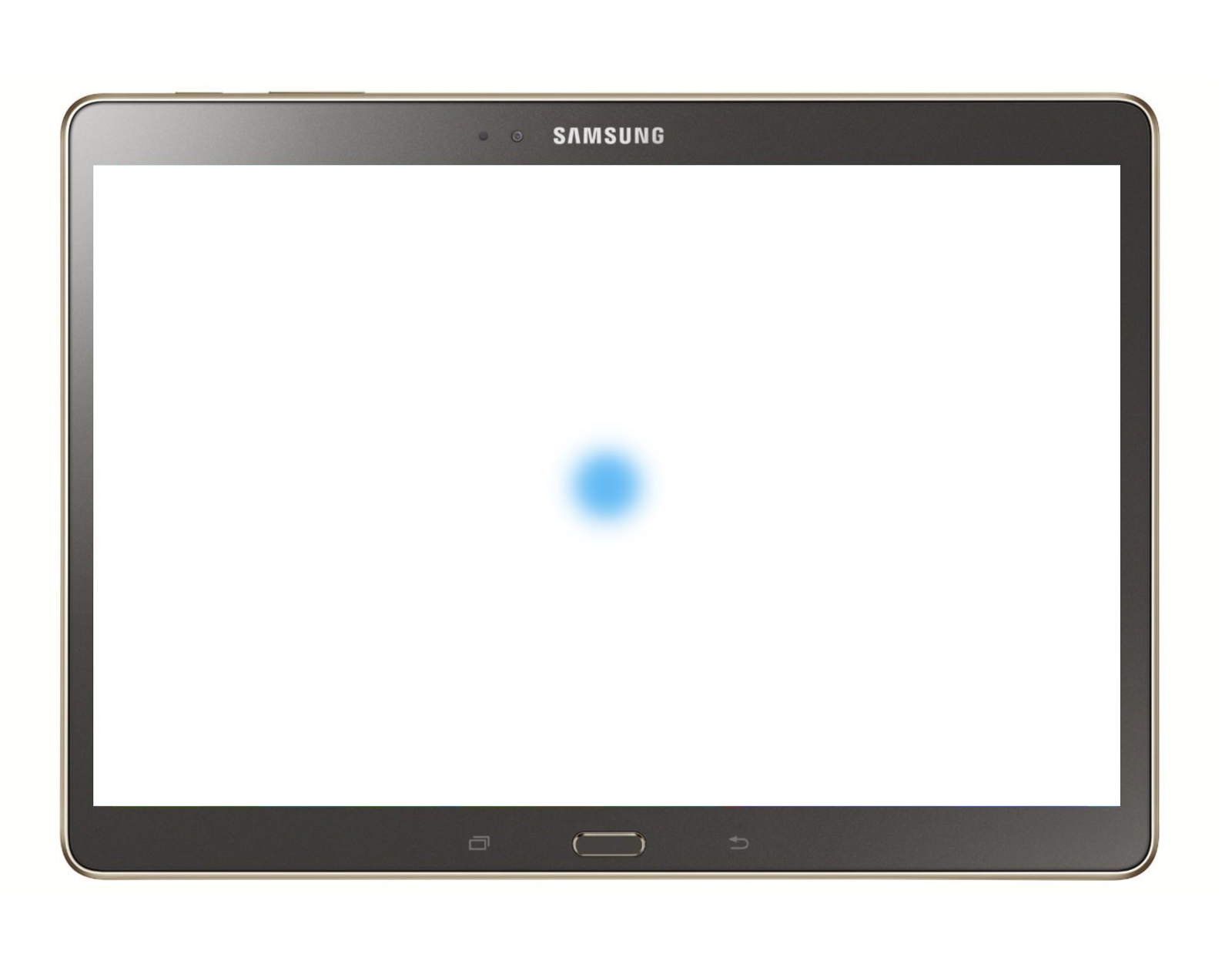
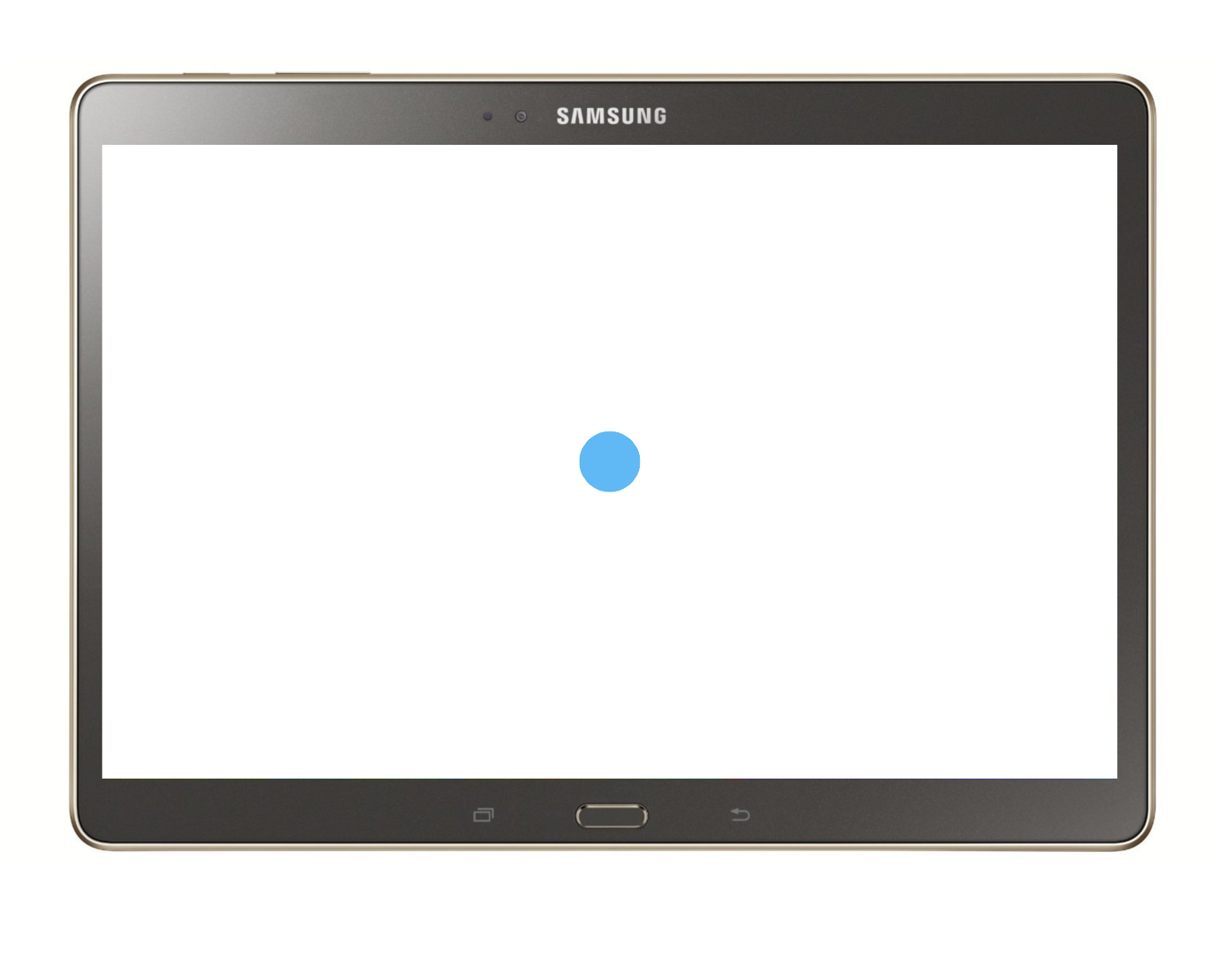
We begin to create a loading screen. We will need 2 background layers. We will make the first blue, the second white.
And for the second layer we will make the first layer parent.
Let us set the blending mode to the second layer - the screen (mixBlendMode: “screen”).
We draw 4 absolutely identical circles (0, 1, 2, 3, 4) with exactly the same position in the center of the screen. In order not to draw each separately, we simplify our task by creating an array.
Let's make the backgroundLayer layer the parent layer for them. Since this layer has a different overlay mode (screen) and for it the parent layer is the loadColor layer of blue color, the circles turned blue, although we set them backgroundColor: “black”.
For example, if we write “red” instead of “black,” they will turn pink.
We also made the circles blurry (blur: 20) so that they smoothly flow one into the other.
But here the question arises, how to make sure that they flow one into another, but at the same time do not look blurry.
Everything is solved simply. We return above to the place where the backgroundLayer was described and add another line - we set a strong contrast:
Now, the circle looks like a circle, not a blurry spot.
Let's make the circles move. To do this, create animations.
There will be 2 - for the first and second circles, and the circle 0 and 3 do not move.
Here, the first circle (circles [1]) is 180 px apart from the zero circle in the x coordinate - x: circles [0] .x - 180. The second circle, respectively, is 90 px.
We created a movement in one direction - to the left, now we will create the same movement to the right.
We return to our event - click on the “Sign In” button and add our new animations there:
As you can see, between each movement of the circles, we give a delay of 0.1 seconds (Utils.delay .1). The movement to the right side occurs after the movement to the left ends. Therefore, we wrote load2.on Events.AnimationEnd, -> ... .. which means
when load2 ends, load11 and load22 begin.
To ensure that the animation lasts forever, close the loop, adding below:
The second screen is ready.
Getting to the 3 screen with a greeting and a color change.
Create an animation for circle 0, in which it will expand to full screen:
Now, we add the start of this animation below in the event by clicking on the button, making a delay of 2 before it:
Draw an invisible TextFinish layer, which is the word “Hello!”:
Add 3 states to it (one in which it becomes visible, and the other 2, where the word Hello changes to Hello and Вітаю):
We add the change of states of the TextFinish layer to the click event of a button. Now the whole event looks like this:
There is only one missing, the last line - the background color change. To add it, add two states to the loadColor layer:
And add to the event:
Done!
I hope that my story has shed light on what cool things every designer can create thanks to Framer. I am pleased to listen to your thoughts about Framer, and in general, do you think - is it time for us to start coding for designers?
This is where I end, but I will continue to write articles on useful materials on design prototyping - programming.
After the article was published on habrahabr - here , I decided to continue my experiments with Framer, simply because I can no longer see my designer everyday life without this fascinating thing.
The aim of the new prototype was again loading , but of a different format, created without importing layers from anything. The prototype serves to illustrate the capabilities of Framer and to describe my experiments with code.
So, here is what we will create in this tutorial:
Three screens of a simple prototype:
Login and password entry
screen Loading
screen Welcome screen You
can see the result here: http://share.framerjs.com/s6q2nzb8xf3f/
We will create all interface elements immediately in Framer (without importing layers from Sketch or Photoshop).
We will complicate the task by trying to create a prototype for a device that is not on the Viewer list in Framer. But first, let's see what devices there are:
As you can see, there is no Samsung Galaxy Tablet. We will use it.
If accuracy is important for the prototype, then you need to find a picture of the Samsung Galaxy Tablet equal to the natural size of the tablet (2560 * 1600 px).
In this tutorial, the natural sizes are not important, as well as what is shown on the device’s screen.
I used this picture .
Its size (1500 * 1000 px).
We write the parameters:
Framer.DeviceView.Devices["custom"] =
"deviceType": "tablet"
"screenWidth": 1258
"screenHeight": 784
"deviceImage":"http://www.androidheadlines.com/wp-content/uploads/2014/09/81WUwHeaVKL._SL1500_.jpg"
"deviceImageWidth": 1500
"deviceImageHeight": 1000
Framer.Device.deviceType = "custom"
Screen sizes of 1258 * 784 are suitable for us, since they completely cover what is shown on the screen of the device in the picture.
Create a background layer for the “Sign In” screen:
Framer.DeviceView.Devices["custom"] =
"deviceType": "tablet"
"screenWidth": 1258
"screenHeight": 784
"deviceImage":"http://www.androidheadlines.com/wp-content/uploads/2014/09/81WUwHeaVKL._SL1500_.jpg"
"deviceImageWidth": 1500
"deviceImageHeight": 1000
Framer.Device.deviceType = "custom"
Now, you can draw fields for login, password and the “Sign in” button on this layer.
In order to enter the password and login in the fields, you need to download the InputField.coffee module. I used the module created by Jordan Robert Dobson. You can download it here .
After loading, go to the “modules,” folder, copy the InputField.coffee file and paste it into the “modules” folder of your project.
In Framer, write:
Framer.DeviceView.Devices["custom"] =
"deviceType": "tablet"
"screenWidth": 1258
"screenHeight": 784
"deviceImage":"http://www.androidheadlines.com/wp-content/uploads/2014/09/81WUwHeaVKL._SL1500_.jpg"
"deviceImageWidth": 1500
"deviceImageHeight": 1000
Framer.Device.deviceType = "custom"
Now, we can create input fields. Let's start with the password field, as this field will be located in the center of the screen:
Password = new InputField
  width: 640
  height: 100
  color: "#212121"
  backgroundColor: "#fff"
  borderWidth: 1
  borderColor: "#60B9F4"
  borderRadius: 10
  fontSize: 36
  fontFamily: "Proxima Nova"
  indent:   48
  placeHolder: "Type Password"
  placeHolderFocus: "********"
Password.center()
In the parameters, we, in addition to the main characteristics, also described what should be displayed in the field when we put the cursor there - in this case, just asterisks: placeHolderFocus: “********”
Next, write the login field parameters:
Login = new InputField
  width: 640
  height: 100
  color: "#212121"
  y: Password.y - 130
  backgroundColor: "#fff"
  borderWidth: 1
  borderColor: "#60B9F4"
  borderRadius: 10
  fontSize: 36
  fontFamily: "Proxima Nova"
  indent:   48
  placeHolder: "Type Login"
  placeHolderFocus: "example@gmail.com"
Login.centerX()
As you can see, we set this field to y = Password.y - 130, that is 130 px above the Password field and aligned it with the X coordinate in the center.
Now create a button that will be below the Password field by 160 px:
Button = new Layer
   width: 640
   height: 100
   borderWidth: 1
   borderColor: "#60B9F4"
   borderRadius: 10
   html: "SIGN IN"
   backgroundColor: "#60B9F4"
   y: Password.y + 160
Button.centerX()
Button.style.color = "#fff"
Button.style.fontSize = "48px"
Button.style.fontFamily = "Proxima Nova"
Button.style.lineHeight = "100px"
Button.style.textAlign = "center"
Let's write the title of this screen. For example, the phrase “Welcome to our system!” .
In order not to set a specific state for the header in the future, we can set a parent layer for it - superLayer. It will be, for example, the Password field. Now, the header will change state along with its parent layer - the Password field.
Text = new Layer
   backgroundColor: null
   width: 640
   html: "Welcome to our system!"
   color: "#212121"
   superLayer: Password
   y: - 240
Text.centerX()
Text.style.fontSize = "48px"
Text.style.fontFamily = "Proxima Nova"
Text.style.textAlign = "center"
Since we can already enter our username and password into the fields, it is time to click on the “Sign in” button. Let's make a hover for her.
In the hover state, the button and the inscription on it will change color and slightly increase in size. To make the color change smoothly, first set the button to the transition and spring curve style:
Button.style.transition = "background-color 1s ease"
Button.states.animationOptions = curve: "spring(600,60,0)"
Now, you can record the onMouseOver event:
Button.onMouseOver ->
 Button.style.backgroundColor = "white"
 Button.style.color = "#60B9F4"
 Button.scale = 1.05
In order for the button to return to its original state, when we move the mouse away from it, we need to create the inverse onMouseOut event:
Button.onMouseOut ->
 Button.style.backgroundColor = "#60B9F4"
 Button.style.color = "white"
 Button.scale = 1
The first screen is ready.
The next boot screen will appear after we click on the button.
First of all, we need to remove the login and password screen. Let it move left when you click on the button. We set states for screen elements.
signInBackground.states.add
   Pressed:
      x: -2000
Button.states.add
    Pressed:
      x: -2000
Login.states.add
   Pressed:
      x: -2000
Password.states.add
   Pressed:
      x: -2000
Now all the elements have a new state - their position is shifted to the left by 2000 px from the original. As you can see, we do not set a separate state for the Text layer - since it will move along with its parent element - the signInBackground layer.
Create an event - click on the button:
Button.on Events.Click, ->
 Button.states.switch("Pressed", time: .4, curve: "easy out")
 Password.states.switch("Pressed", time: .4, curve: "easy")
 Login.states.switch("Pressed", time: .4, curve: "easy")
 signInBackground.states.switch("Pressed", time: 1, curve: "easy out")
Here we also wrote the time with which each element will change its state, and also set a curve for these changes.
We begin to create a loading screen. We will need 2 background layers. We will make the first blue, the second white.
And for the second layer we will make the first layer parent.
Let us set the blending mode to the second layer - the screen (mixBlendMode: “screen”).
loadColor = new BackgroundLayer
   backgroundColor: "#60B9F4"
backgroundLayer = new BackgroundLayer
   backgroundColor: "#fff"
   style: mixBlendMode : "screen"
   superLayer: loadColor
We draw 4 absolutely identical circles (0, 1, 2, 3, 4) with exactly the same position in the center of the screen. In order not to draw each separately, we simplify our task by creating an array.
circles = []
for i in [0..3]
 circle = new Layer
  backgroundColor: "black"
  superLayer: backgroundLayer
  borderRadius: 100
  width: 50
  height: 50
  blur: 20
  name: "circle #{i}"
 circle.center()
 circles.push(circle)
Let's make the backgroundLayer layer the parent layer for them. Since this layer has a different overlay mode (screen) and for it the parent layer is the loadColor layer of blue color, the circles turned blue, although we set them backgroundColor: “black”.
For example, if we write “red” instead of “black,” they will turn pink.
We also made the circles blurry (blur: 20) so that they smoothly flow one into the other.
But here the question arises, how to make sure that they flow one into another, but at the same time do not look blurry.
Everything is solved simply. We return above to the place where the backgroundLayer was described and add another line - we set a strong contrast:
backgroundLayer = new BackgroundLayer
   backgroundColor: "#fff"
   style: mixBlendMode : "screen"
   superLayer: loadColor
   contrast: 10000
Now, the circle looks like a circle, not a blurry spot.
Let's make the circles move. To do this, create animations.
There will be 2 - for the first and second circles, and the circle 0 and 3 do not move.
load1 = new Animation
   layer: circles[1]
   properties:
         x: circles[0].x - 180
    time: .7
    curve: "easy"
load2 = new Animation
   layer: circles[2]
   properties:
         x: circles[0].x - 90
    time: .7
    curve: "easy"
Here, the first circle (circles [1]) is 180 px apart from the zero circle in the x coordinate - x: circles [0] .x - 180. The second circle, respectively, is 90 px.
We created a movement in one direction - to the left, now we will create the same movement to the right.
load11 = new Animation
   layer: circles[1]
   properties:
         x: circles[0].x + 180
    time: .7
    curve: "easy"
load22 = new Animation
   layer: circles[2]
   properties:
         x: circles[0].x + 90
    time: .7
    curve: "easy"
We return to our event - click on the “Sign In” button and add our new animations there:
Button.on Events.Click, ->
 Button.states.switch("Pressed", time: .4, curve: "easy out")
 Password.states.switch("Pressed", time: .4, curve: "easy")
 Login.states.switch("Pressed", time: .4, curve: "easy")
 signInBackground.states.switch("Pressed", time: 1, curve: "easy out")
 load1.start()
 Utils.delay .1, ->
 load2.start()
 Utils.delay .1, ->
load2.on Events.AnimationEnd, ->
    load11.start()
    Utils.delay .1, ->
    load22.start()
    Utils.delay .1, ->
As you can see, between each movement of the circles, we give a delay of 0.1 seconds (Utils.delay .1). The movement to the right side occurs after the movement to the left ends. Therefore, we wrote load2.on Events.AnimationEnd, -> ... .. which means
when load2 ends, load11 and load22 begin.
To ensure that the animation lasts forever, close the loop, adding below:
load22.on Events.AnimationEnd, ->
 load1.start()
 Utils.delay .1, ->
 load2.start()
 Utils.delay .1, ->
The second screen is ready.
Getting to the 3 screen with a greeting and a color change.
Create an animation for circle 0, in which it will expand to full screen:
big = new Animation
   layer: circles[0]
   properties:
      borderRadius: 0
      width: backgroundLayer.width
      height: backgroundLayer.height
      y:0
      x: 0
      blur: 0
      curve: "spring(300, 30, 0)"
Now, we add the start of this animation below in the event by clicking on the button, making a delay of 2 before it:
Utils.delay 2, ->
    big.start()
Draw an invisible TextFinish layer, which is the word “Hello!”:
TextFinish = new Layer
   backgroundColor: null
   width: 640
   y: 300
   opacity: 0
   html: "Hello!"
   color: "#fff"
TextFinish.centerX()
TextFinish.style.fontSize = "148px"
TextFinish.style.fontFamily = "Proxima Nova"
TextFinish.style.textAlign = "center"
TextFinish.style.lineHeight = "154px"
Add 3 states to it (one in which it becomes visible, and the other 2, where the word Hello changes to Hello and Вітаю):
TextFinish.states.add
   activate:
      opacity:1
   nactivate:
      html: "Привет!"
   oactivate:
      html: "Вітаю!"
TextFinish.states.animationOptions = time: .6, curve: "easy out"
We add the change of states of the TextFinish layer to the click event of a button. Now the whole event looks like this:
Button.on Events.Click, ->
 Button.states.switch("Pressed", time: .4, curve: "easy out")
 Password.states.switch("Pressed", time: .4, curve: "easy")
 Login.states.switch("Pressed", time: .4, curve: "easy")
 signInBackground.states.switch("Pressed", time: 1, curve: "easy out")
 load1.start()
 Utils.delay .1, ->
 load2.start()
 Utils.delay .1, ->
load2.on Events.AnimationEnd, ->
    load11.start()
    Utils.delay .1, ->
    load22.start()
    Utils.delay .1, ->
load22.on Events.AnimationEnd, ->
 load1.start()
 Utils.delay .1, ->
 load2.start()
 Utils.delay .1, ->
 Utils.delay 2, ->
    big.start()
    TextFinish.states.next()
There is only one missing, the last line - the background color change. To add it, add two states to the loadColor layer:
loadColor.states.add
   active:
      backgroundColor: "#f87b36"
   nactivate:
      backgroundColor: "#fa635f"
loadColor.states.animationOptions = time: .6, curve: "easy"
And add to the event:
loadColor.states.next()
Done!
I hope that my story has shed light on what cool things every designer can create thanks to Framer. I am pleased to listen to your thoughts about Framer, and in general, do you think - is it time for us to start coding for designers?
This is where I end, but I will continue to write articles on useful materials on design prototyping - programming.