Cities and their “big data”
What are the "big data" of the city? How to present them visually and - more importantly - how to make life of citizens better through them?
We talked about this with Andrei Karmatsky , CEO of Urbica . The company specializes in the visualization of urban data. Among its projects are a map redesign for MAPS.ME, interactive visualization of travel statistics for Velobike and visualization for the launch of the Magistral land transport system.
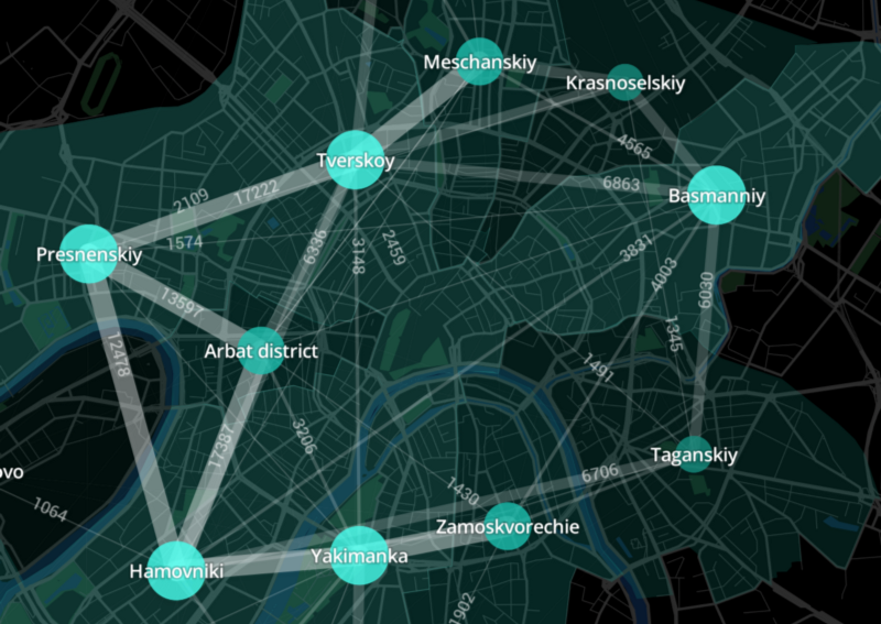
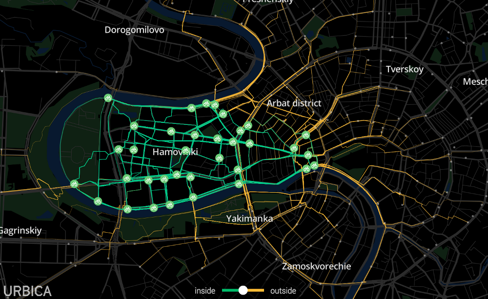
Bicycle traffic between areas in the center of Moscow. Source of images - Urbika blog on Medium

In many of its projects, Urbica tracks the movement of people inside the city. What kind of data do you use?
We do not collect data on our own. For each project, we use customer data or organize their collection (for example, field studies and observations on the street to validate the data).
To visualize trips to Yandex.Taxi, we used data on taxi movements, for Velobayk we used anonymized data on the movements of service users, for transport planning of the network of land transport routes Magistral — data on passenger movements on transport, data of mobile operators, telemetry data of vehicle movements (all buses, trolley buses and trams are equipped with GLONASS sensors).
Naturally, the data transmitted to us is already aggregated and does not violate the legislation on personal data.
How does the predictive system for Velobike controllers work? What methods in it are used for calculations?
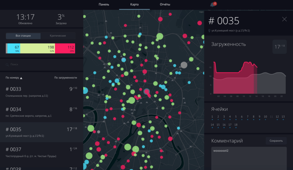
To create a model for predicting the demand for bicycles, we used station load statistics (how many bicycles are available) for all previous seasons, classified areas of the city according to signs of changes in population density and jobs on different days of the week and time of day, took into account the terrain (it greatly affects the balance of shipments -the arrival of cyclists at the station). The predictive model uses the XGBoost method and gives the predicted value of the station load (potential demand) one hour in advance — it is during this time interval that the driver can come to the station and pick up or bring the bikes.
To communicate with the system, the drivers had to use the chat bot in the Telegram. Did you have to change the way of communication due to blocking?
We planned to introduce a chat bot for the drivers of the system this summer in order not to involve the dispatcher in this process, since the model in most cases does not require human participation. Unfortunately, due to the blocking this spring, the chat bot was not implemented.
What other city data makes sense to run through similar algorithms? Where will it bring the greatest benefits?
It seems that this particular model can only be applied to bicycle rental stations, however there are many interesting problems in the city where data analytics could help. For example, it seems to us an interesting task to identify non-optimal routes of land transport and create a more efficient network of routes.
Let's talk about the design component of your work. What are the current trends in data visualization? What is the design looks like outdated?
The question is probably not about the design, but rather about the convenience and information. Analytical interfaces, where visualization is needed, first of all solve applied tasks, and the main purpose of interface design with large data arrays is to create convenient tools for solving the problem.
Being engaged in data visualization, it is very easy to forget about the original task and get carried away by the visualization process itself. Many good projects with urban data should be perceived as data art, this is another way and the purpose of visualization is different.
Evaluate the work of colleagues: what cool projects in your area have come out lately?
We really like the work of colleagues from the Uber visualization team. They created their own data visualization tool Kepler.GL , made it available to all users and published its code in open-source.
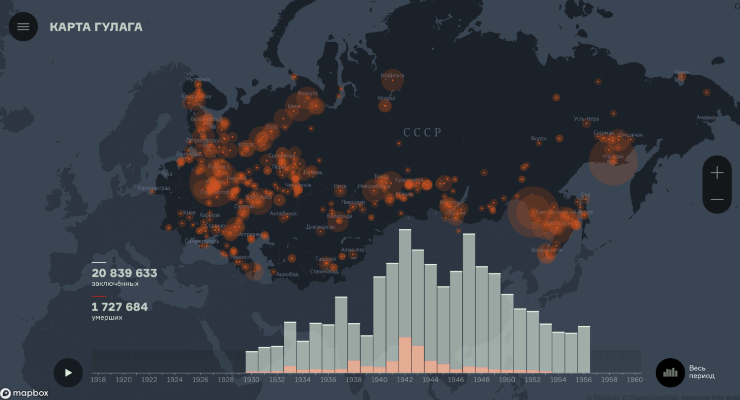
Drawing up an interactive map of the Gulag took two years. See. Gulagmap.ru
Among all your projects, and thematically, and by the amount of time spent, the project with an interactive map of the GULAG stands out. What was the difference in the process of working on it?
Work for the State Museum of History of the Gulag to create an interactive map of the camps is very important to us. The end user of this card or the museum visitor (in December this card will be presented in the updated exposition) looks at the card and sees only the time slider and the statistics of the number of prisoners changing over the years. This is the topmost layer of the project. To create this interface, it was necessary to collect a large amount of data that until now existed only on paper. Together with the scientific department of the museum, we developed a special database and data collection tools to transfer bits of information from the archives to the map. This project is also important in social terms - in this way we can draw attention to the history of our country. About such terrible things as the Gulag need to know, they can not be forgotten.
What changes has the project undergone from the first version to the final one?
The interface of the card and the style, perhaps, changed slightly. We created a prototype and iteratively developed an interface for users. But the internal content of the project has changed greatly - the first version did not assume a system for filling data into the database. In the course of the project, we, together with the museum, studied, learned new needs and opportunities to improve the map’s “filling”.
For this map you have developed your own component, React Map GL. How is it better than ready-made solutions?
We are actively using technology from the company Mapbox, it provides the best, in my opinion, tools for developers of cartographic projects. In this case, we use React.js on the frontend. We studied the existing Mapbox map solutions in React.js and realized that we need our own component.
Approximately the same happened with the project of data visualization of the study of urban agglomerations: we saw that we did not like the existing ready-made solutions and developed our own vector tile server , which we will demonstrate at AI Conference .
What technologies do you most often use in your work?
As already said, for React / Redux front-end development, Node.js / Rust / Python for backend, Pyhton for data analytics, PostgreSQL / PostGIS for data analytics and geoprocessing. Probably, there are no super-exotic technologies.
What is most important for you in your work? What global problem are you trying to solve?
The most important thing is to carry value and see the results of your work in the urban space around us: a museum, bike rental or public transport. The basic idea of creating “Urbika” has remained unchanged - we make interfaces in which complex arrays of data become clear and easy to understand.
We talked about this with Andrei Karmatsky , CEO of Urbica . The company specializes in the visualization of urban data. Among its projects are a map redesign for MAPS.ME, interactive visualization of travel statistics for Velobike and visualization for the launch of the Magistral land transport system.

Bicycle traffic between areas in the center of Moscow. Source of images - Urbika blog on Medium

In many of its projects, Urbica tracks the movement of people inside the city. What kind of data do you use?
We do not collect data on our own. For each project, we use customer data or organize their collection (for example, field studies and observations on the street to validate the data).
To visualize trips to Yandex.Taxi, we used data on taxi movements, for Velobayk we used anonymized data on the movements of service users, for transport planning of the network of land transport routes Magistral — data on passenger movements on transport, data of mobile operators, telemetry data of vehicle movements (all buses, trolley buses and trams are equipped with GLONASS sensors).
Naturally, the data transmitted to us is already aggregated and does not violate the legislation on personal data.
Interactive map lives at urbica.co/bikes.
Our story with “Velobike” began with a visualization of the movement of bicycles at the end of the season for a stand at the Moscow Urban Forum. These visualizations were also used for the Afisha special project online.
Having visualized the data, we found a lot of interesting things: we clearly showed the difference between the scenarios for the use of rental bicycles at different rates, at different times of the day, in different areas of the city. Simply put, data visualization (up to this point all analytics was from “Velobike” was in Excel) allowed to see the difference between the rental station in the city center, and, for example, near Bitsevsky Park - these are completely different scenarios for using the bike, and, as a result , different demand patterns.
Among the curious observations in the data, we saw a problem that can be solved with the help of analytics. The demand for bike rental stations is uneven. This means that you can come to the station and not find free bikes or not find free space to park an already rented bike. Velobike solves this problem with a small truck fleet that rebalances the rental system between 450 stations. We decided to develop a demand prediction system and implement this system in the driver dispatching process in order to improve urban rental service and optimize maintenance costs.
How does the predictive system for Velobike controllers work? What methods in it are used for calculations?
To create a model for predicting the demand for bicycles, we used station load statistics (how many bicycles are available) for all previous seasons, classified areas of the city according to signs of changes in population density and jobs on different days of the week and time of day, took into account the terrain (it greatly affects the balance of shipments -the arrival of cyclists at the station). The predictive model uses the XGBoost method and gives the predicted value of the station load (potential demand) one hour in advance — it is during this time interval that the driver can come to the station and pick up or bring the bikes.
To communicate with the system, the drivers had to use the chat bot in the Telegram. Did you have to change the way of communication due to blocking?
We planned to introduce a chat bot for the drivers of the system this summer in order not to involve the dispatcher in this process, since the model in most cases does not require human participation. Unfortunately, due to the blocking this spring, the chat bot was not implemented.
What other city data makes sense to run through similar algorithms? Where will it bring the greatest benefits?
It seems that this particular model can only be applied to bicycle rental stations, however there are many interesting problems in the city where data analytics could help. For example, it seems to us an interesting task to identify non-optimal routes of land transport and create a more efficient network of routes.
General interface of the dispatching
company Urbica is one of the exhibitors of the AI Conference:
“We will show the tools and visualization technologies for large data arrays that we developed and use in our company. This will be interesting for companies that have the task of analyzing large amounts of information. ”
Let's talk about the design component of your work. What are the current trends in data visualization? What is the design looks like outdated?
The question is probably not about the design, but rather about the convenience and information. Analytical interfaces, where visualization is needed, first of all solve applied tasks, and the main purpose of interface design with large data arrays is to create convenient tools for solving the problem.
Being engaged in data visualization, it is very easy to forget about the original task and get carried away by the visualization process itself. Many good projects with urban data should be perceived as data art, this is another way and the purpose of visualization is different.
Evaluate the work of colleagues: what cool projects in your area have come out lately?
We really like the work of colleagues from the Uber visualization team. They created their own data visualization tool Kepler.GL , made it available to all users and published its code in open-source.

Drawing up an interactive map of the Gulag took two years. See. Gulagmap.ru
Among all your projects, and thematically, and by the amount of time spent, the project with an interactive map of the GULAG stands out. What was the difference in the process of working on it?
Work for the State Museum of History of the Gulag to create an interactive map of the camps is very important to us. The end user of this card or the museum visitor (in December this card will be presented in the updated exposition) looks at the card and sees only the time slider and the statistics of the number of prisoners changing over the years. This is the topmost layer of the project. To create this interface, it was necessary to collect a large amount of data that until now existed only on paper. Together with the scientific department of the museum, we developed a special database and data collection tools to transfer bits of information from the archives to the map. This project is also important in social terms - in this way we can draw attention to the history of our country. About such terrible things as the Gulag need to know, they can not be forgotten.
What changes has the project undergone from the first version to the final one?
The interface of the card and the style, perhaps, changed slightly. We created a prototype and iteratively developed an interface for users. But the internal content of the project has changed greatly - the first version did not assume a system for filling data into the database. In the course of the project, we, together with the museum, studied, learned new needs and opportunities to improve the map’s “filling”.
For this map you have developed your own component, React Map GL. How is it better than ready-made solutions?
We are actively using technology from the company Mapbox, it provides the best, in my opinion, tools for developers of cartographic projects. In this case, we use React.js on the frontend. We studied the existing Mapbox map solutions in React.js and realized that we need our own component.
Approximately the same happened with the project of data visualization of the study of urban agglomerations: we saw that we did not like the existing ready-made solutions and developed our own vector tile server , which we will demonstrate at AI Conference .
What technologies do you most often use in your work?
As already said, for React / Redux front-end development, Node.js / Rust / Python for backend, Pyhton for data analytics, PostgreSQL / PostGIS for data analytics and geoprocessing. Probably, there are no super-exotic technologies.
What is most important for you in your work? What global problem are you trying to solve?
The most important thing is to carry value and see the results of your work in the urban space around us: a museum, bike rental or public transport. The basic idea of creating “Urbika” has remained unchanged - we make interfaces in which complex arrays of data become clear and easy to understand.

