 September 9, 2015 at 00:18
Adaptive scaling: design of online stores for large screens
I bring to your attention a translation of the article " Responsive Upscaling: Large-Screen E-Commerce Design " by Christian Holst.
For a long time, most of the thoughts about responsive design have not gone beyond designing the transition between mobile and desktop interfaces. It's time to pay a little attention to the possibilities of expanding these boundaries beyond the standard desktop screen to create an interface that matches modern wide screens . Take a look at this:
Based on these statistics, we can say that designing a special interface for users with large screens is worth the effort. In fact, the design for large screens can be the next trend in the responsive design of online stores.
In this article, we will explore how online store designers can use adaptive scaling to design an interface specifically for users with large screens. We will learn one basic principle, and with it 11 ideas on how to adapt various elements of the online store interface. Using these ideas, we can solve some of the interaction problems that we observed in the course of our research. This article was originally published by the Baymard Institute.
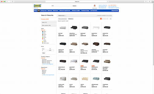
Many commercial sites do not use white space on large screens. Result: often a lot of white space is surrounded by fairly truncated search results. ( Enlarge image )
Notice the white space surrounding the rather trimmed IKEA search results. In the process of our study of the list of products in the online store, it became clear that in the niche of products selected by aesthetic characteristics, like home decor, users need large previews in order to evaluate the product correctly. Removing free space using it is one of the many “adaptive scaling” ideas for online stores that you should pay attention to.
The empty space that appeared mainly due to the large screen, as a ruleIt remains unused and is displayed as a wide sea of white if the original content of the page is trimmed to a narrow design oriented to the laptop screen. At a minimum, there should be a little more air in the content, there should be a little empty space between the elements on monitors with a large diagonal.
In addition, in "adaptive scaling" you can go much further, improving the user interface with a large screen. You can use white space to enlarge images, add product columns, better show page context and simplify access to contextual operations (filter, sorting, “Add to Cart”, etc.).
There are two main ways to get rid of empty space: place additional content on the page (i.e. content that is displayed only at high resolutions) and show the current content in a different form (i.e. move elements, change their format, enlarge, etc. .d.).
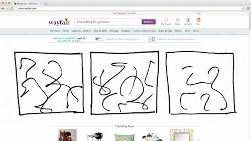
You will notice that all the examples in this article illustrate how the current content can be shown differently.(sometimes fundamentally different). The reason is that adding completely new content that will only be displayed at wide resolutions is, in most cases, not a good idea. Of course, there are exceptions, but, in general, if the content is not important enough to show it in a "standard" desktop form, then most likely it is not important enough to display on large screens. Show the same content on all devices, but pack it differently. ( Enlarge image ) Having a large screen does not mean that the user suddenly wants to get a cropped page that is difficult to view. Similarly, having a smaller screen does not mean

that the user will not need any information that has been seen on the site earlier. Therefore, show the same content, but “pack” it differently, so that it is suitable for display on a large screen.
In no case should important content be added to the page simply because there is room for it on the page. In the same way, important content should not be trimmed just because screen space is limited (see the test results “ How should your mobile and desktop sites differ? ” That describes this principle). The only case when new content can be added on the big screen is if this content makes sense only on the big screen, but on ordinary ones it is not needed.
The universal rule: the emergence of new content at wide resolution is an alarming bell . In some cases, this may be justified, but, basically, the content will be either too unimportant to display on the standard screen, and then you need to exclude it from the advanced version, or it will be really important, and then it needs to be shown regardless of size screen. It is clear that important content can be represented differently in the available space, but this content must be present in one form or another in all versions of the design.
Keeping in mind the rule of content immutability described above, we’ll look at some of the many adaptive scaling paths that can work for online stores.
All the following examples will be shown with the help of sketches superimposed on screenshots of Wayfair.com. At the moment, the desktop design of Wayfair.com does not adapt at all (that is, the pages do not scale and the layout does not change when the browser window is resized), neither to the right nor to the left - the page width remains fixed regardless of the size of the visible area of the screen. However, this is a good example to show how different types of pages of an online store can be adapted to large screens.
In real life, other elements on the page are likely to be rebuilt and possibly scaled (especially elements such as the header and footer). But for our sketchy illustrations it will be enough to move them a little. These examples serve as inspiration . Some may seem more appropriate to you than others, depending on your niche and field of activity.
The authorization window can be made less intrusive on the big screen if you refuse the modal display and instead fix the form in the visible part of the page. Then the form will not be so striking, as it will stop blocking the entire page. This will remain noticeable, since it will appear at the top of the page immediately after loading (over the main layer). The window with the authorization form is embedded as the contents of the column on top of the main layer. ( Enlarge image ) Thus, it will be easier for users who do not want to be authorized to ignore
form, because it no longer needs to be turned off specifically. At the same time, in our usability studies, most respondents simply closed the standard dialog boxes without even reading, and often ranked them as “pop-ups” (see the article “ Avoid these 5 types of graphics for online stores ”). This is a bit of selective blindness. Such people may have a greater desire to look at the authorization form if it is not displayed modally, but inside the main column on top of the content. Looking at an element, they do not have to spend all their attention on finding how to turn it off.
The most popular links from the heading (for example, My Account or placing an order for an authorized user) and from the basement (service and questions) can be shown in the block on the main page, if there is space. Of course, links should remain available in the same place in the header menu and sections of the basement. On the big screen, these links can simply be duplicated on the main page. Popular links from the header and footer are displayed as quick links in the block on the main page. ( Enlarge image ) This is a good example of content that remains accessible on the page but displays differently.
This is not new content, just the current content began to be displayed differently, especially for users with large screens. Specifically, in this example, quick links should be a little muffled so as not to draw attention from the main content.
The carousel on the main page has many interface problems, and it is always necessary to implement it with great care (see eight requirements for the carousel obtained in the course of our research). On the big screen, the carousel, of course, can simply be increased, thereby increasing the entire functionality of the slide show. However, if the slides are square or even with a vertical orientation, their enlarged carousel can lower the rest of the content beyond the border of the visible area - on the main page you will see less, although the visible area has become larger! The solution is to replace the carousel with a series of two or three slides in a row, which are displayed simultaneously. Slides in the carousel are replaced with a series of regular slides. ( Enlarge image )
If the total number of slides corresponds to the number of columns, then problems with the functional features of the carousel can be avoided by using a static layout of slides in several columns. If there are more slides than columns, then of course you have to leave the carousel or add new rows.
After the user has added the product to the basket, most owners of online stores hope for one of two things: the user goes to look for other products to add to the basket, or places an order for goods in the basket. If the user is looking for other products, this is definitely good for sales. On the other hand, this means that the user begins to regret his choice, especially if he spent a lot of time exploring the site when he was looking for added goods. A standard pop-up basket becomes integrated when the user adds products to it. ( Enlarge image )

By integrating a standard pop-up basket (available in the header) into the content, the seller creates for the user an overview of the goods that are already in the basket. And thus recalls what wonderful products the user has already found (which, of course, must be bought before leaving!). This gives the user quick access to placing an order and thereby helps close the sale.
In addition, during our exploration of the homepage and category navigation, we often observed people reopeningcart, just to take a look at the name of previously added products. For example, they can open the basket to see the model name of the camera that has just been added to find a suitable case. The default popped-up basket will make it easier to find related products, as it will allow you to directly compare the current list of products with products in the basket.
One of the most obvious ways to get rid of the empty space in the goods tile is to rebuild the goods so that they fit into an additional column. This can coolly increase the number of products visible on the screen. In the example below, the user can see not six products, but ten. The product list grid is arranged so that additional columns fit on the big screen. ( Enlarge image ) With this approach, you can significantly adapt the list of products
under the big screen, but do it carefully. If the number of columns is too large, then the tile will eventually become more difficult to view. Users will read the information and it will be difficult for them to jump eyes from line to line (for this reason the text has an optimal line length ).
Therefore, limit your list of products to a width of five to eight columns (depending on the size of the items in the list and the niche of the product) so that users do not get lost in the sea of information.
Another obvious way to take advantage of the large visible space in the product list is to enlarge each item in the list to fill the screen. For example, you can greatly increase the size of the product preview, allowing the user to consider the design of each product in much more detail. This is a tangible advantage for niches of products promoted through appearance, since if the amount of transmitted visual information is maximum, it is much easier for the user to choose the product to taste. Elements of the product list are enlarged, loading high-resolution images and transmitting the maximum amount of visual information. ( Enlarge image )

However, caution will not hurt here either. Simple scaling of the image often leads to a serious increase in the height of the list line (we assume that the proportions are preserved). As a result, the number of products per page will be significantly reduced. Pay attention to the illustration above - the second line in the list was almost completely squeezed out of sight.
Therefore, the trade-off when enlarging an image in a product list is as follows: increasing the level of detail of visual data for each product, we limit the overview of available products due to the fact that fewer products are placed in the visible area.
By combining the two previous solutions in case of expanding the user's screen - that is, by adding columns and increasing each item in the list of products - we will get the best of them. There is more visual data for each product, while the overview is saved. The product tile is rebuilt to show additional columns, even if the items in the list reach a lower limit in height. Elements of the product list are simultaneously enlarged and rearranged into additional columns. ( Enlarge image ) Thus, the list item can increase,

to display additional visual information, but without any increase in height, so that you had to compromise with the number of products that are visible on the screen. In fact, due to the addition of columns, the number of products within the visible area will even increase. It turns out that we are increasing both the total number of products on the screen and the level of detail for each.
Another way to get rid of empty space is to fix the panel with filters and sorting in the visible area of the screen as a “sticky” element. This will give the user additional information about which product he is currently watching, as well as quick access to managing list parameters. The filter panel can be displayed as a side panel attached to the edge (s) of the screen. ( Enlarge image ) Fixed content is an effective way to use space if the main content is not very wide. However, whenever you capture content at the edge of the screen, do it only on the axis on which there is enough space to place it, that is, on the axis on which there is too much space. For example,

Do not capture content at the top or bottom of the screen without applying rules based on the height of the visible area (for example, a height-based media query) that will check if there is any space needed.
However, with the corresponding rule check, the sticky side filter panel can also be rebuilt into several columns, with parameters divided into two or three columns. If the filter panel is horizontal , you can attach it to the very top of the screen, if the height of the visible area allows. Or, if there is a lot of free space horizontally, you can rearrange this panel to the side when scrolling the page. You can also use the height of the browser window to dynamically adjust the reduction in settings. filter - the number of parameters that is displayed up to a certain threshold will increase with increasing screen height.
When the respondents went to the product page during testing and realized that the product did not suit them in the end, they either continued the search or left the site. Of course, it’s in the seller’s interests to make it possible to return to the previous screens. By showing offers with alternative options and related products or a list of recently viewed products in the sidebar, you immediately give the user the escape routes that they can choose if the product they are currently watching is not suitable for them. Product offers or a list of recently viewed products can be placed on the sidebar for easy navigation between products. ( Enlarge image )

A simplified transition from product to product can significantly affect the user's willingness to continue searching. Naturally, the category of goods can be promoted in the same way . Recall, for example, user scenarios - does the user move back and forth between product lists and pages, or can he move from one product to another?
Sometimes the possibility of moving from product to product can be attractive, because it gives the user a more complete picture of the site’s offers. But a scenario with such a transition also creates many conflicts. Therefore, make sure that the path that you offer for the promotion of any units maintains a healthy balance between the category and the product cards that the user goes to.
Product cards are long. They may contain images , descriptions, specifications, reviews, suggestions with alternative and related products , questions, etc. All our usability studies have shown that more information almost always means better (as long as the content is of good quality - that is, useful, reliable and more or less accurate). It also means that sometimes the user can stop very far from the main product description (this is the name, price, any possible product options and the Buy button). To always show context and keep the Buy button within reach,place the sticky summary of the product on the free space of the large screen, attaching it to the upper border of the visible area when the user scrolls down the page. A sticky summary of the product and the Add to Cart button are attached to the top edge of the screen when the user scrolls down the long page of the product card. ( Enlarge image ) The sticky product summary can be basically a slightly modified version of the design that is used for the item list item. If the summary is fixed at the upper or lower border of the screen, it can be made narrower in shape. One way or another, the point is to constantly show the context to the user,

giving you the opportunity to see the name, value and any product options, even if the user went deep into the reviews. And of course, always keep the Add to Cart button within reach when a user reads an enthusiastic review of a happy customer.
During checkout, excess horizontal space will not be used, because such pages usually require concentration, and because forms in several columns can lead to serious usability problems during the purchase process. On a large screen, this sea of empty white space can be used for order summaries and support information. A summary of the order can be an invariable element at all stages of placing an order as a constant reminder of the goods from which the user is only a few steps from the purchase. The order summary and support details are displayed on the sidebar when there is room for them on the screen. ( Enlarge image ) Meanwhile, support details,

which are normally located in the basement, can be raised so that they are easily accessible if the user encounters difficulties in the process of placing an order. If you are worried about the overabundance of support calls, you can show support details more selectively, based on the amount of the order and on how many stages of the order process have already been completed and if validation errors have occurred.
It is amazing how few online stores currently optimized their site design for large screens. Even 18% of the top online stores that offer sites optimized for large screens actually took only one small step in this direction. Given the large segment of users with large screens, the realm of adaptive scaling has matured and has potential.
When using adaptive scaling, do not forget about the basic principle“Same content, different presentation.” Either even a small part of the content will be important for all users, or it will not be important enough to bother users on large monitors. The fact that the user has more space on his screen does not mean that he wants to see a heap of poor quality content. Instead, look for ways to show existing content in a different way, so that the interface for large-screen users gets better.
11 ideas described in this article are based on this principle of the same content and different presentation - take the current content of the page and scale it or change the location, somewhere more significantly, somewhere less:
Do you have other ideas for adapting an online store for a large monitor? Share them in the comments. It's time to adapt online stores for users with large monitors.
The revolution in responsive design is just around the corner (if it hasn't happened already!), And even though online stores haven’t taken responsive design as aggressively as other industries, it’s still becoming popular.
For a long time, most of the thoughts about responsive design have not gone beyond designing the transition between mobile and desktop interfaces. It's time to pay a little attention to the possibilities of expanding these boundaries beyond the standard desktop screen to create an interface that matches modern wide screens . Take a look at this:
- Only 18% of the 50 leading US online stores that we tested earlier this year adapted their design to large screens (while 94% of these sites adapted their design to mobile devices).
- Nearly three quarters of electronic sales are still made on PCs and not on mobile devices (see here , here and here ).
- About a third of these users come from screens wider than 1350 pixels (see here , here and here ). (Note: Of course, there is a difference between the width of the screen and the width of the browser window - the actual number of users with a browser of the specified width will be lower. We recommend that you monitor the size of the browser window in your web statistics for a more complete picture of how significant this segment is for your site .
Based on these statistics, we can say that designing a special interface for users with large screens is worth the effort. In fact, the design for large screens can be the next trend in the responsive design of online stores.
In this article, we will explore how online store designers can use adaptive scaling to design an interface specifically for users with large screens. We will learn one basic principle, and with it 11 ideas on how to adapt various elements of the online store interface. Using these ideas, we can solve some of the interaction problems that we observed in the course of our research. This article was originally published by the Baymard Institute.

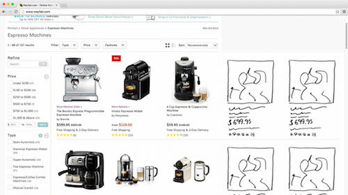
Many commercial sites do not use white space on large screens. Result: often a lot of white space is surrounded by fairly truncated search results. ( Enlarge image )
Notice the white space surrounding the rather trimmed IKEA search results. In the process of our study of the list of products in the online store, it became clear that in the niche of products selected by aesthetic characteristics, like home decor, users need large previews in order to evaluate the product correctly. Removing free space using it is one of the many “adaptive scaling” ideas for online stores that you should pay attention to.
The empty space that appeared mainly due to the large screen, as a ruleIt remains unused and is displayed as a wide sea of white if the original content of the page is trimmed to a narrow design oriented to the laptop screen. At a minimum, there should be a little more air in the content, there should be a little empty space between the elements on monitors with a large diagonal.
In addition, in "adaptive scaling" you can go much further, improving the user interface with a large screen. You can use white space to enlarge images, add product columns, better show page context and simplify access to contextual operations (filter, sorting, “Add to Cart”, etc.).
The basic principle of adaptive scaling: the same content, different presentation
There are two main ways to get rid of empty space: place additional content on the page (i.e. content that is displayed only at high resolutions) and show the current content in a different form (i.e. move elements, change their format, enlarge, etc. .d.).
You will notice that all the examples in this article illustrate how the current content can be shown differently.(sometimes fundamentally different). The reason is that adding completely new content that will only be displayed at wide resolutions is, in most cases, not a good idea. Of course, there are exceptions, but, in general, if the content is not important enough to show it in a "standard" desktop form, then most likely it is not important enough to display on large screens. Show the same content on all devices, but pack it differently. ( Enlarge image ) Having a large screen does not mean that the user suddenly wants to get a cropped page that is difficult to view. Similarly, having a smaller screen does not mean

that the user will not need any information that has been seen on the site earlier. Therefore, show the same content, but “pack” it differently, so that it is suitable for display on a large screen.
In no case should important content be added to the page simply because there is room for it on the page. In the same way, important content should not be trimmed just because screen space is limited (see the test results “ How should your mobile and desktop sites differ? ” That describes this principle). The only case when new content can be added on the big screen is if this content makes sense only on the big screen, but on ordinary ones it is not needed.
The universal rule: the emergence of new content at wide resolution is an alarming bell . In some cases, this may be justified, but, basically, the content will be either too unimportant to display on the standard screen, and then you need to exclude it from the advanced version, or it will be really important, and then it needs to be shown regardless of size screen. It is clear that important content can be represented differently in the available space, but this content must be present in one form or another in all versions of the design.
Ideas for adaptive scaling of online stores
Keeping in mind the rule of content immutability described above, we’ll look at some of the many adaptive scaling paths that can work for online stores.
All the following examples will be shown with the help of sketches superimposed on screenshots of Wayfair.com. At the moment, the desktop design of Wayfair.com does not adapt at all (that is, the pages do not scale and the layout does not change when the browser window is resized), neither to the right nor to the left - the page width remains fixed regardless of the size of the visible area of the screen. However, this is a good example to show how different types of pages of an online store can be adapted to large screens.
In real life, other elements on the page are likely to be rebuilt and possibly scaled (especially elements such as the header and footer). But for our sketchy illustrations it will be enough to move them a little. These examples serve as inspiration . Some may seem more appropriate to you than others, depending on your niche and field of activity.
Integrated authorization window
The authorization window can be made less intrusive on the big screen if you refuse the modal display and instead fix the form in the visible part of the page. Then the form will not be so striking, as it will stop blocking the entire page. This will remain noticeable, since it will appear at the top of the page immediately after loading (over the main layer). The window with the authorization form is embedded as the contents of the column on top of the main layer. ( Enlarge image ) Thus, it will be easier for users who do not want to be authorized to ignore

form, because it no longer needs to be turned off specifically. At the same time, in our usability studies, most respondents simply closed the standard dialog boxes without even reading, and often ranked them as “pop-ups” (see the article “ Avoid these 5 types of graphics for online stores ”). This is a bit of selective blindness. Such people may have a greater desire to look at the authorization form if it is not displayed modally, but inside the main column on top of the content. Looking at an element, they do not have to spend all their attention on finding how to turn it off.
Quick links from the header and basement
The most popular links from the heading (for example, My Account or placing an order for an authorized user) and from the basement (service and questions) can be shown in the block on the main page, if there is space. Of course, links should remain available in the same place in the header menu and sections of the basement. On the big screen, these links can simply be duplicated on the main page. Popular links from the header and footer are displayed as quick links in the block on the main page. ( Enlarge image ) This is a good example of content that remains accessible on the page but displays differently.

This is not new content, just the current content began to be displayed differently, especially for users with large screens. Specifically, in this example, quick links should be a little muffled so as not to draw attention from the main content.
Built-in carousel slider
The carousel on the main page has many interface problems, and it is always necessary to implement it with great care (see eight requirements for the carousel obtained in the course of our research). On the big screen, the carousel, of course, can simply be increased, thereby increasing the entire functionality of the slide show. However, if the slides are square or even with a vertical orientation, their enlarged carousel can lower the rest of the content beyond the border of the visible area - on the main page you will see less, although the visible area has become larger! The solution is to replace the carousel with a series of two or three slides in a row, which are displayed simultaneously. Slides in the carousel are replaced with a series of regular slides. ( Enlarge image )

If the total number of slides corresponds to the number of columns, then problems with the functional features of the carousel can be avoided by using a static layout of slides in several columns. If there are more slides than columns, then of course you have to leave the carousel or add new rows.
Built-in shopping basket
After the user has added the product to the basket, most owners of online stores hope for one of two things: the user goes to look for other products to add to the basket, or places an order for goods in the basket. If the user is looking for other products, this is definitely good for sales. On the other hand, this means that the user begins to regret his choice, especially if he spent a lot of time exploring the site when he was looking for added goods. A standard pop-up basket becomes integrated when the user adds products to it. ( Enlarge image )

By integrating a standard pop-up basket (available in the header) into the content, the seller creates for the user an overview of the goods that are already in the basket. And thus recalls what wonderful products the user has already found (which, of course, must be bought before leaving!). This gives the user quick access to placing an order and thereby helps close the sale.
In addition, during our exploration of the homepage and category navigation, we often observed people reopeningcart, just to take a look at the name of previously added products. For example, they can open the basket to see the model name of the camera that has just been added to find a suitable case. The default popped-up basket will make it easier to find related products, as it will allow you to directly compare the current list of products with products in the basket.
Additional column of goods
One of the most obvious ways to get rid of the empty space in the goods tile is to rebuild the goods so that they fit into an additional column. This can coolly increase the number of products visible on the screen. In the example below, the user can see not six products, but ten. The product list grid is arranged so that additional columns fit on the big screen. ( Enlarge image ) With this approach, you can significantly adapt the list of products

under the big screen, but do it carefully. If the number of columns is too large, then the tile will eventually become more difficult to view. Users will read the information and it will be difficult for them to jump eyes from line to line (for this reason the text has an optimal line length ).
Therefore, limit your list of products to a width of five to eight columns (depending on the size of the items in the list and the niche of the product) so that users do not get lost in the sea of information.
Larger images of products in the list
Another obvious way to take advantage of the large visible space in the product list is to enlarge each item in the list to fill the screen. For example, you can greatly increase the size of the product preview, allowing the user to consider the design of each product in much more detail. This is a tangible advantage for niches of products promoted through appearance, since if the amount of transmitted visual information is maximum, it is much easier for the user to choose the product to taste. Elements of the product list are enlarged, loading high-resolution images and transmitting the maximum amount of visual information. ( Enlarge image )

However, caution will not hurt here either. Simple scaling of the image often leads to a serious increase in the height of the list line (we assume that the proportions are preserved). As a result, the number of products per page will be significantly reduced. Pay attention to the illustration above - the second line in the list was almost completely squeezed out of sight.
Therefore, the trade-off when enlarging an image in a product list is as follows: increasing the level of detail of visual data for each product, we limit the overview of available products due to the fact that fewer products are placed in the visible area.
Scaling and rebuilding a product list
By combining the two previous solutions in case of expanding the user's screen - that is, by adding columns and increasing each item in the list of products - we will get the best of them. There is more visual data for each product, while the overview is saved. The product tile is rebuilt to show additional columns, even if the items in the list reach a lower limit in height. Elements of the product list are simultaneously enlarged and rearranged into additional columns. ( Enlarge image ) Thus, the list item can increase,

to display additional visual information, but without any increase in height, so that you had to compromise with the number of products that are visible on the screen. In fact, due to the addition of columns, the number of products within the visible area will even increase. It turns out that we are increasing both the total number of products on the screen and the level of detail for each.
Sticky filter
Another way to get rid of empty space is to fix the panel with filters and sorting in the visible area of the screen as a “sticky” element. This will give the user additional information about which product he is currently watching, as well as quick access to managing list parameters. The filter panel can be displayed as a side panel attached to the edge (s) of the screen. ( Enlarge image ) Fixed content is an effective way to use space if the main content is not very wide. However, whenever you capture content at the edge of the screen, do it only on the axis on which there is enough space to place it, that is, on the axis on which there is too much space. For example,

Do not capture content at the top or bottom of the screen without applying rules based on the height of the visible area (for example, a height-based media query) that will check if there is any space needed.
However, with the corresponding rule check, the sticky side filter panel can also be rebuilt into several columns, with parameters divided into two or three columns. If the filter panel is horizontal , you can attach it to the very top of the screen, if the height of the visible area allows. Or, if there is a lot of free space horizontally, you can rearrange this panel to the side when scrolling the page. You can also use the height of the browser window to dynamically adjust the reduction in settings. filter - the number of parameters that is displayed up to a certain threshold will increase with increasing screen height.
Recently Viewed Items
When the respondents went to the product page during testing and realized that the product did not suit them in the end, they either continued the search or left the site. Of course, it’s in the seller’s interests to make it possible to return to the previous screens. By showing offers with alternative options and related products or a list of recently viewed products in the sidebar, you immediately give the user the escape routes that they can choose if the product they are currently watching is not suitable for them. Product offers or a list of recently viewed products can be placed on the sidebar for easy navigation between products. ( Enlarge image )

A simplified transition from product to product can significantly affect the user's willingness to continue searching. Naturally, the category of goods can be promoted in the same way . Recall, for example, user scenarios - does the user move back and forth between product lists and pages, or can he move from one product to another?
Sometimes the possibility of moving from product to product can be attractive, because it gives the user a more complete picture of the site’s offers. But a scenario with such a transition also creates many conflicts. Therefore, make sure that the path that you offer for the promotion of any units maintains a healthy balance between the category and the product cards that the user goes to.
Sticky Product Summary
Product cards are long. They may contain images , descriptions, specifications, reviews, suggestions with alternative and related products , questions, etc. All our usability studies have shown that more information almost always means better (as long as the content is of good quality - that is, useful, reliable and more or less accurate). It also means that sometimes the user can stop very far from the main product description (this is the name, price, any possible product options and the Buy button). To always show context and keep the Buy button within reach,place the sticky summary of the product on the free space of the large screen, attaching it to the upper border of the visible area when the user scrolls down the page. A sticky summary of the product and the Add to Cart button are attached to the top edge of the screen when the user scrolls down the long page of the product card. ( Enlarge image ) The sticky product summary can be basically a slightly modified version of the design that is used for the item list item. If the summary is fixed at the upper or lower border of the screen, it can be made narrower in shape. One way or another, the point is to constantly show the context to the user,

giving you the opportunity to see the name, value and any product options, even if the user went deep into the reviews. And of course, always keep the Add to Cart button within reach when a user reads an enthusiastic review of a happy customer.
Sticky order summary and support
During checkout, excess horizontal space will not be used, because such pages usually require concentration, and because forms in several columns can lead to serious usability problems during the purchase process. On a large screen, this sea of empty white space can be used for order summaries and support information. A summary of the order can be an invariable element at all stages of placing an order as a constant reminder of the goods from which the user is only a few steps from the purchase. The order summary and support details are displayed on the sidebar when there is room for them on the screen. ( Enlarge image ) Meanwhile, support details,

which are normally located in the basement, can be raised so that they are easily accessible if the user encounters difficulties in the process of placing an order. If you are worried about the overabundance of support calls, you can show support details more selectively, based on the amount of the order and on how many stages of the order process have already been completed and if validation errors have occurred.
Adaptive scaling for online stores
It is amazing how few online stores currently optimized their site design for large screens. Even 18% of the top online stores that offer sites optimized for large screens actually took only one small step in this direction. Given the large segment of users with large screens, the realm of adaptive scaling has matured and has potential.
When using adaptive scaling, do not forget about the basic principle“Same content, different presentation.” Either even a small part of the content will be important for all users, or it will not be important enough to bother users on large monitors. The fact that the user has more space on his screen does not mean that he wants to see a heap of poor quality content. Instead, look for ways to show existing content in a different way, so that the interface for large-screen users gets better.
11 ideas described in this article are based on this principle of the same content and different presentation - take the current content of the page and scale it or change the location, somewhere more significantly, somewhere less:
- built-in authorization window
- quick links from the header and basement
- built-in carousel slider
- built-in shopping basket
- additional column of goods
- enlarged images of products in the list
- scaling and rebuilding the product list
- sticky filter
- recently viewed items
- sticky product summary
- sticky order summary and support
Do you have other ideas for adapting an online store for a large monitor? Share them in the comments. It's time to adapt online stores for users with large monitors.