Making a machine learning project in Python. Part 3
- Transfer
- Tutorial

Translation A Complete Machine Learning Walk-Through in
Python: Part Three Many people do not like that machine learning models are black boxes : we put them in the data, and without any explanation we get answers - often very accurate answers. In this article we will try to figure out how the model we create makes predictions and what it can tell you about the problem we are solving. And we will conclude with a discussion of the most important part of the machine learning project: we will document what has been done and present the results.
In the first part, we covered data cleansing, exploratory analysis, design, and feature selection. In the second partstudied filling out missing data, implementing and comparing machine learning models, hyperparameter tuning using random cross-validation search, and finally evaluating the resulting model.
All project code is on GitHub. And the third Jupyter Notebook related to this article is here . You can use it for your projects!
So, we are working on solving the problem using machine learning, more precisely, using supervised regression. Based on the energy consumption of buildings in New York, we have created a model that predicts the number of Energy Star Score points. We have a “ regression based on gradient boosting ” model , which is able to predict within 9.1 points (in the range from 1 to 100) based on test data.
Interpretation of the model
The regression based on the gradient boosting is located approximately in the middle of the model interpretability scale : the model itself is complex, but consists of hundreds of rather simple decision trees . There are three ways to understand the work of our model:
- Rate the importance of the signs .
- Visualize one of the decision trees.
- Apply the LIME method - Local Interpretable Model-Agnostic Explainations , local interpreted model -dependent explanations.
The first two methods are characteristic of ensembles of trees, and the third, as you could understand from its name, can be applied to any machine learning model. LIME is a relatively new approach; it is a noticeable step forward in an attempt to explain the work of machine learning .
Importance of signs
The importance of signs allows you to see the relationship of each sign in order to predict. The technical details of this method are complex ( the mean decrease in foreignness is measured (the mean decrease impurity) or the decrease in error due to the inclusion of the feature ), but we can use relative values to understand which features are more relevant. In Scikit-Learn, it is possible to extract the importance of attributes from any ensemble of "pupils" based on trees.
In the code below
model, our trained model is, and with the help model.feature_importances_you can determine the importance of the signs. Then we send them to the Pandas data frame and display the 10 most important signs:import pandas as pd
# model is the trained model
importances = model.feature_importances_
# train_features is the dataframe of training features
feature_list = list(train_features.columns)
# Extract the feature importances into a dataframe
feature_results = pd.DataFrame({'feature': feature_list,'importance': importances})
# Show the top 10 most important
feature_results = feature_results.sort_values('importance',ascending = False).reset_index(drop=True)
feature_results.head(10)
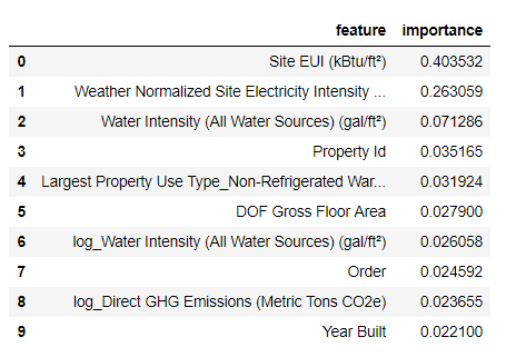
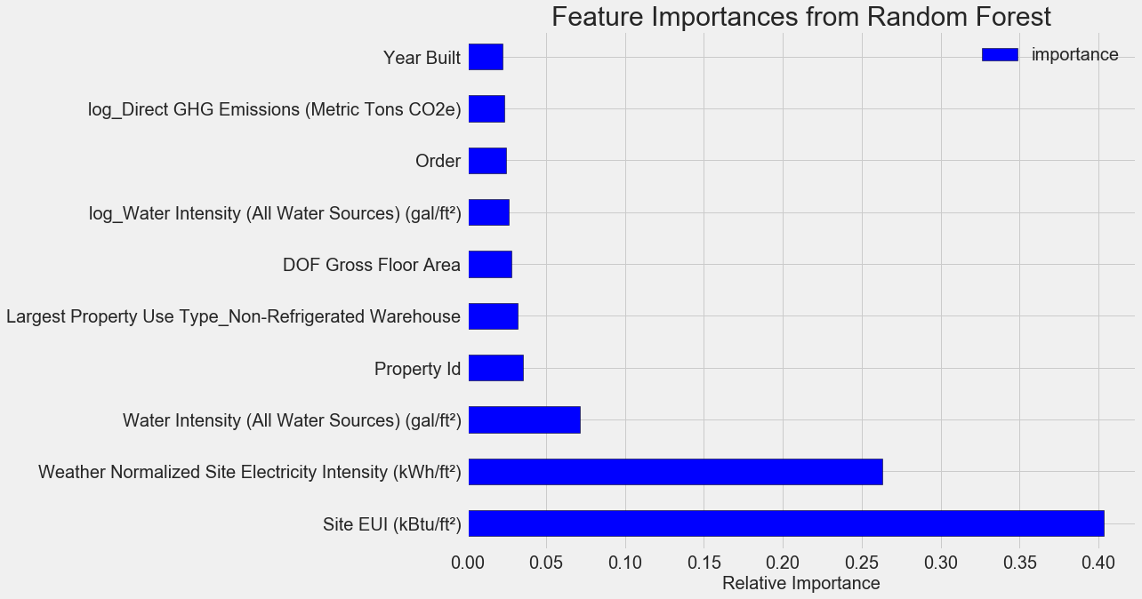
The most important signs are
Site EUI ( intensity of energy consumption ) and Weather Normalized Site Electricity Intensity, they account for more than 66% of the total importance. Already in the third feature, the importance falls dramatically, this may mean that we do not need to use all 64 features to achieve high prediction accuracy (in Jupyter notebook this theory is tested using only the 10 most important features, and the model was not too accurate). Based on these results, you can finally answer one of the initial questions: the most important indicators of Energy Star Score scores are Site EUI and Weather Normalized Site Electricity Intensity. We will not go too deep into the wilds of the importance of signs, we say only that with them you can begin to understand the mechanism of model prediction.
Visualization of a single decision tree
Comprehending the entire regression model based on gradient boosting is hard, which cannot be said about individual decision trees. You can visualize any tree with
Scikit-Learn-функции export_graphviz. First we extract the tree from the ensemble, and then save it as a dot-file:from sklearn import tree
# Extract a single tree (number 105)
single_tree = model.estimators_[105][0]
# Save the tree to a dot file
tree.export_graphviz(single_tree, out_file = 'images/tree.dot', feature_names = feature_list)Using the Graphviz visualizer, we convert the dot-file into png by typing in the command line:
dot -Tpng images/tree.dot -o images/tree.pngWe got a complete decision tree:

A bit cumbersome! Although this tree is only 6 layers deep, it is difficult to track all transitions. Let's change the function call
export_graphvizand limit the depth of the tree to two layers: 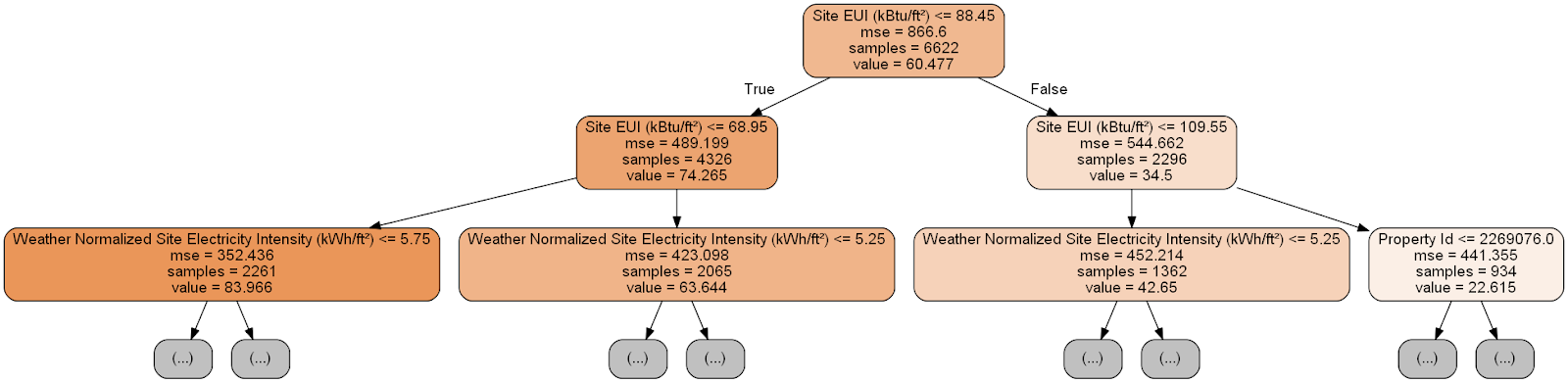
Each node (rectangle) of the tree contains four lines:
- Asked a question about the meaning of one of the attributes of a particular dimension: it depends on which direction we will go out of this node.
Mse- measure of error in the node.Samples- the number of data samples (measurements) in the node.Value- target evaluation for all data samples in the node.
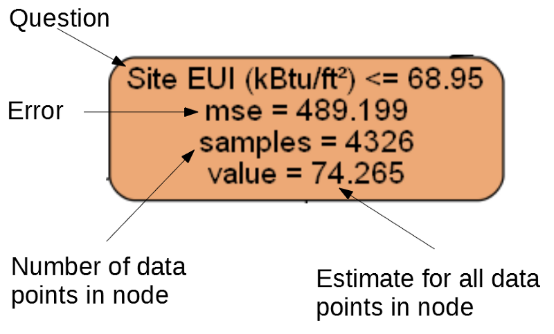
Separate node.
(The leaves contain only 2. – 4. Because they are the final grade and do not have children).
The formation of the forecast for a given measurement in the decision tree begins with the top node - the root, and then goes down the tree. At each node you need to answer the asked question "yes" or "no." For example, the previous illustration asks: “Site EUI of the building is less than or equal to 68.95?” If yes, the algorithm goes to the right child node, if not, then to the left.
This procedure is repeated on each layer of the tree until the algorithm reaches the leaf node on the last layer (these nodes are not shown in the illustration with a smaller tree). The forecast for any measurement in the sheet is
value. If several dimensions come to the sheet (samples), then each of them will receive the same forecast. As the tree depth increases, the error on the training data will decrease as the leaves will be larger and the samples will be divided more carefully. However, a tree that is too deep will lead to retraining on the training data and will not be able to summarize the test data. In the second article, we configured the number of hyperparameters of the model that control each tree, for example, the maximum depth of the tree and the minimum number of samples required for each sheet. These two parameters strongly influence the balance between over-training and under-training, and visualizing the decision tree will allow us to understand how these settings work.
Although we will not be able to study all the trees in the model, the analysis of one of them will help to understand how each “student” predicts. This flowchart-based method is very similar to how a person makes decisions. Ensembles from decision trees combine the predictions of numerous individual trees, which allows you to create more accurate models with less variability. Such ensembles are very accurate and easy to explain.
Local interpretable model-dependent explanations (LIME)
The last tool with which you can try to figure out how our model “thinks”. LIME allows you to explain how a single forecast of any machine learning model is formed . For this, locally, next to some measurement, a simplified model is created based on a simple model like a linear regression (details are described in this work: https://arxiv.org/pdf/1602.04938.pdf ).
We will use the LIME method to study the completely erroneous forecast of our model and understand why it is mistaken.
First we find this incorrect prediction. To do this, we will train the model, generate a forecast and select the value with the largest error:
from sklearn.ensemble import GradientBoostingRegressor
# Create the model with the best hyperparamters
model = GradientBoostingRegressor(loss='lad', max_depth=5, max_features=None, min_samples_leaf=6, min_samples_split=6, n_estimators=800, random_state=42)
# Fit and test on the features
model.fit(X, y)
model_pred = model.predict(X_test)
# Find the residuals
residuals = abs(model_pred - y_test)
# Extract the most wrong prediction
wrong = X_test[np.argmax(residuals), :]
print('Prediction: %0.4f' % np.argmax(residuals))
print('Actual Value: %0.4f' % y_test[np.argmax(residuals)])
Prediction: 12.8615
Actual Value: 100.0000
Then we will create an explainer (explainer) and give it training data, mode information, labels for the training data and the names of the signs. Now you can transfer the observational data and forecasting function to explainer, and then ask to explain the reason for the forecast error.
import lime
# Create a lime explainer object
explainer = lime.lime_tabular.LimeTabularExplainer(training_data = X, mode = 'regression', training_labels = y, feature_names = feature_list)
# Explanation for wrong prediction
exp = explainer.explain_instance(data_row = wrong, predict_fn = model.predict)
# Plot the prediction explaination
exp.as_pyplot_figure();
Forecast explanation diagram:
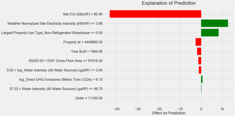
How to interpret a diagram: each record along the Y axis represents one variable value, and the red and green bars reflect the effect of this value on the forecast. For example, according to the upper record, the influence is
Site EUIgreater than 95.90, as a result, about 40 points are deducted from the forecast. According to the second record, the effect is Weather Normalized Site Electricity Intensityless than 3.80, and therefore about 10 points are added to the forecast. The final forecast is the sum of the intercept and the effects of each of the listed values. Let's look at it from the other side and call the method
.show_in_notebook():# Show the explanation in the Jupyter Notebook
exp.show_in_notebook()
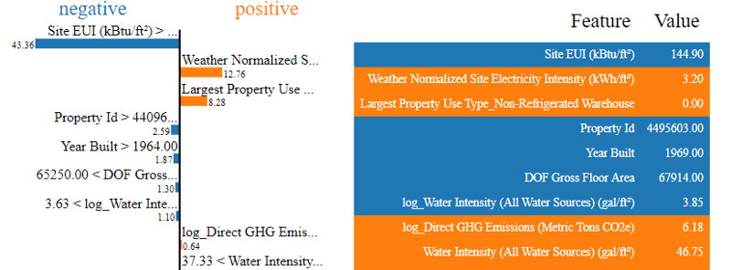
The left shows the process of making a decision by the model: the influence on the forecast of each variable is visually displayed. The table on the right shows the actual values of the variables for the specified measurement.
In this case, the model predicted about 12 points, but in fact it was 100. At first, you may wonder why this happened, but if you analyze the explanation, it turns out that this is not a very bold assumption, but the result of calculation based on specific values. The value
Site EUIwas relatively high and one could expect a low Energy Star Score (because it was strongly influenced by the EUI), which our model did. But in this case, this logic turned out to be erroneous, because in fact the building received the highest Energy Star Score - 100.Model errors can upset you, but such explanations can help you understand why the model was wrong. Moreover, thanks to the explanations, you can begin to dig out why the building received the highest score despite the high value of Site EUI. Perhaps we will learn something new about our task that would have escaped our attention if we didn’t begin to analyze model errors. Such tools are not perfect, but they can greatly facilitate the understanding of the model and make more correct decisions .
Documenting and presenting results
In many projects little attention is paid to documentation and reports. You can do the best analysis in the world, but if you do not present the results properly , they will not matter!
When documenting a data analysis project, we package all versions of the data and code so that other people can reproduce or collect the project. Remember that the code is read more often than they write, therefore our work should be clear to other people and to us if we return to it in a few months. Therefore, insert useful comments into the code and explain your decisions. Notebooks Jupyter Notebook software - the perfect tool for documentation, they can explain the first solution, and then show the code.
Also, Jupyter Notebook is a good platform for interacting with other professionals. With the help of extensions for notebooks, you can hide the code from the final report , because, no matter how hard you believe it, not everyone wants to see a bunch of code in the document!
Perhaps you want to not squeeze, and show all the details. However, it is important to understand your audience when you submit your project, and compile a report accordingly . Here is an example of a brief summary of the essence of our project:
- Using data on the energy consumption of buildings in New York, you can build a model that predicts the number of Energy Star Score scores with an error of 9.1 points.
- Site EUI and Weather Normalized Electricity Intensity are the main factors influencing the forecast.
We wrote the detailed description and conclusions to Jupyter Notebook, but instead of PDF, we converted the Latex .tex file, which we then edited to texStudio , and the resulting version was converted to PDF. The fact is that the default export result from Jupyter to PDF looks pretty decent, but it can be greatly improved in just a few minutes of editing. In addition, Latex - a powerful document preparation system, which is useful to own.
Ultimately, the value of our work is determined by the decisions that it helps to make, and it is very important to be able to “present the goods by face”. By correctly documenting, we help other people to reproduce our results and give us feedback, which will allow us to become more experienced and continue to rely on the results obtained.
findings
In our series of publications, we have dismantled an educational project on machine learning from start to finish. We started with data cleansing, then created a model, and finally learned how to interpret it. Recall the overall structure of the machine learning project:
- Cleaning and formatting data.
- Exploratory data analysis.
- Design and selection of features.
- Comparison of metrics of several machine learning models.
- Hyperparametric adjustment of the best model.
- Evaluate the best model on the test dataset.
- Interpreting the results of the model.
- Conclusions and a well-documented report.
The set of steps may vary depending on the project, and machine learning is often an iterative process rather than a linear one, so this guide will help you in the future. We hope you can now confidently implement your projects, but remember: no one acts alone! If you need help, there are many very useful communities where you can get advice.
These sources can help you:
- Hands-on Machine Learning with Scikit-Learn and Tensorflow ( Jupyter Notebook for this book are available for download for free)!
- An Introduction to Statistical Learning
- Kaggle: The Home of Science and Machine Learning
- Datacamp : Good Practices for Practicing Data Analysis Programming.
- Coursera : free and paid courses on many topics.
- Udacity : paid courses in programming and data analysis.