Flexbox on the example of a dice
- From the sandbox
- Tutorial
What if you could build a complex css layout in minutes? Flexbox is the new CSS layout layout that makes it easy to build dynamic layouts. With Flexbox, vertical alignment, blocks with the same height, rearrangement and direction becomes easy.

There is a popular myth that flex is not yet ready for use. But this is not so! In 93 % of people now running a browser that supports flexbox . This is better than support for HTML5.
In this article, I will walk you through the basics of flexbox by creating a die. Now we will skip some of the more complex subtleties of flexbox, such as vendor prefixes, the old syntax, and browser quirks. Consider them in future lessons.
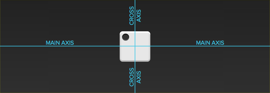
The cube consists of six faces (sides). Each face has a number of points (points) that determine the value of the side. The first side consists of one point in the center.
Let's start with HTML.
To make life a little easier, I added basic styles for sides and dots. Here's what happened:

First you need to tell the browser that
In appearance, nothing has changed, but much has changed under the hood.
Now
Property

Since the main axis is horizontal, the point is now in the center of the parent element.
The properties

That's right, the point is now in the center!
On the second face of the cube, the first is precisely located in the upper left corner, and the second in the lower right. This is pretty easy to do using flexbox.
And again, let's start with the markup and basic css:

Now we have two points next to each other. This time end-to-end, we want the points to be located on opposite sides of the face. There is a special meaning for
Property

This is where we run into the problem. Unlike the previous case, we cannot use

Looks nice!
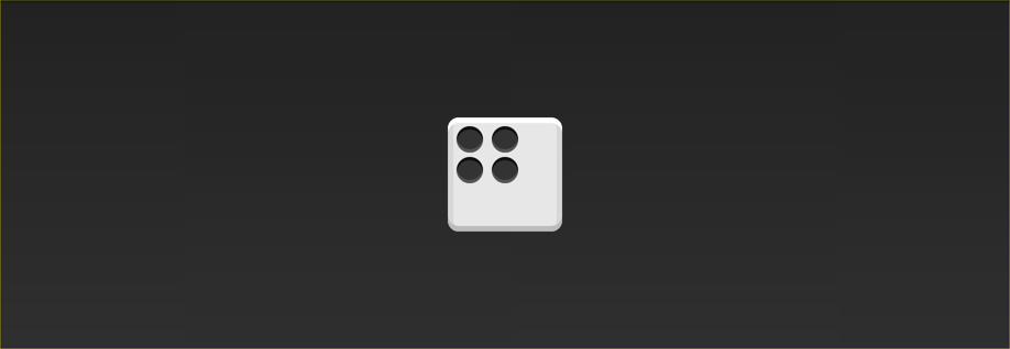
Let's skip the third facet and move on to the fourth. It is a little more complicated than the others, because we have to support two columns, each with two points.
There are two things in flexbox that will save us: Flex containers can have content vertically and horizontally, and Flex containers can be nested.
From now on, our markup will include columns.
Since we want the two columns to be on opposite sides of the barricades, let's move and use

Next, we need to make the columns become flexbox containers. It may seem like they are already, but remember that we have not installed display: flex yet. We can use the property
Nothing has changed in appearance, but the columns are now flex containers. Notice how we stuck the flex container directly inside another flex container? This is normal! flexbox doesn't care if containers are nested.
The final step is the space between the points inside the columns. Since the main axis is vertical, we can use again

We have created 3 faces, and this knowledge should be enough to make 3 more.
Link to the original article
There is a popular myth that flex is not yet ready for use. But this is not so! In 93 % of people now running a browser that supports flexbox . This is better than support for HTML5.
In this article, I will walk you through the basics of flexbox by creating a die. Now we will skip some of the more complex subtleties of flexbox, such as vendor prefixes, the old syntax, and browser quirks. Consider them in future lessons.
First side
The cube consists of six faces (sides). Each face has a number of points (points) that determine the value of the side. The first side consists of one point in the center.
Let's start with HTML.
To make life a little easier, I added basic styles for sides and dots. Here's what happened:
First you need to tell the browser that
.firtst-face
.first-face {
  display: flex;
}
In appearance, nothing has changed, but much has changed under the hood.
Now
.first-facehas a major horizontal axis. The main axis can be either vertical or horizontal, but by default it is horizontal. If we added one more point to the side, it would be displayed to the right of the first. The container also has a vertical axis. The auxiliary axis is always perpendicular to the main axis.
Property
justify-contentdefines alignment along the main axis. Since we want the point to be centered relative to the main axis, we will use the value
center
.first-face {
  display: flex;
  justify-content: center;
}
Since the main axis is horizontal, the point is now in the center of the parent element.
The properties
align-itemsdetermines how elements are arranged along the horizontal axis. After all, we want the point to be centered along this axis, we will use the value
center, as earlier.
.first-face {
  display: flex;
  justify-content: center;
  align-items: center;
}
That's right, the point is now in the center!
Moving on
On the second face of the cube, the first is precisely located in the upper left corner, and the second in the lower right. This is pretty easy to do using flexbox.
And again, let's start with the markup and basic css:
.second-face {
  display: flex;
}
Now we have two points next to each other. This time end-to-end, we want the points to be located on opposite sides of the face. There is a special meaning for
justify-contentwhich will allow us to do this:
space between.
Property
space betweenevenly fills the space between flex items. Since there are only two points, it repels them from each other.
.second-face {
  display: flex;
  justify-content: space-between;
}
This is where we run into the problem. Unlike the previous case, we cannot use
align-itemsas this will affect both points. Fortunately, flexbox includes
align-self. This property allows you to align the individual elements of the Flex container along the transverse axis exactly what we wanted! The value we want to set for this property is
flex end.
.second-face {
  display: flex;
  justify-content: space-between;
}
.second-face .pip:nth-of-type(2) {
  align-self: flex-end;
}
Looks nice!
Horizontal and Vertical Nesting
Let's skip the third facet and move on to the fourth. It is a little more complicated than the others, because we have to support two columns, each with two points.
There are two things in flexbox that will save us: Flex containers can have content vertically and horizontally, and Flex containers can be nested.
From now on, our markup will include columns.
Since we want the two columns to be on opposite sides of the barricades, let's move and use
justify-content: space-betweenas we did before.
.fourth-face {
  display: flex;
  justify-content: space-between;
}
Next, we need to make the columns become flexbox containers. It may seem like they are already, but remember that we have not installed display: flex yet. We can use the property
flex-directionto set the direction of the main axis to the column.
.fourth-face {
  display: flex;
  justify-content: space-between;
}
.fourth-face .column {
  display: flex;
  flex-direction: column;
}
Nothing has changed in appearance, but the columns are now flex containers. Notice how we stuck the flex container directly inside another flex container? This is normal! flexbox doesn't care if containers are nested.
The final step is the space between the points inside the columns. Since the main axis is vertical, we can use again
justify-content.
.fourth-face {
  display: flex;
  justify-content: space-between;
}
.fourth-face .column {
  display: flex;
  flex-direction: column;
  justify-content: space-between;
}
Conclusion
We have created 3 faces, and this knowledge should be enough to make 3 more.
Link to the original article