What a designer needs to know about SVG: pros and cons
Earlier in our blog, we raised the topic of creating high-quality web interfaces, in particular, in one of the previous topics, the question of the correct use of animations was considered . In today's article we will talk about SVG technology, the principles of working with this technology, its pros and cons. In addition, we asked domestic designers whether they use SVG, and if not, why.
Very short: what is SVG
SVG (Scalable Vector Graphics) is a W3C vector graphics markup language, a subset of the XML language. Designed to describe vector and mixed (vector-raster) two-dimensional graphics, supports animation and interactivity. In 2001, version 1.0 was released, in 2011 - version 1.1 , now relevant. Browser support is good , but there are nuances in IE , pixelation when enlarged in Opera Mini and Opera Mobile 12.1.
Pros and challenges of using SVG
Before you begin to consider the question of how designers can use SVG in their work, you should make a small logical digression and talk more about this profession. In our opinion, the division in the IT industry into web designers and layout designers does not always correspond to the realities of creating web projects.
It’s simply impossible to create not just a beautiful, but really good web page design without understanding how this page will load, display in a browser, adapt to viewport size, change when modifying content. Based on this, we can say that a web designer is a technical specialty (perhaps the essence of this work is better conveyed by the term “web engineer”), for the most part implying the use of logic and knowledge, and only a small fraction of which is art. In other words, the web designer who does not know how to typeset is bad at all.
Having figured out who the modern designer really is, we can proceed to discuss the advantages that such specialists can benefit from using SVG technology. In short, its application helps to increase the speed and quality of work: the designer has to perform fewer actions himself, which reduces the time spent at various stages of the project.
Let's consider the list of advantages of SVG in more detail:
SVG is easily modified(moreover, both in the graphics editor and on the page itself using CSS). Changing the location, shape, size, proportions, color, fill and all other properties of the constituent parts of the image is easier than in the case of raster graphics. When working with a raster, you will have to store the "source" in a format with layers, make all changes in it, export it. With SVG, there is usually no need for a "source".
For screens with increased pixel density, one image is sufficient.In the case of raster graphics at the moment (spring 2015), you need at least three (!) Versions of the picture: 100% layout size, 200% and 300%. In the case of using SVG, one version is enough - as for any vector format, the pixels needed to display the image “appear” immediately before the display, based on the required pixel size.
SVG loads fast.Yes, yes, because, as we found out above, designers should also think about page loading speed, too, because the more time passes from sending a request to showing a page, the lower the conversion of the project. Firstly, SVG files, as a rule, have a smaller file size than their raster versions (exceptions are small pixel size images and complex vector images with many shapes). Secondly, you can add several versions of the image to one SVG file and display them under certain conditions (reducing the number of server requests). Thirdly, in “SVG” you can use “cloning” - register a shape (gradient, texture) once and reuse it, referring to the original. There is, however, a minus: rendering SVG in the browser is slightly slower than displaying a bitmap image, but to notice this difference,
SVG is easy to make responsive. In the case when it is necessary to show the site logo in narrow viewports in a simplified version , SVG allows you to achieve this in just one request to the server.
SVG can be interactive. Inside the image there may be links, scripts, interactive parts can respond to guidance and other user actions, you can add animation .
Freely distributed software. For work with SVG it is not necessary to use Adobe Illustrator (as a standard in the world of vector graphics), which is quite freely distributed by Inkscape . There are a number of other tools .
Despite the above advantages of the SVG format, not all designers use it in their projects. We asked about the reasons for this situation from well-known Russian experts in the field of interface design and design:
 Yuri Vetrov, Head of Design and Design Department of Mail.Ru
The simple answer is that it’s not enough for the designer to learn how to prepare SVG, it’s necessary for developers to be able to use it in the product, and this is not so simple, much needs to be changed in technological solutions. Secondly, the process of working with the vector itself needs to be optimized so that SVG can be comfortably exported from the graphic editors used. Those. There are no any prejudices, it is just necessary to significantly reorganize the work process, and this does not give any particular exhaust for the business. Those. it is an infrastructure task that is always a lower priority. Everyone, of course, will switch to it over time, but the problems are approximately as described above.
 Denis Kortunov, Acronis UX Director
This question is not really for designers, but for web technologists or front-end developers. Now a lot of designers initially make a design in a vector, and there is no problem presenting graphics in the form of SVG. The main problem is compatibility with different browsers. Such pictures are often simply not displayed and you need a lot of “dancing with tambourines”. A common alternative to SVG is the use of fonts. This is a “hack” that allows you to use vector images on the web.
In general, there is a problem in the modern web - you need a simple and universal format for displaying vector images on pages. It is possible that SVG will soon become the standard. Really looking forward to it.
 Dmitry Zimin, project manager of “Kinohod”
With regard to “why they do not use SVG,” I can only speak for our project. We have a feature: most of the content is photographs (posters, stills from the movie, video preview).
We want to translate the interface in the mobile application to a vector, because cutting pictures in three resolutions (x.png, @ 2x.png, @ 3x.png) is tedious and provokes errors. But, until the hands got corny.
 Artyom Geller, chief developer of the Kremlin.ru website.
We actively use SVG in our projects, but this technology also has certain limitations. For us, of course, they overlap with the benefits that SVG brings - we do not need complex animation in the elements, and something needs to be painted in them not so often.
At the same time, we replace the elements in SVG with PNG, in the event that a specific version of the browser is not friendly with this format.
 Nikita Mikheenkov, Development Director, Nimax Design
It seems to us that the point here is not at all the designers, but the whole team doing the project. The power of habit pulls back to the raster graphics - it’s easier and more familiar. In our projects, we constantly work with SVG and especially like to do all sorts of animated and flying things.
Here are a few examples with vector graphics: one , two , three .
Instead of a conclusion: how to do SVG
Of course, the designer does not need to keep in mind all the possible technical details of the development of the project, but following a few simple principles is nevertheless necessary:
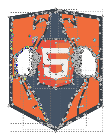
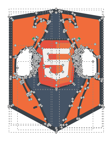
- It is better to try to get by with as few points as possible. The fewer dots, the generally easier to edit the file and the smaller it will be. If forms drawn by other specialists are used, it makes sense to simplify them - to reduce the number of both control and control points. In Adobe Illustrator, the most optimal (from the technical side) contours are obtained when drawing with the pen tool with the correct choice of the type of points. The least optimal, usually, are the result of converting the lines drawn by the brush into vector sections, or thoughtless tracing.
Image 1
(Received from the designer)
83 KbImage 2
(optimized number of dots)
28 KbImage 2
(layout optimized)
10 Kb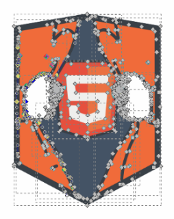

- You should use a pixel grid and try to arrange the contours so that their edges are exactly at the border of the pixels or 1/2 pixel. If you plan to resize elements (for example, icons), you need to check how the resized size will fall on the pixel grid. At the same time, it is important to remember that the screen is an environment with serious limitations, it is impossible to get into pixels at any size, but for the most frequent sizes, you need to try.
Forms aligned to pixel grid
(400%)Shapes are not aligned on the pixel grid
(400%)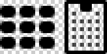

- It is worth creating and saving SVG in the form in which it is planned to further use these elements in the design. Sometimes there is a situation in which used SVGs are applied to the PSD layout, but the layout itself uses a vector shape with some additions (text layer, something finished with a raster, some effect applied). Such an approach may exclude the possibility of using vector graphics for such a design element.
- It is necessary to use as few figures as possible, to group only the necessary. Shapes that are not part of the picture or are invisible (covered by other shapes) should be deleted.
- It is better to convert all symbols, textures and brush drawings to regular vector sections without applying raster effects (Adobe Illustrator) and blending modes.