Flexbox: how big is this flexible box?
- Transfer
I continue to publish translations on the features of Flexbox CSS technology .
From the cycle published the following articles:
- What happens when you create a Flexbox container .
- Everything you need to know about alignment in Flexbox .
Brief summary
In the last two articles, we looked at what happens when creating a flex container, and also considered alignment. This time we will look at the often confusing problem of sizes in the Flexbox . How does Flexbox decide how large the elements should be?
This is the third part of my Flexbox series . In the last two articles, we looked at what happens when you create a flex container , and examined the alignment, how it works in Flexbox . This time we are going to look at the sizes. How do we control the size of our flex elements, and what choice does the browser make when it adjusts its size?
Original display of Flex items
If I have a set of elements that have a variable length of internal content, and set their display: flex parent , the elements will be displayed as a string and line up from the beginning of the main axis. In the example below, my three elements have a small content size and can display the contents of each element as a continuous string. At the end of the flex-container there is a space in which elements do not grow, because the initial value of the flex-grow property of each element is 0, i.e. they are forbidden to increase.
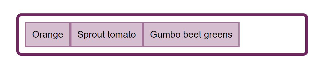
Fig_1. Flex elements have a place to display in one line
If I add more text to these elements, they will gradually fill the container and the text will start to be transferred. Elements are assigned a portion of the container space corresponding to the amount of text in each — an element with a longer line of text is assigned more space. This means that we will not get a tall, narrow column with a lot of text when the next element contains only one word.
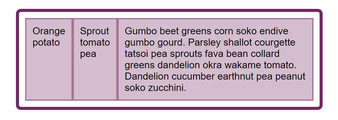
Fig_2. Space is distributed to give more room for a longer element.
This behavior is probably familiar to you if you have ever used a Flexbox . But perhaps you wondered how the browser does the size calculation, since if you look at several modern browsers, you will see that they all do the same.
This is due to the fact that features such as this one are worked out in the specification, ensuring that anyone who implements Flexbox in a new browser or another user agent knows how this calculation should work. We can use the specification to find this information for ourselves.
CSS specification for calculating internal and external dimensions (CSS Intrinsic And Extrinsic Sizing)
Looking at something — something about calculating dimensions in the Flexbox specification , you will rather quickly find that most of the information you need is in another specification — CSS Intrisnic and Extrinsic Sizing . This is because the concept of calculating the dimensions that we use is not unique to the Flexbox , nor is the alignment properties unique to the Flexbox .
To find out how the size calculation used in Flexbox is built , you need to look at the Flexbox specification . This may seem a bit like jumping back and forth, so I’ll describe here a few key definitions that I’ll use in the rest of the article.
Preferred size
The preferred element size is the size determined by the width or height, or by logical aliases of these properties among inline-size and block-size . Using:
.box {
    width: 500px;
}
or inline-size logical alias :
.box {
    inline-size: 500px;
}
You declare that you want your block to be 500 pixels wide or 500 pixels in a row.
Min Content Size (MIN-CONTENT SIZE)
The minimum content size is the smallest content size that can fit an element without overflow. If the element contains text, then all measures of program transfer must be taken.
Maximum Content Size (MAX-CONTENT SIZE)
The maximum content size is the largest content size that an element can contain. If the element contains text without formatting, it will be displayed as one long continuous line.
The main size of the flexible element (FLEX ITEM MAIN SIZE)
The main size of a flexible element is its size in the main direction. If you are working in a string in English, then the main size is the width. In the English column, the basic size is height.
Elements also have properties to indicate the minimum and maximum of the main dimension in the main direction, defined as min-width or min-height .
Flex Size Processing
Now that we have defined some terms, we can see how our flex elements calculate size. The initial values of the flex properties are as follows:
- flex-grow : 0;
- flex-shrink : 1;
- flex-basis : auto.
Flex-basis is the base from which the size is calculated. If we set flex-basis to 0, and flex-grow to 1, then all our elements will not have an initial width, so the space in the flex-container will be evenly distributed by designating the same size of space for each element.
Meanwhile, if flex-basis is set to auto and flex-grow: 1 , then only free space will be distributed, i.e. space without content.
In a situation where there is no free space, for example, when we have more content than can fit on one line, then nothing is distributed.
This shows us that figuring out what auto means is very important if we want to know how Flexbox handles the dimensions of our elements. The auto value will be our starting point.
Defining auto (defining auto)
When auto is assigned as a value to something in CSS, it will have a very specific value in this context that is worth seeing. The CSS working group spends a lot of time figuring out what auto means in any context, as explained by the conversation with the Fantasai specification editor.
In the specification, we can find information about what auto means when used as flex-basis . The terms defined above should help us analyze this statement.
When specifying the auto keyword for a flex element, the value of the main size property is returned as " flex-basis " . If this value is auto itself , then the content value is used .
Thus, if our flex-basis is set to auto , Flexbox will look at the value of the main size property . We should have a main size if we have given one of our flex elements a width. In the example below, all elements are 110px wide, so this value is used as the main size because flex-basis initial value is auto .
However, in our original example, there are elements that do not have width, which means that their main size is auto , and therefore we need to go on to consider the following statement: “if this value is auto itself , then the value content is used .”
Now we need to see what the specification says about the content keyword . This is another value that you can use (with browser support) for the flex-basis property , for example:
.item {
    flex: 11 content;
}
The specification defines content as follows:
Indicates an automatic size based on the contents of the flex element. (Usually it is equivalent to max-content size , but with settings for processing aspect ratios, internal size limits and orthogonal streams.
In our example with flex elements containing text, we can ignore some more complex settings and treat content as the size of max-content .
This explains why, when we have a small amount of text in each element, the text is not transferred. Flex elements have auto size by default , so Flexbox takes their size in the max-content property , elements are placed in a container of this size, and the work is done!
The story does not end there, because when we add more content, the elements do not remain in the max-content size . If they did, they would break out of the flex container and cause an overflow. As soon as they fill the container, the contents start moving, and the elements become different sizes based on the contents inside them.
Flexible length resolution
It is at this point that the specification becomes quite difficult to view, but you need to go through the steps that are as follows:
First, add up the basic size of all the elements and see if it is larger or smaller than the free space of the container.
If the size of the container is larger than the sum, then we will take an interest in the flex-grow parameter , since we have a place for the growth of elements.
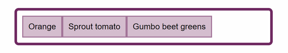
Fig_3. In the first case, our elements have available space for growth.
If the size of the container is less than the sum, then we will take an interest in the flex-shrink parameter , since we need to compress the elements to fit into the container.
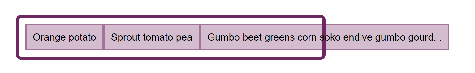
Fig_4. In the second case, our items are too large and require compression to fit into the container.
Freeze all unchangeable elements whose dimensions can already be set. If we use flex-grow this will include all the elements that have flex-grow: 0 . This is the script that we have when flex-elements have free space in the container. The initial flex-grow value is 0, so they become as big as their max-width , and then they no longer grow from their main size .
If we use flex-shrink , this will include all elements with flex-shrink: 0 . We can see what happens in this step if we give our flex-flex set of elements : 0 . Elements become frozen in the max-content state and therefore do not bend or fit into the container.
In our case, with the initial values of the flex elements, our elements can be compressed. Thus, the steps continue, and the algorithm enters a cycle in which it determines how much space to assign or remove. In our case, we use flex-shrink , since the total size of our items is larger than the container, so we need to take away space.
The flex-shrink factor is multiplied by the internal size of the elements, in our case it is the max-content size. This gives value to reduce space. If the elements only removed the space in accordance with the flex-shrink ratio , then the smaller elements could disappear when all of their space would be removed, while the larger element would still have space to compress.
In this cycle, there is an additional step of checking elements that will become larger or smaller than their main size , in which case the element stops growing or shrinking. Again, this is done so that some elements do not become tiny or massive compared to other objects.
Everything that has been simplified in terms of specification, since I have not considered some of the more extreme scenarios, and you can generally just think, assuming that you are happy to let Flexbox do its thing. Remember that in most cases the following two facts will work.
If you grew from auto , then flex-basis will either be handled like any width or height of an element or max-content size. Then the space will be removed in accordance with the flex-basis size multiplied by the flex-shrink factor , and therefore removed in proportion to the maximum size of the elements.
Growth and contraction control
I spent most of this article describing what the Flexbox does when it is left on its device. Of course, you can control more of your flexible elements using flex properties. They hopefully seem more predictable with an understanding of what is happening behind the scenes.
By setting your own flex-basis or by giving the element itself a size that is then used as a flex-basis , you return control of the algorithm, telling the Flexbox that you want to grow or shrink from that particular size. You can completely disable growth or compression by setting the flex-grow or flex-shrink parameter to 0. At this stage, however, you should temporarily use the desire to control flex elements to check whether you are using the correct composition method. If you are trying to align flex elements in two dimensions, you'd better choose a grid layout.
Issues related to debugging related sizes
If your flex elements end in unexpected sizes, this is usually because your flex-basis is auto , and there is something that gives the element width, which is then used as a flex-basis . Checking an item in DevTools can help determine where the size comes from. You can also try setting flex-basis to 0, which will force the Flexbox to treat the element as having a zero width. Even if this is not the result you want, it will help determine the value of flex-basis in using your size problems as the culprit.
Flex clearances
The highly demanded feature of the Flexbox is the ability to specify gaps or gutters between flex elements in the same way that we can specify gaps in a grid layout and a layout with several columns. This feature is defined for Flexbox as part of Box Alignment , and the first implementation of the browser is on the way. Firefox expects to deliver gap properties for Flexbox in Firefox 63 . The following example can be viewed in Firefox Nightly .
Pic_5. As the image is seen in Firefox 63
As with the layout of the grid, the gap length is taken into account before the allocation of space for flex elements.
Concluding
In this article I tried to explain some of the nuances of how Flexbox handles the increase in flex elements . This may seem a little abstruse, however, taking some time to understand how this works can save you a lot of time using Flexbox in your layouts. I find it very useful to come back to the fact that, by default, Flexbox tries to give you the most reasonable layout for a variety of elements with different sizes. If an item contains more content, it is given more space. If you and your designer do not agree with what Flexbox considers best, you can regain control by setting your own value for flex-basis.