Development of accessible interfaces
According to Rosstat, 1 million people have vision problems, ranging from astigmatism to blindness and can hardly use common sites. Try to test your resource for accessibility: shut your eyes so that the screen is blurred and click, enter text, go through the pages. If the usual actions are inconvenient to perform, then you can think about accessibility.
Good examples of available sites at the Pension Fund and State Services. To make your resource available, such large-scale work as for the FIU is not required. It is enough to apply the three principles, add two sites to the bookmarks with detailed documentation on the development of accessible sites and adapt the workflow a little to the new paradigm. As a result, your resources will be transferred to a new level: they will be accessible and convenient for people with disabilities.
On how to quickly and efficiently develop the available resources of today's decryption report by Sergey Krieger on Frontend Conf .
Web access
Our speaker, Sergey Krieger, is a front-end web developer at SinnerSchrader , a web-based web application developer for Alliance, Audi and BMW and other companies. Sergey's main interests are JavaScript, interface design and accessibility. We will talk about accessibility in more detail.
Accessibility is a term that unites a set of rules, recommendations and technologies. Using these rules, developers can create web pages that are convenient for everyone to use, including people with disabilities.
Accessible sites are not special individual resources for visually impaired or hearing impaired people, but the very same pages that we visit every day. An accessible resource is convenient to use for any person: with sight, hearing, retired and healthy person, but with weak mobile Internet.
To make our sites convenient for all users, we will learn how to develop accessible web interfaces based on real examples.
Development
How to build a normal development process?
Suppose we got a layout from a designer and we need to create a web page. Our task, as developers, is to turn the layout into a working site. If the page meets all the requirements of the technical specifications and visually coincides with the layout, then we believe that our work is done.
According to Rosstat, people with vision problems are about 1,000,000. Milling websites without a focus on accessibility, we create resources that 1 million users cannot use.
To make web pages, web elements or web components available not only to healthy users, it ’s enough to add 3 steps to the development process . Consider this process on real examples of the layout of the button, modal window and menu.

We will build a weather widget that shows the current weather and the forecast for the next 4 days. In the settings will be the choice of viewing the weather in one of three cities.
For convenience, we divide the process of creating a widget into 4 parts :
Let's start with the button.
Button
The easiest of interactive elements: beautifully styled and works well with JavaScript.
In the layout of the designer, the button looks like this: The

usual look of the button and the secondary.
Below is the first markup option:
Visually, the result corresponds to the layout, but for a user who does not see the screen well, the page will look blurry.
When you click on the “Basic” button, a blue stroke appears around it. This is the standard behavior of any browser and the indicator that the button is in focus, but for me the green color of the button and the blue frame are indistinguishable and incomprehensible on which button we are now focused.
We come to the first step - working with the focus. Focus is not only a beautiful style of buttons, check boxes and other elements, but also the order of focus, autofocus and more.
Step 1. Focus
Elements have many states. To work with them, there is a whole set of pseudo-classes, but we will consider 3 main ones:
The task seems simple - add pseudo-classes to our elements and is ready, but there is one “but”.
As a rule, a good designer sends along with a layout style guide with a description of all the elements. Using the styles, we will teach the buttons to correctly handle the focus, that is, to change the state when hovering, focus and press. When the screen is blurry, the elements will look much more noticeable for visually impaired users, compared to the usual blue ring around.
Sometimes it happens that the layout does not have all the states. Often we have only 2 types: normal and state of guidance.

For availability, this is not enough, but we can add the missing states on our own. States differ from each other in transparency: slightly darker or lighter. The accessibility task will be solved.
Step 2. Keyboard
The buttons on the page are not just like that. When you click on a button, an event should occur.
On an accessible resource, everything that can be done with a mouse should be duplicated by the keyboard.
We will not think how our button should work with the keyboard. The site w3.org contains a lot of elements with a prescribed scenario of behavior when interacting with a keyboard, screen reader and mouse. The documentation on the site will guide you through all the steps involved in developing the available resources.

The documentation states that the button becomes active when you press the spacebar or Enter on the keyboard.
If we use the standard Button tag, we do not worry about the keyboard, because the behavior described in the documentation is supported in the default button. Clicking on the spacebar or Enter will trigger a normal click handler. You do not need to add anything, just check how our buttons work with the keyboard.
The slide below is a simple counter, which consists of two buttons and an element for displaying the result on the screen.
We taught our buttons to keep focus and work with the keyboard. Let's go further.
Step 3. Screen reader
Imagine that a visually impaired or blind person wants to use our meter. He does not see the screen and the screen reader will be the only way for the user to interact with the meter.
Our buttons still do not work correctly with a screen reader, but we can fix it.
In order for the elements, components or pages being developed by us to be accessible to a large number of users, we need to teach them how to work correctly with a screen reader. Again, no need to invent anything - everything is in the documentation.
Let's try to figure out why this is happening now.
By default, the screen reader reads the text that is located inside the button. In the code for the button "Reset" there is no text, but simply the button itself and the element inside is an SVG icon.
The documentation says that for the case when the button has no text, you can add its description manually using the arial-label attribute .
Add arial-label attribute and any suitable text to the button with text, for example, “ Reset counter” . The counter element, which displays large numbers of the result on the screen, will add the arial-live attribute . This is not in the documentation, but we will do this so that the user can get real feedback and find out the result of the counter.

After clicking on the button, the screen reader will announce the result of the counter. When we drop this value by pressing the reset button, we will hear that the result of the counter is now 0. This is what we wanted to receive.
In this simple way, with the help of 3 steps, we made our ordinary buttons accessible.
Modal window
View of the window in the layout:
The window is made up simply: a fixed element, centered horizontally and vertically with a darkened background.
In our case, the modal window consists of two elements:
Let's start with the button. Here is the first version of our modal window:

After clicking on the element with the gear icon, a modal window will open. It has the text and two buttons: "Agree" or "Cancel." The mechanism works with the mouse, but we know that this is not enough. To make an element accessible, let’s go through 3 steps again: working with focus, keyboard and screen reader.
Step 1. Focus
Turn on the blurred screen and test.
Text is added before and after the icon to follow the movement of the focus.
It is not clear how to work with our modal window. The icon that is responsible for opening the modal window does not hold the focus. Let's figure it out.
Our icon is a regular svg-element:
For javascript, it makes no difference which element you click to open a modal window. You can put a handler on any item and it will work. Despite this, it is considered good practice to use elements as intended, so we will use the svg element to draw the icon, and the button to handle clicks.
The advantages of the button are that it keeps the focus by default and handles all clicks and keyboard without additional actions.
With the button sorted out. Test how the modal window works with focus.
To solve the problem read the documentation.
Green highlights the description of the operation of the modal window with focus. The text is detailed, but here are the important points:
This behavior is called focus-trap and is configured using JS on its own or with ready-made libraries:
Check the edited window:
We taught our modal window how to work with focus.
Step 2. Keyboard
If we are creating an accessible modal window, we should be able to navigate inside it using Tab or Shift + Tab. If you use the default interactive elements, then you do not need to add anything, except for closing the modal window by escape , which we will now do.
With the keyboard sorted out.
Step 3. Screen reader
Check our modal window for a screen reader:
How can we improve our modal window? Using the documentation for working with the screen reader, which contains detailed instructions:
What we need to do:

We add edits, turn on the screen reader and test the modal window:
Note: it is important to understand that after edits, the button performs the operation of opening a modal window. There was an additional attribute collapse, which says that this button will open some content that is now hidden.
We turned the usual modal window into an accessible one by simply following the instructions in the documentation.
Menu
The most difficult part of the work of all three that we have designed earlier. In a menu layout, it looks like this:
Before we start to typeset a menu item, we need to understand one thing: the browser already has an element that does exactly the same thing - Select. The element works very cool, but it is badly styled.
We can manually stylize the element on which we click, but the drop-down modal window will always look like the browser wants and in each browser differently.
From a design point of view, this is not entirely correct. Layout of the default select element will take several times less time than custom layout. If the designer is ready for a compromise, then we should choose the default one, because there is no need to write any JS, but only to style it with CSS. For an average developer, this is 15-30 minutes of work with testing.
If the designer wants to see the menu exactly as he drew it, then the only way to solve the problem is to typeset manually.
The work is not particularly difficult:
For the availability of this is not enough. To make an item available, we need to check a few points again.
Step 1. Focus
Let's start as usual with the focus. Turn on the screen blur and try:
If we decide to impose an element manually, then the markup will look something like on a slide or a little more complicated:

In the block with the select class there is:
The element we need to click on is a regular div . We have abandoned the native element and we can manually create everything on a span or div. From the point of view of semantics, this is not entirely correct, but we can do everything here that we consider correct.
Why should the element on which we press, do not impose a normal button?
From the previous examples we know that by placing a button in this place, we will get together both the focus and the keyboard without additional actions.
We change the code, we add a little bit of styles, and we see that now our menu item is able to work with the focus.
Step 2. Keyboard
Let's go ahead and teach our element to work with the keyboard.

In order for users to use the menu from the keyboard, we need to have support for handlers on the arrows: when clicking on the space bar, the menu will open, and when clicking on the arrows, you can navigate through this menu.
Keyboard support task solved: JS handlers hung on arrows.
Step 3. Screen reader
Turn on the screen reader and see how our menu will be read with it:
For the menu to work with a screen reader, you need to add some attributes to our modal window:
If we add all the attributes, then when moving through the menu items, the screen reader will tell us which element we are in.
Check work:
Build a weather widget
We put together all the interactive elements that are in our weather widget and put everything together. So the widget looks like in the layout: It is made

up on flex boxes or absolute positioning for some elements.
We have already worked on almost all the elements in the widget, and most of the code is already written, it remains to be collected.
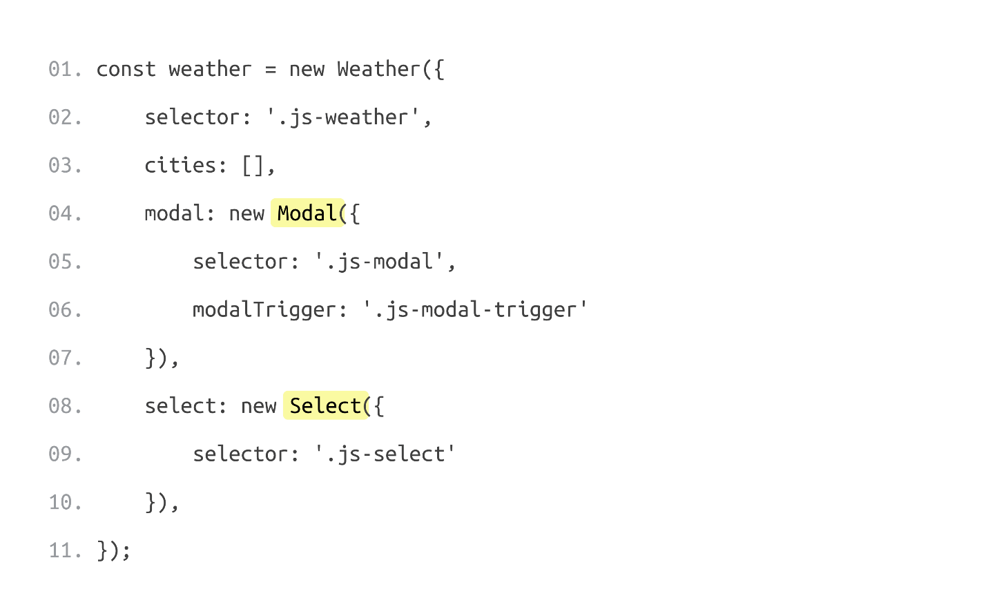
From the point of view of JS, we need to do two things:
Working with the server is a separate topic, but this is not a problem.
In order for the widget to be fully accessible, we need to consider a few points.
Icons
We need to teach the screen reader to read our icons, because the information in the widget consists of 3 parts:
Abbreviations
When you navigate the weather forecast, abbreviations that we can easily read, for example, WED - Wednesday, are perceived worse by ear. For the convenience of the user, we have added the full days of the week to our abbreviations.
Loading city
When choosing another city, the screen reader may say nothing about the fact that it is being loaded. The only way to check this is to go over the widget and read.
Headlines
How will screen reader users search our widget? According to statistics, most screen reader users move around the page with the help of headings. Why don't we add a header to the widget that is hidden from everyone, but accessible to screen readers, explaining what this screen reader is doing.
General list of improvements
Check how the current version of our widget works with the screen reader:
We have built up a widget that not only looks good and works for users who see the screen, but is also available using a keyboard or screen reader for people with disabilities.
findings
3 steps to accessibility. To translate the widget from the usual to the available, we have added 3 steps to the standard layout process on the layout:
Design, content and complex words. The topic of accessibility is not limited to work with the focus, keyboard and screen reader - it is much broader. The topic of accessibility is:
There is a much wider range of things that need to be done for accessibility, but from a technical point of view, we, as developers, can facilitate use. At least we can teach our elements to be available.
Documentation. I advise you to use the detailed accessibility documentation on w3.org . The documentation for each element spells out the requirements for accessibility. The site can be used as a reference, but, unfortunately, all the information is in English.
In the Russian segment there is a similar site weblind.ru .
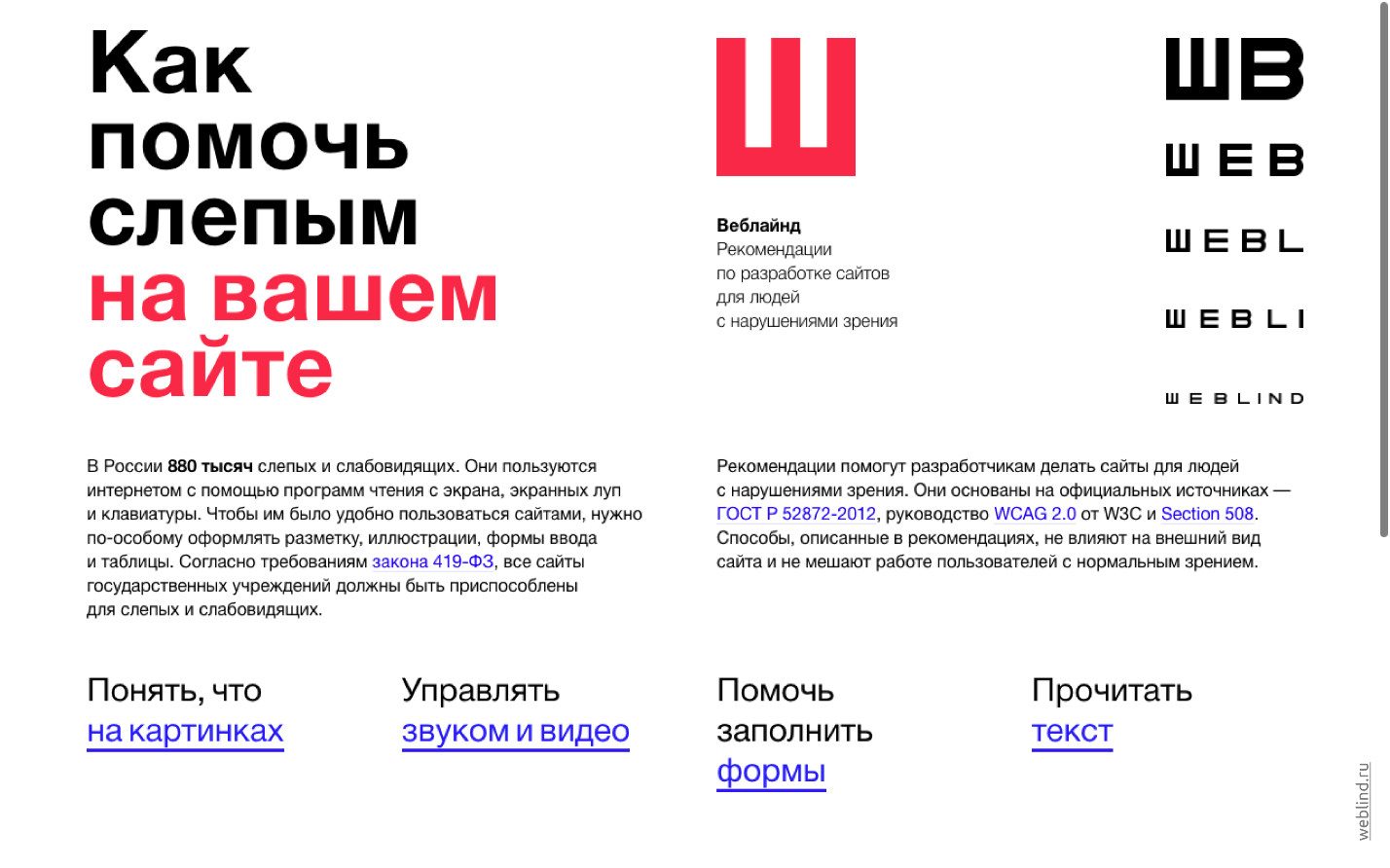
The site is publicly available and if you have something to add on the topic of accessibility, you can go to GitHub and add this information to the site.
ContactsSergey Krieger and a link to an interactive presentation of the report.
Good examples of available sites at the Pension Fund and State Services. To make your resource available, such large-scale work as for the FIU is not required. It is enough to apply the three principles, add two sites to the bookmarks with detailed documentation on the development of accessible sites and adapt the workflow a little to the new paradigm. As a result, your resources will be transferred to a new level: they will be accessible and convenient for people with disabilities.
On how to quickly and efficiently develop the available resources of today's decryption report by Sergey Krieger on Frontend Conf .
Web access
Our speaker, Sergey Krieger, is a front-end web developer at SinnerSchrader , a web-based web application developer for Alliance, Audi and BMW and other companies. Sergey's main interests are JavaScript, interface design and accessibility. We will talk about accessibility in more detail.
Accessibility is a term that unites a set of rules, recommendations and technologies. Using these rules, developers can create web pages that are convenient for everyone to use, including people with disabilities.
Accessible sites are not special individual resources for visually impaired or hearing impaired people, but the very same pages that we visit every day. An accessible resource is convenient to use for any person: with sight, hearing, retired and healthy person, but with weak mobile Internet.
To make our sites convenient for all users, we will learn how to develop accessible web interfaces based on real examples.
Development
How to build a normal development process?
Suppose we got a layout from a designer and we need to create a web page. Our task, as developers, is to turn the layout into a working site. If the page meets all the requirements of the technical specifications and visually coincides with the layout, then we believe that our work is done.
Often there is not a word about accessibility in TK and I think this is a problem.
According to Rosstat, people with vision problems are about 1,000,000. Milling websites without a focus on accessibility, we create resources that 1 million users cannot use.
To make web pages, web elements or web components available not only to healthy users, it ’s enough to add 3 steps to the development process . Consider this process on real examples of the layout of the button, modal window and menu.
We will build a weather widget that shows the current weather and the forecast for the next 4 days. In the settings will be the choice of viewing the weather in one of three cities.
For convenience, we divide the process of creating a widget into 4 parts :
- button layout;
- modal window;
- menu;
- build widget.
Let's start with the button.
Button
The easiest of interactive elements: beautifully styled and works well with JavaScript.
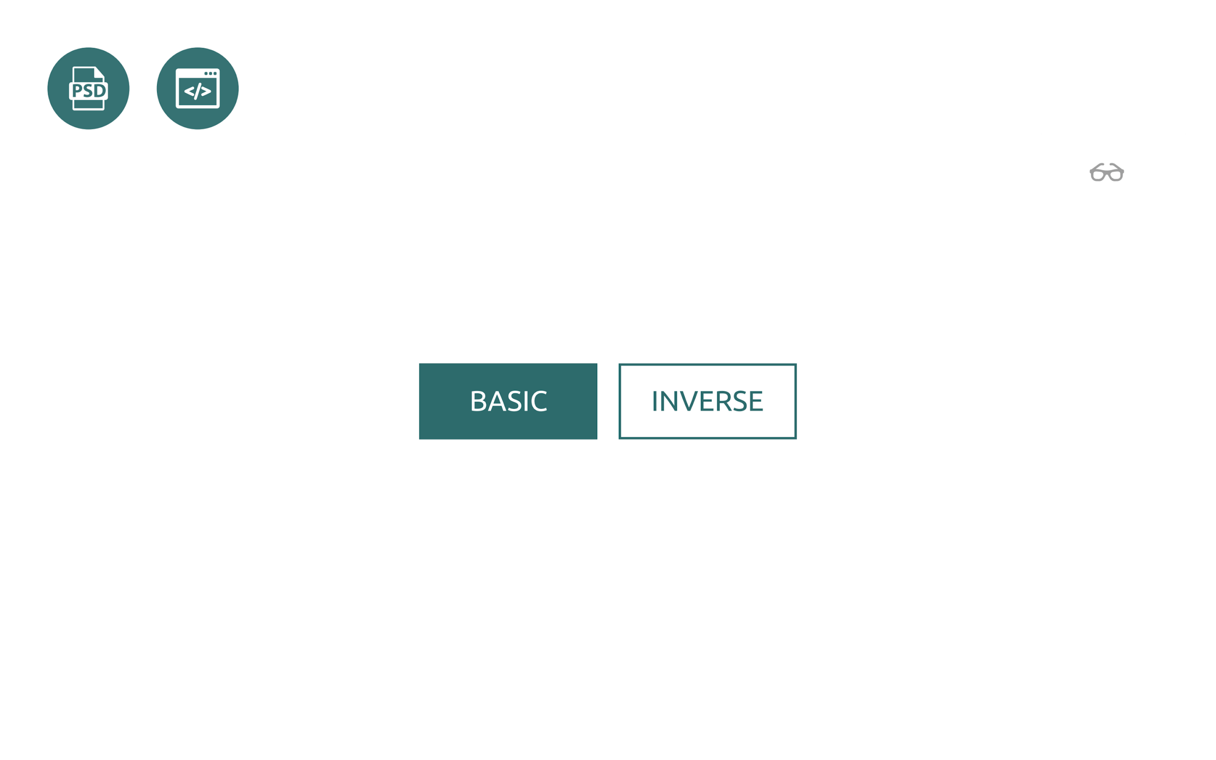
In the layout of the designer, the button looks like this: The
usual look of the button and the secondary.
Below is the first markup option:
Visually, the result corresponds to the layout, but for a user who does not see the screen well, the page will look blurry.
When you click on the “Basic” button, a blue stroke appears around it. This is the standard behavior of any browser and the indicator that the button is in focus, but for me the green color of the button and the blue frame are indistinguishable and incomprehensible on which button we are now focused.
We come to the first step - working with the focus. Focus is not only a beautiful style of buttons, check boxes and other elements, but also the order of focus, autofocus and more.
Step 1. Focus
Elements have many states. To work with them, there is a whole set of pseudo-classes, but we will consider 3 main ones:
- : hover - guidance;
- : focus - focus;
- : active - click.
The task seems simple - add pseudo-classes to our elements and is ready, but there is one “but”.
As a rule, a good designer sends along with a layout style guide with a description of all the elements. Using the styles, we will teach the buttons to correctly handle the focus, that is, to change the state when hovering, focus and press. When the screen is blurry, the elements will look much more noticeable for visually impaired users, compared to the usual blue ring around.
Sometimes it happens that the layout does not have all the states. Often we have only 2 types: normal and state of guidance.
For availability, this is not enough, but we can add the missing states on our own. States differ from each other in transparency: slightly darker or lighter. The accessibility task will be solved.
It is important to understand that accessibility is not just about development. Accessibility and about the design, and about the content, and about everything and the whole team should deal with it.
Step 2. Keyboard
The buttons on the page are not just like that. When you click on a button, an event should occur.
On an accessible resource, everything that can be done with a mouse should be duplicated by the keyboard.
We will not think how our button should work with the keyboard. The site w3.org contains a lot of elements with a prescribed scenario of behavior when interacting with a keyboard, screen reader and mouse. The documentation on the site will guide you through all the steps involved in developing the available resources.
The documentation states that the button becomes active when you press the spacebar or Enter on the keyboard.
If we use the standard Button tag, we do not worry about the keyboard, because the behavior described in the documentation is supported in the default button. Clicking on the spacebar or Enter will trigger a normal click handler. You do not need to add anything, just check how our buttons work with the keyboard.
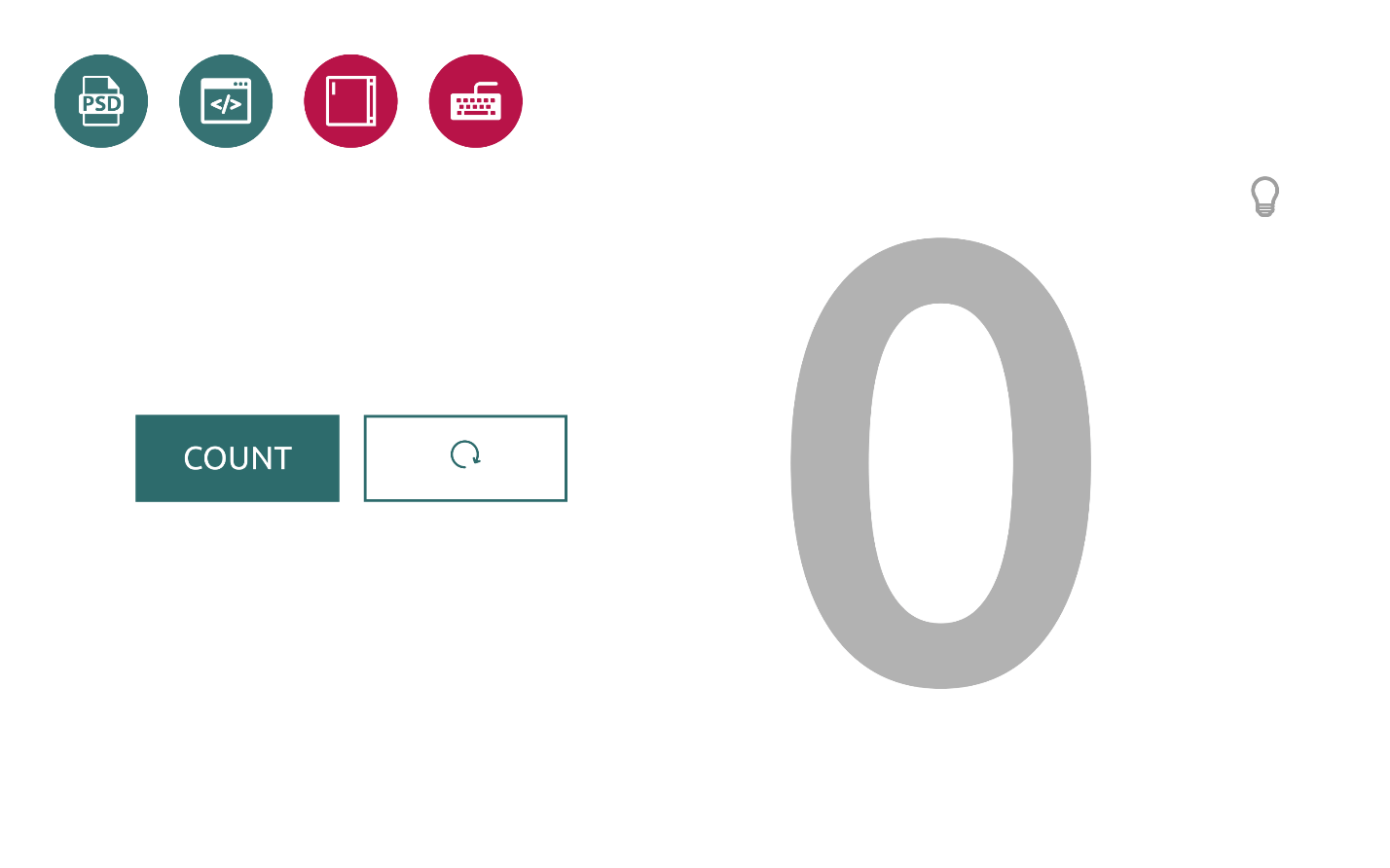
The slide below is a simple counter, which consists of two buttons and an element for displaying the result on the screen.
- When we click the “Count” button , the counter increases the value. We click the adjacent button, and the counter is reset.
- If we use the keyboard through the Tab to focus on the button and press the spacebar, we will see that everything works the same way.
- In order to throw the result, we need to jump to the second button and press the spacebar - the result will drop.
We taught our buttons to keep focus and work with the keyboard. Let's go further.
The main advice I would like to give: if you can use native browser interactive elements, use. It's easy and they already support styles, keyboard and even a screen reader.
Step 3. Screen reader
Imagine that a visually impaired or blind person wants to use our meter. He does not see the screen and the screen reader will be the only way for the user to interact with the meter.
- Turn off the color on the counter to test the screen reader.
- If you jump to the first button with a Tab, the screen reader will indicate that the object is a button and will announce the name explaining that the button is updating the counter.
- The result of the count reader is not voiced.
- Let's try to reset the result and jump to the second button.
- The screen reader says that this is a button, but we have no idea what it is doing. The user will not click on the button, which is not sure.
Our buttons still do not work correctly with a screen reader, but we can fix it.
In order for the elements, components or pages being developed by us to be accessible to a large number of users, we need to teach them how to work correctly with a screen reader. Again, no need to invent anything - everything is in the documentation.
Let's try to figure out why this is happening now.
By default, the screen reader reads the text that is located inside the button. In the code for the button "Reset" there is no text, but simply the button itself and the element inside is an SVG icon.
<button><svg><usexlink:href=”#reset”></use></svg></button>The documentation says that for the case when the button has no text, you can add its description manually using the arial-label attribute .
Add arial-label attribute and any suitable text to the button with text, for example, “ Reset counter” . The counter element, which displays large numbers of the result on the screen, will add the arial-live attribute . This is not in the documentation, but we will do this so that the user can get real feedback and find out the result of the counter.
After clicking on the button, the screen reader will announce the result of the counter. When we drop this value by pressing the reset button, we will hear that the result of the counter is now 0. This is what we wanted to receive.
In this simple way, with the help of 3 steps, we made our ordinary buttons accessible.
Modal window
View of the window in the layout:
The window is made up simply: a fixed element, centered horizontally and vertically with a darkened background.
In our case, the modal window consists of two elements:
- a button that calls the modal window;
- directly windows.
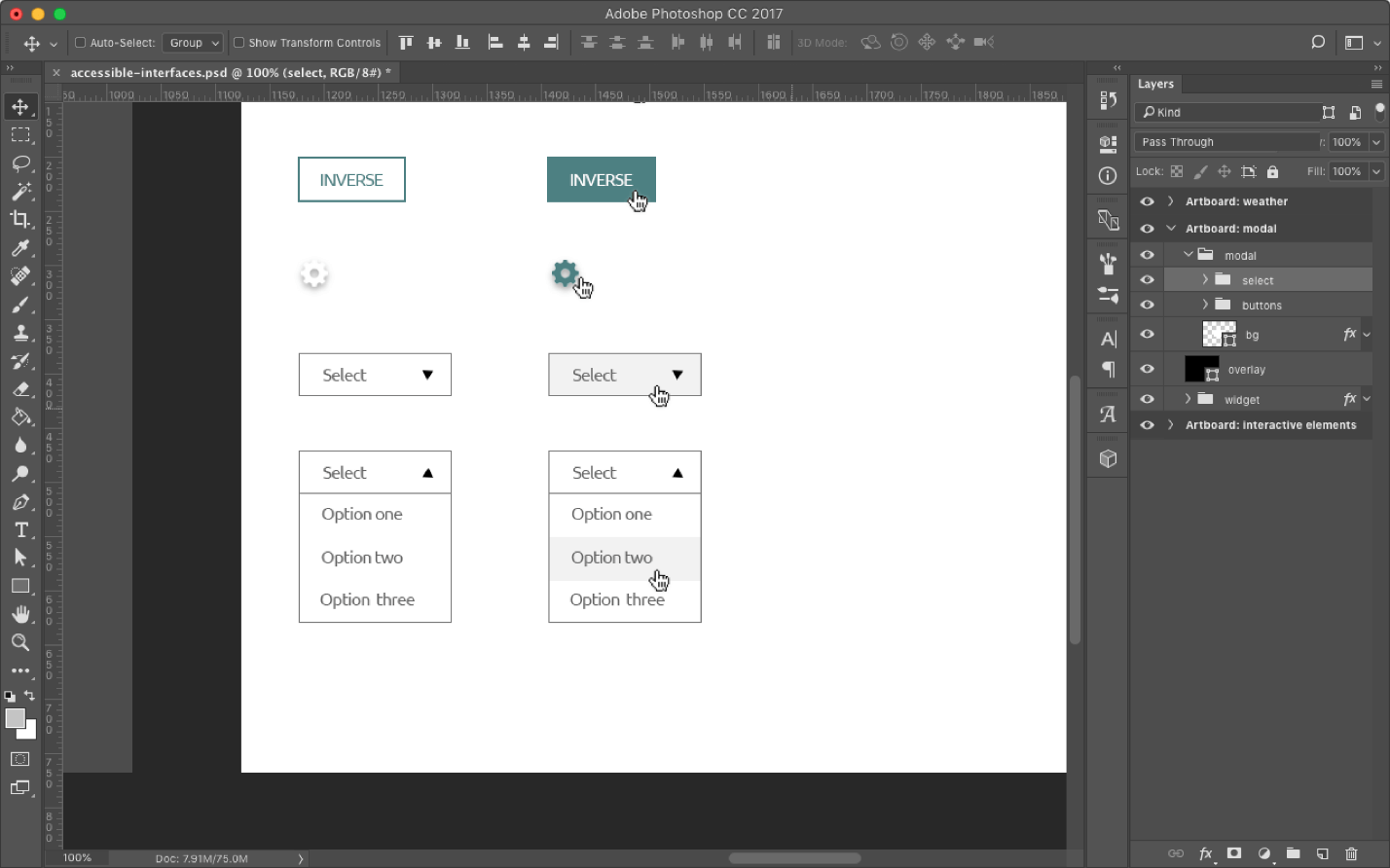
Let's start with the button. Here is the first version of our modal window:
After clicking on the element with the gear icon, a modal window will open. It has the text and two buttons: "Agree" or "Cancel." The mechanism works with the mouse, but we know that this is not enough. To make an element accessible, let’s go through 3 steps again: working with focus, keyboard and screen reader.
Step 1. Focus
Turn on the blurred screen and test.
Text is added before and after the icon to follow the movement of the focus.
- Click Tab'om for the first time - the focus goes to the first element.
- We click the second time - and the focus, bypassing the icon, goes to the second link.
It is not clear how to work with our modal window. The icon that is responsible for opening the modal window does not hold the focus. Let's figure it out.
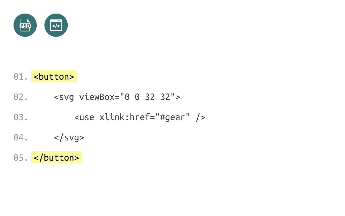
Our icon is a regular svg-element:
<svgviewBox=”003232”><usexlink:href=”#gear”/></svg>For javascript, it makes no difference which element you click to open a modal window. You can put a handler on any item and it will work. Despite this, it is considered good practice to use elements as intended, so we will use the svg element to draw the icon, and the button to handle clicks.
The advantages of the button are that it keeps the focus by default and handles all clicks and keyboard without additional actions.
- We add styles and change the code.
- We check how the icon works - it is already possible to focus on it. We know that if you click the space now, then click on the icon and a modal window will open.
- We click space - it works. Fine!
With the button sorted out. Test how the modal window works with focus.
- Continue clicking Tab and see that with the first click the focus goes to the link after the icon, which already looks weird.
- We continue to click. The focus enters the modal window and moves to the buttons. If you continue to click, then the focus leaves the page. It is not clear how users will work with this modal window.
To solve the problem read the documentation.
Green highlights the description of the operation of the modal window with focus. The text is detailed, but here are the important points:
- When opening a modal window, the focus should move inside the window, and remain there always. We can move outside the modal window, but the focus always remains inside.
- When closing a modal window, the focus should be sent to the element that caused it.
This behavior is called focus-trap and is configured using JS on its own or with ready-made libraries:
- Modals and Keyboard Traps at Udacity;
- library on github .
Check the edited window:
- We add the code and check how the button and the modal window work.
- Jump over the button and click the spacebar - the modal window opens.
- We continue to click Tab'om - the focus remains inside.
- Click on the OK button: the focus goes to the icon and everything works.
We taught our modal window how to work with focus.
Step 2. Keyboard
If we are creating an accessible modal window, we should be able to navigate inside it using Tab or Shift + Tab. If you use the default interactive elements, then you do not need to add anything, except for closing the modal window by escape , which we will now do.
- Turn the focus to the icon.
- We click space - everything works.
- Inside the modal window we imitate the work.
- Click Escape and the modal window closes.
- Everything is working.
With the keyboard sorted out.
Step 3. Screen reader
Check our modal window for a screen reader:
- Turn off the light, turn on the screen reader and listen to what it says about our modal window.
- Tab'om move to our button and see a familiar problem: instead of a text icon, there is no description and it is not clear what the button does. How to solve this problem we already know.
- We click and see what happens. The screen reader counts all the content from the modal window, but it will not be clear for the user: does the text belong to the modal window, is this text after the button or has the user gone to another page?
How can we improve our modal window? Using the documentation for working with the screen reader, which contains detailed instructions:
What we need to do:
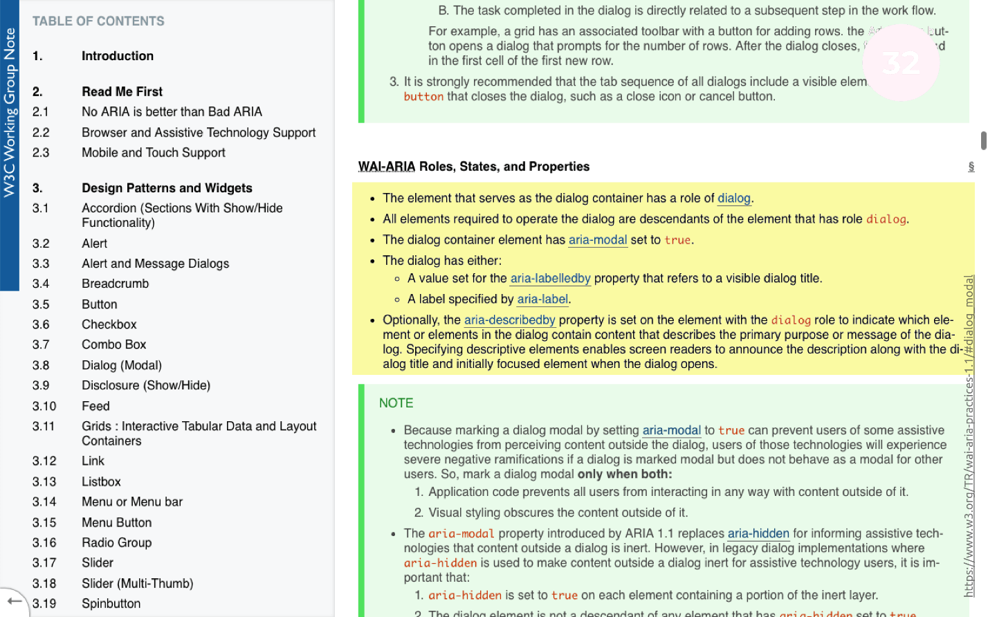
- Add the role = "dialog" and the aria-modal = "true" attribute to the modal window .
- To the button that opens a modal window, add the familiar aria-label and aria-expanded attribute .
We add edits, turn on the screen reader and test the modal window:
- Click on the button. The screen reader says that the modal window is open.
- If we press Tab inside the modal window, we will hear that we have moved to the button, and the content that this button opened is now closed.
Note: it is important to understand that after edits, the button performs the operation of opening a modal window. There was an additional attribute collapse, which says that this button will open some content that is now hidden.
We turned the usual modal window into an accessible one by simply following the instructions in the documentation.
Menu
The most difficult part of the work of all three that we have designed earlier. In a menu layout, it looks like this:
Before we start to typeset a menu item, we need to understand one thing: the browser already has an element that does exactly the same thing - Select. The element works very cool, but it is badly styled.
We can manually stylize the element on which we click, but the drop-down modal window will always look like the browser wants and in each browser differently.
From a design point of view, this is not entirely correct. Layout of the default select element will take several times less time than custom layout. If the designer is ready for a compromise, then we should choose the default one, because there is no need to write any JS, but only to style it with CSS. For an average developer, this is 15-30 minutes of work with testing.
If the designer wants to see the menu exactly as he drew it, then the only way to solve the problem is to typeset manually.
The work is not particularly difficult:
- choose an item;
- we click;
- drop down menu;
- Select something and see that the up / down arrow changes.
For the availability of this is not enough. To make an item available, we need to check a few points again.
Step 1. Focus
Let's start as usual with the focus. Turn on the screen blur and try:
- Focus on the element.
- Click Tab and focus goes to the native Select element - this is normal. The element simply holds the default focus. The design of the element can be stylized if it seems to be homely, but now it is not important.
- Click Tab'om, and see that the focus goes to where it is not clear. Our element does not know how to keep the focus from the very beginning. Let's figure out why.
If we decide to impose an element manually, then the markup will look something like on a slide or a little more complicated:
In the block with the select class there is:
- Select-btn is the element we will click on to open the menu.
- The list itself, which will be either open or closed.
The element we need to click on is a regular div . We have abandoned the native element and we can manually create everything on a span or div. From the point of view of semantics, this is not entirely correct, but we can do everything here that we consider correct.
Why should the element on which we press, do not impose a normal button?
From the previous examples we know that by placing a button in this place, we will get together both the focus and the keyboard without additional actions.
We change the code, we add a little bit of styles, and we see that now our menu item is able to work with the focus.
Step 2. Keyboard
Let's go ahead and teach our element to work with the keyboard.
In order for users to use the menu from the keyboard, we need to have support for handlers on the arrows: when clicking on the space bar, the menu will open, and when clicking on the arrows, you can navigate through this menu.
- Add handlers;
- switch to the button and press the spacebar - everything works.
- We press the arrows, we choose any other city - everything also works.
Keyboard support task solved: JS handlers hung on arrows.
Step 3. Screen reader
Turn on the screen reader and see how our menu will be read with it:
- Move the Tab to the menu item and try to open it with a space.
- Press the space bar. The menu should open.
- Select the last item from the list and randomly click the down arrow and the space bar. When you press the space bar, the menu should close and the value will change. If so, then we selected the last item from the list.
For the menu to work with a screen reader, you need to add some attributes to our modal window:
- role = "listbox" - it does the same thing as select - gives you the opportunity to choose something from the list;
- role = "option" - description for each menu item;
- aria-live = "polite" is an attribute already familiar to us. Hide from all users, but leave it available to the screen reader.
If we add all the attributes, then when moving through the menu items, the screen reader will tell us which element we are in.
Check work:
- Check the menu with the mouse, selecting items.
- Check the keyboard.
- Turn on the screen reader and repeat the check. The screen reader says that the content will now open, but for now it is hidden.
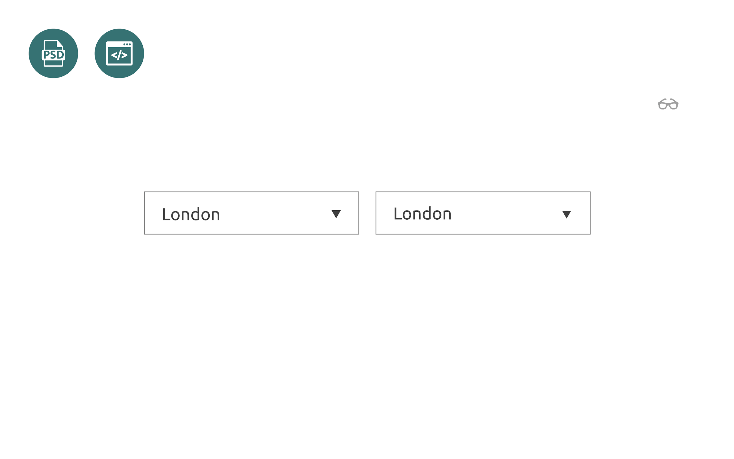
- Press the spacebar, select a city, for example, London. If it works, then everything works.
Build a weather widget
We put together all the interactive elements that are in our weather widget and put everything together. So the widget looks like in the layout: It is made
up on flex boxes or absolute positioning for some elements.
We have already worked on almost all the elements in the widget, and most of the code is already written, it remains to be collected.
From the point of view of JS, we need to do two things:
- Teach the widget to take the weather from the server;
- Upon successful server response, update DOM elements .
Working with the server is a separate topic, but this is not a problem.
In order for the widget to be fully accessible, we need to consider a few points.
Icons
We need to teach the screen reader to read our icons, because the information in the widget consists of 3 parts:
- The location we chose - in this case the city of Berlin;
- temperature ;
- Description of the weather , which is on the screen in the form of icons . We see the sun, and we understand that there is no rain today, but the user does not know this, since the screen reader does not read such information.
Abbreviations
When you navigate the weather forecast, abbreviations that we can easily read, for example, WED - Wednesday, are perceived worse by ear. For the convenience of the user, we have added the full days of the week to our abbreviations.
Loading city
When choosing another city, the screen reader may say nothing about the fact that it is being loaded. The only way to check this is to go over the widget and read.
Headlines
How will screen reader users search our widget? According to statistics, most screen reader users move around the page with the help of headings. Why don't we add a header to the widget that is hidden from everyone, but accessible to screen readers, explaining what this screen reader is doing.
General list of improvements
- H3 - heading for navigation;
- Aria-label - the necessary descriptions for the elements;
- Aria-live is an attribute that we have already used in the menu item in order to teach the screen reader to say the status of the request: the download is in progress, either it turned out or it did not work out.
Check how the current version of our widget works with the screen reader:
- Turn off the light, turn on the screen reader, and try to find on the page our weather widget by moving along the headings.
- We move to the title and try to read the text from the widget. Everything is working fine.
- Now we will try to change the city and find out the weather. Open the modal window, select the desired city, and see what happens. Downloading is pretty fast.
- There is an intermediate status. When the download occurs, the screen reader says: "Now the weather is loading." Now London is loaded, we are on the button and try to read everything that is there. This is really London, and everything works.
We have built up a widget that not only looks good and works for users who see the screen, but is also available using a keyboard or screen reader for people with disabilities.
findings
3 steps to accessibility. To translate the widget from the usual to the available, we have added 3 steps to the standard layout process on the layout:
- We taught the widget elements to be visible, that is, to work with a focus for visually impaired users.
- The second step we taught the widget to work with the keyboard, so that users with problems with motor skills could also find out the weather.
- The last step - taught the widget to work with screen readers for people who do not see the screen at all.
Design, content and complex words. The topic of accessibility is not limited to work with the focus, keyboard and screen reader - it is much broader. The topic of accessibility is:
- Design. Contrasting colors, animation on the site, and you also need to remember about color blind.
- Content . Longer text is more likely to be read by fewer users than short. Pay attention to the sheets of text, most likely they are not available.
- Difficult words in the text . If the student hears an unknown scientific word, he will not understand it. Terms, abbreviations, jargon and professional slang create inaccessible content.
There is a much wider range of things that need to be done for accessibility, but from a technical point of view, we, as developers, can facilitate use. At least we can teach our elements to be available.
Documentation. I advise you to use the detailed accessibility documentation on w3.org . The documentation for each element spells out the requirements for accessibility. The site can be used as a reference, but, unfortunately, all the information is in English.
In the Russian segment there is a similar site weblind.ru .
The site is publicly available and if you have something to add on the topic of accessibility, you can go to GitHub and add this information to the site.
ContactsSergey Krieger and a link to an interactive presentation of the report.
Important!
On our youtube channel we opened the video of all the reports of Frontend Conf as part of the RIT ++ festival - this is a playlist with the best of them. Our next conference for front-end developers will be held in May as part of the RIT ++ festival. In his expectation, subscribe to the newsletter and we will send you new materials, the best reports for 2018, as well as announcements of speeches and other news of the future conference. Subscribe and stay with us, it will be interesting :)