Pixel Art Course 6
This is a translation of the publication Les Forges Pixel Art Course .
Part 1: The right tools
Part 2: Lines and curves
Part 3: Perspectives
Part 4: Shadow and light
Part 5: Color palettes
Part 6: Smoothing
Part 7: Textures and blur
Part 8: World of tiles
Where all your pixel art becomes beautiful. Or not. In fact, it depends on how terrible he was before.
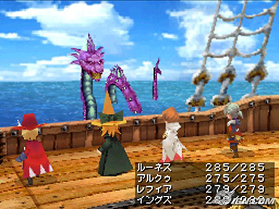
If you had the courage to read current video game news professionals, you may already have seen journalists complaining about aliasing in some games. Aliasing is a phenomenon that occurs when an object in the foreground is in front of a background color, and the border between these objects and the background appears as a terrible, sharp edge. 3D games are the main victims of the phenomenon, since automatic smoothing algorithms are computationally expensive. The example below is from the Final Fantasy III version of the Nintendo DS. The superposition of spectra is especially noticeable at the edges of black in clothes.
2D games are not much affected, because there is always a good old pixel-art anti-aliasing (smoothing) to smooth out all these terrible contours, and smooth the transitions between objects and background. Actually, no algorithms are required here. You just think about it in advance. Think a little if you wish. We can distinguish three situations in which the aliasing phenomenon can occur, and we will act accordingly. The first case: I have two different colors on my sprite, and the transition between these two colors is striking. In this case, we can apply smoothing to soften the transitions. The second case: the transition between one of my characters and the landscape behind him, all in steps (help!). This can be difficult, so we will divide it into two cases:
- if I’m lucky: actually it means "I know the background color that will be shown on my sprite." In this case, you can smooth the edges of your sprite to be sure that the transition between it and the landscape will not be too sharp.
- if I’m not very lucky: sometimes it’s impossible to predict the background color on which your sprite will be shown (for example, if the hero of the game goes through many backgrounds). In this case, do nothing. That's all. It will be stupid to change the edges of your sprite to smooth transitions, since you don’t know what color the transition will be. Well, now you know why and when to use anti-aliasing ... it remains to figure out how to use it!
Good. How do you make these wonderful smooth transitions between two colors? The answer is quite obvious, just use one or more intermediate colors (for example, gray goes between white and black), known as buffer shades. All the subtleties in how you use them. In fact, if you lack artistic flair, you probably want to do something like this:
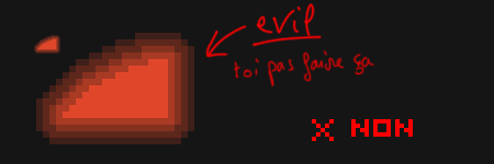
Damn, it's just awful. I hope that you remember no worse than me, not only that this so-called “method” takes a lot of time to implement, (in pixel art it’s quite tedious to do this), but it also does not solve our transition problem. In short, this is not enough, just do something with buffer shades to smooth out. Smoothing is a modest technique, remember that. Now you know how you should not do it (in terms of these nasty contours), look at what has actually been done. First pictures, then words.


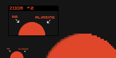
Let me see a small orange arc that violently collides with a black background. On the left is the beast in its natural state. On the right are the successive stages of the smoothing process. We will start by mentioning that the edges of an arc of a circle are a series of segments whose length is from 1 to 3 (this should remind you of the chapter on curves). We will take each segment separately, looking at the image lines, one after another. In the case of vertical segments (not here), we look at the image columns, one after the other. On each line, we soften the transition on both sides of the border, but note: if you deviate beyond the border of your two colors, you will destroy the original shape (and get closer to the example of how not to do it). Your buffer shadows should not extend beyond the ends of the line segments above and below, it seems very complex, but in fact it is not, take a look at the last picture, segments of 1 pixel can only take 2 pixels of smoothing, because if they flow to adjacent segments, they will create a very unpleasant effect called “striping” (and close enough to the bad example above). Do not make a contour around your figure. If necessary, you can make some adjustments, if, despite all the precautions, the shape of the object is slightly distorted, but now we have not the same case. Also be aware that it is not necessary to smooth segments of length 1, which are pretty good on their own. If necessary, you can make some adjustments, if, despite all the precautions, the shape of the object is slightly distorted, but now we have not the same case. Also be aware that it is not necessary to smooth segments of length 1, which are pretty good on their own. If necessary, you can make some adjustments, if, despite all the precautions, the shape of the object is slightly distorted, but now we have not the same case. Also be aware that it is not necessary to smooth segments of length 1, which are pretty good on their own.
The result is visible immediately (or you need glasses immediately). This is how these changes affected our orange circle, as well as our good old friend, the dragon.

Also note that I dimmed a bit of the exterior lighting on the dragon. As previously announced, outdoor lighting is a technique that is used sparingly. I will end with a small technical note, for the most resourceful of you, which I don’t know where to stick: your shadow buffers do not have to be between smoothing colors. If you just want to optimize your palette, you can try using grays because they have the ability to be used in ramps of different colors, and work wonders for antialiasing.
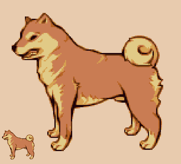
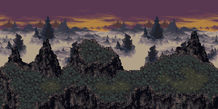
This pixel art sample was generously provided by Panda, which makes anti-aliasing much better than me (and you). Do not forget to wipe the drool from the keyboard after viewing the details.
- From a translator into Russian: in some places the author of the translation from French into English has some kind of jambs with pictures, so he pulled some pictures from the original, and translated a couple of lines with Google from French, and corrected for readability.
Part 1: The right tools
Part 2: Lines and curves
Part 3: Perspectives
Part 4: Shadow and light
Part 5: Color palettes
Part 6: Smoothing
Part 7: Textures and blur
Part 8: World of tiles
Part 6: Anti-aliasing
Where all your pixel art becomes beautiful. Or not. In fact, it depends on how terrible he was before.
1. Plan of attack
If you had the courage to read current video game news professionals, you may already have seen journalists complaining about aliasing in some games. Aliasing is a phenomenon that occurs when an object in the foreground is in front of a background color, and the border between these objects and the background appears as a terrible, sharp edge. 3D games are the main victims of the phenomenon, since automatic smoothing algorithms are computationally expensive. The example below is from the Final Fantasy III version of the Nintendo DS. The superposition of spectra is especially noticeable at the edges of black in clothes.
2D games are not much affected, because there is always a good old pixel-art anti-aliasing (smoothing) to smooth out all these terrible contours, and smooth the transitions between objects and background. Actually, no algorithms are required here. You just think about it in advance. Think a little if you wish. We can distinguish three situations in which the aliasing phenomenon can occur, and we will act accordingly. The first case: I have two different colors on my sprite, and the transition between these two colors is striking. In this case, we can apply smoothing to soften the transitions. The second case: the transition between one of my characters and the landscape behind him, all in steps (help!). This can be difficult, so we will divide it into two cases:
- if I’m lucky: actually it means "I know the background color that will be shown on my sprite." In this case, you can smooth the edges of your sprite to be sure that the transition between it and the landscape will not be too sharp.
- if I’m not very lucky: sometimes it’s impossible to predict the background color on which your sprite will be shown (for example, if the hero of the game goes through many backgrounds). In this case, do nothing. That's all. It will be stupid to change the edges of your sprite to smooth transitions, since you don’t know what color the transition will be. Well, now you know why and when to use anti-aliasing ... it remains to figure out how to use it!
2. Attack!
Good. How do you make these wonderful smooth transitions between two colors? The answer is quite obvious, just use one or more intermediate colors (for example, gray goes between white and black), known as buffer shades. All the subtleties in how you use them. In fact, if you lack artistic flair, you probably want to do something like this:
Damn, it's just awful. I hope that you remember no worse than me, not only that this so-called “method” takes a lot of time to implement, (in pixel art it’s quite tedious to do this), but it also does not solve our transition problem. In short, this is not enough, just do something with buffer shades to smooth out. Smoothing is a modest technique, remember that. Now you know how you should not do it (in terms of these nasty contours), look at what has actually been done. First pictures, then words.
Let me see a small orange arc that violently collides with a black background. On the left is the beast in its natural state. On the right are the successive stages of the smoothing process. We will start by mentioning that the edges of an arc of a circle are a series of segments whose length is from 1 to 3 (this should remind you of the chapter on curves). We will take each segment separately, looking at the image lines, one after another. In the case of vertical segments (not here), we look at the image columns, one after the other. On each line, we soften the transition on both sides of the border, but note: if you deviate beyond the border of your two colors, you will destroy the original shape (and get closer to the example of how not to do it). Your buffer shadows should not extend beyond the ends of the line segments above and below, it seems very complex, but in fact it is not, take a look at the last picture, segments of 1 pixel can only take 2 pixels of smoothing, because if they flow to adjacent segments, they will create a very unpleasant effect called “striping” (and close enough to the bad example above). Do not make a contour around your figure. If necessary, you can make some adjustments, if, despite all the precautions, the shape of the object is slightly distorted, but now we have not the same case. Also be aware that it is not necessary to smooth segments of length 1, which are pretty good on their own. If necessary, you can make some adjustments, if, despite all the precautions, the shape of the object is slightly distorted, but now we have not the same case. Also be aware that it is not necessary to smooth segments of length 1, which are pretty good on their own. If necessary, you can make some adjustments, if, despite all the precautions, the shape of the object is slightly distorted, but now we have not the same case. Also be aware that it is not necessary to smooth segments of length 1, which are pretty good on their own.
3. Complete victory!
The result is visible immediately (or you need glasses immediately). This is how these changes affected our orange circle, as well as our good old friend, the dragon.
Also note that I dimmed a bit of the exterior lighting on the dragon. As previously announced, outdoor lighting is a technique that is used sparingly. I will end with a small technical note, for the most resourceful of you, which I don’t know where to stick: your shadow buffers do not have to be between smoothing colors. If you just want to optimize your palette, you can try using grays because they have the ability to be used in ramps of different colors, and work wonders for antialiasing.
This pixel art sample was generously provided by Panda, which makes anti-aliasing much better than me (and you). Do not forget to wipe the drool from the keyboard after viewing the details.
- From a translator into Russian: in some places the author of the translation from French into English has some kind of jambs with pictures, so he pulled some pictures from the original, and translated a couple of lines with Google from French, and corrected for readability.