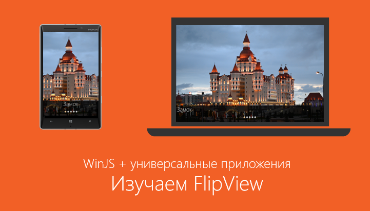
WinJS + universal applications. Learning FlipView
Let's see how to create an image gallery using the FlipView control from the WinJS library. We will make a gallery of photographs and a collection of product cards in the online store as part of a universal application for Windows and Windows Phone, and also consider the use of the WinJS library on the web.
Create a simple gallery

The FlipView control has two key properties - itemDataSource and itemTemplate. The itemDataSource property refers to the data source that corresponds to the IListDataSource interface, for example, the WinJS.Binding.List list , and the itemTemplate property to the data template - an instance of WinJS.Binding.Template (or the template function).
To create a FlipView, you need to follow three simple steps:
- Create a FlipView Control.
- Add data source.
- Define a template to display.
Create FlipView
In order to create a FlipView, you need to add a div block to the page with the data-win-control attribute, and set it to WinJS.UI.FlipView:
Adding data to a FlipView control
To add data to a FlipView control, you need to create an IListDataSource data source . You can use the WinJS.Binding.List object , and, if necessary, create your own data source . As an example, let's see how to create a data source using the WinJS.Binding.List object based on a regular array.
var dataList = new WinJS.Binding.List([
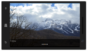
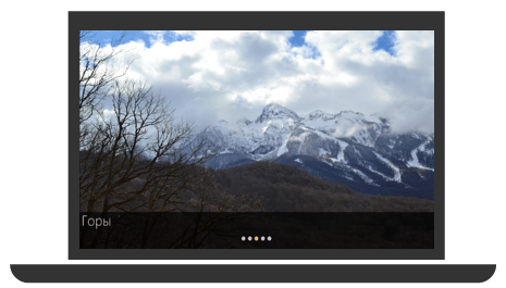
{ type: "item", title: "Горы", picture: "images/1.jpg" },
{ type: "item", title: "Гроза", picture: "images/2.jpg" },
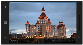
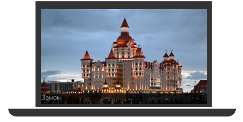
{ type: "item", title: "Замок", picture: "images/3.jpg" },
…
]);
// Делаем dataList видимым глобально
WinJS.Namespace.define("DataExample", { itemList: dataList });
To associate your data list with a FlipView control, use the itemDataSource property:
var flipView = document.getElementById("basicFlipView").winControl;
flipView.itemDataSource = DataExample.itemList.dataSource;
Please note:
Data binding can be done declaratively in HTML code. To do this, inside the data-win-options attribute, set the itemDataSource property to DataExample.itemDataList.dataSource in the div block of the FlipView control.
Creating a template for displaying data
Next, to correctly display the data, you need to specify the WinJS.Binding.Template template . There are two ways to do this: define WinJS.Binding.Template using manual markup, or implement a function that will do this programmatically. Let's see how to create a template manually.
Add a div block and set the data-win-control attribute to WinJS.Binding.Template, add additional markup elements to it that correspond to objects from the data set. To associate data with markup elements, use the data-win-bind attribute.

To apply an element template, inside the data-win-options attribute, set the itemTemplate property to ItemTemplate (template id) in the div block of the FlipView control.
Done! We managed to create a gallery to display photos.
Styling FlipView
You can stylize the FlipView control using the WinJS.Binding.Template template , and there is a separate set of CSS classes for the navigation buttons.
The following is a diagram of the components of the FlipView control that you can apply styles to.
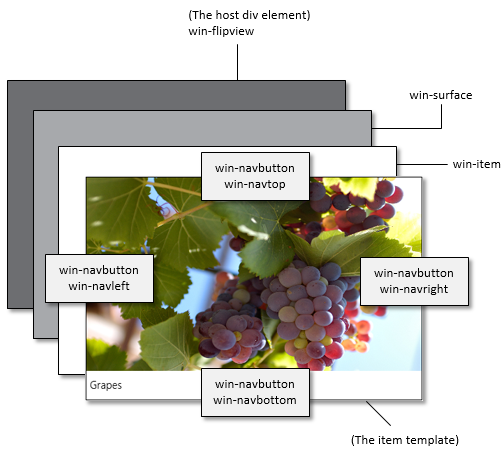
- .win-navbutton Sets the style of all navigation buttons.
- .win-navbottom Specifies the style of the down navigation button.
- .win-navleft Specifies the style of the left navigation button.
- .win-navright Sets the style of the right navigation button.
- .win-navtop Specifies the style of the up navigation button.
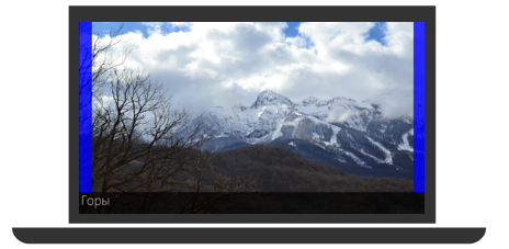
For example, in order to style the right navigation button for a FlipView control, you need to redefine the win-navright CSS class.
.win-flipview .win-navright
{
	background-color: rgba(0,0,255, 0.8);
	width: 50px;
	height: 650px;
	margin-left: -50px;
	margin-top: -402px;
	margin-right: 10px;
}
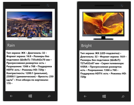
Creating a gallery to display products in the online store
We already learned how to add images to the FlipView control. Let's see how to create a gallery to display products in the online store. It is very easy to do. Suppose we have a list with data, where each element will have four properties - type, picture, name and description. The main change from the previous template is related to the definition of CSS styles.
![]()
For convenience, divide the available space into several parts - for this, define for the overlaidItemTemplate object the display mode in the form of a grid ( Grid Layout ).
In my example, I preferred to split the screen into two equal parts. On one will be displayed a picture with a name, on the other - a description of the product. In order to set CSS styles for the bottom of the screen, I added an element with the .ItemDescription class.
/*CSS стили для всего шаблона*/
.overlaidItemTemplate
{
	display: -ms-grid;
	-ms-grid-columns: 1fr;
	-ms-grid-rows: 1fr 1fr;
	width: 100%;
	height: 100%;
}
/*CSS стили для нижней части шаблона */
.overlaidItemTemplate .ItemDescription
{
	color: black;
	font-family: 'Segoe UI Mono';
	font-size: 15pt;
	padding-top: 8px;
	padding-left: 8px;
	-ms-grid-row-align: stretch;
	background-color: rgba(255, 255, 255, 0.4863);
	background-position-y: 50%;
	position: relative;
	z-index: 2;
	-ms-grid-row: 2;
}
As a result, I got the layout of an online TV store.
In order to make a page where elements will scroll vertically, simply add the orientation property with the value 'vertical' to the data-win-option attribute .
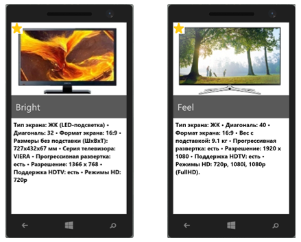
Let's modify the task a bit. Let now we need to somehow mark some products, for example, highlight new models. We will figure out how to do this.
- We add a new property to the data array - isNew, which takes the value true or false depending on whether the product is “new” or not:
var dataArray = [
    { type: "item", title: "Feel", picture: "images/Cliff.jpg", description: "Тип экрана", isNew: true },
    …
    { type: "item", title: "Grape", picture: "images/Grapes.jpg", description: "Тип экрана", isNew: false },
];
- Using WinJS.Binding.converter , create a converter, with which we add a sticker icon on top of the picture.
var converters = {
        convertToPic: WinJS.Binding.converter(function(showSticker) {
            if (showSticker)
                return '/images/star.png';
            else return "";
        })
    };
WinJS.Namespace.define("Data", {"Converters": converters });
- Insert image into template
![]()
Creating a context control
Very often, controls similar to FlipView are used on website pages in order to display the current position and navigate through the elements. Let's see how to do the same with FlipView.
The FlipView control has methods and events that let you know the change in the current position in the gallery and the total number of elements. Let's add buttons with which you can realize the ability to jump to any element. The synchronization of the toggle buttons with FlipView is supported through the pageselected and pagevisibilitychanged events .
You need to describe the events of clicking the buttons and turning the page. The general plan is as follows:
- Create a page control.
- Creating buttons for switching between pages and adding button click events.
- Determining the start of page switching and blocking subsequent switching until the completion of moving to the next page.
- Description of the page switch event.
- Adding the created control to the DOM.
See the full code for implementing navigation on the FlipView control here:
HTML code:
JavaScript code:
(function () {
    "use strict";
    var myFlipview = null;
    var page = WinJS.UI.Pages.define("default.html", {
        processed: function (element, options) {
            myFlipview = document.getElementById("contextControl_FlipView").winControl;
            myFlipview.count().done(countRetrieved);
        }
    });
    function countRetrieved(count) {
// 1) Создаем элемент управления переключением страниц
        var contextControl = document.createElement("div");
        contextControl.className = "contextControl";
        var isFlipping = false;
// 2) Создаем radio кнопки для каждой страницы в FlipView и добавляем «флаг»
        var radioButtons = [];
        for (var i = 0; i < count; ++i) {
            // Создаем radio-кнопку
            var radioButton = document.createElement("input");
            radioButton.setAttribute("type", "radio");
            // Задаем имя для группы radio кнопок
            radioButton.setAttribute("name", "flipperContextGroup");
            // Присваиваем каждой кнопке номер страницы
            radioButton.setAttribute("value", i);
            // Установка маркера доступности
            radioButton.setAttribute("aria-label", (i + 1) + " of " + count);
            // Добавлем обработчик события
            radioButton.onclick = radioButtonClicked;
            // Добавляем кнопки в нашу коллекцию
            radioButtons.push(radioButton);
            // Добавляем кнопки в элемент управления переключением страниц
            contextControl.appendChild(radioButton);
        }
// 3) Устанавливаем связь между выбранным элементом и элементом, на котором
 //находится FlipView
        if (count > 0) {
            radioButtons[myFlipview.currentPage].checked = true;
        }
// 4) Описываем события для radio кнопок
 function radioButtonClicked(eventObject) {
            if (isFlipping) {
                var currentPage = myFlipview.currentPage;
                radioButtons[currentPage].checked = true;
            } else {
                var targetPage = eventObject.srcElement.getAttribute("value");
                myFlipview.currentPage = parseInt(targetPage, 10);
            }
        }
// 5) Определяем начало переключения страницы для того, чтобы предотвратить
// переключения страницы до завершения предыдущего переключения
        myFlipview.addEventListener("pagevisibilitychanged", function (eventObject) {
            if (eventObject.detail.visible === true) {
                isFlipping = true;
            }
        }, false);
// 6) Подсвечиваем элемент, на котором мы находимся
        myFlipview.addEventListener("pageselected", function () {
            // Перемещение закончено, «опускаем» флаг
            isFlipping = false;
            // Устанавливаем выбранную страницу
            var currentPage = myFlipview.currentPage;
            radioButtons[currentPage].checked = true;
        }, false);
 // 7) Добавляем элемент управления в DOM
        var contextContainer = document.getElementById("ContextContainer");
        contextContainer.appendChild(contextControl);
    }
})();
Please note that we will use radio buttons to style the toggle buttons. In order to make cute round buttons, it is enough to set the CSS property border-radius and specify how much percent we want to round the edges (by default, the radio buttons are rectangular)
input[type="radio"]
{
	margin: 10px 5px;
	width: 15px;
	height: 15px;
	padding: 0px;
	border-radius: 50%;
}
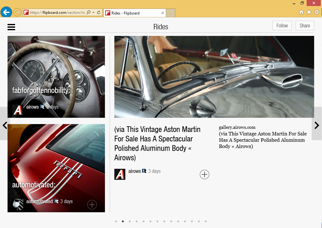
FlipView on the web
WinJS is available for web projects as an open library, and you can use it on your web pages. You can see how the FlipView control looks on the web simply by clicking on this link.

Pay attention to the third example using a dynamic template. We will consider such an opportunity in one of the following articles.
Additional links:
Quick start guide: adding a FlipView control (HTML)
An example of using a FlipView control written in HTML
MVA mobile development course for web developers
You can download Microsoft Visual Studio here
Only registered users can participate in the survey. Please come in.
How do you make mobile apps?
- 12.8% I am a web developer and prefer to make mobile sites 21
- 47.8% I am a web developer and want to make HTML / JavaScript applications 78
- 39.2% I prefer to write native applications (ObjectiveC, Swift, Java, C ++, C # , etc.) 64