What happens when creating a Flexbox container?
- Transfer
This is a translation of the article by Rachel Andrew, one of the developers of the CSS specifications.
In a short series of articles, I’m going to spend some time unpacking the Flexbox in detail - just like I did in the past with the grid . We will look at what Flexbox was designed for , what it really does well, and when we can't select it as the layout method.
In this article, we take a closer look at what actually happens when adding display: flex to your style sheet.
Flex container please!
To use Flexbox , you need an element that will be a flex container. In your CSS you use display: flex:
Let's think a little about what it really means display: flex. In the Display Module Level 3 specification, each property value is displaydescribed as a combination of two elements: an internal and external display model.
When we add display: flex, we actually define display: block flex. External display type of our flex-container block; it acts as a block level element in the standard stream. The internal display type is flex, so the elements directly inside our container will participate in the flex layout.
This is something you may never have thought about, but you probably still understand. The flex container acts like any other block on your page. If you have a paragraph followed by a flex container, then both elements behave as we want from block elements.
We can also assign our container the value of inline-flex , using display: inline flex, i.e. The flex container acts as a row-level element with children that participate in the Flex layout. The child elements of our lowercase flex container behave the same as the children of our block flex container; the difference lies in how the container itself behaves in a general layout.
This concept of behavior of elements with an external display type, defined as a block on a page (plus an internal display type) dictates how their children behave, is very useful. You can apply this reasoning to any block in CSS. How does this element work? How do the children of this element act? Answers relate to their external and internal display models.
Rows Or Columns?
As soon as we have defined our flex-container, some initial values come into play. Without adding additional properties, flex elements are displayed as a string. This is because the initial value of the flex-direction property is row . If you do not change it, you will get a series.
The flex-direction property determines the direction of the main axis. It may take other values:
- column;
- row-reverse;
- column-reverse.
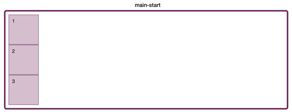
Our items in a single row will be placed, starting at the starting edge, in the direction of the line and displayed in the order in which they appear in the source. In the specification, this edge is called main-start :

Fig_1. main-start - the beginning of the line direction
If we use the column value , the elements will start to be located from the starting edge in the block direction and, therefore, form a column.
Pic_2. main-start - the beginning of the block direction
If we use row-reverse , the layout of the main-start and main-end will be swapped; so the items will be laid out one after another in the reverse order.
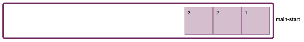
Fig_3. main-start - from the end of the line direction
The column-reverse value does the same thing.
It is important to remember that these values do not "switch the order of elements", although this is what we see, they simply change the place where the flow of elements begins, switching the layout of the main-start . Thus, our items are displayed in reverse order, but this is because they begin to spread from the other end of the container.
It is also important to remember that when this happens, this is a purely visual effect. We ask the elements to display themselves, starting with the final edge; they still flow in the same order, and this is the order your screen reader uses, as well as the order in which they can be tabulated. You should never use row-reverse if you really want to change the order of the elements. To do this, make changes to the original document.
Two axis flexbox
We have already revealed an important feature of flexbox : the ability to switch the main axis from row to column. This is an axis switch, so I think it’s often easier to understand things like alignment in a grid layout. Using a two-way grid, you can align on both axes in almost the same way. Flexbox is a bit more complicated, because some events occur depending on whether you are working with the main or transverse axis.
We have already encountered the main axis, i.e. the axis, which you define as the flex-direction value . The transverse axis is a different direction. If you set the flex-direction: row , your main axis is along the row, and the transverse is down the column. Using flex-direction: column, the main axis will be located down the column, and the transverse - along the line. This is where we need to consider another important feature of the Flexbox , and this is the fact that it is not tied to the physical directions of the screen. We are not talking about a row from left to right, or a column from top to bottom, because this is not always the case.
RECORDING MODES
When I described the row and column above, I mentioned block and line directions. This article is written in English, which has a horizontal recording mode. This means that when you ask Flexbox to provide you with a string, you will get a horizontal display of your flex elements. In this case, the main-start is on the left - at the place from which the sentences in English begin.
If I worked in a language from right to left, such as Arabic, then the starting edge would be on the right:
The initial flexbox values mean that if all I do is create a flex container , then my items will start on the right and appear moving to the left. The starting edge in the line direction is the place where sentences begin in the recording mode used.
If you find yourself in vertical recording mode and refer to the string, your string will work vertically, because that is how lines of text are executed in a vertical language. You can try this by adding a write mode property to the flex container and setting its value to vertical-lr . Now, when you set the flex-direction to row , you get a vertical column of elements.
Thus, the row can work horizontally, with main-start on the left or right, and also work vertically with the main-start at the top. It is still a flex-direction line, even if it is hard for our minds, accustomed to horizontal text, to think about a line that runs vertically!
So that the elements are located in the block direction, we set the value for the flex-direction property to column or column-reverse . In English (or Arabic), we see elements displayed one above the other down the page, starting at the top of the container.
In the vertical recording mode, the block direction runs across the page, since this is the direction of the blocks located in these recording modes. If you specify a column in vertical-lr , your blocks will run from left to right vertically:
However, no matter in which direction the blocks are displayed, if you are working with a column, you are working in a block direction.
Understanding the fact that a row or column can run in different physical directions is useful for understanding some of the terms used for Grid and Flexbox . We do not refer to "left and right" or "top and bottom" in Flexbox and Grid , because we make no assumptions about the recording mode of our document. All CSS becomes more aware of the write mode.
If you are interested in some of the other properties and values that are implemented to make the rest of the CSS behave in the same way, read my article on logical properties and values .
As a summary, remember that:
- flex-direction: row
- main axis = inline dimension;
- main-start will be where the sentences begin in this recording mode;
- transverse axis = block direction;
- flex-direction: column
- main axis = block direction;
- main-start will be where the blocks start laying out in this recording mode;
- transverse axis = row direction (inline dimension).
Initial alignment
When we use display: flex , some other events also occur. Some initial alignment is performed. In one of the following articles in this series, we will look at alignment. however, in our display: flex study, we should consider doing initialization.
Note : It is worth noting that, although these alignment properties began life in the Flexbox specification, the Box Alignment specification will eventually replace them, as specified in the Flexbox specification .
ALIGNMENT OF MAIN AXIS
The initial value of the justify-content property is set to flex-start . This is how our CSS would be like this:
.container {
    display: flex;
    justify-content: flex-start;
}
This causes our flex elements to line up from the starting edge of the flex container. This is also the reason why, when we specify a row-reverse , they switch to the final edge, because now it becomes the beginning of the main axis.
If you see an alignment property that begins with justify- , then it is applied to the main axis of the Flexbox . Thus justify-content aligns along the main axis and places our elements at the beginning.
Other possible values for justify-content :
- flex-end;
- center;
- space-around;
- space-between;
- space-evenly (added to Box Alignment ).
These values deal with the allocation of free space in the flex container. That is why the elements are located near or are separated from each other. If you add justify-content: space-between , then any available space is distributed between all elements. However, this can only happen if there is free space. If you had a tightly packed flex-container (without additional space after all the elements were laid out), justify-content would not do anything at all.
You can see this by switching the flex-direction to the column. Without a height, the flex container has no free space, so setting the justify-content: space-between parameter will do nothing. If you add height and make the container taller than you need to display elements, then the property will have an effect:
ALIGNMENT ALONG TRANSVERSE AXIS
Elements are also aligned in one line along the transverse axis of the flex-container. The alignment that we perform is to align the blocks relative to each other in a row. In the following example, one of our blocks has more content than all the others. Something tells other blocks to stretch to the same height. This property is align-items , which has an initial stretch value :
When you see an alignment property that begins with align- and you are in a flexbox , then you are dealing with alignment along the transverse axis, and align-items align elements along the flex line. Other possible values:
- flex-start;
- flex-end;
- center;
- baseline.
If you do not want all the blocks to stretch to the height of the highest, then the installation align-items: flex-startwill align them all along the initial edge of the transverse axis.
Initial values for Flex elements
Finally, the flex elements themselves also have initial values, they are set to:
- flex-grow: 0;
- flex-shrink: 1;
- flex-basis: auto.
This means that our elements will not grow by default in order to fill the available space on the main axis. If the flex-grow parameter is set to a positive value, the elements will grow and take up any available space.
However, blocks can shrink, since flex-shrink has a positive value of 1. This means that if we have a very narrow flex-container, then the elements will be as small as possible before the overflow occurs. This is reasonable behavior; in general, we want them to remain inside their blocks and not overflow if there is a place to display them.
To get the best layout, the flex-basis property defaults to auto . We will understand what this means in the next article in this series, however, most of the time you can think of auto as “a large enough value to hold the content”. You will see that if you have flexible elements that fill the container, and one of them has a larger amount of content than the others, then it will be given more space.
This is Flexbox flexibility in action. When flex-basis is in auto and there is no indication of the size of the elements, they have the basic size max-content . It would be the size when they stretched and did not carry the line break. In this case, the free space is divided between the elements in the proportion described in the following note of the flexbox specification .
" Note : when allocating the missing space, the flex compression ratio is multiplied by the base flex size. This distributes the missing space in proportion to how the element can contract, so that, for example, a small element will not contract to zero until the larger one is noticeably reduced.”
The larger element has less free space and we get the final layout. You can compare the two screenshots below, both taken from the example above. However, in the first screenshot, the third block has less content, so our columns have a more even distribution of space.
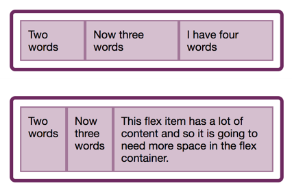
Fig_4. Elements are transferred to give more space to a larger element.
Here, Flexbox helps us ultimately get a reasonable end result without the intervention of the person who wrote the CSS. Instead of evenly reducing the space and eventually getting a very high element with several words on each line, it allocates more space for this element to accommodate itself. Within the framework of this behavior, there is a key to real options for using the Flexbox . Flexbox is best suited to accommodate multiple elements — along a single axis — in a flexible and meaningful way.
I have covered here only some details, but we will look at these algorithms later in this series.
Conclusion
In this article, I took the initial values of Flexbox to explain what actually happens when you specify display: flex . This is an amazing amount as soon as you begin to unpack it, and several properties contained in it turn out to be many of the key characteristics of flexible layouts.
Flex layouts are flexible: they try to make the right choice about your content by default — shrink and stretch to get better readability. Flexible layouts support recording mode: the directions of rows and columns are related to the recording mode used. Flexible layouts allow you to align elements as a group along the main axis, choosing a way to allocate space. They allow you to align elements along their flexible lines, to move elements along the transverse axis relative to each other. It is important to note that flexible layouts understand the volume of your content, and try to make the right basic decisions to display it.
In future articles, we will explore these areas in more detail and further consider when and why we can use the Flexbox .